Categories
Financial data is essential for decision-making, but raw numbers alone can be difficult to interpret. When data is buried in spreadsheets, spotting trends, tracking performance, and identifying opportunities becomes time-consuming.
Financial charts solve this problem by turning complex data into clear, visual insights. They help businesses quickly understand performance, compare results, and make smarter, data-driven decisions.
Definition: Financial charts are visual representations of financial data, including revenue, expenses, profits, investments, and overall financial performance.
They help businesses quickly analyze trends, compare values, and track financial movement over time.
By converting raw numbers into clear visuals, financial insights make reporting easier and highlight patterns and relationships that might be missed in spreadsheets.
They are widely used for:
With financial visuals, analysts can understand performance at a glance, identify trends, and make data-driven decisions without manually scanning rows of numbers.
Charts allow executives and analysts to visualize performance, spot opportunities, and detect risks quickly. By highlighting growth trends, cost impacts, and profitability patterns, finance charts help make faster, data-driven decisions.
Organizations can track:
Visualizing these trends uncovers patterns that remain hidden in raw spreadsheets, enabling proactive planning.
Financial data often needs to be shared with non-finance stakeholders. Charts convert complex figures into clear, easy-to-understand visuals, making reports, data presentations, and meetings more effective.
Visual charts support forecasting, scenario analysis, and evaluating market behavior. They also help detect unusual spending or anomalies early, allowing timely corrective actions.
Businesses and individuals use finance charts to track budgets, savings targets, and operational performance. Clear visual monitoring enhances accountability and encourages proactive management.
You should use financial charts whenever your data becomes difficult to understand in tables, and you need quick, clear insights.
Understanding the key components of a financial diagram is essential for creating visuals that clearly communicate insights. Each element plays a critical role in helping viewers interpret financial data accurately.
These are the financial values being analyzed, such as revenue, expenses, profits, or operating costs. Properly organized data series allow for meaningful comparisons and trend analysis.
The horizontal axis usually represents time periods (days, months, quarters, or years) or categories, while the vertical axis shows financial values. Clear axes make trends and patterns easy to spot.
Chart titles, axis labels, and data labels provide context, ensuring viewers immediately understand what the chart represents. Descriptive titles improve readability and help with SEO.
Legends distinguish multiple datasets, making it easier to differentiate revenue, costs, or profit margins within the same chart.
Gridlines improve visual accuracy, helping readers compare values across periods or categories without confusion.
Different financial scenarios require different types of charts. Below are some of the most effective financial charts used in business analysis, along with practical use cases.
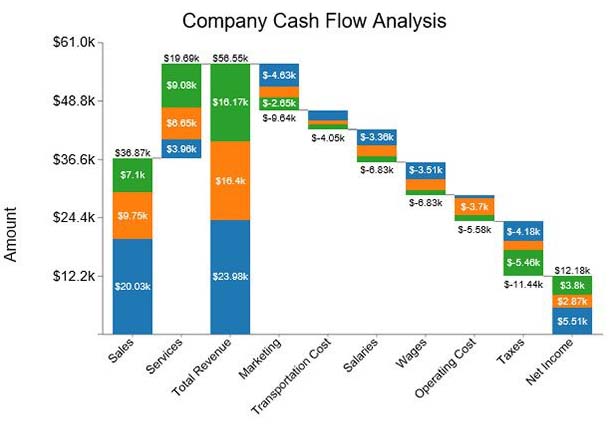
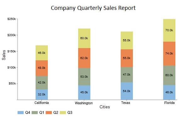
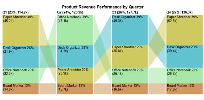
Shows how values change across multiple categories while highlighting cumulative impact. It’s useful for understanding how different components contribute to a final result.
Use Cases:
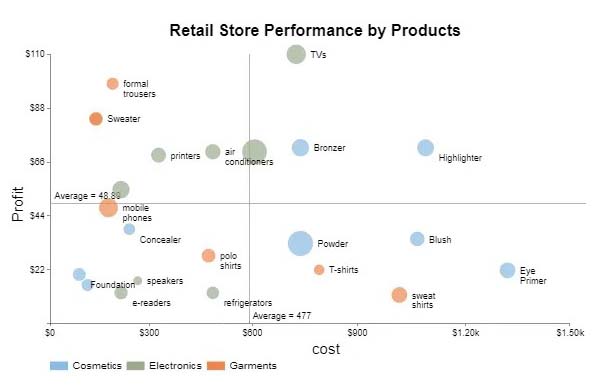
Displays relationships between two variables, helping identify correlation matrix in Excel, patterns, or anomalies in financial data.
Use Cases:
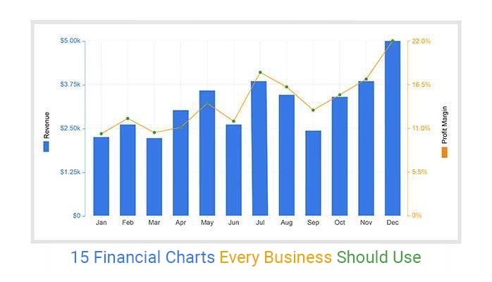
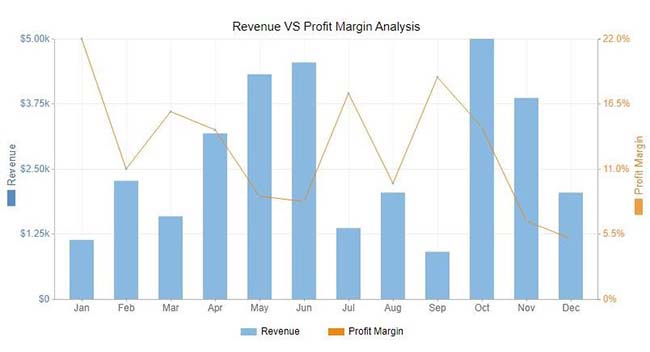
Combines two different metrics in one view, making it easier to compare trends and relationships.
Use Cases:
Represents part-to-whole relationships while allowing comparisons across categories or time periods.
Use Cases:
Highlights progress toward financial goals using simple visual indicators.
Use Cases:
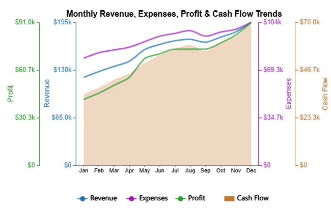
Displays multiple financial metrics with different scales, making trend comparison easier.
Use Cases:
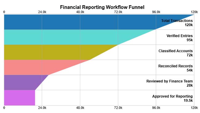
Shows how data moves through stages, helping identify drop-offs or inefficiencies.
Use Cases:
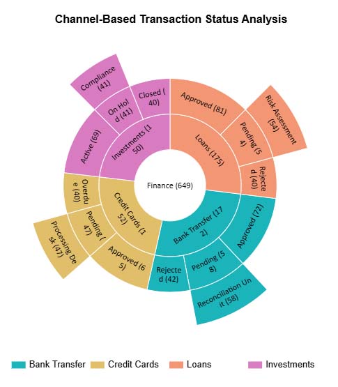
Visualizes hierarchical data in layers, showing how each segment contributes to the total.
Use Cases:
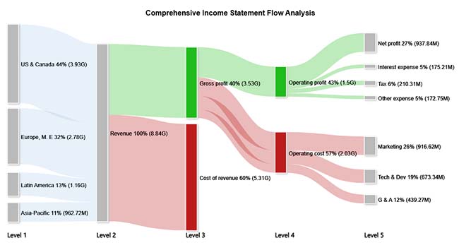
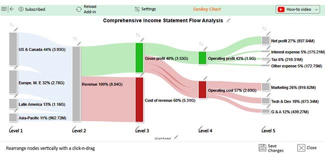
Represents the flow of values between categories, making it easy to track the movement of money.
Use Cases:
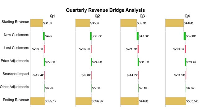
Shows step-by-step changes in values, highlighting gains and losses that lead to a final result.
Use Cases:
Compares the impact of multiple variables, helping identify the most influential factors.
Use Cases:
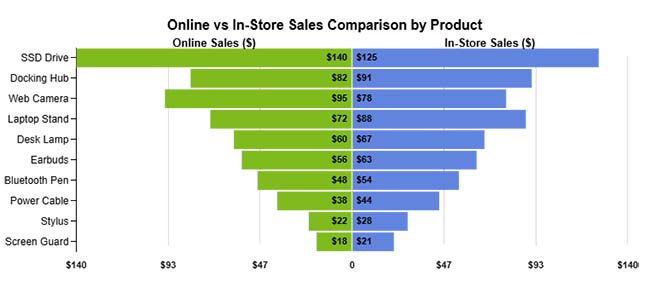
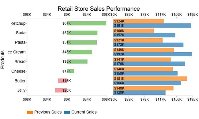
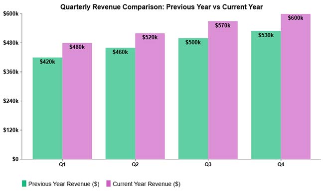
Displays values side by side for easy comparison across categories or time periods.
Use Cases:
Group multiple data series within categories for clear comparison.
Use Cases:
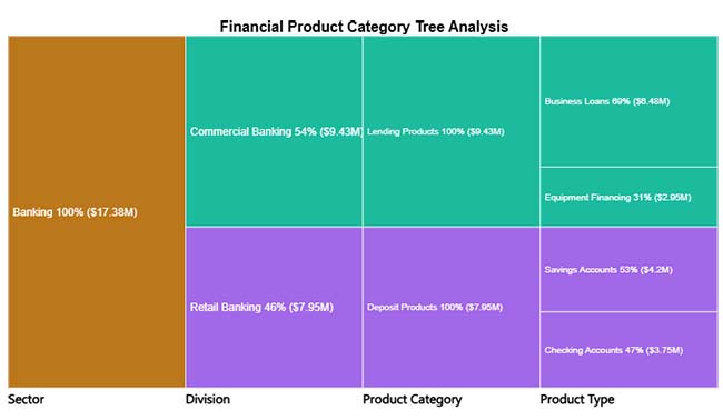
Breaks down financial data into hierarchical structures for a better understanding of relationships.
Use Cases:
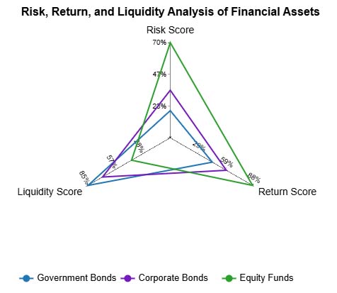
Displays multiple metrics in a single view, making it easy to compare performance across dimensions.
Use Cases:
Financial graphs turn complex numbers into actionable insights, helping businesses make faster, smarter decisions. They provide clarity across operations, performance, and strategy. Key benefits include:
Creating clear financial charts in Excel helps you visualize trends, track performance, and make data-driven decisions. Follow these steps:
Choosing the right financial chart depends on what you want to analyze, whether it’s trends, comparisons, or financial flow.
Reading a financial graph starts with understanding the axes, labels, and units. Look for trends over time, patterns in revenue, expenses, or profits, and key peaks or dips.
Focus on the story the data tells—such as growth periods, seasonal fluctuations, or areas where costs spike—so you can make informed business decisions quickly.
A good financial chart is clear, accurate, and easy to understand. It highlights key insights, uses the right chart type for the data, and avoids unnecessary clutter so viewers can quickly interpret the information.
Many graphs come in many forms, each serving a unique purpose:
Use financial charts when you need to quickly understand trends, compare data, or present insights clearly. Charts are more effective than tables when dealing with large datasets or when communicating with stakeholders.
Financial insights are essential for modern organizations to stay competitive. Raw numbers alone rarely reveal trends or performance patterns. Financial charts transform complex data into clear, actionable visuals, helping businesses make informed decisions quickly.
With the right charts, you can:
While spreadsheet tools provide a solid foundation, advanced charting solutions can simplify complex analyses and enhance decision-making. Choosing the right financial diagrams ensures your data tells a clear story and supports confident, data-driven business decisions.
How much did you enjoy this article?


Learn how to use sparklines in Excel to quickly visualize trends inside cells. Discover types, creation steps, customization, use cases, benefits, and best practices.

Learn what a confidence interval graph is, how to create it in Excel, and how to interpret results to make more reliable, data-driven decisions.

A correlation matrix in Excel helps identify relationships between variables. Learn how to create, read, and use it for effective data analysis.


