Categories
What is a correlation matrix in Excel, and why is it such a powerful tool in data analysis?
These matrices turn complex datasets into clear relationships you can actually understand.
Instead of scanning raw numbers, you can instantly see how variables move together, whether they strengthen, weaken, or have no connection at all.
Marketing teams use it to check if website traffic is truly linked to sales. Finance professionals rely on it to compare revenue patterns with operating costs.
In sports analytics, it helps identify whether training hours actually improve performance.
This is where its real value shows up. A correlation matrix analysis helps you see whether your KPIs are aligned or working against each other.
It cuts through assumptions and shows what the data is actually doing, not what you expect it to do.
It also reveals an important truth: just because two variables move together does not mean one causes the other.
This makes it a key tool for avoiding misleading conclusions in analysis.
When visualized in Excel with proper formatting and charts, a correlation matrix analysis becomes even more powerful.
It highlights patterns faster, improves interpretation, and supports better decisions across reporting and analysis.
In short, it helps you understand relationships in your data that would otherwise stay hidden.
Let’s break it down further.
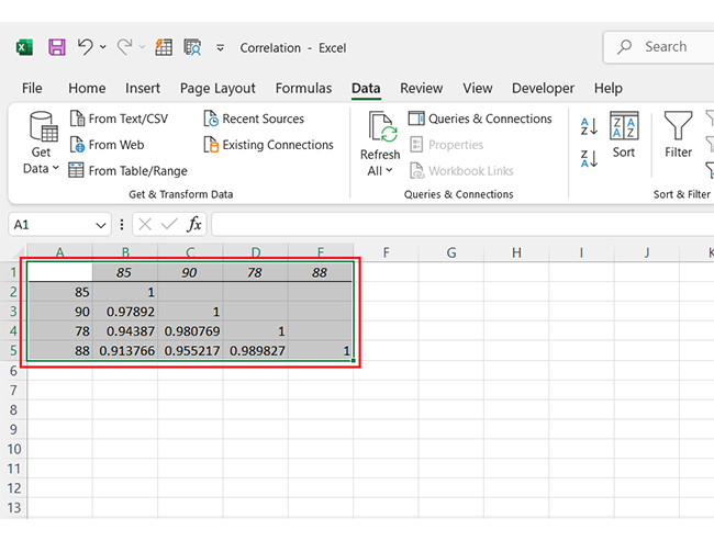
Definition: A correlation matrix in Excel is a table that shows how multiple variables are related to each other using correlation values.
These values range from -1 to +1. A value close to +1 means a strong positive relationship, while a value close to -1 shows a strong negative relationship.
A value near 0 indicates no meaningful relationship between variables.
It helps you quickly identify patterns and relationships across large datasets without analyzing each pair separately.
An Excel correlation matrix matters because it helps you quickly understand how different variables in your dataset are related.
Instead of scanning raw numbers, you get a clear view of relationships that influence outcomes, trends, and decision-making.
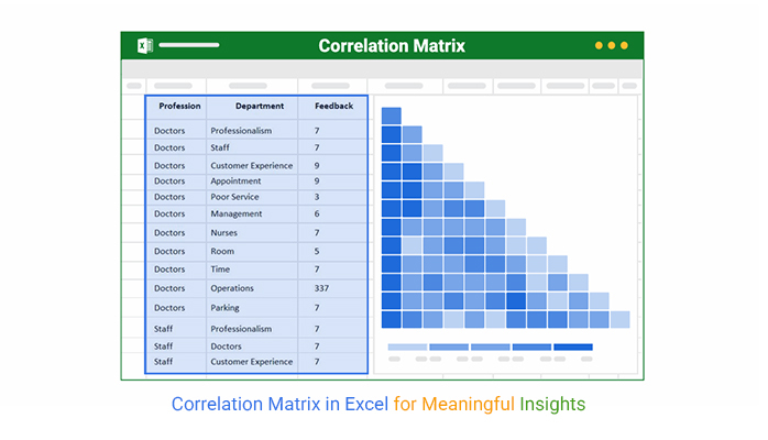
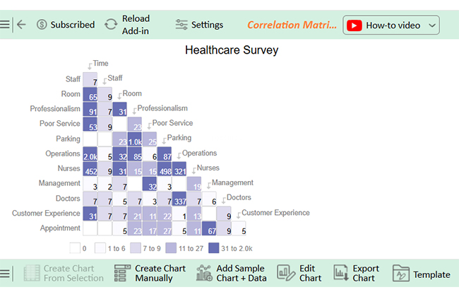
Reading a correlation matrix in Excel can feel like cracking a code until you know what to look for. Once you understand the layout, the insights are crystal clear.
It’s more than rows and columns. It’s a map of how your data moves together.
Let’s break it down:
It is most valuable when you need a clear view of how multiple variables move together. Instead of analyzing one relationship at a time, it lets you see the full picture in one place.
Use a correlation matrix example when your dataset includes several metrics that need comparison.
Use it when you want to find the strongest influencing factors behind an outcome.
Use it before building predictive models or performing advanced data analysis.
Use it to confirm whether your assumptions are supported by data.
It’s quick, visual, and helps you make more brilliant moves. Whether you’re comparing product sales, survey scores, or team metrics, this tool tells you what’s connected—and what’s not.
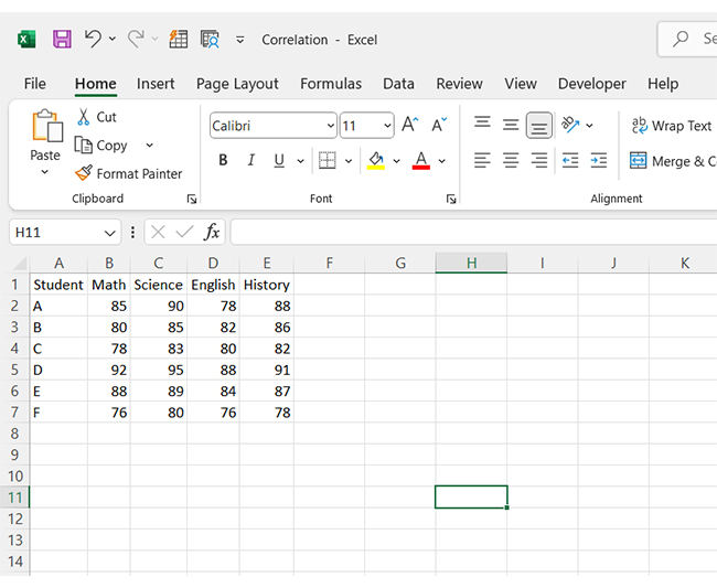
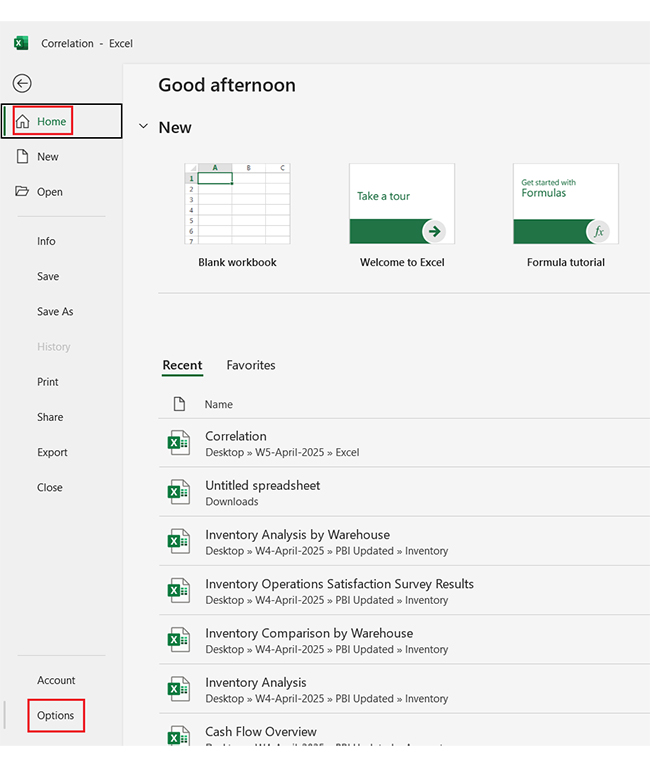
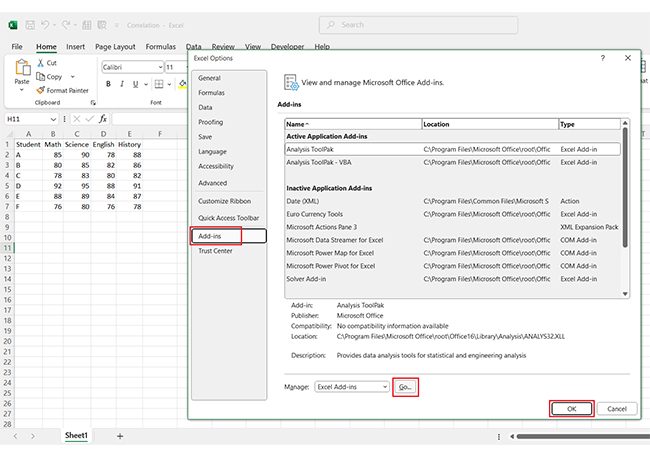
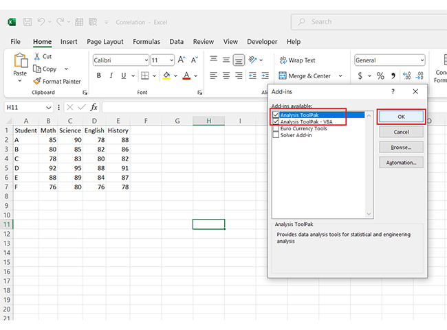
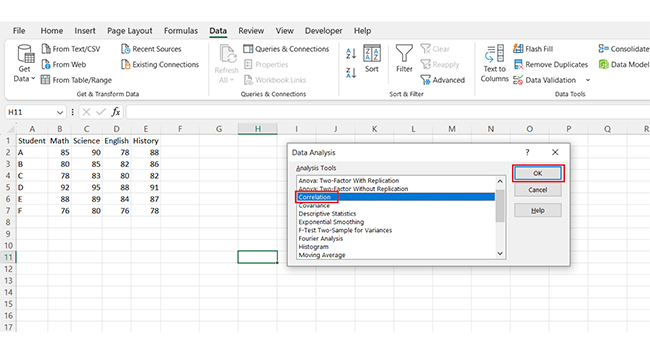
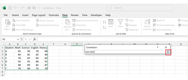
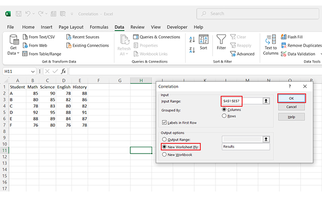
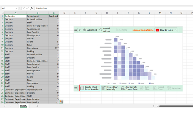
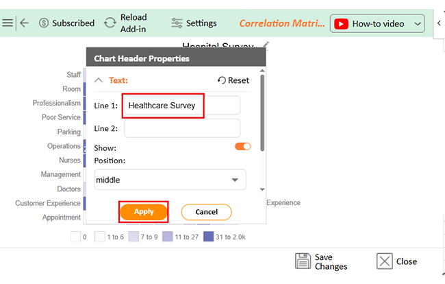
Have you ever stared at a sea of numbers and wondered how they relate? That’s where data correlation in Excel comes to the rescue. Let’s walk through how to create a correlation matrix in Excel—the easy way:
It’s an excellent tool for quick insights, but it has limits. Before you rely on it for significant decisions, here’s what you need to know.
A correlation matrix shows the strength and direction of relationships between variables – it’s standardized. A covariance matrix shows how variables change together and how their values depend on the units of the variables.
A Correlation Chart in Excel takes your data set and transforms it into dots on a coordinate plane, typically X and Y axes.
You can use this chart to display numerical data pairs. Besides, it allows you to study the relationship between the two variables in your data.
It shows how strongly variables move together:
A correlation matrix in Excel helps you compare multiple variables at once and quickly identify how they move together.
It is fast, practical, and easy to generate, making it useful for early-stage data analysis.
However, it only shows relationships, not the reasons behind them. It highlights patterns but does not explain causation, so it should be used for exploration rather than final conclusions.
The accuracy of your insights also depends on data quality. Clean, consistent data is essential, as outliers can easily distort correlation results and lead to misleading interpretations.
Excel mainly provides numerical outputs, which can sometimes limit clarity. Pairing it with visual tools like scatter plots can make patterns easier to understand.
For deeper analysis, combining it with structured frameworks like decision matrices helps turn raw data into more actionable insights.
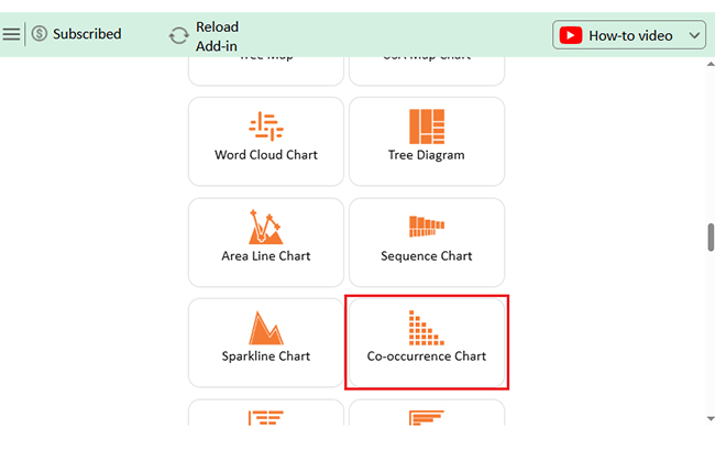
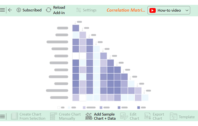
For clearer and more readable visualizations, tools like ChartExpo can help present correlation results more intuitively, making it easier to interpret relationships and support better decisions.
How much did you enjoy this article?


Learn how to use sparklines in Excel to quickly visualize trends inside cells. Discover types, creation steps, customization, use cases, benefits, and best practices.

Learn what a confidence interval graph is, how to create it in Excel, and how to interpret results to make more reliable, data-driven decisions.

Learn how to create a clustered column chart in Excel with real use cases, step-by-step guide, tips, and common mistakes.