Categories
By ChartExpo Content Team
The grid looks sharp. The numbers look solid. The room stays quiet. That silence is the warning.
A prioritization matrix should bring focus. It should surface what matters most. But in many meetings, it does the opposite. It hides tension. It masks bias. It turns a decision into a guessing game.
Think about it. You share the prioritization matrix. No pushback. No questions. You assume it worked. Then the real work starts, and nothing moves. No one acts. No one owns it. The matrix didn’t create clarity. It created confusion.
The problem isn’t the format. It’s how the prioritization matrix gets used. Scoring feels fair until it gets bent. Weights shift. The criteria get stretched. Projects rise for reasons no one will say out loud. Without clear rules and shared understanding, the matrix becomes noise.
But that can change. A good prioritization matrix doesn’t avoid conflict. It brings it forward. It puts tradeoffs on the table. It gives the team a real way to say yes or no. That’s what makes the work move.
| Common Scoring Pitfalls in a Prioritization Matrix | ||
| Pitfall | Description | How to Prevent |
| Misinterpreted criteria | Team members assign scores inconsistently | Run calibration workshops before scoring |
| Hidden bias | Stakeholders inflate scores for favored projects | Introduce neutral facilitators or a third-party review |
| Overprecision | Relying on false numeric certainty | Combine scores with qualitative discussion |
| Equal weighting misuse | Assumes all criteria are equally important | Define weights based on impact and urgency |
| Ambiguous criteria | The criteria definitions are unclear | Provide scoring examples for each level |
| Stakeholder scoring | Self-interest skews results | Use anonymous scoring or third-party scoring |
| Changing scoring logic | Teams shift rules mid-process | Lock the rubric before scoring begins |
| Lack of context | Scores lack background discussion | Review the rationale for each score during the session |
Imagine walking into a meeting with a pristine grid, colors popping, and boxes neatly aligned. It looks like art. But, beneath that clean surface lies chaos. You’ve got folks nodding along, yet something feels off. The visual harmony masks discord, and you sense it. The matrix hides disagreements, the kind that explodes when decisions are due.
Ever been there? Everyone’s silent, but no one’s committed. The matrix looks like peace, but it’s a quiet storm. You come out thinking all’s good, only to find later that no one agreed. The initial beauty meant nothing when push came to shove. It’s a reminder that polish and alignment aren’t the same.
Numbers. Scores. They seem foolproof. Until they aren’t. You’ve got your criteria, and each item gets its slot. But ask ten people, and you get ten interpretations. The scores are supposed to guide, but they often mislead. What feels solid is sand under your feet when opinions change.
Been burned by this? Scoring’s a mirage of precision. Everyone sees a different picture, and suddenly, your matrix wobbles. The numbers don’t tell the whole story. They need context, discussion, and realignment. Without that, scoring is just a game with no rules.
You present the matrix. Silence. Not a peep. You think, “Great, they’re on board.” But silence isn’t agreement. It’s often a mask for reluctance. Passive nods, no objections. But when it’s time to act, you find yourself alone.
Ever faced this? You learn that no pushback doesn’t mean support. It’s a costly lesson. Decisions require true buy-in, not silence. The absence of dissent isn’t consent. It’s a void that fills with doubt when decisions go live. Getting real feedback early could save a lot of trouble down the line.
| False Agreement Signals in a Prioritization Matrix Session | ||
| Symptom | What It Really Means | Suggested Action |
| Nodding without question | The team appears to agree silently | Prompt direct feedback from each participant |
| No objections during scoring | People may feel unsafe to disagree | Use anonymous scoring or structured debate |
| Lack of follow-up actions | Low commitment to agreed priorities | Assign clear next steps with deadlines |
| Everyone scores similarly | Possible groupthink or pressure to conform | Encourage rational sharing before scoring |
| Vague or absent discussion | Superficial review of priorities | Facilitate discussion with targeted prompts |
| Repeated deferrals | Avoidance of controversial priorities | Use a facilitator to surface underlying concerns |
| Off-topic comments | Attempts to steer away from uncomfortable topics | Refocus the conversation on scoring criteria |
| Silent stakeholders | Disengagement or unspoken disagreement | Call on individuals directly to weigh in |
Score manipulation is sneaky. It creeps in when you least expect it. Some folks know how to play the numbers game, bending scores to nudge their interests to the top. They might adjust criteria weights just a bit or redefine what “high priority” means until it fits their agenda. Ever been in a meeting where a project suddenly jumped the queue for no apparent reason? That’s the work of subtle tweaks, not magic.
It’s easy to miss these shifts when everyone’s nodding along. You might see a score and think, “That seems right,” not realizing the hidden hand at play. It’s not about being paranoid, but about staying alert. Scorecards should be transparent, not cloaked in mystery. Keep an eye out. Watch for those small changes that make a big difference.
The idea of equal weight sounds fair, doesn’t it? But let’s face it, not every task carries the same punch. Giving everything an equal score can mask real differences, turning what’s supposed to be a helpful tool into a bland compromise. It’s like saying every player in a team is the MVP. Doesn’t really work, does it?
What gets lost in this shuffle is the nuance of true priorities. Execution varies; some projects need more resources, and others demand less but with a higher impact. When you lump them all together, you risk missing the forest for the trees. Unequal tasks need unequal attention, plain and simple.
Letting folks score their projects? That’s like letting kids grade their homework. It sounds fair, but it’s ripe for bias. Everyone thinks their project is the best, the most crucial. Self-scoring can turn into a game of who can shout the loudest, not who has the best idea.
This approach often leads to misalignment. Stakeholders might inflate scores to push their agenda, sidestepping true accountability. The result? A skewed view that doesn’t reflect reality. The solution is to add checks, have a neutral party review, and balance these scores. It’s about fairness, not favoritism.
Scoring alignment is not a set-it-and-forget-it task. It needs active participation. Without calibration sessions, everyone brings their ruler, and suddenly, nothing matches up. Imagine a band where each musician plays to a different tempo. Chaos, right?
Workshops and audit checks bring everyone to the same page. They ensure that the scoring process isn’t just a formality but a real measure of what matters. It’s about building a shared understanding, so the matrix reflects true priorities, not just a collection of individual opinions.
| Sample Rubric for Scoring in a Prioritization Matrix | ||
| Criterion | Definition | Scoring Scale (1 to 5) |
| Strategic impact | How well does the item align with company goals | 1 = no alignment, 5 = direct impact on key objectives |
| User value | Perceived or measured value to the end user | 1 = minimal, 5 = high user benefit |
| Effort required | Estimated resources and complexity | 1 = low effort, 5 = very high effort |
| Revenue potential | Expected contribution to revenue | 1 = negligible, 5 = major revenue stream |
| Urgency | Time sensitivity and deadline pressure | 1 = no deadline, 5 = must act now |
| Risk reduction | Impact on reducing technical, legal, or operational risks | 1 = minimal risk impact, 5 = critical for risk control |
| Customer demand | Volume and importance of customer requests | 1 = niche interest, 5 = widely requested |
| Confidence | Team’s confidence in the estimate or outcome | 1 = high uncertainty, 5 = high certainty |
When a task lands on the matrix, it needs a name beside it. Just one. That’s the person who will own it, defend it, and see it through. Multiple owners? That’s a recipe for chaos. It’s like having too many cooks in a kitchen. Everyone’s in charge, but no one is accountable. Tasks slip through the cracks, and fingers point in every direction but the right one.
Single ownership brings accountability. It’s clear who’s on the hook, which means decisions get made. This isn’t about ego, it’s about clarity. When you know who’s responsible, there’s no room for excuses. And when the pressure’s on, that kind of certainty is priceless.
Score before you list. Sounds backward, right? But starting with a clear rubric sets the ground rules. Without it, the list becomes a playground for bias and manipulation. You don’t want your project priorities juggled like a circus act.
It’s about keeping everyone honest. Define what matters before you start. It’s like setting the rules before the game. Once the rubric is in place, filling in the list becomes straightforward. No surprises, no sneaky shifts in criteria halfway through. Just a straightforward path to genuine prioritization.
Every decision has a cost. But how often do we lay those costs bare? Embedding trade-offs within the matrix itself forces those conversations early. It’s not just about what you’re doing; it’s about what you’re not doing.
This method keeps everyone honest. It’s easy to say yes to everything without seeing what falls by the wayside. But when the trade-offs are visible, every choice becomes deliberate. It brings real focus to decision-making, cutting through the noise of endless possibilities.
High-level reviews can stall progress. Everyone wants their say, but too many cooks spoil the broth. Instead of moving forward, you’re stuck revisiting decisions, revising plans, and rehashing old debates. It’s a cycle that drains energy and momentum.
Yet, the edits aren’t all bad. They force commitment. Once you’re in, you’re in. There’s no room for second-guessing or half-hearted attempts. It’s a push towards action, a call to stand by your choices. And in the end, that’s what propels projects forward: clear, decisive action.
| Tradeoffs Made Clear in a Prioritization Matrix | ||
| Selected Priority | Tradeoff Made | Reason for Trade |
| Launch the mobile app | Delay international expansion | Focus on core market retention |
| Improve onboarding flow | Defer the analytics dashboard upgrade | Boost early-stage user activation |
| Add payment gateway X | Postpone multi-language support | Target immediate revenue growth |
| Automate reporting | Reduce manual QA expansion | Free up engineering capacity |
| Scale customer support | Limit marketing campaign reach | Address the growing ticket backlog |
| Invest in a security audit | Hold off on UI redesign | Meet compliance deadlines |
| Refactor legacy backend | Suspend beta feature rollout | Improve system reliability |
| Expand B2B outreach | Cut influencer partnership budget | Prioritize high-LTV accounts |
Sending a prioritization grid in advance is like handing over your strategy before the meeting. It removes your chance to guide the conversation and shape the context. In a live setting, you can frame each point, gauge reactions, and steer discussions toward real priorities. That’s where the magic happens, not in a cold email attachment.
Keeping the grid back until the meeting ensures you hold the reins. It lets you respond to concerns, clarify misunderstandings, and adjust focus in real-time. Control isn’t about dominance, but about crafting the most meaningful narrative. Without it, you’re handing over the keys to the room and hoping for the best.
Feature labels are the noisy neighbors of a prioritization grid. They distract from what really matters: outcomes. Each cell should tie directly to a measurable result. When you strip away the fluff, you get to the heart of what drives success. It’s not about what you’re building, but why you’re building it.
Focusing on outcomes keeps everyone aligned. When stakeholders see how their priorities link to real-world results, you get buy-in. You turn abstract features into concrete goals. This shift transforms the conversation from “what” to “why,” creating a clearer path to agreement and action.
| Feature to Outcome Mapping for a Prioritization Matrix | ||
| Feature | Outcome Focus | Success Metric |
| Add comment thread | Increase user engagement and retention | Track comments per active user and retention rate |
| Launch the mobile app | Improve accessibility and market reach | Track mobile user retention and usage frequency |
| Revamp pricing page | Boost conversion rates and revenue | Track the signup conversion rate and revenue increase |
| Create an onboarding tutorial | Enhance user experience and activation | Measure tutorial completion rate and time to first action |
| Automate reporting | Increase efficiency and reduce manual work | Track time saved and error reduction in reports |
| Enable multi-language support | Expand market reach and improve customer satisfaction | Measure adoption rates by region and customer satisfaction |
| Improve search functionality | Enhance user experience and discovery | Track search success rate and time spent searching |
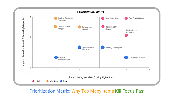
A crowded grid is a sign of indecision, not thoroughness. When there are too many items, focus scatters, and nothing gets the attention it needs. Before the meeting, filter down to what truly matters. It’s about quality over quantity. Fewer items mean deeper dives and more meaningful discussions.
The responsibility for a cluttered grid falls on the creator. It’s on you to trim the fat and streamline the options. When you do, you make room for real conversation. You open up space for critical insights and strategic decisions, instead of getting lost in a sea of choices.
The binary grid is a straightforward tool. It demands a simple yes or no. No room for half-decisions or ambiguous options. By forcing a clear choice, it eliminates the gray areas. You’ll see where the real priorities lie. This isn’t about making everyone happy. It’s about getting to the heart of what needs doing.
You know those meetings where everyone nods but nothing really gets decided? This grid stops that in its tracks. Everyone’s on the hook to make an actual call. Suddenly, the blurry lines sharpen. You’re left with decisions that stick. It’s not about avoiding conflict; it’s about embracing clarity.
Ever tried nailing Jell-O to a wall? That’s what happens when rules shift mid-game. It’s chaos. Lock your scoring logic. Keep it consistent. If the rules change every time someone raises an eyebrow, you’ll never get a true picture of what matters.
Stability in scoring means everyone knows the playbook. No sudden shifts. No sneaky rule-bending. The matrix becomes a trusted tool rather than a moving target. This isn’t micromanagement; it’s about securing a foundation that doesn’t crumble under pressure.
| Visual Planning Strategy in a Prioritization Matrix Presentation | ||
| Visual Type | Best Use Case | Key Message Delivered |
| Impact vs Effort Grid | Shows priority alignment between business value and complexity | Use to identify quick wins and high-value projects |
| Roadmap Timeline | Visualizes project phases and delivery timing | Use to align teams on expected delivery dates and milestones |
| Risk vs Reward Matrix | Highlights high-risk, high-reward initiatives | Use to facilitate discussions around potential tradeoffs |
| Dependency Diagram | Maps the critical dependencies between tasks | Use to manage bottlenecks and ensure the sequencing of tasks |
| Stakeholder Feedback | Shows how priorities align with stakeholder concerns | Use to validate prioritization with key decision-makers |
| Resource Allocation Chart | Visualizes team capacity and workload | Use to ensure that resources are properly aligned with project priorities |
Let’s ditch the project jargon. Focus on outcomes. When everyone knows what success looks like, buy-in becomes natural. People rally behind results, not tasks. It’s about painting a picture of what achievement means for the team.
Imagine telling a group they’ll complete four projects versus saying they’ll increase client satisfaction by 20%. Which gets them excited? Outcomes speak to purpose. They clarify the why behind the what, turning a list of tasks into a mission worth pursuing.
Ever bet on a flashy idea that flopped? Confidence weighting keeps those fantasies in check. It’s about balancing ambition with realism. This doesn’t kill creativity; it grounds it. By adding a layer of confidence, you weigh dreams against their likelihood of success.
Think of it as a reality check. High hopes are great, but without a solid plan, they’re risky. Confidence weighting ensures you’re not just chasing shiny ideas. It aligns vision with feasibility, making sure resources go where they’ll do the most good.
Too many visuals, and you’re drowning in data. Limit it to two: context and the matrix. This isn’t about limiting information; it’s about clarity. When you keep it simple, the message lands. People stop guessing and start knowing.
Visual overload is a real thing. Keep the focus sharp by presenting only what matters. Context sets the stage, and the matrix delivers the message. Anything more, and you’re just adding noise. Let the visuals speak clearly and powerfully, ensuring everyone walks away with a unified understanding.
| Comparing Frameworks in the Context of a Prioritization Matrix | ||
| Framework | Weakness in Real Use | Recommended Shift |
| RICE | Breaks when time constraints override reach or confidence | Replace time with urgency or deadline-based scoring |
| Eisenhower Matrix | Fails in collaborative settings due to subjective urgency | Use team-based alignment metrics and urgency scores |
| MoSCoW | Creates vague prioritization with overlapping categories | Use a binary yes or no to force clear prioritization |
| Value vs Effort | Overlooks delivery risk and team volatility | Include delivery confidence or team capacity metrics |
| Kano Model | Difficult to apply in fast-changing markets | Use direct customer impact and time sensitivity scoring |
| Weighted Scoring | Often manipulated due to unclear weights | Lock and calibrate the rubric before scoring begins |
RICE is supposed to make life easier, but when deadlines loom, it crumbles. Suddenly, all those neat scores mean nothing because time is a wild card nobody can control. Instead, think about urgency. What’s going to make the biggest splash right now? Constraints can give you a grip, helping you focus on what truly matters under tight deadlines.
When the clock is ticking, urgency isn’t just a buzzword. It’s the decider. A rigid timeline demands flexibility in scoring. Replace time with urgency or constraints. This shift turns chaos into clarity. You prioritize what must happen now, not what looks nice on paper. It’s not about filling slots, it’s about making real progress.
The Eisenhower matrix has its fans, but let’s face it: complexity is its kryptonite. It’s like trying to fit a square peg in a round hole when team priorities are at stake. Urgency and importance for one person might miss the mark for the whole group.
Teams aren’t just a collection of urgent tasks. They’re about balancing diverse priorities. The old matrix doesn’t cut it when you need a collective view. Instead, you need a system that captures the bigger picture and aligns everyone on shared goals. This isn’t just about managing tasks, it’s about steering a ship through choppy waters.
MoSCoW sounds like it should work, right? Must-have, should-have, could-have, would-have. But then reality hits, and it all turns into a pile of maybes. There’s too much room for indecision and too much gray area. You need clarity, not chaos.
Binary calls cut through the noise. Yes or no, in or out. That’s how you get decisions made and projects moving. MoSCoW’s vagueness gets tossed aside for clear-cut choices that propel you forward with no room for ambiguity.
Effort and value are classic metrics, but they’re not foolproof. They can be gamed, and suddenly, you’ve got a skewed view of reality. The real risk? Delivery. It’s not just about putting in the work; it’s about making sure the work gets done.
Swap out effort scoring for capacity or volatility metrics. These give you a true picture of what can be achieved. You’re not just planning; you’re setting yourself up to deliver. It’s about creating a roadmap that reflects reality, not just hopes.
By shifting to a matrix that considers urgency, team dynamics, clear choices, and real delivery risks, you move beyond the limitations of legacy frameworks. You create a system that doesn’t just look good but actually works under pressure.
| Matrix Adjustments to Replace Legacy Frameworks in a Prioritization Matrix | ||
| Old Axis | Problem in Practice | Suggested Replacement |
| Effort | Often underestimated, leading to unrealistic prioritization | Use capacity or team volatility metrics to reflect the true effort |
| Reach | Vague and difficult to compare across initiatives | Replace with urgency or business impact scoring to reflect real value |
| RICE | Fails when time constraints override reach or confidence | Replace time with urgency or deadline-based scoring |
| Eisenhower Matrix | Fails in collaborative settings due to subjective urgency | Use team-based alignment metrics and urgency scores |
| MoSCoW | Creates vague prioritization with overlapping categories | Use a binary yes or no to force clear prioritization |
| Kano Model | Difficult to apply in fast-changing markets | Use direct customer impact and time sensitivity scoring |
| Weighted Scoring | Often manipulated due to unclear weights | Lock and calibrate the rubric before scoring begins |
Ever been in a meeting where everyone wants to add their pet project? It’s like trying to fit ten gallons into a five-gallon bucket. That’s where a visual tradeoff comes in. Show them what happens when something else comes in. This isn’t about being the bad guy. It’s about clarity. When stakeholders see the tradeoff on paper, it becomes real. They own the choice.
Picture this: you cut two mid-priority projects to get a high-impact one done. The moment they see the impact laid out, it’s hard to argue. It’s not about saying no; it’s about making sure everyone understands the cost of their yes. Clarity over confusion, every time.
Linking every priority to a signed-off measure is like turning opinion into a contract. Suddenly, it’s not just someone’s idea. It’s a plan with numbers behind it. When metrics are agreed upon, it changes the game. No more arguing over whose idea is better. It’s about what delivers on the numbers.
Remember the last time you saw a vague priority list? You probably thought, “How do we even measure success?” With agreed metrics, that doubt disappears. It’s all about accountability. Metrics don’t lie; they show progress and make sure everyone’s speaking the same language.
Gatekeepers like finance and legal often have their concerns. They need a tailored view to avoid surprises. You can’t hand them the same sheet you give to the tech team. It’s about showing them what they care about.
Imagine sending a legal team a document full of tech jargon. It’s a recipe for misunderstanding. Customize the view for each group. Speak their language. This avoids last-minute roadblocks and keeps everyone on the same track.
You know the drill: someone always wants to add “just one more” thing. Before you know it, the whole stack is teetering. This is the moment you need to stand firm. Language is your tool. Make it clear that adding means swapping, not stacking.
Use phrases like, “If we add this, what are we taking off?” It’s about maintaining balance. When the stack is steady, the whole process runs smoother. Avoiding the addition avalanche keeps priorities true and the workload manageable.
In the high-pressure environment of signoff sessions, holding your ground is vital. It’s about keeping the focus and not letting the stack collapse under its weight. Clear communication is your best ally here.
| Quick Scoring Heuristics for a Prioritization Matrix | ||
| Item Type | Fast Scoring Indicator | Action to Take |
| Simple bug fix | Clearly improves user experience with low effort | Score immediately and move to execution |
| Feature with no clear owner | Requires further discussion | Defer scoring until accountability is set |
| Widely requested feature | High demand from customers and aligned with goals | Score quickly as high-priority |
| Low-usage feature enhancement | Limited data on the impact | Delay scoring until more input is available |
| Compliance requirement | Deadline-driven and critical for risk reduction | Score quickly as a top priority |
| Exploratory idea | Interesting, but no committed delivery plan | Deprioritize or tag for later exploration |
| Technical debt item | The impact is internal, but the efficiency boost is obvious | Score fast with moderate priority |
| Cross-team dependency | Complex ownership or unknown timeline | Flag for deeper review before scoring |
Speed matters. When you’re in the thick of a project, the last thing you need is a bloated list dragging you down. Picture this: you’ve got a stack of tasks, and each one’s screaming for attention. But if you can’t rate its value in half a minute, it’s probably not as important as it seems. This quick-cut method keeps your focus sharp, weeding out the fluff.
Now, why does this work? It forces clarity. When you’re pressed for time, you naturally hone in on the essentials. Suddenly, the vague and the redundant reveal themselves. It’s a bit like having a built-in filter. You get to the core of what truly matters without getting lost in details that, frankly, don’t deserve your attention.
Ever seen a team flounder because they didn’t know what was coming next? It’s a morale killer. When everyone’s clear about priorities, confidence leaps. A clear path means fewer doubts and more action. When folks know where they’re headed, they move faster, they move together.
This clarity does more than just boost spirits. It aligns efforts. The team starts to think and act as one. Instead of scattered actions, there’s a focused drive. Imagine the power of a group that’s sure of its direction. It’s like flipping a switch from chaos to calm, where everyone knows their role in the bigger picture.
| Tailored Prioritization Matrix Views for Stakeholders | ||
| Audience Type | What They Care About | Custom Matrix View Needed |
| Executives | Strategic impact, ROI, timelines | High-level outcomes, risk ratings, confidence scores |
| Product Managers | Feasibility, value tradeoffs, dependencies | Detailed scoring rubric, tradeoff logic, scoring rationale |
| Engineering | Technical complexity, delivery timing | Effort estimates, technical dependencies, and release sequencing |
| Marketing | Customer impact, launch timing | Customer segments, feature appeal, and campaign timing |
| Legal | Compliance, regulatory risks | Flags for risk, external dependencies, and legal approval status |
| Finance | Budget allocation, cost-benefit | Estimated ROI, project cost, and financial priority category |
| Customer Support | User pain points, ticket drivers | Support volume by feature, escalation trends, satisfaction impact |
| Sales | Revenue enablement, deal blockers | Feature alignment with sales feedback, deal velocity impact |
One size never fits all, especially not in meetings with different stakeholders. Imagine presenting the same data to the execs, the team, and partners. It’s a recipe for blank stares or worse, misinterpretation. Each group speaks its own language. Customize your approach to keep them engaged.
Executives want the big picture. The team needs action points. Partners look for collaboration opportunities. By tweaking your presentation, you hit the mark every time. It’s like having three different keys for three different locks. You open doors, not just talk past each other.
Everything’s going sideways, and you’re in the middle of a sprint. How do you pull it back? This matrix is the anchor. It’s not just a tool, it’s your lifeline when the project veers off the rails. You gather the team, lay out the matrix, and reset. It’s all about recalibrating focus.
Here’s how it plays out. You start by revisiting the priorities. What’s changed? What’s urgent now? It’s a live discussion, not a lecture. Everyone gets a say. You’re not just realigning tasks; you’re reigniting the team’s drive. The matrix becomes your map, guiding you back on track with clarity and purpose.
| Reset Conditions for a Live Prioritization Matrix | ||
| Trigger Event | What to Reset | Suggested Matrix Update |
| Client shifts scope | Active priorities no longer match the need | Re-score based on urgency and business value |
| Delivery falls behind | Planned priorities exceed capacity | Drop or defer low-impact items |
| New blocker appears | Key work cannot proceed as planned | Reassess dependencies and risks |
| Urgent escalation | The new task requires immediate attention | Insert and weigh against the current top items |
| Executive re-direction | Strategic goals have shifted | Realign the matrix with new objectives |
| Quality issues emerge | Increased bugs or instability | Elevate fixes and tech debt in the matrix |
| Team resource change | Loss or gain of key contributors | Adjust delivery estimates and scope |
| Market signal shift | Competitor or customer behavior changes | Rethink priorities to maintain relevance |
Sometimes, the best way to communicate a strategy is to show, not tell. When words fail, a well-crafted grid can articulate priorities without sparking defensive reactions. It’s like handing someone a mirror of the team’s goals; they see themselves in the reflection. This approach sidesteps the need for confrontational discussions by letting the visual do the heavy lifting.
A visual grid can be a silent ally. It lays everything out without the need for long-winded explanations. The trick? Make sure your grid is clear enough to spell out the strategy. Then watch as it speaks volumes, aligning everyone without uttering a single word. It’s an invitation to see the bigger picture without the noise of personal bias.
Turning the scoring rules into a reusable model ensures everyone’s on the same page. This isn’t about creating a tool for the toolbox; it’s building something the team can use over and over. When the scoring rules are clear, they act as a guide that anyone can follow. This removes ambiguity and keeps the focus on the real work.
Sharing the model isn’t just about instruction; it’s about empowerment. When the team understands how to use it, they gain confidence in their decisions. They start to see how their work fits into the larger strategy. This shared understanding fosters collaboration and ensures that everyone is working toward the same goals.
If someone’s struggling with scoring, it’s a red flag. It may indicate a lack of understanding about the necessary tradeoffs. Scoring isn’t just a numbers game; it’s about weighing options and making tough calls. Those who fail to score cleanly might not have the full picture.
Use scoring results as a diagnostic tool. It can reveal where the team needs more clarity or training. It’s not just about pointing out weaknesses but about identifying growth opportunities. This awareness leads to stronger decision-making and better alignment across the board.
Version logs aren’t just records, they’re stories of evolution and growth. They show how strategies have changed and where adjustments have been made. This history isn’t just for accountability but for understanding the path taken. It’s a narrative of strategic shifts and tactical pivots.
Keeping track of changes offers a clear view of progress. It’s evidence of thought processes and decision-making paths. This transparency builds trust and shows how each change contributes to the larger strategy. It’s about painting a picture of development, showing stakeholders the journey from past decisions to present strategies.
The prioritization matrix should help make decisions clear. But most teams use it without enough thought. They score, sort, and move on. Then wonder why nothing sticks.
The problem isn’t the tool. It’s how people use it. When teams avoid hard choices, the matrix becomes a scoreboard with no meaning. When scoring lacks shared rules, it turns into guesswork. And when no one speaks up, false agreement takes over.
To fix this, the prioritization matrix must push for real discussion. It should expose tradeoffs. It should tie every item to outcomes. It should show what you skip to make one thing happen.
Use it live. Use it to guide, not follow. Keep it clear. Keep it honest. And make sure the numbers reflect more than silence.
How much did you enjoy this article?


Calculate accounts receivable turnover ratio to measure credit collection speed, improve cash flow, and strengthen your financial strategy. Read on!

Change Management KPIs are the key to tracking adoption, performance, and ROI during transitions. Find out which metrics matter. Read on!

Data collection methods and techniques determine the quality of every insight you act on. Explore key approaches for gathering reliable data. Read on!


