Categories
By ChartExpo Content Team
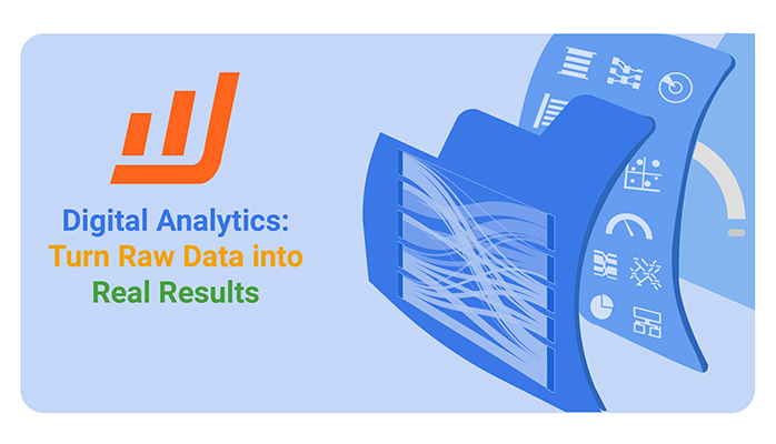
Every click, search, and interaction generates data. The challenge isn’t collecting it—it’s making sense of it. Digital analytics turns raw numbers into meaningful insights, helping businesses understand user behavior, improve engagement, and drive better results.


Businesses that use digital analytics gain a competitive edge. They track customer actions, identify trends, and optimize strategies in real-time. Whether it’s measuring website performance, refining marketing campaigns, or improving customer experiences, data-driven decisions lead to better outcomes.
Digital analytics isn’t about gathering endless amounts of information. It’s about tracking the right metrics, filtering out noise, and using insights to guide action.
By focusing on what matters, businesses can make smarter, faster decisions that drive growth.
Digital analytics is the science of analyzing raw data to make conclusions about information. It’s vital for businesses as it helps understand consumer behavior, optimize online strategies, and improve overall operational efficiency.
By harnessing digital analytics, companies can see what strategies pull in customers and which ones need tweaking, leading to better business decisions and increased profitability.
Web analytics dashboard focuses primarily on metrics like traffic, page views, and clicks. It’s all about what’s happening on your site.
Digital intelligence, on the other hand, collects user data to improve digital strategies, combining data from various sources to get a big-picture view.
Behavioral analytics digs even deeper, analyzing specific actions users take within your applications and websites to help understand the why behind their actions.
Collecting digital data involves gathering raw data from various digital sources.
Analyzing this data means sorting through it to identify patterns and insights.
Interpreting is where the magic happens; it’s about making sense of the analyzed data to make informed decisions.
This three-part process is fundamental in transforming raw data into actionable insights for strategic planning and implementation.
Power BI shines brightly in the realm of digital analytics. What really sets it apart? It’s not just another data visualization tool. Power BI integrates advanced analytics directly into its core, offering predictive capabilities, AI integration, and real-time insights that many other platforms lack.
This integration allows businesses to not just see data, but to anticipate trends and get answers from it.
Imagine having the ability to not just react to market changes, but predict them. That’s where Power BI shines, transforming raw data into a goldmine of actionable insights.
Its powerful analytics engine processes vast amounts of data from various sources, turning them into comprehensible reports and visuals. This capability makes it an indispensable tool for anyone serious about mastering digital analytics.
Tracking and analyzing data across platforms can often feel like trying to solve a puzzle with missing pieces. Power BI elegantly solves this by offering robust connectivity options. It hooks directly into a wide range of data sources, from websites and social media platforms to CRM and marketing tools. This allows users to pull in data seamlessly without the hassle of manual intervention.
For instance, connecting Power BI to a social media platform enables marketers to track engagement metrics and audience demographics in real time. This data feeds into customizable dashboards, providing marketing professionals with the insights needed to make informed decisions quickly.
The ability to track and analyze data across platforms without switching between different tools is crucial for efficiency.
The real magic of Power BI lies in its dashboard capabilities. These aren’t just static displays; they are dynamic, real-time, and interactive. Building a dashboard in Power BI allows users to see the metrics that matter most, updated in real-time, without delay.
This means that decision-makers can react to shifts in data instantaneously, such as a sudden spike in website traffic or a drop in online engagement.
Creating these dashboards doesn’t require advanced technical skills. Users can drag and drop elements to craft customized views of their data.
For example, a digital marketing manager might create a dashboard that tracks campaign performance across different channels, displaying everything from click-through rates to conversion metrics.
This immediate access to real-time data helps businesses stay agile and responsive in a fast-paced digital environment.
When you look at the numbers—clicks, views, conversions—they tell a story. This story isn’t just about popularity; it’s about effectiveness.
Each click is a user’s choice to engage more deeply with your content. Views indicate what catches the eye, while conversions show what truly resonates with your audience.
Analyzing these metrics reveals which aspects of your digital presence hold the most appeal and which may require rethinking. This understanding is vital for refining your online strategies.
Behavioral analytics go beyond mere numbers. They reveal how users behave on your site, what paths they take, and where they linger. By examining patterns, you can identify common behaviors among seemingly different users.
This insight allows for targeted improvements and personalized experiences. Think of it as piecing together a puzzle; each piece is a user action, and the complete picture is your optimized digital strategy.
Bottlenecks can frustrate users and derail potential sales. Identifying these roadblocks in the customer journey involves analyzing where users slow down or drop off. Is it a complex checkout process or a confusing navigation menu?
Once identified, these areas can be streamlined to create a smoother user experience. This not only enhances user satisfaction but also boosts your conversion rates.
A Sankey diagram shows how users move through a website or app. It uses thick lines to represent traffic volume. The width of each line changes as users drop off or continue. This makes it easy to spot friction points in the journey.
Sankey diagrams display paths from entry to exit. Each interaction appears as a node, and the flow between them shows movement. Thicker paths mean more users, while thinner ones highlight drop-offs. The layout makes it simple to see where users struggle.
This chart works well for complex journeys. Unlike traditional funnels, it tracks multiple touchpoints at once. It reveals how users switch between pages, platforms, or devices. Marketers and UX teams use this to remove friction and improve retention.
Bounce rates, conversion rates, and engagement metrics reveal the true story of user interaction on your digital platforms. These metrics show how effectively your content holds attention, converts visitors into customers, and engages users.
Unlike vanity metrics, such as page views or follower counts, these key performance indicators provide actionable insights. They guide improvements in user experience and content strategy, directly influencing business success.
A/B testing is a critical tool in refining marketing and product strategies. By testing two variants, A and B, you can directly measure which one performs better in real time. This method allows marketers to make data-driven decision-making, enhancing the effectiveness of marketing efforts.
A/B testing leads to better product offerings and more efficient use of marketing budgets, ultimately boosting conversion rates and customer satisfaction.
Early detection of underperforming digital campaigns can save significant amounts of marketing spend. By monitoring key metrics like click-through rates and cost per acquisition, marketers can quickly identify campaigns that are not delivering expected results.
Swift action can then be taken to adjust or halt these campaigns. This proactive approach prevents wasteful spending and reallocates the budget to more successful initiatives.
A mosaic plot breaks down customer behavior across marketing channels. It arranges data in a grid where each section represents a segment of users. The size of each block reflects the proportion of users in that category.
This chart uses rectangles to display relationships between variables. Each section’s size and color help compare different marketing efforts. If one block is much larger, that channel attracts more customers. If colors shift across categories, behavior changes between groups.
The mosaic plot reveals which channels drive engagement. It highlights variations across demographics, devices, or campaign types. This helps businesses measure which efforts bring in the most loyal customers. Unlike simple bar charts, this visualization shows multiple factors at once.
Power BI transforms digital marketing by providing clear insights into advertising expenditures, campaign results, and return on investment.
First, by setting up a dashboard, marketers can view real-time data on ad spending. This allows for immediate adjustments to ensure funds are used efficiently. Next, campaign performance metrics are displayed via interactive visualizations, making it easy to spot trends and outliers.
Finally, calculating ROI becomes straightforward with Power BI’s advanced analytics capabilities, which correlate spending with outcomes, showing which campaigns truly pay off.
Deciding where to allocate your marketing budget can be tricky. Power BI assists in comparing organic and paid traffic to make smarter financial decisions. By analyzing the data, marketers can see which type of traffic—organic or paid—leads to better engagement and sales.
This analysis helps in reallocating budgets to optimize marketing spend. By focusing on the traffic sources that yield the best return, companies can boost their overall marketing efficiency and effectiveness.
Identifying the most effective marketing channels is crucial for maximizing engagement and conversions. With Power BI, marketers can pull data from various channels to see which ones drive the most interaction and sales.
This tool allows for a detailed breakdown of performance metrics across different platforms, helping marketers focus their efforts on the channels that truly matter. By investing more in these high-performing channels, businesses can significantly enhance their marketing strategies.
A Pareto chart helps marketers see which efforts bring the best returns. It follows the 80-20 rule, meaning 20% of actions usually drive 80% of results. This chart ranks marketing channels or strategies by impact, helping businesses focus on what works.
A Pareto chart combines bars and a line graph. The bars show individual contributions, while the line represents cumulative impact. The tallest bars highlight the top-performing efforts. As the line approaches 80%, businesses see which actions matter most.
This chart makes it easy to spot the most effective strategies. Instead of guessing, marketers can rank efforts by real impact. It also reveals diminishing returns, showing when extra effort brings little value.
Identifying where users leave your site reveals much about usability. Digital analytics tools show these dropout points clearly. Tracking exits and bounce rates, pinpoint the exact stage where improvements are needed.
Tackle these issues by enhancing content quality or simplifying navigation. These direct actions aim to retain users longer, boosting overall engagement.
Power BI excels in visualizing customer satisfaction through dynamic dashboards. Set up surveys within your platform, then feed responses into Power BI.
This tool breaks down data, showing trends and areas for improvement. It aids in making data-driven decisions to uplift customer satisfaction.
A well-structured website guides visitors effortlessly. Use analytics to identify common paths and stumbling blocks. Adjust layouts based on this data to enhance user experience.
Simplified navigation leads to better user engagement, increasing the likelihood of conversion.
A funnel chart tracks how users move through different stages of a process. It starts wide at the top and narrows as users drop off. Each section represents a step in the journey, making it easy to see where engagement declines.
A funnel chart uses stacked bars to show conversion rates at each stage. The widest section represents the total audience. As users progress, the bars shrink, showing where they leave. Sudden drops reveal friction points that need attention.
This chart helps businesses find where potential customers abandon the journey. It compares different stages, making weak points easy to spot. If most users drop at checkout, the process may be too complicated. If a sign-up form has high abandonment, it may ask for too much information.
When developing products, it’s vital to know what hits the mark with your audience. Digital analytics tools shed light on feature engagement. They show which features users frequently interact with and which ones they bypass.
This data guides developers to focus on enhancing features that users prefer and reevaluate or remove unpopular ones. By tracking user interaction patterns, companies can align their development efforts with actual user preferences, leading to more user-centric products.
Power BI, a business analytics service, offers comprehensive tools for analyzing customer feedback. It allows companies to pull insights from various data sources like surveys and support tickets. This analysis identifies trends and common issues that customers face.
By integrating these findings into the development process, businesses can make informed decisions about which features need refinement or innovation. The actionable data from Power BI helps ensure that updates align closely with customer needs, boosting satisfaction and loyalty.
Digital analytics tools are pivotal in forecasting how new features perform in the market. By examining data on user behavior and feature usage, these tools predict which new additions will likely succeed or falter.
Understanding these trends ahead of time helps businesses strategize effectively, fostering better adoption rates and reducing churn. Analytics provide a roadmap for future updates, ensuring that the product evolves in a way that maximizes user retention and satisfaction.
A multi-axis spider chart helps compare multiple features across different user groups. It looks like a web, with each axis representing a feature. The plotted points show how each segment interacts with the product.
This chart spreads data across a circular grid. Each user group has its shape, showing strengths and weaknesses. If one section is far from the center, that feature is widely used. If it’s close, engagement is low.
The spider chart reveals patterns in user behavior. It shows which features matter most to different segments. If power users prefer one tool, while beginners favor another, the business can adjust priorities.
Think about it: everyone has different tastes, needs, and behaviors. So, why treat all your customers the same? Smart customer segmentation recognizes these differences and targets users more effectively. By grouping customers based on specific criteria—like demographics, purchase history, or online behavior—you can tailor your marketing efforts for each segment.
This personalized approach often leads to higher engagement rates, better customer satisfaction, and, importantly, increased revenue. After all, a message that resonates personally with a customer is more likely to drive sales than a generic one.
Behavioral analytics is like a gold mine for marketers. By examining the actions users take on your website or app—what they click on, how long they stay on a page, what they buy—you gain insights into what they want and how they behave.
This data allows you to refine your targeting strategies, ensuring you deliver the right message to the right person at the right time. For instance, if you notice a group of users frequently abandon their cart at checkout, you might target them with reminders or offers to encourage the completion of the purchase. It’s all about using data to make smarter marketing decisions.
Power BI, a powerful analytics tool, allows you to create dynamic customer profiles that update as new data comes in. These profiles provide a comprehensive view of each customer, helping you understand their needs and preferences in real time.
Imagine having a dashboard that shows customer preferences, purchasing behavior, and engagement levels—all updated with the latest interactions.
This level of detail enables marketers to craft highly personalized campaigns that speak directly to the customer’s current situation, dramatically increasing the effectiveness of marketing efforts.
A radar chart helps compare multiple data points across different customer groups. It spreads variables across multiple axes, creating a web-like shape. Each line represents a segment, showing strengths and weaknesses in behavior.
This chart maps data in a circular layout, with each axis showing a specific behavior. The further a point extends, the stronger that behavior is for that segment. If one shape is larger in a certain area, that group engages more in that behavior.
Radar charts show patterns across multiple metrics at once. They highlight differences between audience segments, helping businesses refine messaging. If one group engages more through mobile, marketing strategies can shift accordingly.
Identifying effective social platforms is vital for maximizing ROI. Certain platforms excel at attracting engaged users who are more likely to convert. For instance, Instagram might excel for lifestyle brands with its visual focus, while LinkedIn is better suited for B2B companies aiming for professional engagement.
To pinpoint which platforms yield the best conversion rates, businesses should track user interactions rigorously. Metrics such as time spent on the site, comments, shares, and actual conversions (like purchases or sign-ups) provide insights into user engagement.
Furthermore, it’s crucial to identify platforms that do not contribute effectively to the marketing goals. Platforms with low engagement and conversion rates might be draining resources that could be better allocated elsewhere. Cutting off or reducing efforts on these platforms can streamline marketing strategies and focus on more profitable avenues.
Effective ad spend is crucial for maximizing marketing budget efficiency. By analyzing performance data from various social media campaigns, companies can identify which ads are performing well and which aren’t. This enables marketers to allocate more budget to successful ads and revise or halt underperforming ones.
Key performance indicators (KPIs) such as cost per click (CPC), conversion rates, and return on ad spend (ROAS) are essential metrics to monitor. These indicators help assess the financial effectiveness of each ad, guiding decisions on where to invest in future campaigns.
Moreover, seasonal trends and user engagement patterns also play a role in optimizing ad spend. By understanding when and where ads perform best, companies can strategically plan their ad placements to coincide with high-engagement periods, thus enhancing the chances of conversion.
The Overlapping Bar Chart is an excellent visual tool for comparing the effectiveness of different social media platforms. This chart type overlays bars for each platform, allowing for a direct comparison of key metrics like user engagement, conversion rates, and ROI.
One advantage of the Overlapping Bar Chart is its clarity in highlighting differences between platforms. For instance, viewers can easily compare how Facebook performs against Twitter in terms of driving traffic to a website or generating leads. This visual representation helps marketers quickly ascertain which platforms are delivering value.
Incorporating this chart into the analysis enhances decision-making. By visually presenting data, it becomes easier for teams to identify trends and make informed adjustments to their social media strategies. This ultimately aids in refining marketing efforts and increasing overall campaign effectiveness.
In today’s digital landscape, consumer journeys are rarely straightforward. Users may engage with various channels—social media, email, and websites—before deciding to buy. This complex behavior makes it essential to track every interaction.
Multi-touch attribution gives credit to all touchpoints that have influenced the customer’s decision. This method reveals the true value of each channel in the conversion path.
Let’s break down the attribution models. First-click attribution credits the first touchpoint that brought a user to your site, emphasizing the top of the funnel. In contrast, last-click attribution values the final touchpoint before conversion, highlighting the bottom of the funnel.
However, data-driven models outshine both by analyzing all touchpoints and assigning credit based on their actual impact on conversion. This approach offers a balanced view, recognizing each channel’s role in the customer journey.
Power BI, a business analytics service, excels in visualizing complex data. It allows marketers to track customer interactions over time, providing a dynamic view of the conversion process.
By integrating data from various sources, Power BI helps pinpoint trends and patterns in customer behavior, making it easier to adjust marketing strategies for better results.
A horizontal waterfall chart shows how users move through different marketing touchpoints. It tracks engagement from first contact to conversion. Each bar represents a step in the process, showing where users drop off or continue.
This chart stacks bars horizontally, with each step building on the last. Positive values show users moving forward, while negative values highlight drop-offs. The layout makes it easy to track engagement over time.
The waterfall chart reveals how different touchpoints impact customer decisions. It shows which channels bring in traffic and which lead to conversion. If social media drives clicks but not sales, retargeting may be needed.
Power BI transforms data management. Set up automated reports easily. These reports pull fresh data periodically without manual intervention.
This means you always have the latest insights at your fingertips. Imagine having sales data updated every hour. This immediate data refresh supports quick, informed business decisions, keeping you agile.
Real-time dashboards in Power BI provide a live view of your business metrics. This feature allows managers to see what’s happening at the moment. For instance, a marketing dashboard can show which campaigns are performing best in real time. This instantaneous data stream helps you to quickly shift resources to capitalize on what’s working best.
Visual storytelling in Power BI makes complex data easy to understand. Use visuals like charts and graphs to depict trends and comparisons.
These visuals help communicate stories behind the numbers. For example, a line graph can show revenue growth over time, making it clear how changes in strategy impact the bottom line.
A tree map helps businesses see which marketing and sales efforts drive the most success. It breaks data into nested rectangles, with size representing impact. Larger blocks mean higher performance, while smaller ones highlight lower results.
This chart arranges data into a grid, grouping related categories. Each section’s size shows its contribution, and colors indicate trends. The structure helps businesses compare multiple strategies at once.
The treemap makes it easy to spot high-impact strategies. If a paid ad campaign generates strong engagement, its block will stand out. If organic traffic lags, the chart shows the gap instantly.
Businesses often collect data without clear goals. This scattershot approach leads to confusion. Define clear objectives before gathering data. This ensures every data point serves a purpose. Without direction, even vast data pools won’t guide sound decisions. Align analytics with specific business goals to avoid this pitfall.
Another frequent error is ignoring data context. Data without context offers little insight. Always analyze data within the framework of your specific business environment. This includes considering market conditions and customer behaviors. Contextual analysis transforms raw data into actionable intelligence.
Lastly, many firms fail to update their analytics tools and methods. Outdated tools skew data interpretation. Regularly review and update your analytics tools. This keeps your data relevant and your insights accurate.
Collecting massive amounts of data can be tempting. But more data doesn’t guarantee better insights. It often leads to noise, not clarity. Focus on collecting quality data that directly impacts your business decisions. This approach saves time and boosts data analysis efficiency.
Data relevance is key. Irrelevant data can mislead decision-making processes. Ensure that each data set has a clear role in your analytics goals. This sharpens focus and enhances decision accuracy.
Data overload also strains resources. It requires more storage and more complex analysis. Streamline your data collection to include only pertinent information. This approach enhances efficiency and reduces costs.
Poor analytics practices often lead to misleading conclusions. One major issue is confirmation bias. This is when analysts only acknowledge data that supports preconceived notions. Combat this by actively seeking data that challenges your expectations. This broadens understanding and reduces bias.
Another issue is overfitting statistical models. This happens when models are too closely fitted to specific data sets. They fail to predict future trends accurately. Use cross-validation techniques to check your models. This ensures they generalize well to new data.
Lastly, poor data quality can skew results. Ensure accuracy in your data collection processes. Implement rigorous data-cleaning techniques. This improves data quality and the reliability of your conclusions.
The Dot Plot Chart is excellent for spotting performance anomalies in campaigns. It displays individual data points across a timeline. This makes it easy to identify outliers and trends. The Dot Plot’s simplicity aids in quick data assessment, making it a valuable tool for marketers.
This chart is particularly useful when comparing multiple campaigns. It clearly shows which campaigns are over or under-performing. This direct visual comparison speeds up decision-making processes.
Integrating a Dot Plot Chart in your analysis highlights inconsistencies swiftly. This allows for rapid adjustments to campaign strategies. It’s an effective tool for maintaining efficient and effective marketing efforts.
Data tells a story. The challenge is knowing what to track and how to use it. Digital analytics turns numbers into actions, helping businesses see what’s working and what’s not.
Success isn’t about collecting more data. It’s about focusing on the right metrics. Businesses that measure engagement, conversions, and customer behavior make smarter choices. They adjust in real time, fix weak spots, and improve results.
Tools like Power BI help make sense of data. They bring patterns to the surface, showing where to invest time and resources. From tracking website visits to analyzing customer actions, digital analytics connects the dots.
Making better decisions starts with asking the right questions. What do customers want? What stops them from converting? What trends signal a shift in behavior? The answers are in the data.
Numbers don’t lie, but they need context. The businesses that use digital analytics well don’t guess. They see, measure, and act. The future belongs to those who listen to the data.
How much did you enjoy this article?


Calculate accounts receivable turnover ratio to measure credit collection speed, improve cash flow, and strengthen your financial strategy. Read on!

Change Management KPIs are the key to tracking adoption, performance, and ROI during transitions. Find out which metrics matter. Read on!

Data collection methods and techniques determine the quality of every insight you act on. Explore key approaches for gathering reliable data. Read on!


