Categories
By ChartExpo Content Team
Data tells a story, but without structure, it’s just noise.
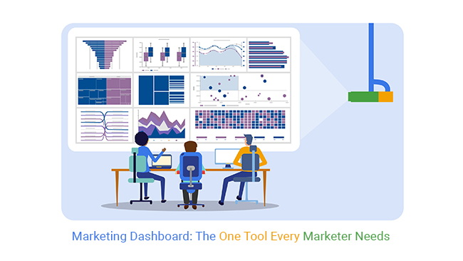
A marketing dashboard brings focus, turning scattered numbers into clear insights. It tracks what matters, highlights patterns, and speeds up decision-making.


Without it, marketing feels like guesswork.
Reports pile up, trends get missed, and teams spend hours digging for insights. A marketing dashboard fixes that. It pulls in data, updates in real-time, and keeps key metrics in one place.
Businesses need clear answers, not endless reports. A marketing dashboard tracks performance, reveals patterns, and shows what’s working.
No more scrambling for numbers. No more wasted time. Everything is there, ready to guide the next move.
First…
A marketing dashboard is a visual tool that gathers key performance indicators (KPIs) in one place. It tracks data from multiple sources, giving a clear picture of marketing efforts. Businesses use it to measure campaign success, monitor trends, and make informed choices.
A good dashboard presents data in real-time, helping marketers react quickly. It eliminates the need to check different reports, saving time and reducing errors. Whether tracking website traffic, social media engagement, or email performance, a dashboard simplifies analysis.
Traditional marketing reports overwhelm teams with excessive data. Spreadsheets filled with numbers make it hard to extract meaningful insights. Static reports become outdated quickly, leading to delayed decisions.
Marketing teams waste hours compiling reports instead of focusing on strategy. Digging through raw data to spot trends is slow and inefficient. Errors creep in, leading to misguided actions.
Dashboards solve these problems by updating data automatically. They visualize metrics, making patterns clear at a glance. Instead of reading through rows of data, marketers get instant insights.
A marketing dashboard collects data, presents it visually, and updates it in real-time. It connects with multiple platforms, pulling in performance metrics from social media, websites, and ads.
Marketers use dashboards to track ROI, spot weak areas, and optimize campaigns. A well-built dashboard replaces tedious manual reporting with automated insights.
Without one, marketing teams work in the dark, relying on outdated information. Dashboards provide clarity, showing what’s working and what needs improvement. They help businesses make data-driven decisions fast.
A marketing dashboard pulls data from different sources and presents it in easy-to-read charts. It tracks performance metrics, such as conversions, engagement, and revenue.
Dashboards reveal trends by showing changes over time. They highlight which campaigns drive results and which underperform. This helps teams adjust strategies quickly.
Automation reduces manual work, freeing up time for higher-value tasks. Instead of spending hours compiling reports, marketers can focus on planning and execution. Dashboards make data analysis simple, turning raw data into actionable insights.
Imagine seeing all your marketing data in one spot. Thrilling, right?
That’s what the “Bird’s Eye View” dashboard offers. It’s a one-stop shop for all marketing metrics. This dashboard provides a holistic overview of performance across multiple channels. It’s perfect for executives and managers who need a quick yet detailed glance at marketing health.
What goes into this dashboard? Key performance indicators (KPIs) like traffic, leads, sales, and customer engagement metrics. Visual elements like graphs and pie charts are out. They are replaced by bar charts and line graphs for better clarity. This allows for real-time decision-making, backed by data.
Why is it beneficial? It saves time and reduces the effort in pulling data from multiple sources. It offers a consolidated view that aids in strategic planning and quick assessments.
Each marketing channel is unique. Channel-specific dashboards reflect this uniqueness. They show tailored insights for SEO, PPC, social media, and other marketing avenues. These dashboards are ideal for specialists who focus on optimizing specific marketing channels.
For SEO, you might see metrics like keyword rankings, organic traffic, and backlink profiles. For PPC, you could track cost per click, conversion rates, and impressions. Social media dashboards might display engagement rates, follower growth, and post-performance.
Channel-specific dashboards help specialists monitor and tweak strategies based on precise data. They ensure each marketing channel is optimized for peak performance.
Goals drive business growth. Goal-driven dashboards are vital for tracking specific marketing objectives like lead generation, brand awareness, and conversion rates. These dashboards are customized to focus solely on the goals they track, offering clear visibility into performance and progress.
For lead generation, the dashboard might track new leads, lead sources, and cost per lead. For brand awareness, it could monitor social mentions, share of voice, and website traffic from PR campaigns. Conversion dashboards would focus on metrics like conversion rates, average order value, and sales by product category.
These dashboards not only track progress but also highlight areas that need attention, making them practical tools for goal achievement.
Effective dashboards should be user-friendly and informative. They must include the right metrics—those that directly impact business goals. Visualizations should be clear and easy to understand, presenting data in a digestible format. Navigation should be intuitive, allowing users to find information quickly without confusion.
Metrics should be aligned with strategic goals to ensure they provide relevant insights. Visualizations like line graphs, bar charts, and heat maps offer clarity and aid in data analysis.
Navigation should enable drill-down capabilities for deeper insights, making the dashboard not just a tool for viewing data but also for analyzing it.
The clustered column chart is an excellent choice for comparing marketing metrics across different channels. Its structure allows for side-by-side comparisons of data, making it easy to spot trends and differences.
How does it fit into the dashboard? It aligns perfectly with the need to analyze performance metrics across various channels. This chart helps highlight which channels are performing well and which might need more attention or adjustment.
By embedding clustered column chart in the dashboard, users can quickly assess channel performance, leading to faster and more informed decision-making. This ensures marketing efforts are properly aligned and optimized for the best possible outcomes.
Numbers flood every dashboard. Not all deserve attention. Some look nice but add nothing. Others mislead. A few, however, shape decisions. The trick? Find what moves the needle.
Vanity metrics fool marketers. Social likes, page views, and impressions inflate egos. But do they drive revenue? No. Actionable data does. Think conversion rates, customer acquisition cost, and return on ad spend. These tell the real story.
Every business needs its own set of key metrics. What fuels growth? Which numbers signal trouble? Define these early. Keep them in sight. Ignore distractions. Decision-making gets easier when dashboards cut straight to what matters.
Dashboards drown in charts, graphs, and widgets. Too much information stalls action. Simplicity speeds up understanding. A clean layout forces focus on what’s important.
Color misused overwhelms. Keep it purposeful. Red means warning. Green signals success. Neutral tones allow critical numbers to stand out. Visual clutter disappears when design guides attention.
More charts do not mean better insights. Pick fewer but clearer ones. A dashboard must answer key questions fast. If a decision takes longer because of excess visuals, something’s wrong. Reduce noise. Clarity wins.
A dashboard must feel natural. Clicking should not be a puzzle. Users should find what they need without effort. Logical grouping makes data easier to digest.
Information overload slows decisions. The best dashboards cap visuals at 7 to 9. This keeps insights sharp. A crowded interface buries meaning under excess. Each element must earn its place.
KPIs should never confuse. Metrics need labels that explain their value. Revenue per customer beats generic “Sales.” Bounce rate means little without context. Show trends, not just numbers. Smart labels turn data into understanding.
A mosaic plot simplifies comparisons. It stacks data into a clear, proportional grid. Each section’s size reflects its weight. Unlike cluttered bar graphs, mosaic plots reveal relationships fast.
This chart helps pinpoint which factors impact performance. It shows categorical data in a way that highlights significance. Instead of scanning multiple visuals, a marketer sees trends in one glance.
Dashboards benefit when visuals work harder. Mosaic plots replace multiple graphs, reducing clutter. Instead of spreading data across many charts, they compress key insights. Decision-making speeds up when critical numbers stay visible.
The following video will help you create the Sankey Chart in Microsoft Excel.
The following video will help you to create the Sankey Chart in Google Sheets.
Choosing the right tool is crucial. Start by listing what you need from a dashboard tool. Do you need real-time updates, or is historical data enough? Must it integrate well with your existing tools? Answer these questions first.
Look for tools with strong reviews and reliable customer support. Don’t overspend on features you won’t use. Look for scalability — the tool should grow with your business.
Finally, try before you buy. Use free trials to see if the tool fits your needs. This step saves money and ensures the tool works for you.
What metrics matter most to your strategy? Sales leads? Website traffic? Customer engagement? Identify these key performance indicators (KPIs). These metrics should directly relate to your business goals.
Don’t track everything. Focus on metrics that help you make decisions. For example, if increasing customer retention is a goal, track repeat customer rates.
Regularly review and adjust your metrics. As your business evolves, so should your KPIs. This alignment ensures your dashboard remains relevant.
Start by selecting a marketing analytics tool that aligns with your needs. Ensure it can track the KPIs you’ve identified as most valuable. Set these KPIs up in the tool.
Next, launch your dashboard. Share it with key team members. Gather their feedback on its usability and the relevance of the data displayed.
Iterate based on this feedback. Make adjustments to improve clarity and usefulness. Continuously refining your dashboard ensures it remains a valuable tool.
A funnel chart is perfect for visualizing stages in the customer journey. It shows where potential customers drop off and helps identify areas for improvement.
In the context of a marketing dashboard, the funnel chart highlights critical conversion points. This visibility helps marketers optimize each stage of the customer journey.
By embedding a funnel chart in your dashboard, you enhance decision-making. This chart provides a clear, visual representation of customer flow through your sales funnel. It’s an invaluable tool for improving marketing strategies.
Numbers can be tricky. Some look impressive but do nothing for revenue. Others seem small but change everything. Knowing the difference saves time and money.
Vanity metrics make dashboards look busy. They include likes, followers, and page views. These numbers can grow without bringing in a single sale. They make reports look good but don’t impact revenue. Tracking them is a distraction.
Revenue-driving KPIs measure real success. These include conversion rates, customer acquisition costs, and retention. These numbers tell a story. They show what’s working and what’s wasting money. Every number should tie back to revenue.
Identifying the right KPIs requires discipline. Start by asking: Does this number affect revenue? If not, cut it. If yes, track it. Simple, clear, effective.
Marketing ROI doesn’t have to be a mystery. It’s a simple formula: revenue earned compared to money spent. But measuring it right takes more than guesswork.
Attribution tells where sales come from. It tracks customer journeys from the first click to the final purchase. Knowing which channels drive revenue stops wasteful spending. A strong attribution model guides smarter marketing decisions.
Customer Lifetime Value (CLV) measures long-term profit from a single customer. A buyer’s first purchase is a small piece of the puzzle. The real value comes from repeat sales. A high CLV means strong retention and customer loyalty.
Customer Acquisition Cost (CAC) shows how much is spent to gain one customer. If CAC is higher than CLV, the business loses money. A good balance between these numbers ensures sustainable growth.
ROI improves when these numbers work together. Strong attribution means better spending decisions. A high CLV means repeat business. A low CAC means efficient marketing. The right mix creates a profitable marketing machine.
Every dollar spent should drive results. Tracking the wrong numbers leads to bad decisions. Focusing on revenue-driving KPIs changes everything.
Time is valuable. Chasing vanity metrics wastes it. Likes don’t pay the bills. Sales do. The right KPIs focus efforts on what matters.
Wasteful spending drains profits. Bad data leads to poor choices. Cutting useless metrics stops unnecessary spending. The right numbers show where to invest.
Marketing works best when focused. A clear ROI strategy means less guessing and more results. The right numbers drive action. Every marketing dollar should bring back more than it costs.
The Pareto Chart is based on the 80-20 rule, it makes patterns clear. It highlights the small efforts making the biggest impact. Instead of guessing, this chart points to what’s working.
A Pareto chart combines bars and a line graph. Bars show individual contributions to a result. The line tracks cumulative impact. The highest bars show where to focus. The goal is simple: find the 20% of actions driving 80% of outcomes.
This chart changes how businesses see marketing. It stops teams from wasting time on low-impact efforts. If one ad campaign brings in most of the revenue, focus shifts there. If a small group of customers spends the most, retention strategies improve.
Using Pareto Chart means smarter marketing. No more guessing. No more wasted budgets. Just clear data showing what matters most.
Understanding your marketing funnel is vital. It shows where potential customers drop out. A detailed analysis of these stages can highlight problems that need immediate action.
Begin with the top of the funnel (awareness stage), and track down to the bottom (conversion). Identify stages with the highest drop-off rates. These are your critical points where potential leads are lost. This insight directs you to strengthen these weak spots.
By keeping a close watch on these metrics, you can fine-tune your approach. Adjusting content, communication channels, and strategies at each stage ensures a smoother customer journey. This not only retains more potential customers but also increases overall conversion rates.
Bottlenecks in your marketing funnel can be a major drain on your budget. Identifying and addressing these quickly prevents wasting money. Look for stages in the funnel where leads stall or drop off significantly.
Analyzing customer feedback, engagement metrics, and conversion rates helps pinpoint these bottlenecks. Once identified, brainstorm with your team to find solutions. It could mean adjusting your messaging, offering more targeted content, or refining your follow-up strategies.
Acting swiftly on these insights prevents minor issues from becoming costly problems. It ensures your marketing budget is spent efficiently, maximizing your return on investment.
Knowing where leads drop off is crucial for optimizing your marketing campaigns. This knowledge allows you to make data-driven decisions that can significantly boost your conversion rates. By focusing on problematic areas, you can enhance the effectiveness of your marketing efforts.
This strategic focus helps in fine-tuning your campaigns. You’ll know exactly where to improve user experience or where to offer more engaging content. Making these adjustments leads to a smoother customer journey, thus higher conversions.
The goal is clear: keep potential customers engaged and moving smoothly through your funnel. This not only improves conversion rates but also boosts your overall marketing ROI.
The Sankey Diagram is a powerful tool for visualizing lead flow and identifying where potential customers drop off. Its clear, flow-like structure shows the movement of leads through different stages of the marketing funnel.
This diagram highlights the volume of leads at each stage, making it easy to spot where the numbers thin out. By focusing on these areas, you can analyze what might be causing the drop-offs. Is it the messaging, the medium, or the market fit? The Sankey diagram lays it all out clearly, guiding your investigative efforts.
Incorporating a Sankey Diagram into your dashboard aids in quick decision-making. It serves as a visual checklist of where you need to focus your optimization efforts, ensuring your marketing strategies are as effective as possible, especially when integrated into a Power BI sales dashboard, where lead tracking and conversion analysis directly support revenue growth decisions.
Understanding what drives traffic to your site is vital. SEO dashboards excel here. They track which keywords bring visitors. This includes both high-volume terms and more specific phrases. You see what works.
Such dashboards show trends over time, too. Are certain terms gaining popularity? Or are they losing ground? This insight helps adjust strategies swiftly. It’s all about staying ahead.
Knowing the source of traffic helps tailor content. If certain keywords bring visitors, you might expand on those topics. It makes your site more relevant and attractive.
Google values user engagement highly. Metrics like bounce rates and session durations tell a lot. A high bounce rate might mean your content isn’t engaging or relevant. Long session durations suggest the opposite.
Click-through rates (CTRs) are also crucial. They measure how often people click on your links in search results. High CTRs indicate that your titles and descriptions are effective.
Dashboards can track these metrics in real-time. This means you can see what changes make a difference. Adjusting content based on these metrics can improve your rankings significantly.
A comprehensive SEO dashboard includes several key metrics. Keyword rankings are a must. They show where your pages rank in search results for specific terms. This is fundamental for measuring SEO success.
Bounce rates and session durations give insights into user engagement. Low bounce rates and longer sessions are good signs. They suggest that visitors find your content useful and engaging.
CTR insights help refine your snippets in search results. Improving these can boost your visibility and attract more clicks.
A scatter chart offers a clear visualization of two variables. For SEO, comparing keyword performance against conversion rates is insightful. The plot shows which keywords not only drive traffic but also lead to conversions.
The visual clarity of scatter plots helps spot trends and outliers quickly. Are there keywords that bring lots of traffic but few conversions? Or the opposite? This chart makes it easy to see.
Incorporating this chart into your dashboard enhances decision-making. It helps prioritize SEO efforts. Focus might shift to keywords with high conversion rates even if their traffic is lower.
This strategic insight ensures resources are used where they have the most impact. It’s about smart allocation based on clear, visual data. The scatter plot is integral for these insights.
Counting likes and shares feels good, but they don’t tell the full story. People can tap a like button in seconds without reading a post. Shares might spread content, but do they lead to real action? Engagement goes beyond surface-level interactions. It measures how people connect with the brand and respond to its message.
Click-through rates show if posts drive traffic. Comments reveal audience sentiment. Dwell time indicates if people actually read or watch content. Direct messages signal deeper interest. These data points paint a clear picture of how content resonates. A strong engagement rate means the audience isn’t just scrolling past. They’re interacting, reacting, and responding.
Social dashboards should track meaningful interactions. Not all engagement holds the same value. A heated debate in the comments section may not benefit a brand. A high volume of shares with low clicks suggests people like the headline, not the content. Meaningful engagement leads to conversions, not empty metrics.
Organic reach measures how far content spreads without paid promotion. Paid reach extends that reach with targeted ads. Both matter, but one costs money while the other builds loyalty. Tracking both reveals what’s working.
A spike in paid reach without engagement means wasted money. If organic engagement outperforms paid, content quality drives interest. Paid campaigns should amplify success, not replace it. A strong dashboard compares side-by-side performance to guide smarter spending.
Click-through rates, cost per engagement, and follower growth matter in both categories. If organic content keeps people engaged, ads should mirror its style. A high ad spend with low organic interaction signals weak brand trust. Paid reach boosts exposure, but organic engagement sustains a brand.
A useful social dashboard should track follower trends. Growth means content attracts new audiences. Decline signals disinterest. Tracking engagement rates shows whether followers interact or ignore posts.
Ad spend effectiveness measures return on investment. If high spending leads to low engagement, adjustments are needed. Comparing organic and paid content side by side highlights what drives real action. Tracking brand reach shows whether content spreads beyond current followers. If reach stays within the same bubble, expansion strategies need reworking.
Dashboards should provide clear comparisons. Seeing engagement per post type helps refine content strategies. If video outperforms text, brands should invest in video. If stories drive more clicks than posts, they should focus there. A strong dashboard highlights patterns, making content decisions easier.
A co-occurrence chart reveals patterns between post types and interactions. It visualizes how different content formats perform across various engagement metrics. Instead of guessing, brands see what works and what flops.
This chart highlights relationships. If live videos lead to more shares, it’s visible. If infographics generate high saves but low comments, that trend stands out. It connects formats with outcomes, providing a clear roadmap for content strategy.
Using co-occurrence chart, brands stop shooting in the dark. They see whether carousels drive engagement or if memes boost shares. Understanding these connections helps refine content plans. When a dashboard includes this chart, decision-making becomes straightforward.
Determining the ROI of PPC and paid social channels can be tricky. Yet, it’s vital for directing ad spend effectively. By using marketing dashboards, marketers can see which channels excel at converting viewers into customers. This data is crucial for budget allocation.
Dashboards display performance metrics like cost-per-click or conversion rates by channel. Marketers can compare these figures to decide where to invest more heavily. It’s a game of numbers, but dashboards make it much easier to play.
This approach ensures that each dollar spent is an investment in high-return channels. It’s about being smart with the budget and strategic with the moves. In the end, it’s how well the channels perform that dictates where the budget should go.
A/B testing is essential for optimizing marketing campaigns. It allows marketers to test different versions of their ads to see which performs better. Marketing dashboards centralize these A/B test results and other key performance insights. This centralization makes it easier to compare and make data-driven decisions.
With all data in one place, marketers can quickly see which ad variation is winning. This saves time and enhances the effectiveness of marketing efforts. The ability to act fast based on solid data is a major advantage in today’s fast-paced market.
Avoiding overspending on ads that don’t perform well is crucial for budget efficiency. Marketing dashboards play a key role here. They provide performance data that helps marketers pull the plug on losing ads quickly. This ability to stop wasteful spend is a major advantage.
Moreover, dashboards help refine targeting by showing which audiences engage most. This insight allows for better-targeted campaigns that are more likely to convert. Better targeting means less money wasted on reaching uninterested audiences.
In short, dashboards help marketers spend smarter, not harder. They ensure that ad budgets are spent on ads that perform well and reach the right people.
A double bar graph provides a clear comparison of campaign Return on Ad Spend (ROAS) across different platforms. This visual tool highlights which platforms are yielding better returns. It’s a straightforward way to see where money makes the most impact.
The graph’s dual bars allow for easy side-by-side comparisons of different campaign performances. This visual setup helps marketers quickly assess which platforms deserve more investment. It’s about spotting the winners and capitalizing on them.
By embedding this graph within the dashboard, marketers gain valuable insights into their spending efficiency. It serves as a constant reminder of where the budget is best allocated. This strategic placement of the graph aids in smarter decision-making and better budget management.
An email’s success starts with the open rate. A subject line gets one shot at grabbing attention. If it fails, the message never gets read. Low open rates signal weak subject lines or poor send timing. Tracking patterns exposes what works.
Click-through rates (CTR) take the next step. They show if people care beyond the subject line. A high CTR means the content inside sparks interest. Low numbers point to weak messaging, dull visuals, or misplaced buttons. Adjustments here boost performance fast.
Conversions seal the deal. Opens and clicks mean nothing if they don’t lead to action. Whether it’s signing up, buying, or scheduling, conversions prove impact. Measuring this rate connects email efforts to revenue. Without it, there’s no way to tell if emails drive results or just take up space.
Blasting the same message to everyone kills engagement. Different groups want different things. Segmentation ensures emails feel relevant. Without it, messages miss the mark.
Behavior-based segmentation tracks actions. Did they buy before? Do they browse certain products? Sending tailored content boosts interest. Data shows what people respond to and where to tweak.
Demographic splits refine targeting. Location, age, and industry influence email preferences. A teenager and a business owner won’t react the same way. Adjusting tone and content keeps messages from falling flat.
Engagement segmentation filters by interaction. Active users get frequent updates. Inactive ones need re-engagement strategies. Ignoring this leads to unsubscribes. Tracking these groups prevents wasted efforts.
If emails don’t land, they don’t matter. Delivery rates show the percentage reaching inboxes. A drop here signals spam filters, bad email lists, or server issues. Watching this metric helps prevent blacklisting.
Bounce rates break into two types. A hard bounce means the email is dead—wrong address or blocked. A soft bounce is temporary—full inbox or server issue. High bounce rates ruin sender reputation. Keeping lists clean avoids this problem.
List growth tracks new subscribers and losses. If unsubscribes outpace sign-ups, content isn’t sticking. Tracking where new leads come from guides better acquisition strategies.
Email revenue tracking connects campaigns to sales. Without it, there’s no way to prove email marketing works. Measuring revenue per email clarifies what generates profit. Every campaign should tie back to the bottom line.
A tornado chart in Excel visualizes performance across different audience groups. It highlights which segments engage most and where gaps exist. Each bar represents a metric—open rates, click-through rates, conversions. The longer the bar, the stronger the performance.
For example, a chart may show:
If younger users have high CTRs but low conversions, the offer may not be strong enough. If older users open emails but don’t click, the messaging may not connect. The chart lays out these differences, helping marketers fine-tune campaigns.
Without clear visuals, comparing audience segments is hard. Tables and lists clutter the view. A tornado chart simplifies complex data. It quickly shows what’s working and where adjustments are needed.
Businesses can compare:
Tornado chart eliminates guesswork. It provides instant insights for smarter marketing decisions.
Data without direction is useless. A marketing dashboard connects numbers to decisions. It cuts through the noise, showing what moves the needle.
Without one, guesswork drives strategy. Teams waste time chasing reports. Budgets bleed into campaigns that don’t convert. A dashboard stops the leaks. It highlights what’s working, what’s failing, and where to adjust.
Building a dashboard isn’t about cramming in every metric. Less is more. Clarity beats clutter. The right setup makes tracking effortless and decisions faster.
Numbers tell a story. A marketing dashboard makes sure you read the right one.
How much did you enjoy this article?


Calculate accounts receivable turnover ratio to measure credit collection speed, improve cash flow, and strengthen your financial strategy. Read on!

Change Management KPIs are the key to tracking adoption, performance, and ROI during transitions. Find out which metrics matter. Read on!

Data collection methods and techniques determine the quality of every insight you act on. Explore key approaches for gathering reliable data. Read on!


