Categories
Data visualization is the go-to method when you want quick insights into your data.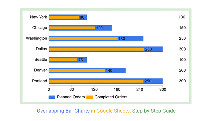
But not any type of visualization design can be used in your data storytelling. Some charts are designed to visualize information in an exploratory way. Others are designed to display the composition and comparison of sub-variables contributing to the whole data.
If your goal is to display the composition and comparison of key variables in your data, your go-to chart should be an Overlapping Bar Chart (OBC) in Google Sheets.
Popular and widely used visualization tools, such as Google Sheets, lack ready-made Overlapping Bar Charts.
But you can transform the spreadsheet into a reliable tool by installing third-party add-ons to access visually appealing and ready-to-use Overlapping Bar Chart Google Sheets.
In this blog, you’ll learn:
Before we cover the how-to, let’s address the following question:
Definition: An Overlapping Bar chart in Google Sheets is similar to a standard Bar Chart. However, unlike a Stacked Bar Diagram, its composite variables that contribute to the whole, start at the baseline.
The chart is best suited to comparing two distinct variables. An Overlapping Bar Chart in Google Sheets is more useful than a Bar Chart, especially if your goal is to display comparison insights.
The data visualization design requires three data columns or rows from your data set: one for categories, one for the series in each category, and one for values.
Keep reading because, in the coming section, we’ll address the following question: What is a great way to use a Bar Chart showing an overlap?
Overlapping Bar Charts in Google Sheets are a handy tool for comparing various datasets or categories within a single chart. They offer a straightforward way to visualize relationships and trends, making data analysis more accessible.
This chart type shines when we need to emphasize both similarities and differences across different groups of data. By layering bars from distinct datasets, we can quickly spot patterns, correlations, or discrepancies.
Ultimately, this visual aid streamlines the process of interpreting data, empowering better decision-making and insights.
The Overlapping Bar Chart in Google Sheets is best used to compare different items or categories. Similarly, a Stacked Bar Chart in Google Sheets, much like a Segmented bar graph, allows for a visual comparison of multiple numerical variables within each category, providing a clear overview of how each segment contributes to the total.
However, the Overlapping Bar Chart can only compare two numerical variables per item or category in your data. The data points should be closely related to merit a comparison.
As you know, there is no way to overlay graphs in Excel and Google Sheets, so you can use Overlapping Bar Charts to show multiple bars in one bar, presenting different variables. Also, you can use the visualization design for trends analysis and patterns over time based on similar premises.
The conceptual idea behind the Overlapping Bar Chart in Google Sheets is to contrast key data points using color-coded overlaps.
An Overlapping Bar Chart in Google Sheets is a two-dimensional graph with two axes -similar to a standard Bar Chart and Clustered Bar Chart in Google Sheets.

Its rectangular bars are oriented horizontally or vertically. One axis depicts categories, while the other shows numerical values related to two variables.
Bars representing the same category share the same baseline. We recommend that the numerical variables be closely related and share the same scale to get reliable insights. If you’re unsure how to make a graph from a table, ensure that your variables are consistently aligned for accurate visualization.
Take a look at the table below.
Can you provide a reliable data story after going through the table?
| City | Planned Orders | Completed Orders |
| New York | 100 | 80 |
| Houston | 150 | 120 |
| Chicago | 100 | 100 |
| Washington | 250 | 180 |
| Boston | 80 | 120 |
| Dallas | 300 | 250 |
| Los Angeles | 120 | 90 |
| Seattle | 100 | 75 |
| Denver | 80 | 25 |
| Portland | 300 | 250 |
Note the difference after visualizing the data using Othe verlapping Bar Chart in Google Sheets.
Visualization Source: ChartExpo
Note how easy it is to decode the chart above. For instance, Boston surpassed the target set for orders by 40 units. Chicago achieved its target. Conversely, Portland and Dallas have missed their targets by -50 units.
Keep reading because we’ll cover the following in the coming section: how to make an Overlapping Bar Chart in Google Sheets.


Google Sheets is one of the most used tools for visualizing data because it’s free and easy to use.
However, a ready-made Overlapping Bar Chart does not exist in Google Sheets’ chart library. But this does not mean you should ditch this freemium data visualization tool.
Did you know you can supercharge your Google Sheets with add-ons to access visually stunning and ready-to-go Overlapping Bar Graphs?
Yes, you can increase the functionality of your tool and access a ready-made Overlapping Bar Graph as well as a Side-by-Side Bar Graph in Google Sheets for your data stories.
The add-on we recommend you to use is ChartExpo.
So, what is ChartExpo?
We recommend this tool (ChartExpo) because it’s super easy to use.
You don’t need to take programming or coding night classes just to extract insights from your data. ChartExpo is more of a ‘drag-and-drop tool,’ which means you’ll only need to scroll your mouse and fill in the respective metrics and dimensions in your data. Whether you’re working with histograms or other visualizations, ChartExpo makes the process straightforward and accessible.
More so, this Overlapping Bar Chart in Google Sheets generator comes with a 7-day free trial period. You can also create a Pareto chart in Google Sheets to highlight key contributors.
ChartExpo empowers you to visualize diverse data types, such as sales and marketing data, annual reports, etc. More so, the tool produces charts that are incredibly easy to read and interpret. And it allows you to save charts in the world’s most recognized formats, namely PNG and JPG.
We will use the following table to create an Overlapping bar graph in Google Sheets.
| City | Planned Orders | Completed Orders |
| New York | 100 | 80 |
| Houston | 150 | 120 |
| Chicago | 100 | 100 |
| Washington | 250 | 180 |
| Boston | 80 | 120 |
| Dallas | 300 | 250 |
| Los Angeles | 120 | 90 |
| Seattle | 100 | 75 |
| Denver | 80 | 25 |
| Portland | 300 | 250 |


To Edit your Overlapping Bar Chart in Google Sheets, follow the simple steps below:


To organize the variables in category and subcategory in descending order, follow the simple steps below.


Follow the steps below to create an Overlapping Bar Chart in Google Sheets.
An Overlapping Bar chart is similar to a standard Bar Chart. However, unlike a Stacked Bar chart, its composite variables start at the baseline.
The chart is best suited to comparing two distinct variables. More so, it’s more valuable than the Bar Chart, especially if your goal is to display comparison insights.
To overlap a bar chart in Google Sheets, you can follow these steps:
Data visualization is the go-to method when you want quick insights into your data.
As we said, no visualization design can be used in your data storytelling. Some charts are designed to visualize information in an exploratory way. Others are designed to display the composition and comparison of sub-variables contributing to the whole of your data.
If your goal is to display the composition and comparison of key variables in your data, your go-to chart should be an Overlapping Bar Chart (OBC).
What’s the best tool to visualize data using an Overlapping Bar Chart in Google Sheets?
Popular and widely used visualization tools, such as Google Sheets, lack ready-made Overlapping Bar Charts.
We recommend our readers to use ChartExpo because it’s one of the most trusted add-ons. Besides, it has a super-friendly user interface for everyone, irrespective of their computer skills.
Create a simple, ready-made, and easy-to-interpret Overlapping Bar Chart today without breaking a sweat or wasting your time.
How much did you enjoy this article?


SUMPRODUCT in Google Sheets handles multi-condition calculations without extra columns. Master its syntax, uses, and errors. Read on!

An annual budget template in Google Sheets organizes your yearly finances, tracks every dollar, and reveals spending patterns. Read on!

Learn the best graph to show profit and loss with practical examples and use cases. Discover how to visualize your business data, track trends, and make smarter financial decisions.


