Categories
Excel offers a good selection of charts and graphs. But you may have a situation outside the norm.

For instance, you may need to visualize two sets of varying data for insights. Let’s say actual versus forecast revenue.
In this scenario, what’s the go-to chart for the graph?
You need Overlay Graphs in Excel for the task. These charts are also called Combination Graphs or Combo Charts.
Excel does not have ready-made and visually stunning Overlay Graphs for your analysis.
So, what’s the solution?
Download and install a particular third-party application (add-in) if your goal is to get ready-to-use and visually stunning Overlay Graphs.
Keep reading to discover more about this add-in.
In this blog, you’ll learn:
Before jumping into the how-to guide, we’ll address the following question:
Definition: Overlapping Data refers to the situation where data of 2 or more variables overlap with each other. Sometimes we want to compare the data of 2 variables using a Bar Chart that overlaps bars of both variables instead of displaying them side by side.
An Overlapping Bar chart is best suited to comparing two distinct variables. An Overlapping Bar Chart in Excel is more valuable than a Stacked Bar Chart, especially if your goal is to display comparison insights.

The visualization design is similar to a standard Stacked Bar Chart. However, unlike a Stacked Diagram, its composite variables that contribute to the whole start at the baseline.
Besides, the chart requires three data columns or rows from your data set””one for categories, one for the series in each category, and one for values. Different types of data call for different types of charts.
While overlapping graphs are suitable for visualizing data overlaps, when it comes to showcasing both positive and negative aspects of data, a Stacked waterfall chart in Excel is the ideal choice, and vice versa
The chart is more valuable than the Grouped Bar Chart because it uses color strategically to display comparison insights. More so, you can leverage the chart to display insights into current progress against the benchmark.
In the following video, you will learn How to Display Overlapping Data in Excel.
Definition: A chart represents large sets of data using charts and diagrams.
To create a visualization, you start with a two-dimensional space, a vertical dimension (y), and a horizontal dimension (x).
Also, you need a data source.
Once a chart is ready, your task changes to translating data points in terms of patterns, relationships, and trends.
Charts and graphs can help you to forecast the performance of the metrics under study. For instance, you can predict performance with insights into past data if certain factors remain unchanged.
A graph in Excel is a diagram, a picture, a map, or a chart, including options like a Waterfall chart. You can use charts and graphs as backdrops for your data stories, especially during a board or investor meeting.
Microsoft Excel is one of the go-to tools for visualization among business owners.
And it’s available on Windows, macOS, Android, and iOS operating systems.
This spreadsheet application has calculation capabilities, pivot tables, charts, and Visual Basic for Applications.
In this blog, we’ll talk mainly about Excel.
So, what are the key types of Excel overlay charts?
Below are tested and proven Excel Overlay Charts and Graphs for your reference.
Let’s dive in.

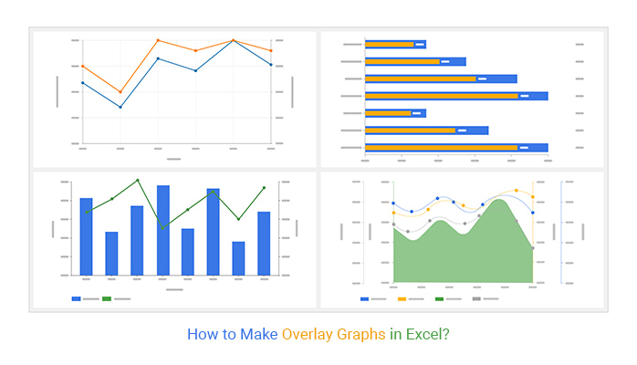
A Dual Axis Line Chart is a visualization design you can use to display data with metrics with varying measures.
It uses two axes to easily showcase the relationships between two varying variables in terms of the scale of measurements.
The resulting curves comprise of series of data points called ‘markers’ connected by straight lines.
The visualization displays plenty of information using limited space. This means you can quickly uncover trends and patterns in your data with a glance.
If you want to make the most of limited space in your data visualization dashboard, your go-to chart should be a Multi-Axis Chart in Excel, such as the Dual Axis Line Chart. This type of chart is particularly useful for comparing complex data sets, like marginal revenue vs. marginal cost, in a single view.
How to make overlay graphs in Excel should never stress you. Keep reading to discover more.

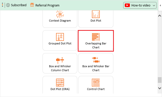
The Dual Axis Bar and Line Chart have a secondary axis to help you visualize data points with varying scales of measure.
For instance, the chart above has two Y-axes, which depict sales and profit margins. Using an x and y axis chart can make comparing these variables even easier.
A secondary axis chart (such as the above) can help you display insights into more than one variable.
A Dual Axis Bar and Line Chart is an excellent example of an overlaid chart (a Bar Chart and Line Graphs).
Keep reading because, in the ensuing section, we’ll show you how to make an overlay graph in Excel.

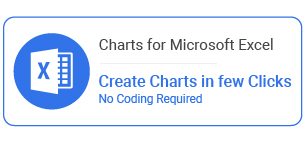
A Multi-Axis Line Chart uses 3 axes to illustrate the relationships between data points with different scales of measure.
For instance, the chart above has 3 Y-axes representing expenses, sales, and profits.
The Overlay visualization displays plenty of information using limited space. This means you can uncover trends and patterns quickly.
A Multi-Axis Chart in Excel is an overlay of Area and Line Graphs. And it can help you make comparisons between categories using a highly contrasting color scheme.
If you want to use limited space in your data visualization dashboard, use a Multi-Axis Line Chart.

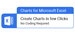
An OBC shares remarkable similarities with a standard Stacked Bar Diagram as well as a Clustered Stacked Bar Chart.
But its composite variables that contribute to the whole start at the baseline, unlike the latter visualization chart.
For instance, the chart above compares the actual versus forecast sales in various US cities.
We recommend you use the graph to compare two distinct metrics in your data. An OBC is handier than a Stacked Bar graph if you intend to display comparison insights.
In the coming section, we’ll show you How to Create an Overlay Chart in Excel.
You don’t want to miss this.

So, how do you overlay charts to create an all-in-one visualization with secondary Y-axes?
Excel is one of the popular tools of visualization among business owners. However, it lacks ready-made Overlay Charts.
In other words, you’ll have to overlay charts manually to end up with insightful graphs, such as OBC & Multi-Axis Line Chart.
We’re not advising you to do away with Excel.
There’s an amazingly affordable tool that comes as an add-in you can easily install in Excel to access ready-to-go and easy-to-customize Overlay Charts.
The application is called ChartExpo.
What is ChartExpo?
ChartExpo is an add-in you can easily install in your Excel to access ready-made and visually appealing Overlaid Charts.
How to make overlay graphs in Excel should never consume your time or overwhelm you.
Features and Benefits
This section will use an Overlay Chart to visualize the table below.
Let’s jump in.
| Cities | Forecast | Sales |
| Los Angeles | 2,627,049 | 2,476,774 |
| Chicago | 2,810,279 | 2,127,736 |
| New York | 2,441,855 | 2,611,717 |
| Phoenix | 2,397,170 | 2,663,863 |
| Philadelphia | 2,715,795 | 2,279,076 |
| Miami | 2,758,997 | 2,163,999 |
To get started with ChartExpo in Excel, follow the steps below:


The chart can help you compare categories using a highly contrasting color scheme.

Excel offers a good selection of charts and graphs. But you may have a unique situation.
For instance, you may need to visualize two sets of varying data for insights. Let’s say actual revenue versus forecast revenue.
In this scenario, what’s the go-to chart for the graph?
You need Overlay Graphs for the task. These charts are also called Combination Graphs or simply Combo Graphs.
Excel does not have ready-made and visually stunning Overlay Graphs for your analysis.
How much did you enjoy this article?


Learn how to use sparklines in Excel to quickly visualize trends inside cells. Discover types, creation steps, customization, use cases, benefits, and best practices.

Learn what a confidence interval graph is, how to create it in Excel, and how to interpret results to make more reliable, data-driven decisions.

A correlation matrix in Excel helps identify relationships between variables. Learn how to create, read, and use it for effective data analysis.


