• Home
  • Tools dropdown img
    • Spreadsheet Charts

      • ChartExpo for Google Sheets
      • ChartExpo for Microsoft Excel
    • Power BI Charts

      • Power BI Custom Visuals by ChartExpo
    • Word Cloud

  • Charts dropdown img
    • Chart Category

      • Bar Charts
      • Circle Graphs
      • Column Charts
      • Combo Charts
      • Comparison Charts
      • Line Graphs
      • PPC Charts
      • Sentiment Analysis Charts
      • Survey Charts
    • Chart Type

      • Box and Whisker Plot
      • Clustered Bar Chart
      • Clustered Column Chart
      • Comparison Bar Chart
      • Control Chart
      • CSAT Survey Bar Chart
      • CSAT Survey Chart
      • Dot Plot Chart
      • Double Bar Graph
      • Funnel Chart
      • Gauge Chart
      • Likert Scale Chart
      • Matrix Chart
      • Multi Axis Line Chart
      • Overlapping Bar Chart
      • Pareto Chart
      • Radar Chart
      • Radial Bar Chart
      • Sankey Diagram
      • Scatter Plot Chart
      • Slope Chart
      • Sunburst Chart
      • Tornado Chart
      • Waterfall Chart
      • Word Cloud
    • Google Sheets
      Microsoft Excel
  • Services
  • Pricing
  • Contact us
  • Blog
  • Support dropdown img
      • Gallery
      • Videos
      • Contact us
      • FAQs
      • Resources
    • Please feel free to contact us

      atsupport@chartexpo.com

Categories
All Data Visualizations Data Analytics Surveys
Add-ons/
  • Google Sheets
  • Microsoft Excel
  • Power BI
All Data Visualizations Data Analytics Surveys
Add-ons
  • Google Sheets
  • Microsoft Excel
  • Power BI

We use cookies

This website uses cookies to provide better user experience and user's session management.
By continuing visiting this website you consent the use of these cookies.

Ok

ChartExpo Survey


Home > Blog > Power BI

Insider’s Guide: Power BI Transform Data Unveiled

Data is the oil of the 21st century, they say. And just like oil, data needs refining to unleash its power.

That’s where Power BI Transform Data comes in. This powerful feature streamlines data cleaning, shaping, and modeling, turning chaotic datasets into cohesive narratives.

Power BI Transform Data

Picture a dataset with scattered information, inconsistencies, and gaps. Power BI data transformation can whip it into shape, making it ready for analysis in no time. There is no need for mind-numbing formulas and complex coding. This powerful tool simplifies the process and puts the control back in your hands.

But wait, there’s more! Power BI Transform Data isn’t just about making your data look pretty. It’s about giving it a voice, a personality, and a purpose. It’s about turning those boring spreadsheets into captivating visualizations that make your audience go, “Wow!”

Don’t let your data go to waste. Embrace the power of Power BI Transform Data and watch your business soar to new heights.

Let the magic begin!

Table of Content:

  1. What is Power BI Transform Data?
  2. Why Do You Need to Transform Data in Power BI?
  3. Load vs Transform Data in Power BI: Differences
  4. Types of Data Transformations In Power BI
  5. 4 Ways to Transform Power BI Data
  6. How Does Power BI Transform Data After Import?
    • Stage 1: Logging in to Power BI
    • Stage 2: Arrange a Data Set
    • Stage 3: Paste Data into Power Query Editor
    • Stage 4: Load Your Data
    • Stage 5: Cleaning and Shaping Data
    • Stage 6: Adding Chart Extension
    • Stage 7: Draw Your Chart
    • Stage 8: Visualize Your Chart
  7. Benefits of Advanced Data Transformation in Power BI
  8. Common Challenges In Transforming Data In Power BI
  9. Tips For Effective Data Transformation In Power BI
  10. Power BI Transform Data – FAQs
  11. Wrap Up

What is Power BI Transform Data?

Definition: Power BI Transform Data is the process of refining, cleaning, and structuring raw data for better analysis. It involves tasks like data cleaning, merging, filtering, and creating calculated columns.

With Power BI’s Transform Data feature, you can effortlessly reshape and prepare data for insightful visualizations and reports. This step is vital in harnessing the full potential of Power BI for data-driven decision-making.

Why Do You Need to Transform Data in Power BI?

In a world overflowing with data, we need a superhero to save us from drowning in numbers. Can using Power BI for data transformation save us?

Let’s find out.

  1. User-friendly interface: Empower users with an intuitive data transformation interface through Power BI Transform Data. This feature ensures that even non-technical users can effortlessly manipulate data without delving into complex code. By democratizing the data transformation process, Power BI makes it accessible to all, promoting ease of use and broadening the reach of data manipulation capabilities.
  2. Data integration: Data comes from various sources in different formats. Power BI connects to a wide range of data sources, including databases, cloud services, and spreadsheets. As a result, you can effortlessly integrate data from disparate sources into a single dataset for analysis.
  3. Data cleansing: Tackle the challenges of messy raw data effortlessly with Power BI, Transform Data like a Power BI Income Statement. In the presence of missing values, duplicates, and inconsistencies, Power BI’s robust data transformation capabilities empower you to clean and preprocess your data seamlessly. From eliminating duplicates to handling missing values and applying data quality checks, Power BI Transform Data and Power BI Income Statement ensure precision, accuracy, and reliability throughout the data preparation process.
  4. Data enrichment: Sometimes, raw data lacks essential context. Power BI enables data enrichment by merging it with additional datasets or creating calculated columns based on existing data. This enrichment process adds depth and value to your analysis, offering more comprehensive insights that drive informed decision-making.
  5. Transformations: Power BI offers a rich set of data transformation operations. You can perform tasks like filtering, sorting, pivoting, aggregating, and grouping data to prepare it for analysis. Advanced users can even write custom transformations using Power Query M language.

Load vs Transform Data in Power BI: Differences

Feature Transform Data Load Data
Purpose Cleans, shapes, and prepares data before loading Imports data into Power BI for analysis and visualization
Tool Used Power Query Editor Power BI Data Model
Key Actions Remove duplicates, filter data, merge queries, change data types Load structured data into Power BI reports and dashboards
Impact Ensures data is clean and structured for accurate analysis Enables data visualization and reporting
When to Use Before loading, when data needs cleaning or restructuring After transforming, when the data is ready for analysis

Types of Data Transformations In Power BI

  • Filtering Rows: This transformation helps you remove data that doesn’t meet certain criteria, such as excluding records with null values or data outside a specific date range.
  • Sorting Data: Organize your dataset by sorting it in ascending or descending order based on one or more columns. This is useful for ranking products, sales figures, or other metrics to highlight top performers or trends.
  • Grouping Data: Aggregate data into categories or groups to summarize and analyze it more effectively. For instance, you can group sales data by region or product category to see the total sales figures for each group.
  • Merging Queries: Combine data from different tables or sources into a single dataset. This allows you to integrate related information, such as merging customer details with sales data, to get a comprehensive view for analysis.

4 Ways to Transform Power BI Data

  1. Power Query Editor: Use Power Query Editor to perform a wide range of data transformations, such as filtering, sorting, and merging tables. This tool provides a user-friendly interface for shaping and cleaning data before loading it into Power BI.
  2. DAX Calculations: Utilize Data Analysis Expressions (DAX) to create calculated columns, measures, and calculated tables. DAX allows for complex calculations and aggregations within your data model, enabling dynamic data analysis and reporting.
  3. Data Model Relationships: Establish relationships between different tables in your data model to integrate and analyze data across multiple sources. Properly defining these relationships helps in creating accurate and insightful reports.
  4. Transformations in Visualizations: Apply transformations directly within your visualizations using features like Power BI slicers, cross-filters, and drill-through options. This allows for interactive data exploration and custom views based on user input.

How Does Power BI Transform Data After Import?

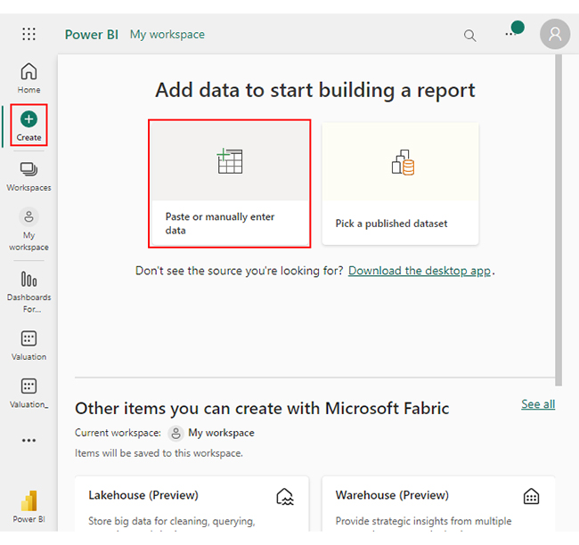
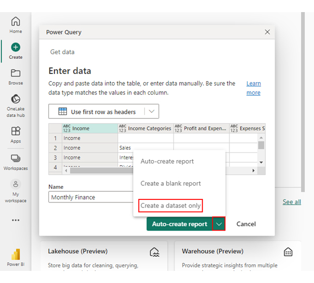
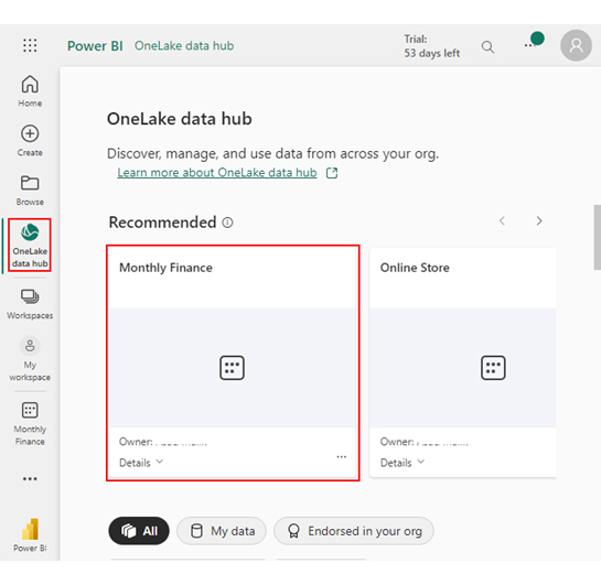
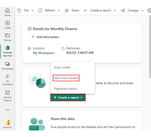
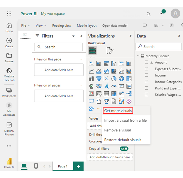
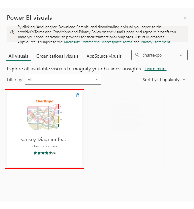
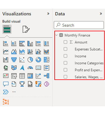
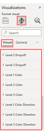
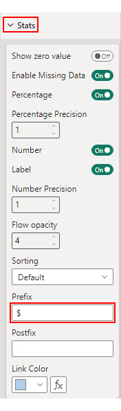
Follow the steps below to learn how to load and transform data in Power BI. We will divide the process into five stages.

Stage 1: Logging in to Power BI

Enter email to login to Power BI
  • You are redirected to your Microsoft account.
  • Enter your password and click “Sign in”.
Enter Password to login to Power BI
  • You can choose whether to stay signed in.
Click on stay signed in
  • Once done, the Power BI home screen will open.

select Paste or manually enter data in Power BI ce441

Stage 2: Arrange a Data Set

  • We’ll use the following cash flow data for this example.
Income Income Categories Profit and Expenses Expenses Subcategories Salaries, Wages, & Marketing Details Amount
Income       75,000
Income Sales       45,000
Income Interest Profit          5,000
Income Dividends Profit          5,000
Income Other Income Profit       20,000
Sales Profit          5,000
Sales Operating Expenses       40,000
Operating Expenses Salaries and Wages       20,000
Salaries and Wages Management       10,000
Salaries and Wages Sales Team          5,000
Salaries and Wages Support Team          3,000
Salaries and Wages Administrative          2,000
Operating Expenses Rent       10,000
Operating Expenses Utilities          2,000
Operating Expenses Marketing          5,000
Marketing Online Ads          3,000
Marketing Print Ads          1,500
Marketing Social Media             500
Operating Expenses Supplies          3,000

Stage 3: Paste Data into Power Query Editor

Create Dataset in Power BI ce444

Stage 4: Load Your Data

Click on Data Hub ce444
Workspace in Power BI ce444

Stage 5: Cleaning and Shaping Data

Create Report and start from scratch ce444
  • A Report Canvas screen appears as below:
Report Canvas screen in Power BI ce444

Stage 6: Adding Chart Extension

  • Creating the Sankey Diagram requires us to use an add-in or Power BI visual from AppSource.
  • Navigate to the right side of the Power BI dashboard.
  • Open the Power BI Visualizations panel.
  • Click the ellipsis symbol (…) as highlighted in the diagram below. This will import the Power BI Sankey Diagram extension by ChartExpo.
click on to get more visuals ce444
  • The following menu opens:
  • Select the “Get more visuals” option.
get more visuals in Power BI ce444
  • The following window opens.
  • Enter “Sankey Diagram for Power BI by ChartExpo” in the highlighted search box.
  • You should see the “Sankey Diagram for Power BI by ChartExpo”, as shown in the image below.
Sankey Diagram for Power BI by ChartExpo ce444
  • Click the highlighted “Add” button.
Click the Add button ce444
  • Power BI will add the “Sankey Diagram for Power BI by ChartExpo” icon in the visualization panel.
Click on Sankey Diagram Icon

Stage 7: Draw Your Chart


Report Section in Dashboard ce441
  • You can resize the visual as needed.
  • Navigate to the right side of your Power BI dashboard.
  • You should see “Fields” next to “Visualizations“.
Fields next to visualizations ce444
  • You’ll select the fields to use in your Sankey chart here.
  • The ChartExpo visual needs to be selected, though. Select the field in the following sequence:
    • Income
    • Income Categories
    • Profit and Expenses
    • Expenses Subcategories
    • Salaries, Wages, & Marketing Details
    • Amount
Select fields for Sankey diagram ce444
  • You’ll be asked for a ChartExpo license key or email address.
enter email for ChartExpo license ce430

Stage 8: Visualize Your Chart

  • Select the ChartExpo visual.
  • You should see three icons below “Build Visual” in the Visualizations panel.
Build visual panel in Power BI
  • Select the middle icon, “Format visual“. The visual properties will be populated as shown below.
visual properties in Power BI
  • To begin using ChartExpo as a new user;
    • Enter your email address in the textbox under the “Trial Mode” section. ChartExpo will send the License key to this email upon subscribing to the add-in.
    • Ensure you provide an accurate and up-to-date email address.
    • Toggle “Enable Trial” to activate your 7-day trial.
enter email id
  • You should receive a welcome email from ChartExpo.
  • If you do not find the email in your inbox, kindly check your spam folder.
  • The Sankey Diagram you create under the 7-day trial contains the ChartExpo watermark.
Power BI Transform Data 1
  • If you have obtained a license key:
    • Enter your license key in the “ChartExpo License Key” textbox in the “License Settings” section (see below).
    • Slide the toggle switch next to “Enable License” to “On“.
enter license key
  • Your Sankey Diagram will then appear without a watermark.
Power BI Transform Data 2
  • Let’s add colors to each node. Expand the “Level Colors” properties and select the colors.
coloring sankey diagram ce441
  • Let’s add the Prefix (e.g., $ sign) and Postfix (e.g., B sign) with the numeric values in the chart.
  • Expand the “Stats” properties. Add the Prefix value (e.g., $ sign) and Postfix value (e.g., B sign).
Add Prefix in Power BI ce441
  • Automatically all changes will be saved.
Final Power BI Transform Data 2

Insights

  • Income Composition

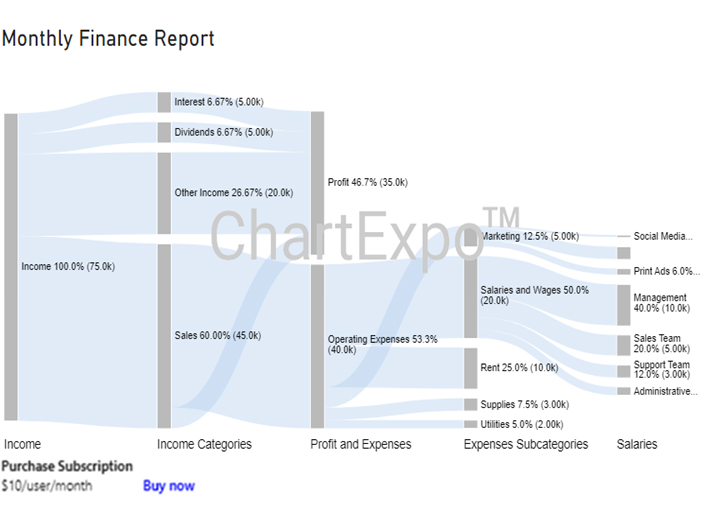
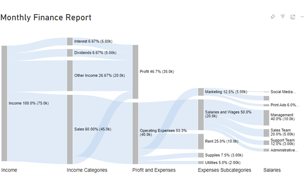
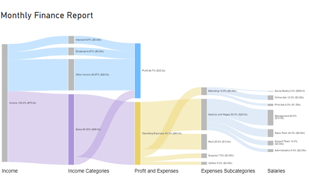
The monthly income amounts to $75,000, with sales being the main contributor at $45,000. Interest and dividends make up $5,000 each, while an additional $20,000 is generated from other sources of income. This breakdown allows for a clear identification of the main revenue streams.

  • Expense Breakdown

The total amount of expense in the expense report of small business is $40,000. The majority is allocated to operating expenses. Among these operating expenses, salaries and wages account for the largest portion, amounting to $20,000. The remaining operating expenses are attributed to rent, utilities, marketing, and supplies.

  • Detailed Salary Allocation

The data provides a detailed breakdown of salaries and wages, revealing the highest expense in the “Management” category at $10,000. Following this, the “Sales Team” incurs a cost of $5,000, the “Support Team” $3,000, and the “Administrative” team $2,000. This breakdown is valuable for understanding labor cost distribution among various roles.

  • Marketing Expenses

The $5,000 marketing expenses are distributed among three subcategories: online ads ($3,000), print ads ($1,500), and social media ($500). This breakdown provides a transparent overview of how marketing resources are allocated.

  • Profit Contribution

There is a net profit of $35,000 ($75,000 income – $40,000 expenses).

Benefits of Advanced Data Transformation in Power BI

Say goodbye to confusion and hello to deeper insights. Here are the benefits you get to enjoy when you transform data in Power BI:

  1. Data cleaning: Power BI Transform Data excels in data cleaning. It automates the process of identifying and fixing errors, removing duplicates, and handling missing values. This ensures your data is pristine and ready for analysis, saving hours of manual data scrubbing.
  2. Data integration: With Power BI, data integration becomes a breeze. It seamlessly connects to various data sources, consolidating information into one cohesive dataset. Say goodbye to data silos and hello to holistic insights.
  3. Data enrichment: Power BI empowers you to enrich your data with additional context. You can merge supplementary datasets or create calculated columns to add layers of information. This depth enhances the quality of your analysis and unlocks new dimensions of understanding.
  4. Flexible data transformation: Experience unmatched flexibility in data transformation with Power BI’s capabilities. Tailoring to your specific requirements, Power BI Transform Data empowers you to seamlessly apply a diverse array of transformations. Whether tackling straightforward data-cleaning tasks or executing intricate custom operations, Power BI ensures adaptability to meet your unique needs.
  5. Efficiency: Power BI automates data transformation tasks, significantly improving efficiency. Data preparation that used to take days can now be accomplished in hours or even minutes. This efficiency lets your team focus on extracting insights rather than wrangling data.
  6. Automation: Power BI enables the automation of data refreshes and transformations, ensuring your reports and dashboards are always up-to-date. This automation reduces manual effort, minimizes errors, and ensures the reliability of your data-driven decision-making.
  7. Scalability: As your data grows, Power BI scales with it. It doesn’t matter whether you’re dealing with a small dataset or a massive data warehouse. Power BI can handle the load, ensuring consistent performance and responsiveness.
  8. Real-time data: Enhance your data agility with Power BI’s support for streaming data sources. Through Power BI Transform Data, you gain the ability to monitor and promptly act upon incoming data, fostering a more agile and responsive decision-making process.
  9. Improved decision-making: Ultimately, the benefits of Power BI data transformation translate into improved decision-making. Power BI empowers you to make informed decisions by providing clean, integrated, enriched data with speed and accuracy.
  10. Accessibility: One of the most significant advantages of Power BI on Mac is its accessibility. Everyone, from data analysts to business users, can harness the power of data transformation, democratizing insights across organizations.

Common Challenges In Transforming Data In Power BI

  • Data Quality Issues: Poor data quality, such as incomplete, inconsistent, or incorrect data, can complicate transformations. Cleaning and standardizing data before transforming it is crucial to avoid errors and ensure accurate results.
  • Performance Problems: Large datasets or complex transformations can lead to performance issues, such as slow query execution or delays in loading data. Optimizing queries and using efficient data processing techniques can help mitigate these issues.
  • Complex Data Models: Working with intricate data models or relationships between multiple tables can be challenging. Properly defining and managing relationships, and understanding the data model, are essential for accurate analysis.
  • Data Source Compatibility: Integrating data from various sources can sometimes be difficult due to differences in data formats or structures. Ensuring compatibility and transforming data into a consistent format can help resolve these issues.
  • User Skill Levels: Transforming data effectively requires a good understanding of Power BI’s tools and functionalities. Users with limited experience may face difficulties, making training or seeking assistance important for overcoming these challenges.
  • Handling Large Volumes of Data: Dealing with large volumes of data can strain system resources and affect performance. Implementing strategies such as data aggregation or using DirectQuery can help manage and analyze large datasets more efficiently.

Tips For Effective Data Transformation In Power BI

  • Plan Ahead: Understand your data and set clear transformation goals.
  • Use Power Query: Utilize Power Query for easy and efficient data shaping.
  • Clean Data Early: Address quality issues before complex transformations.
  • Optimize Performance: Filter early, minimize columns, and use efficient data types.
  • Document Steps: Keep track of your transformation process for better management.
  • Explore Advanced Features: Use custom columns and DAX for complex needs.
  • Review Regularly: Test transformations on sample data and adjust as needed.
  • Build a Solid Data Model: Define relationships and use efficient schemas.
  • Automate Tasks: Streamline repetitive tasks to save time and reduce errors.
  • Seek Feedback: Gather input from users to refine your transformations.

Power BI Transform Data – FAQs

What is Power BI Data Transformation?

Power BI data transformation is the process of refining and preparing raw data for analysis. It involves tasks like cleaning and structuring. As a result, this enhances data to make it suitable for creating meaningful visualizations and reports in Power BI.

What is the difference between loading and transforming data in Power BI?

Loading data in Power BI is the act of importing it into the tool. Transformation, on the other hand, involves modifying data after it’s loaded. Transformation tasks include cleaning, shaping, and enriching the data to make it suitable for analysis and reporting.

What is an example of data transformation?

Converting dates from different formats (e.g., MM/DD/YYYY to YYYY-MM-DD) is a data transformation example. This process standardizes date data, ensuring consistency and compatibility for analysis in Power BI.

Wrap Up

Data transformation isn’t just about tidying up messy data; it’s about extracting actionable insights. Power BI’s flexibility and automation streamline this crucial process, facilitating faster, data-driven decisions. It eliminates the drudgery of manual data preparation, freeing up valuable time for in-depth analysis.

The scalability of Power BI ensures that it can grow with your data needs. It doesn’t matter whether you’re dealing with a modest dataset or a sprawling data warehouse. Real-time data capabilities keep you ahead of the curve, responding promptly to changing business dynamics.

Efficiency is a game-changer, with hours of manual work reduced to minutes. Moreover, automation ensures that your reports are always up-to-date.

Conclusively, Power BI Transform Data is not just a feature; it’s a catalyst for data-driven transformation. It takes you from raw data chaos to refined, actionable insights.

Do not hesitate! Embrace it, harness its capabilities, and embark on a data-driven journey of excellence.

How much did you enjoy this article?

PBIAd2
Start Free Trial!
129822

Related articles

next previous
Power BI12 min read

How to Create Sankey Diagram in Microsoft Power BI?

Learn How to Create Sankey Diagram in Microsoft Power BI using Desktop & Web Service. What they are and how to use them effectively.

Power BI8 min read

Power BI Artificial Intelligence: Insights Using Visuals

Discover all there is to know about the Power BI artificial intelligence. You'll also discover how AI is used in Power BI, and how to use it for analysis and more.

Power BI9 min read

Budgeting in Healthcare: Use Visuals to Spot Budget Gaps

This guide helps you discover what budgeting in healthcare is. You'll also discover the factors that affect hospital budgets and types of budgeting in healthcare.

Power BI9 min read

Predictive Analytics in Power BI for Making Insightful Visuals

This guide shows you everything you need to know about Predictive Analytics in Power BI. It also shows you how it works, and how to interpret the results.

Power BI8 min read

Quarterly Business Review Template for Optimum Reports

Discover what the quarterly business review template is. This guide also shows you the best practices to consider when using the QBR template.

ChartExpo logo

Turn Data into Visual
Stories

CHARTEXPO

  • Home
  • Gallery
  • Videos
  • Services
  • Pricing
  • Contact us
  • FAQs
  • Privacy policy
  • Terms of Service
  • Sitemap

TOOLS

  • ChartExpo for Google Sheets
  • ChartExpo for Microsoft Excel
  • Power BI Custom Visuals by ChartExpo
  • Word Cloud

CATEGORIES

  • Bar Charts
  • Circle Graphs
  • Column Charts
  • Combo Charts
  • Comparison Charts
  • Line Graphs
  • PPC Charts
  • Sentiment Analysis Charts
  • Survey Charts

TOP CHARTS

  • Sankey Diagram
  • Likert Scale Chart
  • Comparison Bar Chart
  • Pareto Chart
  • Funnel Chart
  • Gauge Chart
  • Radar Chart
  • Radial Bar Chart
  • Sunburst Chart
  • see more
  • Scatter Plot Chart
  • CSAT Survey Bar Chart
  • CSAT Survey Chart
  • Dot Plot Chart
  • Double Bar Graph
  • Matrix Chart
  • Multi Axis Line Chart
  • Overlapping Bar Chart
  • Control Chart
  • Slope Chart
  • Clustered Bar Chart
  • Clustered Column Chart
  • Box and Whisker Plot
  • Tornado Chart
  • Waterfall Chart
  • Word Cloud
  • see less

RESOURCES

  • Blog
  • Resources
  • YouTube
SIGN UP FOR UPDATES

We wouldn't dream of spamming you or selling your info.

© 2025 ChartExpo, all rights reserved.