Categories
Raw datasets rarely arrive fully prepared for reporting. Missing derived values, inconsistent categories, and gaps in logic create obstacles that slow analysis and reduce reporting accuracy.
Power BI Calculated Columns address this directly by allowing analysts to define row-level values within the data model, each one computed using DAX formulas during every dataset refresh.
Whether you are building financial dashboards, monitoring sales trends, or segmenting customer data, these columns add structure and precision to your reports.
This guide covers what calculated columns are, how to build and analyze them, and the best practices that keep your data model running efficiently.
Definition: Power BI Calculated Columns are columns added to a table using DAX expressions, where each row receives an individually computed value.
Unlike measures, which produce results on demand based on active filters, these columns store their output inside the data model after every dataset refresh.
This design makes them ideal for row-level tasks such as labeling, categorization, conditional flags, and metric derivation. For instance, subtracting a cost column from a revenue column produces a profit value for every transaction in the table.
Because results are stored directly in the model, calculated columns in Power BI integrate naturally with charts, slicers, and table visuals.
Relationships between tables also benefit, since a calculated column can serve as a grouping key or filtering dimension, making it a core building block in advanced data modeling.
Source data often lacks the fields necessary for thorough analysis. Power BI Calculated Columns fill those gaps by deriving new values from what already exists in the dataset, which is exactly what creating a calculated column in Power BI accomplishes. Key reasons to use them include:
Knowing how Power BI Calculated Columns behave inside a data model helps you apply them correctly and avoid performance pitfalls.
Below are the defining characteristics:
Understanding how formulas are structured is fundamental to working confidently with calculated columns. DAX expressions follow a consistent pattern: a column name is declared on the left, and an expression that evaluates to a scalar value is placed on the right.
Profit = Sales[Revenue] – Sales[Cost]
This formula reads two existing columns and computes a profit figure for every row in the table.
When building a formula, several types of operations can be used:
Creating a calculated column is a straightforward process within Power BI Desktop. These steps walk through adding a column to an existing table and validating the result, including working with a calendar table in Power BI for time-based analysis.
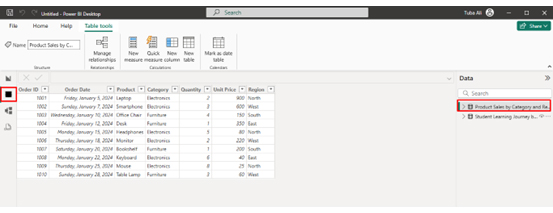
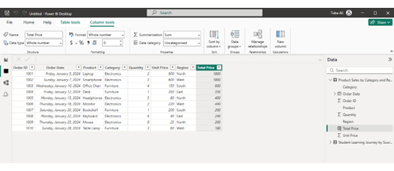
First, open Power BI Desktop and load your dataset. On the left panel, click the Data View icon (table symbol). This view displays your dataset in a tabular format. Next, select the table where you want to create the calculated column.
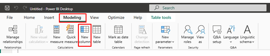
From the Modeling tab, click New Column.
Enter your formula in the formula bar. For example:
Total Price = ‘Product Sales by Category and Region'[Quantity] * ‘Product Sales by Category and Region'[Unit Price]
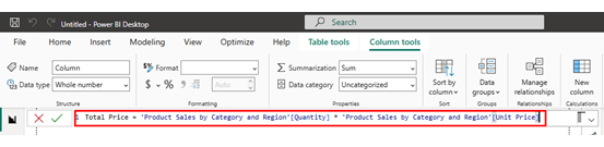
Power BI automatically evaluates the formula and populates values for every row.
Once created, the column becomes part of the dataset and can be used in charts, slicers, and filters. You can also organize the results for better visualization using features like Power BI sort by column.
This process allows you to create calculated columns for tasks such as segmentation, transformation, or categorization. Many analysts build on this foundation using Power BI calculation groups or other advanced modeling techniques.
Analyzing calculated columns in Power BI helps you derive new insights by transforming existing data into meaningful values. These columns are created using DAX formulas and are useful for segmenting, categorizing, and enhancing your dataset. Follow these steps to analyze them effectively:
Start by creating calculated columns using DAX formulas in Power BI. These columns can combine fields, apply conditions, or categorize data to make the analysis more insightful.
Review the logic of your calculated columns to ensure accuracy. Check for errors in formulas and confirm that the results align with your expected outcomes.
Ensure your calculated columns are properly connected within your data model. This allows them to interact with other tables and supports deeper analysis across related data.
Incorporate calculated columns into charts and tables to segment your data. For example, use them to group categories, define ranges, or highlight specific conditions.
Create interactive visuals such as bar charts, matrices, or dashboards to explore insights. For more advanced and visually engaging dashboards, you can use ChartExpo to simplify complex data visualization.
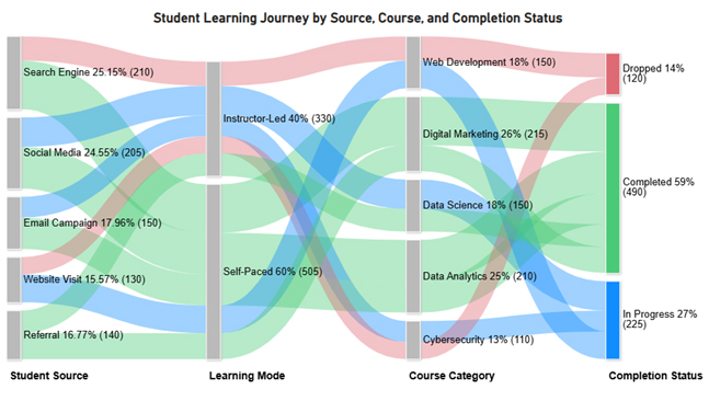
Evaluate how calculated columns influence trends and relationships in your data. Identify patterns, flows, or transitions between categories to uncover deeper insights.
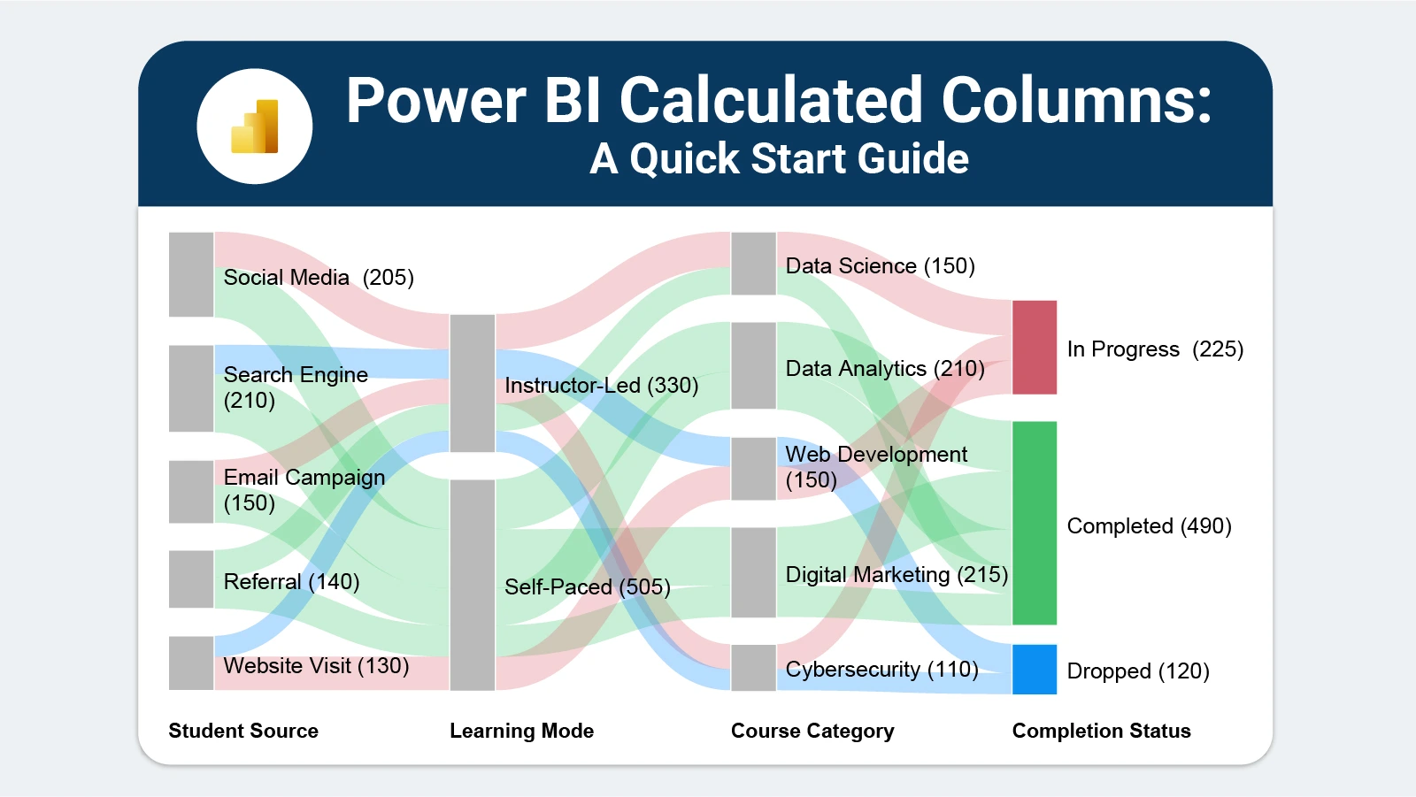
Include a final visualization, such as a flow-based chart, that illustrates how data moves across multiple stages or categories.
For example, the image can show the progression from sources to categories and outcomes, helping you clearly understand relationships and overall data flow.
Key Insights
Applied with intention, Power BI Calculated Columns reshape how data is structured for downstream reporting. The ability to create a calculated column in Power BI means analysts can tailor their datasets precisely to each reporting requirement.
Key benefits include:
Power BI Calculated Columns are powerful, but careless implementation leads to bloated models and slow refresh times. A few disciplined practices keep data models lean and maintainable.
Here are some useful tips:
Use them when you need a fixed, row-level value stored in the model, such as a category label, a conditional flag, or a derived numeric field. They work best for attributes that do not need to respond to the current filter context.
They can contribute to slower refresh times and larger file sizes because each value is written into the model. Keeping the number of columns minimal and avoiding unnecessarily complex formulas reduces the impact.
Select the target table, click New Column from the Modeling tab, and enter a DAX expression in the formula bar. For example:
Profit = Sales[Revenue] – Sales[Cost]
Power BI evaluates the expression for each row and fills the column automatically.
Reference your existing calculated columns by name inside a new DAX expression. For example, if columns named Revenue and Cost already exist, write:
Margin = Sales[Revenue] – Sales[Cost]
Row-level logic is the foundation of effective data modeling, and Power BI Calculated Columns make that logic accessible without complex preprocessing or external transformations.
By computing values at the row level and storing them in the model, these columns give analysts a reliable base for filtering, segmenting, and visualizing data across any report or dashboard.
Pair them with strong visualization tools and sound DAX practices, and the result is a reporting environment that is both flexible and maintainable.
Start with clear naming, keep formulas simple, and document your logic. The quality of your calculated columns will directly shape the quality of every insight your data delivers.
How much did you enjoy this article?


Discover diverse and high-quality Power BI report examples for inspiration and insights. Elevate your reporting with strategic visualization techniques.

A Customer Relationship Management Dashboard centralizes data, tracks key metrics, and drives smarter business decisions. Discover now!

Explore Healthcare Dashboard Examples and learn how to turn complex healthcare data into clear, actionable insights for better decision-making.


