Categories
Are you looking to supercharge your data modeling in Power BI? We have Power BI calculated tables – a data analytics and visualization game-changer.
Let’s say you have multiple data sources. You need to create a unified, comprehensive table for analysis and reporting. That’s where Power BI calculated tables come in. They allow you to craft virtual tables tailored to your needs by leveraging the might of Data Analysis Expressions (DAX).


Power BI calculated tables are not just another feature. They are the key to unlocking deeper insights and accelerating your data analysis process. They are so powerful you can use them for visualization purposes in your Power BI dashboards. This introduces an additional element to your data narrative.
In the fast-moving business intelligence industry, quickness and precision are crucial. Using Power BI calculated tables enables you to efficiently merge and adjust data while preserving a strong data structure. Therefore, you can effectively walk your way through complex data situations. This allows you to concentrate on the most important things””making informed, data-based choices.
Are you ready to elevate your data modeling skills? Come and participate in the discussion on Power BI calculated tables with us. You’ll learn how this feature transforms data analysis and reporting.
First…
Definition: Calculated tables in Power BI are virtual tables created using Data Analysis Expressions (DAX). They define the table’s values based on existing data in the model. They are beneficial for intermediate calculations and storing data as part of the model.
Calculated tables allow you to combine and manipulate data without querying and loading values for each new table. They can be used for:
Calculated tables offer a quick and efficient method to enhance data modeling and analysis in Power BI. Functions like DISTINCT, VALUES, CROSSJOIN, UNION, and others can be used to define these tables. They provide immense flexibility in creating formulas for various data analysis needs.
Power BI calculated tables are important for several reasons:
Calculated tables in Power BI are useful for various purposes. Here are some scenarios where you can use calculated tables:
You can create new tables in calculated tables using the existing data in the model. You don’t have to retrieve and insert values from a data source into the columns of the new table. Instead, you can generate a DAX formula to determine the table’s values.
It is advisable to use calculated tables for intermediate calculations. Also, use data that you can store as part of the model. There is no need to calculate them on the spot or for each query result.
Calculated table columns come in various data types and formats and may also include a data category. Similar to different tables, they can be tagged and incorporated into the process of documenting visualizations. If the tables they gather data from are updated, the calculations are also updated. This makes the data analysis process more efficient.
Here is a step-by-step creation and Functions for calculated tables:
Step 1: Navigate to the Data View section within Power BI Desktop. The data view is displayed in a grid layout located on the left side of the Power BI Desktop.
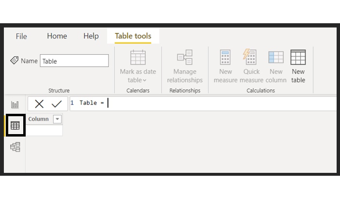
Step 2: Click the Table tools option located at the top right corner.
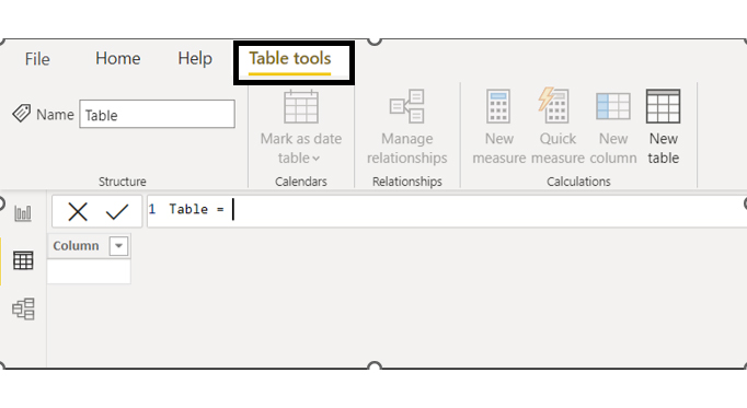
Step 3: Click New table in the upper right corner. A dialog box will appear for creating a calculated table using DAX.
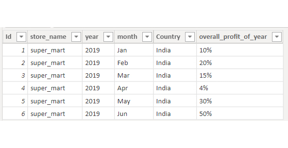
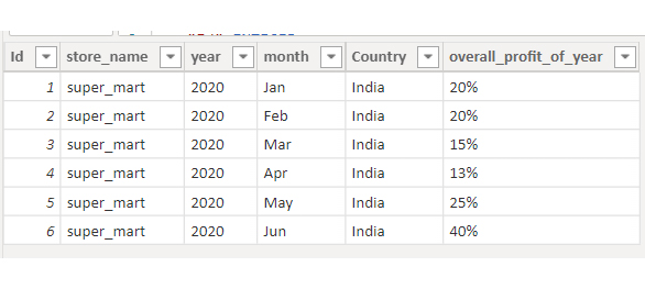
union_data = UNION(Sales_data_2019,Sales_data_2020)
Input this DAX code into the open dialog box to create the calculated table. We are merging the two physical tables into one by employing the UNION operation. This code will produce the following result:
Not only UNION – we also have many more table functions for creating calculated tables:
It is employed to filter the Physical table based on the provided condition.
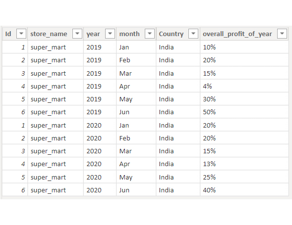
DAX code for Filter:
Filter_example = FILTER(Sales_data_2019,Sales_data_219[over_all_profit_of_year]>=”30”³)
We are trying to generate a calculated table by applying the FILTER condition to the “overall_profit_of_year” column located in the “Sales_data_2019” physical table. We are trying to retrieve information from Sales_data_2019, where the total profit for the year is >=30. The result of the code will be:
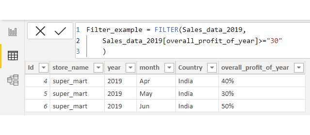
Distinct
The name suggests that it generates a structured chart containing unique values.
DAX Code for Distinct:
Distinct_example = DISTINCT(Sales_data_2020[overall_profit_of_year])
This code will produce the following result:
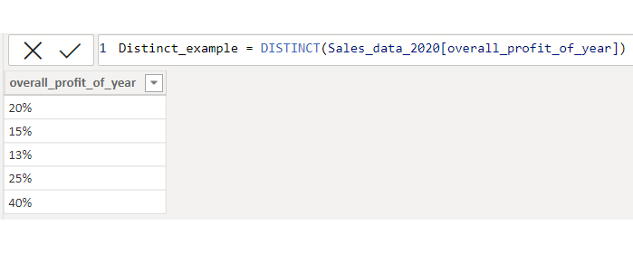
Values
Both Values and Distinct function similarly, producing unique values as output. The only distinction is that Values includes a blank row in the output, whereas Distinct does not. For better understanding, refer to the Filter_example table (which is the previously generated table for the filter function). I wanted to fetch the overall_profit_of_year column using the Distinct and Values functions to compare the differences between them.
DAX Code for Values:
value_example = VALUES(Filter_example[overall_profit_of_year])
The result of the code mentioned above will be:
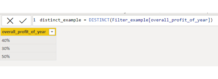
Let’s use the Distinct function on the Filter_example table.
DAX Code for Distinct:
distinct_example = DISTINCT(Filter_example[overall_projit_of_year])
The result for the code above will be:
In the Values_example output, you can identify an empty row that is not present in the distinct_example output. We must thoroughly explore the concept to understand it. First and foremost, verify if the Do Filter_example table shows any connections with other tables. If this is the case, the Values function operates based on the tables’ relationship, while the Distinct function remains unaffected by table relationships.
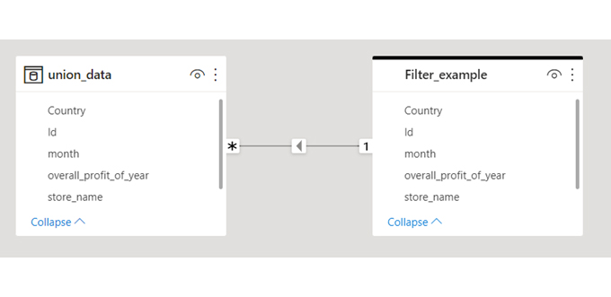
The Filter_example table has numerous connections with the union_data table, resulting in a blank row in the value_example table. This indicates a unique profit value in the union_data table that is missing from the Filter_example table.
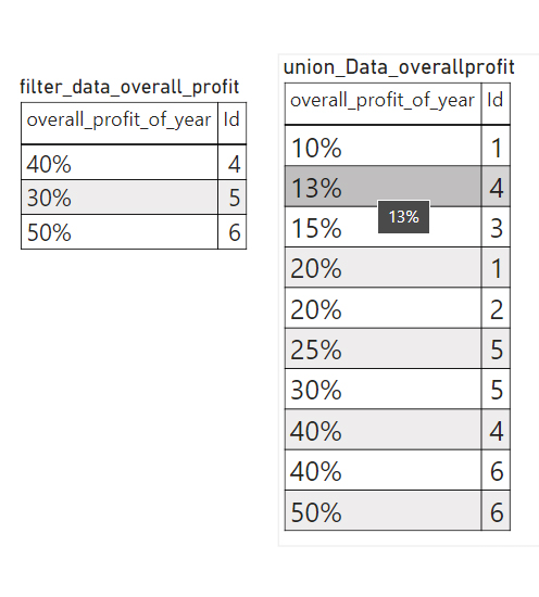
For a clearer understanding, compare the profit column for the filter_example and union_data tables in a matrix. Notice that in the union_data representation, hovering over 13% profit of year with id 4 is not found in filter_data, but id 4 is present. When the Values function is used, we receive a row with no data.
CALCULATETABLE
Evaluates a table expression in a modified filter context.
Syntax: CALCULATETABLE(<expression>[, <filter1> [, <filter2> [, ”¦]]])
| Term | Definition |
| expression | The table expression to be evaluated. |
| filter1, filter2,”¦ | (Optional) Boolean expressions or table expressions that define filters or filter modifier functions. |
The first parameter must be a model table or a function that generates a table.
Types of filters include:
If there are many filters, they are assessed by applying the AND logical operator. This implies that every condition has to be TRUE simultaneously.
Example
In this instance, the CALCULATETABLE function is utilized to calculate the total Internet sales for the year 2006. This value is subsequently utilized to calculate the ratio of Internet sales compared to all sales for the year 2006.
Look at the formula below:
= SUMX(
CALCULATETABLE(
‘InternetSales_USD’,
‘DateTime'[CalendarYear] = 2006
),
[SalesAmount_USD]
)
It results in the following table:
| Row Labels | Internet SalesAmount_USD | CalculateTable 2006 Internet Sales | Internet Sales to 2006 ratio |
| 2005 | $2,627,031.40 | $5,681,440.58 | 0.46 |
| 2006 | $5,681,440.58 | $5,681,440.58 | 1.00 |
| 2007 | $8,705,066.67 | $5,681,440.58 | 1.53 |
| 2008 | $9,041,288.80 | $5,681,440.58 | 1.59 |
| Grand Total | $26,054,827.45 | $5,681,440.58 | 4.59 |
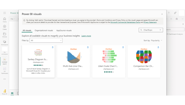
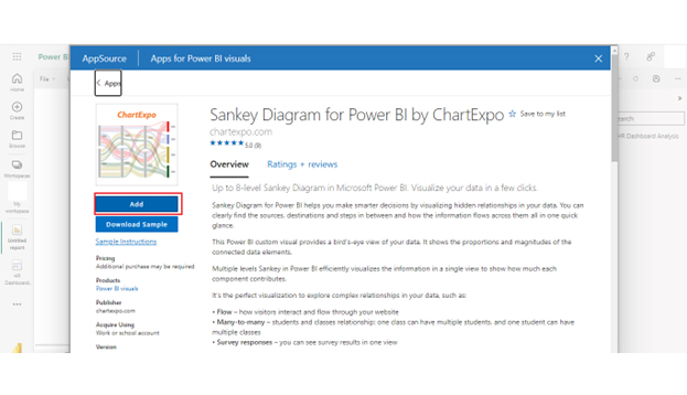
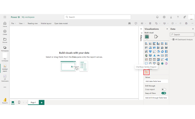
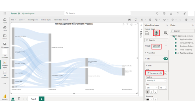
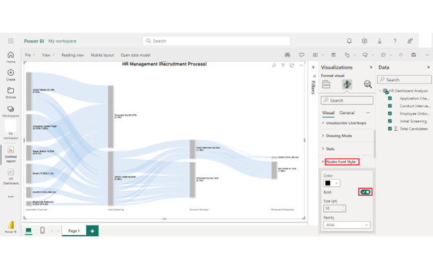
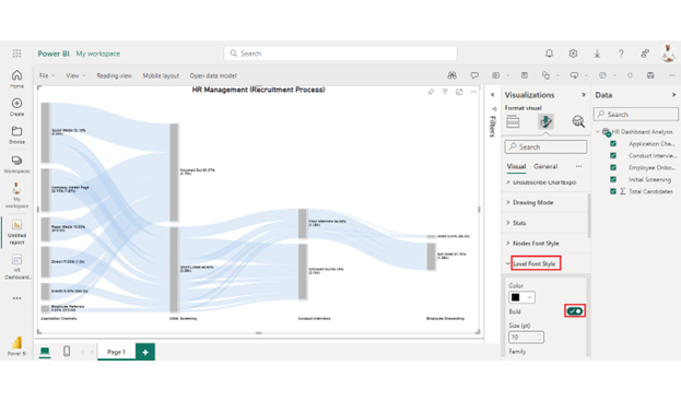
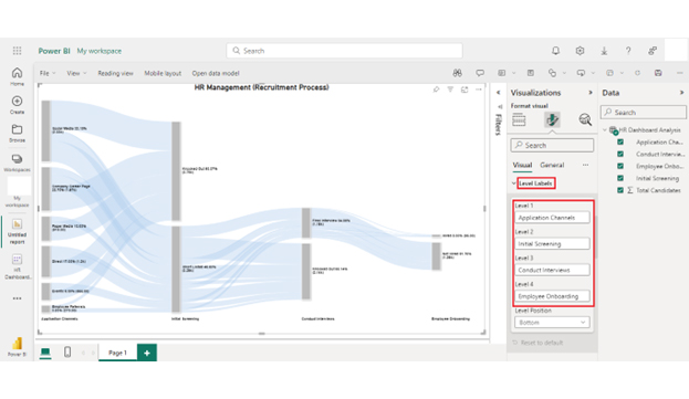
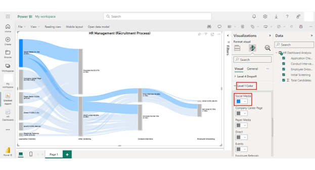
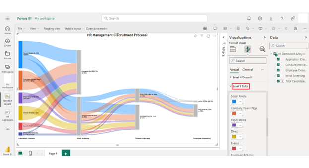
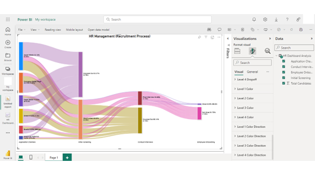
Here is a step-by-step process for creating a Sankey Diagram in Power BI to visualize relationships between calculated tables, using a Sankey diagram generator to clearly illustrate data flows and connections.


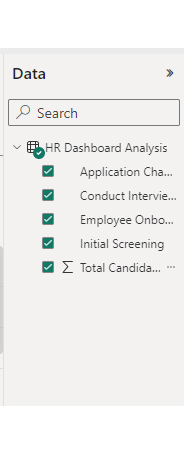
| Application Channels | Initial Screening | Conduct Interviews | Employee Onboarding | Total Candidates |
| Social Media | Short Listed | Final Interview | Hired | 32 |
| Social Media | Short Listed | Final Interview | Not Hired | 400 |
| Social Media | Short Listed | Knocked Out | 800 | |
| Social Media | Knocked Out | 1100 | ||
| Company Career Page | Short Listed | Final Interview | Hired | 20 |
| Company Career Page | Short Listed | Final Interview | Not Hired | 250 |
| Company Career Page | Short Listed | Knocked Out | 500 | |
| Company Career Page | Knocked Out | 900 | ||
| Events | Short Listed | Final Interview | Hired | 5 |
| Events | Short Listed | Final Interview | Not Hired | 100 |
| Events | Short Listed | Knocked Out | 200 | |
| Events | Knocked Out | 350 | ||
| Paper Media | Short Listed | Final Interview | Hired | 3 |
| Paper Media | Short Listed | Final Interview | Not Hired | 80 |
| Paper Media | Short Listed | Knocked Out | 135 | |
| Paper Media | Knocked Out | 700 | ||
| Employee Referrals | Short Listed | Final Interview | Hired | 10 |
| Employee Referrals | Short Listed | Final Interview | Not Hired | 70 |
| Employee Referrals | Short Listed | Knocked Out | 80 | |
| Employee Referrals | Knocked Out | 110 | ||
| Direct | Short Listed | Final Interview | Hired | 25 |
| Direct | Short Listed | Final Interview | Not Hired | 150 |
| Direct | Short Listed | Knocked Out | 425 | |
| Direct | Knocked Out | 600 |
Calculated tables in Power BI offer several benefits:
However, calculated tables also have limitations:
To add calculations to a table in Power BI, create calculated columns using DAX. This will help you define new columns based on expressions evaluated row by row. Additionally, you can create custom columns using the Power Query M formula language.
A measure is a DAX expression that provides aggregations, calculations, or business logic and is used in visualizations. A calculated table, however, is a table created by a DAX expression. This table can be used in the data model to define table values based on existing data.
To calculate values from different tables in Power BI, use DAX expressions. Assume you have a relationship between Table A and Table B. You can create a calculated column in Table A using the RELATED function to fetch values from Table B.
Power BI calculated tables are vital for advanced data modeling and analysis. They provide flexibility by allowing you to create new tables based on DAX expressions from existing data. This facilitates complex data transformations and intermediate calculations.
Additionally, calculated tables simplify the definition of table values using DAX formulas. This feature offers over 200 functions, operators, and constructs for various data analysis needs. This simplification enhances the ability to create complex data models and scenario analyses and establish relationships with other tables. As a result, it improves data modeling efficiency.
Moreover, calculated tables offer custom aggregations and dynamic data model capabilities. They allow for scenario analysis and adaptation to changing business requirements.
However, it is important to recognize calculated tables’ limitations. They can impact performance, data refresh complexity, storage overhead, and data model complexity, especially when dealing with large datasets. These limitations necessitate careful consideration and optimization of calculated tables to maintain Power BI’s model performance and manageability.
In conclusion, calculated tables in Power BI are important because they provide flexibility. They also simplify data modeling and enhance the efficiency of data analysis. Leveraging calculated tables allows you to perform advanced data transformations, create summary tables, and establish relationships.
While mindful of their limitations, calculated tables remain an indispensable tool for generating insights. From this, you can make informed decisions and drive business growth through data-driven strategies in Power BI.
How much did you enjoy this article?


Discover diverse and high-quality Power BI report examples for inspiration and insights. Elevate your reporting with strategic visualization techniques.

A Customer Relationship Management Dashboard centralizes data, tracks key metrics, and drives smarter business decisions. Discover now!

Explore Healthcare Dashboard Examples and learn how to turn complex healthcare data into clear, actionable insights for better decision-making.


