Categories
By ChartExpo Content Team
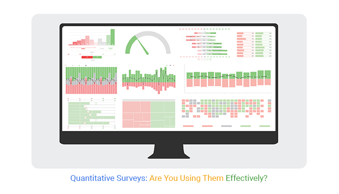
How do you make decisions backed by facts rather than guesses? Quantitative surveys are your answer. They turn opinions and behaviors into clear numbers you can analyze, offering insights you can trust.
Quantitative surveys gather structured, numerical data using closed-ended questions. They’re designed to quantify trends, measure impact, and support predictions.


Whether you’re running a business, conducting research, or tracking customer satisfaction, these surveys provide the hard numbers you need to move forward confidently.
Used across industries like market research, healthcare, and sociology, quantitative surveys make complex data easy to digest. They allow you to identify patterns and make informed decisions, saving time and minimizing risks.
Ready to learn more about how these surveys work and why they matter? Read on!
First…
Quantitative surveys are research tools used to gather numerical data. They help in making informed decisions based on statistical analysis. This type of survey targets a large audience to ensure data validity.
Responses are often designed to be in specific formats such as multiple choices or scales. This structure aids in easy analysis and comparison of data across a broad spectrum.
Quantitative surveys are defined by their structured nature. Each question is crafted to elicit responses that are easy to quantify. This means that the answers are often predefined, allowing for uniform data collection.
The scale of these surveys can be vast, targeting thousands of respondents to gather significant data sets. This large scale assists in producing results that are statistically reliable.
Reproducibility is another crucial feature of quantitative surveys. The structured format allows the survey to be replicated in different settings or times, providing data consistency. This reproducibility is essential for studying trends over time or assessing changes in response to different variables.
Such features make quantitative surveys a robust tool in data-driven decision-making processes.
Creating unbiased survey questions is crucial. Questions should be straightforward and avoid leading questions. For instance, instead of asking, “Don’t you think product X is amazing?”, ask, “How would you rate product X?” This method keeps questions neutral and responses unbiased.
Avoid double-barreled questions that might confuse respondents. Stick to one question at a time to ensure accuracy in the answers you receive. Test your questions with different individuals to identify potential biases and correct them before the survey goes live.
A well-structured survey enhances participant engagement. Begin with less sensitive questions to ease respondents into the survey. Gradually transition to more specific questions. This flow keeps respondents comfortable and willing to complete the survey.
Group similar topics together to maintain a coherent flow. This organization prevents the survey from feeling disjointed, which can frustrate participants and lead to incomplete responses.
Pilot tests are essential to refining your survey. They help identify confusing or misleading questions that could distort your data. Conduct a pilot survey with a small, diverse group of people. Their feedback will be invaluable in fine-tuning your questions.
Adjust your survey based on the pilot results. This step is vital for ensuring that your main survey is as effective as possible. Re-test if significant changes are made, to guarantee the reliability of your data.
Closed-ended questions are the backbone of quantitative surveys. They prompt respondents to choose from a predetermined set of responses. This format not only streamlines the analysis process but also enhances the comparability of data.
By limiting the responses, you gather standardized data that are easy to quantify and compare.
The Likert Scale is a popular choice for measuring attitudes and opinions. It typically offers a range of options from “strongly agree” to “strongly disagree.” This allows for a nuanced view of respondents’ feelings about a particular statement.
The precision of this scale makes it invaluable for capturing the subtleties of public opinion.
Multiple-choice questions are versatile and effective. They can cover a broad range of topics without requiring lengthy responses from participants. When well-crafted, these questions yield high-quality data that are straightforward to analyze.
Designing effective multiple-choice questions involves offering clear, mutually exclusive choices that cover all likely responses.
The CSAT Survey Chart is vital for understanding client feedback. It visually represents satisfaction levels across different touchpoints or products. Businesses often use this chart to pinpoint areas needing improvement.
By measuring responses on a typical scale—from very unsatisfied to very satisfied—companies can gauge overall customer feelings toward their services or products.
Reading the chart is straightforward. High percentages towards the satisfied end indicate good performance, while the opposite may signal trouble. This immediate visual feedback aids companies in making quick, informed decisions. It’s crucial for adjusting strategies and improving customer interactions.
The Likert Scale Chart is essential in quantitative surveys, especially when assessing attitudes and opinions. This chart facilitates an easy understanding of how respondents feel about a certain statement.
The scale typically ranges from strong agreement to strong disagreement. This setup helps in capturing the intensity of feelings about specific issues or items.
Interpreting a Likert Scale Chart involves looking at the concentration of responses across different categories. A skew towards agreement or disagreement can provide clear insights into group perceptions. It’s particularly useful in social science research, customer feedback, and employee surveys.
When deploying a Likert Scale in surveys, clarity in question design is key. Questions must be precise and unbiased to ensure that responses accurately reflect true sentiments.
The following video will help you to create a Likert Scale Chart in Microsoft Excel.
The following video will help you to create a Likert Scale Chart in Google Sheets.
The following video will help you to create a Likert Scale Chart in Microsoft Power BI.
Probability sampling is a technique where every member of the population has a known chance of being selected. This method is crucial for achieving representativeness in surveys. It ensures that the sample closely mirrors the entire population structure, making the survey results more accurate and generalizable.
One common form of probability sampling is simple random sampling. Here, each individual is chosen entirely by chance. This method prevents bias in the selection process. However, it requires a complete list of the population, which might not always be available or feasible to compile.
Another method is stratified sampling, where the population is divided into subgroups, or strata, based on shared characteristics. A random sample is then drawn from each stratum. This approach is beneficial when researchers need to ensure that specific subgroups are adequately represented in the sample.
Non-probability sampling involves selecting samples based on non-random criteria, often due to practical limitations. While this method may compromise the representativeness of the population, it offers flexibility and accessibility, making it suitable for exploratory research or when probability sampling is not feasible.
Convenience sampling is a typical example, where samples are chosen based on their accessibility. This method is quick and cost-effective but runs a higher risk of bias. It’s not ideal for making generalizations about a larger population but can be useful for preliminary data gathering.
Quota sampling is another non-probability method where researchers select individuals to meet a predefined quota. This can help ensure that the sample includes proportions of certain groups reflecting their presence in the population. While still prone to bias, quota sampling can provide a more structured approach than convenience sampling.
Determining the right sample size is critical to conducting effective quantitative research. An adequately sized sample helps achieve reliable, valid results. It balances the needs for precision and logistical constraints, such as time and budget.
The concept of statistical power plays a vital role in sample size determination. Power is the probability that a study will detect an effect if there is one to be detected. A higher power means a greater chance of identifying true effects, reducing the risk of Type II errors (falsely accepting the null hypothesis).
To achieve high power, researchers must consider the expected effect size, the level of significance (usually set at 0.05), and the sample size. Tools and software are available to help calculate the necessary sample size to achieve desired power levels, facilitating more robust and reliable survey results.
Online surveys are a staple for reaching a broad audience quickly. They allow researchers to send out questionnaires to participants across the globe. This method is cost-effective and fast, facilitating the collection of large amounts of data within a short period. Online platforms offer varied tools that aid in designing these surveys, making them interactive and easier to navigate.
The global reach of online surveys means that you can gather diverse responses, which is crucial for studies requiring varied demographic insights. However, the challenge lies in designing questions that are culturally sensitive and understandable by all participants. Ensuring the questions are unbiased and clear is key to collecting reliable data.
Moreover, the data gathered from online surveys is easily manageable. Most platforms provide real-time data analytics, which helps in quick decision-making and analysis. This immediacy can be pivotal in fields that require swift action based on the survey results, such as customer service or public health.
In-person surveys are invaluable when detailed, high-quality data is necessary. This method involves direct interaction between the researcher and the participant, allowing for comprehensive understanding and detailed responses.
In-person surveys are particularly useful when the survey topic is complex or sensitive, needing thorough explanation or immediate clarification.
The quality of data collected through this method is generally higher due to the personal engagement and the ability to probe deeper based on responses. Additionally, non-verbal cues such as body language and facial expressions can provide further insights, which are not possible through other modes. However, this method is more costly and time-consuming, often requiring a team of trained professionals.
Mixed-mode surveys combine various data collection methods, such as online and in-person surveys, to enhance data quality and reach. This approach allows researchers to target a wider audience while also catering to those who might not have access to digital platforms. It’s an effective strategy to balance the breadth of online surveys with the depth of in-person interviews.
The key advantage of mixed-mode surveys is their flexibility. Researchers can adjust their methods based on the target demographic and the nature of the information sought. For instance, initial broad data collection can be conducted online, followed by in-depth interviews with selected participants to explore complex topics further.
However, managing mixed-mode surveys requires careful planning to ensure consistency and reliability across different modes. Data integration from various sources must be handled meticulously to maintain the data integrity of the results. This method, though resource-intensive, can provide a comprehensive understanding of the surveyed topic, making it ideal for multifaceted research projects.
Google Forms is a user-friendly tool for crafting surveys. It is accessible to anyone with a Google account, making it a favorite for both personal and professional use.
The platform allows you to create surveys quickly with its intuitive interface. You can choose from various question types, such as multiple choice, dropdowns, or scale ratings, to gather the data you need.
The real magic happens after collecting responses. Google Forms provides a straightforward way to analyze data. Its built-in tools summarize survey results with automatic charts and insights. This feature helps you visualize response trends at a glance, facilitating easier decision-making.
Exporting data from Google Forms to Google Sheets is a breeze. With just a few clicks, all your survey results transfer to Sheets. This process does not require complex setups or technical knowledge. Once in Sheets, your data is ready for deeper analysis or can be shared with others in your team.
One powerful tool for visual analytics in Google Sheets is the ChartExpo add-on. ChartExpo enhances your ability to create detailed and visually appealing charts. It offers a wide range of chart types beyond the basic options in Google Sheets. This variety allows you to represent your survey data in the most effective way possible.
Remember, the ChartExpo add-on works only with Google Sheets. It is not supported for direct use in Google Forms. After exporting your data to Sheets, you can easily access ChartExpo to start crafting compelling visual representations of your survey results.
Microsoft Forms is another excellent tool for building quantitative surveys. It caters especially to business needs, offering integration with the Office 365 suite.
This compatibility is perfect for organizations already embedded in the Microsoft ecosystem. Forms provide a clean, professional interface that helps you design surveys that look as good as they function.
The platform supports various question types, enabling you to tailor your surveys precisely. You can set up logic-based responses, which guide users through different paths depending on their answers. This feature ensures you gather the most relevant data from each participant.
Additionally, Microsoft Forms is equipped with real-time data analytics. As responses come in, you can view summary reports and individual responses. These insights are crucial for making informed decisions quickly.
Microsoft Forms allows you to export survey results directly into Excel with minimal effort. This feature is invaluable for businesses that rely on Excel for data analysis and reporting. By exporting data to Excel, you unlock a world of possibilities for advanced analytics and customization.
To enhance your data visualization in Excel, consider using the ChartExpo add-in. ChartExpo expands your charting options in Excel, offering unique and insightful ways to display your data. With this tool, you can go beyond standard charts and explore more sophisticated visualizations.
It’s important to note that while ChartExpo is an invaluable tool for Excel, it does not integrate directly with Microsoft Forms. You’ll need to export your data to Excel first, then use ChartExpo to start visualizing your survey results creatively and effectively.
Non-response bias occurs when survey participants differ from non-respondents. This difference can skew results, reflecting inaccurate trends. Detecting and adjusting for this bias is essential for accurate data interpretation.
Researchers identify potential biases by comparing respondent demographics with known population characteristics. If significant differences are found, statistical adjustments, such as weighting responses, may be necessary. These methods help mitigate the effects of non-response bias, ensuring more representative and reliable results.
To boost survey participation, clear communication and incentives are key. First, ensure the survey’s purpose is transparent to encourage engagement. Explain how participants’ feedback will be used.
Secondly, offer incentives. These can be monetary, such as gift cards, or non-monetary, like access to survey results. Scheduling reminders can also effectively increase response rates. Tailor these strategies to your target audience for the best results.
Understanding and addressing potential participants’ specific needs and preferences can significantly enhance participation rates.
Handling partial data effectively is crucial for maintaining the integrity of survey results. One common technique is imputation, where missing values are replaced with estimated ones based on available data.
Several imputation methods exist, such as mean substitution, regression imputation, and multiple imputation. Each has its strengths and is chosen based on the specific missing data pattern. Additionally, using software tools that support advanced data handling techniques can automate and streamline the process.
Proper handling of partial data ensures comprehensive analysis and robust results.
An executive summary is crucial for any quantitative survey report. It provides the top findings in a brief format. Stakeholders often read the executive summary to gauge the survey’s outcomes quickly. Thus, it must be clear and concise.
Start with the main objectives of the survey. Then, list the key findings that directly relate to these objectives. Also, include any surprising insights that could influence decision-making. Remember, this section should be a standalone document.
Readers should understand the survey’s results without needing to read the full report.
When presenting survey results to stakeholders, customization is key. Understand what each stakeholder values most. Some may prioritize financial implications, while others might focus on customer satisfaction.
Start with a brief overview of the survey purpose and methodology. Then, dive into the results that matter most to your audience. Use graphs and charts for visual impact. These help in highlighting trends and comparisons effectively.
Always be ready to answer deeper questions about the data. This shows your command over the material and helps in building trust.
It’s ethical to acknowledge the limitations of your survey in the report. This transparency ensures that decision-makers understand the context of the data. Discuss any factors that could affect the validity of the results, such as sample size or survey distribution methods.
However, frame these limitations in a way that does not undermine the overall findings. Suggest ways the data can still be useful despite these issues. Also, recommend steps for future surveys to overcome these limitations. This approach maintains the report’s impact while ensuring credibility.
Quantitative surveys are a staple in the marketing toolkit. They provide hard numbers that can guide strategic decisions.
For instance, surveys can quantify how well a product is received. They allow marketers to gauge customer satisfaction, brand recognition, and product demand. This data is crucial. It informs decisions on marketing strategies and product launches.
Marketers can also track changes in consumer behavior over time. This tracking helps predict future trends. Thus, surveys are not just tools for current insights but also for future planning.
In the realm of human resources, quantitative surveys play a vital role. They measure employee engagement and satisfaction. Such surveys often include questions about workplace culture, job satisfaction, and leadership effectiveness.
The data gathered provides HR departments with a clear picture of the overall workplace sentiment. This is crucial for improving employee retention and satisfaction. Surveys can also identify areas needing improvement. They help in crafting targeted interventions that boost morale and productivity.
Quantitative surveys are crucial in healthcare for measuring patient outcomes. They provide data that can improve patient care and healthcare policies.
For example, surveys can assess patient satisfaction with hospital services. They also measure the effectiveness of treatments. This data helps healthcare providers identify successful practices and areas needing improvement. Moreover, surveys can track patient health outcomes over time. This tracking helps in evaluating the long-term effectiveness of treatments.
Thus, these surveys are essential tools for evidence-based practice in healthcare.
Longitudinal surveys track the same respondents over time. They gather data at multiple points. This method captures dynamic changes and patterns in behavior or opinions. Researchers can observe how variables change under different conditions.
They can also see the long-term effects of specific policies or events. These surveys are crucial in social science, health, and economics.
In educational research, they track students’ progress over semesters. In health studies, they monitor patients’ recovery post-treatment. Economists use them to assess the impact of policy changes on employment rates. Thus, longitudinal surveys provide valuable insights that cross-sectional studies cannot.
These surveys require careful planning and significant resources. They must maintain participants’ engagement over time to prevent dropout. This challenge demands innovative approaches in survey design and follow-up procedures. Researchers must ensure data integrity and consistency across different survey waves.
Machine learning (ML) transforms how we analyze survey data. It allows for more accurate predictions and classifications. ML algorithms can identify patterns and relationships in large datasets. This capability is particularly useful in quantitative surveys where vast amounts of data are involved.
For instance, ML can predict customer behavior based on survey responses. It can also segment populations into meaningful groups for targeted analysis. In healthcare, ML models predict patient outcomes based on survey data about lifestyle and environment.
However, applying ML requires a solid understanding of both the algorithms and the data. One must prepare data meticulously for ML processes. This preparation involves handling missing data, normalizing scales, and selecting relevant features. These steps are critical to build reliable and effective ML models.
Clustering techniques group respondents with similar characteristics. This approach offers deeper insights into the data. It helps in identifying subgroups within the population that share common responses or behaviors.
Marketing professionals often use clustering to tailor their strategies according to different customer segments.
Common clustering methods include K-means and hierarchical clustering. K-means clustering partitions respondents into K distinct clusters based on survey responses.
Hierarchical clustering creates a tree of clusters. It allows us to visualize the data hierarchy and decide the number of clusters by cutting the tree at a certain level.
The choice of clustering technique depends on the nature of the survey data and the specific research questions. Clustering is a powerful tool but requires careful interpretation. Misinterpretations can lead to incorrect conclusions about the data.
Hence, researchers must understand the assumptions and limitations of each clustering technique.
Survey fatigue often lowers response rates and affects data quality. It occurs when respondents feel overwhelmed by the survey length or frequency. To keep them engaged, first, limit the number of questions. Focus on essential queries that serve the research goal. Use a mix of question types to maintain interest. For instance, balance multiple-choice questions with scale ratings.
Second, ensure the survey interface is user-friendly. A clean design helps respondents navigate through questions without stress. Also, provide a progress bar. It shows how much of the survey they have completed. This can motivate them to complete the survey.
Lastly, consider offering incentives. Rewards can boost participation rates. However, choose incentives that align with the survey’s target demographic. This ensures the incentive appeals to the respondents, encouraging completion.
Ambiguous questions can lead to unreliable data, as respondents may interpret them in varied ways. To write with precision, first, use simple language. Avoid technical terms unless necessary. If you must use them, provide clear definitions. This ensures all respondents understand the questions in the same way.
Second, keep questions specific. Avoid double-barreled questions that ask about two topics at once. For example, don’t ask, “How satisfied are you with the product’s price and quality?” Instead, break it into two separate questions. This clarity allows for more accurate answers.
Lastly, test the survey before launching it. Use a small sample of your target audience to take the survey. Gather feedback on the clarity of the questions. Refine the questions based on the feedback to eliminate any ambiguity.
Unexpected results in survey data, or anomalies, can skew the overall analysis. First, verify the data collection process. Ensure there were no errors in the way responses were recorded or processed. Sometimes, technical glitches can create anomalies.
Second, look for patterns in the anomalies. Do they cluster around certain questions or among specific demographic groups? Identifying a pattern can point to specific issues with certain questions or the need for additional demographic breakdowns.
Lastly, consider external factors. Sometimes, external events can influence survey responses in unforeseen ways. For instance, a sudden market change can affect how respondents view pricing questions. Be prepared to reassess and possibly reissue the survey if significant external influences are suspected.
Finding the right incentives boosts survey response rates. Think about your audience. What do they value? For some, cash rewards might be attractive. For others, gift cards or discounts could work better. It’s about knowing what clicks with your respondents.
Consider tiered incentives too. These can encourage more detailed responses. The more questions answered, the better the reward. This method also helps in retaining respondent interest throughout the survey.
Always ensure the incentive aligns with the survey’s aim. Overly generous incentives might sway the responses, affecting the data’s integrity. Keep it balanced and fair.
Timing isn’t just everything; it’s the only thing. Reach out when your audience is most likely responsive. For many, this might be weekday evenings. For others, it could be early mornings. Analyzing past engagement data helps pinpoint the perfect timing.
Think about distribution channels as well. Where does your audience hang out? Email, social media, and websites are common. But don’t overlook offline methods if it fits your demographic. Sometimes, a direct approach works best.
Optimize your survey’s opening line. Make it engaging. This ensures that once you’ve reached your audience, you grab their attention immediately.
Quantitative surveys provide a structured way to collect and analyze numerical data. They help you uncover patterns, track trends, and make informed decisions.
By focusing on clear questions, reliable sampling methods, and efficient tools, these surveys deliver results you can trust.
Whether you’re in business, healthcare, or research, quantitative surveys simplify decision-making. They take the guesswork out of the process, offering insights grounded in facts.
Start using quantitative surveys to turn questions into actionable answers. Reliable data isn’t optional—it’s your next best step.
How much did you enjoy this article?


Google Forms to Google Sheets keeps your data organized and current with every submission. Learn the steps, methods, and tips now!

Product survey questions reveal what customers truly think. Learn how to ask the right ones and act on the survey results. Read on!

Learn how the 5-Point Performance Rating Scale improves employee evaluations with clear, consistent, and fair performance reviews across teams.


