Categories
You’ll agree that comparison is one of the critical steps in any data analysis project.
By comparing key data points, you discover in-depth insights into patterns and trends. In other words, you won’t be scratching the surface of your data. Instead, you’ll be digging deeper to uncover hidden insights.

To compare critical metrics in your data, you need access to a wider variety of comparison-based charts. Yes, you need a tool that has a fully-stocked library of Comparison Charts to succeed in your mission.
How about the Excel spreadsheet you use for all your data visualization needs?
Well, Excel is a very handy tool, primarily due to its simplicity and intuitive user interface (UI).
However, this tool comes with very basic charts, which need significant amounts of time to edit. Besides, Excel’s library has limited types of Comparison Charts.
But, you don’t have to do away with Excel. It turns out you can transform it into a reliable data visualization tool by downloading and installing add-ins.
In this blog, you’ll learn:
Before we dive right into the types of Comparison Charts, let’s go through the definition.
Definition: You can use Comparison Charts to compare the performance of two or more critical metrics in your data.
For instance, you can use a comparison chart type to check how key data points stack up against each other. If you want to compare, let’s say, sales revenue versus profits across a specified period, your go-to chart should be Comparison Graphs.
You can also leverage Comparison chart types to compare different products and services in the market before buying. In a marketing analytics platform, especially in digital marketing, you can compare the performance of various attribution sources to establish the primary source of traffic.
You can also use comparison charts to compare your product or team’s performance on a week-to-week, month-to-month, or year-over-year basis.
In other words, the practical application of types of Comparison Charts, such as those for the cost of living comparison by city, is incredibly massive.
In the coming section, you’ll learn how you can leverage Comparison Charts to extract hidden insights into your data. This is a key aspect of data storytelling, which is essential for conveying the narrative behind the numbers effectively.
Comparison charts are indispensable tools in today’s fast-paced world. They simplify complex information, making it easier for us to make informed decisions.
Whether you’re shopping for a new phone, comparing insurance plans, or evaluating software options for your business, comparison charts, such as side-by-side bar charts, streamline the process and help you navigate through the clutter of options.
Dot plots, for instance, are particularly effective in illustrating distributions and comparisons with their straightforward visual representation of data points. Let’s delve into why these charts are so valuable.
Comparison charts, including Mekko graphs, distill information into clear, concise visuals. Instead of sifting through pages of text or endless lists, you can quickly grasp the differences between products or services at a glance. This clarity saves time and reduces the likelihood of confusion or misunderstanding.
When faced with multiple choices, decision-making can feel overwhelming. Comparison charts simplify this process by presenting relevant details side by side, allowing users to weigh their options more efficiently. Instead of relying on memory or flipping back and forth between tabs.
Comparison charts facilitate objective evaluation by presenting facts in an unbiased manner. Unlike promotional materials or persuasive pitches, these charts focus on tangible features and specifications. By removing subjective opinions and marketing jargon, comparison charts like Radar Chart enable users to assess products.
Comparison charts leverage visual representation to enhance clarity and comprehension. Instead of relying solely on text, these charts incorporate visuals like Sankey diagram, tables, and icons to convey information in a more engaging format.
For instance, skills matrix templates utilize visual elements like color coding or symbols to highlight key differences and draw attention to important details, making it easier to assess competencies and identify gaps.
In today’s information age, time is a precious commodity. Comparison charts, such as a price comparison template Excel, recognize this reality by condensing vast amounts of data into a compact and digestible format. Rather than overwhelming users with excessive details, these charts focus on the essentials, presenting only the most relevant information.
One size does not fit all, especially when it comes to decision-making. Comparison charts, including circular charts, offer customization options that empower users to tailor their experience according to their specific preferences. Whether it’s sorting columns, hiding irrelevant categories, or filtering results, users can customize comparison charts to suit their unique needs.
Data visualization experts recommend the following list of charts if your goal is to cherry-pick hidden comparison insights into key data points.
Let’s check them out.
Note: All the charts (above) fall into the category of best graphs for comparing data.
The Excel spreadsheet lacks a massive chunk of the charts in the list (above). Besides, its charts are pretty basic, which means you have to put in more work to make them insightful, ready-to-use, and visually appealing.
But, there’s a third-party app you can install in your Excel to access the 10 types of Comparison Charts (above).
Keep reading to discover more.
As we said, Excel lacks a significant chunk of Comparison Charts. Besides, it has pretty basic Comparison Chart templates, which require more work in edits.
But, we’re not recommending you stop using Excel.
Yes, you read that right.
There’s an add-in you can install in your Excel to access the best graphs for comparing data, which is called ChartExpo.
So what is ChartExpo?
ChartExpo is a trusted data visualization tool that thousands of professionals across the world use to create insightful and easy-to-understand Comparison Charts in Excel.
You can easily install ChartExpo in your Excel (as you will see later).
Besides, it has many advanced types of graphs and charts to ensure you never struggle to select the best graphs for comparing data.
We almost forgot to mention this: ChartExpo is loaded with all the 10 types of Comparison Charts, namely:
Let’s learn how to Install ChartExpo Add-in in Your Excel.
To enjoy unlimited access to all major types of Comparison Charts, follow the steps below:
How to Access ChartExpo Add-in in Excel?


Let’s go through 10 easy-to-follow comparison chart examples to get started with types of Comparison Charts. You’ll also learn about the best graphs for comparative analysis in the coming section.
Let’s visualize the tabular data below using one of the best graphs for comparing data (the Comparison Bar Chart). We’ll be comparing the sales of various laptop brands across 4 financial years.
Let’s get started.
| Years | Laptop brands | Sales |
| 2018 | Lenovo | 11 |
| 2018 | HP. | 29 |
| 2018 | Dell | 20 |
| 2018 | Acer | 2 |
| 2018 | Apple | 55 |
| 2018 | MSI | 12 |
| 2019 | Lenovo | 15 |
| 2019 | HP. | 8 |
| 2019 | Dell | 4 |
| 2019 | Acer | 3 |
| 2019 | MSI | 12 |
| 2019 | Apple | 16 |
| 2020 | Apple | 51 |
| 2020 | HP. | 28 |
| 2020 | Dell | 4 |
| 2020 | Acer | 45 |
| 2020 | Lenovo | 12 |
| 2020 | MSI | 16 |
| 2021 | Lenovo | 19 |
| 2021 | HP. | 28 |
| 2021 | Dell | 17 |
| 2021 | Acer | 6 |
| 2021 | Apple | 38 |
| 2021 | MSI | 3 |


How to Edit Your Chart Using ChartExpo?


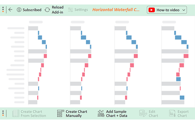
A Waterfall chart can serve as a comparison chart, especially when visualizing changes or differences between various data points or categories. By depicting the cumulative effect of positive and negative values, it allows for a clear comparison of different scenarios, periods, or categories.
| Category | Year | Amount |
| Starting Balance | 2021 | 100,000 |
| Starting Balance | 2022 | 150,000 |
| Starting Balance | 2023 | 237,000 |
| Sales Revenue | 2021 | 50,000 |
| Sales Revenue | 2022 | 80,000 |
| Sales Revenue | 2023 | 110,000 |
| New Investment | 2021 | 30,000 |
| New Investment | 2022 | 40,000 |
| New Investment | 2023 | 45,000 |
| Operating Expenses | 2021 | -25,000 |
| Operating Expenses | 2022 | -30,000 |
| Operating Expenses | 2023 | -32,000 |
| Loan Payment | 2021 | -10,000 |
| Loan Payment | 2022 | -9,000 |
| Loan Payment | 2023 | -8,000 |
| Other Income | 2021 | 25,000 |
| Other Income | 2022 | 35,000 |
| Other Income | 2023 | 50,000 |
| Ending Balance | 2021 | 170,000 |
| Ending Balance | 2022 | 266,000 |
| Ending Balance | 2023 | 402,000 |

Let’s visualize the data below using one of the best graphs for comparing data (Slope Graph). We’ll be comparing the performance of the current versus previous periods of a hypothetical brand in various states.
| Period | State | Sales |
| Previous | Chicago, Illinois, USA | 14 |
| Previous | Dallas, Texas, USA | 7 |
| Previous | Houston, Texas, USA | 12 |
| Previous | Austin, Texas, USA | 14 |
| Previous | Albany, New York, USA | 31 |
| Previous | Trenton, New Jersey, USA | 24 |
| Previous | Newark, New Jersey, USA | 22 |
| Previous | Helena, Montana, USA | 8 |
| Previous | San Antonio, Texas, USA | 7 |
| Current | Chicago, Illinois, USA | 21 |
| Current | Dallas, Texas, USA | 27 |
| Current | Houston, Texas, USA | 30 |
| Current | Austin, Texas, USA | 69 |
| Current | Albany, New York, USA | 21 |
| Current | Trenton, New Jersey, USA | 34 |
| Current | Newark, New Jersey, USA | 21 |
| Current | Helena, Montana, USA | 21 |
| Current | San Antonio, Texas, USA | 28 |


In this example, we’ll use a Progress Chart in Excel to compare a hypothetical brand’s current versus previous product sales.
| Products | Previous sales | Current sales |
| Robot Vacuum Cleaner | 20 | 7 |
| Indoor Security Camera | 90 | 10 |
| Portable Chargers | 20 | 80 |
| Power Bank | 50 | 50 |
| Dishwasher | 70 | 30 |
| Smart Alarm Clocks | 30 | 70 |
| Electric Deep Fryer | 67 | 33 |
| Coffee Maker Machine | 54 | 46 |
| Laptop Cooling Pad | 40 | 60 |


In this example, we’ll use a Tornado Chart and a Butterfly Chart(both are types of Comparison Charts) to compare the number of men’s apparel orders versus the number of women’s apparel orders in a given financial year.
| Months | No. of Men’s Apparel Orders | No. of Women’s Apparel Orders |
| Jan | 85 | 82 |
| Feb | 95 | 75 |
| Mar | 81 | 79 |
| Apr | 65 | 55 |
| May | 60 | 43 |
| Jun | 55 | 49 |
| Jul | 59 | 20 |
| Aug | 40 | 60 |
| Sep | 69 | 35 |
| Oct | 89 | 23 |
| Nov | 92 | 23 |
| Dec | 39 | 19 |


In example #5, we’ll use a Pie Chart (one of the types of Comparison Charts) to compare units sold versus product categories.
| Product Category | Units Sold |
| Smart Phones | 1200 |
| Smart Watches | 700 |
| Headsets | 1000 |
| LCD | 1400 |
| Laptops | 600 |
| Accessories | 3000 |


We’ll use the Double Bar Graph (one of the types of Comparison Charts) to compare the performance of class A versus B in various courses, as shown in the table
| Courses | Class A | Class B |
| Computer Programming | 85 | 82 |
| Information Science | 95 | 75 |
| Networking | 81 | 79 |
| Operating Systems | 65 | 55 |
| Artificial Intelligence | 60 | 43 |
| Theory, Logic and Design | 55 | 49 |
| Multimedia | 59 | 20 |
| Automata Theory | 40 | 60 |
| Data Logic | 69 | 35 |


We’ll use the Donut Chart (a key tool in Sports Analytics and one of the types of Comparison Charts) to compare the popularity of various sports.
| Sports | Popularity |
| Football | 60 |
| Baseball | 33 |
| Basketball | 30 |
| Ice Hockey | 15 |


We’ll use the Matrix Chart (one of the types of Comparison Charts) to compare various performance metrics in various locations, as shown below.
| Locations | Analysis | Period | sales |
| Florida | Expenses | Current | 2,470 |
| Florida | Profit | Current | 109 |
| Florida | Loss | Current | 3 |
| Georgia | Revenue | Current | 2,030.9 |
| Georgia | Expenses | Current | 2459 |
| Georgia | Profit | Current | 35 |
| Georgia | Loss | Current | 16 |
| Hawaii | Revenue | Current | 803.1 |
| Hawaii | Expenses | Current | 2,256 |
| Hawaii | Profit | Current | 112 |
| Hawaii | Loss | Current | 14 |
| New York | Revenue | Current | 2,160 |
| New York | Expenses | Current | 1,802 |
| New York | Profit | Current | 87 |
| New York | Loss | Current | 11 |
| Ohio | Revenue | Current | 1,469.9 |
| Ohio | Expenses | Current | 750 |
| Ohio | Profit | Current | 56 |
| Ohio | Loss | Current | 30 |
| Alabama | Revenue | Current | 531.1 |
| Alabama | Expenses | Current | 637 |
| Alabama | Profit | Current | 58 |
| Alabama | Loss | Current | 0 |
| California | Revenue | Current | 1,559.6 |
| California | Expenses | Current | 627 |
| California | Profit | Current | 38 |
| California | Loss | Current | 10 |
| Colorado | Revenue | Current | 377.6 |
| Colorado | Expenses | Current | 626 |
| Colorado | Profit | Current | 21 |
| Colorado | Loss | Current | 2 |
| Connecticut | Revenue | Current | 488.4 |
| Connecticut | Expenses | Current | 619 |
| Connecticut | Profit | Current | 47 |
| Connecticut | Loss | Current | 20 |
| Delaware | Revenue | Current | 4,024.3 |
| Delaware | Expenses | Current | 587 |
| Delaware | Profit | Current | 21 |
| Delaware | Loss | Current | 9 |


We’ll use the Stacked Bar Chart (one of the types of Comparison Charts) to compare the proportion of various age groups in the population of various countries.
| Country | 0 – 14 years | 15 – 64 years | 64 years and older |
| United Kingdom | 5 | 20 | 3 |
| Germany | 6 | 29 | 5 |
| Mexico | 17 | 31 | 2 |
| Japan | 9 | 44 | 10 |
| Russia | 13 | 49 | 5 |
| Brazil | 26 | 55 | 3 |
| United States | 29 | 91 | 15 |


In example #9, we’ll use the Dual Axis Grouped Bar Chart (one of the types of Comparison Charts) to compare reviews in a given time, as shown below.
| Months | Positive Reviews | Negative Reviews |
| Jan | 88 | 23 |
| Feb | 32 | 62 |
| Mar | 66 | 19 |
| Apr | 96 | 23 |
| May | 117 | 42 |
| Jun | 68 | 27 |
| Jul | 85 | 26 |
| Aug | 17 | 56 |


In the following video, you will learn how to create a comparison chart using a Comparison Chart in Excel without any coding in a few clicks.
By comparing key metrics in your data, you can map performance with a significant degree of accuracy. Besides, you can easily identify lapses or growth in performance, especially if you use the recommended types of Comparison Charts.
One of the recommended Comparison Chart types is the Stacked Bar Chart.
Use these Comparison Charts to compare the performance of key metrics in your raw data.
For instance, you can use a Comparison Chart to check how key data points stack up against each other. More so, you can compare sales revenue versus profits in a given financial period.
Extracting comparison insights from raw data is one of the key steps toward mapping growth in your business (or workplace).
You need the best graphs for comparing data metrics. This is where the top 10 types of Comparison Charts come in.
Check out the comprehensive list of comparison-oriented visualization designs:
Use Comparison Charts (above) if your goal is to display in-depth insights into how key metrics stack up against others.
Excel is not recommended if your goal is to generate ready-to-use Comparison Visualization types. The spreadsheet application lacks a huge chunk of the charts we’ve just highlighted above.
Besides, it has pretty basic Comparison Chart templates, which require more work in edits.
We recommend you install third-party apps, such as ChartExpo, into your Excel to access all the Comparison Charts (we’ve highlighted above). ChartExpo is an add-in you can easily download and install in your Excel app. Besides, it has all 10 types of Comparison Charts, plus over 50 more advanced visualization designs.
Sign up for a 7-day trial to access all 10 variants of Comparison Charts.
How much did you enjoy this article?


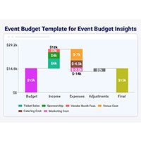
Event budget template keeps event finances clear and controlled. Use one to track costs, compare spending, and stay on budget. Learn more!
MySQL ODBC connector bridges MySQL databases and BI tools for secure, reliable data access across platforms. Set up yours today. Read on!
A ranking chart maker helps turn data into clear rankings for fast comparison. Learn Excel steps, examples, and tools to improve data visualization.