Categories
Comparative analysis is one of the most straightforward methodologies you can leverage to extract insights from your data. You only need to compare the value of one data point against another. One of the straightforward strategies for conducting a comparative analysis is visualizing data using Comparison Charts in Excel.
It gets better.
These visualization designs are incredibly easy to plot and decode if you have a proper tool. And they quickly reveal the similarities and differences of critical variables in your data.
Excel has tables and charts for visualizing data. Yet, it lacks ready-made and insightful charts for comparing key data points.
You don’t have to do away with your Excel. You can supercharge it with a particular add-in to access ready-made Comparison Charts in Excel.
Before jumping right into the how-to guide, we’ll address the following question: Definition of Comparison Chart
Definition: Comparison Graphs fall in the category of visualization designs that can help you compare two or more items.
Using these charts, you can easily extract insights into your raw data by conducting a comparative analysis of key categories and sub-categories.
Visualization Source: ChartExpo
Since there are multiple uses of a Comparison Chart, a sizable number of options fall under this category. For example, you can easily use a simple Bar Chart to compare key data points. However, the visualization design can only do so much, especially if you have more than two variables.
To overcome these shortcomings, we’ve put together a list of Comparison Charts in Excel you have to try.
Keep reading to discover more.
Moreover, utilizing comparison-based visualization designs like the Stacked waterfall chart in Excel allows you to observe differences and similarities between metrics, particularly beneficial when managing a digital marketing campaign
Moreover, they offer a reliable way of highlighting your data in an easy-to-understand format.
It gets better.
Remember, one of the straightforward analyses you can do is a comparison using visualization charts, such as a Waterfall chart. This is because comparing your data uncovers actionable insights that directly improve your results.
Check out some of the examples during comparison analysis.
The chart is suited to display insights into your business’s best and worst performers.
Besides, you can use the charts to compare two data sets to highlight variations and similarities in your data.
Keep reading if your goal is to learn how to plot Comparison Charts in Excel.

Comparison Charts in Excel are versatile and flexible, which means you can analyze diverse data sets.
Check out the power of Comparison Charts in Excel.
Firstly, Comparison Charts in Excel provides you with a versatile way of comparing data using easy-to-read charts and graphs.
There’s a sizable number of Comparison Charts available, which makes it one of the most flexible visualization strategies. You can easily leverage these charts to compare key points for actionable intelligence.
Comparative analysis can help you to learn where to double down on your time, money, and energy.
Secondly, the objective of Comparison Charts in Excel is to help you uncover the strengths and weaknesses of critical variables in data. And this means you can draw valuable insights for continuously improving performance.
It doesn’t matter whether it’s sales or even hiring.
It’s critical to know what’s working and what isn’t if your goal is to maximize returns and cut costs in the long term.
Insights from these charts can help you discover ways to enhance your efforts by minimizing weak links and maximizing strengths.
While it’s remarkable to know what you’re doing right, we recommend you invest time investigating what’s going wrong. Draw a graph from a table in Excel to visually pinpoint issues and opportunities for improvement.
Comparison Charts in Excel not only show you the strengths and weaknesses attributes of key variables in data, but they also cut the learning curve.
Remember, data is changing all the time.
Yes, you read that right.
Agility in adopting changes is vital. The longer you take, the less valuable these improvements become. Besides, you risk losing your market to the competition.
Comparison graphs and charts can help you detect the best and worst performers in areas, such as sales.
Thirdly, opportunities in your data are always appearing. You can continuously steer your strategies using data if you have Comparison Charts in your armory. One of the ways Comparison Charts uncover hidden opportunities is by pointing out gaps and outliers in your data.
Lastly, you can quickly evaluate the competition for more insights.
Remember, competition plays a significant role in your overall performance.
But it can easily detract from your core objective. On the other hand, if you lack intelligence about what your rivals are doing, it will be challenging to measure their impact on your bottom line. This is where Comparison Charts come in, such as a price comparison template in Excel, which can help you visualize and analyze competitor pricing effectively.
You can leverage these charts to conduct a competitive analysis that can reveal new answers. For instance, you might discover who you thought was your biggest competitor isn’t so moving needles anymore. Conversely, new players in the market that you weren’t aware of may have taken their place.
Comparison Charts in Excel can help you evaluate the competition using attributes, such as:
In the coming section, we’ll address the best comparison charts in Excel.
There are 2 key types of Comparison Charts, namely:
Comparison Bar Charts are arguably the most familiar choice of all types.
It uses bars to compare the values of key data points along a specific dimension, such as time.
The taller the bar, the more value the data point holds. This chart type highlights the categories and items that are most and least important in your data.
You can introduce additional bars and axes if you want to add a greater dimension to your comparative analysis.
A Dual Axis Grouped Bar Chart is one of the visualization designs that allows you to track multiple dimensions because of the extra y-axis. For instance, you can easily visualize cost versus revenue versus time, using different scales in the same chart.
Comparison Line Charts are excellent at showcasing trends, shifts, and other patterns.
You can draw direct comparisons by judging the slope of the lines between key data points. Besides, you can analyze multiple data points alongside one another.
However, one of the weaknesses of this chart category is that lines may cross paths, making it hard to tell one item from the next.
Adding colors to your Comparison Charts is critical, especially when performing comparative analysis on varying variables in your data. And just like a Comparison Bar Visualization, you have full freedom to add additional Y-axes to accommodate more dimensions.
Some of the Comparison Charts in Excel examples include:
Keep reading because, in the ensuing section, we’ll address the following question: How to Create Comparison Charts in Excel?

Comparative visualization is a form of analysis you can use to extract answers from your data.
More so, one of the standard tools for conducting comparative data visualization is charts and graphs in Excel. However, the spreadsheet application lacks ready-made Comparison Charts and Graphs.
We’re not advising you to do away with Excel in favor of other expensive tools.
This is because there’s an amazingly affordable visualization tool that comes as an add-in you can easily install in Excel to access insightful and easy-to-customize comparison-based charts. The application is called ChartExpo.
What is ChartExpo?
ChartExpo is an add-in you can easily install in your Excel without needing tutorials.
With many ready-to-go and insightful charts, graphs, and maps, ChartExpo turns your complex, raw data into easy-to-interpret and visually appealing Comparison Charts in Excel.
In the coming section, we’ll show you how to analyze your data using the Comparison Charts in Excel.
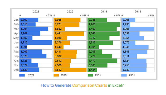
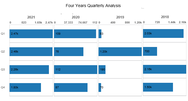
This section will use a Matrix Chart (one of the Comparison Charts) to visualize the data below.
Let’s dive in.
| Quarter | Year | Period | Orders |
| Q1 | 2021 | Current | 2470 |
| Q1 | 2020 | Current | 109 |
| Q1 | 2019 | Current | 83 |
| Q1 | 2018 | Current | 2030 |
| Q2 | 2021 | Current | 2459 |
| Q2 | 2020 | Current | 76 |
| Q2 | 2019 | Current | 1200 |
| Q2 | 2018 | Current | 700 |
| Q3 | 2021 | Current | 2256 |
| Q3 | 2020 | Current | 112 |
| Q3 | 2019 | Current | 190 |
| Q3 | 2018 | Current | 2160 |
| Q4 | 2021 | Current | 1802 |
| Q4 | 2020 | Current | 87 |
| Q4 | 2019 | Current | 70 |
| Q4 | 2018 | Current | 1500 |


Check out the why use comparison charts in Excel:
Intuition is natural.
Yes, it’s the inner voice speaking to you. However, profitable ventures don’t run on gut feeling and intuition they are data-driven. This is where Comparison Charts come in. They help you establish what’s working and what’s not.
Uncovering hidden patterns and trends is tremendously straightforward if you use Comparison Charts in Excel.
For instance, you can quickly point out how your target audience interacts with your marketing ads.
These visualization designs can help you make sense of the patterns and trends to back up business decisions.
Data is less valuable, especially if you’re unable to translate it into digestible information. Comparison Charts in Excel can help you to distill signals from noise in your data and imply you can draw tons of hidden answers.
Besides, these charts are 10 times more effective than pivot tables, where you’re likely to commit sizable hours to extract answers.
Creating effective comparison charts in Excel involves careful consideration of the data you’re presenting and selecting the appropriate chart type. Here are some tips to help you create impactful comparison charts in Excel:
Select the chart type that best suits your data and the message you want to convey. Common comparison chart types include bar charts, column charts, line charts, pie charts, and radar charts.
Avoid clutter and complexity. A simple, clean design is more effective for conveying information. Use clear labels, minimal colors, and a straightforward layout.
Ensure that your chart axes are labeled clearly with relevant titles. Include units if necessary to provide context for your data.
If your comparison involves different categories or groups, use consistent colors to represent each category. This helps in maintaining clarity and makes the chart more visually appealing.
Emphasize important data points by using colors, data labels, or annotations. This helps draw attention to critical information in your comparison chart.
Comparison Charts display the comparison insights into multiple metrics in your data.
Besides, they fall in the category of visualization designs that can help you compare two or more items.
You can easily extract insights into your raw data by conducting a comparative analysis of key categories and sub-categories using these charts.
Comparative analysis is one of the easiest methodologies you can leverage to extract insights from your data.
You only need to compare the value of one data point against another.
One of the straightforward strategies for conducting a comparative analysis is visualizing data using Comparison Charts in Excel.
These visualization designs are incredibly easy to plot and decode if you have a proper tool. They quickly reveal critical variables’ similarities and differences in your data.
How much did you enjoy this article?


Learn how to use sparklines in Excel to quickly visualize trends inside cells. Discover types, creation steps, customization, use cases, benefits, and best practices.

Learn what a confidence interval graph is, how to create it in Excel, and how to interpret results to make more reliable, data-driven decisions.

A correlation matrix in Excel helps identify relationships between variables. Learn how to create, read, and use it for effective data analysis.


