Categories
Some charts are better suited for visualizing year-over-year (YoY) data than others. In other words, they display insights in a clear and easy-to-follow way.
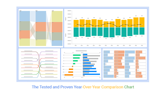


Examples of yearly comparison charts include
The charts highlighted above are amazingly easy to read and interpret, even for non-technical audiences.
Excel has very basic Slope, Comparison, Sentiment Trend, Progress, and Matrix Charts. Yes, the spreadsheet tool comes with pretty basic charts that need more time and effort in editing.
You don’t have to do away with Excel. You can supercharge it by installing third-party add-ons to access ready-to-use and visually appealing year-over-year comparison charts. You can create a year-over-year comparison chart in Excel using chart add-on.
In this blog, you’ll learn the following:
Before jumping into the blog’s core, let’s address the following question: What is a year-over-year chart?
Definition: Year-over-year (YOY) charts compare data from one period to the prior one. The charts are widely used in discussing economic or financial data.
YoY provides a high-level view of the performance between two financial periods. Besides, it offers comparison insights into financial performance using different types of charts. You can easily compare budget spending and return on investment between two distinct financial periods in marketing by leveraging the right types of charts.
Year-over-year (YOY) growth is a key performance indicator for comparing growth in one period (usually a month) against a previous one.
Unlike standalone monthly metrics, YOY gives you a picture of your performance without seasonal effects, monthly volatility, etc. Besides, you can easily see a clearer picture of your actual successes and challenges over time. Unsurprisingly, this is a key metric for retail analytics.
The most significant advantage of YOY growth is eliminating seasonality from your growth metrics.
Most retailers see a sharp uptick in sales during the holiday season. This can give a false indication of massive growth on a single-month basis.
However, these inflated numbers aren’t truly representative of growth over time. To better understand the data, you might want to create an Area chart or use a price comparison template. This can help you visualize the differences more clearly. If these numbers return to normal levels after the holidays, the chart will clearly show the actual trends.
YoY growth is more than just revenue. You can measure myriad aspects of your development, namely: conversions, average sale value, and other related metrics.
The YoY percentage change denotes a change in percentage terms.
For example, rather than using raw numbers to describe how much a company’s net profit climbed for January 2021 and January 2020, a year-over-year percentage change is expressed as profit increasing by 10%.
Let’s use a real-world example to illustrate this.
Imagine your monthly revenues for January 2021 were $1,000, and revenues for January 2020 were $900.
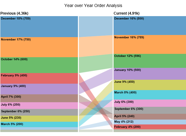
Check out one of the examples of the yearly comparison chart below.

In the coming section, we’ll address the following question: what’s the best-suited chart for comparing yearly data?
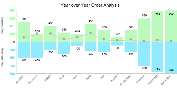
Take a look at the table below. How easy is it to create a meaningful data story?
| Month | Current Year | Previous Year |
| January | 500 | 400 |
| February | 200 | 400 |
| March | 400 | 200 |
| April | 240 | 300 |
| May | 212 | 100 |
| June | 450 | 230 |
| July | 300 | 250 |
| August | 123 | 90 |
| September | 300 | 250 |
| October | 596 | 600 |
| November | 789 | 750 |
| December | 800 | 789 |
Note the difference after visualizing the data using the following different types of comparison charts: Slope, Comparison, Sentiment Trend, Progress, and Matrix Charts.
A Waterfall chart, also referred to as a Bridge Chart in finance, is a dynamic visualization tool akin to a bar graph, revealing the evolution of an initial value through successive changes over time or categories.

It provides a detailed before-and-after depiction of data, delineating each step in the journey and elucidating the contributing factors that either bolster or hinder the progression.
Slope Charts (one of the best graphs for year-on-year comparison) are simple graphs that quickly and directly show transitions, changes over time, absolute values, and even rankings. Besides, they’re also called Slope Graphs.

You can use this chart to show your data’s before and after story of key variables.
Use the chart if your goal is to show relative increases and decreases quickly across various categories between two data points.
The best way to explain the value of and use case for slope graphs is through a specific example.
A Comparison Bar Chart is a visualization design that uses composite-colored bars to show comparison insights in a specified period.

The graph is ideal if your goal is to compare more than two key data points. One of the significant advantages of the chart is it’s incredibly easy to read and interpret, even for non-technical audiences.
A Sentiment Trend Graph is one of the best data storytelling charts for demonstrating the trend of sentiments.
The visualization design, one of the best graphs for year-on-year comparison, is amazingly critical, especially if your goal is to track the rise and decline of key metrics, such as sales revenue, through an exponential growth chart.
The line curve in the chart shows the overall pattern and trend of a key variable over a specified period. The visualization design is incredibly easy to decode.
A Progress Bar Chart (one of the year-over-year comparison charts) is a visualization design that displays the progress made in a task or project.

You can use the chart to monitor and prioritize your objectives, providing critical data for strategic decision-making.
The Progress Bar in Excel uses filled bars to display how much of the planned activity or goal has been completed.
To access a ready-made Progress Bar Chart, we recommend downloading ChartExpo (which we’ll talk about later).
A Matrix Graph (one of the year-over-year comparison charts) can help you identify the presence and strengths of relationships between two or more lists of items. Besides, it provides a compact way of representing many-to-many relationships of varying strengths.

Use this chart to analyze and understand the relationships between two or more data sets.
The relationships between items are indicated by a number or color shade in the cell where each pair of elements intersect. For example, in a skills matrix, this visual representation helps identify the proficiency levels across various competencies. The matrix shape you should use depends on the number of elements you want to compare.
In the coming section, we’ll address the following question: how do I compare year-over-year data in Excel?
Excel generates very basic year-over-year comparison charts. And this means you’ve got to spend extra effort and time editing the chart.
You don’t have to undergo all this.
Download and install a particular chart add-in for Excel to access ready-made charts for data stories. In other words, add-ins in Excel help you access ready-made year-over-year comparison charts, such as Matrix, dot plot, and Progress Bar Graphs.
There are thousands of add-ins purposely designed for Excel. To simplify things, we tested over 60 data visualization-based add-ins for Excel Mac, including those for creating a Radar Chart. We’ve narrowed down our results based on the following factors:
The Excel add-in that met all our conditions is ChartExpo.
Let’s take a closer look at ChartExpo.
ChartExpo is an add-in for Excel with a super-friendly user interface, ensuring that any professional can visualize data, including creating funnel charts, regardless of their programming skills.
The tool supercharges your Excel by expanding its library with a large number of visually appealing and ready-to-go year-over-year comparison charts in Excel, including formats like a percentage bar graph for clearer comparisons.
ChartExpo also contains many ready-made comparison chart templates that can help you save time.
This section will use a Matrix Chart to visualize the data below:
| Quarter | Year | Period | Orders |
| Q1 | 2021 | Current | 2470 |
| Q1 | 2020 | Current | 109 |
| Q1 | 2019 | Current | 83 |
| Q1 | 2018 | Current | 2030 |
| Q2 | 2021 | Current | 2459 |
| Q2 | 2020 | Current | 76 |
| Q2 | 2019 | Current | 1200 |
| Q2 | 2018 | Current | 700 |
| Q3 | 2021 | Current | 2256 |
| Q3 | 2020 | Current | 112 |
| Q3 | 2019 | Current | 190 |
| Q3 | 2018 | Current | 2160 |
| Q4 | 2021 | Current | 1802 |
| Q4 | 2020 | Current | 87 |
| Q4 | 2019 | Current | 70 |
| Q4 | 2018 | Current | 1500 |


In the following video, you will learn how to create a year-over-year comparison chart in excel.
Next we are going to learn when we need to use Year-over-year Comparison charts.
Taking industry cycles into consideration allows you to compare big-picture growth accurately and scale.
Suppose you’re working in a SaaS environment.
In that case, tracking metrics such as Customer LTV gives you a long-term view of the relationship between retention and how much customers contribute to your bottom line.
Metrics can vary dramatically between quarters, which often means seasonality is at play. However, if they change dramatically between years, you might consider looking deeper, perhaps by using a Mekko chart or other options to analyze the shifts across different dimensions and identify underlying trends.
Did you try a new activation channel or growth tactic and see your conversions drop?
Perhaps it’s an opportunity to iterate and experience.
While year-over-year growth is a critical calculation to track in your business, it can help you get a birds’ eye view of your performance.
Alternatives of year-over-year comparison charts include:
Year-over-year (YoY) charts track the performance of a particular financial year relative to the previous ones. On the other hand, the year-to-date (YTD) tracks performance from the start of a particular financial year.
In other words, YTD and YoY are two different metrics, which means you need different charts.
Some charts are better suited for visualizing year-over-year (YoY) data than others.
Examples of YoY comparison charts include:
The charts highlighted above are amazingly easy to read and interpret, even for non-technical audiences.
Excel has very basic Slope, Comparison, Sentiment Trend, Progress, and Matrix Charts. Yes, the spreadsheet tool comes with pretty basic charts that need more time and effort in editing.
You don’t have to do away with Excel. You can supercharge it by installing third-party add-ons to access ready-to-use and visually appealing year-over-year comparison charts.
We recommend you try ChartExpo because it’s one of the most trusted add-ins for Excel. Besides, it has a super-friendly user interface for everyone, irrespective of their computer skills.
Create simple, ready-made, and easy-to-interpret graphs today using our chart add-in for Excel (ChartExpo).
How much did you enjoy this article?


Calculate accounts receivable turnover ratio to measure credit collection speed, improve cash flow, and strengthen your financial strategy. Read on!

Change Management KPIs are the key to tracking adoption, performance, and ROI during transitions. Find out which metrics matter. Read on!

Data collection methods and techniques determine the quality of every insight you act on. Explore key approaches for gathering reliable data. Read on!


