Categories
A Comparison Bar Chart is arguably among the most straightforward visualization designs best suited for displaying month-to-month insights.


Besides, the chart is straightforward to read and interpret.
Excel has a very basic month-to-month Comparison Excel Chart. Yes, the spreadsheet tool comes with pretty basic charts that need more time and effort in editing.
You don’t have to do away with Excel. You can supercharge it by installing third-party add-ins to access ready-to-use and visually appealing Comparison Bar Charts.
A Comparison Chart (as the name indicates) is used to compare varying metrics within your data against dimensions, such as time.

You can use month-to-month comparison Excel Charts, such as Comparison Bar Graphs, to analyze the progress of different categories within your data.
The chart is amazingly easy to read and interpret, even for non-technical audiences.
You can also use a graph like a Radar Chart to compare different products and services in the market before buying. In digital marketing, you can compare the performance of various attribution sources to establish the primary source of traffic.
One of the significant benefits of a month-to-month Comparison Chart is that you can compare the performance of various variables.
You can leverage charts, such as the Tornado chart example, to assess your firm’s weaknesses and strengths, identify gaps, and implement changes for more success.
You’ll learn how to create a month-to-month Comparison Chart to curate compelling data stories in the coming section.
Excel can produce a range of charts from basic to advanced, including a Stacked waterfall chart in Excel. However, this also implies that you may need to invest additional time and effort in editing the chart to suit your specific needs and preferences
You don’t have to undergo all this.
Download and install a particular third-party add-in into your Excel to access a ready-made month-to-month comparison Excel chart, as well as a price comparison template in Excel that can help streamline your analysis.
There are thousands of add-ins purposely designed to create advanced Excel charts. To simplify things, we tested over 60 data visualization-based add-ins.
We narrowed down our results based on the following factors:
The Excel add-in that met all our conditions to create Excel charts is ChartExpo.
The tool comes with a ready-made month-to-month Comparison Excel Chart that needs minimal editing.
Let’s take a closer look at ChartExpo.
ChartExpo is an Excel-based add-in with an ultra-friendly user interface that allows professionals to visualize data effortlessly, including complex visuals like a Waterfall chart, regardless of their coding or programming skills.
How to create a month-to-month Comparison Chart in Excel should never throw a curveball at you when you have the best comparison chart maker (ChartExpo). Keep reading to discover more.
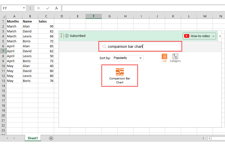
This section will use a Comparison Bar Graph (a month-to-month Comparison Excel chart variant) created using a chart maker to display insights into the table below.
| Months | Name | Sales |
| March | Alan | 90 |
| March | David | 82 |
| March | Lewis | 66 |
| March | Boris | 72 |
| April | Alan | 85 |
| April | David | 62 |
| April | Lewis | 50 |
| April | Boris | 73 |
| May | Alan | 40 |
| May | David | 60 |
| May | Lewis | 80 |
| May | Boris | 76 |


In this video, you’ll learn How to make a comparison chart in Excel.
Visualization tools, such as Excel, have pretty basic month-to-month charts you can use to create data stories.
And this means you’ve got to invest more time in editing.
However, you can supercharge your Excel by installing a particular add-in called ChartExpo to access ready-made comparison charts.
The month-to-month charts, such as the Comparison Bar Graph, are arguably among the most straightforward visualization designs best suited for time-based insights.
Besides, the charts are amazingly easy to read and interpret.
Excel is a popular data visualization tool among professionals and owners. However, the application has very basic trend analysis-oriented charts, such as the Vertical Axis Line Chart. Essentially, you have to manually edit the chart, which is time-intensive.
So, what’s the solution?
We recommend installing third-party apps, such as ChartExpo, into your Excel to access ready-made month-to-month Comparison Excel Charts.
ChartExpo is an add-in you can easily download and install in your Excel app. Besides, this tool comes loaded with insightful and easy-to-interpret month-to-month Comparison Excel Charts.
Here’s the bottom line: You don’t need programming or coding skills to visualize your data using ChartExpo.
How to create a month-to-month Comparison Chart in Excel should never stress you or even consume a lot of your time.
Sign up for a 7-day free trial today to access easy-to-interpret and visually appealing month-to-month Comparison Excel Charts.
How much did you enjoy this article?


Learn how to use sparklines in Excel to quickly visualize trends inside cells. Discover types, creation steps, customization, use cases, benefits, and best practices.

Learn what a confidence interval graph is, how to create it in Excel, and how to interpret results to make more reliable, data-driven decisions.

A correlation matrix in Excel helps identify relationships between variables. Learn how to create, read, and use it for effective data analysis.


