Categories
Are you looking for ways to make your data more appealing in Excel?
Excel has many advanced charts and graphs to help you present your data more effectively. Some of the advantages of using advanced Excel charts are that they enable you to present complex data appealingly, compare different data sets, and make better decisions.
In this article, you will go through some of the most advanced Excel charts and graphs to help you visualize your data. So without further ado, let’s get started.
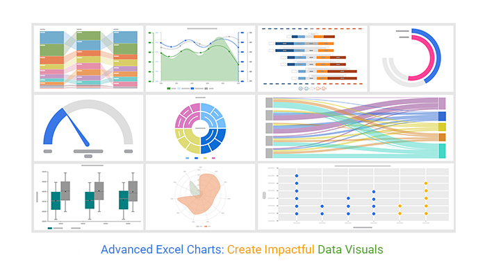
Visualizing data is one of the most powerful ways to make sense of it. With the right charts and graphs, you can quickly get insights into your data and make informed decisions. Excel has a wide range of charts that you can use to visualize your data. Excel has something for everyone, from simple bar charts to an advanced Waterfall chart.
However, not all charts and graphs are created equal. Some charts are more advanced than others, like a Funnel chart, and require more effort to create and understand. Here, we’ll focus on some of the most advanced Excel charts and graphs. Another example is side-by-side bar charts, which you can use to visualize your data effectively.
The Sankey Diagram is a powerful tool for visualizing flows and relationships between different elements. It is a great way to visualize complex data sets and track the flow of information.
This chart is often used to show energy or material flows between different nodes and is perfect for financial charts that show how different elements are related and how one data set affects another.

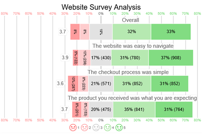
Likert Scale Charts measure people’s attitudes and opinions toward a particular topic. They are used in market research surveys. They consist of a series of statements that people must rate on a scale from one to five.
We can then visualize this data in a chart format to display the results of surveys or other data sets.
The Comparison Bar Chart is a great way to compare different elements in a data set. We use this type of chart to compare different items or elements, which is perfect for quickly visualizing their differences. We can also use it to compare the performance of two or more items.

The Gauge Chart is a great way to display real-time data and monitor the progress of a project or task. Thus, it is a perfect chart for quickly getting insights into your data.

The Multi-Axis Line chart is a great way to visualize multiple data points in a single chart. We use it to compare the performance of different products or services over time. Multi-Axis Line charts provide an effective way to compare the performance of different sets of data.

The Sunburst Chart is a great way to display hierarchical data appealingly. We use it to visualize data sets with multiple levels or layers, which is perfect for quickly getting insights into your data. It is also useful for displaying the size of each category in a hierarchical structure.

A Radar Chart, also known as a Spider Chart or Web Chart, is used to compare multiple variables across various categories. It spreads the round around the circular look and data from the center is distributed based on the values.
It uses lines to connect data points, creating a spider-like or radar shape. When you have limited set of data, Radar Charts are a great way to visualize and compare multiple variables. For larger data sets it may get clutter.

A Radial Bar Chart is a Bar Chart variation used to display data in a radial shape. It is a two-dimensional chart that uses bars to represent data points, creating a radial shape. Radial Bar Charts are useful for displaying cyclical data or comparing data points across multiple categories, and they can even enhance a price comparison template by offering a visually engaging way to analyze pricing data across various products or services.

A Box and Whisker Chart is a type of chart used to display the distribution of a data set. It uses boxes and lines to represent the data’s minimum, maximum, median, first quartile, and third quartile. Box and Whisker Charts are a great way to visualize the spread of a data set quickly.

A Dot Plot Chart is a type of chart used to display data points. It uses dots to represent data points, creating a plot of points. Dot Plot Charts are a great way to visualize many data points and compare them to each other.

This is because there’s an amazingly affordable visualization tool that comes as an add-in you can easily install in Excel to access insightful and easy-to-customize advanced Charts, including Pyramid charts, in Excel. The application is called ChartExpo.
What is ChartExpo?
ChartExpo is an add-in you can easily install in your Excel to access ready-made and visually appealing Charts, including Tornado charts, in Excel, along with other advanced visual tools like a ranking chart maker that helps you quickly organize and compare data in a clear, structured way.
ChartExpo comes with a free 7-day trial. Essentially, if you’re not satisfied with the tool within a week, you can opt out as easily as signing up for a trial. This makes it easy to explore advanced visualizations like a Control chart in Excel without any long-term commitment.
ChartExpo charts are available both in Google Sheets and Microsoft Excel. Please use the following CTA’s to install the tool of your choice and create beautiful visualizations in a few clicks in your favorite tool, including for datasets such as population pyramid and other analytical models
Using the following example, let’s learn how to create a Sankey Diagram in Excel. Below you have website traffic flow data.
| From | Sources | Web Pages | Traffic |
| Product Page | Checkout Page | 10831 | |
| Product Detail Page | Contact us | 22121 | |
| Product Detail Page | Checkout Page | 26751 | |
| Home Page | Product Page | 28240 | |
| Home Page | Contact us | 24506 | |
| Direct | Home Page | Product Detail Page | 28166 |
| Direct | Product Page | Product Detail Page | 28074 |
| Direct | Contact us | 10779 | |
| Direct | Product Page | Checkout Page | 11449 |
| Direct | Product Detail Page | Contact us | 19316 |
| Product Detail Page | Checkout Page | 27440 | |
| Home Page | Product Page | 16351 | |
| Home Page | Contact us | 28424 | |
| Home Page | Product Detail Page | 24986 | |
| Product Page | Product Detail Page | 10182 | |
| Contact us | 18607 | ||
| Product Page | Checkout Page | 18375 | |
| Product Detail Page | Contact us | 10815 | |
| Product Detail Page | Checkout Page | 22742 | |
| Home Page | Product Page | 28432 | |
| Google Ads | Home Page | Contact us | 17722 |
| Google Ads | Home Page | Product Detail Page | 11160 |
| Google Ads | Product Page | Product Detail Page | 11722 |
| Google Ads | Contact us | 19854 | |
| Google Ads | Product Page | Checkout Page | 21936 |
| SERP | Product Detail Page | Contact us | 23250 |
| SERP | Product Detail Page | Checkout Page | 26512 |
| SERP | Home Page | Product Page | 10236 |
| SERP | Home Page | Contact us | 22565 |
| SERP | Home Page | Product Detail Page | 17076 |
| SERP | Product Page | Product Detail Page | 24402 |
| SERP | Contact us | 27724 |


The best tool to create advanced charts in Excel is ChartExpo. It provides a comprehensive set of charting capabilities that are more advanced than those offered in Excel. It also offers automatic chart formatting, data labels, and more.
With ChartExpo, you can create Sunburst Charts, Treemap, Radar Charts, Radial Bar Charts, Box and Whisker Charts, Dot Plot Charts, Likert Scale Charts, Circular Charts, and Sankey Diagrams.
Yes, ChartExpo offers a wide range of customization options to make your charts like the best Mekko charts and many more look the way you want.
These are some of the most advanced Excel charts and graphs you can use to visualize your data. From Sankey Diagrams to Dot Plot charts, there is something for everyone. So if you’re looking for ways to make your data more appealing in Excel, these charts and graphs like a waterfall graph are a great place to start.
With the right charts and graphs, you can quickly get insights into your data and make informed decisions. So start exploring the magic of charts and graphs today with ChartExpo.
How much did you enjoy this article?


Learn how to use sparklines in Excel to quickly visualize trends inside cells. Discover types, creation steps, customization, use cases, benefits, and best practices.

Learn what a confidence interval graph is, how to create it in Excel, and how to interpret results to make more reliable, data-driven decisions.

A correlation matrix in Excel helps identify relationships between variables. Learn how to create, read, and use it for effective data analysis.


