Categories
By ChartExpo Content Team
Survey bias skews data, leading to flawed conclusions. It hides in question wording, respondent selection, and even survey timing. Without spotting it, businesses waste budgets, policies miss the mark, and research loses credibility.


Bias isn’t always obvious. A simple word choice can push respondents toward an answer. A poorly selected sample can exclude key voices. Even the way questions are ordered can shape results. Survey bias sneaks in, leaving data that looks solid but misleads decision-makers.
Ignoring survey bias costs time, money, and trust. It leads to marketing flops, ineffective policies, and bad investments. Spotting and reducing bias isn’t just good practice—it’s necessary. Want accurate data? Start by questioning the questions.
First…
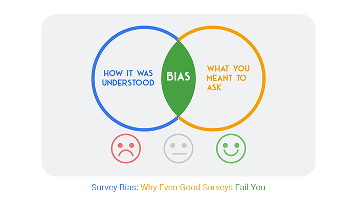
Survey bias occurs when the data collected through surveys is distorted due to flaws in question design, respondent selection, or data collection methods. This bias leads to inaccurate conclusions that do not reflect the true opinions or behaviors of the target population.
Common causes include leading questions, unrepresentative sampling, and response biases that influence how participants answer. When survey bias goes unchecked, it can mislead businesses, researchers, and policymakers, resulting in flawed decisions and unreliable insights.
Recognizing and mitigating survey bias is essential to ensuring data accuracy and making data-driven decisions based on trustworthy results.
Business strategies heavily rely on data from market research, including surveys. If this data is biased, the strategies based on it are likely flawed from the start. For instance, a retail company might make stocking decisions based on biased customer feedback surveys. This could result in overstocking unpopular products and understocking potential best-sellers.
In the tech industry, product development often pivots on user feedback. Biased feedback can lead to developing features that aren’t needed. These unnecessary features waste resources and can make the product more complicated than helpful. This misstep could lead to poor user adoption and eventually, product failure.
Financial institutions might use survey data to decide on new branch locations. Bias in this data could lead to branches in locations where there’s little demand for banking services. This misallocation of resources can be costly and could hinder the institution’s growth in more lucrative areas.
Often, biased data aligns with pre-existing beliefs or expectations, making it feel “right.” This confirmation bias can prevent decision-makers from questioning the data’s validity. For example, a marketing team might ignore data that doesn’t support their successful campaign narrative. Instead, they focus on biased data confirming their perceived success.
In politics, biased poll results can mislead a campaign about where to focus their efforts. If they believe they are leading comfortably in one area (based on biased data), they might allocate resources elsewhere. This could lead to unexpected losses where the data was incorrect but felt right.
In social services, agencies might use biased data to assess the effectiveness of their programs. This can lead to continuing ineffective programs because the data suggests they are doing well. The result is continued funding for programs that don’t meet the community’s needs.
Cognitive biases influence how questions are framed, how data is collected, and how results are interpreted. For instance, the confirmation bias of a researcher might lead them to subconsciously select survey populations that will likely provide desired answers. This creates a feedback loop where biased data reinforces existing beliefs, which in turn influences future surveys.
Another example is the bandwagon effect, where people’s opinions are swayed by the majority opinion. If early survey results are shared publicly, they might influence later responses, skewing the data further. This is particularly problematic in public opinion surveys during election seasons.
Lastly, the Dunning-Kruger effect can lead inexperienced researchers to overlook nuances in survey design that mitigate bias. Their lack of expertise can result in poorly crafted surveys that do not capture true, unbiased responses. This cycle of bias can be hard to break without conscious effort and expertise in survey design and data analysis.
Biased survey questions can mislead respondents. They might suggest a certain answer or misinterpret the question’s intent. This manipulation often occurs subtly through word choice or question framing. To avoid these pitfalls, questions should be neutral. They must not hint at preferred responses or assumptions.
Using clear, precise language is crucial. Ambiguous or leading terms can introduce bias. They influence the respondent’s answer. Neutral wording helps in collecting genuine and unbiased data. It reflects the true opinions of the respondents.
Leading questions are a common source of survey bias. They subtly prompt respondents to answer in a particular way. This manipulation might seem harmless but can significantly distort the data. For instance, asking, “Don’t you agree that product X is fantastic?” nudges towards a positive response.
To combat this, rephrase questions to be open-ended without a leaning tone. Instead of the above, ask, “How would you rate product X?” This approach ensures responses are based on personal views, not prompted by the question’s phrasing.
Anchoring bias occurs when the first question influences how respondents answer subsequent ones. Initial information provided sets a context that impacts all following answers. For example, starting with a question about personal income might affect how one answers questions about spending habits.
To mitigate this, carefully order your questions. Ensure that each is independent and does not lead to biased interpretations of other questions. Sometimes, randomizing the order of questions can help. This technique reduces the chance of earlier questions affecting later responses.
CSAT survey charts are vital for gauging customer satisfaction. Yet, they can mislead if not used carefully. For instance, a high CSAT score may seem to indicate satisfaction across the board. However, it might only reflect the views of a vocal minority who respond to surveys. This scenario can provide a skewed perception of overall customer sentiment.
Businesses often display average scores in these charts. This method glosses over individual dissatisfactions or extreme opinions. It can create a false sense of success. To avoid this, it’s crucial to look beyond the averages. Analyzing individual scores and feedback can reveal more about customer experiences.
Diving deeper, segmenting the data based on various customer demographics can also uncover hidden dissatisfaction. This approach helps businesses identify specific areas needing improvement. Thus, while CSAT charts are helpful, they require a nuanced interpretation to prevent misleading conclusions about customer satisfaction.
Likert scale charts are commonly used in surveys to measure attitudes or perceptions. However, their design can lead to skewed results, especially with the central tendency bias. This bias occurs when respondents avoid extreme responses on the scale, often opting for middle options. Such tendencies can dilute the actual sentiments being measured, leading to data that doesn’t accurately reflect respondent opinions.
Another issue is the assumption of equidistance in Likert scales. Survey designers often treat the jump from ‘strongly disagree’ to ‘disagree’ as equal to that from ‘disagree’ to ‘neutral.’ In reality, the emotional or perceptual distance between these choices might not be equal, further complicating data interpretation.
To mitigate these risks, it’s advisable to use balanced scales and ensure clear, unambiguous statements. Also, providing respondents with a ‘not applicable’ option can help filter out irrelevant responses, enhancing the accuracy of the data collected. This careful structuring and analysis can help uncover the true insights from Likert scale data, avoiding the pitfalls of skewed scoring.
The following video will help you to create a Likert Scale Chart in Microsoft Excel.
The following video will help you to create a Likert Scale Chart in Google Sheets.
The following video will help you to create a Likert Scale Chart in Microsoft Power BI.
Sampling bias sneaks into surveys when the participants chosen aren’t representative of the broader group. This error can doom your survey from the start by giving you skewed data that doesn’t reflect reality. Imagine trying to understand a forest ecosystem by only examining the plants in a single clearing!
Often, this problem arises from convenience sampling, where researchers choose participants because they are easy to reach. For instance, using only online survey tools can exclude those without internet access or tech-savvy, potentially misrepresenting age groups like the elderly.
To avoid this, consider using multiple methods to reach your audience. Combine online surveys with mail, phone interviews, or even face-to-face interactions. This blended approach broadens your reach, pulling in a wider array of perspectives and significantly reducing the risk of sampling bias.
Selection bias occurs when participants are not randomly chosen but selected based on specific traits, leading to non-representative sample groups. This bias can seriously skew survey outcomes, as it doesn’t give all potential respondents an equal chance to participate. Picture picking only red apples from a tree laden with fruits of various colors and then claiming all apples are red!
This bias often happens during the recruitment phase of a survey. For example, if you post a survey link on a specific online forum, you might only attract users frequenting that site, who may share similar opinions, ignoring wider public opinion.
To mitigate this, employ random sampling techniques where every member of your population has an equal chance of being selected. This method helps in achieving a more accurate representation of the whole group, ensuring that your survey insights are valid and reliable.
Survivorship bias is a deceptive pitfall that leads researchers to focus only on those who ‘survived’ a particular process, ignoring those who did not. By concentrating solely on success, you miss the critical lessons failures offer. It’s like inferring the safety of airplanes by only looking at those that landed safely, disregarding any that might have crashed.
In the context of surveys, this bias can occur if feedback is gathered only from customers who have remained with a service or product, ignoring those who have discontinued use. This approach can falsely suggest high satisfaction levels, overlooking potential areas for improvement that could be critical to retaining more customers.
The way questions are framed in a survey significantly impacts the responses. Subtle changes in wording can lead to vastly different outcomes. For example, asking “Do you support the new policy?” versus “Do you oppose the new policy?” can elicit responses biased toward the phrasing.
This type of bias is known as question-order bias, where earlier questions influence responses to later ones. Similarly, complex or technical wording can confuse respondents, pushing them to select neutral or unrelated answers, thus skewing the survey results.
Social desirability bias occurs when survey respondents provide answers they think the questioner wants to hear. This bias is driven by the desire to conform to social norms and appear favorable in the eyes of others.
For example, in a survey asking about unethical work behaviors, employees might underreport such behaviors, fearing judgment or repercussions. This tendency can significantly distort survey findings, especially in topics sensitive to social judgment and personal ethics.
Nonresponse bias emerges when certain individuals do not participate in the survey, leading to skewed results. This often happens if the survey is lengthy, causing busier individuals to skip participation. The resulting data then disproportionately represents views from those with more free time, potentially those who feel strongly about the survey topics.
This skew can lead to misleading conclusions, as the silent majority’s perspectives are underrepresented. Understanding the demographic and psychographic profiles of non-respondents is crucial to mitigate this bias.
Collecting data through various channels—online, phone, and in-person—each introduces its biases. Online surveys often attract tech-savvy participants, skewing results toward younger demographics or those comfortable with digital platforms. This method can exclude older populations or those without reliable internet access.
Phone surveys can lead to a different type of bias. They might capture a demographic that prefers personal interaction or has time to engage in phone conversations. This method often misses those who are typically busy during call times, like working professionals or younger individuals who prefer texting to talking.
In-person surveys provide rich, qualitative data but are limited by geographical and logistical constraints. They often gather information from a specific locale, which might not represent wider populations. These surveys are resource-intensive and might only attract participants who have the time and interest in face-to-face interactions.
Relying on a single method for survey data collection is risky. It assumes one type of data gathering can represent diverse populations accurately. This approach often misses nuances that multi-mode methods can capture. For instance, an online-only survey might overlook insights from those who prefer direct interaction, potentially skewing data toward digital-friendly users.
Moreover, single-mode surveys can amplify specific biases inherent in the chosen method. An online survey could disproportionately represent views of younger, more tech-oriented individuals, ignoring the perspectives of older or less tech-savvy participants. This limits the scope and applicability of the findings.
To mitigate these risks, employing a mixed-methods approach ensures broader representation and more balanced data. It allows researchers to cross-validate data across different modes, enhancing the reliability of the survey results.
The gap in access to technology, known as the digital divide, significantly impacts survey research. Surveys conducted online are inherently skewed toward individuals who have internet access and are comfortable using digital tools. This method misses out on critical viewpoints from those without access to technology, often those in lower socio-economic groups or older demographics.
This divide not only affects who can participate but also impacts data quality, influencing the accuracy and reliability of the data collected. Responses may be biased toward the opinions and experiences of more tech-savvy individuals, leaving out a significant portion of the population whose insights might lead to different conclusions.
Addressing this issue involves incorporating alternative data collection methods, such as phone or paper surveys, to include a wider audience. This approach helps in balancing out the tech-centric biases and offers a more comprehensive understanding of the surveyed group.
Confirmation bias occurs when analysts seek out or interpret data that confirms their preconceived notions. This bias can lead to overlooking contradictory evidence, thus skewing the analysis. To counteract this, it’s essential to adopt a neutral stance when reviewing data.
Cognitive bias involves reading into data what isn’t there. Analysts might infer patterns or trends that do not exist due to their subjective interpretation. Rigorous statistical tests and peer reviews can help mitigate these errors, ensuring that interpretations remain objective.
Implicit bias influences how data is interpreted based on unconscious beliefs or stereotypes. This can distort the analytical outcomes, leading to flawed decisions or policies. Awareness training and diverse analytical teams can help reduce the impact of implicit biases.
Each type of bias requires careful consideration and specific strategies for mitigation to ensure that data analysis is both accurate and reliable. By acknowledging and addressing these biases, analysts can improve the quality of their insights and decisions.
Primacy and recency effects play crucial roles in survey responses. Primacy occurs when respondents recall initial options more favorably. Conversely, recency makes them prefer later options. This dynamic shifts based on the list’s length and the respondent’s focus level. To mitigate these effects, researchers can randomize question order or balance the survey’s structure to neutralize biases.
How a question is framed can alter perceptions dramatically. Framing in a positive or negative light can lead respondents to different conclusions. For instance, asking about “the success rate” vs. “the failure rate” of a procedure, despite being statistically identical, elicits different responses. Careful consideration of wording and context is required to minimize these framing biases.
Contrast bias occurs when the response to one question influences the answer to subsequent ones. If an initial question sets a high standard or a specific context, it can make the following responses seem lesser or skewed by comparison. To avoid this, survey designers should consider separating contrasting questions or providing palate cleansers in between heavy or emotionally charged topics.
To address and correct question order bias, several strategies can be employed. These include randomizing the order of questions, ensuring a logical flow, and interspersing neutral questions to reset respondent biases. By integrating these methods, researchers can enhance survey accuracy and reliability, leading to more dependable data collection.
The vocal minority problem occurs when a small group of respondents, who are more outspoken, overshadow the silent majority. These respondents are highly active in providing feedback, which can distort the perception of a product or service.
Their responses are often more extreme, whether positive or negative, which can skew the overall analysis. This issue is crucial because it can lead businesses to believe that these opinions represent the entire customer base, which is rarely the case.
Addressing this requires businesses to implement strategies to encourage a wider range of responses. Methods might include making surveys more accessible, offering incentives for participation, or reaching out directly to less active customer segments. By broadening the respondent pool, companies can obtain a more accurate gauge of customer satisfaction and sentiment.
Surveys often capture the extremes of customer emotions—those who are very happy or very angry. These groups tend to be more motivated to share their experiences, overshadowing the moderate and mixed responses that might provide more nuanced insights.
The feedback from these extremes can create an imbalanced view of customer satisfaction, leading to skewed business strategies.
To mitigate this, companies need to design surveys that capture a broader emotional range. This might involve asking more detailed questions that allow for gradient responses rather than simple yes/no answers.
Additionally, following up with customers who provide moderate scores can unearth more detailed insights, helping to balance out the extremes.
Passive respondents, or those who rarely provide feedback, often go unheard in surveys. This group might actually hold the majority opinion but their lack of participation can lead to significant gaps in data.
Their silence often stems from believing that their feedback won’t lead to real change, or they may not have strong feelings toward the service or product.
It’s vital for businesses to understand why these customers remain silent. Engaging with them through direct communication channels, ensuring anonymity in responses, and simplifying the feedback process can encourage more participation.
Hearing from passive respondents can provide a fuller, more accurate picture of customer attitudes, leading to better-informed business decisions.
Sometimes, customers who report satisfaction still leave negative feedback. This paradox can arise from several scenarios. For instance, a customer might be generally pleased but chooses to highlight a minor issue in an otherwise positive review.
Alternatively, the survey might capture their feedback on a bad day, which isn’t reflective of their overall positive experience. These anomalies introduce false positives into data analysis, complicating the interpretation of feedback and assessment of product satisfaction.
Brand loyalty significantly influences customer feedback. Loyal customers often overlook minor issues, which might lead them to provide overly favorable feedback. This distortion can mask potential areas for improvement, as their bias towards the brand colors their perception of the product.
Consequently, new or less loyal customers’ genuine concerns might be underrepresented or ignored, based on the skewed feedback from brand loyalists.
The difference in feedback between free trial users and paying customers can also introduce bias. Free trial users might rate a product highly, motivated by the novelty or zero cost associated with the trial. In contrast, paying customers have higher expectations and their feedback might be more critical.
This discrepancy can lead to a biased understanding of overall customer satisfaction, where the enthusiastic reviews of trial users overshadow the critical feedback from paying customers.
Crafting survey questions demands neutrality to avoid bias. Phrasing questions in a way that doesn’t lead respondents is vital. This ensures that responses reflect true beliefs and not the influence of the question’s tone or content.
Neutral wording avoids terms that carry strong emotional connotations or implicit assumptions. For instance, asking, “What issue is most troubling?” assumes the respondent is troubled, which could skew results.
Instead, frame questions to be open and unbiased: “What issue affects you the most?” This approach respects the respondent’s viewpoint without steering their response.
It’s also beneficial to avoid double-barreled questions, which tackle more than one issue but only allow for one answer. Such questions can confuse respondents and muddy the data collected.
Additionally, neutral wording extends to choices provided in multiple-choice questions. Ensuring that options don’t favor one response over another preserves data integrity and maintains accuracy. Striking a balance in question design enhances the reliability of the insights gained.
Randomizing the order of survey responses tackles another form of bias: order effects. Respondents often exhibit a preference for items appearing earlier in a list. By shuffling the order for each participant, this tendency is minimized, leading to more accurate data.
The process involves using survey software that automatically changes the order of answer choices. This method prevents patterns that could influence the results, such as primacy and recency effects—where respondents choose the first or last options more frequently. Randomization ensures each response is weighed fairly, enhancing the survey’s validity.
This strategy is particularly crucial in extensive surveys where fatigue might affect later choices. Keeping respondents on their toes with changing orders can help maintain engagement throughout the survey process. Implementing this simple change can significantly improve the quality of the data collected.
After collecting survey responses, certain data might not accurately represent the broader population. Here, weighting comes into play. This statistical technique adjusts the results to compensate for sample bias or imbalances within the respondent group.
For example, if a survey sample has too many individuals from a particular age group, responses can be weighted to balance this skew. The process involves assigning a weight to each response based on how representative it is of the overall population. More representative responses get a standard weight, while less representative ones are adjusted to diminish their impact.
Weighting can correct discrepancies in demographic representation or response rates among different groups. It’s a powerful tool for enhancing the precision of survey findings, ensuring they more accurately reflect the views of the total population. This method requires careful calculation and understanding of the population and sample to apply the correct weights effectively.
Survey bias distorts results, leading to flawed decisions. It creeps in through question wording, sampling errors, and response tendencies. Ignoring it weakens research, misleads businesses, and wastes resources.
Fixing survey bias starts with awareness. Test questions, randomize order, and reach a balanced sample. Look for hidden influences that could shift answers. Small changes make a big difference.
Bad data leads to bad choices. If you want results you can trust, challenge the way you collect information.
The right question, asked the right way, gets you the truth.
How much did you enjoy this article?


Google Forms to Google Sheets keeps your data organized and current with every submission. Learn the steps, methods, and tips now!

Product survey questions reveal what customers truly think. Learn how to ask the right ones and act on the survey results. Read on!

Learn how the 5-Point Performance Rating Scale improves employee evaluations with clear, consistent, and fair performance reviews across teams.


