Categories
Data analysis has become an integral aspect of any successful business. It enables you to identify trends, zero in on opportunities, and settle on a course of action.


This relies heavily on an analytical report template that summarizes data in detail.
Let’s say you run a retail business and want to understand its performance in different locations.
You can use an analytical report template to write a report.
This report can include sales data, customer feedback, and testimonials. It can also contain information about market trends, customer demographics, and average purchase prices.
Upon analyzing this data, you can decide on product placement and marketing tactics.
Then what is an analytical report template, and how can you create one? This article seeks to answer these questions by guiding you to create an analytical report template in Excel.
Definition: An analytical report template is a structured framework that helps organize data, findings, and insights into a clear and logical format. It guides users in presenting a problem, analyzing relevant information, and offering data-driven conclusions and recommendations.
The template ensures accuracy, objectivity, and clarity by following a consistent layout. This makes it easier for businesses to evaluate performance, identify trends, and make informed decisions.
A brief snapshot of the problem, key findings, and recommendations for quick understanding.
Outlines the purpose, scope, and clearly defines the issue or question being addressed.
Explains the data sources, tools, and approach used for analysis to ensure transparency.
Presents the core data with charts, visuals, and insights that support decision-making.
Provides practical solutions and wraps up with clear takeaways for action.
A Data Analysis Report Template is essential because it provides a consistent structure for presenting insights and financial charts, making complex information easy to understand and act upon. Here are the key reasons it matters:
A ready-to-use structure reduces the effort needed to create reports from scratch.
It standardizes data presentation, making reports easier to compare and understand.
Helps showcase key trends, patterns, and findings in an organized way.
Gives managers and teams quick access to reliable insights for better choices.
Well-structured templates make reports look polished and credible.
Summarizes past data and trends to show what has already happened in the business.
Digs deeper into data to explain why certain events or results occurred.
Uses historical data and patterns to forecast future outcomes or trends.
Recommends specific actions or strategies based on data insights.
Focuses on KPIs and performance metrics to guide long-term business strategy.
A company’s sales and revenue report is a gold mine of information on the business’s financial health.
It contains:
This allows you to make pricing, marketing strategy, product offering, and resource allocation decisions. By analyzing sales follow-up statistics, you can better understand customer engagement and response patterns. Therefore, you can boost your profitability and maximize your growth potential.

With a website traffic report, you can evaluate its performance. It provides a bird’s-eye perspective of how many people visit your site and where they found it.
The report includes metrics such as page views, unique visitors, bounce rate, and average time spent on the website. It can help you identify patterns and trends in the website’s performance. Thus, you can make informed decisions about site optimization, content creation, and marketing campaigns.

Excel is one of the most used visualization instruments. However, the spreadsheet application lacks ready-to-use Analytical report templates Excel-based charts, such as Sankey Charts.
We’re not advising you to do away with Excel in favor of other expensive tools.
This is because there’s an amazingly affordable visualization tool that comes as an add-in you can easily install in Excel to access an insightful and ready-to-use Excel analytical report template. The tool is called ChartExpo.
So, what is ChartExpo?
ChartExpo is an add-in you can easily install in your Excel.
With many ready-to-go and insightful charts, graphs, and maps, including Box and Whisker plot, ChartExpo turns your complex, raw data into easy-to-interpret and visually appealing analytical report templates that tell data stories in real-time.
Features and benefits:
How to Install ChartExpo in Excel?
ChartExpo charts are available both in Google Sheets and Microsoft Excel. Please use the following CTA’s to install the tool of your choice and create beautiful visualizations in a few clicks in your favorite tool.
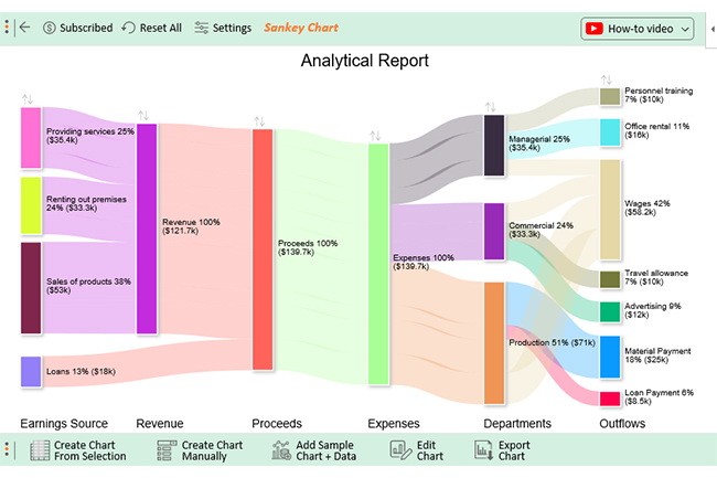
Assume you have the following data and wish to create an analytical report template for cash flow using a Sankey diagram in Excel.
| Earnings Source | Revenue | Proceeds | Expenses | Departments | Outflows | Amount |
| Providing services | Revenue | Proceeds | Expenses | Managerial | Personnel training | 10000 |
| Providing services | Revenue | Proceeds | Expenses | Managerial | Office rental | 16000 |
| Providing services | Revenue | Proceeds | Expenses | Managerial | Wages | 9400 |
| Renting out premises | Revenue | Proceeds | Expenses | Commercial | Wages | 11300 |
| Renting out premises | Revenue | Proceeds | Expenses | Commercial | Travel allowance | 10000 |
| Renting out premises | Revenue | Proceeds | Expenses | Commercial | Advertising | 12000 |
| Sales of products | Revenue | Proceeds | Expenses | Production | Material Payment | 25000 |
| Sales of products | Revenue | Proceeds | Expenses | Production | Loan Payment | 8500 |
| Sales of products | Revenue | Proceeds | Expenses | Production | Wages | 19500 |
| Loans | Proceeds | Expenses | Production | Wages | 18000 |


An analysis report format organizes complex information into a simple structure, making data easier to read and understand.
Using a standard format ensures every report follows the same layout, which makes it easier to compare results across different periods or projects.
With clear insights, businesses can make informed choices that improve strategies, processes, and overall performance.
A predefined format saves time by eliminating the need to start from scratch, letting you focus on the actual analysis.
Well-structured reports look polished and reliable, helping build trust with clients, managers, and stakeholders.
Be clear about what the report should achieve—whether it’s tracking performance, spotting trends, or supporting decisions.
Focus only on the most relevant KPIs and metrics that align with your business goals to avoid clutter.
Include charts, graphs, and tables to simplify complex data and highlight insights quickly.
Organize the template with clear sections (summary, data, insights, recommendations) for easy navigation.
Double-check calculations and maintain a consistent format across reports to build trust in your analysis.
Including too much information makes the report confusing. Stick to the most relevant data that supports your objective.
Failing to tailor the report for decision-makers or stakeholders can make it less impactful. Always consider who will read it.
Using the wrong charts or cluttered visuals can distort insights. Choose clear and simple visuals that highlight key findings.
Unorganized sections or missing summaries make reports hard to follow. A logical flow improves clarity.
Relying on unchecked or inaccurate data reduces credibility. Always verify data sources and calculations before presenting.
A formal analytical report comprehensively examines a specific subject or issue. It delves deep into a particular organization, process, or occurrence and provides a thorough evaluation. Statistics, graphs, charts, and other visual aids support the report’s findings.
Here is a perfect analytical report template structure:
Data analysis makes an immense contribution to your success as a business owner. It helps you spot patterns, zero in on improvement avenues, and arrive at well-considered conclusions.
A critical part of this success is an analytical report template. It provides a bird’s-eye view of the data so stakeholders can better grasp the issue at hand.
Now you have a comprehensive guide to creating an analytical report template in Excel with ChartExpo. We’ve also discussed the importance of analytical report templates and the different types of reports.
You now have the expertise to design your custom analytical report template. You can create a report from the template to guide smart decision-making and boost productivity.
How much did you enjoy this article?


Calculate accounts receivable turnover ratio to measure credit collection speed, improve cash flow, and strengthen your financial strategy. Read on!

Change Management KPIs are the key to tracking adoption, performance, and ROI during transitions. Find out which metrics matter. Read on!

Data collection methods and techniques determine the quality of every insight you act on. Explore key approaches for gathering reliable data. Read on!


