Categories
By ChartExpo Content Team
Why guess when you can know? A market research survey is more than a questionnaire—it’s a direct line to what your customers want, need, and value.
Whether you’re refining a product, planning a campaign, or exploring new markets, these surveys take the guesswork out of decision-making. They’re your backstage pass to customer preferences and market trends, letting you act on facts, not assumptions.


The real power of a market research survey lies in its ability to bridge the gap between what businesses think and what customers experience. By asking targeted questions, you get to hear the honest truth straight from the people who matter most—your audience.
This clarity fuels smarter strategies, sharper campaigns, and products that hit the mark. In short, these surveys save time, money, and effort while delivering invaluable insights.
Every decision maker needs tools they can trust, and a market research survey is exactly that. It’s flexible, precise, and works across industries. From spotting trends to understanding customer pain points, it gives you the edge to stay ahead of the curve.
So, whether you’re a seasoned pro or just starting out, this is your opportunity to make informed decisions and grow with confidence.
First…
A market research survey is a tool used by businesses to collect data from a specific group of people. This tool helps companies understand customer preferences, market trends, and other important factors that can affect business strategies.
By asking a series of questions, these surveys gather insights directly from the target audience, which can include current or potential customers. The format of these surveys can vary, ranging from online questionnaires to face-to-face interviews or phone surveys. The key is to ask questions that provide clear and valuable insights into what consumers want and need.
The primary purpose of market research surveys is to inform business decisions. By understanding what customers think about products or services, companies can make informed choices about product development, marketing strategies, and more.
These surveys can identify market needs that are not currently met, or reveal perceptions that could shift a company’s strategic direction. Additionally, they help businesses measure customer satisfaction, determine market demand, and analyze competitors effectively.
This information is crucial for any business looking to improve its market position and grow sustainably.
To build a successful market research survey, certain components must be included.
First, clearly defined objectives are essential. What exactly does the business want to learn from this survey?
Next, designing the survey involves choosing the right questions that align with these objectives. These questions should be clear, direct, and structured in a way that avoids bias. The survey must also target the correct audience; ensuring the right participants are chosen to provide relevant insights.
Finally, analyzing the results with the correct tools and expertise is crucial to turning raw data into actionable business strategies. Each of these components plays a vital role in the overall effectiveness of a market research survey.
The key to writing effective survey questions is clarity. Each question must be straightforward, avoiding ambiguity or complex language. It’s important to be direct—ask about one thing at a time to avoid confusing respondents.
Additionally, balance the types of questions used. Mix multiple-choice questions with open-ended ones to gather both quantitative and qualitative data. This variety can provide a fuller picture of the respondent’s views and experiences.
Deciding the length of your survey is a tightrope walk. Too long, and you risk losing the participant’s interest—too short, and you might not gather all the insights you need. The best approach? Keep it as brief as possible while ensuring all essential questions are included.
Typically, a survey should take no more than 5-10 minutes to complete. Timely and relevant questions keep respondents engaged and willing to complete the survey.
Pilot testing is a crucial step in survey design. It involves running the survey on a small scale with participants who resemble your target audience. This test helps identify questions that are confusing or irrelevant.
Customer feedback from this group can be invaluable, allowing you to adjust the survey for clarity and effectiveness before launching it on a larger scale.
This step not only enhances data quality but also saves time and resources in the long run, ensuring reliable insights and efficient processes.
Customer Satisfaction (CSAT) scores are pivotal for gauging client contentment with a product or service. CSAT Survey Chart illuminates how many respondents are satisfied, dissatisfied, or neutral.
Imagine plotting this data on a bar chart where each bar represents a different response category—from ‘very satisfied’ to ‘very dissatisfied’. This data visualization quickly reveals the strength and weaknesses in customer service, guiding businesses on where to focus their improvement efforts.
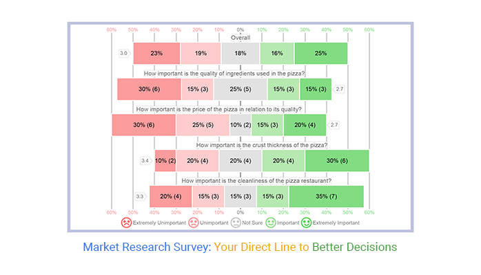
Likert Scale Charts explore deeper sentiments by illustrating responses across a spectrum, typically from ‘strongly agree’ to ‘strongly disagree’.
For instance, if you’re measuring agreement with the statement “The customer support was helpful,” each segment of the bar shows how many respondents felt positively, neutrally, or negatively about the service. This method highlights prevailing attitudes and can be instrumental in pinpointing areas that require attention or reinforcement.
The following video will help you to create a Likert Scale Chart in Microsoft Excel.
The following video will help you to create a Likert Scale Chart in Google Sheets.
The following video will help you to create a Likert Scale Chart in Microsoft Power BI.
Quantitative surveys are tools to collect measurable data. They help in making decisions based on statistical evidence. Businesses use these surveys to get data that can be counted or compared on a numeric scale.
For instance, how many people prefer Product A over Product B? You use tools like online surveys, face-to-face questionnaires, or telephone interviews to get this data. Each question is structured to avoid ambiguity, ensuring that the responses are clear and directly related to the numbers.
This method is perfect when you need solid numbers to analyze trends or make forecasts.
Qualitative surveys focus on the ‘why’ behind people’s actions. They are less about numbers and more about understanding deeper insights and opinions. Methods like in-depth interviews, focus groups, and open-ended questions on surveys are common.
These approaches allow respondents to share their thoughts in their own words, offering rich, detailed data. This data is then interpreted to grasp the underlying motivations, feelings, and preferences of the audience.
It’s particularly useful when you want to explore new ideas or get feedback on experiences.
Mixed-method surveys combine the numerical depth of quantitative surveys with the behavioral insights of qualitative surveys.
This approach provides a fuller picture of the market landscape. You might start with a quantitative survey to gather broad numerical data and follow up with a qualitative survey to explore particular trends or anomalies in the data.
This method ensures both breadth and depth in the data collected, allowing for more comprehensive data analysis and data-driven decision-making. It’s ideal for complex issues where multiple factors influence the market scenario.
Sampling techniques are the backbone of market research surveys. They help you decide who to include in your survey to get reliable and relevant results. There are several methods you can choose from, each with its strengths.
Random sampling is one popular choice because it gives every potential respondent an equal chance of being selected. This method reduces sampling bias and makes it easier to generalize the findings to a larger population.
Another approach is stratified sampling, where you divide the population into smaller groups, or strata, based on specific characteristics like age, income, or location. You then randomly sample from each stratum.
This method ensures that all significant subgroups in the population are represented proportionally, which enhances market segmentation efforts and provides more accurate insights for specific market segments.
Determining the right sample size is crucial for ensuring your survey results are accurate and dependable. A sample too small might not capture enough variability and could lead to biased results.
Conversely, a sample too large could be a waste of resources without adding much value to your findings. The key is to find a balance.
To determine the optimal sample size, consider your survey’s margin of error and confidence level. A smaller margin of error requires a larger sample size to ensure accuracy.
Similarly, a higher confidence level, which indicates how sure you can be that the data reflects the population, also calls for more respondents.
Tools and formulas are available to help calculate the right sample size based on these factors, making this task more manageable.
Targeting specific demographics in your survey sampling can significantly enhance the relevance and depth of your data. By focusing on particular age groups, genders, income levels, or other demographic factors, you can uncover insights that are more precise and tailored to your needs.
To effectively target these demographics, start by defining who your ideal respondents are based on the objectives of your market research.
Next, use demographic data to locate and reach out to these groups. Techniques such as quota sampling can be particularly useful here. This approach involves setting quotas for different demographic groups to ensure that your sample accurately reflects the diversity of the population you’re studying.
This method not only improves the relevance of the results but also helps in addressing specific business questions related to particular demographic groups.
When you’re ready to send out your market research survey, think about where your audience hangs out.
Email is a reliable old pal that gets your survey directly into personal inboxes. Craft a catchy subject line; think of it as a friendly wave saying, “Hey, take a look at this!”
Social media platforms are like the bustling town squares of the internet. By leveraging social media analytics tools, you can strategically post your survey on platforms like Facebook, Twitter, or LinkedIn, where discussions are vibrant, and engagement is high.
Don’t forget niche forums and websites specific to your target demographic. These spots can often provide concentrated feedback from engaged community members.
Timing isn’t just a thing in comedy; it’s crucial for surveys too! Send your surveys when people are most likely to respond.
For instance, Monday mornings can be a no-go as folks are usually gearing up for their workweek. However, Tuesday to Thursday shows higher engagement rates as people settle into their routines.
Also, consider time zones if you’re surveying across regions. You want to hit the sweet spot when most of your audience is awake and online. Early evenings or lunch hours can be golden times to catch folks ready to engage.
Incentives can be a nifty trick to boost your survey responses but handle them with care to avoid bias. Small rewards, like a discount code or entry into a prize draw, can motivate folks to participate without swaying their answers too much.
Keep the incentives relevant but not so grand that they tempt people to skew results just for the prize. It’s like tossing a small thank you to those who took the time to help you out, without making it the main event.
Google Forms is a go-to for many when talking about survey tools, and it’s no surprise why! This tool is all about simplicity and ease of use.
If you’re looking to whip up a survey in no time, Google Forms might just be your new best pal. It provides a straightforward interface where you can drag and drop different types of questions. Whether it’s multiple-choice, checkboxes, or short answers, setting these up is a breeze.
What’s more, it’s free! You can create as many surveys as you like without worrying about hitting a limit. The responses to your surveys are neatly collected in Google Sheets. You can use ChartExpo to perform visual analytics on survey data.
You can view this data in real-time, which is perfect for making quick decisions based on the latest feedback. For anyone dipping their toes into market research, or if you’re on a tight budget, Google Forms is a solid choice.
On the other hand, Microsoft Forms packs a punch with its robust features tailored for more detailed data collection. It integrates seamlessly with other Microsoft products.
Imagine you’re working in Teams or Outlook, and you can access and distribute your surveys directly—quite handy, right? Microsoft Forms allows for a bit more complexity in survey design compared to Google Forms, supporting branching and conditional logic.
This means you can guide respondents through different paths in your survey based on their previous answers.
When you face incomplete responses, don’t panic. Start by understanding why the data is missing. Is the question unclear? Is it too personal? Once you know the problem, you can fix it. If the survey’s too long, shorten it. Confusing questions? Rewrite them.
You can also use reminders to encourage completion. Emails or texts can nudge people to finish surveys. This way, you save your data from being incomplete.
Data cleaning is crucial before analysis. Begin by removing duplicates. This keeps your data set accurate. Fix structural errors. Typos or inconsistent capitalization can lead to big problems later. Filter out irrelevant data.
If it doesn’t relate to your research questions, you don’t need it. Use software tools to help. They can automate some of the cleaning processes. Clean data leads to trustworthy analysis.
Managing data across different platforms can be tricky. Start by setting standards. Ensure everyone knows what data to collect and how. Use compatible tools across platforms. This makes merging data easier later.
Regularly sync your data. This prevents discrepancies. Check for consistency. Regular audits help catch mismatches early. Consistent data collection across platforms means reliable results you can trust.
When you dive into market research survey data, the first step is spotting trends and patterns. How do you start?
Begin by grouping responses by common characteristics. These might include age, location, or answers to specific questions. Charts like multi axis line chart or grouped stacked bar charts can help you visualize these patterns, making it easier to see what’s going on. Look for consistent responses or significant variations.
These insights can lead to understanding customer behavior, preferences, and areas of satisfaction or dissatisfaction.
Cross-tabulation is a method that lets you compare two or more variables in your survey data, revealing relationships that aren’t obvious. Think about it like checking how often people in different age groups prefer a certain product feature.
You set up a table where one variable is listed down the side, another across the top, and the intersections show how often each combination occurs. This can highlight surprising contrasts or trends, which can be critical in shaping product development or marketing strategies.
Outliers – those unusual responses that don’t fit the pattern of your data set. They can skew your analysis, leading to faulty conclusions if not handled properly.
First, identify outliers by using statistical graphs or scatter plots. Once spotted, decide how to handle them. Options include adjusting the outlier values to more typical levels or removing them from your data set. Do this only if you can justify they’re due to errors or unique circumstances not relevant to your analysis.
This cleanup is vital for maintaining the reliability of your data interpretations.
Nobody likes a drag, right? Long, repetitive surveys can be a total snooze fest for respondents.
To keep them engaged, it’s essential to design surveys that are concise and to the point. Mixing up question formats – from multiple choice to scale ratings or even quick yes/no options – can make the process less monotonous.
Also, consider the timing and frequency of your surveys; don’t bombard people every other day. A little consideration goes a long way in keeping your audience interested and willing to provide the insights you need.
What worked yesterday might not work today. That’s why revising survey questions regularly is crucial. It’s like updating your wardrobe – you want to keep it stylish but appropriate.
Ensure your survey questions reflect current trends and changes in the market. This isn’t just about staying relevant; it’s about ensuring that the data you collect provides a clear picture of the current market landscape.
Periodic reviews and revisions help in maintaining the accuracy and effectiveness of your market research.
How do you know if your survey is a hit? It’s all in the metrics! Tracking the right metrics can give you insights into how well your survey is performing. Look at response rates, completion rates, and the quality of the data collected.
These metrics and KPIs can tell you if your survey is too long, too boring, or just right. It’s like having a feedback loop for your feedback tool. By keeping an eye on these key performance indicators, you can continuously improve your surveys and make sure they’re doing the job they’re meant to do.
Surveys provide essential insights that businesses can use to shape their marketing strategies effectively.
For example, understanding customer preferences helps in tailoring marketing messages that resonate with the target audience. If a survey reveals that most customers prefer eco-friendly products, a business can focus its marketing efforts on highlighting the environmental benefits of its products.
This strategic alignment with customer values not only boosts sales but also enhances brand loyalty.
Feedback from market research surveys is vital for product innovation. It reveals what customers are looking for in products and highlights areas for improvement in existing items.
For instance, if survey results indicate that users find a certain gadget difficult to use, a company can use this feedback to develop more user-friendly designs in future models. This responsiveness to customer needs improves product quality. It also positions a company as customer-centric, fostering stronger customer relationships.
Presenting survey data effectively to stakeholders is crucial for securing buy-in on new initiatives. It involves translating complex data into compelling narratives that underscore the need for proposed changes or strategies.
For example, using visual aids like graphs and charts can help stakeholders visualize the potential impact of customer opinions on company performance. This approach ensures that decision-makers grasp the significance of the insights and are more likely to support initiatives that are informed by solid data.
When tackling the retail sector, surveys focus sharply on what ticks with customers. Retailers must know colors, sizes, styles, and price points that resonate best. The data from these surveys guides product lines, stock levels, and marketing strategies.
Imagine knowing exactly what your customer wants before they do! That’s the power of effectively executed retail surveys. They can pinpoint rising trends and fading interests, making sure the shelves are never bare of the next hot item, and no space is wasted on a not-so-hot one.
In the fast-paced tech world, staying ahead is not just an advantage but a necessity. Technology industry surveys dig into user experience, product performance, and market needs. This feedback is crucial for driving innovation and usability improvements.
Think of it as direct insight into the user’s mind, which can guide the next big tech development. Companies can also gauge the effectiveness of their tech support and update cycles, ensuring they meet user expectations and outpace competitors.
Surveys in financial services unearth clients’ needs and expectations about their fiscal management. They provide a snapshot of client satisfaction and areas craving improvement. Banks and investment firms can learn about the services clients value most, which ones fall short, and what new services they desire.
This knowledge allows firms to tailor their offerings, ensuring they hit the mark every time. They also help in compliance with financial regulations by gauging client understanding and satisfaction with the provided information.
When you’re knee-deep in market research, biased responses can throw a wrench in your data set, painting an inaccurate picture of your market landscape.
Social desirability bias happens more often than you’d think. People might sway their answers based on what they believe you want to hear or due to their own subconscious preferences. So, how do you tackle this head-on?
First, it’s all about how you frame your questions. Ensure they’re as neutral as possible. Avoid leading questions that might nudge participants towards a particular answer.
Next, consider your sample mix. Are you chatting with a diverse group that truly represents your target market? If not, it’s time to broaden that net.
Lastly, anonymity works wonders. Let respondents know their details are under wraps, and they’re more likely to dish out honest thoughts.
Imagine throwing a party and half the invitees don’t show up. Nonresponse Bias happens when folks don’t respond to your survey. It skews your data because you’re only hearing from a chunk of your audience. To dodge this pitfall, you’ve got to up your engagement game. Make your survey short and sweet—nobody wants to slog through a questionnaire that’s as long as a novella.
Incentives are your best friend here. A chance at a gift card or a sneak peek at survey results can motivate people to participate.
Also, timing is key. Hit send when your audience is most likely throwing a glance at their emails or socials. This could be mid-week or on a lazy Sunday afternoon. Keep a close eye on response patterns and adjust your send-out times accordingly.
Ever scratched your head trying to decipher a survey response? Ambiguous answers can leave you more baffled than a tourist without a map. It’s crucial to craft questions that close the door on vague replies. Opt for specifics.
Instead of asking if someone likes your product, ask how often they use it, and what feature they find most helpful.
Scale questions help too. Instead of yes or no, how about Likert scale of 1 to 5? This gives you a clearer picture of where you stand. And don’t forget to pilot your survey. A test drive with a small group can help you spot and iron out any confusing bits before you go live to your entire audience.
Clear, concise, and to the point – that’s your mantra when refining those questions for better clarity.
When a business aligns its market research surveys with its strategic goals, it’s like hitting the bullseye in darts; the impact maximizes the return on effort.
Start by identifying the key decisions that drive business growth—be it entering new markets, enhancing customer experience, or optimizing product features.
Surveys then need to be designed to gather data directly related to these areas. Each question should serve a purpose in informing strategy, helping leaders make choices based on data rather than guesswork.
This approach not only streamlines the decision-making process but also boosts the chances of achieving desired business outcomes.
Imagine you’re a chef trying to perfect a new dish. You’d likely ask your patrons for feedback to tweak the recipe until it’s just right.
Similarly, using market research surveys for product development lets businesses refine their offerings based on direct customer input. This feedback loop can identify what features are missing, which are unnecessary, and how a product can better meet consumer needs.
Such targeted data empowers businesses to innovate with precision, creating products that truly resonate with their target audience, potentially leading to increased market share and customer loyalty.
Keeping a finger on the pulse of how consumers perceive your brand can be as revealing as reading a good book that gives you new perspectives.
Regularly conducting surveys to assess brand perception lets you understand the strengths and weaknesses in how your brand is viewed in the marketplace. This insight is crucial for managing your brand’s health, guiding marketing strategies, and correcting misconceptions in the market.
It provides a clear view of where you stand in the competitive landscape and can help direct efforts to improve areas where your brand may be lagging.
Market research surveys are your direct line to what matters most—your audience. They help you understand customer needs, improve products, and shape winning strategies. From crafting the right questions to analyzing results, every step adds value to your decisions.
Keep your surveys focused and user-friendly. Use clear questions, a logical flow, and accessible formats. Don’t overwhelm respondents—shorter surveys lead to higher completion rates and better data.
Analyze your results carefully. Look for trends, address outliers, and make connections that drive smarter business decisions. Use your insights to refine products, improve marketing, and strengthen customer loyalty.
Finally, remember: a survey isn’t just about collecting data. It’s about starting a conversation. Your audience’s feedback can guide your business toward success. Listen, act, and keep the dialogue open.
How much did you enjoy this article?


Google Forms to Google Sheets keeps your data organized and current with every submission. Learn the steps, methods, and tips now!

Product survey questions reveal what customers truly think. Learn how to ask the right ones and act on the survey results. Read on!

Learn how the 5-Point Performance Rating Scale improves employee evaluations with clear, consistent, and fair performance reviews across teams.


