• Home
  • Tools dropdown img
    • Spreadsheet Charts

      • ChartExpo for Google Sheets
      • ChartExpo for Microsoft Excel
    • Power BI Charts

      • Power BI Custom Visuals by ChartExpo
    • Word Cloud

  • Charts dropdown img
    • Chart Category

      • Bar Charts
      • Circle Graphs
      • Column Charts
      • Combo Charts
      • Comparison Charts
      • Line Graphs
      • PPC Charts
      • Sentiment Analysis Charts
      • Survey Charts
    • Chart Type

      • Box and Whisker Plot
      • Clustered Bar Chart
      • Clustered Column Chart
      • Comparison Bar Chart
      • Control Chart
      • CSAT Survey Bar Chart
      • CSAT Survey Chart
      • Dot Plot Chart
      • Double Bar Graph
      • Funnel Chart
      • Gauge Chart
      • Likert Scale Chart
      • Matrix Chart
      • Multi Axis Line Chart
      • Overlapping Bar Chart
      • Pareto Chart
      • Radar Chart
      • Radial Bar Chart
      • Sankey Diagram
      • Scatter Plot Chart
      • Slope Chart
      • Sunburst Chart
      • Tornado Chart
      • Waterfall Chart
      • Word Cloud
    • Google Sheets
      Microsoft Excel
  • Services
  • Pricing
  • Contact us
  • Blog
  • Support dropdown img
      • Gallery
      • Videos
      • Contact us
      • FAQs
      • Resources
    • Please feel free to contact us

      atsupport@chartexpo.com

Categories
All Data Visualizations Data Analytics Surveys
Add-ons/
  • Google Sheets
  • Microsoft Excel
  • Power BI
All Data Visualizations Data Analytics Surveys
Add-ons
  • Google Sheets
  • Microsoft Excel
  • Power BI

We use cookies

This website uses cookies to provide better user experience and user's session management.
By continuing visiting this website you consent the use of these cookies.

Ok

ChartExpo Survey


Home > Blog > Microsoft Excel

How to Analyze Quantitative Market Research Data in Excel?

You’ve gathered an overwhelming amount of data. Now you’re wondering how to tame it all using everyone’s favorite number-crunching tool, Excel. Sure, numbers don’t lie. But they can keep you up all night trying to make sense of them.

quantitative market research

That’s where quantitative market research comes into play. Here, spreadsheets become the battleground of analysis and insights.

Do not worry if you do not have experience in crunching numbers. We’ll guide you on this quest to decode the mysteries of analyzing quantitative market research data.

From crunching numbers to spotting trends, we’ll unravel the market’s mysteries. And who knows? Perhaps along the way, we’ll stumble upon a groundbreaking correlation that will make data analysts gasp and marketers rejoice.

Roll up your sleeves, sharpen your pencils (or rather, your keyboard shortcuts). Let’s rock those market research digits like never before.

Table of Contents:

  1. What is Quantitative Market Research?
  2. Characteristics of Quantitative Market Research
  3. Quantitative Market Research Techniques
  4. How to Analyze Quantitative Market Research Data in Excel?
  5. How to Create a Chart to Analyze Survey Data for Market Research?
  6. Wrap Up

What is Quantitative Market Research?

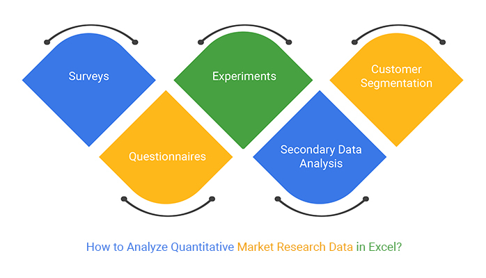
Quantitative market research is a technique used to collect and analyze numerical data. It involves asking structured questions to the target audience through surveys, polls, or questionnaires. The data is then analyzed to make informed decisions and improve products and services. This research method is used in various sciences to test hypotheses and investigate relationships between variables.

Characteristics of Quantitative Market Research

Let’s look at the characteristics that make this survey research method valuable.

  • Structured Data Collection

Quantitative market research follows a structured approach to data collection. It involves using standardized questionnaires, surveys, or experiments with predefined response options. This structured format ensures consistency in data collection and allows for efficient analysis.

  • Objective and Replicable

The quantitative research process is designed to minimize biases and subjective interpretations. Researchers follow established methodologies, employ statistical techniques, and document their procedures. This allows for independent verification and replication of the study.

  • Data-Driven Decision Making

Quantitative market research provides a foundation for data-driven decision-making. Analyzing numerical data allows you to identify patterns, trends, and relationships. This facilitates informed decision-making based on evidence rather than intuition. Consequently, leading to more effective marketing strategies, product development, and customer targeting.

Quantitative Market Research Techniques

Making business decisions based on guesswork is like trying to navigate a labyrinth blindfolded. Ditch the blindfold and embrace these quantitative market research techniques.

  • Surveys: Surveys involve asking a series of structured questions to a representative sample of the target population. You can conduct surveys through various channels, including online, telephone, or in-person interviews.
  • Questionnaires: Questionnaires are similar to surveys but are self-administered by respondents. They typically consist of predefined questions with multiple-choice or rating scale questions. Questionnaires help to collect data from many respondents efficiently.
  • Experiments: Experiments involve manipulating variables in a controlled environment to measure their impact on consumer behavior or preferences. Controlled experiments are commonly used in product testing, pricing research, or advertising effectiveness studies.
  • Secondary data analysis: Secondary data include government statistics, industry reports, and market research studies. Analyzing secondary data can provide quantitative insights into market trends, competitor analysis, and consumer behavior.
  • Customer segmentation: Customer segmentation involves dividing a target market into distinct groups, considering shared characteristics. This approach helps you gain a deeper understanding of specific customer segments. Consequently, you can enhance effectiveness and satisfaction by tailoring marketing strategies and offerings accordingly.

How to Analyze Quantitative Market Research Data in Excel?

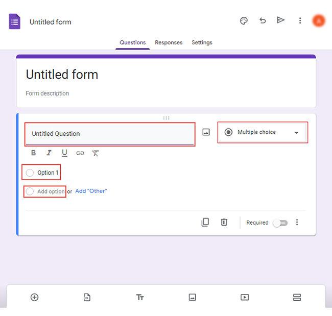
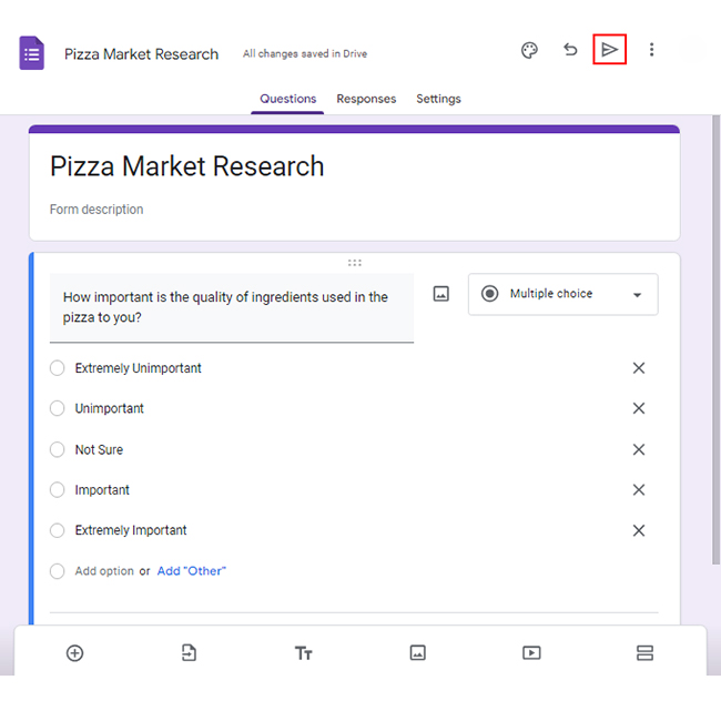
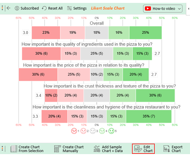
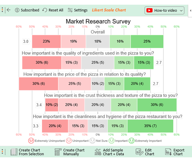
Let’s say you want to launch a pizza restaurant. You want to conduct an online survey of the following questions to understand what customers want.

  • How important is the quality of ingredients used in the pizza to you?
  • How important is the price of the pizza in relation to its quality?
  • How important is the crust thickness of the pizza to you?
  • How important is the cleanliness of the pizza restaurant to you?

You want to embed the response scale below on each question:

  • Extremely Unimportant
  • Unimportant
  • Not Sure
  • Important
  • Extremely Important

Follow these steps to create the survey in Google Forms;

  • Log in to Google Forms using your Google account.
  • Click the “Blank” button to create a new form.
survey in google forms 1 ce349
  • Select the type of question you want to use, such as multiple-choice, checkbox, or short answer.
  • Type your Questions in the “Untitled Question” section. Write “Option 1” and choose “Add option” for more options.
survey in google forms 2 ce349
  • Click the “Send” button to share the form with the target audience.
survey in google forms 3 ce349
  • When you have collected sufficient responses, click the three vertical dots next to “Link to Sheets.”
survey in google forms 4 ce349
  • Select the option to download the responses as a.csv file.
survey in google forms 5 ce349

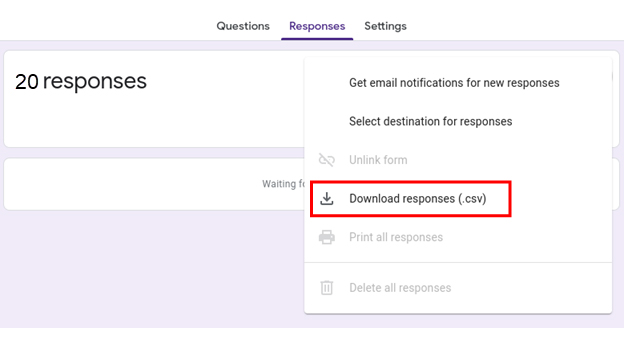
Access the document from your download folder and click to open it in Excel.

How to Create a Chart to Analyze Survey Data for Market Research?

Excel is a formidable tool for number crunching and organizing data. However, Excel can sometimes leave us longing for more allure when it comes to data visualization. Sure, those basic bar charts and line graphs get the job done. But wouldn’t it be fantastic if there was a way to breathe new life into your survey data?

ChartExpo is here to sprinkle a generous dose of magic on your Excel charts. It makes data analysis feel like a captivating work of art. Thus, you can unlock the true potential of your survey data with minimal effort.

Benefits of Using ChartExpo

  • ChartExpo is the Swiss Army Knife of data visualization tools. It offers a wide range of visualizations to slice and dice your data with efficiency.
  • ChartExpo’s intuitive interface takes the stress out of creating insightful visualizations. You don’t need to be a coding wizard to create appealing, insightful charts that tell compelling stories.
  • ChartExpo lets you unleash your creativity by giving you complete control over your visuals. Whether you want to go bold or sleek, ChartExpo’s customization options allow you to make your mark.
  • ChartExpo is an affordable solution to your data visualization needs. For $10 a month, you get access to a wealth of features. It also has a free 7-day trial to test before committing to the paid plan.

How to Install ChartExpo in Excel?

  1. Open your Excel application.
  2. Open the worksheet and click the “Insert” menu.
  3. You’ll see the “My Apps” option.
  4. In the office Add-ins window, click “Store” and search for ChartExpo on my Apps Store.
  5. Click the “Add” button to install ChartExpo in your Excel.

ChartExpo charts are available both in Google Sheets and Microsoft Excel. Please use the following CTA’s to install the tool of your choice and create beautiful visualizations in a few clicks in your favorite tool.

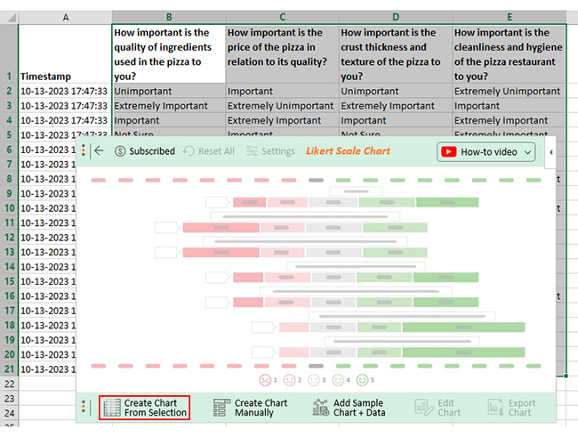
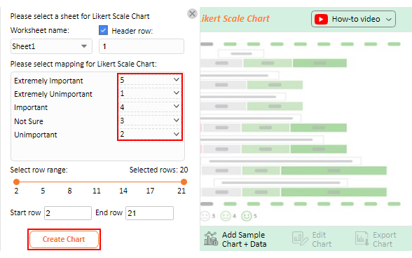
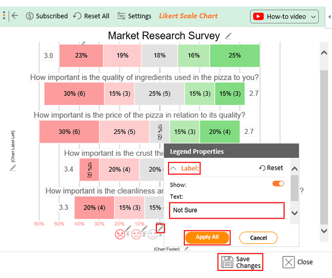
Let’s say your survey yields the data table below.

Timestamp How important is the quality of ingredients used in the pizza to you? How important is the price of the pizza in relation to its quality? How important is the crust thickness of the pizza to you? How important is the cleanliness of the pizza restaurant to you?
10-13-2023 17:47:33 Unimportant Important Unimportant Extremely Unimportant
10-13-2023 17:47:33 Extremely Important Extremely Unimportant Extremely Important Important
10-13-2023 17:47:33 Important Extremely Important Important Extremely Important
10-13-2023 17:47:33 Not Sure Important Not Sure Extremely Important
10-13-2023 17:47:33 Unimportant Extremely Unimportant Extremely Important Not Sure
10-13-2023 17:47:33 Not Sure Unimportant Unimportant Not Sure
10-13-2023 17:47:33 Extremely Important Extremely Important Extremely Important Extremely Unimportant
10-13-2023 17:47:33 Not Sure Important Not Sure Unimportant
10-13-2023 17:47:33 Not Sure Unimportant Unimportant Extremely Unimportant
10-13-2023 17:47:33 Extremely Unimportant Unimportant Important Unimportant
10-13-2023 17:47:33 Important Unimportant Unimportant Important
10-13-2023 17:47:34 Extremely Unimportant Extremely Important Not Sure Not Sure
10-13-2023 17:47:35 Extremely Unimportant Extremely Unimportant Not Sure Unimportant
10-13-2023 17:47:36 Extremely Unimportant Not Sure Extremely Important Important
10-13-2023 17:47:37 Extremely Unimportant Unimportant Important Extremely Unimportant
10-13-2023 17:47:38 Important Extremely Important Extremely Important Extremely Important
10-13-2023 17:47:39 Extremely Important Extremely Unimportant Extremely Important Extremely Important
10-13-2023 17:47:40 Extremely Unimportant Not Sure Extremely Unimportant Extremely Important
10-13-2023 17:47:41 Unimportant Extremely Unimportant Extremely Unimportant Extremely Important
10-13-2023 17:47:42 Not Sure Extremely Unimportant Important Extremely Important

This table contains example data. Expect many responses and questions in real life.

  • To get started with ChartExpo, install ChartExpo in Excel.
  • Now Click on My Apps from the INSERT menu.
insert chartexpo in excel
  • Choose ChartExpo from My Apps, then click Insert.
open chartexpo in excel
  • Once it loads, choose the “Likert Scale Chart” from the charts list.
list of charts in excel
  • Click the “Create Chart From Selection” button after selecting the data from the sheet, as shown.
Create Chart From Selection ce349
  • When you click the “Create Chart From Selection” button, you have to map responses with numbers manually. The Likert scale has this arrangement:
    • Extremely Unimportant = 1
    • Unimportant = 2
    • Not Sure = 3
    • Important = 4
    • Extremely Important = 5
  • Once all is set, click the “Create Chart” button.
Map Likert Responses to Numbers ce349
  • ChartExpo will generate the visualization below for you.
quantitative market research template example
  • If you want to have the chart’s title, click Edit Chart, as shown in the above image.
  • Click the pencil icon next to the Chart Header to change the title.
  • It will open the properties dialog. Under the Text section, you can add a heading in Line 1 and enable Show.
  • Give the appropriate title of your chart and click the Apply button.
apply title on chart ce349 2
  • Let’s say you want to add text responses instead of numbers against every emoji.
  • Click the pencil icon next to the respective emoji. Expand the “Label” properties and write the required text. Then click the “Apply All” button.
  • Click the “Save Changes” button to persist the changes.
apply label on chart ce349 3
  • Your final chart will appear below.
final quantitative market research

Insights

  • 30% of the respondents consider the quality of pizza ingredients important. 45% consider it unimportant, and 25% are neutral.
  • Regarding the price, 35% believe it should be proportional to the pizza quality, while 55% consider it unimportant.
  • 50% believe that the thickness of the pizza crust is important, while 30% say it’s unimportant.
  • 50% prioritize the cleanliness of the pizza restaurant, while 35% don’t consider it important.
  • Overall, 41% of the respondents find these factors significant in their decision-making, while 42% don’t.

FAQs

What is quantitative market research?

Quantitative market research involves gathering data for analysis using numerical measurements and statistical techniques. It helps predict target markets or audiences, providing valuable insights into consumer behavior, preferences, and emerging trends.

What are the main types of quantitative market research data?

Quantitative market research data has two main types: primary and secondary data. Primary data is collected firsthand through surveys, experiments, and observations. Conversely, secondary data is obtained from external sources like government agencies, trade associations, and market research firms.

Why is quantitative market research important?

Quantitative market research holds significant importance for various reasons;

  • It provides numerical data that facilitate objective analysis and informed decision-making.
  • It enables businesses to grasp market trends, consumer preferences, and behavior.
  • It helps to assess the effectiveness of marketing strategies and identify avenues for growth.

Wrap Up

Excel reigns as the go-to tool in quantitative market research data analysis. Its robust features and functions allow for data organization, calculation, and charting.

However, Excel does have limitations when it comes to advanced data visualization and analysis. Basic chart types and limited customization options can sometimes hinder complex insights communication.

That’s where ChartExpo comes into play.

ChartExpo enhances Excel’s capabilities by providing visually appealing and interactive charting options. This makes it easier to uncover patterns, trends, and insights within the data. You can create compelling charts and visualizations that effectively communicate findings and support decision-making processes.

That’s not all.

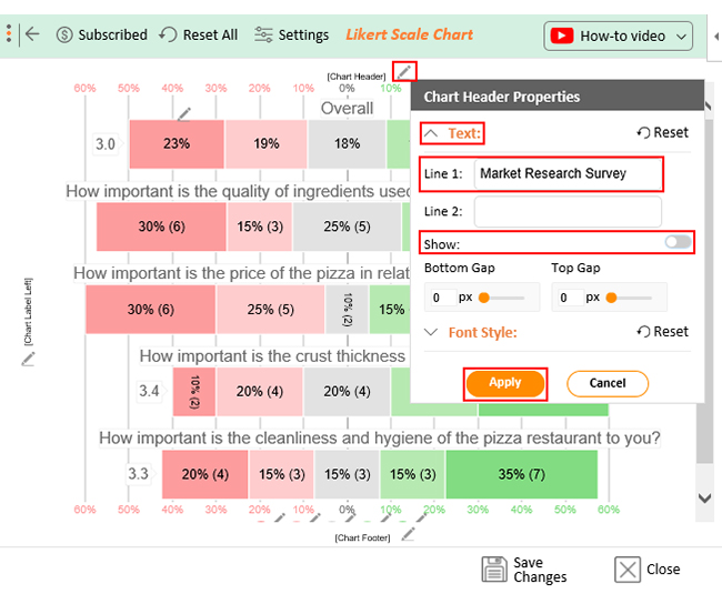
ChartExpo presents a delightful array of templates and themes you can customize to match your preferences. Beyond aesthetics, this intuitive platform enables creating, customizing, and interacting with visualizations without extensive coding knowledge.

Do not hesitate.

Join the ChartExpo revolution and turn your data into a masterpiece. Your charts will be the talk of the town.

How much did you enjoy this article?

ExcelAd2
Start Free Trial!
127458

Related articles

next previous
Microsoft Excel8 min read

Excel Task Tracker Template for Smarter Task Insights

Task tracker template in Excel organizes tasks, tracks deadlines, and boosts efficiency. Learn its benefits, and explore expert tips to simplify task management.

Microsoft Excel10 min read

Invoice Tracker Template in Excel for Better Insights

An invoice tracker Excel template helps track invoices, due dates, and payments. Learn how to use this template for better financial management.

Microsoft Excel12 min read

Key Performance Indicators in Healthcare for Better Insights

Key Performance Indicators in healthcare track patient care and efficiency. Learn about these KPIs, top examples, and how to use them to improve outcomes.

Microsoft Excel10 min read

BMI Calculation Formula in Excel for Better Fitness Insights

The BMI calculation formula in Excel helps track and analyze body mass index. Explore step-by-step instructions and tips to simplify BMI tracking in Excel.

Microsoft Excel29 min read

How to Create a Tornado Chart in Excel? A Complete Guide

Click to learn how to plot a Tornado Chart in Excel using easy-to-follow steps. Also, we’ll address the following question: what is a Tornado Diagram?

ChartExpo logo

Turn Data into Visual
Stories

CHARTEXPO

  • Home
  • Gallery
  • Videos
  • Services
  • Pricing
  • Contact us
  • FAQs
  • Privacy policy
  • Terms of Service
  • Sitemap

TOOLS

  • ChartExpo for Google Sheets
  • ChartExpo for Microsoft Excel
  • Power BI Custom Visuals by ChartExpo
  • Word Cloud

CATEGORIES

  • Bar Charts
  • Circle Graphs
  • Column Charts
  • Combo Charts
  • Comparison Charts
  • Line Graphs
  • PPC Charts
  • Sentiment Analysis Charts
  • Survey Charts

TOP CHARTS

  • Sankey Diagram
  • Likert Scale Chart
  • Comparison Bar Chart
  • Pareto Chart
  • Funnel Chart
  • Gauge Chart
  • Radar Chart
  • Radial Bar Chart
  • Sunburst Chart
  • see more
  • Scatter Plot Chart
  • CSAT Survey Bar Chart
  • CSAT Survey Chart
  • Dot Plot Chart
  • Double Bar Graph
  • Matrix Chart
  • Multi Axis Line Chart
  • Overlapping Bar Chart
  • Control Chart
  • Slope Chart
  • Clustered Bar Chart
  • Clustered Column Chart
  • Box and Whisker Plot
  • Tornado Chart
  • Waterfall Chart
  • Word Cloud
  • see less

RESOURCES

  • Blog
  • Resources
  • YouTube
SIGN UP FOR UPDATES

We wouldn't dream of spamming you or selling your info.

© 2025 ChartExpo, all rights reserved.