• Home
  • Tools dropdown img
    • Spreadsheet Charts

      • ChartExpo for Google Sheets
      • ChartExpo for Microsoft Excel
    • Power BI Charts

      • Power BI Custom Visuals by ChartExpo
    • Word Cloud

  • Charts dropdown img
    • Chart Category

      • Bar Charts
      • Circle Graphs
      • Column Charts
      • Combo Charts
      • Comparison Charts
      • Line Graphs
      • PPC Charts
      • Sentiment Analysis Charts
      • Survey Charts
    • Chart Type

      • Box and Whisker Plot
      • Clustered Bar Chart
      • Clustered Column Chart
      • Comparison Bar Chart
      • Control Chart
      • CSAT Survey Bar Chart
      • CSAT Survey Chart
      • Dot Plot Chart
      • Double Bar Graph
      • Funnel Chart
      • Gauge Chart
      • Likert Scale Chart
      • Matrix Chart
      • Multi Axis Line Chart
      • Overlapping Bar Chart
      • Pareto Chart
      • Radar Chart
      • Radial Bar Chart
      • Sankey Diagram
      • Scatter Plot Chart
      • Slope Chart
      • Sunburst Chart
      • Tornado Chart
      • Waterfall Chart
      • Word Cloud
    • Google Sheets
      Microsoft Excel
  • Services
  • Pricing
  • Contact us
  • Blog
  • Support dropdown img
      • Gallery
      • Videos
      • Contact us
      • FAQs
      • Resources
    • Please feel free to contact us

      atsupport@chartexpo.com

Categories
All Data Visualizations Data Analytics Surveys
Add-ons/
  • Google Sheets
  • Microsoft Excel
  • Power BI
All Data Visualizations Data Analytics Surveys
Add-ons
  • Google Sheets
  • Microsoft Excel
  • Power BI

We use cookies

This website uses cookies to provide better user experience and user's session management.
By continuing visiting this website you consent the use of these cookies.

Ok

ChartExpo Survey


Home > Blog > Microsoft Excel

How to do Cross Tabulation Analysis in Excel?

Picture this: you’re staring at rows and columns of numbers, desperately trying to make sense of it all. You feel like you’ve stumbled into a maze with no way out. It’s frustrating, right? Don’t worry; cross-tabulation in Excel is here to your rescue.

Cross-Tabulation in Excel

This feature allows you to dissect data like a master chef, serving valuable insights on a silver platter.

Why does it matter?

Imagine the satisfaction of unearthing valuable insights and connections from your data with just a few clicks. That “aha!” moment when patterns and trends suddenly become crystal clear, empowering you to make informed decisions. Cross-tabulation in Excel will give you just that.

So, how do you do cross-tabulation in Excel?

In this blog post, we’ll take you through the ins and outs of cross-tabulation in Excel. We’ll show you how to wield this tool with finesse, transforming your raw data into an insights goldmine. By the end, you’ll be armed with the skills to conquer any dataset that comes your way.

Are you ready to elevate your data game?

Let’s embark on this enlightening journey together.

Table of Contents:

  1. What is Cross Tabulation?
  2. Understanding Cross Tabulation in Excel
  3. Why is Excel Cross Tabulation Used?
  4. When Should You Use Cross-Tabulation?
  5. How to Create a Crosstab in Excel (Step-by-Step)?
    1. Step 1: Enter the Data
    2. Step 2: Create the Crosstab
    3. Step 3: Populate the Crosstab with Values
  6. How to Do Cross-Tabulation Analysis in Excel?
  7. What are the Benefits of Cross Tabulation Analysis?
  8. Cross-Tabulation With Chi-Square Analysis
  9. Chi-Square Statistic for Cross-Tabulation Tables
  10. Cross Tabulation in Excel FAQs
  11. Wrap Up

First…

What is Cross Tabulation?

Definition: Cross tabulation, often dubbed “cross tabs,” is a tool for decoding patterns and relationships within a spreadsheet. It involves creating a table with one variable along the rows and the other along the columns.

The intersection of these rows and columns displays the frequency of observations that share specific combinations of values.

Cross-tabulation is commonly employed in fields like market research, social sciences, and business analytics. It helps to gain insights into how different variables interact.

Analysts use it to discern relationships and make decisions based on the observed patterns in the cross-tabulated results.

Understanding Cross Tabulation in Excel

Cross tabulation in Excel is a dynamic, user-friendly technique that empowers you to explore relationships within data. Follow these steps to leverage the power of pivot tables.

  1. Prepare your data: Organize your data in a structured manner. Ensure it contains the relevant variables you want to cross-tabulate. This could be anything from sales figures, survey responses, or other categorical data.
  2. Select your data: Highlight the data range you want to analyze. Excel makes selecting specific columns or rows easy, ensuring you’re focusing on the relevant information for your cross-tabulation.
  3. Insert a Pivot Table: Navigate to the “Insert” tab on the Excel ribbon and select “PivotTable.” This action creates a blank canvas for your cross-tabulation.
  4. Choose data source: In the PivotTable Field List, choose the data source for your analysis. Ensure you’ve selected the correct range and sheets that contain the data you want to include in your cross-tabulation.
  5. Design your Pivot Table: Drag and drop the variables from your data into the rows and columns section of the Pivot Table Field List. This sets up the framework for your cross-tabulation.
  6. Add data: Place the variables you want to analyze in the Values section. Here, you can choose how Excel should aggregate data ”“ whether through sums, counts, averages, or other mathematical functions.
  7. Customize your Pivot Table: Excel allows you to customize your pivot table further. You can apply filters, sort data, or even format the table to enhance its visual appeal. This elevates your pivot table from a simple cross-tabulation to a powerful tool for visual storytelling. This ensures your cross-tabulation is not only insightful but also presentable.
  8. Interpret results: Examine the cross-tabulated results to identify relationships and patterns. The intersection points provide valuable information about the correlation between the variables, helping you draw meaningful conclusions.
  9. Refresh data: If your underlying data changes, it’s crucial to refresh the pivot table to update the results. This ensures your analysis remains accurate and reflects the most recent data.

Why is Excel Cross Tabulation Used?

Excel cross-tabulation is a stalwart ally in data analysis. It offers a structured approach to uncovering insights within datasets. Let’s unravel the key reasons why this tool is indispensable:

  • Pattern recognition: Excel cross-tabulation is a master at recognizing patterns and relationships within data. It organizes information into a grid, unveiling connections that might remain elusive, and providing a visual roadmap for analysts.
  • Data summarization and digestibility: Handling vast datasets becomes manageable with Excel cross-tabulation. It excels at summarizing information and condensing heaps of data into a digestible format. This ensures you can focus on the essential aspects of the dataset.
  • Visual representation of trends: Numbers come to life with Excel cross tabulation’s ability to create visual representations. It transforms raw numerical data into an understandable visual narrative, facilitating a deeper understanding of trends and outliers.
  • Comparative analysis made easy: Comparing variables with cross-tabulation in Excel is a breeze. Its structured layout, much like skills matrix templates, invites easy comparison, enabling you to discern trends, differences, and similarities between data sets.
  • Simplified decision-making: Excel cross-tabulation isn’t just about data organization; it’s a data-driven decision-making catalyst. It transforms raw data into actionable insights, equipping you with the clarity to make informed choices. This ensures that data becomes a strategic asset.

When Should You Use Cross-Tabulation?

Cross-tabulation is ideal when analyzing the relationship between two or more categorical variables, often used in surveys, market research, and demographic studies.

It’s particularly valuable when you want to compare different groups, such as customer preferences, behaviors, or demographic segments (e.g., age, gender, or location).

By breaking down the data into categories, cross-tabulation helps trend analysis, patterns, or correlations between variables, allowing for deeper insights and more informed decision-making.

How to Create a Crosstab in Excel (Step-by-Step)?

Step 1: Enter the Data

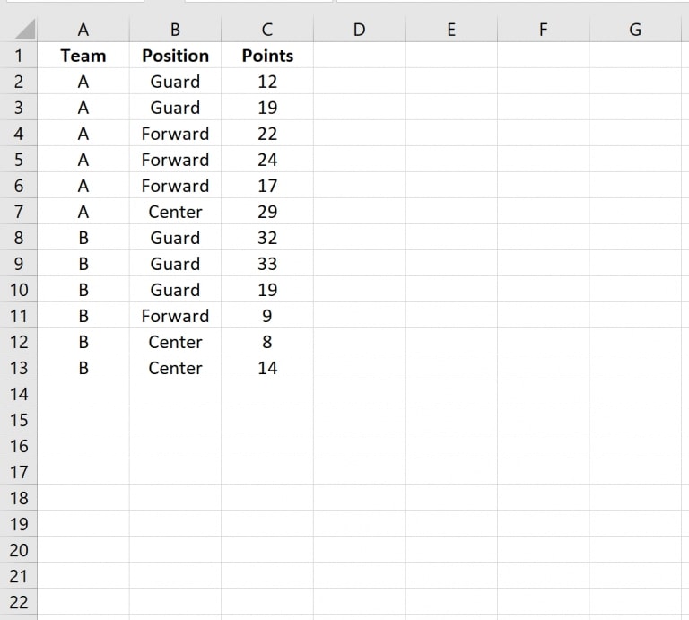
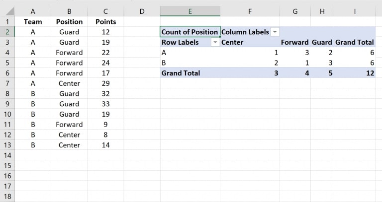
First, input the following dataset into Excel:

Cross Tabulation 1

Step 2: Create the Crosstab

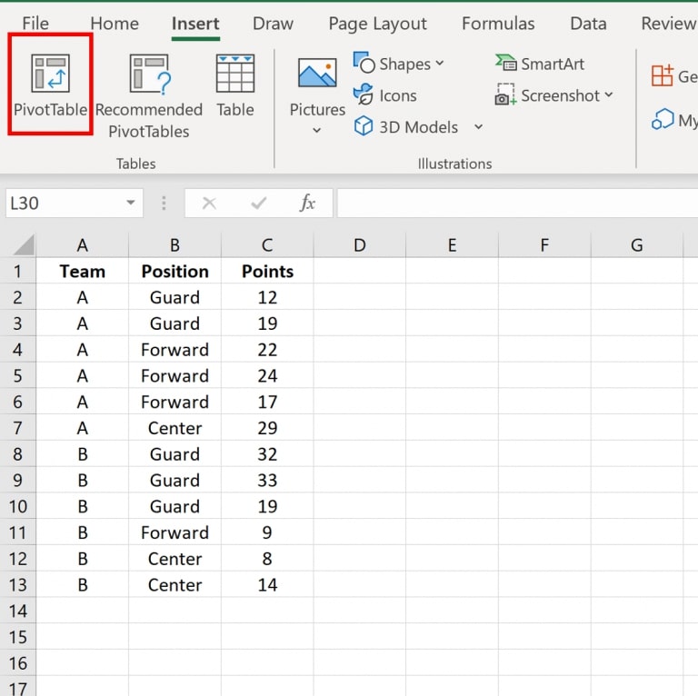
Next, select the Insert tab from the top ribbon and click on the PivotTable button.

Cross Tabulation 2

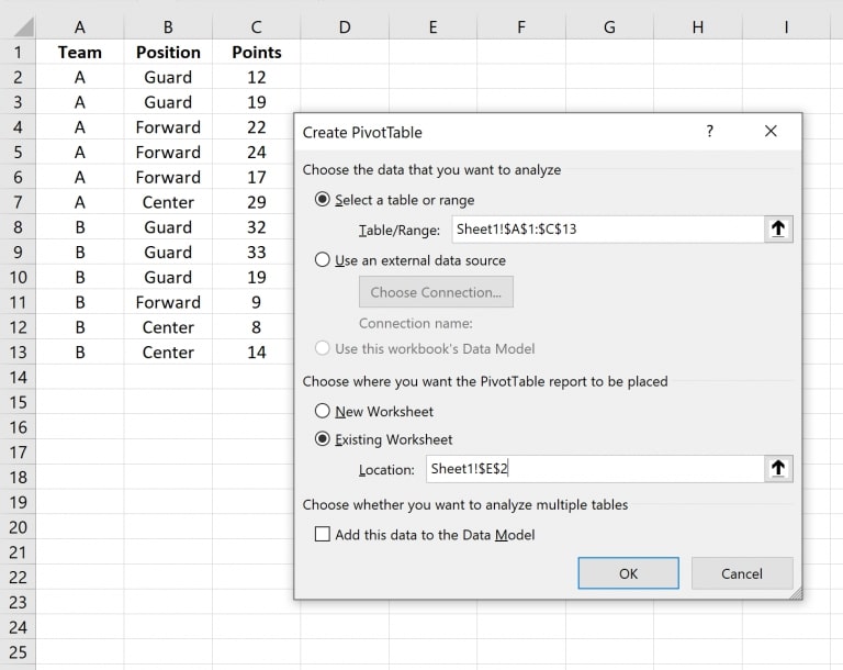
In the window that opens, specify the data range as the Table/Range and select a cell in the Existing Worksheet where you want to insert the crosstab. In this case, we’ll choose cell E2:

Cross Tabulation 3

Step 3: Populate the Crosstab with Values

After clicking OK, a new panel will appear on the right side of your screen.

Drag the “Team” variable into the Rows section, place the “Position” variable into the Columns section, and then add the “Position” variable again into the Values section, as shown below:

Cross Tabulation 4

After completing these steps, the following crosstab will appear in the cell you designated:

Cross Tabulation 5

How to Do Cross-Tabulation Analysis in Excel?

So, you’ve got data and are ready to dive into the world of cross-tabulation in Excel? Shout for joy because we’re about to make those numbers dance.

But hey, as much as we love Excel, let’s face it. Its visualization prowess might leave you yearning for more pizzazz when visualizing cross-tabulation data. That’s where ChartExpo comes to rescue your analysis from Excel’s clunky charts and lackluster visuals.

Let’s learn how to install ChartExpo in Excel.

  1. Open your Excel application.
  2. Open the worksheet and click the “Insert” menu.
  3. You’ll see the “My Apps” option.
  4. In the Office Add-ins window, click “Store” and search for ChartExpo on my Apps Store.
  5. Click the “Add” button to install ChartExpo in your Excel.

ChartExpo charts are available both in Google Sheets and Microsoft Excel. Please use the following CTA’s to install the tool of your choice and create beautiful visualizations in a few clicks in your favorite tool.

Cross Tabulation Example

Let’s say you want to analyze the data below.

Social Networks Browsers Usage
Pinterest Chrome 40.79
Pinterest Safari 36.99
Pinterest Firefox 25.83
Pinterest Edge 15.29
Pinterest Android WebView 30
SlideShare Chrome 22.59
SlideShare Firefox 14.4
SlideShare Edge 6.93
SlideShare Android WebView 16.87
Twitter Chrome 56.84
Twitter Firefox 13.5
Twitter Safari 48.02
Twitter Android WebView 44.5
LinkedIn Chrome 52.11
LinkedIn Android WebView 14
LinkedIn Edge 9.9
LinkedIn Firefox 13.45
LinkedIn Safari 30.53
Quora Safari 20.42
Quora Edge 14.05
Quora Android WebView 19.72
Quora Chrome 46.25
Quora Firefox 10.59
Instagram Safari 25.63
Instagram Android WebView 25.73
Instagram Firefox 15.72
Instagram Chrome 27.01
Reddit Chrome 21.71
Reddit Android WebView 16.33
Reddit Safari 20.77
Reddit Firefox 16.3
Reddit Edge 3.3
Facebook Firefox 24.59
Facebook Safari 34.5
Facebook Chrome 69.47
Facebook Edge 13.25
Facebook Android WebView 37.61

Follow the steps below to create a cross-tabulation in Excel using ChartExpo.

  • To get started with ChartExpo, install ChartExpo in Excel.
  • Now Click on My Apps from the INSERT menu.
insert chartexpo in excel
  • Choose ChartExpo from My Apps, then click Insert.
open chartexpo in excel
  • Once it loads, choose the “Crosstab Chart” from the charts list.
Search Crosstab Chart After Cross-Tabulation in Excel
  • Click the “Create Chart From Selection” button after selecting the data from the sheet, as shown.
Create Chart From Selection After Cross-Tabulation in Excel
  • ChartExpo will generate the visualization below for you.
Edit Chart After Cross-Tabulation in Excel
  • If you want to have the chart’s title, click Edit Chart, as shown in the above image.
  • Click the pencil icon next to the Chart Header to change the title.
  • It will open the properties dialog. Under the Text section, you can add a heading in Line 1 and enable Show.
  • Give the appropriate title of your chart and click the Apply button.
Add Title After Cross-Tabulation in Excel
  • You can add a Title and Subtitle as follows:
Add Heading After Cross-Tabulation in Excel
  • Click the “Save Changes” button to persist the changes.
Save Changes After Cross-Tabulation in Excel
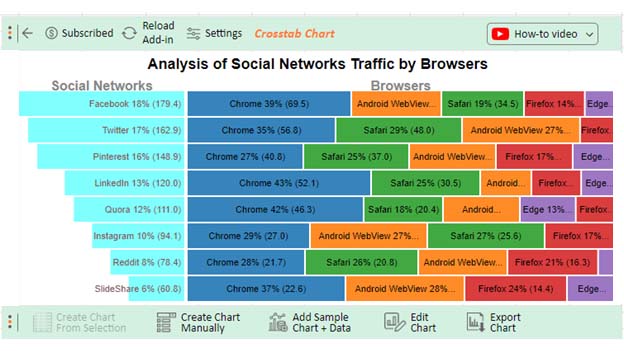
  • Your Crosstab Chart will appear as below.
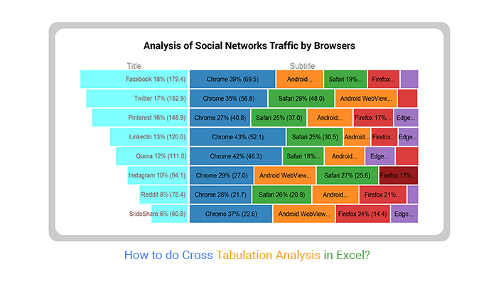
Final Cross-Tabulation in Excel

Insights

  • Chrome dominates social networks as the most popular browser, particularly on Facebook, with the highest usage at 69.5%.
  • Following closely, Safari secures the second spot in browser usage, with a notable presence on Twitter (48%) and Facebook (34.5%).
  • Firefox maintains a moderate presence across various social networks, with Pinterest leading in usage at 25.87%.
  • Edge and Android WebView lag in usage compared to other browsers, with Pinterest also holding the highest usage on Edge at 15.29%.
  • Facebook, Twitter, and Pinterest emerge as the triumvirate of most-utilized social networks, collectively capturing 53% of the audience.

What are the Benefits of Cross Tabulation Analysis?

Cross-tabulation is a versatile and indispensable tool. It not only organizes information but also illuminates the narrative within. This gives decision-makers the clarity needed to navigate the complexities of modern datasets. Here is an array of cross-tabulation analysis benefits that redefine how we extract knowledge from raw data.

  • Identifying relationships: At its core, cross-tabulation excels in revealing relationships between variables. It acts as a virtual detective, meticulously sifting through data to expose correlations that might otherwise remain hidden. This provides a visual roadmap to navigate the interconnected web of your dataset.
  • Data summarization: Cross tabulation condenses information into an understandable format, offering a bird’s-eye view of trends and patterns. This summarization prowess allows you to focus on the essence of data. As a result, it facilitates a more efficient understanding of the underlying story.
  • Visualization: Numbers, when left unattended, can be overwhelming. Cross-tabulation transforms raw numerical data into a visual feast. Creating clear and concise charts, tables, and graphs enables effortless grasping of trends, outliers, and distributions.
  • Hypothesis testing: Cross tabulation is not merely a descriptive analytics tool but a robust foundation for hypothesis testing. It provides a structured framework for statistical analysis, empowering you to test and validate hypotheses rigorously. This ensures that insights drawn from the data are not merely coincidental but grounded in statistical significance.
  • Segmentation analysis: Understanding the nuances within diverse datasets requires market segmentation analysis. Cross-tabulation facilitates this by allowing you to dissect data based on different criteria. Whether examining consumer behavior or market trends, this capability unveils insights specific to distinct groups or categories within the dataset.
  • Forecasting and predictive modeling: Peering into the future requires a solid understanding of the past. Cross-tabulation aids in forecasting by revealing historical trends. This historical context provides a foundation for informed predictive modeling, allowing you to anticipate future developments accurately.

Cross-Tabulation With Chi-Square Analysis

Cross-tabulation is a method used to analyze the relationship between two categorical variables by presenting their frequency distribution in a table. To assess whether these variables are independent, a Chi-Square analysis can be applied.

Steps for Cross-Tabulation with Chi-Square Analysis

  • Create a Cross-Tabulation Table: Organize your data into a table showing the frequency of each category.
  • Calculate Expected Frequencies: Determine the expected frequencies assuming the variables are independent.
  • Calculate Chi-Square: Use the formula: 
Formula for Chi-Sqaure for Doing Cross Tabulation in Excel

Where O is the observed frequency and E is the expected frequency.

  • Determine Degrees of Freedom: Use:                                                                       
Degree of Freedom for Doing Cross Tabulation in Excel

Where r is the number of rows and c is the number of columns.

  • Consult Chi-Square Distribution Table: Compare the Chi-Square value with the critical value from the table at the desired significance level.
  • Draw Conclusions: If the calculated Chi-Square value exceeds the critical value, there is a significant association between the variables.

Chi-Square Statistic for Cross-Tabulation Tables

Chi-square analysis evaluates the relationship between two categorical variables using a cross-tabulation table. To compute the Chi-Square statistic, create a table of observed frequencies, calculate expected frequencies with the formula:

Formula for Chi-Sqaure for Doing Cross Tabulation in Excel

Finally, compare the result to the critical value based on the degrees of freedom, calculated as:

Degree of Freedom for Doing Cross Tabulation in Excel

This comparison determines if there is a significant association between the variables.

Cross Tabulation 1

Cross Tabulation in Excel FAQs

What is cross tabulation?

Cross tabulation is a data analysis technique that organizes and summarizes data in a table format. It allows for a quick exploration of relationships between variables by displaying their intersections. This provides valuable insights into patterns and connections within the dataset.

What are cross-tabulation charts used for?

Cross-tabulation charts are used to represent relationships between two or more variables visually. They provide a clear snapshot of data patterns, aiding in identifying trends, comparisons, and correlations. This makes complex datasets more understandable and actionable for decision-making.

How do you make a cross tab in Excel?

To make a cross tab in Excel:

  1. Select your dataset.
  2. Insert a Pivot Table.
  3. Choose the data source.
  4. Design your Pivot Table by adding variables.
  5. Customize the layout.
  6. Interpret the results.
  7. Refresh data for dynamic analysis.

Wrap Up

Cross-tabulation in Excel is a formidable tool for unraveling the intricacies of datasets. It begins with a simple yet crucial step: preparing your data. Selecting the right information is key; it sets the foundation for a meaningful analysis.

Inserting a Pivot Table sets the stage for a detailed analysis. Choose the right data source to ensure accuracy in your results. Designing your PivotTable involves a simple drag-and-drop process, creating a structured framework for analysis.

Adding data to rows and columns allows for in-depth examination. Customize your PivotTable for a polished presentation apply filters, sort data, and format for clarity.

Interpreting results becomes straightforward as the intersection points reveal correlations between variables. This facilitates drawing meaningful conclusions from the data.

A critical step is to refresh your data when changes occur. Keeping your analysis up-to-date ensures accuracy and relevance. The process is a user-friendly journey from data preparation to actionable insights.

The ability to unravel patterns and relationships makes cross-tabulation an indispensable tool in the analytical arsenal. Following these steps, you can easily navigate the vast sea of data, distilling valuable insights.

Do not hesitate.

Embrace the power of cross-tabulation in Excel with ChartExpo today to transform raw data into actionable intelligence.

How much did you enjoy this article?

ExcelAd2
Start Free Trial!
134290

Related articles

next previous
Microsoft Excel13 min read

Excel for Teachers for Insightful Preparation

Excel for teachers simplifies grading, tracks attendance, and organizes data. Find its key features, expert tips, and how ChartExpo enhances data visualization.

Microsoft Excel14 min read

How to Make a Cash Flow Diagram in Excel?

Learn how to make a Cash Flow Diagram in Excel. It will help you learn to visualize and analyze inflows and outflows of your business cash flow.

Microsoft Excel11 min read

Succession Planning Template for Long-Term Success

Succession Planning Templates help businesses prepare for leadership changes. Learn to create, analyze, and use them for seamless transitions and growth.

Microsoft Excel10 min read

Grant Tracking Spreadsheet: Insights Made Easy

A Grant Tracker Spreadsheet helps track funding, deadlines, and expenses in Excel. Learn to use grant tracking templates, analyze data, and stay organized.

Microsoft Excel10 min read

What is Excel Software Used for: A Complete Guide

What is Excel software used for? It organizes, analyzes, and manages data. Explore its workplace applications, benefits, and top tips for efficiency and more.

ChartExpo logo

Turn Data into Visual
Stories

CHARTEXPO

  • Home
  • Gallery
  • Videos
  • Services
  • Pricing
  • Contact us
  • FAQs
  • Privacy policy
  • Terms of Service
  • Sitemap

TOOLS

  • ChartExpo for Google Sheets
  • ChartExpo for Microsoft Excel
  • Power BI Custom Visuals by ChartExpo
  • Word Cloud

CATEGORIES

  • Bar Charts
  • Circle Graphs
  • Column Charts
  • Combo Charts
  • Comparison Charts
  • Line Graphs
  • PPC Charts
  • Sentiment Analysis Charts
  • Survey Charts

TOP CHARTS

  • Sankey Diagram
  • Likert Scale Chart
  • Comparison Bar Chart
  • Pareto Chart
  • Funnel Chart
  • Gauge Chart
  • Radar Chart
  • Radial Bar Chart
  • Sunburst Chart
  • see more
  • Scatter Plot Chart
  • CSAT Survey Bar Chart
  • CSAT Survey Chart
  • Dot Plot Chart
  • Double Bar Graph
  • Matrix Chart
  • Multi Axis Line Chart
  • Overlapping Bar Chart
  • Control Chart
  • Slope Chart
  • Clustered Bar Chart
  • Clustered Column Chart
  • Box and Whisker Plot
  • Tornado Chart
  • Waterfall Chart
  • Word Cloud
  • see less

RESOURCES

  • Blog
  • Resources
  • YouTube
SIGN UP FOR UPDATES

We wouldn't dream of spamming you or selling your info.

© 2025 ChartExpo, all rights reserved.