Categories
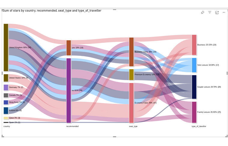
Power BI report examples are interactive dashboards that turn raw data into visual insights using charts, KPIs, tables, and filters.
They help businesses analyze performance, track trends, and make faster data-driven decisions.
Instead of working with static spreadsheets, users can explore data dynamically through drill-downs, slicers, and real-time updates.
These reports are widely used across finance, sales, marketing, and operations to improve visibility and simplify reporting.
Power BI report examples are interactive dashboards that visualize data using charts, tables, KPIs, and filters.
They help users explore data from multiple sources in a structured and interactive way.
These reports are built to support analysis, reporting, and decision-making through features like drill-downs, slicers, and dynamic filtering.
In simple terms: The Power BI report turns raw data into interactive insights that are easy to analyze and act on.
Power BI reporting is important because they improve how businesses access, understand, and use data.
Core value: They help teams move from static reporting to interactive, insight-driven decision-making.


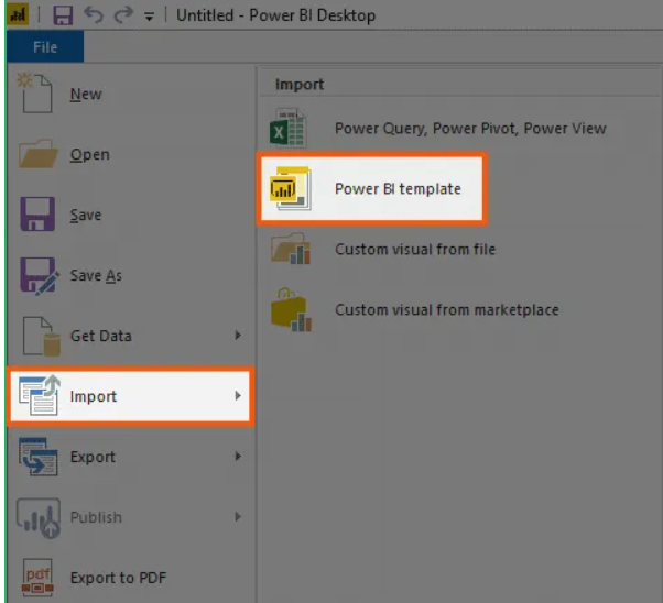
Creating a Microsoft Power BI sample report becomes easier when you follow a structured workflow. Below are simple, practical steps to build a clean and interactive report.
Open Power BI Desktop and import your dataset.
Check the data model view to ensure relationships are correctly formed between tables.
Set up relationships between tables if you have multiple datasets.
A strong data model ensures accurate visuals later.
Improve clarity and readability by adjusting layout and formatting.
For more advanced and polished visuals, you can use ChartExpo to create ready-made, presentation-friendly charts directly inside Power BI.

Make your report dynamic by adding:
This helps users explore data more effectively.
Before publishing, carefully review your report.
Once finalized:

Power BI report examples are widely used for data visualization and business intelligence. While they offer strong analytical capabilities, they also come with a few limitations depending on scale, usage, and licensing.
Every report should start with a clear purpose. Without it, dashboards become cluttered and less useful.
Focus on identifying:
A well-defined objective ensures that every visual serves a purpose rather than adding noise.
Clean design improves understanding and speeds up decision-making.
Follow these principles:
Simplicity helps users focus on insights rather than effort.
A strong data model directly improves report speed and usability.
Best practices include:
A well-structured model makes reports faster and easier to maintain.
Using the wrong chart type can lead to misleading insights.
Use the right mapping:
The right visual makes insights instantly understandable.
A good report should guide users naturally through the data.
Focus on:
Good UX ensures users can interact with data without confusion.
One of the most common mistakes is adding excessive visuals, metrics, and tables in a single report.
What goes wrong:
Better approach:
Focus only on KPIs that directly support the report’s objective. Remove anything that does not add decision value.
A weak data model leads to slow performance and inaccurate reporting.
Common issues:
Better approach:
Build a clean and structured data model with clear relationships and minimal redundancy to improve speed and accuracy.
Incorrect chart selection can distort insights and mislead users.
Examples of mistakes:
Better approach:
Match visuals to data type:
Slow reports reduce user engagement and trust in the data.
Common causes:
Better approach:
Simplify datasets, reduce visual load, and optimize queries to ensure smooth report performance.
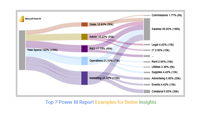
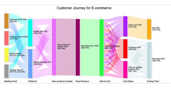
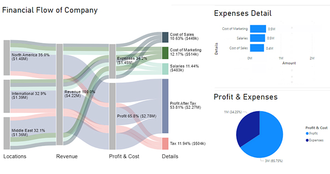
The five main types are:
Creating Power BI report examples may seem simple at first, but building effective, insight-driven dashboards requires practice and the right approach.
In this article, we explored what Power BI report is, along with their key advantages and limitations. We also reviewed practical examples, including finance-related reports such as spend analysis and financial performance dashboards.
Next, we walked through a step-by-step process for building charts in Power BI using a cash flow dataset to demonstrate a real-world application.
Finally, we covered common questions to help clarify key concepts and use cases.
Power BI becomes more powerful when you focus on clarity, structure, and real business needs. Exploring different report types and use cases will help you build more impactful dashboards over time.
How much did you enjoy this article?


A Customer Relationship Management Dashboard centralizes data, tracks key metrics, and drives smarter business decisions. Discover now!

Explore Healthcare Dashboard Examples and learn how to turn complex healthcare data into clear, actionable insights for better decision-making.

Power BI Copilot converts natural language into instant reports, dashboards, and data insights for teams at every level. Read on to learn more!