• Home
  • Tools dropdown img
    • Spreadsheet Charts

      • ChartExpo for Google Sheets
      • ChartExpo for Microsoft Excel
    • Power BI Charts

      • Power BI Custom Visuals by ChartExpo
    • Word Cloud

  • Charts dropdown img
    • Chart Category

      • Bar Charts
      • Circle Graphs
      • Column Charts
      • Combo Charts
      • Comparison Charts
      • Line Graphs
      • PPC Charts
      • Sentiment Analysis Charts
      • Survey Charts
    • Chart Type

      • Box and Whisker Plot
      • Clustered Bar Chart
      • Clustered Column Chart
      • Comparison Bar Chart
      • Control Chart
      • CSAT Survey Bar Chart
      • CSAT Survey Chart
      • Dot Plot Chart
      • Double Bar Graph
      • Funnel Chart
      • Gauge Chart
      • Likert Scale Chart
      • Matrix Chart
      • Multi Axis Line Chart
      • Overlapping Bar Chart
      • Pareto Chart
      • Radar Chart
      • Radial Bar Chart
      • Sankey Diagram
      • Scatter Plot Chart
      • Slope Chart
      • Sunburst Chart
      • Tornado Chart
      • Waterfall Chart
      • Word Cloud
    • Google Sheets
      Microsoft Excel
  • Services
  • Pricing
  • Contact us
  • Blog
  • Support dropdown img
      • Gallery
      • Videos
      • Contact us
      • FAQs
      • Resources
    • Please feel free to contact us

      atsupport@chartexpo.com

Categories
All Data Visualizations Data Analytics Surveys
Add-ons/
  • Google Sheets
  • Microsoft Excel
  • Power BI
All Data Visualizations Data Analytics Surveys
Add-ons
  • Google Sheets
  • Microsoft Excel
  • Power BI

We use cookies

This website uses cookies to provide better user experience and user's session management.
By continuing visiting this website you consent the use of these cookies.

Ok

ChartExpo Survey


Home > Blog > Power BI

Create Relationship in Power BI: Unlock Data Insights

Power BI Model relationships show the user how multiple tables are linked. Creating relationships in Power BI will show you how numerous tables are linked. Model relationships, for instance, help in linking a column from one table to another table’s column.

Create Relationship in Power BI

In this guide, you’ll discover what Power BI relationships are, how to create relationships in Power BI, the types of relationships in Power BI, and how to create relationships in Power BI manually.
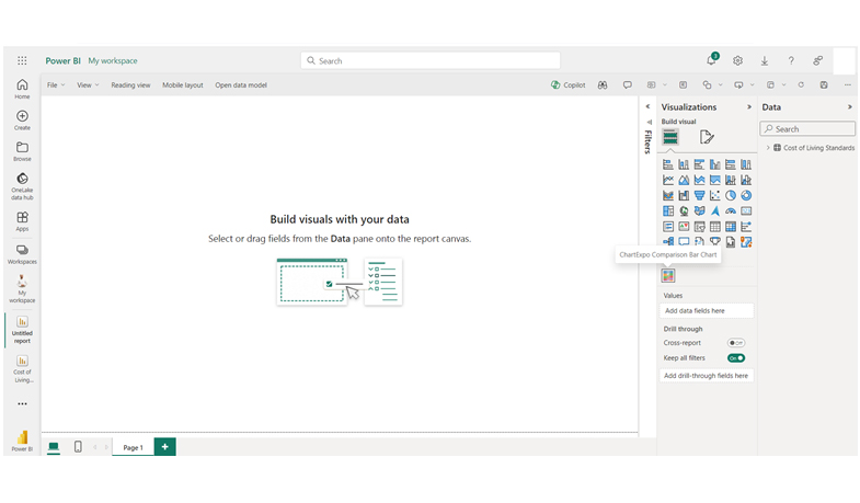
Table of Contents:

  1. What are Power BI Relationships?
  2. Why is Creating Relationships in Power BI Useful?
  3. Tips for Creating Effective Relationships in Power BI
  4. How Many Types of Relationships are in Power BI?
  5. How to Manage Relationships in Power BI?
  6. Common Mistakes to Avoid When Creating Relationships in Power BI
  7. How to View Relationships in Power BI?
  8. How Do You Edit and Change Relationships in Power BI?
  9. How to Visualize the Data in Power BI?
  10. Wrap Up

First…

What are Power BI Relationships?

Power BI Model relationships pass filters from the column of one model’s table to another. If there’s a relationship path to follow, filters will propagate – and they can propagate across multiple tables.

Filters in Power BI typically propagate consistently along relationship paths without random variation. However, with certain DAX functions, model calculations can modify the filter context or even disable relationships entirely. These advanced techniques give you greater control, allowing you to refine how filters impact your data models, ensuring you get the precise insights you need.

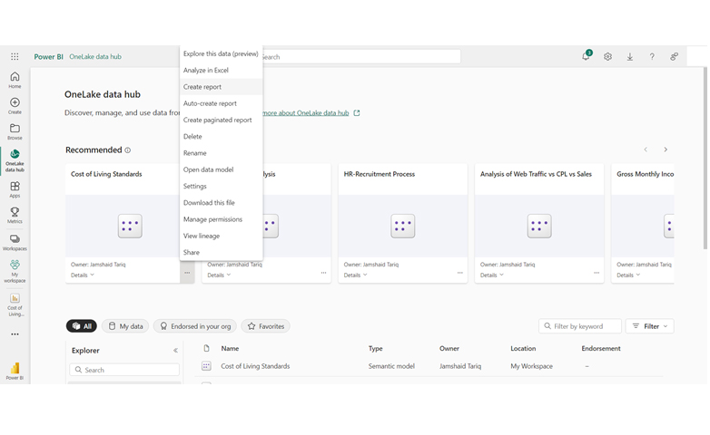
The image below shows how Power BI model relationships propagate filters.

Image Show How to Create Relationship in Power BI

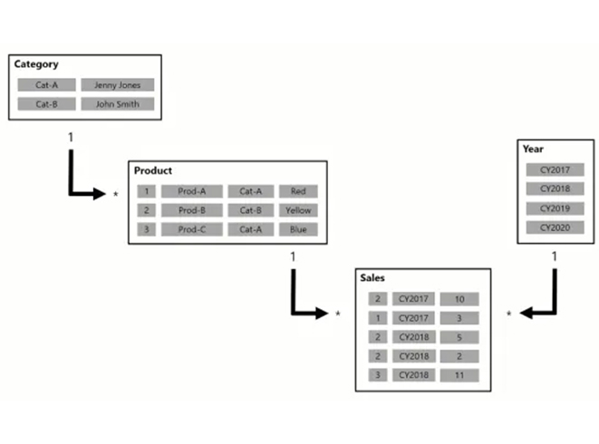
The model above contains four tables – Category, Product, Sales, and Year. The Category table is linked to the Product table, which is also linked to the Sales table. The Sales table is also linked to the Year Table.

Why is Creating Relationships in Power BI Useful?

Here are reasons why creating relationships in Power BI is useful:

  • Data Integration: It helps in connecting multiple data tables, and also enables comprehensive datasets analysis.
  • Time Efficiency: It automates data connection, thereby saving the time that goes into manual data linking.
  • Scalability: It maintains usability and performance even as you scale your data models.
  • Enhances Analysis: It facilitates advanced analytics like multi-table calculations and cross-filtering.

Tips for Creating Effective Relationships in Power BI

  1. Document Relationships: Keep notes of the details and purpose of relationships.
  2. Define Primary Keys: The tables have to be properly identified for proper linking.
  3. Regular Review: Regularly check and validate relationships.
  4. Ensure Data Quality: Your data has to be cleaned and prepared to ascertain accuracy and consistency.

How Many Types of Relationships are in Power BI?

  • One-to-One (1:1):

Each row in a table has a unique corresponding row in the other table. It’s used in cases where tables have a direct, unique match for each entry.

  • One-to-Many (1: or:1):

A single row in a table corresponds to multiple rows in the other table. It’s used for connecting a primary table (like the product list) to related data (like the sales records).

  • Many-to-Many (:):

Used in cases where complex relationships exist between tables without unique matches. For instance, multiple rows in a table correspond to multiple rows in the other table.

How to Manage Relationships in Power BI?

  1. Access Relationship View: Open the Power BI Desktop, and select the “Model” icon to go to Model View in the left pane. The view enables you to manage and visualize relationships between tables.
  2. Create Relationships: To create relationships, you’ll have to drag and drop fields between tables. Always connect the correct key fields (like primary key to foreign key).
  3. Define Relationship Cardinality: Specify the relationship type. It could be One-to-One, One-to-Many, or Many-to-Many. It helps to ascertain accurate data modeling and filtering.
  4. Configure Cross-Filter Direction: Set up the cross-filter direction (single or both) to determine how filters apply across related tables. If you’re working with complex data models, opt for bidirectional filtering.
  5. Manage Relationship Properties: To edit relationship properties, double-click on the relationship line. Always adjust the cardinality, active/inactive status, and cross-filter direction.
  6. Utilize Relationship Functions: DAX functions like RELATEDTABLE and RELATED can be used to leverage relationships in the measures and calculations.

Common Mistakes to Avoid When Creating Relationships in Power BI

  • Missing Primary Keys: Failure in setting unique identifiers could cause relationship failures.
  • Not Testing: Failure to validate relationships could lead to inaccurate data reports.
  • Circular Relationships: One way to prevent calculation errors is by avoiding the creation of loops.
  • Incorrect Cardinality: Misconfiguring many-to-many or one-to-many relationships will lead to data errors.

How to View Relationships in Power BI?

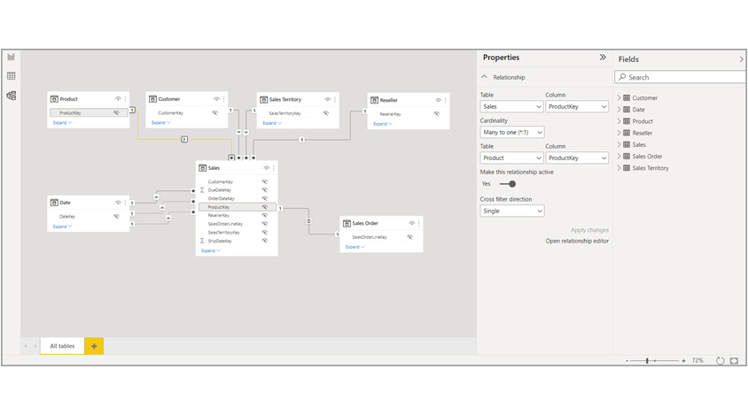
Model views show the relationships, columns, and tables in your model. The view comes in handy when you have complex relationships between multiple tables in the model.

To view the existing model, navigate to the side of the window and select “Model view.” To show the columns used, you’ll have to hover the cursor over the “relationship line.”

Select Model View to Create Relationship in Power BI

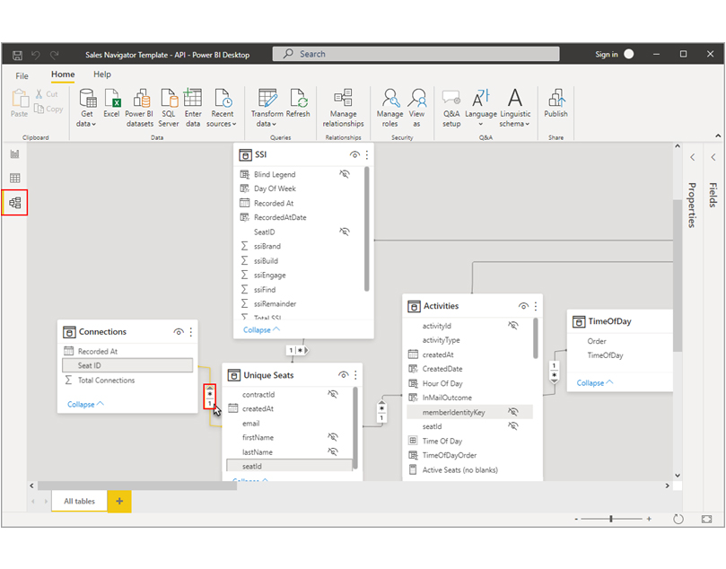
To open the relationship, double-click it in the “Edit relationship” dialog box. To get more information about the relationships, navigate to the Create and Manage Relationships option in the Power BI Desktop.

Updated Model View

The updated “Model view” is enabled in the current releases of Power BI Desktop.

Update Model View to Create Relationship in Power BI

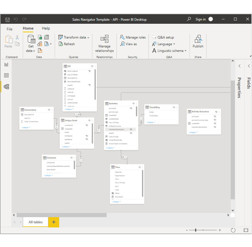
The colors of the table card headers will automatically match the colors in your report theme. However, if the colors are too close to white, they will not be used in the Model view. That’s to eliminate cases where it becomes difficult to differentiate tables in dual mode. From the previous image, you’ll notice that the card headers are white. In cases where the report theme is blue, the card headers in the “Mode view” will be blue and not white.

If the model has less than 75 tables, all the tables will be shown in the Model view. If there are over 75 tables, an image similar to the one below will be displayed.

Click Create a Custom Layout to Create Relationship in Power BI

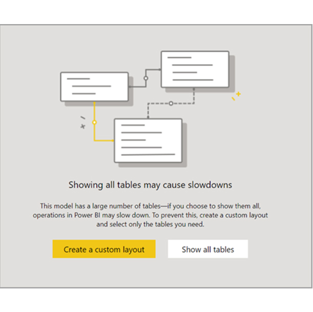
In cases where the model has more than 75 tables, Power BI notifies you of the likelihood of experiencing slowdowns. To reduce significant memory and CPU usage when there are over 75 tables, you’ll have to create a custom layout. To do that, select the “Create a custom layout” button.

How Do You Edit and Change Relationships in Power BI?

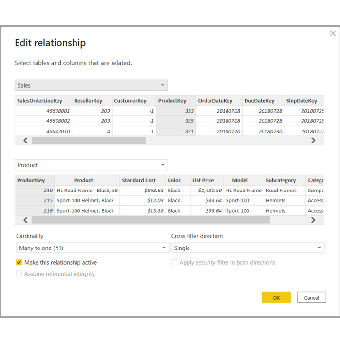
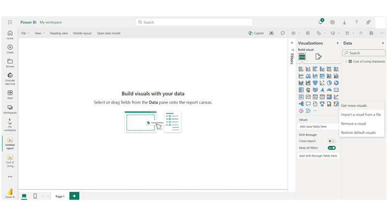
You can edit the relationship in Power BI in one of two ways. First, you can navigate to the Model view and use the editing relationships in the properties pane. This option allows you to choose any line between two tables to figure out the relationship options in the properties pane. To see the relationship options, you’ll have to expand the properties pane.

See the relationshop options to Create Relationship in Power BI

The second method involves the use of the relationship editor dialog. And there are multiple ways of opening it in Power BI Desktop. You can open the relationship editor dialog using any of the methods below:

Navigate to the Report view and do any of the following:

  • Select Modeling ribbon > Manage relationships. After that, select the relationship and choose edit.
  • Select a table in the Fields list. After that, select Table tools ribbon > Manage relationships. Finally, select the relationship and choose edit.

Here’s a screenshot of the Edit relationship window.

Edit Relationshop Window to Create Relationship in Power BI

How to Visualize the Data in Power BI?

Stage 1: Logging in to Power BI
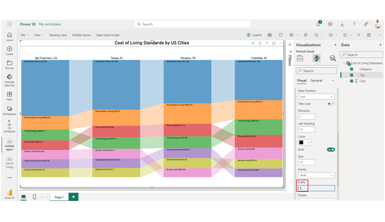
  • Log in to Power BI.
  • Enter your email address and click the “Submit” button.
Enter email to login to Power BI
  • You are redirected to your Microsoft account.
  • Enter your password and click “Sign in“.
Enter Password to login to Power BI
  • You can choose whether to stay signed in.
Click on stay signed in
  • Once done, the Power BI home screen will open.

Stage 2: Creating a Data Set and Selecting the Data Set to Use in Your Chart

  • Go to the left-side menu and click the “Create” button.
  • Select “Paste or manually enter data“.
select Paste or manually enter data in Power BI ce487
  • We’ll use the sample data below for this example.
City Category Cost
Houston, TX Apartment Rent 1,352
Houston, TX Total Energy 190.29
Houston, TX Phone Bill 211.13
Houston, TX Doctor Visit 93.85
Houston, TX Dentist Visit 120.24
Houston, TX Optometrist Visit 120.7
Houston, TX Prescription Drug 505.78
Tampa, FL Apartment Rent 1,661
Tampa, FL Total Energy 189.14
Tampa, FL Phone Bill 193.94
Tampa, FL Doctor Visit 122.6
Tampa, FL Dentist Visit 111.7
Tampa, FL Optometrist Visit 116.93
Tampa, FL Prescription Drug 367.5
Columbia, SC Apartment Rent 1,154
Columbia, SC Total Energy 290.58
Columbia, SC Phone Bill 192.75
Columbia, SC Doctor Visit 150
Columbia, SC Dentist Visit 78.33
Columbia, SC Optometrist Visit 59
Columbia, SC Prescription Drug 416.3
San Francisco, CA Apartment Rent 3,830
San Francisco, CA Total Energy 298.77
San Francisco, CA Phone Bill 203.63
San Francisco, CA Doctor Visit 174.45
San Francisco, CA Dentist Visit 155.36
San Francisco, CA Optometrist Visit 159.79
San Francisco, CA Prescription Drug 498.84
  • Paste the data table into the “Power Query” window and name it “Cost of Living Standard Analysis.” After that, select the “Create a dataset only” option.
Click Create a Dataset Only After You Create Relationship in Power BI
  • From the left-side menu, click “Data Hub.” Next, Power BI populates the data set list. If you’ve not created a data set, you’ll get an error message. After that, click “Create report.”
Click Data Hub After You Create Relationship in Power BI
  • Click “Get more visuals.”
Click Get More Visuals After You Create Relationship in Power BI
  • Search “ChartExpo,” and choose “Comparison Bar Chart” from the list of options.
Choose Comparison Bar Chart After You Create Relationship in Power BI
  • Click on the comparison bar chart, and on “Add.”
Click Add Button After You Create Relationship in Power BI
  • You’ll see the Comparison Bar Chart in the visuals list:
See Comparison Bar Chart in Visuals List After You Create Relationship in Power BI
  • Click on Cost-of-Living Standards:
Click on Data Set After You Create Relationship in Power BI
  • At this point, you’ll have to select the metrics of your data. Navigate to the “License Settings,” click on it, and add your key. After that, the comparison bar chart will be displayed. To add the header text, click on the “General tab,” and add the header text in Title.
Add Chart Header After You Create Relationship in Power BI
  • There’s the option of disabling the value of each top bar, and aligning the text into the center as shown below:
Disable Top Bar and Align Text into Center After You Create Relationship in Power BI
  • Navigate to the “Bar Level,” and look at the options beneath it to disable the percentage value and title case.
Disable Percentage Value After You Create Relationship in Power BI
  • Here’s how to add the dollar sign with values.
Add Dolalr Sign After You Create Relationship in Power BI
  • Here’s how the final look of the Comparison Bar Chart in Power BI will be.
Final Create Relationship in Power BI

Insights

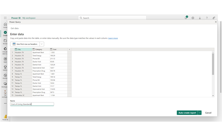
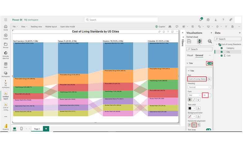
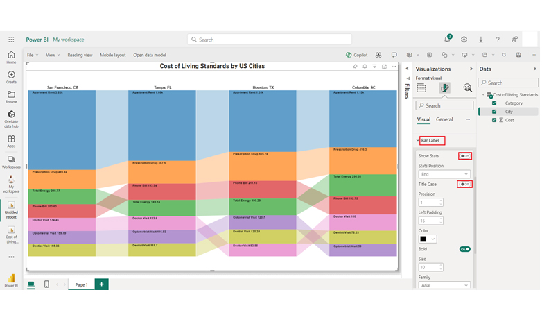
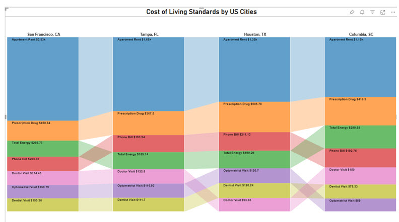
Here are three insights from the chart:

  • Houston, TX: Energy $190.29; Rent $1,352; Optometrist $120.7; Doctor $93.85; Prescription $505.78; Phone $211.13; Dentist $120.24.
  • Tampa, FL: Energy $189.14; Rent $1,661; Optometrist $116.93; Doctor $122.6; Prescription $367.5; Phone $193.94; Dentist $111.7.
  • Columbia, SC: Energy $290.58; Rent $1,154; Optometrist $59; Doctor $150; Prescription $416.3; Phone $192.75; Dentist $78.33.

FAQs

How to create multiple relationships between two tables in Power BI?

Creating multiple relationships between two tables involves using the “Manage Relationships dialog,” and defining primary and secondary relationships. Finally, you’ll have to activate specific relationships in calculations using DAX functions like USERELATIONSHIP.

How to create a relationship in Power BI without unique values?

Creating a relationship in Power BI without unique values involves using a bridge table with unique keys. After that, you’ll have to create one-to-many relationships between the bridge table and each original table.

Does Power BI automatically detect relationships between tables?

Yes, relationships between tables are detected by Power BI. And it’s based on matching data types and column names. There are times when manual adjustments are needed to define specific relationship types and ascertain accuracy.

Wrap Up

Common columns are ways of linking tables in Power BI. This helps in seamless data combination and gives room for an integrated data analysis. Common relationship types in Power BI include one-to-one, one-to-many, and many-to-many.

To manage the relationships, use the “Manage Relationships dialog.” Common mistakes to avoid when creating relationships in Power BI are:

  • Missing primary keys
  • Circular relationships
  • Not testing
  • Ignoring data quality.

The steps outlined in this guide will help you use Power BI to create interactive, and engaging visualizations. What pieces will you put in place when creating relationships in Power BI?

How much did you enjoy this article?

PBIAd2
Start Free Trial!
137841

Related articles

next previous
Power BI12 min read

Power BI Group By Guide for Effective Data Insights

Learn how Power BI Group By helps you aggregate data, clarify trends, and create reports by grouping values to make large datasets manageable & insightful.

Power BI12 min read

How to Create Sankey Diagram in Microsoft Power BI?

Learn How to Create Sankey Diagram in Microsoft Power BI using Desktop & Web Service. What they are and how to use them effectively.

Power BI8 min read

Power BI Artificial Intelligence: Insights Using Visuals

Discover all there is to know about the Power BI artificial intelligence. You'll also discover how AI is used in Power BI, and how to use it for analysis and more.

Power BI9 min read

Budgeting in Healthcare: Use Visuals to Spot Budget Gaps

This guide helps you discover what budgeting in healthcare is. You'll also discover the factors that affect hospital budgets and types of budgeting in healthcare.

Power BI9 min read

Predictive Analytics in Power BI for Making Insightful Visuals

This guide shows you everything you need to know about Predictive Analytics in Power BI. It also shows you how it works, and how to interpret the results.

ChartExpo logo

Turn Data into Visual
Stories

CHARTEXPO

  • Home
  • Gallery
  • Videos
  • Services
  • Pricing
  • Contact us
  • FAQs
  • Privacy policy
  • Terms of Service
  • Sitemap

TOOLS

  • ChartExpo for Google Sheets
  • ChartExpo for Microsoft Excel
  • Power BI Custom Visuals by ChartExpo
  • Word Cloud

CATEGORIES

  • Bar Charts
  • Circle Graphs
  • Column Charts
  • Combo Charts
  • Comparison Charts
  • Line Graphs
  • PPC Charts
  • Sentiment Analysis Charts
  • Survey Charts

TOP CHARTS

  • Sankey Diagram
  • Likert Scale Chart
  • Comparison Bar Chart
  • Pareto Chart
  • Funnel Chart
  • Gauge Chart
  • Radar Chart
  • Radial Bar Chart
  • Sunburst Chart
  • see more
  • Scatter Plot Chart
  • CSAT Survey Bar Chart
  • CSAT Survey Chart
  • Dot Plot Chart
  • Double Bar Graph
  • Matrix Chart
  • Multi Axis Line Chart
  • Overlapping Bar Chart
  • Control Chart
  • Slope Chart
  • Clustered Bar Chart
  • Clustered Column Chart
  • Box and Whisker Plot
  • Tornado Chart
  • Waterfall Chart
  • Word Cloud
  • see less

RESOURCES

  • Blog
  • Resources
  • YouTube
SIGN UP FOR UPDATES

We wouldn't dream of spamming you or selling your info.

© 2025 ChartExpo, all rights reserved.