• Home
  • Tools dropdown img
    • Spreadsheet Charts

      • ChartExpo for Google Sheets
      • ChartExpo for Microsoft Excel
    • Power BI Charts

      • Power BI Custom Visuals by ChartExpo
    • Word Cloud

  • Charts dropdown img
    • Chart Category

      • Bar Charts
      • Circle Graphs
      • Column Charts
      • Combo Charts
      • Comparison Charts
      • Line Graphs
      • PPC Charts
      • Sentiment Analysis Charts
      • Survey Charts
    • Chart Type

      • Box and Whisker Plot
      • Clustered Bar Chart
      • Clustered Column Chart
      • Comparison Bar Chart
      • Control Chart
      • CSAT Survey Bar Chart
      • CSAT Survey Chart
      • Dot Plot Chart
      • Double Bar Graph
      • Funnel Chart
      • Gauge Chart
      • Likert Scale Chart
      • Matrix Chart
      • Multi Axis Line Chart
      • Overlapping Bar Chart
      • Pareto Chart
      • Radar Chart
      • Radial Bar Chart
      • Sankey Diagram
      • Scatter Plot Chart
      • Slope Chart
      • Sunburst Chart
      • Tornado Chart
      • Waterfall Chart
      • Word Cloud
    • Google Sheets
      Microsoft Excel
  • Services
  • Pricing
  • Contact us
  • Blog
  • Support dropdown img
      • Gallery
      • Videos
      • Contact us
      • FAQs
      • Resources
    • Please feel free to contact us

      atsupport@chartexpo.com

Categories
All Data Visualizations Data Analytics Surveys
Add-ons/
  • Google Sheets
  • Microsoft Excel
  • Power BI
All Data Visualizations Data Analytics Surveys
Add-ons
  • Google Sheets
  • Microsoft Excel
  • Power BI

We use cookies

This website uses cookies to provide better user experience and user's session management.
By continuing visiting this website you consent the use of these cookies.

Ok

ChartExpo Survey


Home > Blog > Power BI

Filters in Power BI: Unlock the Power of Data Filtering

Filters in Power BI are one of the most significant features of the tool. Being able to apply filters helps you focus on what’s important. Without filters in Power BI, it will be somewhat impossible to analyze subsets of data and draw insights from them.

Filters in Power BI

In this guide, you’ll discover what insights in Power BI are, and why they’re important.

Table of Contents:

  1. What are Filters in Power BI?
  2. Why are Power BI Filters So Important?
  3. What is the Purpose of Power BI Filters?
  4. How Many Types of Filters are in Power BI?
  5. What is the Difference Between a Power BI Filter vs. Slicer?
  6. How to Remove the Filter from Power BI Visuals?
  7. How to Apply or Add a Filter in the Power BI Dashboard?
  8. How to Create Visualizations in Power BI?
  9. Wrap Up

First…

What are Filters in Power BI?

Power BI filters are used for extracting information from a large volume of data and representing such information in visuals and reports. With Power BI filters, including Power BI cross-filter direction, it becomes easy to focus on a specific subset of data from a dataset.

This feature enhances the filtering process by allowing data to flow across related tables, enabling users to see how changes in one filter affect others. The specific subset of data is targeted using the given criteria.

After opening the Power BI report design with the dataset, the filters panel is found on the right side of the screen.

Why are Power BI Filters So Important?

Here are the major benefits of using Power BI filters.

  • Data Focus: Power BI filters help in isolating data points. It’s useful when you’re dealing with large Power BI datasets, and in cases when it’s somewhat challenging to isolate specific data points or ranges from large datasets.
  • Interactivity: Power BI filters are interactive. A user has the option of adjusting the filters to enable the user to see how different selections impact the overall data visualizations. The interactivity helps in deepening understanding and promoting the exploration of the data.
  • Customization: There are various customization criteria when using Power BI filters. These criteria could be category, time, or other dimension. This helps the user to design their analysis in such a way that fits their requirements.
  • Comparative analysis: Power BI filters are like your personal data detective, helping you compare different data subsets side by side. This is especially useful for those diving into trend analysis, as it allows you to spot patterns, outliers, and trends across various data segments. With these filters, you can effortlessly unearth insights and make data-driven decisions based on a comprehensive view of your data.
  • Drill-down analysis: Drill-down analysis is a case where users can begin by reviewing data and progress by diving deeper into specific subsets. All these can be accomplished by applying filters.

What is the Purpose of Power BI Filters?

Power BI filters help in narrowing down the data that’s being visualized in the Power BI dashboards and reports. Some key purposes of Power BI filters are:

  • Interactivity
  • Customization
  • Data Focus
  • Drill-Down Analysis
  • Comparative Analysis

How Many Types of Filters are in Power BI?

The main types of filters are:

  • Visual Level Filters
  • Page Level Filters
  • Report Level Filters
  • Drill-Through Filters
  • Cross-Report Filters (found in Power BI Service)

What is the Difference Between a Power BI Filter vs. Slicer?

Here is the major difference between Power BI filter vs. slicer:
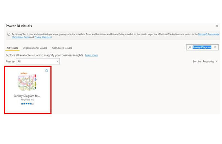
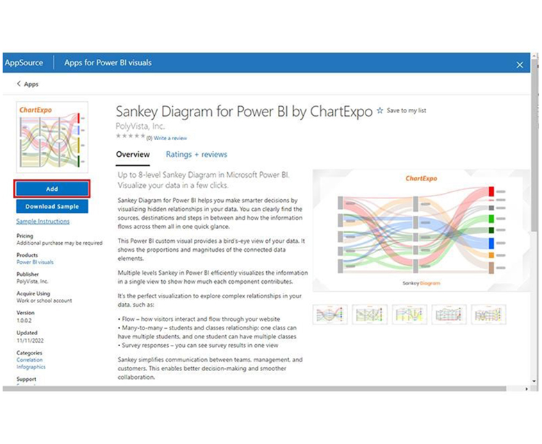
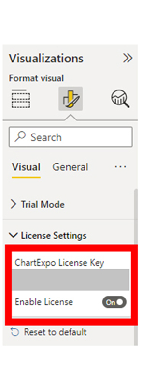
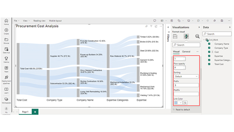
Power BI Filters

  • Directly applied to pages, visualizations, and the overall report.
  • Can be used to filter data based on predefined conditions or rules.
  • Operates behind the scenes without visible user interaction, and data is refined based on selected criteria.

Slicers

  • With Slicers in Power BI, Users are enabled to choose ranges (or values) to filter data.
  • Comes with interactive visual controls that are visible on the report canvas.
  • Users can intuitively manipulate data subsets.

How to Remove the Filter from Power BI Visuals?

Clear Filter Button

  • To apply the filter, click on the specific visual.
  • Navigate to the “Clear Filter” icon found at the top-right corner of the visual. The “Clear Filter” icon is the funnel with an “X” inside.
  • To remove the filter, click the “Clear Filter” option.

Remove Individual Filters

  • Select the specific visual.
  • From your Power BI interface, navigate to the “Filters” pane.
  • To delete a specific filter, click the “X” icon that’s next to it.

Clear All Filters

  • Navigate to the “Home” tab of your Power BI interface.
  • To remove the filters that are applied to an entire report, click the “Clear filters” icon.

How to Apply or Add a Filter in the Power BI Dashboard?

Step 1: Using the page-level filter involves creating two visuals on the Power BI dashboard designs. For instance, two visuals (a pie chart and a table) were created.

Use Page-Level Filter for Applying Filters in Power BI

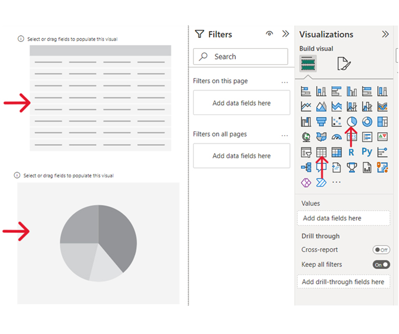
Step 2: The visual level filters can be used to individually populate each visual. From the image below, you’ll notice that the two visual pie charts and tables have been populated by selecting the perspective fields from the data panel.

Using Visual Level Filters for Applying Filters in Power BI

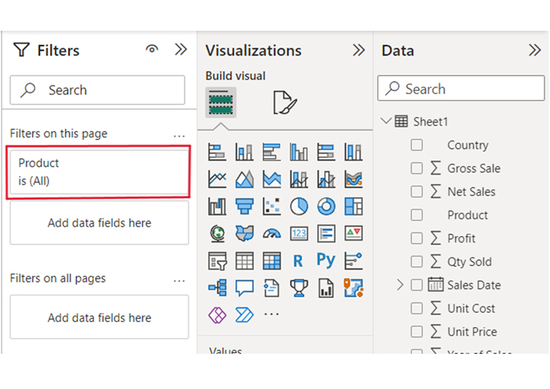
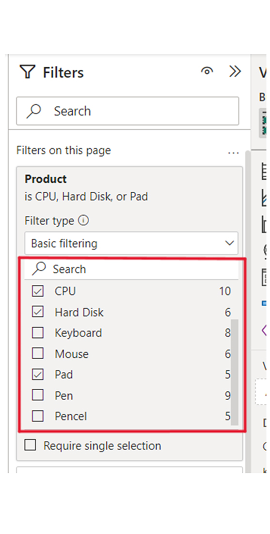
Step 3: To use the page-level filter, you’ll have to navigate to the data panel beneath the “Filters on this page” option and drag and drop the data fields. From the screenshot below, you’ll notice that the product data field has been dropped in the “Filters on this page.”

Select Data Panel Beneath Filters on this Page for Applying Filters in Power BI

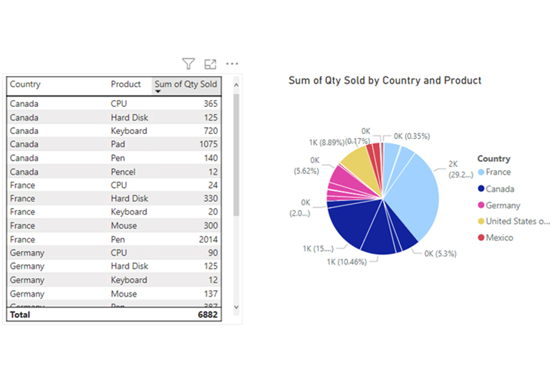
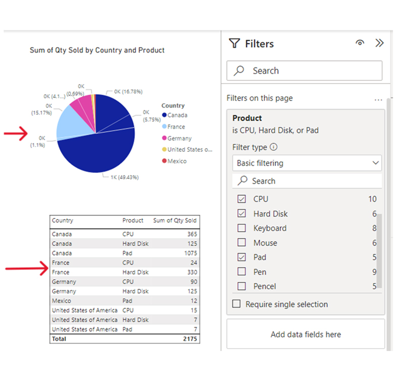
Step 4: Select the values from the data field you want to update on all visuals of your current page to update the entire visuals on the page. From the image below, values from the CPU, Hard Disk, and Pad have been selected, and they’ve been updated on the pie chart and table visuals.

Select Data Field for Applying Filters in Power BI

From the image below, you’ll notice that the two visuals in the pie chart and table are updated.

Create Pie Chart and Table After Applying Filters in Power BI

How to Create Visualizations in Power BI?

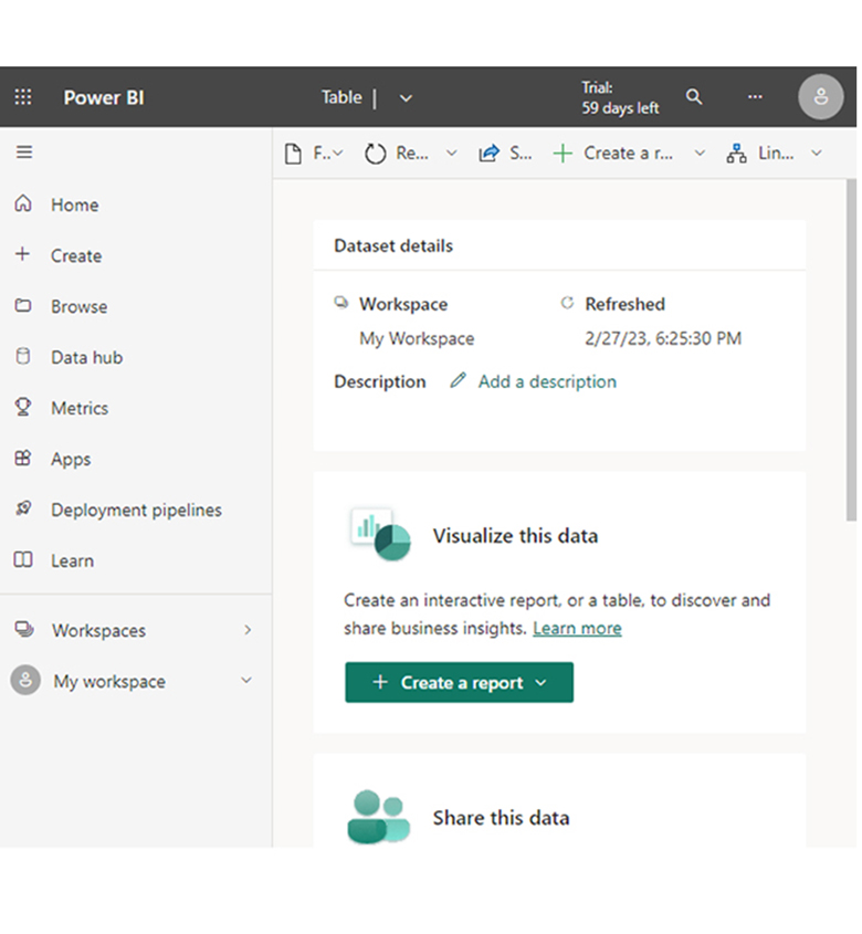
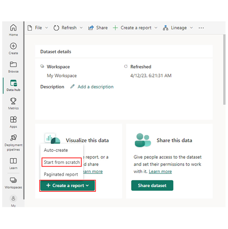
Stage 1: Logging in to Power BI
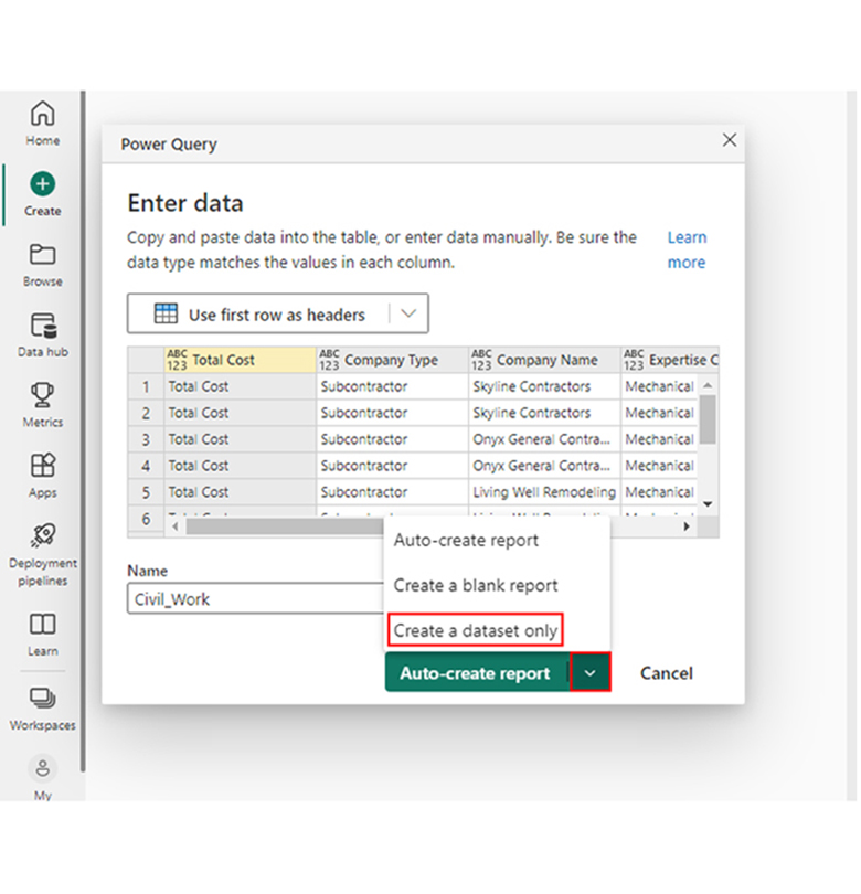
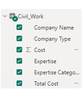
  • Log in to Power BI.
  • Enter your email address and click the “Submit” button.
Enter email to login to Power BI
  • You are redirected to your Microsoft account.
  • Enter your password and click “Sign in“.
Enter Password to login to Power BI
  • You can choose whether to stay signed in.
Click on stay signed in
  • Once done, the Power BI home screen will open.

Stage 2: Creating a Data Set and Selecting the Data Set to Use in Your Chart

  • Go to the left-side menu and click the “Create” button.
  • Select “Paste or manually enter data“.
select Paste or manually enter data in Power BI ce487
  • We’ll use the sample data below for this example.
Total Cost Company Type Company Name Expertise Categories Expertise Cost
Total Cost Subcontractor Skyline Contractors Mechanical Installation Plumbing & Heating 15456
Total Cost Subcontractor Skyline Contractors Mechanical Installation Mechanical Work 10159
Total Cost Subcontractor Onyx General Contractors Mechanical Installation Plumbing & Heating 18045
Total Cost Subcontractor Onyx General Contractors Mechanical Installation Mechanical Work 12695
Total Cost Subcontractor Living Well Remodeling Mechanical Installation Plumbing & Heating 14589
Total Cost Subcontractor Living Well Remodeling Mechanical Installation Welding 11456
Total Cost Supplier Power-up Builders Raw Material Cement 20561
Total Cost Supplier Power-up Builders Raw Material Steel 32456
Total Cost Supplier Five-star Construction Raw Material Bricks 10253
Total Cost Supplier Five-star Construction Raw Material Timber 9000
  • Paste your data table into the “Power Query” window, and choose the “Create a dataset only” option.
Create a Dataset Only After Applying Filters in Power BI
  • Navigate to the left-side menu, and click the “Data Hub” option. After that, Power BI populates the data set list. If no data set has been created, you’ll get an error message.
Select Dataset in Data hub After Applying Filters in Power BI
  • Select the data set you want to represent in a Sankey diagram. After that, Power BI populates the screen similar to the image below.
Power BI Dataset Populates for Report After Applying Filters in Power BI
  • From the dropdown menu, click “Create a report.” Next, select “Start from scratch.”
Create Start from Scratch After Applying Filters in Power BI
  • The Report Canvas will be similar to the image below:
Report Canvas After Applying Filters in Power BI

Stage 3: Add the Power BI Sankey Diagram Extension by ChartExpo

  • Navigate to the right side of your Power BI dashboard, and open the Power BI Visualization panel. After that, click the ellipsis symbol (…) to import the Power BI Sankey Diagram extension by ChartExpo.
Click 3 Dots Icon After Applying Filters in Power BI
  • From the menu that opens, choose the “Get more visuals” option.
Click Get more visuals After Applying Filters in Power BI
  • Input “Sankey Diagram for Power BI by ChartExpo” into the highlighted search box. You’ll see the “Sankey Diagram for Power BI by ChartExpo.”
Search Sankey Diagram After Applying Filters in Power BI
  • Click the “Add’ button.
Click Add Button After Applying Filters in Power BI
  • The “Sankey Diagram for Power BI by ChartExpo” icon will be added to the visualization panel.
Sankey Diagram Icon will be added on Visualization Panel After Applying Filters in Power BI

Stage 4: Drawing the Sankey Diagram with ChartExpo’s Power BI extension.

  • From the visualization panel, choose the “Sankey Diagram for Power BI by ChartExpo” icon. After that, a window similar to the image below will open.
Visualization Panel Window After Applying Filters in Power BI
  • There’s the option of resizing the visual. Moving on, navigate to the right side of the Power BI dashboard, and look out for “Fields” next to “Visualizations.”
Look in Fields for Visualization After Applying Filters in Power BI
  • You should select the fields using the sequence below:
    • Total Cost
    • Company Type
    • Company Name
    • Expertise Categories
    • Expertise
    • Cost
Select Fields in Sequence After Applying Filters in Power BI
  • You’ll have to provide your email address or ChartExpo license key.
Enter Email Address After Applying Filters in Power BI

Stage 5: Activate your ChartExpo Trial or Apply a Subscription Key.

  • Choose the ChartExpo visual, and in the Visualization panel, look out for the three icons below “Build Visual.”
Select Sankey Diagram Icon After Applying Filters in Power BI
  • Choose the middle icon, “Format visual.” The visual properties will be populated as shown in the image below.
Choose Format Visual in Middle Icon After Applying Filters in Power BI
  • As a new user, you can get started by;
    • Input your email address into the textbox under the ”˜Trial Mode” section. A license key will be sent to your email. To activate the 7-day trial, toggle “Enable Trial.”
Enter License Key After Applying Filters in Power BI
  • The Sankey Diagram created within the 7-day trial will have the ChartExpo watermark.
Sankey Diagram with Watermark After Applying Filters in Power BI
  • If you have a license key, you should enter it in the “ChartExpo License Key” textbox in the “License Settings” section. After that, slide the toggle switch next to “Enable License” to “On.”
Enable License in License Settings After Applying Filters in Power BI
  • The Sankey diagram will be similar to the one below.
Initial Sankey Diagram After Applying Filters in Power BI
  • To add a prefix (like the $ sign), expand the “Stats” properties, and insert the prefix value.
Add Prefix and Stats After Applying Filters in Power BI
  • To add colors to each node, expand the “Level Colors” properties, and choose the colors.
Add Colors to Each Node Expand Level Colors After Applying Filters in Power BI
  • All changes will be saved automatically.
Final Filters in Power BI

Insights:

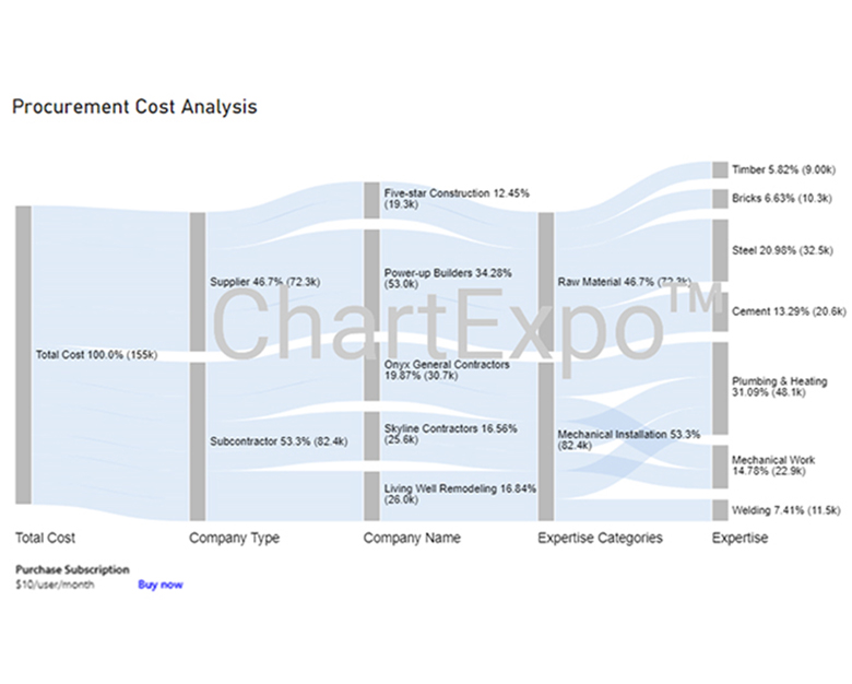
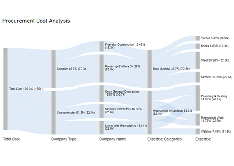
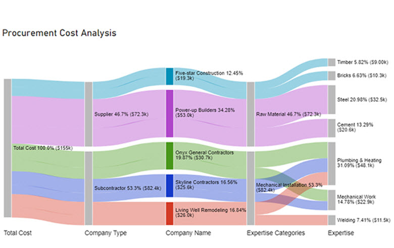
Here are three insights from the chart.

  • At Level 1 (Total Cost), the procurement cost was $155k.
  • At Level 2 (Company Type), out of the $155k cost, $82.4k (53.3%) was spent on subcontractors, while $72.3k (46.7%) was allocated to the supplier.
  • At Level 3 (Company Name), the supplier cost of $72.3k was divided between two companies: Five-star Construction and Power-up Builder with charges of $19.3k and $53.0k, respectively.

FAQs

How to Use Filters in Power BI?

  • Click on the visual
  • Choose the field you want to filter
  • To apply your desired filter, choose a filter type (like slicer or dropdown).

Can You Put a Filter on the Power BI Dashboard?

No, filters cannot be directly applied to a Power BI dashboard. However, there’s the option of filtering the underlying reports that are pinned to the dashboard, and the filters will reflect on your dashboard.

How Do You Write a Filter Query in Power BI?

Writing a filter query involves using Data Analysis Expressions (DAX) functions like CALCULATE, FILTER, and ALL to define criteria for filtering data in measures or visualizations.

Wrap Up

Filters in Power BI are features that help you focus on specific subsets. They play crucial roles when it comes to interactivity, data focus, storytelling, and analysis. Types of filters in Power BI include reports, pages, visuals, slicers, and others. Slicers provide user-visible interactive filtering.

With Power BI filters, users can narrow down and refine the data that’s being visualized in their dashboards and reports. It also helps the user to focus on specific data subsets that are relevant to their reporting and analysis needs.

For emphasis, Power BI filters help in:

  • Data focus
  • Customization
  • Comparative analysis
  • Drill-down analysis
  • Interactivity

Now you know the benefits of filters in Power BI and how to use them in your Sankey chart, what kind of data will you be filtering?

How much did you enjoy this article?

PBIAd1
Start Free Trial!
137227

Related articles

next previous
Power BI12 min read

How to Create Sankey Diagram in Microsoft Power BI?

Learn How to Create Sankey Diagram in Microsoft Power BI using Desktop & Web Service. What they are and how to use them effectively.

Power BI8 min read

Power BI Artificial Intelligence: Insights Using Visuals

Discover all there is to know about the Power BI artificial intelligence. You'll also discover how AI is used in Power BI, and how to use it for analysis and more.

Power BI9 min read

Budgeting in Healthcare: Use Visuals to Spot Budget Gaps

This guide helps you discover what budgeting in healthcare is. You'll also discover the factors that affect hospital budgets and types of budgeting in healthcare.

Power BI9 min read

Predictive Analytics in Power BI for Making Insightful Visuals

This guide shows you everything you need to know about Predictive Analytics in Power BI. It also shows you how it works, and how to interpret the results.

Power BI8 min read

Quarterly Business Review Template for Optimum Reports

Discover what the quarterly business review template is. This guide also shows you the best practices to consider when using the QBR template.

ChartExpo logo

Turn Data into Visual
Stories

CHARTEXPO

  • Home
  • Gallery
  • Videos
  • Services
  • Pricing
  • Contact us
  • FAQs
  • Privacy policy
  • Terms of Service
  • Sitemap

TOOLS

  • ChartExpo for Google Sheets
  • ChartExpo for Microsoft Excel
  • Power BI Custom Visuals by ChartExpo
  • Word Cloud

CATEGORIES

  • Bar Charts
  • Circle Graphs
  • Column Charts
  • Combo Charts
  • Comparison Charts
  • Line Graphs
  • PPC Charts
  • Sentiment Analysis Charts
  • Survey Charts

TOP CHARTS

  • Sankey Diagram
  • Likert Scale Chart
  • Comparison Bar Chart
  • Pareto Chart
  • Funnel Chart
  • Gauge Chart
  • Radar Chart
  • Radial Bar Chart
  • Sunburst Chart
  • see more
  • Scatter Plot Chart
  • CSAT Survey Bar Chart
  • CSAT Survey Chart
  • Dot Plot Chart
  • Double Bar Graph
  • Matrix Chart
  • Multi Axis Line Chart
  • Overlapping Bar Chart
  • Control Chart
  • Slope Chart
  • Clustered Bar Chart
  • Clustered Column Chart
  • Box and Whisker Plot
  • Tornado Chart
  • Waterfall Chart
  • Word Cloud
  • see less

RESOURCES

  • Blog
  • Resources
  • YouTube
SIGN UP FOR UPDATES

We wouldn't dream of spamming you or selling your info.

© 2025 ChartExpo, all rights reserved.