Categories
Tracking data isn’t the challenge.
Knowing whether you’re actually hitting your target is.
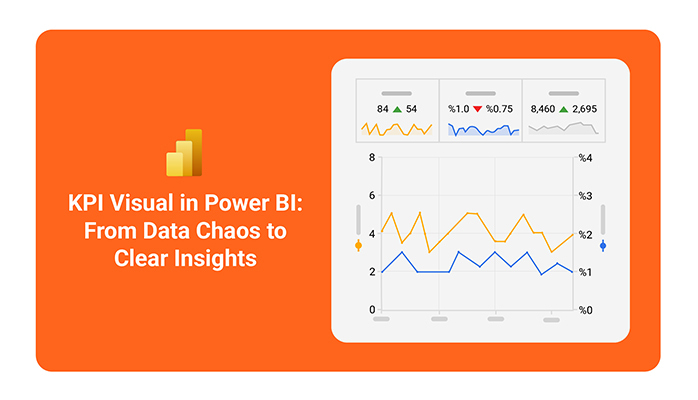
A KPI visual in Power BI is designed specifically for this. It shows whether a single metric is on track, falling behind, or improving by combining current value, target, and trend in one view.
Unlike dashboards that monitor multiple metrics for broader performance tracking, a KPI visual focuses on one critical measure, making it easier to validate performance quickly and act when needed.
Definition: A KPI visual in Power BI is a focused visualization used to determine whether a specific metric is meeting its target.
It compares the current value against a defined goal and uses trend data to show whether performance is improving, declining, or remaining stable.
Instead of exploring data in detail, it provides a quick performance signal that helps users instantly understand the status of a metric.
Key elements are following:
Business decisions depend on how quickly performance status can be understood.
A KPI visual simplifies this by converting raw data into a clear and immediate performance signal, helping teams act without delay.
Use a KPI visual when you need a quick, decision-ready view of whether a key metric is meeting its target.
This helps teams instantly understand whether they are moving toward or away from their goals.
Especially useful in executive views where speed matters more than depth.
This adds context beyond the current value and supports better decision-making.
Avoid KPI visuals when the data requires deeper analysis, comparison, or detailed insights.
Use supporting visuals to investigate underlying causes.
A KPI without a target is just a number, not a decision tool.
Creating a KPI visual in Power BI is not just about adding a chart. It’s about setting up a structure that clearly shows whether a business metric is performing as expected.
Start by importing data that includes:
Ensure your dataset is structured for comparison:
Assign fields carefully:
Improve interpretability by:
Before publishing, confirm:
Then publish to the Power BI Service for sharing with stakeholders.
A KPI visual in Power BI is not just about displaying a metric.
It is about turning performance data into a clear signal that helps teams quickly understand whether they are meeting targets and how performance is changing over time.
This comparison is what turns a simple metric into a performance decision tool.
Trend context helps identify whether performance is improving, declining, or remaining stable.
This ensures users see performance status immediately without searching for it.
Focus on what the visual is communicating rather than the raw value.
The real value lies in the performance signal, not the number itself.
Avoid unnecessary formatting or visual clutter that can distract from the message.
Use clear color indicators:
Use the metric from the line chart as the indicator, add a target value, and assign the date field as the trend axis. Then switch to a KPI visual to focus on status instead of detailed trends.
The KPI visual is used to display KPIs in Power BI by comparing a metric against a target and showing trend context to indicate performance over time.
The KPI visual in Power BI helps convert raw metrics into clear performance signals by comparing actual values against targets and adding trend context.
Its main value lies in simplifying decision-making. Instead of analyzing multiple reports, users can quickly see whether performance is on track and where attention is needed.
When used correctly, KPI visuals improve alignment, accountability, and speed of decision-making across teams.
Overall, they shift reporting from data presentation to decision clarity, making performance easier to understand and act on.
How much did you enjoy this article?


Discover diverse and high-quality Power BI report examples for inspiration and insights. Elevate your reporting with strategic visualization techniques.

A Customer Relationship Management Dashboard centralizes data, tracks key metrics, and drives smarter business decisions. Discover now!

Explore Healthcare Dashboard Examples and learn how to turn complex healthcare data into clear, actionable insights for better decision-making.


