Categories
By ChartExpo Content Team
Creating a chart can be the difference between confusion and clarity. A well-designed chart turns raw data into a story that anyone can understand. With a Chart Maker, you can transform numbers into visual insights quickly.
You don’t need to be a designer to make beautiful charts. A Chart Maker provides the tools to create professional-looking visuals effortlessly. Think of it as a shortcut to making your data speak volumes without the hassle.
Why struggle with complicated software when a Chart Maker offers simplicity and effectiveness? It’s about making data accessible and engaging for everyone. With a few clicks, you can bring your data to life and make informed decisions easier.
First…
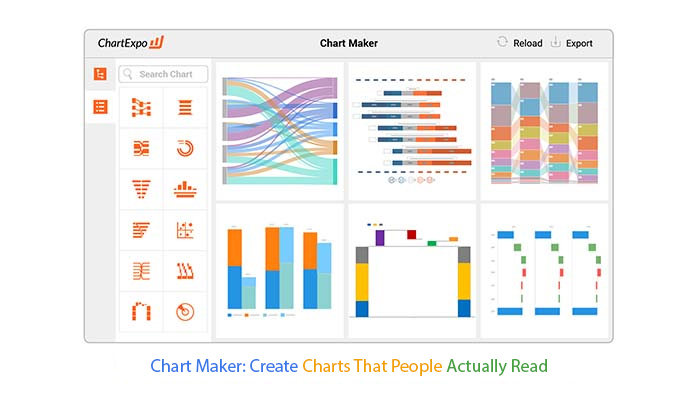
A Chart Maker is a tool or software designed to create visual data representations. It helps you transform raw data into easy-to-understand charts. This can include the Sankey Diagram, Likert Scale Chart, Comparison Bar Chart, and more. Each chart type serves a specific purpose and helps highlight different aspects of your data.
Imagine you have a spreadsheet full of numbers. Without a Chart Maker, it might be tough for trend analysis or patterns. But with a Chart Maker, you can quickly turn those numbers into visuals that tell a clear story. For instance, a sunburst chart can show how different parts contribute to a whole, making it easy to see percentages at a glance.
Professionals in business, education, healthcare, and many other fields use Chart Maker. This tool helps users see trends, compare statistics, and communicate complex information. Whether you’re presenting sales figures, creating a chart for cohort analysis, or tracking health metrics, a Chart Maker turns data into a story everyone can understand.
Visual data analytics helps you see patterns and insights that are hard to spot in raw numbers. It highlights what’s important and allows quick understanding. This is essential for making informed decisions. When data is visualized, you can quickly grasp key points and make better, faster decisions.
Visuals make complex data easy to understand. They can highlight trends, show relationships, and illustrate comparisons. By turning data into charts, you can communicate findings clearly and effectively. This makes data accessible to a broader audience, enhancing collaboration and decision-making.
Chart-making has come a long way. It started with simple pen and paper drawings. Over time, it evolved into sophisticated digital tools. Today, Chart Makers are powerful, enabling complex visual data analysis with ease, including the creation of detailed customer journey mapping.
There have been several milestones in chart making. Early computers introduced basic digital charts. Spreadsheet software brought more capabilities. Now, advanced tools offer dynamic, interactive charts that can be customized to fit any need. These breakthroughs have made data visualization an integral part of data analysis and presentation.
A user-friendly interface is everything. Imagine trying to create a chart, and you can’t find the options you need. Frustrating, right? A clean, intuitive design saves you time and reduces errors, empowering data democratization by making insights accessible to everyone. It makes chart creation enjoyable rather than a chore.
Not all Chart Makers are created equal. Some have cluttered interfaces, while others are streamlined. If you’re using them for marketing analytics or other data-heavy tasks, look for features like easy-to-access menus and clear labels. The best Chart Makers make it easy to start creating without a steep learning curve.
Your data comes in various formats. A good Chart Maker supports Excel, Google Sheets, and Microsoft Power BI. This flexibility means you can work with your data, no matter where it’s stored.
Customization options are a must. You need to tweak colors, labels, and styles to fit your brand or data narrative. For example, if you’re using a mosaic plot to visualize categorical data, look for Chart Makers that offer a wide range of customization features.
This will allow you to adjust every detail, ensuring your charts stand out and effectively tell your story.
Different projects have different needs. Whether you’re presenting to a board or sharing insights with your team, your charts should adapt.
Choose a Chart Maker, like a Box and Whisker plot maker, that offers templates and customization to fit any scenario, including a ranking chart maker for clearly comparing performance or positions across different datasets.
Once your chart is ready, you need to share it. The best Chart Makers offer multiple exporting options, i.e. PDF, JPG, PNG, and SVG. This makes it easy to distribute your charts across platforms and devices.
Your audience uses different devices. Ensure your charts look great on desktops, tablets, and smartphones. A good Chart Maker ensures compatibility across all platforms, so your data is always accessible.
Both browser-based and app-based Chart Makers have their perks. Browser-based tools offer flexibility and easy access, while apps might provide more powerful features. If you’re looking to create a diverse range of visualizations, including a slope chart, choose the one that fits your workflow and ensures you can create and share charts with ease.
Follow the steps below to use Chart Maker in your favorite spreadsheet.


Color choices can make or break your chart. Pick colors that stand out but also harmonize. Avoid overly bright colors that strain the eyes. Use contrasting colors to distinguish different data sets clearly. For example, blue and orange are great contrasting colors that work well together.
Pick palettes that are pleasing and effective, and stick to a maximum of three to five colors to keep things simple. When using data visualization tools, always test your color choices for color blindness. Some of these tools can show how your chart looks to someone who is colorblind, ensuring your data is accessible to everyone.
Fonts should be easy to read. Sans-serif fonts like Arial or Helvetica work best for charts. Avoid fancy fonts that distract from the data. The goal is clarity, not creativity.
Labels should be concise and informative. Use a consistent font size and style. Ensure labels don’t overlap or clutter the chart. Annotations can provide extra context but keep them brief and to the point.
White space, or negative space, helps your Control chart breathe. It keeps your chart from looking cluttered. Use it to separate different sections of your Control chart in Excel. This separation makes your chart easier to read and understand.
Balance elements by aligning them properly. Ensure there’s enough space between different data sets. Symmetry can help, but don’t be afraid of asymmetrical designs if they enhance clarity.
Scaling is key to an accurate chart. Make sure your data is represented proportionally. A distorted scale can mislead viewers. Always double-check your scales to ensure accuracy.
Use logarithmic scales for data with a wide range. This type of scaling makes large differences more manageable and easier to compare. For linear data, keep your scales consistent to avoid confusion.
Consistency builds trust and makes your charts more professional. Use the same colors, fonts, and styles across all your charts. This uniformity helps viewers focus on the data, not the design differences.
Templates save time and ensure consistency. Create a few templates that fit your brand’s style. These can be reused for different charts, maintaining a cohesive look and feel.
Data can be tricky. Knowing your data is the first step to making great charts. Are you dealing with categorical data, like survey responses?
Or maybe you have numerical data, like sales figures. Each type of data needs a different approach.
Categorical data works well with bar charts and pie charts.
Numerical data might need line charts or scatter plots. When deciding between a scatter plot vs. line chart, consider the relationships and trends you want to highlight. For more complex datasets, a treemap maker can be useful in visualizing hierarchical relationships. The key is matching your data to the right chart type. This ensures your information is clear and easy to understand.
Your data has unique features that affect how you visualize it. Look at the range of your data. Are the values close together, or is there a big spread? This can influence your choice of axis scales and intervals, especially when creating visuals like a waterfall chart.
Think about any outliers in your data. These can skew your results and might need special handling. Also, consider the volume of data points. Too much data can clutter your chart, while too little can make it look empty. Understanding these characteristics helps you create charts that accurately represent your data.
Your audience matters. A chart that works for experts might confuse beginners. Balance technical detail with readability.
For a general audience, keep it simple. Use clear labels and avoid jargon.
For a technical audience, you can include more details and complex visuals. Always think about what your audience needs to know and how best to show it.
Feedback is gold. After presenting your charts, ask for feedback. Did the audience understand the message? Were any parts confusing?
Use customer feedback to improve future charts. Sometimes small changes, like adjusting colors or labels, can make a big difference. Keep refining your approach to meet your audience’s needs better.
Charts are tools for communication. Start by defining your message. What do you want your audience to learn or do? Your chart should align with this goal.
If you’re showing trends over time, a line chart with multiple lines in Google Sheets might be best.
If you’re comparing parts of a whole, consider a sunburst chart. Always choose the chart type that best supports your message.
Clarity is key. A cluttered chart can confuse your audience. Keep it concise. Remove unnecessary elements and focus on the core message. Use labels and legends wisely. Make sure every element of the chart serves a purpose. A clear, concise chart communicates your message effectively.
Misleading charts are everywhere. Avoid common traps like manipulating axes to exaggerate trends. Ensure your scales are consistent and start from zero unless there’s a good reason not to. Be honest with your data representation. This builds trust with your audience.
Overcomplicated visuals can overwhelm you. Keep it simple. Use minimal colors and shapes. Stick to one or two chart types, like a scatter plot, per visualization. Too many elements can distract from your message. Aim for simplicity and clarity in every chart you create.
Hybrid charts mix different chart types, such as stacked bar diagrams and line charts, to show complex data clearly. They help you see multiple data relationships at once. For example, combining a stacked bar chart with a line chart allows you to compare categories and trends, such as an IELTS band score chart, in one view. This approach makes your data easier to understand and helps you make better decisions.
Creating hybrid charts can be straightforward. Start with your base chart type, like a bar chart, then add another layer, such as a line chart. Use tools like Excel or Google Sheets for basic hybrids, or specialized software such as ChartExpo, a powerful text visualization tool, for more complex needs.
Another technique is using dual-axis charts. These allow different data sets with distinct scales to share one chart, making complex data easier to interpret.
Custom visualizations let you tailor charts to your specific needs. A tool like ChartExpo offers flexibility and advanced features for unique designs. ChartExpo allows you to design charts that are not available in standard chart libraries, including visual formats used for comparing population pyramid types in demographic analysis.
Using a Chart Maker simplifies data presentation. It helps you see trends, compare values, and make data-driven decisions quickly. Whether for business reports, academic projects, or personal use, it makes complex data accessible.
Most Chart Makers are user-friendly. They offer templates and drag-and-drop features, so you don’t need to be a tech expert to create a chart. Many also provide step-by-step guides to get you started.
This depends on the Chart Maker. Some tools are web-based and require an internet connection. Others offer desktop versions that you can use offline. Choose one that fits your working environment.
When choosing a Chart Maker, consider ease of use, customization options, and integration capabilities with other tools you use. Check for customer support and reviews to ensure reliability.
No! Many Chart Makers are designed for non-coders. They often have drag-and-drop interfaces or simple input forms. You’ll usually just need to enter your data and select your chart type.
You’ve learned what a Chart Maker is and why it’s useful. From understanding the basics to mastering customization, every step was laid out to make sure you’re equipped to create effective charts. Remember, effective chart-making is all about clear, accurate, and visually appealing data presentation. This guide has provided you with the tools and insights to achieve that.
The future of chart-making is exciting. With emerging technologies like AI for data analytics and machine learning, the process will become even more intuitive and sophisticated. These advancements will enable the creation of charts that are not only accurate but also interactive and dynamic.
And that’s it. You’re now ready to create charts that not only look good but also convey meaningful insights. Keep experimenting, keep learning, and most importantly, enjoy the process.
Happy chart-making!
How much did you enjoy this article?


Calculate accounts receivable turnover ratio to measure credit collection speed, improve cash flow, and strengthen your financial strategy. Read on!

Change Management KPIs are the key to tracking adoption, performance, and ROI during transitions. Find out which metrics matter. Read on!

Data collection methods and techniques determine the quality of every insight you act on. Explore key approaches for gathering reliable data. Read on!


