Categories
By ChartExpo Content Team
Imagine you’re looking at a group of people. They all purchased your service around the same time, but some stick around, and others leave. Why? That’s where Cohort Analysis steps in. It’s like having a magnifying glass that lets you see patterns in behavior over time. This method breaks your audience into groups, or “cohorts,” based on shared characteristics or experiences. By tracking these cohorts, you can understand how your decisions affect their journey with your brand.
Cohort Analysis isn’t just another buzzword. It’s a powerful tool that helps businesses make sense of customer data. Whether you’re a startup or a well-established company, this analysis reveals insights that traditional metrics miss. You’re not looking at numbers in a vacuum; you’re seeing how different groups of users interact with your product over time. This focused approach allows you to make smarter, data-driven decisions.
Why does Cohort Analysis matter? In a world where customer retention is everything, understanding the “why” behind user behavior is crucial. Cohort Analysis gives you the clarity to see what’s working and what’s not. Are your retention strategies effective? Are users from one marketing campaign sticking around longer than those from another? With Cohort Analysis, you get answers that can shape your business strategy and fuel growth.
This introduction should give you a good sense of the importance and practicality of Cohort Analysis. It’s not about getting lost in data; it’s about finding the patterns that matter. Ready to explore how this tool can transform your approach? Let’s get started.
First…
Cohort Analysis breaks down your audience into smaller, more meaningful groups. Think of it as slicing a pie – each slice represents a specific group with something in common. Maybe they all signed up in the same month or used the same feature first. Instead of seeing your users as one big group, you see the pieces that make up the whole. This view helps you understand different customer journeys and figure out what works – and what doesn’t.
To use Cohort Analysis effectively, you need to focus on what groups matter most to your business. It’s not about looking at everything but zeroing in on key actions or behaviors that align with your goals. Are you tracking users who signed up during a promotion? Or those who interacted with a new feature? By defining the right cohorts, you get insights that help you make changes that matter.
Basic analytics give you surface-level numbers. Cohort Analysis digs deeper, showing you how different groups behave over time. It’s the difference between knowing how many people signed up and understanding why they stick around or drop off. By focusing on cohorts, you see the story behind the numbers. This approach helps you understand your customers better, tailor your strategies, and ultimately, improve your business outcomes.
You’ve got to start with the right data. Think of it like making a recipe; you need the right ingredients to get the best results. Your data sources are those ingredients. Start with website analytics, transaction logs, and user profiles. Each piece tells a part of the customer’s story. When you put them together, you see the whole picture.
Make sure these sources talk to each other. It’s like setting up a chat between your best friends – they need to share everything, or you’ll miss out on important details. Using a web analytics dashboard can help you integrate and visualize this data seamlessly, ensuring nothing slips through the cracks.
Event-based tracking might sound technical, but it’s simply keeping an eye on what customers do. Did they sign up? Make a purchase? Click on that shiny new feature. You need to capture these events to avoid analysis paralysis and ensure you can group customers who act similarly. Think of it as tagging your photos – you want to be able to find that group later. Use this method to track these events automatically. Set it up once, and you’re good to go.
Bad data is worse than no data. It messes up your analysis and leads you down the wrong path. To avoid that, automate your data checks. Use scripts or software that can flag errors before they become a problem.
Embracing data democratization can also help by ensuring that everyone in your organization has access to accurate and reliable data, reducing the chances of errors. It’s like having a spell-checker for your data – catch mistakes early so you don’t waste time fixing them later.
This step ensures you’re working with reliable information, which is critical for accurate Cohort Analysis.
Before diving into Cohort Analysis, get your data in shape. You need to clean, organize, and segment it. Start by removing duplicates and filling in missing details. Next, break the data into groups based on customer behavior or demographics. This step is essential because it sets the stage for meaningful analysis. By leveraging customer behavior analytics, you ensure that your data is accurate and well-structured, enabling deeper insights and more effective strategies.
Think of it as sorting laundry before washing – you wouldn’t throw whites and colors together, right?
When you’re designing cohorts, you’ve got to start with the end in mind. What are you trying to learn? The goal here is to make your cohorts align with what your business cares about most. No fluff, no extra bells and whistles – just straight to the point.
Think about the metrics and KPIs that matter. Are you trying to boost sales, reduce churn, or increase engagement? Whatever it is, your cohorts need to reflect those goals. Focus on grouping customers in a way that gives you clear insights into how your actions impact these metrics.
Don’t fall into the trap of only thinking short-term. Sure, quick wins feel great, but you also need to keep an eye on the bigger picture. Design your cohorts to help you see both immediate results and long-term trends. It’s a balancing act, but it’s doable if you keep your eyes on the prize.
Time is a powerful factor in Cohort Analysis. Whether you’re looking at daily, weekly, or monthly data, how you slice the timeline can reveal different patterns. Daily might show immediate impacts, weekly gives a broader view, and monthly can highlight longer-term trends. Experiment with each to see what clicks. Incorporating trend analysis into your approach can help you identify which time frame provides the most valuable insights, allowing you to better understand and act on your data.
Grouping by behavior can uncover insights that numbers alone won’t show. Look at how users interact with your product or service. Are they power users, or do they barely log in? Do they engage with specific features more than others? Segmenting based on actions can give you a much deeper understanding of what drives your customers.
Don’t stop at the surface level. Demographics and psychographic segmentation can add a whole new layer to your Cohort Analysis. Who are your customers? What drives them? What are their pain points? Segmenting by these factors can give you insights that are truly valuable for your business.
Every department sees the customer from a different angle. Sales know what closes deals, marketing knows what grabs attention, and support knows where things go wrong. Pulling in insights from across the business can help you create cohorts that are more comprehensive and meaningful. When everyone’s voice is heard, the analysis is sharper, and the strategies are smarter. Including data from the marketing report can provide valuable context and depth, ensuring that your cohorts reflect a true 360-degree view of the customer experience.
Think of survival analysis as your way to see who sticks around. It’s about tracking how long customers stay with you. You’re not guessing here; you’re using numbers to watch customers drop off over time. It’s like watching a movie, where each scene reveals who stays and who goes. The goal? Figure out the patterns and plan your next move.
Time series chart in Excel is your go-to for finding patterns. You’re looking at data over time and noticing when things change. Maybe customers are falling off after a month or sticking around for six. By watching these trends, you can tweak your strategies to keep them around longer. It’s like having a crystal ball that shows what’s likely to happen next.
Ever wondered if changing one thing makes a big difference? That’s what hypothesis testing helps you figure out. You’re testing ideas, seeing if one group behaves differently than another. Maybe one group got a discount and another didn’t. This method helps you see what’s working and what’s not, so you can do more of the good stuff.
It’s easy to think two things are connected, but causality vs. correlation teaches you to dig deeper. Don’t just assume because two things happen together that one causes the other. Look closer. What’s driving your customer’s behavior? This is where tools like a correlation matrix in Excel help you quickly spot relationships before making conclusions. Maybe it’s not the discount but the timing of it. Finding the real reason behind actions helps you make better decisions.
Interpreting churn data can be tricky. Jumping to conclusions without solid analysis can lead to mistakes. Make sure you’re looking at the right numbers, and don’t confuse correlation with causation. It’s about making careful observations and avoiding hasty decisions that could steer you wrong.
Charts are your best friend when you need to make sense of data quickly. Use them to show who’s sticking around and who’s leaving. Simple, clear visuals can make even the most complex data easy to understand. Keep it straightforward – avoid clutter so your main points stand out.
When it’s time to share your findings, keep it simple. Your goal is to tell a story with your data. Use plain language and clear visuals. Make sure anyone, even if they aren’t a data expert, can follow along. The easier it is to understand, the more likely people will act on your insights.
By leveraging Cohort analysis, you can transform visuals to provide actionable insights that drive strategic decision-making.
The following video will help you to create the required chart in Microsoft Excel.


The following video will help you to create the required chart in Google Sheets.
Creating different types of charts and graphs that stand out helps your team see what’s happening at a glance. When making cohort retention charts, start with clear labels and color codes. Show retention rates over time. Highlight key points where changes happen. This way, your audience quickly gets the story behind the data.
Best-design dashboards let stakeholders play with the data. They can filter by date, product, or customer segment. This hands-on approach makes it easier to spot trends and make decisions. Tools like Tableau or Power BI are great for this.
When sharing your findings, focus on the main points. Don’t bury the lead in numbers. Say what matters most first. Use simple language. For example, “Customers who joined in January stay longer than those who joined in June.”
Context helps people understand data. Compare cohorts with overall averages or industry benchmarks. Explain why trends matter. For example, if a cohort shows high churn after three months, suggest looking at customer support during that time.
In SaaS, understanding cohorts can significantly boost retention. Take Company A, for example. They noticed that users who completed the onboarding process tended to stay longer. By improving the onboarding experience, they managed to increase their retention rates by 20%. This is a perfect illustration of how SaaS data analytics can drive actionable insights.
Another example is Company B. Through SaaS data analytics, they discovered that offering a discount to users who seemed likely to leave brought many back. These targeted strategies, informed by detailed cohort analysis, can transform user engagement and retention in the SaaS industry.
As your business grows, so does the need for robust Cohort Analysis. You can’t rely on basic tools forever. Let’s talk about scaling up without getting bogged down.
Moving to the cloud is a smart move. Azure, AWS, and Google Cloud offer scalable solutions. They handle huge data loads and provide the flexibility you need. Choose the one that fits your business needs best. Think about storage, processing power, and ease of integration.
Handling large data sets is key. Use techniques like batch processing and parallel computing. Tools like Hadoop and Spark can help. They break down big data into manageable chunks. This makes your analysis faster and more efficient.
Automation is a lifesaver. It saves time and cuts down on errors. Set up scheduled updates to keep your cohorts fresh. Real-time insights can make a huge difference in data-driven decision-making.
Scheduled updates keep your data current. You don’t want to base decisions on outdated information. Automate these updates to ensure you always work with the latest data. It’s one less thing to worry about.
Real-time insights are gold. They let you react quickly to trends and changes. Use tools that support real-time data processing. This way, you can make decisions on the fly and stay ahead of the curve.
Your business will change, and your Cohort Analysis needs to keep up. Stay flexible by customizing your queries. Tailor them to fit specific goals. Choose tools that can grow with your business and adapt to new challenges.
Custom queries are essential for advanced data analysis. They let you dig deeper into your data. Tailor your queries to match your goals. This way, you get the insights you need without extra noise.
Choose tools that scale with you. Look for ones that handle increased data loads and offer advanced features, especially for tasks like market segmentation. Tools that integrate well with others can make your life easier. This way, your analysis stays effective as your business grows.
Want to stay sharp? Sign up for newsletters that matter. These aren’t spam – they’re packed with insights. They deliver the latest trends straight to your inbox. You don’t need to scour the web; the updates come to you. It’s like having a cheat sheet, but better. Regular reading keeps you in the loop and ahead of your competition.
Webinars and conferences are goldmines. You get to hear from experts and see how they solve real problems. Plus, you can ask questions and get instant answers. It’s not a classroom; it’s more like a conversation with someone who knows their stuff. These events are perfect for picking up new tricks and understanding what’s happening right now in Cohort Analysis.
Machine learning isn’t sci-fi – it’s your next tool. By integrating it into your Cohort Analysis and YouTube analytics, you can spot patterns that were invisible before. It’s like putting on glasses and seeing the fine print. Start small, test things out, and see how machine learning can give your analysis that extra edge.
More data means more power, but only if you know where to look. Don’t stick to the same old sources. Expand your horizons. Look into social media metrics, customer service logs, or even weather data. The goal is to add layers to your analysis, giving you a fuller picture of what’s driving your cohorts.
Off-the-shelf solutions are good, but custom-built ones are better. Python and R are your go-to tools for building exactly what you need. Whether it’s a specific metric or a unique data visualization, coding gives you control. You’re not limited by what others think is important; you can focus on what truly matters to your business.
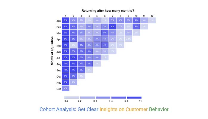
A cohort class is a group of people who share a common characteristic during a specific period. Think of it as a class in school, where everyone starts the same course at the same time. In Cohort Analysis, this concept helps you track the behavior of that group over time. It’s all about comparing apples to apples by focusing on specific groups and watching how they change or stay the same.
Reading a Cohort Analysis might seem tricky, but it’s pretty straightforward once you get the hang of it. Picture a grid or table with rows and columns. Each row represents a cohort, like people who signed up for your service in January. The columns show different periods, like one month after signup, two months after, and so on.
The magic happens when you look at how the numbers change across the row. Are they sticking around or dropping off? That’s the story the data tells. The goal is to spot trends and patterns – where people are staying engaged or where they’re losing interest.
To do a Cohort Analysis, you first need to define your cohort. This could be a group of customers who made their first purchase in a specific month or users who signed up for your app during a particular quarter.
Next, you’ll track these cohorts over time. How are they behaving? Are they buying more, using the app, or fading away? You can visualize this in a table or chart, where each row shows a cohort and each column shows periods. This lets you see how behavior changes over time.
Finally, interpret the results. If one cohort is doing better than another, dig into why. What did you do differently? This is where you can find insights to improve your strategy.
Cohort Analysis helps you see the bigger picture by breaking down your data into manageable chunks. Instead of looking at your users as one big group, you can see how different groups behave over time. This lets you spot trends, understand user behavior, and make better decisions. Whether you’re trying to improve retention, increase revenue, or just understand your users better, Cohort Analysis gives you the insights you need.
Common mistakes include grouping cohorts too broadly or narrowly, missing key time frames, or focusing on the wrong metrics.
Another big one is not comparing cohorts properly – if you mix up periods or don’t account for external factors, your insights might be off. Always double-check your groups, make sure your metrics match your goals, and keep an eye out for anything that could skew your results.
By using Cohort Analysis, you can see exactly when and why customers drop off. Maybe they’re leaving after a specific update or losing interest after a certain time. Once you spot these trends, you can take action – whether it’s improving the product, changing your messaging, or offering incentives to stick around. The key is understanding what’s causing churn and using that info to keep customers engaged.
Cohort Analysis looks at groups over time, while segmentation divides your audience based on characteristics, such as age or location. Both are valuable but serve different purposes.
So, you’ve taken a deep dive into Cohort Analysis. You’ve learned how it breaks down customer behavior into clear, actionable steps. It’s not just about collecting data – it’s about understanding patterns and trends over time. You now know how to group customers by common traits and track their journey, giving you the power to predict what they’ll do next. And remember, this isn’t a one-time thing. Keep revisiting your cohorts to see what’s working and what’s not.
Now, it’s time to take what you’ve learned and put it to work. Start by reviewing your current strategies. What’s been effective? What needs tweaking? Set up a regular schedule to revisit and refine your Cohort Analysis. Don’t hesitate to try new approaches – experiment with different metrics, adjust your segments and see how small changes can lead to big improvements. Stay curious, keep testing, and remember: the more you know your customers, the better you can serve them.
Cohort Analysis isn’t just a tool – it’s a mindset. It’s about seeing the bigger picture and making smarter decisions based on real insights. By focusing on cohorts, you’re not just reacting to what’s happening today; you’re predicting what will happen tomorrow. This proactive approach will drive your business forward, helping you stay ahead of the competition. In the end, it’s about growth, and Cohort Analysis gives you the roadmap to get there.
How much did you enjoy this article?


Calculate accounts receivable turnover ratio to measure credit collection speed, improve cash flow, and strengthen your financial strategy. Read on!

Change Management KPIs are the key to tracking adoption, performance, and ROI during transitions. Find out which metrics matter. Read on!

Data collection methods and techniques determine the quality of every insight you act on. Explore key approaches for gathering reliable data. Read on!


