Categories
Are you struggling to make sense of your SaaS business’s data?
Are you ready to take your software-as-a-service business to the next level with data?


Look no further!
This blog post will introduce you to some of the top SaaS data analytics hacks that can help you revolutionize your business.
With these tips, you’ll be able to easily visualize your data for insights, enabling you to make informed and data-backed decisions.
If you’re ready to unlock the full potential of your data, keep reading to uncover game-changing SaaS data analytics solutions.
SaaS analytics is a key component of the software-as-a-service (SaaS) sector. And this is because it allows you to track and analyze your data to make data-driven decisions.
The current SaaS marketplace is super competitive and saturated. In this landscape, if you can effectively use data to understand your market and differentiate your brand, you can have a significant advantage.
As such, we recommend you put together robust data analytics systems in place to analyze key performance indicators (KPIs) for in-depth insights.
Your SaaS data analytics strategy should be easy to implement and execute, even for non-technical users. Besides, it should be flexible and agile enough to allow other key players in your business to customize reports for personalized insights.
To sum up, SaaS analytics is crucial if your goal is to succeed in the dynamic and rapidly evolving SaaS marketplace.
In the ensuing section, we’ll address the following question: Why do you need SaaS analytics?
There are numerous benefits to analyzing data in a SaaS (software as a service) firm.
Check out the benefits below.
By analyzing data, you can easily gain valuable insights into your operations and use the resulting insights to make more informed decisions.
For instance, a solid SaaS data analytics strategy can help you:
You can leverage SaaS data analytics to understand your customers and your needs. This can help you improve the customer experience in the long term.
For example, SaaS data analytics can help you identify customer pain points and develop solutions to address them.
Data and analytics services can help you identify bottlenecks and inefficiencies in your operations, leading to cost savings and improved efficiency.
For example, it can help you uncover and optimize workflows, streamline processes, and identify opportunities for automation.
By analyzing data in real-time, you can identify and respond to changes in the market.
Or, even within your internal operations. This can help you be more agile and flexible in adapting to changing conditions.
A well-crafted SaaS data analytics strategy can help you better understand trends and patterns in your business.
This can improve forecasting and planning.
For instance, it can help you to identify potential risks, predict the future, and develop contingency plans.
Recap: SaaS data analytics is a powerful tool that can help you to improve the customer experience, make better decisions, increase efficiency, and be responsive in a rapidly changing market.
So, which SaaS metrics should you track?
Several key SaaS metrics can help drive revenue in your Software-as-a-service business.
These metrics or KPIs can provide valuable insights into the performance of your business. Besides, it can help identify areas for improvement and growth.
Some of the SaaS metrics we recommend you track include:
This metric represents the expected, monthly recurring revenue generated from subscriptions.
MRR is a key indicator of the health and growth of your SaaS business. And this is because it reflects the long-term value of the customer base.
This metric depicts the total expenses of acquiring a new customer. And it’s made up of marketing and sales costs.
By tracking customer acquisition costs, you can identify the most cost-effective methods for acquiring new subscription-based customers.
Also, it can help you optimize your sales and marketing efforts.
This metric shows a customer’s total value throughout your relationship.
The Customer Lifetime Value can help you identify your most valuable customers. More so, it can help you optimize your retention efforts to maximize revenue.
This metric shows the percentage of your customers who cancel or do not renew subscriptions.
Churn rate can help you identify factors that may be contributing to customer drop-offs and implement strategies to reduce them.
This metric represents customer satisfaction and loyalty.
It’s measured by asking your customers how likely they are to recommend the product or service to others.
The NPS chart can help you identify opportunities for improvement and increase the overall customer experience.
To sum up, tracking these metrics can help you unlock the full power of SaaS data analytics in your business.
In addition, these metrics can help you drive revenue by providing valuable insights into the areas that need improvement to drive growth.
By keeping a close eye on these metrics, you can:
In the ensuing section, we’ll take you through the best charts to create a SaaS analytics dashboard.
Check out some of the charts we recommend you use to unlock the full potential of your SaaS data analytics strategy.
Let’s dive in.

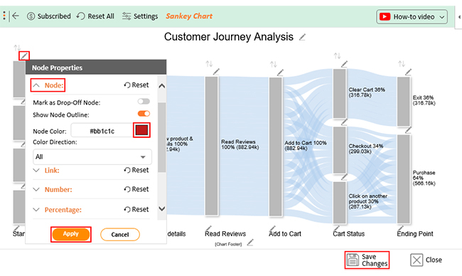
The Sankey chart is one of the SaaS data analytics-friendly charts we recommend you adopt in your SaaS data analytics strategy.
Check out how you can use a Sankey in your business to get the most from your data.
This visualization design can help you to show how customers move through different stages of your business funnel, such as awareness, consideration, and purchase.
A Sankey Diagram can help you identify areas for improvement and optimize your customer acquisition efforts.
A Sankey Diagram can help you visualize the flow of leads through your SaaS business sales and marketing funnel, from initial contact to conversion.
This can help you uncover the marketing channels that are most effective. Also, you can easily identify opportunities for optimization.
This flow-based visualization can help you to track how users interact with a product or service.
Besides, by using the customer journey visualization, you’ll be able to understand user behavior and identify areas for improvement.
A Sankey Diagram can help you to identify bottlenecks and inefficiencies in your SaaS business.
Recap: Sankey Diagram can be a valuable tool for visualizing data in your startup by helping you to identify trends, optimize processes, and drive growth.
The Sentiment Trend Chart can help you uncover the overall sentiment of your market base. In other words, you can leverage the visualization design to visualize survey responses for insights.
Check out the benefits of the SaaS data analytics-oriented chart below.
By tracking sentiment over time, you can learn how satisfied customers are with your offers. Furthermore, you can easily identify areas for improvement.
Use a Sentiment Trend Chart in your SaaS data analytics strategy to track the overall sentiment towards your brand. You’ll uncover and timely respond to any negative sentiment or reputation issues.
By tracking sentiment over time, you can identify trends and patterns in your customer sentiment.

Use a Likert Scale Chart in your SaaS data analytics strategy to visualize responses from your target audience.
Check out more benefits below:
Likert Scale questions help you to gauge customer satisfaction with your SaaS products, and identify areas for improvement.
Use Likert Scale questions to gather feedback on new feature releases. By doing this, you’ll understand how well new feature releases are being received.
A Waterfall chart shows how a value changes over time. Each bar in the chart represents a positive or negative value that contributes to the overall change.
Check out the benefits below
The visualization design can help show the changes in your SaaS business’s financial performance over time.
This can help you identify trends and patterns and make informed decisions about your financial strategy.
This visualization design can help you display the costs associated with acquiring new customers, including marketing and sales costs.
This can help you understand the most cost-effective methods for acquiring new customers and optimize your sales and marketing efforts.
Use a Waterfall Chart in your SaaS data analytics strategy to track the adoption of a new product or feature over time
This will help you understand how well it is being received and identify any issues or concerns.

Pareto Charts can help you to display the relative importance of different factors.
In a SaaS business, the visualization design can be used to:
You can use Pareto charts to identify the most important factors contributing to customer satisfaction in your SaaS business.
Use Pareto Charts to prioritize product development efforts by identifying the features or functionality that are most important to customers.
Pareto Charts can identify bottlenecks and inefficiencies in your business’s processes and prioritize efforts to improve them.
In the coming section, we’ll show you how to analyze SaaS data in Excel.
These charts (highlighted above) are unavailable in Microsoft Excel.
You don’t have to do away with Excel in favor of other expensive tools.
Install the ChartExpo add-on to access ready-made charts for your SaaS data analytics strategy, such as Sankey, Pareto, Likert Scale, and Sentiment Trend Charts.
ChartExpo comes with ready-to-go and SaaS analytics-friendly charts, plus many insightful charts you’ll never find in Excel.
The tool costs $10 per month after a week of a free trial. ChartExpo can help you create insightful and easy-to-interpret charts for your data stories in minutes.
Why?
It’s an easy-to-use application that does not require hours of tutorials.
ChartExpo charts are available both in Google Sheets and Microsoft Excel. Please use the following CTA’s to install the tool of your choice and create beautiful visualizations in a few clicks in your favorite tool.


In this section, we’ll use a Sankey diagram Excel to visualize the hypothetical data from a SaaS firm.
Let’s dive in.
| Starting Point | Platforms | View product & details | Read Reviews | Add to Cart | Cart Status | Ending Point | Traffic |
| External Ad | Mobile App | View product & details | Read Reviews | Add to Cart | Clear Cart | Exit | 29246 |
| External Ad | Mobile App | View product & details | Read Reviews | Add to Cart | Checkout | Purchase | 6133 |
| External Ad | Mobile App | View product & details | Read Reviews | Add to Cart | Click on another product | Purchase | 12954 |
| External Ad | Mobile App | View product & details | Read Reviews | Add to Cart | Clear Cart | Exit | 22337 |
| External Ad | Mobile App | View product & details | Read Reviews | Add to Cart | Checkout | Purchase | 14685 |
| External Ad | Mobile App | View product & details | Read Reviews | Add to Cart | Click on another product | Purchase | 10210 |
| External Link | Mobile App | View product & details | Read Reviews | Add to Cart | Clear Cart | Exit | 29605 |
| External Link | Mobile App | View product & details | Read Reviews | Add to Cart | Checkout | Purchase | 27600 |
| External Link | Mobile App | View product & details | Read Reviews | Add to Cart | Click on another product | Purchase | 5637 |
| External Link | Mobile App | View product & details | Read Reviews | Add to Cart | Clear Cart | Exit | 23336 |
| External Link | Mobile App | View product & details | Read Reviews | Add to Cart | Checkout | Purchase | 28281 |
| External Link | Mobile App | View product & details | Read Reviews | Add to Cart | Click on another product | Purchase | 17939 |
| Direct Search | Mobile App | View product & details | Read Reviews | Add to Cart | Clear Cart | Exit | 5490 |
| Direct Search | Mobile App | View product & details | Read Reviews | Add to Cart | Checkout | Purchase | 19138 |
| Direct Search | Mobile App | View product & details | Read Reviews | Add to Cart | Click on another product | Purchase | 27311 |
| Direct Search | Mobile App | View product & details | Read Reviews | Add to Cart | Clear Cart | Exit | 19560 |
| Direct Search | Mobile App | View product & details | Read Reviews | Add to Cart | Checkout | Purchase | 24788 |
| Direct Search | Mobile App | View product & details | Read Reviews | Add to Cart | Click on another product | Purchase | 10914 |
| Organic Search | Mobile App | View product & details | Read Reviews | Add to Cart | Clear Cart | Exit | 29043 |
| Organic Search | Mobile App | View product & details | Read Reviews | Add to Cart | Checkout | Purchase | 12028 |
| Organic Search | Mobile App | View product & details | Read Reviews | Add to Cart | Click on another product | Purchase | 24685 |
| Organic Search | Mobile App | View product & details | Read Reviews | Add to Cart | Clear Cart | Exit | 8508 |
| Organic Search | Mobile App | View product & details | Read Reviews | Add to Cart | Checkout | Purchase | 12448 |
| Organic Search | Mobile App | View product & details | Read Reviews | Add to Cart | Click on another product | Purchase | 5034 |
| External Ad | Official Website | View product & details | Read Reviews | Add to Cart | Clear Cart | Exit | 23552 |
| External Ad | Official Website | View product & details | Read Reviews | Add to Cart | Checkout | Purchase | 19632 |
| External Ad | Official Website | View product & details | Read Reviews | Add to Cart | Click on another product | Purchase | 18914 |
| External Ad | Official Website | View product & details | Read Reviews | Add to Cart | Clear Cart | Exit | 19234 |
| External Ad | Official Website | View product & details | Read Reviews | Add to Cart | Checkout | Purchase | 26871 |
| External Ad | Official Website | View product & details | Read Reviews | Add to Cart | Click on another product | Purchase | 29736 |
| External Link | Official Website | View product & details | Read Reviews | Add to Cart | Clear Cart | Exit | 14141 |
| External Link | Official Website | View product & details | Read Reviews | Add to Cart | Checkout | Purchase | 10680 |
| External Link | Official Website | View product & details | Read Reviews | Add to Cart | Click on another product | Purchase | 23756 |
| External Link | Official Website | View product & details | Read Reviews | Add to Cart | Clear Cart | Exit | 18491 |
| External Link | Official Website | View product & details | Read Reviews | Add to Cart | Checkout | Purchase | 15740 |
| External Link | Official Website | View product & details | Read Reviews | Add to Cart | Click on another product | Purchase | 5976 |
| Direct Search | Official Website | View product & details | Read Reviews | Add to Cart | Clear Cart | Exit | 19080 |
| Direct Search | Official Website | View product & details | Read Reviews | Add to Cart | Checkout | Purchase | 22204 |
| Direct Search | Official Website | View product & details | Read Reviews | Add to Cart | Click on another product | Purchase | 22736 |
| Direct Search | Official Website | View product & details | Read Reviews | Add to Cart | Clear Cart | Exit | 25578 |
| Direct Search | Official Website | View product & details | Read Reviews | Add to Cart | Checkout | Purchase | 11141 |
| Direct Search | Official Website | View product & details | Read Reviews | Add to Cart | Click on another product | Purchase | 6881 |
| Organic Search | Official Website | View product & details | Read Reviews | Add to Cart | Clear Cart | Exit | 18022 |
| Organic Search | Official Website | View product & details | Read Reviews | Add to Cart | Checkout | Purchase | 21183 |
| Organic Search | Official Website | View product & details | Read Reviews | Add to Cart | Click on another product | Purchase | 15307 |
| Organic Search | Official Website | View product & details | Read Reviews | Add to Cart | Clear Cart | Exit | 11557 |
| Organic Search | Official Website | View product & details | Read Reviews | Add to Cart | Checkout | Purchase | 26480 |
| Organic Search | Official Website | View product & details | Read Reviews | Add to Cart | Click on another product | Purchase | 29140 |


SaaS analytics is a critical component of the software-as-a-service (SaaS) marketplace. it empowers you to track and analyze your data to make data-driven decisions.
In the competitive SaaS marketplace, using data to understand your market and differentiate your brand has a massive advantage.
By analyzing data, you can gain valuable insights into your operations and use this information to make more informed decisions.
For example, SaaS data analytics can help identify inefficiencies, optimize processes, and identify new growth opportunities.
It can help you identify customer pain points and develop solutions.
In conclusion, analyzing data is a powerful tool for SaaS (software as a service) businesses looking to:
By leveraging SaaS data analytics to identify trends, patterns, and areas for improvement, you can make more informed decisions, optimize your processes, and stay agile and responsive in a rapidly changing market.
The charts that can help you unlock the full potential of your SaaS data analytics strategy, such as Sankey and Pareto, are unavailable in Excel.
You don’t have to do away with Excel in favor of other expensive tools.
Install the ChartExpo add-on to access ready-made charts for your SaaS data analytics strategy.
Sign up for a 7-day trial to access SaaS analytics-friendly charts for your analysis.
How much did you enjoy this article?


Calculate accounts receivable turnover ratio to measure credit collection speed, improve cash flow, and strengthen your financial strategy. Read on!

Change Management KPIs are the key to tracking adoption, performance, and ROI during transitions. Find out which metrics matter. Read on!

Data collection methods and techniques determine the quality of every insight you act on. Explore key approaches for gathering reliable data. Read on!


