Categories
By ChartExpo Content Team
Your data isn’t just numbers on a spreadsheet. It’s a story waiting to be told. Cluster analysis is the key that helps unlock these stories by grouping similar data points.
Whether you’re sorting customer behaviors or refining market strategies, it’s the tool that takes chaos and turns it into clarity. Every cluster reveals something valuable, like a treasure map pointing you toward actionable insights.


Why is cluster analysis valuable? It doesn’t stop at simply identifying groups. It digs deeper, showing relationships and patterns that aren’t obvious.
Imagine spotting trends in customer buying habits or uncovering inefficiencies in your processes. These aren’t vague ideas—they’re concrete pathways to smarter decisions and sharper strategies.
The success of cluster analysis lies in its execution. Choosing the right method, cleaning your data, and understanding your results are vital steps. Each cluster represents a slice of reality—whether it’s a segment of customers or a breakdown of market trends.
And when you use those clusters to shape your actions, you’re not just analyzing data—you’re driving real-world impact.
First…
Cluster analysis sorts objects into groups, or clusters, that share similar characteristics. This method is pivotal in market segmentation, helping businesses understand customer preferences, design targeted marketing campaigns, and refine overall strategy.
By grouping related items together, businesses can more effectively tailor their strategies to meet specific group needs.
Cluster analysis is a technique used to group a set of objects in a way that objects in the same group are more similar to each other than to those in other groups.
It’s widely used across different business fields such as marketing, bioinformatics, and more. This method helps in identifying hidden patterns and structures in large data sets, enabling decision-makers to make insights-driven strategies.
Hard clustering means each data point or object belongs strictly to one cluster. Think of it as a clear-cut division where each customer is placed into a single category based on their purchasing behavior.
On the other hand, soft clustering assigns a probability to each data point for belonging to each cluster. This method acknowledges that boundaries between clusters are sometimes vague and that an individual might simultaneously belong to multiple segments.
In cluster analysis, how we measure the similarity between objects is crucial. Distance measures, such as Euclidean, Manhattan, and Cosine similarity, are some of the most common methods used to determine this similarity.
In a business context, understanding these metrics through data analysis for marketing enables accurate grouping of customers with similar behaviors and preferences. This is critical for developing precise marketing strategies and tailored product offerings.
Starting with the right data set for cluster analysis is a bit like setting up a domino display. If the pieces aren’t lined up just right, the whole thing won’t work as it should.
Before diving into algorithms or clusters, prioritize data cleansing techniques. This involves fixing or removing incorrect, incomplete, or irrelevant data. It’s a vital step because clean data ensures meaningful results. After all, who wants to base decisions on messy data?
Ever tried comparing apples to oranges? Not very helpful, right? That’s similar to what happens when you try to cluster data without scaling features first.
Different units and scales can mess up the whole process, making some data points seem more important than they really are. Scaling adjusts everything to a common scale, without distorting differences in the range of values. So, whether it’s dollars, pounds, or percentages, everything gets a fair role in the analysis.
Outliers are those data points that stand out from the crowd, and not always in a good way. Think of them as the rebels of the data world. They can skew your analysis, leading to clusters that don’t really represent your data.
Managing outliers involves detecting them and then deciding whether to drop them, adjust them, or maybe even keep them if they’re important for a particular reason. It’s like deciding whether to invite that unruly cousin to your party; their presence can really change the vibe!
Categorical data can be tricky because it’s qualitative, not numerical. It’s like trying to cluster music genres—how do you decide what’s closer to rock, classical, or jazz? Using the best graphs for categorical data, such as bar charts or pie charts, can help make these relationships more understandable.
But fear not, there are ways to handle this. Techniques like encoding can convert these categories into numbers so that clustering algorithms can understand them. Think of it as translating a foreign language into your native tongue so you can finally understand what’s being said.
When picking an algorithm for cluster analysis, think about your business’s specific needs. Each algorithm shines differently based on the type of data and the desired outcomes.
For instance, if speed is paramount and your data set is large but well-behaved, K-means might be your go-to.
On the other hand, if you’re dealing with lots of outliers or the data doesn’t clump into spherical shapes, DBSCAN could save the day.
And let’s not forget hierarchical clustering, which is perfect when the relationship between data points is key. With hierarchical data visualization, you can clearly see the nested connections, making complex relationships easier to interpret.
K-means clustering is all about speed and simplicity. It partitions data into K distinct clusters based on distance from the nearest centroid. It’s ideal for large datasets where you need quick, clear results.
However, it does best with numerical data that clusters around a central point. If you’ve got a straightforward task and need answers fast, K-means is like hitting the bullseye.
DBSCAN stands out when your data is a bit wild. This algorithm groups points that are closely packed together and marks points in low-density areas as outliers.
It’s a champ at dealing with weird data shapes and sizes, making it perfect for real-world data that doesn’t always play nice. If your data includes lots of outliers, DBSCAN doesn’t flinch—it handles them like a pro.
Hierarchical clustering is all about connections. This method builds a tree of clusters and doesn’t require you to specify the number of clusters beforehand.
It’s fantastic for when you’re interested in the relationship and hierarchy between clusters. If visualizing data in an intuitive, tree-like diagram gets you excited, hierarchical clustering might just be your match.
Finding the right number of clusters in cluster analysis isn’t just a number-guessing game; it’s a data-driven decision that impacts the effectiveness of your data analysis.
You want just enough clusters to capture the natural groupings in your data without overcomplicating things. Think of it as hitting the bullseye in darts – aim for the center to maximize accuracy and minimize confusion.
The Elbow Method isn’t about joint flexibility—it’s a clever trick to find the ideal number of clusters. By plotting the sum of squared distances from each point to its assigned cluster center, and looking at where the rate of decrease sharply shifts (the “elbow”), you can spot the sweet spot.
This method is like watching for the point in a road trip where the scenery changes dramatically; that’s your cue to stop adding clusters.
Imagine each cluster as a social circle. Silhouette scores are like asking each member how well they fit in their own group versus how well they’d mesh with others.
A high score means they’re right where they should be—cozy with their own crowd and distinct from the rest. It’s a bit like finding out if everyone at the party feels they’re with the right friends.
Gap Statistics are the secret sauce for confirming if you’ve truly nailed the number of clusters. This method leverages statistical graphs to compare the total within-cluster variation across different cluster counts with their expected values under null reference distributions, ensuring precision in cluster determination.
It’s akin to checking whether the chapters of a book make sense both as stand-alone sections and as part of the overall narrative, ensuring each piece contributes to a cohesive whole.
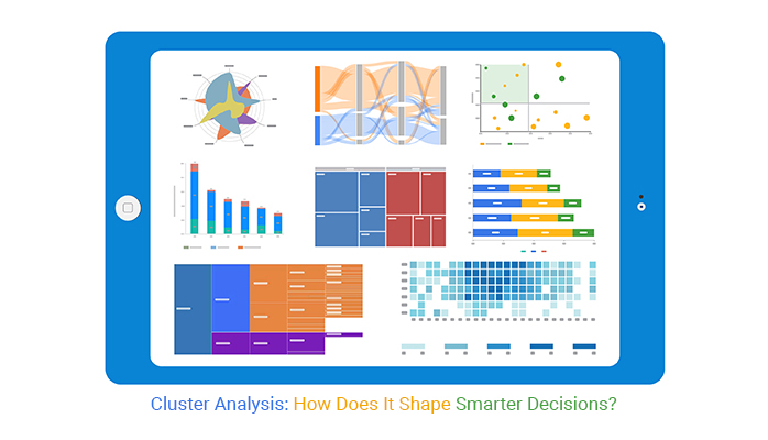
Scatter plot are straightforward yet effective. They plot individual data points on a graph, each marked by a dot. When dealing with cluster analysis, each cluster can be colored differently. This simple data visualization helps us quickly see how data points group together and how these groups differ from each other.
Radar charts, or spider charts, show multiple variables on a two-dimensional graph. Each cluster has its own ‘web’, which can make it easier to compare clusters directly. This chart is perfect for viewing the strengths and weaknesses of each cluster at a glance.
Box and whisker plots provide a summary of one or several numeric variables. In the context of cluster analysis, they help us see the distribution of data within each cluster. This includes medians, quartiles, and potential outliers. It’s a great way to visually summarize the variability within and between clusters.
Mosaic plots are similar to bar charts but with a twist. They display proportions of categories and their interaction with other categories, making them ideal for showing how categorical variables differ across clusters. A correlation matrix in Excel can also help validate these relationships before deeper cluster analysis.
Each cluster’s relationship with categorical variables is represented by tiles whose sizes are proportional to the counts or percentages within the dataset, providing an immediate sense of correlation or discrepancy.
The following video will help you create a Scatter Plot in Microsoft Excel.

The following video will help you to create a Scatter Plot in Google Sheets.
Understanding your customers is the bread and butter of successful business strategies. Cluster analysis is a savvy tool that groups your customers based on shared attributes. This method offers a bird’s-eye view of where marketing efforts can be most effective. Think of it as sorting your morning emails into urgent and non-urgent: it streamlines your focus areas.
Why treat all your customers the same when they clearly aren’t? Customer segmentation allows businesses to identify which groups are most valuable. By examining factors like purchase history, preferences, and behavior patterns, companies can tailor their approaches to meet the specific needs of each segment effectively.
This targeted strategy not only boosts customer satisfaction but also elevates your ROI.
Nobody likes losing customers. Predicting churn involves identifying which customers are likely to leave and understanding why.
Cluster analysis sorts customers into groups based on risk levels. This insight allows companies to proactively engage at-risk customers with customer retention strategies that could include special offers or improved service, nipping potential losses in the bud.
Tailoring offers to individual customer needs and preferences can significantly enhance engagement and loyalty. By leveraging cluster analysis, businesses can create specific clusters based on purchasing behavior or engagement levels, enabling them to design more effective customer loyalty rewards programs that resonate with each segment.
This enables more personalized marketing strategies. Imagine sending a pet food coupon to a pet owner rather than a one-size-fits-all promotion. Personalized touches like these can turn a casual customer into a loyal one.
In market research, clustering is a key market research method that helps businesses understand how they stack up against the competition.
By leveraging customer behavior analytics to group similar customer preferences or behaviors, companies can pinpoint where they’re hitting the mark and identify areas where they might be missing opportunities.
It’s like finding out you’re part of a secret club where everyone shares your taste in pizza—it’s good to know you’re not alone!
Finding a niche market is like discovering a hidden path in a well-trodden park. Clustering identifies these unique paths by analyzing customer data for patterns that aren’t immediately obvious.
For instance, if a cluster of customers consistently buys eco-friendly products but also spends on high-tech gadgets, a company could consider launching a line of eco-friendly tech products—filling a gap that competitors might not even see.
Think of clustering as the process of drawing an invisible map that reveals where each competitor has set up camp. By clustering their market offerings, pricing strategies, and customer reviews, a business can see not just who their competitors are, but how they are positioned in the marketplace.
It’s like seeing where the other players are on a chessboard, helping businesses plan their next move effectively.
Clustering turns raw market data into a clear picture of what’s trending. By grouping similar data points from sales, customer feedback, and market movements, businesses can spot trends as they’re emerging.
It’s akin to noticing that before every big storm, the wind picks up. By recognizing these patterns, companies can make decisions that are not just reactive but proactive, staying ahead of the curve instead of just keeping up.
Imagine you’re in a giant warehouse, shelves stacked high with various products, from gadgets to groceries. Now, think about finding the one item you need. Sounds tough, right? That’s where cluster analysis comes in handy.
By grouping similar stock items together based on sales trends, seasonal demands, or even size and type, businesses can manage their inventory more efficiently. This means less time spent searching and more time selling. Smart, isn’t it?
Picture a smooth-running conveyor belt, everything in sync and on time. That’s the dream, right? Cluster analysis helps turn that dream into reality for supply chain operations.
By analyzing delivery routes, purchase patterns, and supplier performance, clustering helps identify the most efficient pathways and processes. This leads to faster deliveries and happier customers, all while saving costs. It’s like finding the express lane in a traffic jam!
Ever been stuck in line at your favorite coffee shop, waiting endlessly because of a slow coffee machine? That’s a bottleneck, and they can happen in production too.
Cluster analysis serves as a detective, uncovering hidden slowdowns in the manufacturing process. By clustering different production stages and analyzing their output rates using key performance indicators for the manufacturing industry, companies can pinpoint exactly where things are getting stuck.
Once identified, they can address these issues directly, smoothing out the process like a well-oiled machine. No more waiting for that metaphorical morning coffee!
Think of cluster analysis as the financial world’s watchful guardian. By grouping similar data points, this method helps banks and financial institutions spot odd ones out—those that don’t quite fit the pattern.
This is crucial for detecting fraudulent transactions where outliers may indicate suspicious activity. For instance, if most clients spend around $100 at grocery stores weekly, an unexpected $10,000 expense at a luxury store might raise a red flag. Cluster analysis helps in identifying such anomalies swiftly, protecting both the institution and its clients from potential fraud.
When banks give out loans, they need to know who’s likely to pay back and who isn’t—cluster analysis to the rescue! By grouping borrowers with similar financial behaviors and backgrounds, lenders can better assess risk levels.
This way, they can tailor their loan terms and interest rates based on risk, rather than a one-size-fits-all approach. It’s a smarter, more efficient way to manage credit risk, ensuring stability and profitability in their lending practices.
For investors, spotting the next big opportunity is key. Cluster analysis helps by grouping stocks, bonds, or other investment vehicles according to similar performance patterns or market behaviors. This can highlight trends that might not be obvious at first glance.
For example, if several tech companies begin showing similar growth trajectories, it might indicate a broader sector movement worth investing in. This method offers a strategic advantage, allowing savvy investors to get ahead of market curves and make data-driven investment decisions.
First up, let’s chat about cohesion and separation metrics—fancy terms, right?
Cohesion measures how tight the clusters are. In simpler terms, it checks if the members of the cluster are close buddies or just acquaintances. The closer, the better.
Separation, on the other hand, looks at how distinct or separated one cluster is from another. You want clear lines between different groups, just like how you wouldn’t mix up apples with oranges.
Moving on, we have external validation measures. These are like the reality check for our clustering efforts. Here we compare our cluster results with a pre-defined, known outcome to see if they match up.
Think of it as checking your answers at the back of a math textbook to see if you did the problems right. If your clustering can predict or align well with these known outcomes, you’re on the right track!
Last but definitely not least, let’s talk about stability tests. Ever made a great dish and then tried to recreate it but couldn’t remember what exactly you did the first time?
Stability tests in clustering are here to avoid that scenario. They check if you can run the same clustering process again on similar or new data and still get the same or very similar clusters. It’s all about being able to repeat your success, not leaving it to chance.
Mixing data types in cluster analysis can be like trying to blend oil and water. Categorical and numeric data behave differently. While numeric data is continuous, categorical data is often binary or nominal, making direct comparisons challenging.
The trick lies in finding a way to level the playing field. Techniques such as one-hot encoding for categorical data or normalizing numeric values ensure that one type doesn’t dominate the other. This balance is crucial for creating meaningful clusters.
Selecting the wrong features for cluster analysis can lead you down a rabbit hole. It’s like putting together a puzzle with the wrong pieces. The outcome? A distorted picture that misleads rather than enlightens.
Effective feature selection involves understanding the relevance of each variable to your clustering objectives. Irrelevant or redundant features can distort the distances between points, leading to clusters that don’t accurately reflect the natural groupings in the data.
Ever seen a Venn diagram with almost identical circles? That’s the visual equivalent of overlapping clusters. When cluster boundaries aren’t clear, determining where one group ends and another begins can be a headache. This often happens when the dataset contains elements that share characteristics with multiple clusters.
Addressing this involves either revising the clustering algorithm or tweaking the features used, aiming for a clearer separation of groups. Techniques like silhouette analysis can help assess the distinctiveness of clusters, guiding improvements in the clustering process.
When you look at the clusters formed from your data, it’s like finding a treasure map. Each cluster holds key insights about different customer groups or market segments. The real magic happens when you turn these insights into actionable strategies.
For instance, if data clusters reveal a group of customers who often buy eco-friendly products, you might consider launching a green initiative or eco-focused marketing campaign to attract more of these customers.
Clusters can dramatically shift how you approach sales and marketing campaigns. By understanding the unique characteristics and preferences of each cluster, you can tailor your campaigns to be more relevant and engaging.
Let’s say a cluster shows a preference for quick and easy purchases. You could streamline the buying process for this group, perhaps by offering faster checkout options or more direct marketing messages that highlight ease and convenience.
Clusters are not just groups of data; they are reflections of real-world behaviors and preferences that can align closely with your business goals.
If your goal is to increase market share, identify clusters in untapped markets and focus your efforts there. Or, if customer retention is your goal, use clusters to pinpoint and address the needs of groups that show signs of dwindling engagement.
Think of your resources as seeds—you want to plant them where they will grow the strongest. Clusters help you identify these fertile grounds.
If a cluster analysis shows that certain products or services are popular in specific regions, you might allocate more inventory or marketing resources to those regions. This strategic allocation not only optimizes resources but also boosts overall business efficiency and effectiveness.
Imagine walking into a store where every item seems perfectly placed to catch your eye and encourage you to buy more. That’s no accident; it’s cluster analysis at work! Retailers use this technique to understand customer buying habits better.
By grouping similar purchase behaviors, stores can design their layout and bundle products in a way that increases sales. For instance, if data shows that people who buy diapers often buy baby wipes, placing these items together can prompt an additional purchase, enhancing the shopping experience and boosting store revenue.
Ever noticed how online shopping sites seem to read your mind? Well, cluster analysis is the magician behind the curtain. E-commerce platforms gather tons of data on browsing and purchasing patterns.
By clustering users with similar behaviors, these sites can tailor product recommendations uniquely to each visitor. This personalization not only makes shopping smoother and more enjoyable but also increases the likelihood of purchases.
It’s a win-win: customers find what they need faster, and sites sell more products.
For tech startups, every customer counts, and finding the most efficient way to attract them is critical. Cluster analysis helps by identifying distinct groups within a market, characterized by specific needs and preferences.
Startups can then craft targeted marketing campaigns that speak directly to these clusters, rather than wasting resources on a one-size-fits-all approach. This strategy not only improves the chance of engaging potential users but also helps in carving out a niche in the competitive tech landscape.
When it comes to sharing cluster analysis results, getting stakeholders on board is key. Start by identifying what matters most to them. For some, it’s cost savings; for others, it might be customer satisfaction or market expansion.
Align your insights with these interests. Show stakeholders how understanding customer segments through clustering can lead directly to achieving these business goals.
Visual aids are invaluable here. Don’t just tell them; show them. Use clear, engaging graphs and charts to illustrate how clusters differ and what these differences mean for strategic decisions. Ensure these visuals are straightforward and highlight the most relevant insights, making the data easy to grasp at a glance.
When presenting cluster analysis findings, bridge the gap between data and business strategy. Each cluster insight should tie back to a business objective. For instance, if a cluster shows a high potential for upselling, link this to strategies for increasing sales or customizing marketing messages.
Start your presentation with the end goal in mind. For example, if the goal is to enhance customer retention, lead with how specific clusters have high churn rates and discuss targeted strategies to retain those customers. This approach not only makes your data presentation more compelling but also more actionable.
Effective collaboration between data teams and business units is crucial for successful cluster analysis applications. Often, data scientists need to step out of their technical bubble and into the shoes of marketing or sales teams to see the practical applications of their insights.
Regular workshops or meetings can help foster this collaboration. These shouldn’t be one-sided lectures but interactive sessions where both sides can voice their views and explore data insights together. Think of it as a creative brainstorming session fueled by data.
Data teams should also simplify their language. Instead of talking in statistical jargon, translate findings into business impacts.
For example, instead of discussing “hierarchical clustering,” focus on how this method helps identify customer segments that are likely to respond to a new product line. This makes the insights more relatable and easier for business teams to act on.
Cluster analysis isn’t just about grouping data—it’s about creating value. Each cluster offers insights that can guide decisions, whether it’s targeting specific customer segments or improving business operations. By focusing on what the data reveals, you can turn raw numbers into strategies that make an impact.
The success of cluster analysis depends on preparation and interpretation. Clean your data, choose the right methods, and ensure your insights align with business goals. Each step is a chance to uncover patterns that lead to smarter actions.
Remember, clusters are only as valuable as the actions they inspire. Use them to inform decisions, drive efficiency, and explore new opportunities. Let your data guide you toward meaningful outcomes.
Your data has a story to tell—use cluster analysis to hear it.
How much did you enjoy this article?


Calculate accounts receivable turnover ratio to measure credit collection speed, improve cash flow, and strengthen your financial strategy. Read on!

Change Management KPIs are the key to tracking adoption, performance, and ROI during transitions. Find out which metrics matter. Read on!

Data collection methods and techniques determine the quality of every insight you act on. Explore key approaches for gathering reliable data. Read on!


