• Home
  • Tools dropdown img
    • Spreadsheet Charts

      • ChartExpo for Google Sheets
      • ChartExpo for Microsoft Excel
    • Power BI Charts

      • Power BI Custom Visuals by ChartExpo
    • Word Cloud

  • Charts dropdown img
    • Chart Category

      • Bar Charts
      • Circle Graphs
      • Column Charts
      • Combo Charts
      • Comparison Charts
      • Line Graphs
      • PPC Charts
      • Sentiment Analysis Charts
      • Survey Charts
    • Chart Type

      • Box and Whisker Plot
      • Clustered Bar Chart
      • Clustered Column Chart
      • Comparison Bar Chart
      • Control Chart
      • CSAT Survey Bar Chart
      • CSAT Survey Chart
      • Dot Plot Chart
      • Double Bar Graph
      • Funnel Chart
      • Gauge Chart
      • Likert Scale Chart
      • Matrix Chart
      • Multi Axis Line Chart
      • Overlapping Bar Chart
      • Pareto Chart
      • Radar Chart
      • Radial Bar Chart
      • Sankey Diagram
      • Scatter Plot Chart
      • Slope Chart
      • Sunburst Chart
      • Tornado Chart
      • Waterfall Chart
      • Word Cloud
    • Google Sheets
      Microsoft Excel
  • Services
  • Pricing
  • Contact us
  • Blog
  • Support dropdown img
      • Gallery
      • Videos
      • Contact us
      • FAQs
      • Resources
    • Please feel free to contact us

      atsupport@chartexpo.com

Categories
All Data Visualizations Data Analytics Surveys
Add-ons/
  • Google Sheets
  • Microsoft Excel
  • Power BI
All Data Visualizations Data Analytics Surveys
Add-ons
  • Google Sheets
  • Microsoft Excel
  • Power BI

We use cookies

This website uses cookies to provide better user experience and user's session management.
By continuing visiting this website you consent the use of these cookies.

Ok

ChartExpo Survey


Home > Blog > Microsoft Excel

Finance Dashboard in Excel for Fast Insights

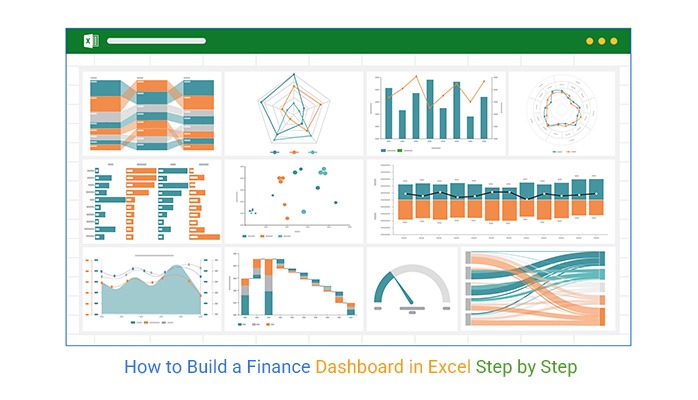
What is a finance dashboard in Excel? It’s a powerful tool that brings all your financial data into one place. Businesses that use dashboards report 20% faster responses to economic issues. Organizing numbers into clear visuals simplifies decision-making.

A finance dashboard in Excel helps track key metrics such as revenue, expenses, and cash flow. It uses financial graphs and charts in Excel to turn raw data into actionable insights.

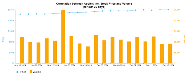
Finance Dashboard in Excel

Businesses can integrate other tools, such as a CRM template for Excel, seamlessly aligning sales and financial data. By connecting various departments, the dashboard promotes a unified approach to growth.

Understanding customer behavior is another essential part of financial planning. Moreover, companies can target the right audience more effectively using concepts such as psychographic segmentation. Incorporating these insights into your dashboard leads to smarter strategies.

A well-structured dashboard not only highlights gaps but also tracks improvements over time. It becomes an indispensable asset for managing finances with precision.

Are you ready to explore how this tool transforms your approach to financial management? Let’s dive into the details.

Table of Contents:

  1. What is a Finance Dashboard in Excel?
  2. Types of Financial Dashboards in Excel
  3. Key Metrics to Include in a Financial Dashboard in Excel
  4. How do you Create a Financial Dashboard in Excel?
  5. Tips for Creating a Successful Financial Dashboard in Excel
  6. Benefits of Excel Personal Finance Dashboard
  7. FAQs
  8. Wrap Up

What is a Finance Dashboard in Excel?

Definition: A finance dashboard in Excel is a tool that consolidates financial data into one visual platform. It tracks revenue, expenses, and cash flow for better decision-making. Therefore, businesses use it to monitor performance and identify trends.

A dashboard simplifies complex data into clear visuals. It supports creating financial models in Excel, offering deeper insights into financial planning. This dashboard provides clarity and control for small businesses or large corporations. It’s a must-have for efficient financial management.

Types of Financial Dashboards in Excel

Financial dashboards in Excel come in various types to suit different needs. They simplify Excel charts into visual insights for better decision-making. Whether you’re a business owner, an analyst, or a finance enthusiast, these dashboards can transform raw numbers into actionable strategies:

  1. Profit and loss dashboard: This dashboard tracks income, expenses, and profitability, providing a clear picture of your financial performance. You can enhance it using a Tornado Chart for visual clarity.
  2. Cash flow dashboard: This dashboard focuses on your business’s cash inflow and outflow. Understanding your cash flow ensures you can cover expenses and plan for growth.
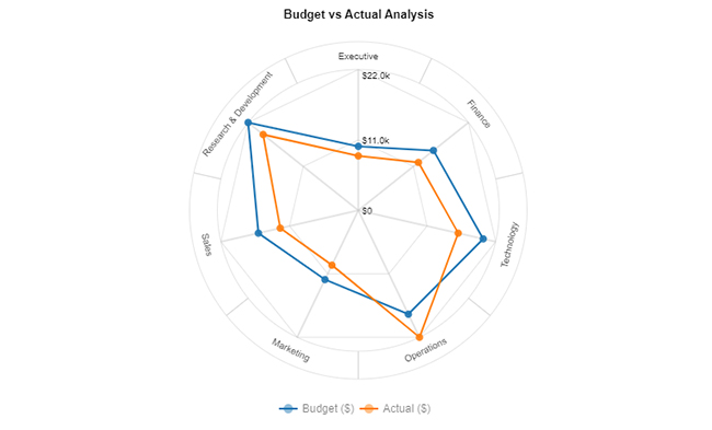
  3. Budget vs. actual dashboard: Compare your financial projections against actual results and highlight areas where spending or income deviates from your plan.
  4. Key performance indicators (KPI) dashboard: Monitor essential metrics, such as revenue growth or customer acquisition. It keeps your goals measurable and aligned with strategy.
  5. Balance sheet dashboard: This dashboard summarizes your assets, liabilities, and equity, helping you evaluate your company’s financial position.

Key Metrics to Include in a Financial Dashboard in Excel

A finance dashboard in Excel is essential for tracking your business’s performance. It highlights critical metrics to guide informed decisions. With the help of Excel plug-ins, you can enhance functionality and streamline your financial analysis. But what metrics should you prioritize?

  1. Revenue and profit: Monitor total revenue and net and gross profit margins. These metrics provide descriptive analytics to show how effectively your business generates income and controls costs.
  2. Operating expenses: Monitor spending across various categories to identify unnecessary costs. This ensures resources are allocated efficiently to support business goals.
  3. Cash flow: Understand how money moves in and out of your business over time. Positive cash flow keeps your operations running and prevents liquidity issues.
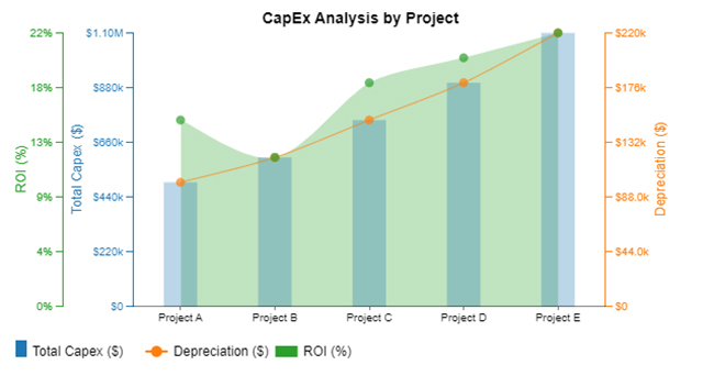
  4. Return on Investment (ROI): Measure the profitability of investments relative to their costs. Focusing on ROI helps you prioritize projects that deliver the highest value.
  5. Working capital: Evaluating the difference between current assets and liabilities reflects your ability to handle short-term financial obligations effectively.
  6. Debt-to-equity ratio: Compare your company’s debt to its equity to assess financial leverage. Maintaining a balanced ratio supports long-term stability and investor confidence.

How do you Create a Financial Dashboard in Excel?

Have you ever tried making sense of endless rows and columns in Excel? That’s where a finance dashboard in Excel comes in handy. It turns raw numbers into meaningful insights.

However, when it comes to data visualization, Excel often falls short. Its limited design options can make analysis more complicated than it should be.

Data transformation in Excel can help organize your numbers, but it doesn’t guarantee clarity. Install ChartExpo—a powerful tool that elevates your data visualization game. With ChartExpo, you can create stunning visuals that simplify financial analysis and decision-making.

The charts below were created in Excel using ChartExpo:

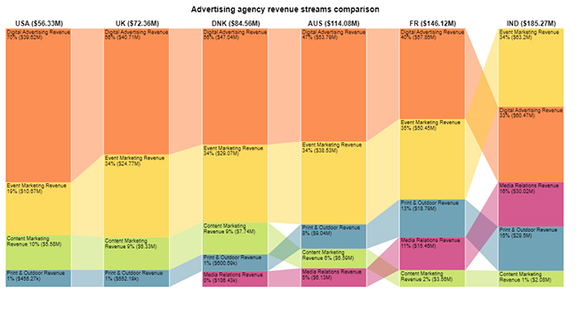
Sankey Chart:

Finance Dashboard in Excel

Multi-Axis Line Chart:

Finance Dashboard in Excel

Sentiment Trend Chart:

Finance Dashboard in Excel

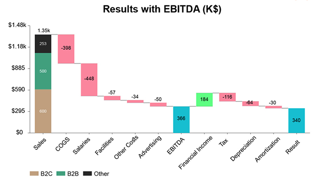
Stacked Waterfall Chart:

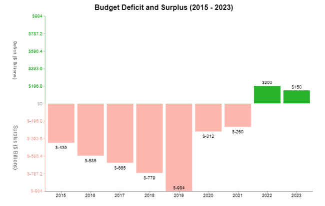
Finance Dashboard in Excel

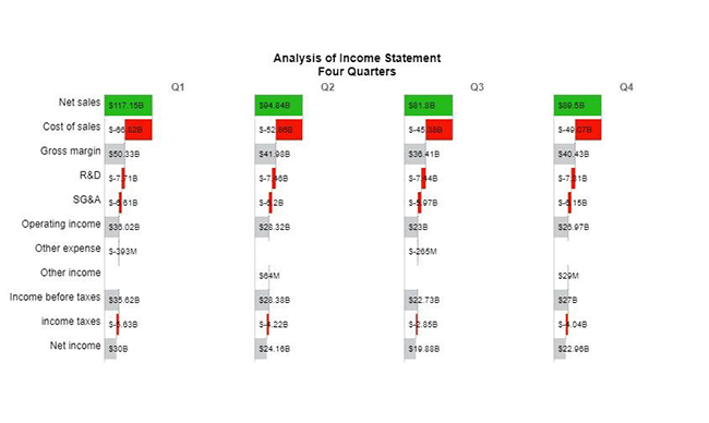
Horizontal Waterfall Chart:

Finance Dashboard in Excel

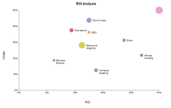
Scatter Plot:

Finance Dashboard in Excel

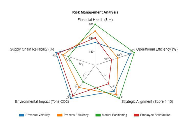
Multi-Axis Spider Chart:

Finance Dashboard in Excel

Double Axis Line Graph:

Finance Dashboard in Excel

Circular Org Chart:

Finance Dashboard in Excel

Comparison Bar Chart:

Finance Dashboard in Excel

How to Install ChartExpo in Excel?

  1. Open your Excel application.
  2. Open the worksheet and click the “Insert” menu.
  3. You’ll see the “My Apps” option.
  4. In the Office Add-ins window, click “Store” and search for ChartExpo on my Apps Store.
  5. Click the “Add” button to install ChartExpo in your Excel.

ChartExpo charts are available both in Google Sheets and Microsoft Excel. Please use the following CTAs to install the tool of your choice and create beautiful visualizations with a few clicks in your favorite tool.

Example

Let’s learn how to create a dashboard in Excel with ChartExpo using the sample data below.

Level 1 Level 2 Level 3 Level 4 Level 5 Amount
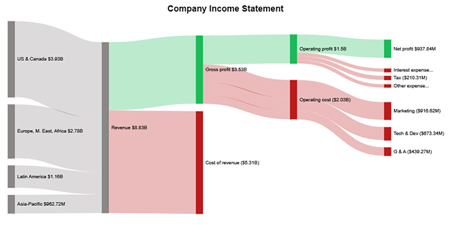
US & Canada Revenue            3,930,557,000
Europe, M. East, Africa Revenue            2,783,530,000
Latin America Revenue            1,156,023,000
Asia-Pacific Revenue               962,715,000
Revenue Gross profit            3,525,340,000
Revenue Cost of revenue           (5,307,485,000)
Gross profit Operating profit            1,496,109,000
Operating profit Net profit               937,838,000
Operating profit Interest expense              (175,212,000)
Operating profit Tax              (210,312,000)
Operating profit Other expense              (172,747,000)
Gross profit Operating cost Marketing              (916,617,000)
Gross profit Operating cost Tech & Dev              (673,341,000)
Gross profit Operating cost G & A              (439,273,000)
  1. To get started with ChartExpo, install ChartExpo in Excel.
  2. Now Click on My Apps from the INSERT menu.
Finance Dashboard in Excel
  1. Choose ChartExpo from My Apps, then click Insert.
Finance Dashboard in Excel
  1. Once it loads, choose the “Sankey Chart” from the charts list.
Finance Dashboard in Excel
  1. Click the “Create Chart From Selection” button after selecting the data from the sheet.
Finance Dashboard in Excel
  1. ChartExpo will generate the visualization below for you.
Finance Dashboard in Excel
  1. If you want to have the chart’s title, click Edit Chart, as shown in the above image.
  2. Click the pencil icon next to the Chart Header to change the title.
  3. It will open the properties dialog. Under the Text section, you can add a heading in Line 1 and enable Show.
  4. Give the appropriate title of your chart and click the Apply button.
Finance Dashboard in Excel
  1. You can disable the Percentage values as follows:
Finance Dashboard in Excel
  1. You can enable the numbers and change the format type. After this, your node size will change.
Finance Dashboard in Excel
  1. Let’s give colors to the nodes. Click the pencil icon at the top of the nodes and go to “node”.
  2. Select the color and click the “apply” button to save all changes.
  3. Also, disable the Levels as follows:
Finance Dashboard in Excel
  1.  Click the “Save Changes” button to persist the changes.
Finance Dashboard in Excel
  1. Your final chart will appear below.
Finance Dashboard in Excel

Insights

  • Revenue: US & Canada lead with $3.93B.
  • Gross profit: $3.53B, with a cost of revenue at $5.31B.
  • Operating profit: $1.50B, reduced by expenses.
  • Net profit: $937.84M after interest, tax, and other deductions.
  • Marketing costs: The largest operating expense at $916.62M.

Tips for Creating a Successful Financial Dashboard in Excel

Want to build a standout financial dashboard? Use advanced Excel charts to simplify complex data and follow these tips:

  • Focus on key metrics: Concentrate on the essential metrics that drive decision-making, excluding unnecessary data. This ensures your dashboard remains focused and impactful.
  • Use clear visuals: Use charts and graphs that convey information clearly, allowing quick interpretation without confusion.
  • Keep it simple: A simple, uncluttered design improves usability and makes the dashboard more intuitive. Moreover, simplicity reduces distractions, enhancing your experience.
  • Automate data updates: Automating data updates saves time and reduces the risk of manual errors. Therefore, your dashboard stays accurate and up-to-date with less effort.
  • Know your audience: Since different users have unique needs, tailor the dashboard to meet their specific requirements. By understanding your audience, you can ensure the dashboard provides relevant insights.
  • Spotlight key trends: To grasp significant developments quickly, highlight significant trends using a Cash Flow Diagram in Excel. Focusing on key trends makes it easier for decision-makers to act on critical insights.

Benefits of Excel Personal Finance Dashboard

Managing your finances can feel overwhelming. An Excel personal finance dashboard with data for Excel chart visualizations is here to make life easier. Let’s explore the benefits;

  • Centralized financial overview: An Excel personal finance dashboard brings all your financial information together in one place. This makes tracking everything from bank accounts to investments easier without switching between different tools.
  • Better budgeting: Tracking income and expenses with data analytics allows you to manage your money. It helps you stick to your budget, prevent overspending, and make necessary adjustments.
  • Improved financial planning: With clear insights into your financial situation, you can plan for future expenses, savings, and investments. It is a proactive approach that helps you achieve long-term financial goals.
  • Real-time updates: Automated data inputs ensure your financial dashboard is always updated. They offer the latest information to make timely and informed decisions.
  • Goal tracking: Set specific financial goals, such as paying off debt and use the progress bar in Excel to track your progress. It keeps you motivated and focused on achieving your objectives.
  • Enhanced financial awareness: The dashboard helps you identify spending patterns and habits, increasing awareness. It enables you to make smarter choices and improve your financial health.

FAQs:

How do I create a financial dashboard in Excel?

  1. Gather data: Collect and organize financial data in Excel.
  2. Create pivot tables: Summarize data for easy analysis.
  3. Add charts: Use bar, line, or pie charts to visualize trends.
  4. Apply conditional formatting: Highlight key metrics for quick insights.
  5. Use sparklines: Add mini-charts for compact visual summaries.
  6. Integrate ChartExpo: Enhance visuals with advanced and interactive charts.

What is the financial KPI dashboard in Excel?

A financial KPI dashboard in Excel tracks key performance indicators. It provides a visual overview of financial metrics like revenue, profit, and expenses. The dashboard simplifies data analysis, aiding decision-making and highlighting trends for business growth.

Wrap Up

A finance dashboard in Excel is a powerful tool. It consolidates financial data into a clear and organized view, enabling faster and more informed decisions. Businesses can also leverage recruitment dashboards for hiring insights.

Visualizing key metrics simplifies complex financial details. Cool Excel charts and graphs bring data to life, making trends easier to spot. You can effortlessly track revenue, expenses, and cash flow. This clarity helps identify trends and areas for improvement.

Moreover, it is customizable to suit individual or business needs. You can focus on ROI, working capital, or profit margins. Including types of charts and graphs in your dashboard improves analysis and understanding.

Using Excel for dashboards also ensures accessibility. Many rely on it for its familiar interface and powerful features. It supports various tools and techniques to enhance your data insights.

Regularly updating a finance dashboard ensures accuracy. It keeps you aligned with your goals and aware of financial performance. This practice reduces risks and supports long-term success.

In conclusion, a finance dashboard in Excel is more than a spreadsheet. It is a guide to better financial decisions.

For better insights, install ChartExpo. It will transform your data into meaningful strategies.

How much did you enjoy this article?

ExcelAd2
Start Free Trial!
148392

Related articles

next previous
Microsoft Excel9 min read

How to Create a Stacked Waterfall Chart in Excel?

Discover how to build and customize a stacked waterfall chart in Excel. Ideal for showing positive and negative values across categories or time.

Microsoft Excel10 min read

Excel Bookkeeping for Small Business: Insights at a Glance

Excel bookkeeping for small businesses helps track income, expenses, and cash flow. Learn about templates and financial analysis to simplify bookkeeping.

Microsoft Excel10 min read

Compound Interest in Excel for Smarter Reporting

Discover compound interest in Excel and how it works. Learn its formulas, calculation tips, and common errors to avoid for more accurate financial analysis.

Microsoft Excel9 min read

KPI Dashboard in Excel: A Complete Guide

A KPI dashboard in Excel helps track key metrics and streamline data visualization. Discover how to create, analyze, and use it with clear guides and examples.

Microsoft Excel11 min read

How to Plot a Speedometer Chart in Excel?

Create a Speedometer Chart in Excel to track KPIs, goals, and performance metrics visually. Explore templates, examples, and step-by-step instructions for better dashboards.

ChartExpo logo

Turn Data into Visual
Stories

CHARTEXPO

  • Home
  • Gallery
  • Videos
  • Services
  • Pricing
  • Contact us
  • FAQs
  • Privacy policy
  • Terms of Service
  • Sitemap

TOOLS

  • ChartExpo for Google Sheets
  • ChartExpo for Microsoft Excel
  • Power BI Custom Visuals by ChartExpo
  • Word Cloud

CATEGORIES

  • Bar Charts
  • Circle Graphs
  • Column Charts
  • Combo Charts
  • Comparison Charts
  • Line Graphs
  • PPC Charts
  • Sentiment Analysis Charts
  • Survey Charts

TOP CHARTS

  • Sankey Diagram
  • Likert Scale Chart
  • Comparison Bar Chart
  • Pareto Chart
  • Funnel Chart
  • Gauge Chart
  • Radar Chart
  • Radial Bar Chart
  • Sunburst Chart
  • see more
  • Scatter Plot Chart
  • CSAT Survey Bar Chart
  • CSAT Survey Chart
  • Dot Plot Chart
  • Double Bar Graph
  • Matrix Chart
  • Multi Axis Line Chart
  • Overlapping Bar Chart
  • Control Chart
  • Slope Chart
  • Clustered Bar Chart
  • Clustered Column Chart
  • Box and Whisker Plot
  • Tornado Chart
  • Waterfall Chart
  • Word Cloud
  • see less

RESOURCES

  • Blog
  • Resources
  • YouTube
SIGN UP FOR UPDATES

We wouldn't dream of spamming you or selling your info.

© 2025 ChartExpo, all rights reserved.