Categories
What is data transformation in Excel?
Picture this: you’ve got a massive spreadsheet filled with raw sales numbers, customer details, product SKUs, and order dates. It’s a mess. Rows don’t match up, columns overlap, and finding valuable insight is impossible. This is where data transformation in Excel becomes your ally. It’s the process of taking that tangled web of data and shaping it into something meaningful.


Data transformation in Excel isn’t just about making spreadsheets look good. It’s about changing the actual structure of your data to make analysis faster and more effective. According to research, businesses spend up to 80% of their time preparing data rather than analyzing it. Now, imagine reducing hours of tedious work to just a few clicks. Excel’s transformation tools can help you achieve this.
Maybe you need to clean up inconsistencies, like mismatched dates, duplicate entries, or empty fields. Or perhaps you need to reshape data, turning rows into columns to get a different view of your metrics. Excel offers powerful features for these tasks. From PivotTables to Power Query, each tool is built to help transform data and make it accessible for clear analysis.
These tools not only save time but also help ensure accuracy. After all, poor data quality can cost businesses millions annually. With data transformation in Excel, you gain control over your information, turning it into a source of knowledge.
Let’s see how the right data transformation in Excel can mean the difference between guessing and knowing.
First…
Definition: Data transformation in Excel involves changing data into a usable format. This can include tasks like cleaning, organizing, and converting data types.
Common data transformation methods in Excel include using functions like TEXT, VALUE, and DATE. You can also use features like Power Query for advanced transformations.
Data transformation facilitates the simplification and improvement of data analysis. It prepares data for visualization or reporting. Overall, it enhances the quality and usability of your data in Excel.
Data transformation in Excel is crucial for various situations. It helps make sense of raw data and improves analysis. Let’s explore some cases where this process is needed.
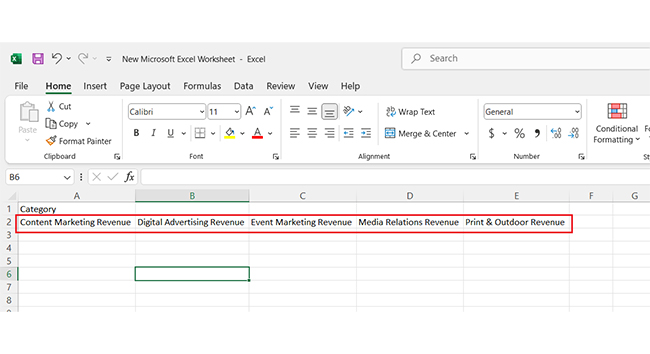
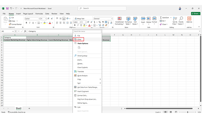
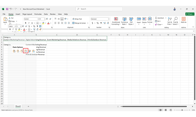
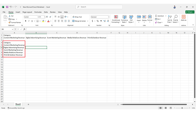
Transforming data in Excel is simple and effective. Here’s how you can refine your data step by step:
Here’s a simple way to do it.
Excel is packed with powerful functions for data transformation. These functions allow faster manipulation and analysis of data. Let’s dive into some key categories.
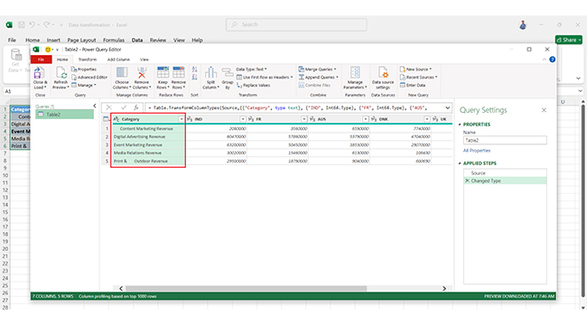
Power Query is an advanced tool for data transformation. It allows you to import, clean, and reshape data from various sources. You can apply multiple transformations and load data directly into Excel. This makes it a game-changer for handling large datasets.
Transforming data effectively can make a huge difference in analysis. The right approach helps you get more precise insights. Here’s the best way to transform your data.
Data analysis in Excel can feel like wearing sunglasses indoors—helpful but missing the full picture. Excel’s transformation tools, along with effective data cleansing techniques, help you clean and organize data. But when it’s time to make that data speak, it often falls flat.
Data visualization is key; it brings your insights to life, making them clearer and more compelling. That’s where ChartExpo comes in. This visualization add-in transforms your data into stunning, interactive visuals, including a Waterfall chart, taking your analysis up a notch.
Say goodbye to static charts and hello to a world of dynamic, interactive storytelling. With ChartExpo, you can create powerful visuals, including a tornado chart in Excel – install it today and transform your data.
Let’s learn how to install ChartExpo in Excel.
ChartExpo charts are available both in Google Sheets and Microsoft Excel. Please use the following CTAs to install the tool of your choice and create beautiful visualizations with a few clicks in your favorite tool.


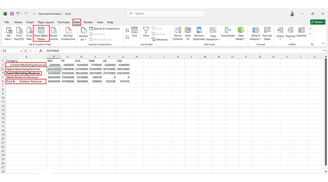
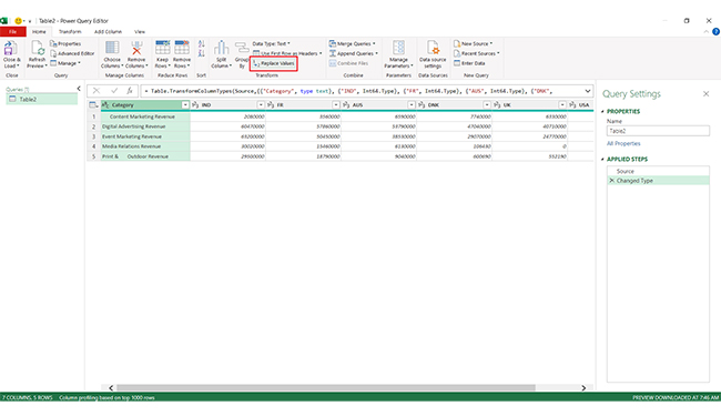
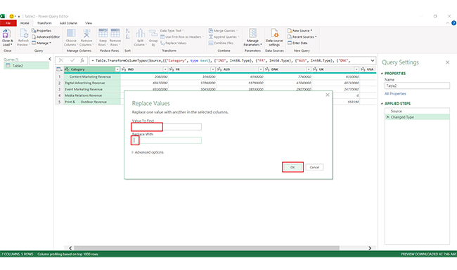
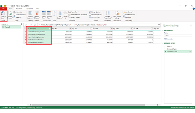
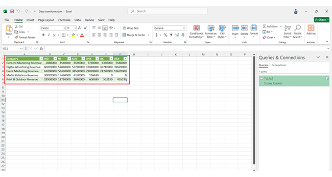
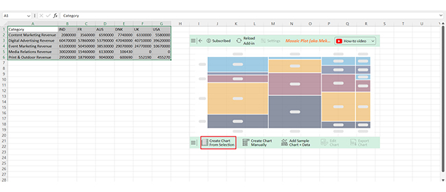
Let’s analyze the transformed data below in Excel using ChartExpo.
| Category | IND | FR | AUS | DNK | UK | USA |
| Content Marketing Revenue | 2080000 | 3560000 | 6590000 | 7740000 | 6330000 | 5580000 |
| Digital Advertising Revenue | 60470000 | 57860000 | 53790000 | 47040000 | 40710000 | 39620000 |
| Event Marketing Revenue | 63200000 | 50450000 | 38530000 | 29070000 | 24770000 | 10670000 |
| Media Relations Revenue | 30020000 | 15460000 | 6130000 | 106430 | 0 | 0 |
| Print & Outdoor Revenue | 29500000 | 18790000 | 9040000 | 600690 | 552190 | 455270 |


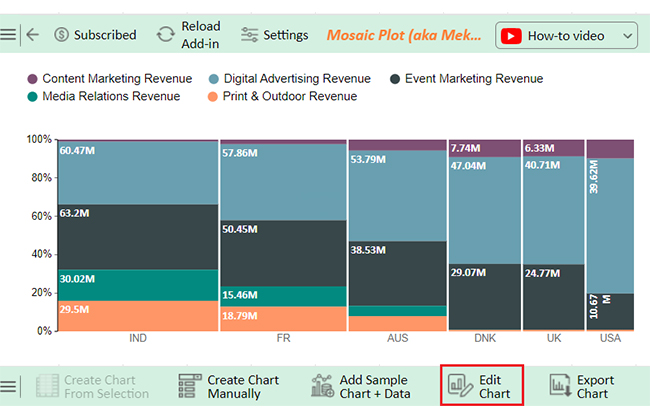
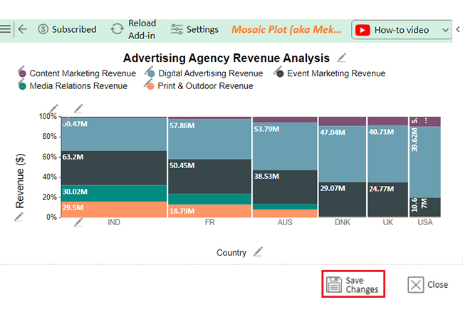
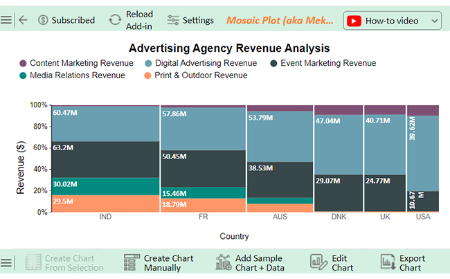


The USA leads in:
India shows the highest revenue in:
Denmark and Australia excel in:
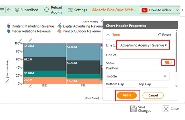
The following video will help you to create a Mosaic Plot in Microsoft Excel.
Data transformation is like polishing a diamond – it makes your data shine, bringing out the full value hidden within. Here are the key benefits of transforming data in Excel:
Excel offers basic data transformation features like sorting, filtering, and pivoting. It’s handy for simple data prep but lacks the advanced transformation capabilities found in dedicated tools. For complex data tasks, specialized transformation software is better suited.
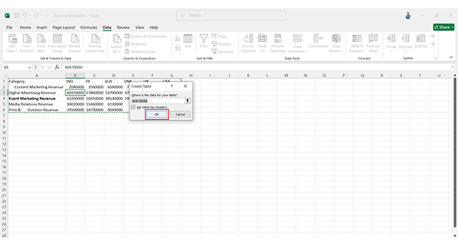
The Transform tool in Excel is found within the Power Query Editor. Access it by selecting Data > Get & Transform Data and choosing an import option. Once inside, Power Query enables various data transformation tasks, such as merging, splitting, and filtering.
To transform data in Excel:
Data transformation in Excel is a crucial process. It helps convert raw data into a usable format. This process makes analysis easier and more accurate. You can clean, organize, and reshape your data using various functions and tools.
First, data transformation enhances clarity. It removes errors and inconsistencies, ensuring that the data is reliable. When data is clear, it leads to better insights and decision-making.
Next, Excel offers numerous transformation functions. Functions like TEXT, CONCATENATE, and VLOOKUP simplify tasks. You can easily manipulate text, perform calculations, and look up values. These functions save time and improve efficiency.
Moreover, Power Query provides advanced options. It allows you to import, clean, and reshape data from multiple sources. This tool makes complex transformations more manageable.
Additionally, data transformation prepares data for analysis. Summarizing and grouping data helps identify trends. This is essential for making informed decisions in business and research.
In conclusion, mastering data transformation in Excel unlocks valuable insights. It empowers you to work with data effectively.
Do not hesitate.
Start transforming data in Excel and analyzing it using ChartExpo today, and watch your insights flourish!
How much did you enjoy this article?


Learn how to use sparklines in Excel to quickly visualize trends inside cells. Discover types, creation steps, customization, use cases, benefits, and best practices.

Learn what a confidence interval graph is, how to create it in Excel, and how to interpret results to make more reliable, data-driven decisions.

A correlation matrix in Excel helps identify relationships between variables. Learn how to create, read, and use it for effective data analysis.


