Categories
By ChartExpo Content Team
Numbers tell a story. In business, that story is shaped by Financial Metrics. These numbers show how well a company makes money, controls costs, and manages risks. Without them, every financial decision is a guess.
Financial Metrics track profits, cash flow, and debt. They help businesses adjust strategies, plan for growth, and avoid costly mistakes. A strong cash flow metric warns of trouble before it hits. A rising profit margin confirms a business is on the right track.


Every company relies on Financial Metrics to stay competitive. They guide investments, shape budgets, and reveal risks. Without them, leaders make decisions in the dark. Knowing which numbers matter—and what they mean—keeps businesses moving forward.
First…
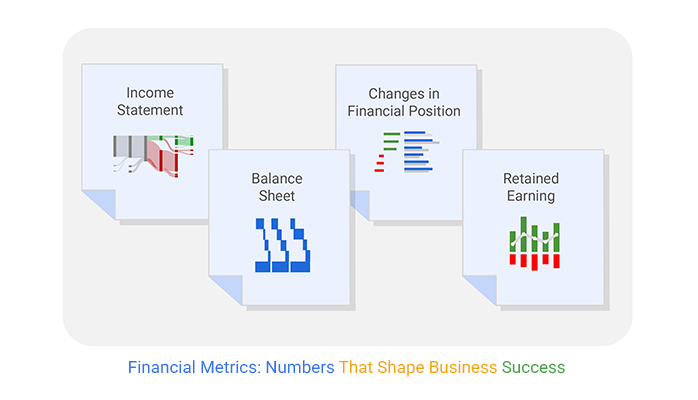
Financial metrics are numbers that show a company’s financial health. They measure profits, costs, cash flow, and more. These figures help businesses make smart money decisions.
Companies use financial metrics to track performance over time. They compare results to industry benchmarks. This helps leaders adjust strategies to stay competitive.
Every business, big or small, relies on these numbers. They help spot trends, reduce risks, and improve profits. Without them, companies would be flying blind in a competitive market.
Financial KPIs guide business strategy. They show whether a company is growing, shrinking, or staying the same. Leaders use them to decide where to invest time and money.
These indicators track revenue, profits, and costs. They also highlight risks before they become major problems. A falling cash flow metric signals trouble, while a rising profit margin shows success.
Companies that monitor KPIs make better decisions. They can fix issues faster and seize opportunities sooner. Without them, financial planning becomes a guessing game.
Revenue growth measures how fast a company’s income increases over time. This number reflects market demand, pricing strength, and sales performance. A rising trend suggests a healthy business expanding its customer base.
Flat or declining revenue signals trouble. It may indicate pricing issues, weak sales, or market shifts. Leaders track this metric to adjust sales strategies and pricing models. A business must grow revenue steadily to stay competitive.
Profit margins show how much money a company keeps after costs. These metrics reveal efficiency in pricing, production, and expense management. A strong margin suggests a business is operating efficiently.
Three key profit margins exist. Gross margin measures profits after direct costs like materials and labor. Operating margin considers overhead and operating expenses. Net margin reflects total profitability after all costs, including taxes and interest.
Cash flow tracks money moving in and out of a business. Positive cash flow means a company can pay bills and invest in growth. Negative cash flow signals trouble, possibly leading to debt or financial struggles.
Cash flow isn’t the same as profit. A company can be profitable yet struggle with cash shortages. Businesses must manage expenses, invoice collections, and payment cycles to keep cash steady.
ROI measures how effectively a company generates profits from investments. This metric helps businesses decide where to spend money for growth. A high ROI means investments are paying off.
ROI applies to marketing, equipment, and new projects. A company must compare returns to costs before making big spending decisions. If an investment isn’t generating value, it may need adjustment.
The debt-to-equity ratio compares borrowed money to shareholder investment. A high ratio means a company relies heavily on debt. A low ratio suggests financial stability and less risk.
Lenders and investors examine this metric closely. Too much debt raises concerns about repayment ability. Too little debt may mean missed opportunities for growth. Companies must balance debt with equity to maintain financial strength.
Gross profit margin isn’t just a number; it’s your business’s heartbeat. This metric shows how well your company retains revenue after covering the direct costs of goods sold (COGS). Think of it as a clear gauge of your production efficiency and pricing strategy.
A higher gross profit margin implies that your company retains more revenue per dollar of sales, which can be funneled back into expanding operations or building reserves. It prompts you to ask, “Are my production methods cost-effective? Am I pricing my products right?” By tweaking your strategies here, you can boost this margin, holding onto more revenue with every sale.
This metric also serves as a litmus test for your pricing strategies and cost control measures. If you see it dip, it’s a signal to examine your production costs or reconsider your pricing. Keeping an eye on this metric helps you make strategic decisions that directly impact your bottom line.
Net profit margin takes the spotlight when assessing a company’s overall health. This metric deducts all expenses, not just COGS, from revenue to show what percentage of income actually translates into profit. It’s the ultimate test of your business’s efficiency.
This figure is your bottom line and includes costs like operating expenses, interest, taxes, and more. A robust net profit margin means your company isn’t just generating revenue but is efficient in managing its cost base against its total revenue. It answers the critical question, “After all is said and done, what are we really earning?”
Boosting this margin involves not just increasing sales, but also controlling overheads and other expenses. It’s about being smart with every dollar your business spends. By focusing on both sides of the equation — increasing revenue and managing expenses — you can drive this metric up, reflecting true business success.
ROA and ROE are key indicators of how well your company is using its assets to generate earnings. ROA shows the efficiency of management in using assets to secure profits, while ROE reveals how effectively the company uses equity to generate financial growth.
These metrics are crucial for investors as they assess the bang for their buck — in terms of assets or equity. A higher ROA means your company generates more income per dollar of assets, while a higher ROE indicates effective use of investor funds. These insights drive strategic investment and operational decisions, aiming to optimize asset and equity use for higher returns.
Improving these metrics can involve strategies like better asset management or more prudent financial leveraging. They encourage a focus on making every asset and equity dollar work harder to contribute to your company’s profit growth.
The clustered column chart is a visual hero when it comes to comparing the profitability of different product lines. This chart type stacks data in clusters, making it easy to compare multiple categories across the same axis.
For profitability analysis, this means you can see side-by-side comparisons of gross profit margin, net profit margin, ROA, and ROE across different product lines.
Clustered column chart adds immense value by highlighting which products are boosting your bottom line and which might be lagging. It plays a pivotal role in strategic decision-making, pushing you to allocate resources to the most profitable areas.
By embedding this chart in your financial analysis, you reinforce key points about where your business stands and where it could go, driving home the importance of targeted strategy adjustments for enhanced profitability.
The Current Ratio and Quick Ratio both evaluate short-term financial health. The Current Ratio measures whether your assets can cover your liabilities. It calculates by dividing current assets by current liabilities. A higher ratio means more liquidity, signifying robust financial health.
Conversely, the Quick Ratio, also known as the acid-test, strips out less liquid assets like inventories. It focuses on cash, marketable securities, and receivables divided by current liabilities. This metric tells us how well a company can meet its short-term obligations without selling inventory.
Both ratios are vital for assessing immediate financial stability. They help stakeholders understand if a business can handle unexpected downturns or obligations.
Operating Cash Flow (OCF) is crucial for daily business survival. It shows the cash generated from regular business operations, helping to assess a company’s efficiency at earning cash. You calculate OCF by adjusting net income for changes in non-cash accounts like depreciation and accounts receivable.
A positive OCF indicates that a company can maintain and grow its operations. It means the business generates enough cash to reinvest in its operations, pay debts, and return money to shareholders. On the other hand, a negative OCF signals potential trouble in covering everyday expenses.
The Cash Burn Rate is essential for understanding how long a company can operate before it needs more financing or becomes profitable. It’s particularly crucial for startups and companies in growth phases. This rate is calculated by measuring the amount of cash a company uses over a specific period.
You can find the monthly burn rate by dividing the total cash burned over a set period by the number of months. A lower burn rate means a longer runway, giving a company more time to achieve profitability or secure additional funding.
A Waterfall chart is a powerful tool for visualizing cash flow changes over time. It helps in understanding how sequential financial decisions impact the final cash position. This chart type shows the cumulative effect of progressively adding positive or negative values.
The Waterfall Chart’s clear visualization aids in pinpointing key transactions and operational changes affecting liquidity. It aligns perfectly with fund flow analysis by highlighting how each component contributes to the overall financial health.
By integrating this chart, stakeholders can see not just static figures but the narrative of financial flow. It enhances decision-making by pinpointing where financial management can be improved. This data visualization makes it easier to grasp complex financial scenarios quickly.
Inventory turnover is crucial. It measures how quickly your products sell. A high turnover indicates strong sales; a lower one, potential issues. To improve this metric, streamline your inventory systems. Efficient stock management speeds up operations and boosts profitability. Keep track of this metric to ensure your inventory practices are up to snuff.
Days Sales Outstanding (DSO) tracks how long it takes to collect payments. A lower DSO means you’re getting paid faster, which is great for cash flow. To reduce DSO, streamline your invoicing process and set clear payment terms. Consider incentives for early payments. Monitoring DSO helps maintain a healthy cash flow, vital for operational stability.
Revenue per employee looks at the output each staff member generates. It’s a snapshot of your workforce’s productivity. To boost this metric, focus on training and technology. Efficient employees drive company success. Keep an eye on this metric to ensure your team’s productivity aligns with business goals.
A dot plot chart helps businesses compare efficiency across departments. It shows multiple data points on a single axis, making trends and outliers easy to spot. Each dot represents a specific value, showing how different areas perform against key metrics.
This chart works well for highlighting performance gaps. If one department’s cost per unit is higher than others, something is off. Leaders can investigate, adjust workflows, or reassign resources to improve efficiency.
The dot plot also reveals workload imbalances. If certain teams process fewer transactions but spend more time, productivity issues may exist. Tracking these numbers helps businesses balance workloads and reduce wasted effort.
Year-over-Year growth, or YoY, measures performance from one period to the next. It shows if a business is growing or shrinking. You compare this year’s revenue to last year’s. If the number goes up, that’s good! It means you’re growing. This metric is key for seeing long-term trends. It helps businesses plan better and react to changes. If the numbers decline, it might be time to rethink your strategy.
CLTV tells you the total revenue a single customer brings during their time with your business. CAC is what you spend to get a new customer. For a healthy business, CLTV should be higher than CAC. This means you earn more from a customer than the cost to acquire them. If not, you might be spending too much on marketing. Keep an eye on these figures to make sure you’re making money, not losing it.
Monthly Recurring Revenue, or MRR, is what you earn from customers each month. This is common in businesses like software services where customers pay a regular fee. MRR makes your income predictable, which is great for planning your budget. It’s important to grow your MRR to show that your business is doing well. Tracking MRR helps spot trends and plan for future growth.
A funnel chart helps visualize the customer journey. It shows how potential buyers move from first contact to final purchase. Each stage narrows, revealing where customers drop off.
This chart highlights weak spots in sales and marketing efforts. If too many leads exit early, it signals a need for better engagement strategies. If conversion rates dip at the final step, pricing or product concerns may exist.
A well-structured funnel guides decision-making. It helps businesses focus resources on fixing problem areas. Improving each stage ensures more prospects become paying customers.
To determine if your products are priced profitably, examine the contribution margin. This metric reveals the portion of sales revenue exceeding variable costs. For instance, if your product sells for $100 and costs $60 to make and deliver, your contribution margin is $40. This $40 covers your fixed costs and profits. The higher this value, the more you pocket post covering variable expenses. Ideal pricing strategies boost this margin without deterring customers.
Breakeven analysis calculates when revenue from sales covers all business costs. It pinpoints the sales quantity needed to ensure no profit or loss. This analysis aids in setting realistic sales targets and planning for profit. If your fixed costs are $10,000 and each unit’s contribution margin is $50, you must sell 200 units to breakeven. Understanding this metric guides pricing strategies and operational adjustments.
Price elasticity of demand measures how demand varies with price changes. If demand changes significantly with slight price adjustments, the demand is considered elastic. Conversely, inelastic demand means demand barely changes despite price shifts. Knowing this helps in deciding whether to increase prices without losing customers or lower them to boost sales volume. This metric requires careful analysis as it directly impacts revenue streams.
A slope chart compares data points over time. It shows how numbers change between two periods. Each line represents a shift, making trends clear at a glance.
This chart is ideal for tracking pricing effects. If revenue rises after a price adjustment, the trend is visible. If sales drop, the decline is easy to spot.
Businesses use slope charts to evaluate pricing models. They compare before-and-after results, refining strategies for growth. A clear visual helps decision-makers adjust pricing without uncertainty.
A slope chart highlights successful strategies. It reveals which pricing changes drive revenue and which harm sales. This insight helps businesses stay competitive while maximizing profits.
Cost of Goods Sold, or COGS, tracks the direct costs of producing goods sold by a company. This metric is vital for managers to scrutinize as it directly impacts profitability. Lowering COGS can lead to significant profit increases without boosting sales. How? By negotiating better prices with suppliers, improving production efficiency, or using materials more effectively.
Yet, there’s a fine line here. Cut too deeply, and the quality might drop, leading to unhappy customers. Therefore, it’s about finding that sweet spot where cost-cutting doesn’t compromise product quality.
Operating expenses cover the costs required to run a company but aren’t directly tied to production. These include rent, utilities, and payroll. The key here is efficiency. Every dollar saved on these expenses is a dollar straight to your profit margin.
Regular reviews of these costs can reveal wastage. Maybe you’re paying for unused space, or perhaps an upgrade to energy-efficient appliances could reduce utility bills. It’s all about maintaining a lean operation where every expense can be justified.
The Payroll Headcount Ratio compares the number of employees to the revenue they generate. A high ratio might indicate that you’re overstaffed, whereas a low ratio could mean your staff is overworked, potentially leading to burnout and reduced productivity.
This metric encourages a balancing act. It’s not only about reducing staff numbers but ensuring you have the right number of people to drive your company’s growth without unnecessary expenditure.
A Pareto chart helps businesses find the biggest cost drivers. It follows the 80-20 rule, which suggests that 80% of expenses come from 20% of cost sources. This chart makes it easy to see which expenses demand attention.
A Pareto chart combines bars and a line graph. The bars show individual cost sources, arranged from highest to lowest. The line represents the cumulative percentage of total expenses, making trends clear.
This chart helps businesses focus on areas with the greatest financial impact. If a few vendors or processes drive most costs, addressing them first yields the best results.
Using a Pareto chart, companies avoid spreading resources too thin. They tackle the largest expenses first, reducing costs efficiently. This targeted approach improves financial health and strengthens cash flow.
Return on Investment, or ROI, measures profit against cost. It shows how much you gain from an investment relative to its cost. Calculating ROI involves subtracting the initial investment from the return, then dividing by the initial investment. The result, expressed as a percentage, tells investors how effective their money has been at generating profit. This metric is vital for comparing the efficiency of multiple investments.
Return on Capital Employed, or ROCE, highlights how well a company uses its capital to generate profits. This metric divides earnings before interest and taxes (EBIT) by the total capital employed. It’s a crucial indicator of financial efficiency, showing how well a company uses both its equity and debt to produce earnings. Companies with high ROCEs are often good stewards of capital.
Earnings Before Interest, Taxes, Depreciation, and Amortization, or EBITDA, provides a clear picture of a company’s operating performance. This metric strips out the non-operational costs that don’t affect cash flow, like taxes and interest. It’s a useful gauge of a company’s financial health and its ability to generate cash flow from operations. EBITDA is particularly helpful for comparing companies within the same industry.
A multi-axis spider chart compares multiple investment options across various performance metrics. It displays data on a web-like grid, with each axis representing a different factor. The larger the plotted area, the better the overall performance.
This chart makes complex comparisons simple. It allows businesses to visualize multiple investment returns at once. A quick glance reveals which investments perform well and which need attention.
A multi-axis spider chart helps compare assets, stocks, or projects. It highlights strengths and weaknesses across different financial indicators. This visual approach ensures capital is allocated to the best-performing investments.
The debt-to-equity ratio paints a clear picture of financial health. It compares total liabilities to shareholders’ equity. High ratios suggest reliance on debt, which could spell trouble in rocky economic waters. Is your business leaning too heavily on borrowed money? This metric will tell you. It’s vital for assessing risk and ensuring long-term sustainability.
This metric measures your ability to pay off interest expenses on outstanding debt. It’s calculated by dividing earnings before interest and taxes (EBIT) by interest expenses. A higher ratio indicates more earnings available to cover interest, thus lower financial risk. Struggling to meet interest obligations? It might be time to reassess your debt strategy.
Liquidity stress tests evaluate your ability to handle financial distress situations. They simulate scenarios like sudden revenue drops or unexpected large expenses. Can your business survive without new income for months? This test provides insights, helping prepare for potential financial storms.
A mosaic plot visualizes financial risk across multiple categories. It divides data into color-coded sections, showing how different factors contribute to overall risk. The size of each section represents its impact on the business.
This chart simplifies complex risk analysis. It highlights which financial areas need attention. If debt levels take up a large portion, reducing liabilities becomes a priority.
Businesses use mosaic plots to compare risk across departments. If one area faces higher financial instability, resources can be shifted accordingly. This data-driven approach strengthens financial decision-making.
A mosaic plot helps businesses stay ahead of risks. It offers a clear breakdown of financial vulnerabilities. By addressing these issues early, companies maintain stability and protect long-term growth.
Return on Equity (ROE) measures how effectively a company uses its assets to generate profit. High ROE indicates strong management and efficient use of assets. Compare your ROE with industry peers to evaluate your company’s performance. If your ROE falls short, consider strategies to improve profitability or asset utilization. This metric is vital for investors and stakeholders to assess financial health and operational efficiency.
Market Value Per Share reflects what investors are willing to pay for a company’s stock. It’s influenced by earnings, market conditions, and investor perception. A higher value suggests investors see robust growth potential. Compare your value with industry averages to gauge market confidence in your business. This comparison helps in understanding how well you’re communicating value and future prospects to the market.
Efficiency metrics such as Asset Turnover Ratio and Inventory Turnover reveal how well resources are utilized. Low scores may indicate underused assets or slow sales. Benchmarking these against similar companies uncovers areas needing improvement. Focus on streamlining operations and optimizing resource use to boost these metrics. Enhanced efficiency often leads to better financial performance and competitive advantage.
A comparison bar chart presents financial data side by side. It displays key performance indicators for multiple companies, making differences easy to spot. Each bar represents a specific metric, allowing for clear analysis.
This chart highlights financial gaps. If one company’s profit margin is higher, others can analyze why. If expenses are significantly lower, cost-saving strategies become a priority.
Businesses use comparison bar charts to track trends. They see where they lead or lag in the market. This visual tool helps refine decisions, ensuring competitive financial positioning, and is considered the best graph to show profit and loss.
Rolling forecasts are key for responsive planning. Unlike static forecasts, they update regularly throughout the year. This method aligns with current market conditions, offering businesses an edge in adaptability. By continuously adjusting projections, companies handle unpredictability better. They make informed decisions based on the latest data, staying one step ahead in dynamic environments.
Budget variance is the gap between projected and actual figures. This metric is crucial for financial health. Analyzing these discrepancies helps organizations understand where they are overspending or underspending. It prompts necessary adjustments in funding allocations or operational strategies. Regular variance analysis improves financial control and supports more accurate future budgets.
Capital expenditure planning focuses on investments in long-term assets. It’s vital for growth and operational efficiency. Effective planning ensures funds are spent on assets that yield the best returns. It involves evaluating potential investments rigorously to avoid unnecessary or unprofitable expenditures. This strategic approach supports sustained growth and competitive advantage.
A horizontal waterfall chart shows how financial values change over time. It breaks total changes into individual components, showing the impact of each factor. This makes it easy to track gains and losses across multiple periods.
This chart highlights trends in revenue, expenses, and profit. If costs increase in a specific period, it stands out. If revenue jumps unexpectedly, leaders can investigate the reason.
Businesses use waterfall charts to track financial movement. Each section shows how key factors contribute to overall financial performance. This visual approach helps in making smarter budgeting and forecasting decisions.
What is the total value of your company? This figure is crucial in mergers and acquisitions. Enterprise Value (EV) lets you see a business’s worth beyond mere market capitalization. It includes outstanding debt, minority interest, and subtracts cash and cash equivalents. This metric helps potential acquirers understand what it would cost to buy out a company’s entire stock and pay off its debts. EV is vital as it gives a fuller picture than just the stock price would.
EBITDA stands for Earnings Before Interest, Taxes, Depreciation, and Amortization. It’s a key indicator of a company’s financial health. EBITDA helps investors determine the profitability of a company before accounting for financial and accounting decisions. This metric is widely used in valuing and comparing companies, especially for potential mergers or acquisitions. It simplifies assessing a company’s performance without the need to factor in tax environments and capital structure.
Assessing a company’s debt is crucial before merging or acquiring. High debt might indicate risk, potentially impacting the merged entity’s financial health. Assessing the debt load helps in understanding how much debt the company carries and how it affects its overall value. This assessment aids in strategizing whether to proceed with the merger or acquisition, ensuring that the decision aligns with financial health and sustainability goals.
A clustered stacked bar chart compares financial performance before and after a merger. It groups related metrics side by side while showing individual breakdowns within each category. This format highlights financial changes over time.
The chart reveals shifts in revenue, costs, and profit margins. If operating expenses rise post-merger, leaders can investigate inefficiencies. If revenue growth accelerates, the deal may be delivering expected value.
Businesses use this tool to track financial success. It provides a clear side-by-side comparison of key metrics. Decision-makers rely on this data to refine strategies and maximize merger benefits.
In any financial dashboard, certain metrics are essential for informed decision-making. Revenue growth rate, profit margins, and return on investment (ROI) stand out. These indicators help leaders gauge the company’s profitability and financial trajectory. Tracking these metrics can highlight success areas and pinpoint where corrective action is needed.
Automating the tracking of key performance indicators (KPIs) allows businesses to monitor their financial health continuously. This automation provides real-time insights into operational effectiveness and financial stability. It enables quick adjustments, ensuring companies remain agile in their strategic responses to financial data.
Customizing financial dashboards ensures that they serve the specific needs of a business. This personalization can involve setting threshold alerts for specific metrics or displaying data relevant to particular departments. Custom dashboards help firms monitor what matters most to their unique operational needs, enhancing strategic alignment.
A Sankey diagram is an effective visual tool for tracking the flow of funds from revenue to expenses. Its clear, flow-oriented layout helps identify how money moves within a company. By using this diagram, businesses can easily spot inefficiencies in fund allocation and optimize their spending for better financial management.
The chart’s strength lies in its ability to display large volumes of data as flows that are easy to understand. This visualization helps stakeholders quickly grasp complex financial relationships and make data-driven decisions. Its straightforward depiction of financial transfers makes it an invaluable tool in financial analysis.
Incorporating a chart into financial dashboards can significantly enhance a user’s understanding of money management within a business. It reinforces key financial insights by visually linking data points, which aids in more strategic planning and analysis. This integration ensures that financial dashboards are not only informative but also practically useful in managing company finances.
Financial metrics are not optional. They guide decisions, flag risks, and shape growth. Companies that track these numbers make informed choices. Those that don’t are guessing.
Revenue, profits, cash flow, and costs paint a clear picture of financial health. Monitoring these numbers helps businesses stay competitive, plan for the future, and avoid costly mistakes.
Strong metrics mean a stronger business. Track them. Understand them. Use them. The right numbers keep your business on the path to success.
How much did you enjoy this article?


Calculate accounts receivable turnover ratio to measure credit collection speed, improve cash flow, and strengthen your financial strategy. Read on!

Change Management KPIs are the key to tracking adoption, performance, and ROI during transitions. Find out which metrics matter. Read on!

Data collection methods and techniques determine the quality of every insight you act on. Explore key approaches for gathering reliable data. Read on!


