Categories
By ChartExpo Content Team
Data without purpose is noise. Business leaders don’t need more numbers—they need clarity. Management reporting turns raw figures into decisions that move companies forward. Without it, businesses operate on guesswork, risking missed opportunities and costly mistakes.


Management reporting tracks financial performance, efficiency, and long-term trends. It highlights what’s working and what’s not. Strong reporting helps leaders see past the numbers, understand trends, and make informed choices.
It’s not about spreadsheets. It’s about insights that guide action.
Every company relies on management reporting, whether they realize it or not. Executives use it to set strategy. Managers depend on it to monitor performance. Business owners need it to track progress and stay ahead. Without clear reporting, decision-making becomes a gamble.
First…
Imagine you are a pilot of a plane. Management reports are your cockpit controls. Just as a pilot needs controls to navigate the plane, managers use these reports to steer their company toward its goals.
Management reporting provides insights into various aspects of the business. This includes financial performance, operational efficiency, and more. It’s not just about spreadsheets and graphs; it’s about translating data into actionable insights.
These insights help in making strategic decisions that drive business success.
Why should every business invest in management reporting? The answer is simple: to stay ahead of the curve.
In today’s fast-paced market, having a detailed analysis of your business’s performance helps you identify growth opportunities and areas needing improvement. Management reporting acts as a GPS to guide businesses through the competitive landscape.
It helps track efficiency, monitor progress toward goals, and adapt strategies promptly. This ongoing evaluation fosters a competitive edge, ensuring businesses are not just surviving but thriving.
Who exactly uses management reports? It’s the trio of managers, executives, and business owners. Managers use these reports to oversee daily operations, ensuring everything runs smoothly.
Executives, on the other hand, use them to set long-term strategies and evaluate the company’s overall performance.
Business owners rely on these reports for a bird’s eye view of their business health, aligning operational outcomes with business goals.
Each report serves as a critical tool in their decision-making arsenal, helping them lead their teams effectively toward success.
In a high-impact management report, financial data is vital. Revenue, cash flow, and profitability metrics offer a snapshot of the company’s financial health. Revenue shows the income generated from business activities.
Cash flow indicates the net amount of cash moving in and out. Profitability reveals the financial gains when expenses are subtracted from total revenue.
These figures guide strategic planning and decision-making, providing a clear financial path forward.
Operational insights are crucial for streamlining processes. Productivity metrics measure the efficiency of workforce output. Inventory levels are tracked to ensure optimal stock, avoiding both surplus and shortages.
Workflow efficiency examines the steps and processes in place, identifying areas for improvement. These insights help managers boost operational effectiveness, ensuring resources are used to their maximum potential.
Key Performance Indicators (KPIs) are essential for informed decision-making. Leading indicators predict future events and trends, offering foresight into business health.
Lagging indicators, on the other hand, provide data reflecting past performance, confirming long-term trends.
Tracking these helps managers understand both where the business is heading and how past actions influenced current standings.
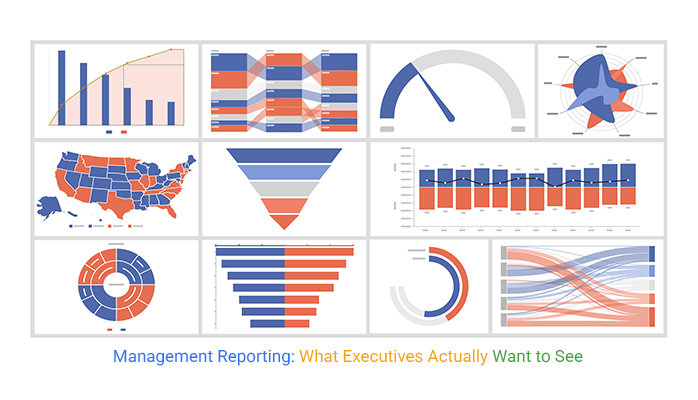
A mosaic plot breaks down categorical data, making it easier to compare different variables at a glance. Unlike bar charts or tables, this visualization uses size and proportion to reveal relationships between categories. Each section represents a combination of factors, giving instant insight into how various KPIs interact.
The strength of a mosaic plot lies in its ability to highlight dependencies. It shows which factors influence outcomes, helping leaders focus on what truly matters.
If one section dominates, it signals an area demanding attention. If a KPI shrinks over time, it reveals a shift in business dynamics.
This type of chart is invaluable for dissecting customer behavior, sales performance, or operational efficiency.
If sales drop, the plot can show whether it’s due to region, product category, or customer type. Decision-makers can pinpoint which levers to pull without drowning in spreadsheets.
Visual elements like graphs and charts do wonders in terms of communication. They turn complex data into digestible visual stories. To make these visuals speak volumes, focus on simplicity and relevance. Use bar charts for comparisons and line charts to show changes over time.
Always label your axes clearly and keep data labels readable. Smart design means not just displaying data but showcasing the most crucial insights upfront, guiding viewers to understand the why, not just the what.
Tables are straightforward: they organize data in rows and columns, making it easy to compare different items directly. But when you need to show relationships or proportions, ratios take the stage. They simplify complex numerical relationships and highlight what’s important in a snapshot.
For instance, a profitability ratio can instantly show the health of a company better than sifting through rows of numbers. Knowing when to use tables and when to use ratios can significantly enhance the clarity of your report.
Data alone doesn’t inspire action; stories do. When giving an oral presentation, use data as your backdrop and narratives as your path.
Start with a relatable problem your audience faces. Introduce data that highlights the problem’s scale. Then, led to a story where data-driven decisions led to successful outcomes.
This approach not only makes your presentation memorable but also makes it more persuasive, ensuring your data sticks with your audience long after you’ve finished talking.
A matrix chart organizes data across two or more dimensions. It helps compare categories, relationships, and trends in a structured grid. Unlike bar or line graphs, it lays out multiple variables side by side. This makes it easier to see connections between different factors.
Each section of a matrix represents a specific combination of data points. The layout highlights how different metrics interact. Color coding or size variations help show intensity, frequency, or importance. This allows decision-makers to focus on patterns, not raw numbers.
A matrix chart is ideal for tracking performance across departments, sales channels, or customer segments.
If revenue shifts, it shows whether location, product type, or pricing plays a role. It also works for monitoring operational efficiency by comparing workloads, timelines, or resource usage.
It’s tempting to think that more data leads to better decisions, but that’s not always true. Excess data can obscure important information.
To combat this, focus on quality over quantity. Implement stringent data quality checks. These ensure only accurate and relevant data informs your decisions.
Also, consider reducing the frequency or detail of reports not directly linked to core business outcomes. Such strategic filtering maintains a clear line of sight to your goals.
Simplification doesn’t mean losing depth; it means focusing on what matters. Start by identifying key performance indicators (KPIs) that align closely with business objectives. Structuring reports around these KPIs keeps them relevant and insightful.
Additionally, use visual aids like graphs to represent complex data simply and effectively. This not only clarifies the reports but also helps in quicker comprehension and decision-making.
Executives need reports that drive action, not just presentations of data. Reports should be concise, focusing on outcomes and recommendations. Ensure each report begins with an executive summary highlighting key findings and actions required.
This respects their time and aids in swift decision-making. Moreover, tailor the content to reflect the strategic interests of the audience, which increases the report’s impact and usefulness.
A stacked area chart shows how different variables change over time. Unlike bar graphs, it layers data, making it easy to compare multiple categories. This format helps track overall trends without losing sight of individual contributions.
Each section represents a distinct data set. The total height at any point shows the combined impact. Colors or shading differentiate categories, making shifts clear. This allows decision-makers to see overall movement while identifying which factors drive change.
This chart works well for revenue breakdowns, market share shifts, or customer growth. If sales increase, leaders can see whether new products, pricing changes, or seasonal demand plays a role. If one category shrinks, it signals a possible problem.
Management reporting does more than summarize data; it reveals trends and patterns that inform strategy. By regularly reviewing these reports, managers can identify what’s working and what’s not. This ongoing analysis drives continuous improvement and innovation.
Identifying trends helps companies anticipate market changes. This foresight is invaluable for staying competitive. It allows businesses to adapt their strategies proactively rather than reactively, seizing opportunities as they arise.
Furthermore, pattern recognition within reports can highlight unexpected areas of success or concern. Managers can leverage this information to capitalize on strengths and address weaknesses. This strategic use of data creates a significant competitive edge.
Proactive risk management is crucial for business stability and growth. Management reports play a key role in identifying potential risks early. They provide a snapshot of performance across various parameters, flagging anomalies that could indicate deeper issues.
By monitoring these indicators, companies can address problems before they escalate. This preemptive approach saves resources and protects the company’s reputation. It also supports a stable business environment where proactive measures maintain performance integrity.
Effective risk management fosters resilience. It prepares companies to face uncertainties with strategies already in place. This readiness is vital in navigating the ever-changing business landscape confidently.
Management reports are vital tools for enhancing departmental performance. They provide detailed insights into each team’s operations, highlighting areas for improvement.
By addressing these specific issues, departments can operate more efficiently and contribute more effectively to the organization’s overall success.
Reports also allow managers to benchmark performance against industry standards or past data. This comparison helps identify performance gaps and opportunities for improvement. It motivates teams to strive for excellence, driving the entire organization forward.
Continual monitoring through reports ensures that improvements are sustained. It creates an environment of ongoing development, where every success sets the stage for the next. This cycle of improvement is key to long-term success.
The Pareto chart is a visual tool that helps identify the few critical issues causing the most problems. It illustrates the 80-20 rule that 80% of problems are often due to 20% of causes. This insight is invaluable for prioritizing problem-solving efforts.
By focusing on these key issues, companies can achieve significant improvements in performance with minimal resource expenditure.
The Pareto Chart’s clear visualization supports quick and effective decision-making, aligning efforts with the most impactful areas.
Incorporating the Pareto Chart into management reporting enhances the strategic value of the data. It directs attention to where it is most needed, optimizing the impact of corrective actions.
This targeted approach not only solves immediate problems but also contributes to more stable and efficient operations in the long run.
To align KPIs with business goals, start by defining what success looks like for your organization. What are your key business objectives? From there, identify which metrics effectively measure those objectives.
This process involves communication across departments to ensure alignment from the top down. By focusing on metrics that matter, you eliminate unnecessary data collection and focus on driving meaningful change.
This strategic alignment helps in making informed decisions that propel the business forward, rather than simply tracking metrics that offer no real value.
In management reporting, it’s crucial to track a balanced mix of financial, operational, and predictive indicators.
Financial indicators provide a snapshot of your financial health, such as revenue and profit margins. Operational indicators, on the other hand, measure the efficiency and effectiveness of your business operations.
Predictive indicators are forward-looking metrics that help anticipate future trends based on current data. This mix provides a comprehensive view of both your current performance and future potential, enabling proactive rather than reactive management.
Grasping the cause and effect of KPI fluctuations is key to insightful management reporting. When a KPI changes, it’s essential to understand why. Is a dip in sales the result of a new competitor entering the market, or is it due to a change in customer preferences?
Analyzing the underlying causes behind KPI movements allows for more informed decision-making and strategy adjustments. This analysis is not just about observing trends but understanding the factors that drive those trends.
The Multi-Axis Spider Chart is a powerful tool for comparing multiple KPIs simultaneously. This chart type allows managers to visualize performance across various indicators in a single, coherent format. It’s particularly useful when dealing with dimensions like customer satisfaction, operational efficiency, and financial performance, providing a clear overview without losing focus on individual metrics.
Integrating a Multi-Axis Spider Chart in management reporting enhances strategic insights. It aids in identifying correlations and trade-offs between different KPIs, facilitating a balanced approach to performance management.
This visual tool supports better decision-making by highlighting areas of strength and opportunities for improvement across the board.
The Secret to Management Reports That Get Read
CEOs often seek strategic overviews: revenue growth, cost management, and market position. They need clear insights to make swift, effective decisions.
Department heads, however, look for operational data. They focus on efficiency, team performance, and resource needs. Crafting your report with these distinctions in mind ensures it provides value, meeting the specific demands of its readers.
The art of data presentation lies in clarity. Simplify the complex without losing depth. Focus on key data points that influence decisions.
Use common terms and avoid jargon to ensure understanding. Smart formatting, like bullet points and highlighted takeaways, can help emphasize essential information without oversimplifying.
A Sankey Diagram visualizes how resources flow through a system. It shows inputs, outputs, and where energy flow chart, money, or effort gets distributed. Unlike basic charts, it focuses on movement, making it easier to track inefficiencies.
Each flow is represented by a line, with width indicating volume. Larger sections highlight major contributors, while thinner paths show minor ones. This makes it easy to see where funds, time, or materials are being used—or wasted.
Sankey Diagram is perfect for mapping sales funnels, expense tracking, or supply chain management. If a process leaks revenue, a Sankey diagram pinpoints where. If labor costs spike, it reveals which departments consume the most.
Imagine staring at a spreadsheet filled with numbers but no clues about what they mean. That’s data without context—a common pitfall in management reporting.
Managers often receive data sets that lack explanations or benchmarks, making them practically useless for decision-making.
How do you fix this? Start by aligning each data point with specific goals or performance indicators. Include a brief narrative or annotations that explain why these numbers matter. This approach turns bare figures into valuable insights, helping managers make informed decisions rather than just educated guesses.
Ever felt overwhelmed by a report crammed with every bit of data imaginable? That’s information overload. It occurs when reports try to cover too much, often diluting the critical messages.
The fix? Prioritize clarity and relevance. Stick to data that directly impacts key business decisions. Use filters and categories to organize the report, making it easy for readers to find what they need quickly.
By trimming the fat, you ensure that your management reports remain both lean and potent, facilitating quicker and smarter decision-making.
Timing is crucial in management reporting. Often, reports are generated and delivered well after the actionable time frame has passed.
This delay renders the insights ineffective. To combat this, streamline your data collection and analysis processes. Implement automation tools that gather and process data in real-time or at shorter intervals.
This way, reports are ready when managers need them, not after the fact. Timely reports mean that decision-makers are always equipped with the most relevant and up-to-date information, keeping them one step ahead in the fast-paced business environment.
A Waterfall chart breaks down financial changes step by step. Unlike standard bar graphs, it shows how different factors add or subtract from a total. This makes it perfect for tracking profit shifts, budget variances, or cost overruns.
Each bar represents an increase or decrease. The starting point is the initial value, and each movement is stacked until it reaches the final amount. Positive values push the total up, while negative ones pull it down. This format makes financial trends easy to follow.
The waterfall chart is useful for understanding revenue streams, expense breakdowns, and operational costs. If profits drop, it reveals whether the issue is rising expenses, lower sales, or unexpected losses. If savings increase, it shows where gains are happening.
Manual reporting is slow and prone to errors. Automation streamlines this by generating reports quickly and accurately. This shift not only saves hours but also reduces the frustration associated with manual errors. Teams can reallocate their time to strategic tasks.
Dashboards provide real-time insights, unlike static reports. They offer a dynamic view of data that helps in making timely decisions. This is crucial in fast-paced environments where data is continuously changing. Dashboards allow users to see trends as they happen.
AI and BI tools transform data into insights. Stop guessing and make decisions based on solid data. These tools analyze patterns and predict trends. This enables smarter decision-making. With AI, reports become more than just numbers—they tell a story.
A funnel chart effectively visualizes stages in a process. It shows how data moves through an automated reporting system. This visualization helps identify bottlenecks. It also highlights conversion rates at each stage, aiding in process optimization.
The funnel chart’s tapered shape shows data volume through stages. It is perfect for visualizing lead conversions or sales processes. Its clear, visual format aids quick understanding and decision-making.
By integrating a funnel chart, stakeholders can pinpoint where drop-offs occur. This insight is vital for optimizing processes and improving outcomes. The chart supports strategic decisions by highlighting critical areas in data flow.
Finance teams thrive on detailed reports. They track cash flow meticulously, analyze profit margins, and forecast future financial scenarios. These metrics are crucial for maintaining the financial health of an organization. Accurate financial reporting enables better budget planning and financial strategy formulation.
Cash flow charts help in monitoring the inflow and outflow of cash, ensuring that the company can meet its financial obligations. Margin analysis helps in understanding the profitability of products or services, while forecasting aids in preparing for future financial needs and challenges.
By regularly reviewing these financial metrics, organizations can make informed decisions that drive growth and sustainability. Effective financial management is foundational to the success of any enterprise.
Sales and marketing reports focus on different metrics. They look at revenue growth, track how many new customers are acquired, and measure the retention of existing ones. These metrics help sales and marketing teams assess their performance and plan their strategies accordingly.
Understanding trends in revenue growth helps in setting realistic sales targets. Analysis of customer acquisition and retention rates provides insights into the effectiveness of marketing strategies and customer service initiatives. These insights are crucial for tweaking strategies to improve performance.
Tailored reports for sales and marketing can significantly enhance the effectiveness of these departments by providing them with the specific data they need to excel in their roles.
Operations and HR teams focus on different aspects of organizational functioning. They monitor productivity levels, analyze hiring trends, and evaluate workforce metrics. This data helps in managing the workforce effectively and ensuring that operational processes are efficient.
Productivity reports help in identifying areas where efficiency can be improved while hiring trends provide insights into the labor market and help in planning recruitment strategies. Workforce metrics give a detailed view of employee performance and engagement levels.
Tailored reports for operations and HR assist in optimizing workforce management and operational efficiency, contributing to the overall productivity of the organization.
A Clustered Stacked Bar Chart is ideal for comparing performance across different departments. This chart type combines elements of both clustered and stacked bar charts, enabling a comprehensive comparison of multiple data points.
The visual clarity of Clustered Stacked Bar Charts helps in quickly identifying trends and anomalies. They show data clustered by department and stacked by metrics, providing a clear view of each department’s performance relative to others.
This chart type is particularly useful in management reporting as it allows for a quick assessment of comparative performance, facilitating better decision-making and strategic planning. By using this chart, managers can easily spot areas needing attention and commend departments excelling in their operations.
Turning data into action plans bridges the gap between insights and execution. It starts with clear, actionable data presented in reports. Managers must see what steps to take next. This clarity is crucial for effective action.
Action plans derived from data should be specific and measurable. They need clear timelines and assigned responsibilities. This structure ensures that insights from reports lead to concrete steps and measurable outcomes.
Feedback loops are vital. They track the progress of actions and report back on their effectiveness. This ongoing cycle refines strategies and improves future reporting and actions.
Securing buy-in from leadership requires presenting data persuasively. Leaders need to see how data-driven decisions can impact the business positively. Effective presentations tell a compelling story with data, emphasizing ROI and potential benefits.
Present data with clarity. Focus on key insights that support business goals. Avoid overwhelming your audience with too much information. Highlight how data-driven strategies have succeeded in the past.
Engage leaders with scenarios showing potential outcomes. Use predictive analytics to demonstrate what could happen if action is taken or ignored. This approach helps in making the data relatable and urgent.
Using reports for course correction involves measuring the impact of past decisions. This analysis identifies what worked and what didn’t. It’s a crucial step for continuous improvement.
Implement regular reviews of business outcomes against forecasts and past data. This comparison highlights variances and helps in understanding their causes. Learning from these insights guides better future decisions.
Encourage a culture where data drives decisions. This mindset ensures that decisions are always informed by the latest and most accurate information, promoting a cycle of perpetual improvement.
The Slope Chart is a powerful visualization tool. It shows changes in business performance over time. This chart is simple yet effective in highlighting trends, progress, and setbacks between two-time points.
Using a Slope Chart adds value by making it easy to compare performances at a glance. It clarifies where improvements are made or where issues persist. This clarity supports quicker, more informed decision-making.
Integrate Slope Charts into reports to emphasize key changes and trends. This integration helps stakeholders understand data at a deeper level. It provides a clear, visual representation of progress, aiding in strategic reviews and planning.
Financial reports and management reports serve different purposes. Financial reports are formal and focus on the financial status of external stakeholders.
Management reports are more flexible, and designed for internal use, helping in decision-making with real-time data. They often include forecasts and qualitative insights, unlike the strictly historical data of financial reports.
Collecting massive amounts of data can backfire. It’s called over-reporting. When reports are overloaded with data, key insights get buried. Efficient management reporting focuses on relevant data.
It aligns with strategic goals, avoiding the clutter of unnecessary information. This makes reports clearer and decision-making faster.
Data alone doesn’t tell the whole story; actionable insights are crucial. Management reporting should interpret data to suggest clear actions.
It’s not just about what happened, but why it happened and what to do next. Reports should guide future strategies, not just review past performances.
An overlapping bar chart compares two sets of data side by side. Unlike traditional bar graphs, it places bars over one another, making differences clear. This helps highlight how financial and management reports focus on separate goals.
Each bar represents a category, such as revenue, expenses, or operational metrics. Financial data appears in one color, while management data overlaps in another. The visual contrast makes it easy to see where numbers align and where they don’t.
Companies use this chart to compare reporting structures across departments. If financial goals focus on short-term profits, while management reports track long-term efficiency, the chart makes the gap visible. If reporting priorities don’t match, it signals a need for realignment.
Data should guide business choices, not create confusion. An overlapping bar chart shows how different reports serve different needs, making it easier to use each one effectively.
Management reporting isn’t about drowning in numbers. It’s about clarity. The right reports reveal trends, expose inefficiencies, and push decision-makers toward action. Without them, businesses run on guesswork.
Strong reports track what matters—financial health, operational efficiency, and market trends. They don’t overwhelm. They highlight what needs attention. Leaders need reports that are clear, focused, and aligned with business goals. Anything less is noise.
Data alone changes nothing. Action does. Reports should drive strategy, refine operations, and identify risks before they become problems. They should not sit unread in an inbox.
The best companies use reporting as a competitive edge. They measure what drives success, cut what doesn’t, and adjust before it’s too late. They don’t wait for problems—they see them coming.
Numbers tell a story. The right reports make sure it’s one worth reading.
How much did you enjoy this article?


Calculate accounts receivable turnover ratio to measure credit collection speed, improve cash flow, and strengthen your financial strategy. Read on!

Change Management KPIs are the key to tracking adoption, performance, and ROI during transitions. Find out which metrics matter. Read on!

Data collection methods and techniques determine the quality of every insight you act on. Explore key approaches for gathering reliable data. Read on!


