• Home
  • Tools dropdown img
    • Spreadsheet Charts

      • ChartExpo for Google Sheets
      • ChartExpo for Microsoft Excel
    • Power BI Charts

      • Power BI Custom Visuals by ChartExpo
    • Word Cloud

  • Charts dropdown img
    • Chart Category

      • Bar Charts
      • Circle Graphs
      • Column Charts
      • Combo Charts
      • Comparison Charts
      • Line Graphs
      • PPC Charts
      • Sentiment Analysis Charts
      • Survey Charts
    • Chart Type

      • Box and Whisker Plot
      • Clustered Bar Chart
      • Clustered Column Chart
      • Comparison Bar Chart
      • Control Chart
      • CSAT Survey Bar Chart
      • CSAT Survey Chart
      • Dot Plot Chart
      • Double Bar Graph
      • Funnel Chart
      • Gauge Chart
      • Likert Scale Chart
      • Matrix Chart
      • Multi Axis Line Chart
      • Overlapping Bar Chart
      • Pareto Chart
      • Radar Chart
      • Radial Bar Chart
      • Sankey Diagram
      • Scatter Plot Chart
      • Slope Chart
      • Sunburst Chart
      • Tornado Chart
      • Waterfall Chart
      • Word Cloud
    • Google Sheets
      Microsoft Excel
  • Services
  • Pricing
  • Contact us
  • Blog
  • Support dropdown img
      • Gallery
      • Videos
      • Contact us
      • FAQs
      • Resources
    • Please feel free to contact us

      atsupport@chartexpo.com

Categories
All Data Visualizations Data Analytics Surveys
Add-ons/
  • Google Sheets
  • Microsoft Excel
  • Power BI
All Data Visualizations Data Analytics Surveys
Add-ons
  • Google Sheets
  • Microsoft Excel
  • Power BI

We use cookies

This website uses cookies to provide better user experience and user's session management.
By continuing visiting this website you consent the use of these cookies.

Ok

ChartExpo Survey


Home > Blog > Data Analytics

Monthly Finance Report with Charts for Better Insights

Are you wondering what your monthly finance report is trying to tell you? Wonder no more – we’re here to decode the secret language of finance.

Monthly finance reports are like Pandora’s box, but instead of unleashing chaos, they unveil your organization’s financial truth.

Want to know where those dollars went? This report’s got your answers.

Monthly Finance Report

We’ll explore financial statements, decipher balance sheets, and decode income statements like seasoned detectives. You’ll uncover trends, spot anomalies, and learn to dance through the financial numbers like a pro.

Don’t worry if numbers make your head spin. We’ve got your back. This guide isn’t just another snooze-inducing financial manual. It’s your cheat code to understand the secrets hidden behind those rows and columns.

You’ll be armed with financial superpowers that can impress even the most numbers-savvy of your colleagues. Thanks to this monthly finance report analysis guide, they’ll brand you the wizard of Wall Street.

Table of Content:

  1. What is a Monthly Finance Report?
  2. Video Tutorial:
  3. Why are Monthly Financial Reporting Important?
  4. What is the Purpose of Month-End Financial Reports?
  5. What Should Be Include in a Monthly Financial Summary?
  6. How to Write a Monthly Finance Report
  7. Top 4 Example of Monthly Finance Report
  8. How to Create a Monthly Finance Report With ChartExpo?
    • Step 1: Collect All Financial Data
    • Step 2: Install ChartExpo
    • Step 3: Select Chart
    • Step 4: Create Chart
    • Step 5: Customize Your Finance Report 
    • Step 6: Final Monthly Finance Report
  9. Benefits of Monthly Finance Report
  10. Tips For Design an Impactful Monthly Finance Report
  11. FAQs
  12. Wrap Up

Let’s get started.

What is a Monthly Finance Report?

Definition: A monthly finance report is a concise document that encapsulates a company’s financial performance during a specific month. It encompasses vital financial information, including revenue, expenditure, earnings, and cash flow.

This document serves as a tool for organizations to monitor fiscal well-being, spot trends, and facilitate well-informed choices. It holds significant importance for management, investors, and stakeholders, offering insights into a company’s financial resilience and aiding in future planning.

Video Tutorial: How to Visualize a Monthly Finance Report

Why are Monthly Financial Reporting Important?

Monthly financial reporting give you a clear snapshot of your business’s financial health. They help track income, expenses, and cash flow, making it easier to understand where your money is going. These reports are important because they:

  • Track Performance: Show how your business is doing compared to goals or budgets.
  • Spot Issues Early: Identify overspending, low revenue, or other financial risks before they grow.
  • Support Better Decisions: Provide accurate data for smarter planning and resource allocation.
  • Ensure Compliance: Keep financial records organized for audits, taxes, and regulatory requirements.
  • Guide Future Strategy: Offer insights that help plan growth, investments, and operational changes.

What is the Purpose of Month-End Financial Reports?

The purpose of month-end financial reports is to provide an accurate picture of a company’s financial position at the end of each month. These reports summarize income, expenses, cash flow, and overall performance so decision-makers can see how the business is doing.

They help identify trends, highlight potential issues, ensure records are accurate, and support compliance with accounting standards. Most importantly, month-end reports give managers the insights they need to make informed decisions, plan for the future, and keep the business on track financially.

What Should Be Include in a Monthly Financial Summary?

  • Revenue and Income: Total money earned from sales or services during the month.
  • Expenses: A breakdown of operating costs, payroll, and other business expenses.
  • Net Profit or Loss: The difference between income and expenses, showing overall performance.
  • Cash Flow Overview: How much cash is coming in and going out to track liquidity.
  • Key Financial Ratios: Indicators like profit margins or debt-to-equity for quick insights.
  • Budget vs. Actuals: A comparison to planned targets to spot variances.

How to Write a Monthly Finance Report

Creating a monthly finance report is a critical task for any organization. It provides a snapshot of the company’s financial health and performance over a specific month. Here is a detailed discussion on how to create a financial analysis report, including the integration of a 3-statement financial model:

  • Gather financial data: Collect all financial data relevant to the month you’re reporting on. This includes income, expenses, investments, loans, and other financial transactions.
  • Organize data: Categorize and organize the data into sections. Common sections include revenue, expenses, assets, liabilities, and equity. This organization helps in presenting a clear picture of the financial situation.
  • Create financial statements:

Develop financial statements, including:

    • Income Statement (Profit and Loss Statement): Shows revenues, expenses, and net profit or loss.
    • Balance Sheet: Lists assets, liabilities, and equity, revealing the company’s financial position.
    • Cash Flow Statement: Tracks cash inflows and outflows, ensuring liquidity.
  • Analyze trends: Compare the current month’s data with previous months or industry benchmarks to identify trends. Analyze revenues, expenses, and profit margin changes and recognize any outliers or anomalies.
  • Highlight key metrics: Include important financial metrics relevant to your business. These might include gross profit margin, net profit, and others specific to your industry. These metrics provide a deeper understanding of your financial performance.
  • Create visuals: Visual aids like charts and graphs can make complex financial data more accessible and engaging. As a result, they help stakeholders quickly grasp key insights.
  • Provide explanations: Offer brief explanations or narratives for significant variances or changes in financial performance. This helps stakeholders understand the reasons behind fluctuations.
  • Summarize and recommend: Summarize the report’s findings and provide recommendations based on the data. For instance, if cash flow is tight, you can recommend cost-cutting measures or seek additional financing.
  • Review and proofread: Review the data report for accuracy, consistency, and adherence to accounting standards and regulations. Errors or inconsistencies can undermine the report’s credibility.

Top 4 Example of Monthly Finance Report

  • Income Statement Report

This report summarizes a company’s revenues, costs, and expenses for the month. It helps you measure profitability and see if your business is on track to meet its financial goals.

Income Statement Report
  • Cash Flow Report

A cash flow report tracks the money coming in and going out during the month. It’s essential for monitoring liquidity, ensuring bills are paid on time, and understanding how operations, investments, or financing activities affect cash.

Cash Flow Report
  • Balance Sheet Report

The monthly balance sheet provides a snapshot of assets, liabilities, and equity at the end of the reporting period. It helps assess the overall financial health of the business and supports planning for growth or debt management.

Balance Sheet Report
  • Budget vs. Actual Report

This report compares the budgeted financial figures with the actual performance. It highlights variances, making it easier to identify overspending, underperformance, or opportunities for improvement.

How to Create a Monthly Finance Report With ChartExpo?

Excel is an excellent tool for crunching numbers. However, it isn’t all sunshine and rainbows when it comes to data visualization. Those charts and graphs can sometimes be about as exciting as a library on a Saturday night.

Fear not, for ChartExpo is here to the rescue! ChartExpo turns raw financial data into visual masterpieces that even Excel’s most colorful Pie Chart would envy. Say goodbye to the limitations and hello to data analysis that’s as vibrant as your financial future.

Benefits of Using ChartExpo

  • ChartExpo offers a wide range of visualizations, making it a choose-your-own-adventure for your data. It’s like having a visual buffet at your fingertips, streamlining your data presentation and analysis game.
  • Navigating ChartExpo is as easy as dancing through a field of daisies. Its user-friendly interface empowers you to craft insightful, appealing charts without needing a secret coding handshake. You’ll feel like a data virtuoso in no time.
  • When it comes to customization, ChartExpo is your data’s fashion designer. You can tailor your visuals, playing with colors, fonts, and styles like a kid in a coloring book.
  • ChartExpo isn’t just a pretty face; it’s a frugal friend too. It has a free 7-day trial and an affordable $10 monthly plan. You get to enjoy a front-row seat to the insightful data visualization show without emptying your wallet.

How to Install ChartExpo in Excel?

  1. Open your Excel application.
  2. Open the worksheet and click the “Insert” menu.
  3. You’ll see the “My Apps” option.
  4. In the office Add-ins window, click “Store” and search for ChartExpo on my Apps Store.
  5. Click the “Add” button to install ChartExpo in your Excel.

ChartExpo charts are available both in Google Sheets and Microsoft Excel. Please use the following CTA’s to install the tool of your choice and create beautiful visualizations in a few clicks in your favorite tool.

Step 1: Collect All Financial Data

Income Income Categories Profit and Expenses Expenses Subcategories Salaries Amount
Income       75,000
Income Sales       45,000
Income Interest Profit          5,000
Income Dividends Profit          5,000
Income Other Income Profit       20,000
Sales Profit          5,000
Sales Operating Expenses       40,000
Operating Expenses Salaries and Wages       20,000
Salaries and Wages Management       10,000
Salaries and Wages Sales Team          5,000
Salaries and Wages Support Team          3,000
Salaries and Wages Administrative          2,000
Operating Expenses Rent       10,000
Operating Expenses Utilities          2,000
Operating Expenses Marketing          5,000
Marketing Online Ads          3,000
Marketing Print Ads          1,500
Marketing Social Media             500
Operating Expenses Supplies          3,000

You want to present this data in a way that everyone can understand. Follow the steps below to learn how to create a visualization in Excel with ChartExpo.

Step 2: Install ChartExpo

insert chartexpo in excel
  • Choose ChartExpo from My Apps, then click Insert.
open chartexpo in excel

Step 3: Select Chart

search sankey chart in excel

Step 4: Create Chart

Create Chart From Selection ce439
  • ChartExpo will generate the visualization below for you.
Monthly Finance Report Design Template

Step 5: Customize Your Finance Report

  • If you want to have the chart’s title, click Edit Chart, as shown in the above image.
  • Click the pencil icon next to the Chart Header to change the title.
  • It will open the properties dialog. Under the Text section, you can add a heading in Line 1 and enable Show.
  • Give the appropriate title of your chart and click the Apply button.
apply title on chart ce439
  • Click the pencil icon at the top of nodes to add the Prefix (e.g. $ sign) with the numeric values in the chart.
  • Click the highlighted pencil icon, then expand the “Symbols” properties to add the Prefix value (e.g. $ sign).
apply prefix value on chart ce439
  • Let’s give colors to the nodes. Click the pencil icon at the top of the nodes and go to “Node“. Select the color and click the “Apply” button to save all changes.
  • Click the “Save Changes” button to persist the changes.
apply nodes on chart ce439

Step 6: Final Monthly Finance Report

Final Monthly Finance Report

Insights

  • Income Composition

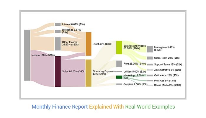
The total monthly income is $75,000. Sales contribute the majority of the income, amounting to $45,000. $5,000 is generated from both interest and dividends, while another $20,000 is derived from other income sources. This breakdown provides clarity on the main contributors to the total monthly income.

  • Expense Breakdown

Total expenses sum up to $40,000, with the majority being allocated to operating expenses. Within the operating expenses, salaries and wages constitute the largest portion, amounting to $20,000. The remaining portion of operating expenses includes rent, utilities, marketing, and supplies.

  • Detailed Salary Allocation

The data provides a more detailed breakdown of salaries and wages. The “Management” category has the highest salary expense, amounting to $10,000. It is followed by the “Sales Team” at $5,000, the “Support Team” at $3,000, and the “Administrative” team at $2,000. This breakdown is valuable in gaining insights into the distribution of labor costs among various roles.

  • Marketing Expenses

The $5,000 marketing expenses are in three subcategories: Online ads ($3,000), print ads ($1,500), and social media ($500).

  • Profit Contribution

The Sankey Diagram provides a clear visualization of the financial flow, indicating a profit of $35,000 ($75,000 income minus $40,000 expenses). The primary contributor to this profit is the sales, which generate $5,000.

Benefits of Monthly Finance Report

Monthly end financial reports offer a multitude of benefits, making them a crucial tool for financial management:

  1. Financial visibility: Monthly finance reports provide a clear and up-to-date picture of the company’s financial health. This transparency allows stakeholders to understand the current financial position, which is essential for informed decision-making.
  2. Budget monitoring: These reports facilitate the tracking of financial performance against budgeted figures. They help identify areas where expenses or revenues deviate from the plan, allowing for timely adjustments.
  3. Trend analysis: Comparing monthly reports over time helps to spot trends in financial performance. Using an income statement template in Excel for this analysis can reveal whether the company is growing, stagnating, or facing challenges that need attention.
  4. Profitability insights: Monthly finance reports give a breakdown of revenue and expense categories. This provides insights into which aspects of the business are driving profitability and which may need optimization.
  5. Expense control: Detailed business expense reports in monthly financials help control costs. This allows you to identify areas where expenses are rising unexpectedly and take corrective actions.
  6. Cash flow management: Monthly reports, including those generated through the income statement, help manage cash flow by showing when and where cash is coming in and going out. This is crucial for ensuring your business has enough liquidity to meet its financial obligations.
  7. Investor confidence: Regular, well-prepared monthly finance reports enhance investor confidence. They demonstrate that the company is transparent about its financial performance and actively manages its finances.
  8. Risk mitigation: These reports serve as an early warning system. Early spotting of unfavorable trends or financial instability allows proactive steps to mitigate risks and avoid potential crises.
  9. Compliance: Monthly finance reports ensure the organization complies with financial regulations and accounting standards. This is particularly important for public companies and those in highly regulated industries.
  10. Strategic decision support: Monthly finance reports are valuable tools for strategic decision-making. They provide the necessary data and insights to evaluate the impact of business strategies, make informed choices, and create a monthly budget.

Tips For Design an Impactful Monthly Finance Report

  • Keep It Clear and Simple

Use clean layouts, headings, and visuals so readers can quickly understand key financial data.

  • Highlight Key Metrics

Focus on the most important numbers such as revenue, expenses, and cash flow instead of overwhelming with details.

  • Use Visuals Wisely

Add charts, graphs, and tables to make trends and comparisons easier to interpret.

  • Provide Insights, Not Just Numbers

Include short explanations or takeaways that help readers understand what the numbers mean for decision-making.

FAQs

What Documents are used in the Monthly Financial Report?

Monthly financial reports often include:

  • Income Statement (Profit & Loss) – Tracks revenue, expenses, and net income.
  • Balance Sheet – Shows assets, liabilities, and equity.
  • Cash Flow Statement – Details inflows and outflows of cash.
  • Budget vs. Actual Report – Compares planned figures with actual performance.

How are Weekly and Monthly Financial Reports Commonly Used?

  • Weekly reports are used for short-term tracking, such as monitoring sales, expenses, and cash flow trends. They help managers react quickly to changes.
  • Monthly reports provide a broader financial picture, useful for measuring performance against goals, preparing for taxes, supporting investor updates, and guiding long-term planning.

What is a monthly financial report sample?

A sample monthly financial report typically includes an income statement, balance sheet, and cash flow statement. It displays revenues, expenses, assets, liabilities, and equity, offering a snapshot of that month’s company financial status.

Wrap Up

We’ve navigated the labyrinth of financial analysis and explored the invaluable monthly finance report. You can now decipher the cryptic language of numbers and turn them into powerful tools for informed decision-making.

Monthly finance reports offer a window into the financial soul of an organization. They provide clarity, transparency, and a roadmap for fiscal success. With careful data gathering, structured presentation, and insightful analysis, these reports become your compass in the financial wilderness.

We’ve also discovered ChartExpo, the secret sauce for dazzling data visualization, making reports pop, and insights shine. You transform data into actionable insights by understanding key metrics, spotting trends, and customizing visuals.

Remember, the monthly finance report is not just about crunching numbers; it’s your ticket to financial stewardship. It fuels budget monitoring, profit maximization, and risk mitigation. Moreover, it keeps investors confident, regulators content, and decision-makers visionary.

Dive into the numbers, create your visual magic, and let the monthly finance report guide you to success.

How much did you enjoy this article?

PBIAd1
Start Free Trial!
129535

Related articles

next previous
Data Analytics7 min read

Healthcare Industry Market Research: Insights Made Easy

Discover what the healthcare industry market research is, how to use it, and the benefits of medical market research. You'll also discover why it is important.

Data Analytics14 min read

How to Conduct Customer Behavior Analytics in Excel?

Unlock the power of customer behavior analytics to track habits, predict trends, and improve customer satisfaction across every touchpoint.

Data Analytics10 min read

Leading vs Lagging Indicators: A Walkthrough with Visual

Explore leading vs. lagging indicators with clear examples and definitions. This blog will help you improve planning, tracking, and decision-making.

Data Analytics9 min read

Event Budget Template for Clear Insights

An event budget template tracks and controls event costs with ease. Learn how to build, use, and improve it in Google Sheets for better planning.

Data Analytics13 min read

How to Create Monthly Sales Reports Templates in Excel?

Discover the 4 best monthly sales report templates in Excel. Track sales, compare targets, and spot trends easily with ready-to-use reporting tools

ChartExpo logo

Turn Data into Visual
Stories

CHARTEXPO

  • Home
  • Gallery
  • Videos
  • Services
  • Pricing
  • Contact us
  • FAQs
  • Privacy policy
  • Terms of Service
  • Sitemap

TOOLS

  • ChartExpo for Google Sheets
  • ChartExpo for Microsoft Excel
  • Power BI Custom Visuals by ChartExpo
  • Word Cloud

CATEGORIES

  • Bar Charts
  • Circle Graphs
  • Column Charts
  • Combo Charts
  • Comparison Charts
  • Line Graphs
  • PPC Charts
  • Sentiment Analysis Charts
  • Survey Charts

TOP CHARTS

  • Sankey Diagram
  • Likert Scale Chart
  • Comparison Bar Chart
  • Pareto Chart
  • Funnel Chart
  • Gauge Chart
  • Radar Chart
  • Radial Bar Chart
  • Sunburst Chart
  • see more
  • Scatter Plot Chart
  • CSAT Survey Bar Chart
  • CSAT Survey Chart
  • Dot Plot Chart
  • Double Bar Graph
  • Matrix Chart
  • Multi Axis Line Chart
  • Overlapping Bar Chart
  • Control Chart
  • Slope Chart
  • Clustered Bar Chart
  • Clustered Column Chart
  • Box and Whisker Plot
  • Tornado Chart
  • Waterfall Chart
  • Word Cloud
  • see less

RESOURCES

  • Blog
  • Resources
  • YouTube
SIGN UP FOR UPDATES

We wouldn't dream of spamming you or selling your info.

© 2025 ChartExpo, all rights reserved.