• Home
  • Tools dropdown img
    • Spreadsheet Charts

      • ChartExpo for Google Sheets
      • ChartExpo for Microsoft Excel
    • Power BI Charts

      • Power BI Custom Visuals by ChartExpo
    • Word Cloud

  • Charts dropdown img
    • Chart Category

      • Bar Charts
      • Circle Graphs
      • Column Charts
      • Combo Charts
      • Comparison Charts
      • Line Graphs
      • PPC Charts
      • Sentiment Analysis Charts
      • Survey Charts
    • Chart Type

      • Box and Whisker Plot
      • Clustered Bar Chart
      • Clustered Column Chart
      • Comparison Bar Chart
      • Control Chart
      • CSAT Survey Bar Chart
      • CSAT Survey Chart
      • Dot Plot Chart
      • Double Bar Graph
      • Funnel Chart
      • Gauge Chart
      • Likert Scale Chart
      • Matrix Chart
      • Multi Axis Line Chart
      • Overlapping Bar Chart
      • Pareto Chart
      • Radar Chart
      • Radial Bar Chart
      • Sankey Diagram
      • Scatter Plot Chart
      • Slope Chart
      • Sunburst Chart
      • Tornado Chart
      • Waterfall Chart
      • Word Cloud
    • Google Sheets
      Microsoft Excel
  • Services
  • Pricing
  • Contact us
  • Blog
  • Support dropdown img
      • Gallery
      • Videos
      • Contact us
      • FAQs
      • Resources
    • Please feel free to contact us

      atsupport@chartexpo.com

Categories
All Data Visualizations Data Analytics Surveys
Add-ons/
  • Google Sheets
  • Microsoft Excel
  • Power BI
All Data Visualizations Data Analytics Surveys
Add-ons
  • Google Sheets
  • Microsoft Excel
  • Power BI

We use cookies

This website uses cookies to provide better user experience and user's session management.
By continuing visiting this website you consent the use of these cookies.

Ok

ChartExpo Survey


Home > Blog > Microsoft Excel

How to Create a Dashboard Using Excel With Practical Tips?

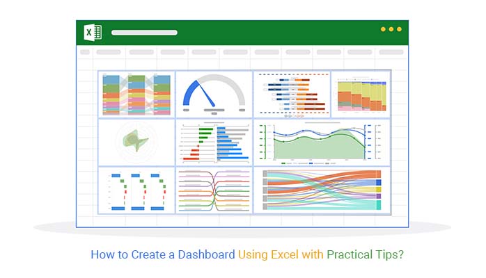
How do you create a dashboard using Excel?

If you’re dealing with messy spreadsheets and struggling to make sense of your data, you’re not alone. Excel dashboards have become essential for turning raw numbers into clear, actionable insights.

With over a billion users worldwide, Excel has evolved far beyond basic spreadsheets. It now supports data tracking, trend analysis, and data visualization—all in one place. A well-designed dashboard brings everything together, helping you monitor performance and make faster decisions.

How to Create a Dashboard Using Excel

According to Forbes, companies that use data analytics effectively are 5% more productive and 6% more profitable. Dashboards play a key role by simplifying complex data into easy-to-understand visuals.

So, how do you create a dashboard using Excel that actually delivers value? It may sound complex, but the process is more straightforward than you think.

Whether you want to track sales, monitor financial performance, or measure KPIs, Excel gives you the flexibility to build dashboards for any use case. In fact, 64% of companies rely on Excel for data management, making it a core tool in everyday business operations.

By the end of this guide, you’ll know exactly how to create a dashboard in Excel that transforms raw data into meaningful insights and supports smarter, data-driven decision-making.

First…

What is an Excel Dashboard?

Definition: An Excel dashboard is a one-page visual report that combines charts, tables, and key metrics to help users quickly monitor performance and analyze data.

It simplifies complex datasets by presenting them in a clear, interactive format, making it easier to track trends, compare results, and support data-driven decision-making. Excel dashboards can be customized based on specific goals, such as tracking sales, financial performance, or key business KPIs.

By bringing all critical information into a single view, an Excel dashboard helps users save time, reduce manual analysis, and stay focused on what matters most.

Why is Building Dashboards Using Excel Useful?

Building dashboards in Excel helps turn raw data into clear, actionable insights, making it easier for teams to monitor performance and support data-driven decision-making. Instead of working through large spreadsheets, users can quickly understand key metrics in one place.

  1. Data visualization: Excel dashboards present data using charts, graphs, and tables, making complex information easier to interpret.
  2. Near real-time monitoring: When connected to updated data sources, dashboards can reflect recent changes, helping users stay informed.
  3. Better decision-making: By displaying key metrics in a single view, dashboards enable faster and more informed decisions.
  4. Customizable and interactive: You can tailor dashboards to your needs with filters, slicers, and dynamic elements for deeper analysis.
  5. Performance and historical tracking: Dashboards allow you to monitor current performance while analyzing past trends to identify patterns and opportunities.

Before Creating Dashboards in Excel: What You Should Know

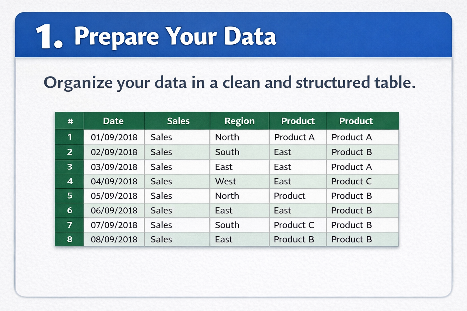
Before creating a dashboard in Excel, it’s important to plan carefully. A well-prepared approach ensures your dashboard is accurate, easy to use, and delivers meaningful insights.

  1. Define your objectives: Identify what you want to achieve, such as tracking sales, monitoring KPIs, or analyzing trends. Clear goals help you focus on the right data.
  2. Understand your audience: Consider who will use the dashboard. Executives may need high-level summaries, while analysts require detailed data.
  3. Gather and clean data: Use accurate, well-structured data. Clean datasets reduce errors and improve the reliability of your analysis.
  4. Choose the right metrics: Focus on key performance indicators that align with your objectives. Avoid adding unnecessary data that can clutter the dashboard.
  5. Plan the layout: Organize your dashboard logically so users can quickly find and interpret information.
  6. Select appropriate visuals: Use charts and tables that match your data. For example, line charts work well for trends, while bar charts are better for comparisons.
  7. Set up reliable data sources: Connect your dashboard to dependable data sources and ensure they are easy to update for consistent results.
  8. Add interactivity: Use features like slicers, filters, or dropdowns to let users explore the data more effectively.
  9. Design for clarity: Keep the layout clean with consistent colors, fonts, and spacing to improve readability.
  10. Test and validate: Review your dashboard to ensure calculations, links, and visuals are accurate and working correctly.
  11. Maintenance plan: Update your dashboard regularly to reflect changes in data or business needs.
  12. Document your work: Provide clear documentation so others can understand, use, and update the dashboard when needed.

How to Create a Dashboard Using Excel: Step by Step

Follow these steps to build a clear, interactive dashboard using Excel that delivers actionable insights.

Step 1: Prepare Your Data

  • Organize your data in a clean, structured table.
  • Remove duplicates and fix errors to ensure accuracy.
  • Use clear, descriptive column headers.
  • Maintain consistent formatting for dates, numbers, and text.
  • Keep your data complete and up-to-date for reliable insights.
Prepare Your Data

Step 2: Insert Charts

  • Go to the Insert tab in Excel.
  • Choose the chart type that best represents your data (bar, line, pie, column).
  • Match charts to your analysis goal—clarity over decoration.
  • Keep visuals simple and easy to read.
  • Avoid using too many chart types in one dashboard.
Insert Chart

Step 3: Create PivotTables

  • Navigate to Insert > PivotTable.
  • Select your data range for analysis.
  • Use rows, columns, and values to summarize your data efficiently.
  • Apply filters to focus on critical insights.
  • PivotTables allow fast, flexible data exploration.
Create PivotTables

Step 4: Build Your Charts

  • Create charts from PivotTable data for dynamic insights.
  • Add descriptive titles and labels for clarity.
  • Customize colors, fonts, and styles for consistency.
  • Highlight key trends and comparisons.
  • Keep chart designs uniform across the dashboard.
Build Your Chart

Step 5: Design the Dashboard

  • Arrange all charts and visuals on a single worksheet.
  • Organize elements logically for easy navigation.
  • Feature the most important KPIs at the top.
  • Use consistent fonts, colors, and styles.
  • Keep the layout clean and uncluttered for readability.
Design the Dashboard

Step 6: Add Slicers & Filters

  • Insert slicers for interactive filtering.
  • Use dropdowns or timelines where relevant.
  • Connect slicers to multiple charts for unified interactivity.
  • Enable users to explore data easily.
  • Enhance the user experience with interactive controls.
Add Slicers and Filters

What is the Best Excel Dashboard Creator?

Ever tried making sense of endless rows of numbers? It can feel like searching for a needle in a haystack.

Data visualization changes all that. It turns raw data into clear, understandable insights.

Excel is great for basic analysis, but when you need advanced dashboards, it can feel limiting. That’s where an Excel add-in like ChartExpo can help. It transforms your spreadsheets into interactive dashboards, making it simple to visualize complex data, including flows and relationships, with tools like a Sankey chart generator.

Now, let’s walk through how to create a dashboard in Excel and elevate it with powerful visualizations.

Top 10 Best Charts for Excel Dashboards

Here are some of the best Excel Dashboard Ideas:

Horizontal Waterfall Chart

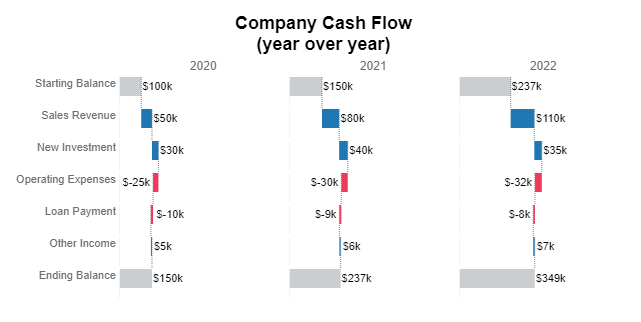
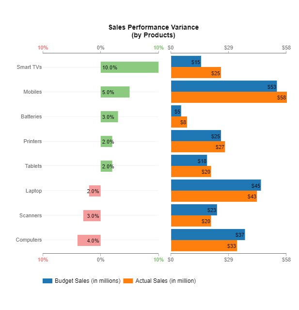
Shows sequential increases and decreases, making it easy to track profit/loss, revenue changes, or any cumulative data in your dashboard.

Horizontal Waterfall Chart for Learning How to Create a Dashboard Using Excel

Comparison Bar Chart

Compares multiple categories side by side, helping you quickly spot trends, gaps, or top-performing items.

Comparison Bar Chart for Learning How to Create a Dashboard Using Excel

Likert Scale Chart

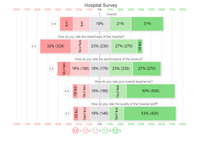
Visualizes survey responses or feedback scores on a scale, perfect for understanding customer or employee sentiment at a glance.

Likert Scale Chart for Learning How to Create a Dashboard Using Excel

Circular Org Chart

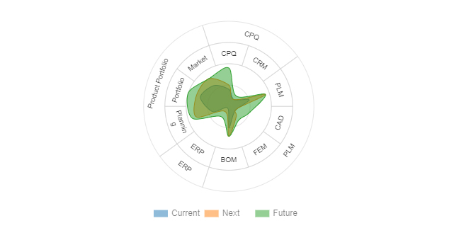
Displays hierarchical structures in a compact, circular format, making organizational relationships easy to understand in dashboards.

Circular Org Chart for Learning How to Create a Dashboard Using Excel

Multi Axis Line Chart

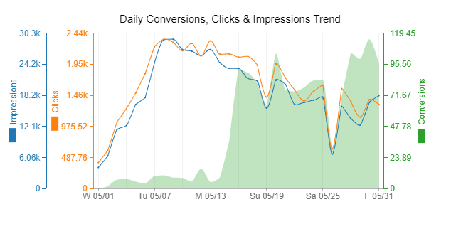
Plots multiple metrics with different scales on the same graph, ideal for tracking complex trends over time in one view.

Multi Axis Line Chart for Learning How to Create a Dashboard Using Excel

Mosaic Plot (aka Mekko)

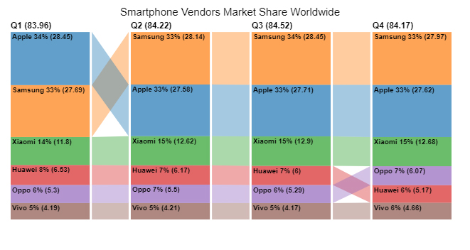
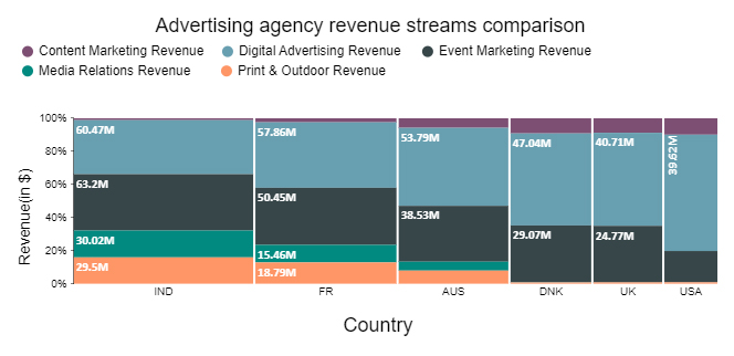
Highlights proportions and relationships across categories, excellent for market share, product segmentation, or demographic comparisons.

Mosaic Plot for Learning How to Create a Dashboard Using Excel

Multi-Gauge Chart

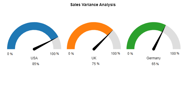
Shows multiple KPIs in one visual, giving stakeholders a quick snapshot of performance metrics simultaneously.

Multi Gauge Chart for Learning How to Create a Dashboard Using Excel

Slope Chart

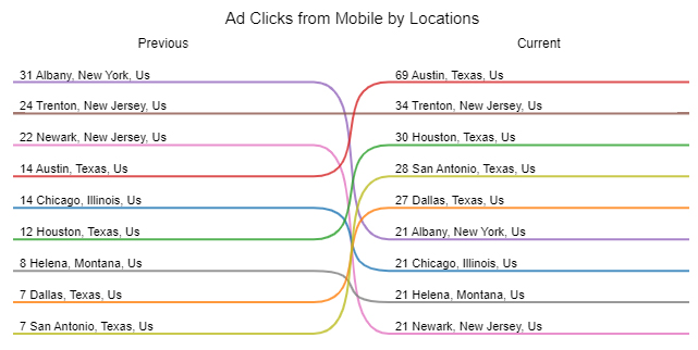
Illustrates changes between two points for various categories, helping identify trends, improvements, or declines effectively.

Slope Chart for Learning How to Create a Dashboard Using Excel

Progress Chart

Tracks project milestones, goals, or performance metrics visually, making it easy to monitor progress at a glance.

Progress Chart for Learning How to Create a Dashboard Using Excel

Sankey Chart

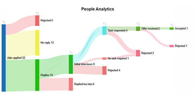
Maps flows and connections between data points, ideal for visualizing processes, resource allocation, or user journeys within a dashboard.

Sankey Chart for Learning How to Create a Dashboard Using Excel

Excel Dashboard Example (Real Use-Case)

  • Sales Dashboard

A sales dashboard tracks revenue, sales targets, and performance across regions or products. It provides a quick overview of which products are performing best, highlights trends over time, and helps identify areas that need attention.

  • KPI Dashboard

A KPI dashboard monitors key business metrics, such as operational efficiency, revenue growth, or customer satisfaction. It allows teams to quickly see whether they are meeting goals and spot performance changes at a glance.

  • Marketing Dashboard

Marketing dashboards visualize campaign performance, lead generation, and conversion rates. They help marketing teams understand which strategies are working, track progress toward goals, and make data-driven decisions.

Excel vs Other Dashboard Tools

Feature / Aspect Excel Power BI Google Sheets
Ease of Use Familiar interface for most users; easy for basic dashboards. Steeper learning curve; designed for professional BI users. Simple and collaborative; good for lightweight dashboards.
Data Volume Handles moderate datasets well; can slow down with very large data. Optimized for large datasets; handles millions of rows efficiently. Suitable for small to medium datasets; may lag with very large files.
Visualization Options Good variety; can be enhanced with add-ins for advanced charts. Extensive built-in visualizations and custom visuals are available. Limited visualizations; mainly standard charts, but easy to integrate with add-ons.
Real-Time Updates Limited; manual refresh or external connections required. Strong real-time data capabilities with automatic refresh. Real-time updates are supported via Google Sheets collaboration and integrations.
Collaboration Manual sharing or cloud via OneDrive; not inherently real-time. Cloud-based collaboration; dashboards can be easily shared with teams. Excellent real-time collaboration; multiple users can edit simultaneously.
Cost Part of a Microsoft Office subscription; affordable for most businesses. Paid subscription; higher cost for premium features and sharing. Free for basic use; affordable for business accounts.
Integration Strong with the Microsoft ecosystem; supports various add-ins for analytics. Extensive integrations with databases, cloud services, and APIs. Integrates with Google Workspace and third-party apps; less extensive than Power BI.
Best Use Case Quick, moderately complex dashboards for reporting and analysis. Enterprise-grade business intelligence and advanced analytics. Simple dashboards, lightweight reporting, and collaborative projects.

Benefits of Making Dashboards in Excel

  1. Easy Access and Familiarity: Most professionals already use Excel, so creating dashboards doesn’t require learning new software.
  2. Customizable to Your Needs: Excel allows you to design dashboards tailored to your KPIs, with flexible layouts, formatting, and formulas.
  3. Real-Time Insights: Dynamic charts, pivot tables, and formulas let you update and analyze data instantly for timely decisions.
  4. Streamlined Data Management: Excel can pull and consolidate data from multiple sources, making reporting more efficient and reducing manual work.
  5. Cost-Effective Analytics: Excel dashboards provide powerful business insights without the expense of dedicated BI tools.

What are the Limitations of Creating Excel Dashboards?

Excel dashboards are powerful, but they have some limitations to be aware of:

  1. Performance Issues: Large datasets or complex calculations can slow down Excel, leading to lag and longer load times, especially with real-time data.
  2. Complexity: Building advanced dashboards with dynamic charts, pivot tables, or formulas can be time-consuming and requires strong Excel skills, which may challenge beginners.
  3. Limited Real-Time Updates: Unless connected to external data sources, Excel dashboards are often static and require manual refreshes to stay current.
  4. Limited Interactivity: While slicers and filters add some interactivity, Excel dashboards can’t match the interactive features of tools like Power BI or Tableau.
  5. Design Constraints: Excel offers basic design options, making it harder to create visually engaging dashboards compared to specialized visualization tools.
  6. Collaboration Challenges: Sharing dashboards with multiple users can lead to version control issues. Excel lacks robust cloud-based collaboration features found in tools like Google Sheets or Power BI.

Excel Dashboard Design Best Practices

Designing an effective Excel dashboard requires clarity, focus, and usability. Follow these best practices to create dashboards that deliver insights quickly:

  1. Define Objectives: Clearly identify the key metrics and insights your dashboard should highlight. Know your audience and the decisions the dashboard will support.
  2. Keep It Simple: Avoid clutter by including only essential data. A clean layout ensures users can understand insights at a glance.
  3. Use Consistent Formatting: Maintain uniform colors, fonts, and layouts throughout your dashboard to make it professional and easy to read.
  4. Prioritize Data Visualization: Visuals like charts and graphs make complex data easy to interpret and trends easier to spot.
  5. Ensure Interactivity: Add filters, slicers, or drop-down menus so users can explore data dynamically and view the insights most relevant to them.
  6. Test with Users: Gather feedback from the dashboard’s intended audience to ensure it meets their needs and is intuitive to use.
  7. Focus on Actionable Insights: Highlight key takeaways, trends, or anomalies so users can make informed decisions without digging through raw data.

 FAQs

Can we create Dashboards in Excel?

Yes, you can create a dashboard in Excel!

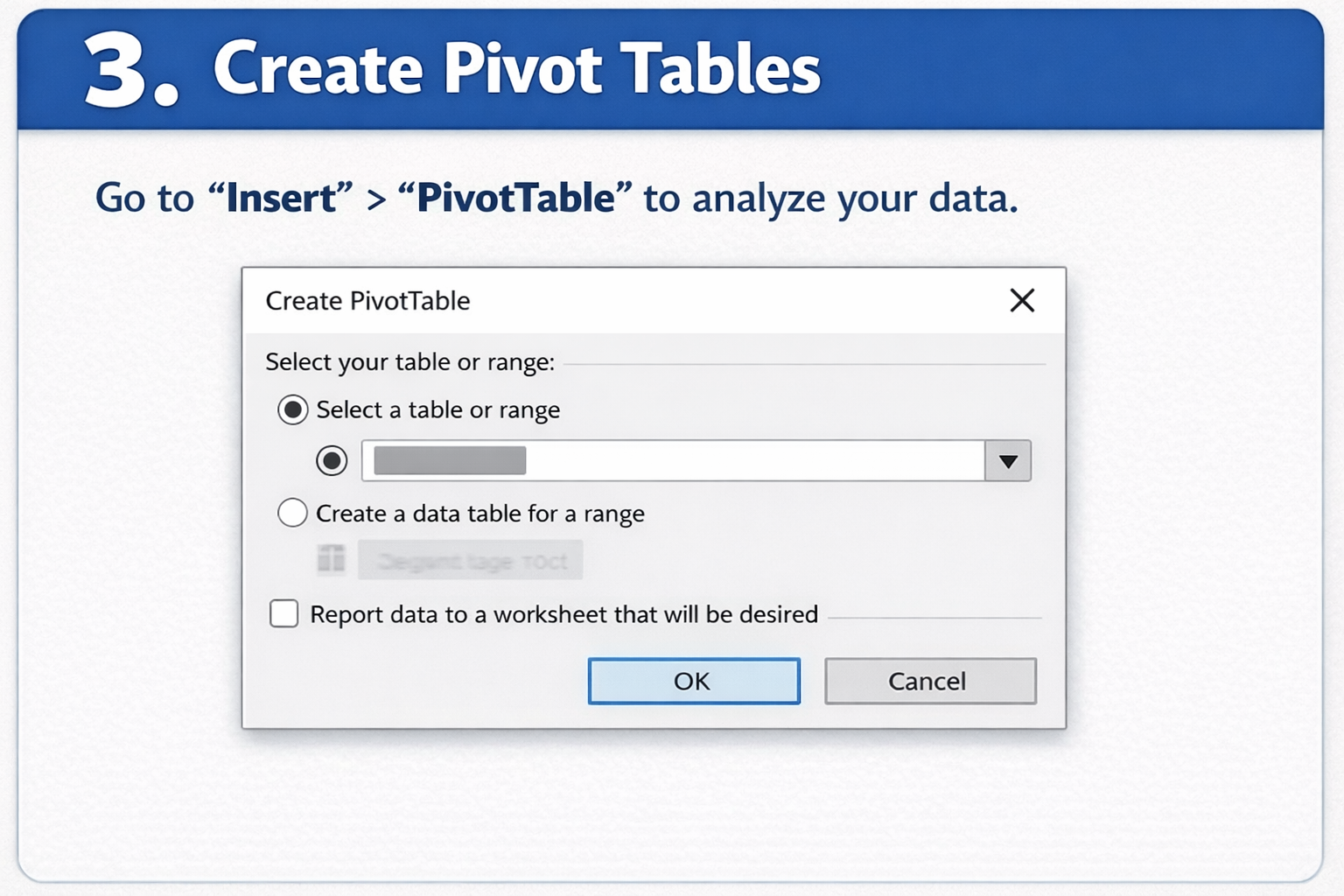
Excel offers powerful tools like PivotTables, charts, slicers, and Power Query to build interactive and dynamic dashboards. You can visualize key metrics, track trends, and make data-driven decisions—all within a single Excel sheet. Whether it’s for sales, a finance dashboard in Excel, or project tracking, Excel reporting dashboards are flexible and easy to customize.

How to Create a Dashboard in Excel that Updates Automatically?

  • Format Data as a Table – Use Ctrl + T so data expands automatically.
  • Connect to Data Source – Use Power Query for live or external data.
  • Create PivotTables or Formulas – Summarize data dynamically.
  • Add Charts & Slicers – Visualize your metrics clearly.
  • Enable Auto-Refresh – Go to Query Properties > check “Refresh data when opening.”
  • Design Your Dashboard – Organize visuals on one sheet for easy tracking.

Can I create dynamic dashboards using Excel?

Yes, we can create Dynamic dashboards in Excel by following these steps:

  1. Use PivotTables – Summarize and organize your data.
  2. Insert PivotCharts – Visualize the summarized data.
  3. Add Slicers – Filter data interactively with buttons.
  4. Apply Data Validation Lists – Enable dropdowns for easy filtering.
  5. Link to Data Sources – Ensure charts update automatically.

What is the use of Microsoft Excel as a dashboard designing tool?

Microsoft Excel is a powerful tool for dashboard design. It helps visualize data through charts, graphs, and PivotTables. Excel allows real-time data updates, interactive filtering, and customization. This makes it ideal for tracking metrics and business performance efficiently.

What kind of charts can you make using an Excel dashboard?

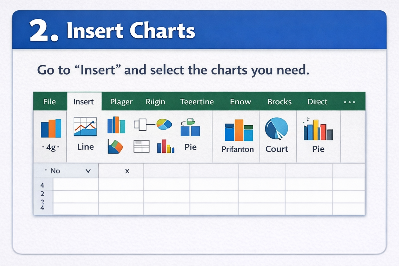
You can create charts in an Excel dashboard, including bar, column, pie, line, area, scatter, and combo charts. You can also use PivotCharts, histograms, and waterfall charts for more advanced data visualization and analysis.

Wrap Up

How to create a dashboard using Excel is straightforward, but success depends on careful planning and execution.

Start by defining your objectives. Identify the key metrics and KPIs your audience needs to see. Clear goals ensure your dashboard delivers actionable insights.

Next, gather and organize your data. Clean, structured data is essential for accurate calculations and meaningful visualizations. Use Excel’s built-in tools like sorting, filtering, and tables to prepare your data efficiently.

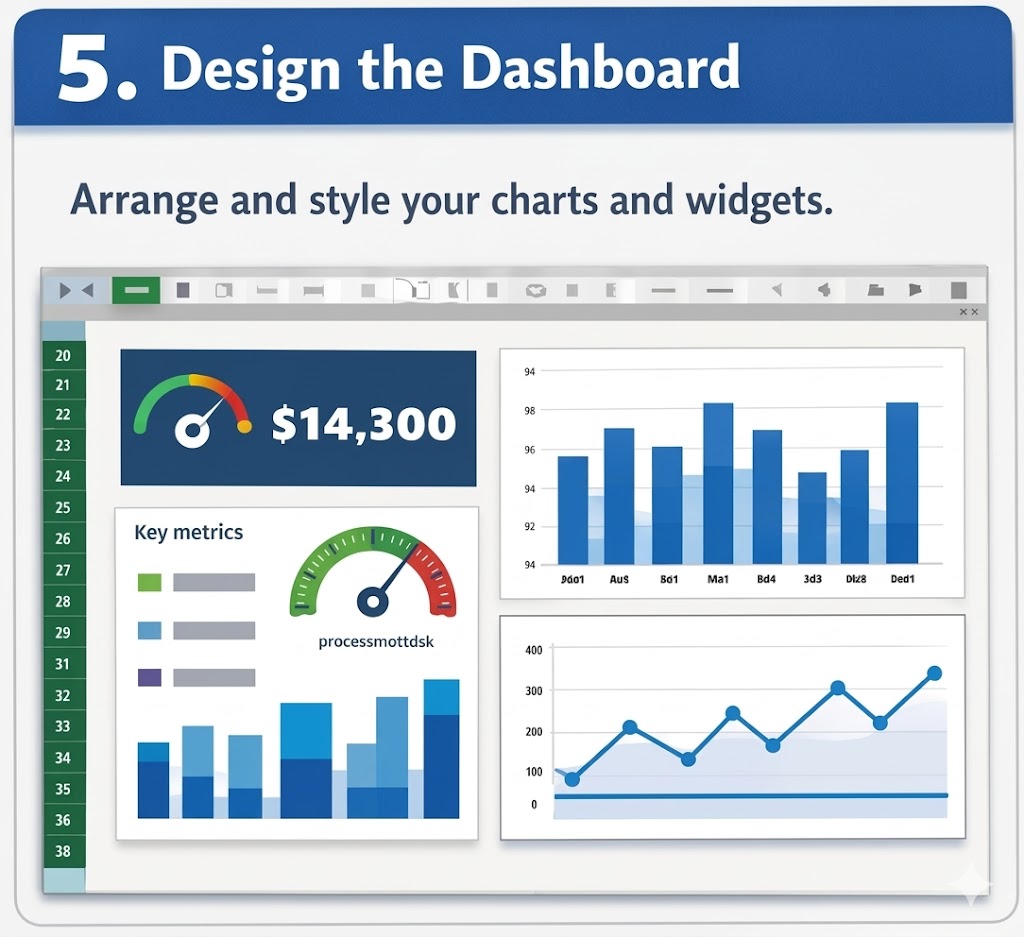
When designing your dashboard, focus on clarity and usability. Summarize key information with PivotTables and PivotCharts, which allow dynamic interaction and give users control over what they view.

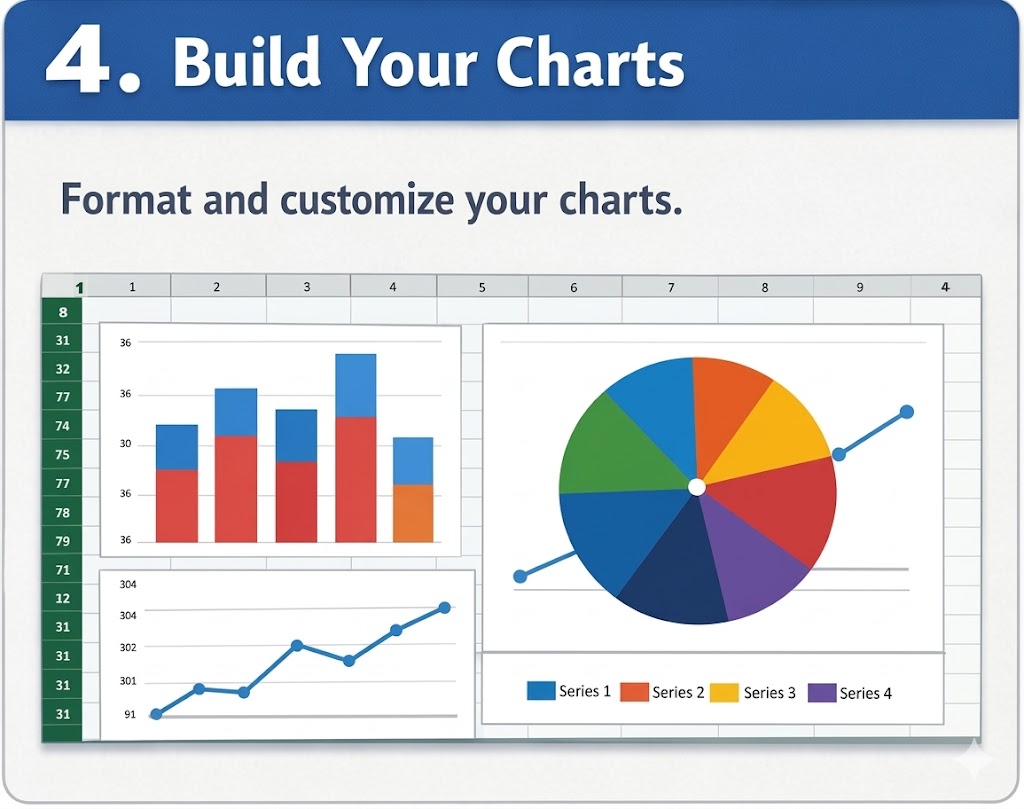
Choose charts wisely to communicate data effectively. Use bar, line, or pie charts depending on the data type, maintain consistent formatting, and avoid cluttering the dashboard with unnecessary elements.

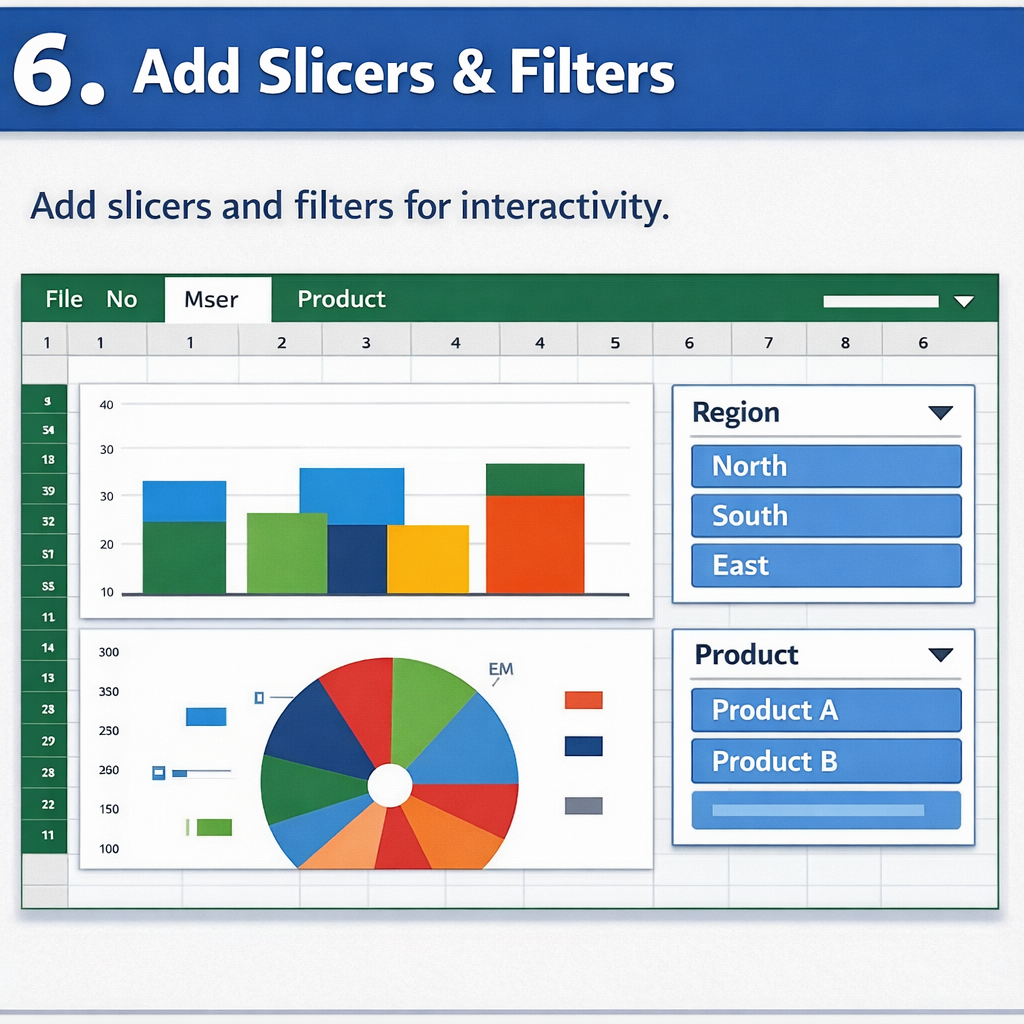
Enhance interactivity by adding slicers, drop-downs, and filters. These features allow users to explore data on their own and gain deeper insights.

Finally, test your dashboard. Gather feedback from your audience to ensure it’s intuitive, user-friendly, and meets its intended purpose.

Start building your dashboard in Excel today and explore advanced visualizations with ChartExpo to take your reporting to the next level.

How much did you enjoy this article?

ExcelAd2
Start Free Trial!
143181

Related articles

next previous
Microsoft Excel11 min read

How to Create Control Chart in Excel?

Learn how to create a Control chart in Excel to track process stability, detect unusual variation early, and improve data-driven decision-making.

Microsoft Excel8 min read

Frequency Chart in Excel: Easy Methods Explained

Learn how to create and use frequency charts in Excel to simplify data analysis, visualize distributions, and make better business decisions with clear insights.

Microsoft Excel9 min read

How to Identify Box Plot Outliers? Easy Steps

Learn what box plot outliers in Excel are, how to detect them using the IQR method, and how to interpret them with real-world examples and Excel use cases.

Microsoft Excel11 min read

Data Validation in Excel: A Complete Guide

Data validation in Excel prevents errors before they spread. Explore types, setup steps, removal, and benefits for cleaner data. Read on!

Microsoft Excel9 min read

How to Use SUMPRODUCT in Excel: Formula & Insights

How to use SUMPRODUCT in Excel for weighted averages, conditionals, and multi-range calculations. Master the syntax and examples. Read on!

ChartExpo logo

Turn Data into Visual
Stories

CHARTEXPO

  • Home
  • Gallery
  • Videos
  • Services
  • Pricing
  • Contact us
  • FAQs
  • Privacy policy
  • Terms of Service
  • Sitemap

TOOLS

  • ChartExpo for Google Sheets
  • ChartExpo for Microsoft Excel
  • Power BI Custom Visuals by ChartExpo
  • Word Cloud

CATEGORIES

  • Bar Charts
  • Circle Graphs
  • Column Charts
  • Combo Charts
  • Comparison Charts
  • Line Graphs
  • PPC Charts
  • Sentiment Analysis Charts
  • Survey Charts

TOP CHARTS

  • Sankey Diagram
  • Likert Scale Chart
  • Comparison Bar Chart
  • Pareto Chart
  • Funnel Chart
  • Gauge Chart
  • Radar Chart
  • Radial Bar Chart
  • Sunburst Chart
  • see more
  • Scatter Plot Chart
  • CSAT Survey Bar Chart
  • CSAT Survey Chart
  • Dot Plot Chart
  • Double Bar Graph
  • Matrix Chart
  • Multi Axis Line Chart
  • Overlapping Bar Chart
  • Control Chart
  • Slope Chart
  • Clustered Bar Chart
  • Clustered Column Chart
  • Box and Whisker Plot
  • Tornado Chart
  • Waterfall Chart
  • Word Cloud
  • see less

RESOURCES

  • Blog
  • Resources
  • YouTube
SIGN UP FOR UPDATES

We wouldn't dream of spamming you or selling your info.

© 2026 ChartExpo, all rights reserved.