Categories
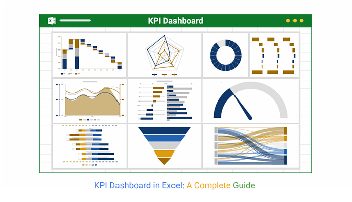
What is a KPI dashboard in Excel? Businesses track performance every day, but raw data alone isn’t enough. Decision-makers need a clear picture. That’s where a KPI dashboard in Excel helps. It turns numbers into insights, helping teams make informed decisions quickly.


Every second, companies generate massive amounts of data. Spreadsheets store it, but analyzing rows and columns is time-consuming. A KPI dashboard in Excel organizes key metrics in one place. For instance, a marketing dashboard ensures sales, revenue, and customer retention data stand out. This saves time and improves decision-making.
A digital dashboard in Excel transforms numbers into visual stories with charts, graphs, and conditional formatting. A well-structured dashboard brings clarity and focus. And the best part? Customization. Teams can choose what to track – financial performance, marketing, operations, etc.
Success depends on measuring the right things. Without tracking key metrics, businesses operate in the dark. Excel provides basic tools, but data analytics solutions can enhance insights and make reporting more effective. A KPI dashboard in Excel makes data worthwhile, helping leaders drive growth with confidence. It simplifies performance tracking, enabling smarter and faster decisions.
How?
Let’s find out…
Definition: A KPI Dashboard in Excel tracks key business metrics in one place. It organizes data into charts, graphs, and tables for quick insights. Businesses use it to monitor sales, revenue, and performance trends. Instead of sorting through endless spreadsheets, teams see only the important numbers.
Data transformation in Excel enhances how information is structured and analyzed. Raw data becomes meaningful visuals, making trends easier to spot. With the right formulas and tools, Excel simplifies reporting and improves efficiency.
Excel’s flexibility allows customization for different goals. Visuals make complex data easy to understand. A well-designed dashboard improves decision-making. It helps businesses stay on track and respond to changes faster.
An Excel KPI dashboard template makes tracking key metrics simple. You’ll not build from plug-in data and get instant insights. This template streamlines business analytics, helping teams analyze trends and make data-driven decisions faster.
Here’s why it’s a smart choice:
Drowning in spreadsheets? You’re not alone. A KPI dashboard in Excel helps organize key metrics, but Excel wasn’t built for stunning visuals. Sure, it offers charts, but making them clear, interactive, and insightful? That’s another story.
This is where ChartExpo comes in. It transforms dull spreadsheets into dynamic, easy-to-read visuals, making data analysis in Excel a breeze. If Excel leaves you guessing, ChartExpo will help you see the whole picture.


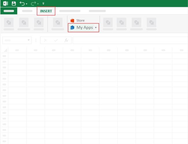
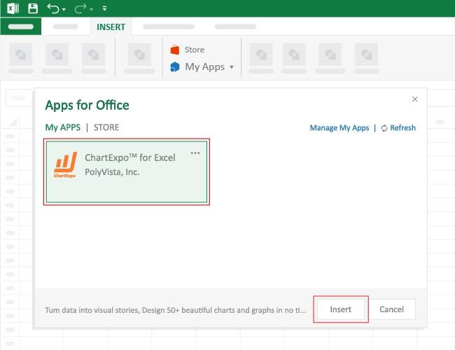
How to Install ChartExpo in Excel?
ChartExpo charts are available both in Google Sheets and Microsoft Excel. Use the following CTAs to install the tool of your choice and create beautiful visualizations, track key KPIs, and build a comprehensive finance dashboard in Excel with just a few clicks.
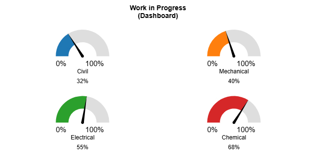
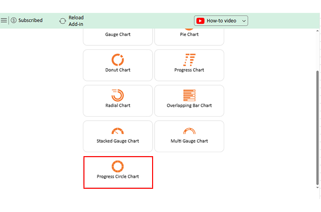
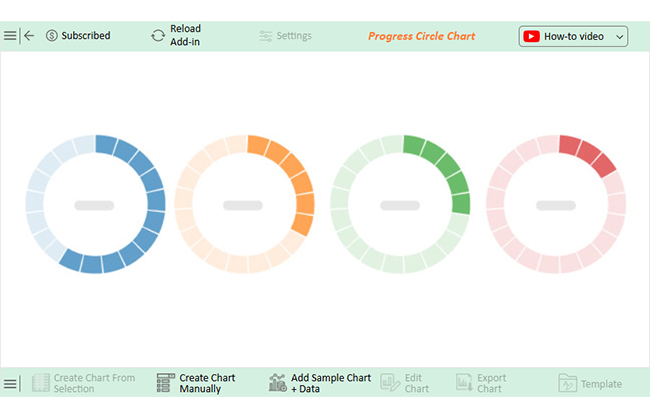
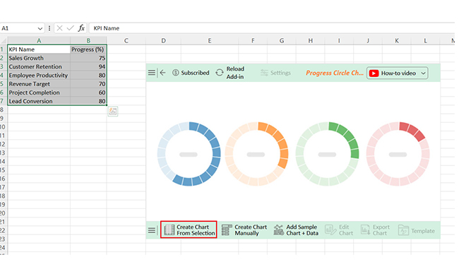
Let’s learn how to create a dashboard using ChartExpo for Excel and analyze it.
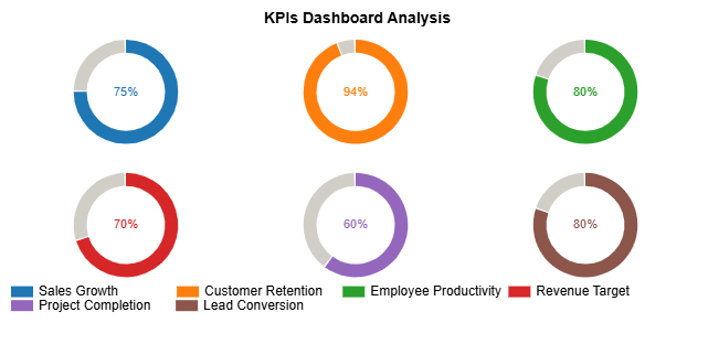
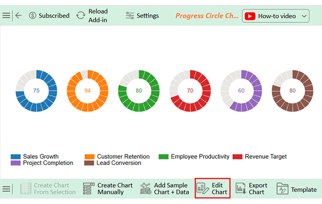
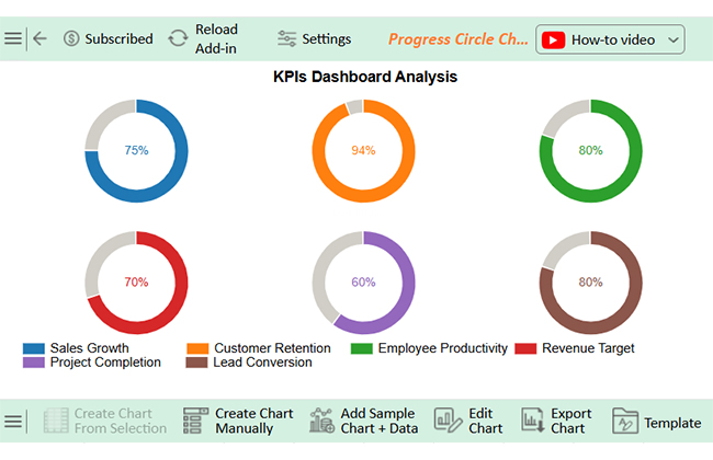
| KPI Name | Progress (%) |
| Sales Growth | 75 |
| Customer Retention | 94 |
| Employee Productivity | 80 |
| Revenue Target | 70 |
| Project Completion | 60 |
| Lead Conversion | 80 |

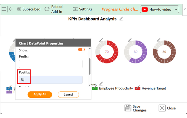
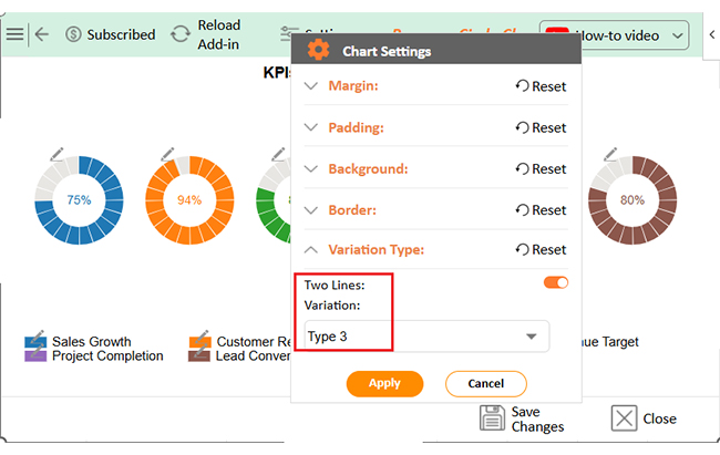
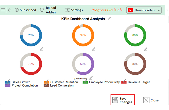
A great KPI Dashboard in Excel isn’t just about numbers—it’s about clarity. The right setup turns raw data into powerful insights. Here’s how you can build a real-time dashboard that tracks performance with a few smart steps:
An Excel KPI dashboard is a powerful tool, but it’s imperfect. While it helps track performance, there are some challenges to consider:
A KPI format in Excel helps turn scattered numbers into meaningful insights. Whether tracking sales, expenses, or productivity, Excel makes it easier to see what’s working and what’s not. Here’s why it’s a great choice:


An Excel KPI dashboard for employee performance tracks key metrics like productivity, efficiency, and attendance. It organizes data into charts and tables for quick insights. You can monitor progress, identify trends, and make informed decisions to improve team performance.
A KPI dashboard in Excel simplifies data tracking. It consolidates key metrics for quick insights. You can track performance without sorting through countless spreadsheets.
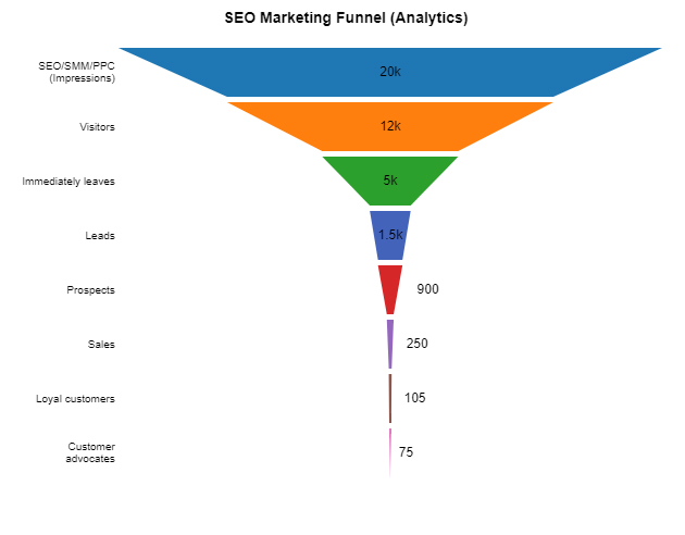
Don’t know where to start? Look at data dashboard examples for insights on designing effective dashboards that display the most relevant insights. You can create a web analytics dashboard that will help you track traffic, user behavior, and conversions in detail.
Visualizing data helps in decision-making. Excel provides basic charts, but its features have limits. Complex data often needs better tools for clarity.
Customization makes Excel dashboards useful. Teams can tailor them to track what matters most. Whether sales, productivity, or revenue, data modeling in Excel ensures that raw numbers are structured properly for accurate reporting.
However, Excel isn’t perfect. Handling large data sets can slow it down. Collaboration challenges and security risks also need attention.
Despite limitations, Excel remains a cost-effective choice. It’s widely used and accessible for businesses of all sizes. With the right setup, you can turn raw data into valuable insights.
Conclusively, a well-designed KPI Dashboard in Excel improves efficiency. It highlights trends, tracks goals, and helps businesses stay on course. When paired with advanced tools, it becomes even more powerful.
Do not hesitate.
Install ChartExpo to unlock better data visualization.
How much did you enjoy this article?


Learn how to use sparklines in Excel to quickly visualize trends inside cells. Discover types, creation steps, customization, use cases, benefits, and best practices.

Learn what a confidence interval graph is, how to create it in Excel, and how to interpret results to make more reliable, data-driven decisions.

A correlation matrix in Excel helps identify relationships between variables. Learn how to create, read, and use it for effective data analysis.


