Categories
What is dynamic graph Excel? Dynamic graphs automatically update as your data changes, saving time and ensuring accuracy.
81% of businesses use Excel for financial reporting. With dynamic graph Excel, these reports become more efficient and insightful.
Imagine crunching numbers for hours only to realize your graphs are outdated. Frustrating, right? Dynamic graph Excel eliminates this problem. As you input new data, your charts transform instantly. This real-time visualization helps spot trends and make decisions faster.


However, dynamic graph Excel isn’t limited to finance. Marketing teams use it to track campaign performance, while project managers monitor timelines and budgets.
The applications are endless. Dynamic graphs improve data analysis in various industries, from small startups to Fortune 500 companies.
Let’s talk numbers. A study found that dynamic graphs can reduce report creation time by up to 40%. That’s a significant boost in productivity. Moreover, 73% of Excel users report improved data comprehension when using dynamic graphs.
Dynamic graph Excel also promotes collaboration. Teams can work on the same dataset and see updates in real-time. This fosters better communication and decision-making. With remote work on the rise, such tools are invaluable.
Stay tuned as we explore how to create and leverage dynamic graphs in Excel, boosting your data visualization game.
First…
Definition: A dynamic graph in Excel automatically updates when the data it represents changes. It’s useful for visualizing data trends in real-time without manually adjusting the chart.
This is achieved by linking the graph to dynamic data ranges or tables. The graph refreshes as new data is added or modified to display the updated information.
Dynamic graphs are ideal for dashboards and reports that require constant data monitoring and analysis. Why? To ensure accuracy and efficiency in data presentation.
Dynamic graphs save you the hassle of manually updating charts if you’re working with constantly changing data. They automatically reflect data changes, helping you stay on top of trends without extra effort.
Here are the key elements that make dynamic graphs work so seamlessly.
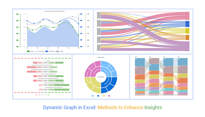
Below are charts we created in Excel using ChartExpo:
Dynamic charts in Excel are incredibly useful. However, there are a few things to remember to ensure they function smoothly.
These key points will help you make the most of dynamic charts, including when building a frequency chart in Excel for clearer and more adaptive data analysis.
Data visualization is the heartbeat of effective data analysis. But Excel? It’s often the wallflower at the data party. Creating a dynamic chart in Excel can feel like teaching a spreadsheet to tango.
Enter ChartExpo, the smooth operator in the world of graphs. This add-in doesn’t just ask Excel for a dance; it sweeps it off its feet, turning Excel’s rigid rows and columns into a visual feast, complete with a stunning Control chart in Excel.
With ChartExpo, you’re not just creating charts like a Scatter plot. You’re telling data stories that captivate. Let’s explore how ChartExpo can make your Excel charts move and groove.
Let’s learn how to install ChartExpo in Excel.
ChartExpo charts are available both in Google Sheets and Microsoft Excel. Please use the following CTAs to install the tool of your choice and create beautiful visualizations with a few clicks in your favorite tool, including a tornado chart in Excel.
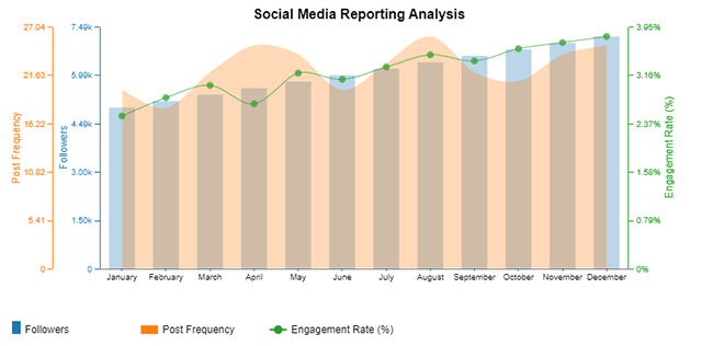
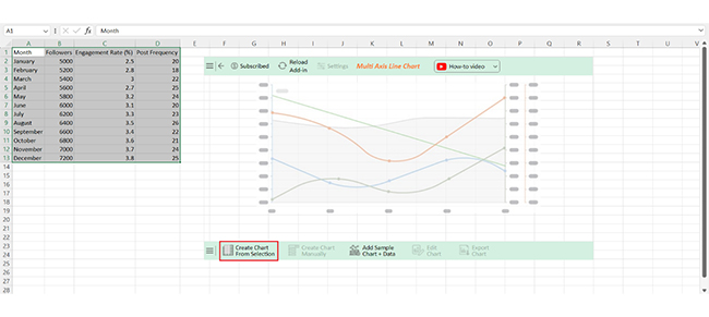
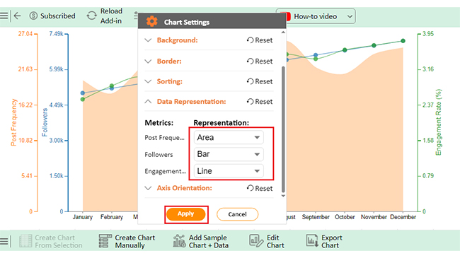
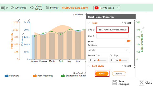
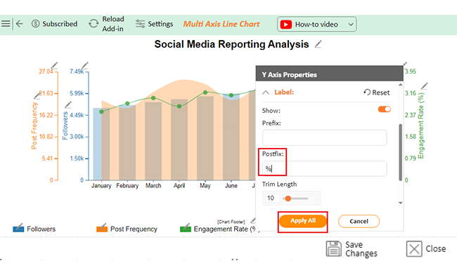
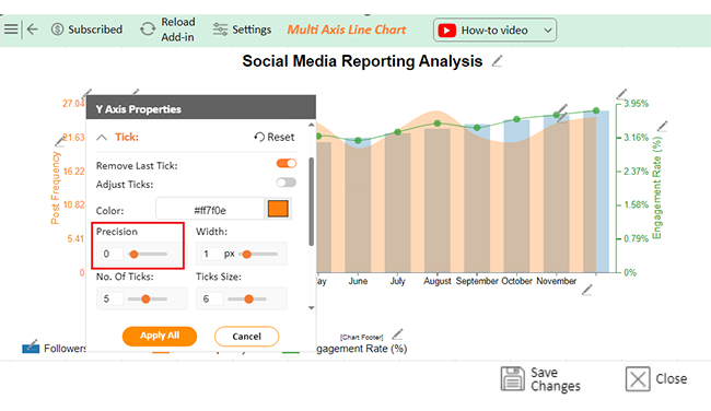
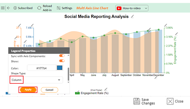
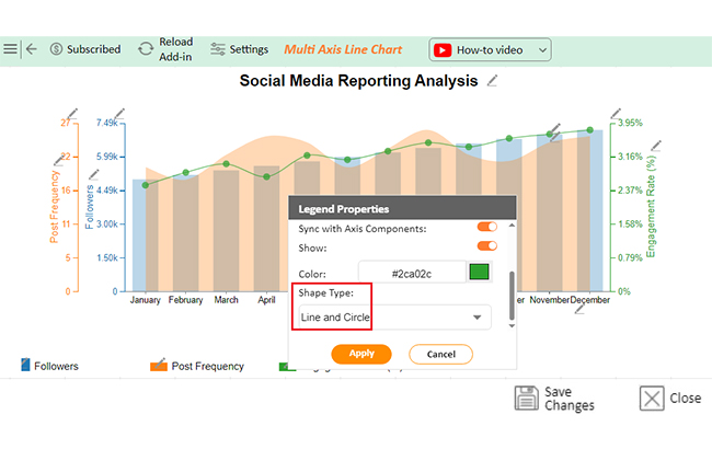
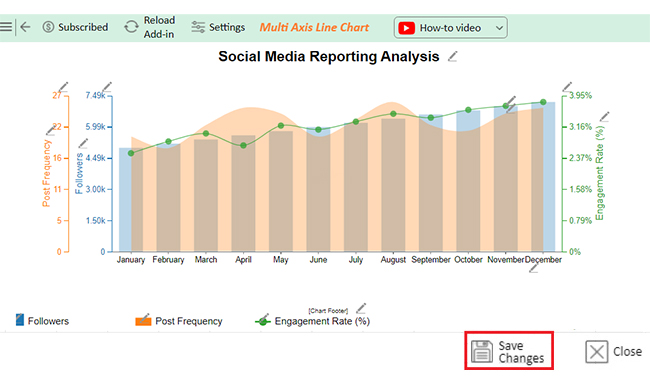
Let’s create a dynamic graph in Excel from the data below using ChartExpo.
| Month | Followers | Engagement Rate (%) | Post Frequency |
| January | 5000 | 2.5 | 20 |
| February | 5200 | 2.8 | 18 |
| March | 5400 | 3 | 22 |
| April | 5600 | 2.7 | 25 |
| May | 5800 | 3.2 | 24 |
| June | 6000 | 3.1 | 20 |
| July | 6200 | 3.3 | 23 |
| August | 6400 | 3.5 | 26 |
| September | 6600 | 3.4 | 22 |
| October | 6800 | 3.6 | 21 |
| November | 7000 | 3.7 | 24 |
| December | 7200 | 3.8 | 25 |


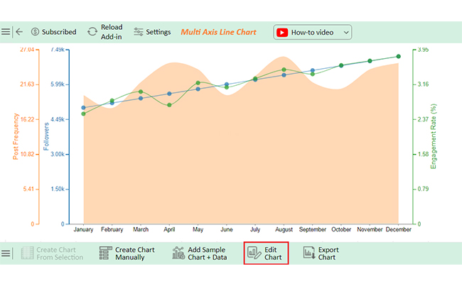
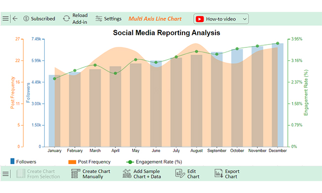
Dynamic graphs in Excel, such as a Scatter plot in Excel with 3-variables, make data visualization more efficient. They save time and ensure your charts always reflect the latest data.
However, like anything in Excel, they have advantages and drawbacks. Let’s explore the pros and cons of using dynamic graphs.
Use Excel’s Table feature:
Create a table by selecting your data range and clicking “Insert > Table.” Then, insert a chart linked to this table. The chart will be updated with changes to the data table.
Dynamic graphs automatically adjust to new data. They provide real-time insights, reduce manual updates, and improve accuracy. This enhances the clarity and relevance of your reports.
Dynamic graphs update automatically with data changes. Interactive graphs allow users to manipulate the display, like filtering or zooming. Moreover, dynamic graphs focus on data refresh, while interactive graphs emphasize user engagement.
Dynamic graphs in Excel are an efficient way to visualize changing data. They automatically update as new data is added or existing data changes. This feature saves time and reduces the need for manual adjustments.
Using dynamic data ranges ensures graphs are always accurate. You can expand or shrink the data set; the chart will instantly reflect the change. This flexibility is a key benefit of dynamic graphs.
Excel tables also play a crucial role in dynamic graphs. By organizing data into tables, charts become more structured and responsive. Tables make it easy to add new data without needing to update the chart settings.
Pivot charts further enhance the ability to analyze large datasets. They adjust automatically when changes are made, making them ideal for detailed data analysis. Slicers and filters make it easy to narrow down the data you need to visualize.
However, keep in mind that dynamic graphs can become complex. They may slow down with large datasets and require careful formula setup.
In summary, dynamic graphs in Excel offer flexibility, efficiency, and improved data presentation. But they require attention to detail and proper setup.
How much did you enjoy this article?


Learn how to use sparklines in Excel to quickly visualize trends inside cells. Discover types, creation steps, customization, use cases, benefits, and best practices.

Learn what a confidence interval graph is, how to create it in Excel, and how to interpret results to make more reliable, data-driven decisions.

A correlation matrix in Excel helps identify relationships between variables. Learn how to create, read, and use it for effective data analysis.


