• Home
  • Tools dropdown img
    • Spreadsheet Charts

      • ChartExpo for Google Sheets
      • ChartExpo for Microsoft Excel
    • Power BI Charts

      • Power BI Custom Visuals by ChartExpo
    • Word Cloud

  • Charts dropdown img
    • Chart Category

      • Bar Charts
      • Circle Graphs
      • Column Charts
      • Combo Charts
      • Comparison Charts
      • Line Graphs
      • PPC Charts
      • Sentiment Analysis Charts
      • Survey Charts
    • Chart Type

      • Box and Whisker Plot
      • Clustered Bar Chart
      • Clustered Column Chart
      • Comparison Bar Chart
      • Control Chart
      • CSAT Survey Bar Chart
      • CSAT Survey Chart
      • Dot Plot Chart
      • Double Bar Graph
      • Funnel Chart
      • Gauge Chart
      • Likert Scale Chart
      • Matrix Chart
      • Multi Axis Line Chart
      • Overlapping Bar Chart
      • Pareto Chart
      • Radar Chart
      • Radial Bar Chart
      • Sankey Diagram
      • Scatter Plot Chart
      • Slope Chart
      • Sunburst Chart
      • Tornado Chart
      • Waterfall Chart
      • Word Cloud
    • Google Sheets
      Microsoft Excel
  • Services
  • Pricing
  • Contact us
  • Blog
  • Support dropdown img
      • Gallery
      • Videos
      • Contact us
      • FAQs
      • Resources
    • Please feel free to contact us

      atsupport@chartexpo.com

Categories
All Data Visualizations Data Analytics Surveys
Add-ons/
  • Google Sheets
  • Microsoft Excel
  • Power BI
All Data Visualizations Data Analytics Surveys
Add-ons
  • Google Sheets
  • Microsoft Excel
  • Power BI

We use cookies

This website uses cookies to provide better user experience and user's session management.
By continuing visiting this website you consent the use of these cookies.

Ok

ChartExpo Survey


Home > Blog > Data Analytics

How to Calculate Range of a Data Set: Unleash Insights

How to calculate the range of a data set is fundamental to dealing with numbers. The range is the simplest measure of variability. It is obtained by subtracting the smallest from the largest values in the data set. It’s simple yet mighty.

How to Calculate the Range of a Data Set

Businesses, researchers, and almost everyone utilize the concepts of range in their field to improve various aspects. For example, the range of test scores in education can assist teachers in evaluating student performance. Similarly, in quality control, analyzing the range of product measurements ensures consistency and precision.

Too broad of a concept, I know. But here’s the thing: at any rate, this theoretical knowledge holds a high measure of practical value. It’s not about whether you are in finance, healthcare, or sports. What matters is that knowing how to calculate the range of a data set will pay off. How? It will inform your decision-making and facilitate problem-solving.

Your journey to learn more about the concept of range starts with this blog post. We’ll walk through the calculation process and explore its real-world significance. By the end, you’ll realize that the range goes beyond numbers. It’s a tool that can help you uncover actionable insights from data and make rational decisions.

Table of Contents:

  1. What is the RANGE Function in Power BI?
  2. Why is DAX Range Important?
  3. How to Use the Range Function in Power BI?
  4. How to Create Data Depiction in Power BI?
  5. What is the Best Practice for Using Range in Power BI?
  6. Wrap Up

Let’s get started.

What is the RANGE Function in Power BI?

Definition: The RANGE function in Power BI helps analyze data within a specified range. It extracts data falling between defined limits.

The syntax for the RANGE function is:

RANGE(<Start>, <End>, [<Increment>])

Where:

  • <Start> is the starting value of the range.
  • <End> is the ending value of the range.
  • <Increment> (optional) is the step size between consecutive numbers in the range. If not provided, it defaults to 1.

This function is useful for filtering data based on conditions like dates, numbers, or text. By specifying a start and end point—such as calculating the No of Days Between Two Dates—it enables focused analysis of relevant data subsets. It simplifies data manipulation tasks by narrowing down Datasets.

RANGE in Power BI is essential for various analytical tasks, such as trend analysis and performance evaluation. Its versatility supports diverse business requirements. Moreover, utilizing Power BI RANGE enhances data visualization and reporting capabilities. By selecting specific data ranges, you can derive actionable insights more effectively.

Why is DAX Range Important?

The DAX RANGE function is vital for data manipulation and analysis in Power BI. It has multifaceted utility across various analytical tasks.

  • Data Generation and Exploration

In data exploration, DAX RANGE allows you to generate specific data subsets based on defined ranges. For example, you can filter sales data only to analyze transactions within a particular month or year. This ability to subset data facilitates focused exploration, enabling you to understand trends or anomalies within specific segments.

  • Iterative Calculations

RANGE in Power BI is instrumental in iterative calculations. Filtering data within specified ranges facilitates computations on subsets of data. For instance, you can calculate moving averages or cumulative sums over defined periods, such as quarterly sales performance. Or rolling averages of inventory levels. This capability is crucial for accurate analysis of data trends and patterns.

  • Custom Aggregations

DAX RANGE supports the creation of custom aggregations by summarizing data within user-defined ranges. This feature offers flexibility in data aggregation processes, allowing you to define specific criteria for summarizing data. For instance, you can create custom aggregations to calculate average sales per customer within specific age groups.

  • Dynamic Visualization

Dynamic visualization is enhanced through the use of DAX RANGE. The function ensures that visualizations accurately reflect specific data segments by selecting and data presentation within desired ranges. For example, you can create dynamic charts that display sales performance for a selected time range or product category. This, as a result, enables interactive exploration of data insights.

  • Scenario Analysis

DAX RANGE facilitates scenario analysis by enabling data analysis under different conditions or scenarios within defined ranges. You can evaluate the impact of changing variables by adjusting the range criteria. For instance, you can analyze sales performance under different pricing strategies or market conditions by varying the time frame.

  • Statistical Analysis

In statistical analysis, DAX RANGE segments data into ranges for statistical computations, enhancing the accuracy of analysis outcomes. You can perform various statistical calculations on data subsets defined by ranges, such as mean, median, or standard deviation. This capability is essential for deriving meaningful insights and informed decision-making based on statistical evidence.

  • Forecasting and Trend Analysis

DAX RANGE enables you to analyze data trends within specified ranges for forecasting and trend analysis. You can predict and forecast future outcomes by identifying patterns and trends over time or across different segments. This capability supports predictive modeling and decision-support initiatives within organizations.

How to Use the Range Function in Power BI?

The RANGE function allows you to segment or filter data based on specific criteria, such as numerical ranges. Follow these steps to use the RANGE function in Power BI.

  • Open Power BI Desktop: Launch Power BI Desktop to access your data and begin creating or editing your Power BI data model.
  • Add a new column or measure: Select the table or data model where you want to apply the RANGE function. Then, choose whether to add a new column or measure depending on your analysis needs.
  • Write the DAX expression: In the formula bar, write the DAX expression using the RANGE function. Specify the criteria for the range, such as the starting point, ending point, and optional increment value. The syntax is as follows:

RANGE ( <Step> [, <IncludeCurrent>] [, <Axis>] [, <Blanks>] [, <Reset>] )

PARAMETER ATTRIBUTES DESCRIPTION
Step The desired length of the window. If negative, the window will contain the last -STEP rows before the current row. Otherwise, the window will contain the first STEP rows after the current row.
IncludeCurrent Optional A logical value specifying whether or not to include the current row. The default value is TRUE.
Axis Optional An axis reference.
Blanks Optional An enumeration that defines how BLANK values are ordered. Valid values are: DEFAULT, LAST, FIRST.
Reset Optional Specifies how the calculation restarts. Valid values are: None, LowestParent, HighestParent, or an integer.

This function can be used in visual calculations only.

The <includeCurrent>, <axis>, <blanks>, and <reset> parameters can be omitted.

Example

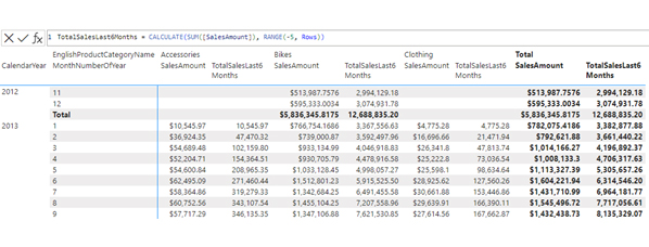
The DAX query below extends a table containing summaries of total sales per product category and month. It appends a new column showcasing the cumulative sales over the last half-year period.

TotalSalesLast6Months = CALCULATE(SUM([SalesAmount]), RANGE(-5, Rows))

The screenshot below shows the visual matrix and the visual calculation expression:

Visual Calculation Expression for Learning How to Calculate the Range of a Data Set
  • Enter the function parameters: Provide values for the RANGE function’s start, end, and increment parameters.
  • Press Enter: Press Enter to apply the function after entering the expression.
  • View the results: Depending on whether you created a column or measure, observe the results in the data model or visualizations, respectively.
  • Verify and adjust: Ensure the generated range aligns with your needs. If necessary, tweak the RANGE function parameters to attain the desired result.

How to Create Data Depiction in Power BI?

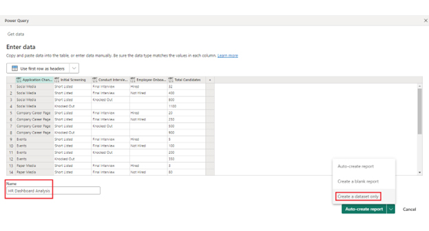
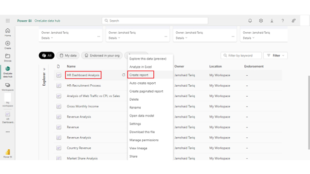
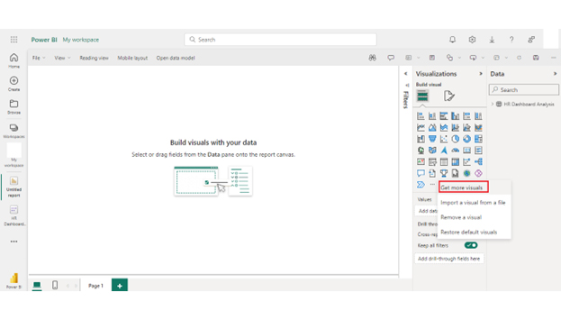
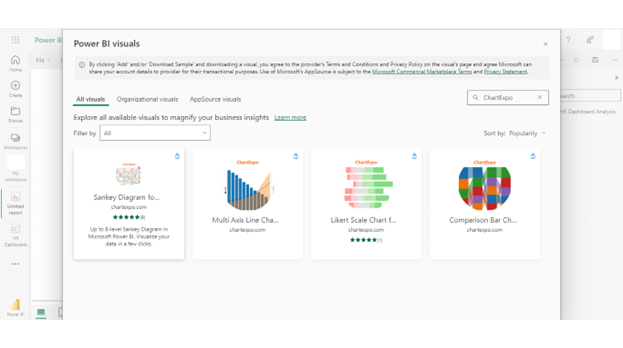
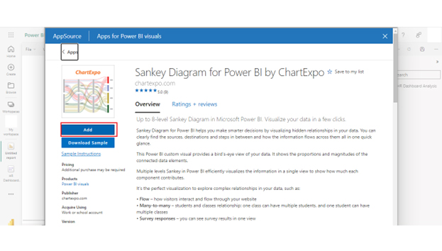
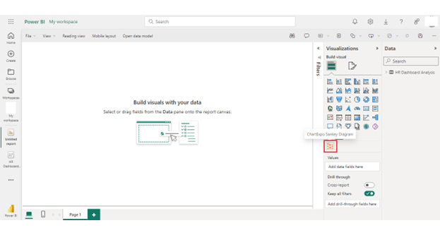
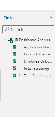
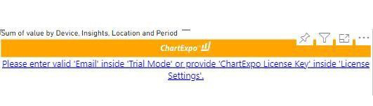
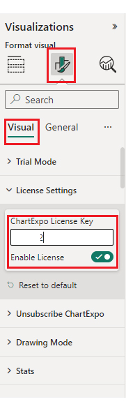
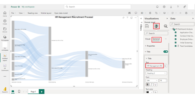
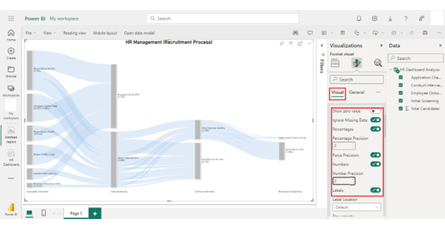
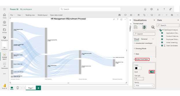
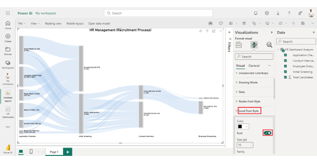
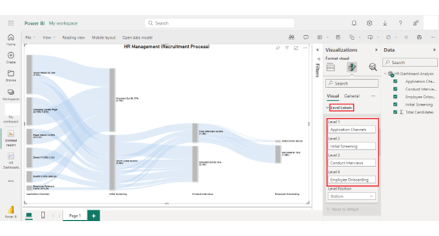
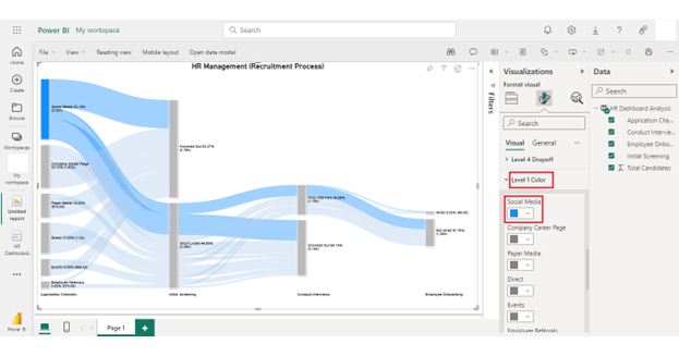
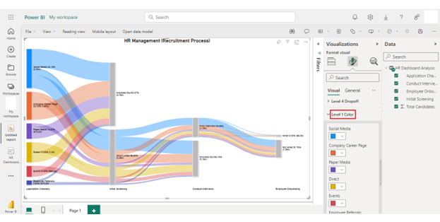
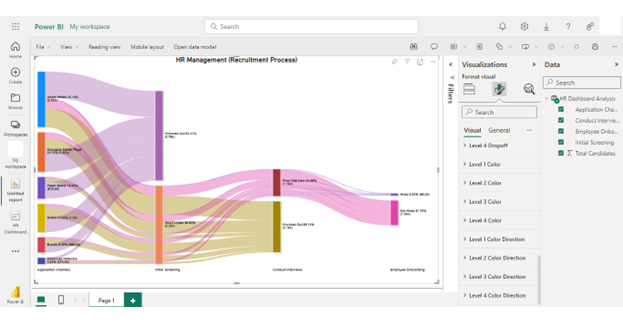
Here is a step-by-step process for creating a visualization in Power BI.

Stage 1: Logging in to Power BI

  • Log in to Power BI.
  • Enter your email address and click the “Submit” button.
Enter email to login to Power BI
  • You are redirected to your Microsoft account.
  • Enter your password and click “Sign in“.
Enter Password to login to Power BI
  • You can choose whether to stay signed in.
Click on stay signed in
  • Once done, the Power BI home screen will open.

Stage 2: Creating a Data Set and Selecting the Data Set to Use in Your Chart

  • Go to the left-side menu and click the “Create” button.
  • Select “Paste or manually enter data“.
select Paste or manually enter data in Power BI ce487
  • We’ll use the HR sample data below for this example.
Application Channels Initial Screening Conduct Interviews Employee Onboarding Total Candidates
Social Media Short Listed Final Interview Hired 32
Social Media Short Listed Final Interview Not Hired 400
Social Media Short Listed Knocked Out 800
Social Media Knocked Out 1100
Company Career Page Short Listed Final Interview Hired 20
Company Career Page Short Listed Final Interview Not Hired 250
Company Career Page Short Listed Knocked Out 500
Company Career Page Knocked Out 900
Events Short Listed Final Interview Hired 5
Events Short Listed Final Interview Not Hired 100
Events Short Listed Knocked Out 200
Events Knocked Out 350
Paper Media Short Listed Final Interview Hired 3
Paper Media Short Listed Final Interview Not Hired 80
Paper Media Short Listed Knocked Out 135
Paper Media Knocked Out 700
Employee Referrals Short Listed Final Interview Hired 10
Employee Referrals Short Listed Final Interview Not Hired 70
Employee Referrals Short Listed Knocked Out 80
Employee Referrals Knocked Out 110
Direct Short Listed Final Interview Hired 25
Direct Short Listed Final Interview Not Hired 150
Direct Short Listed Knocked Out 425
Direct Knocked Out 600
  • Paste the above data table in the Power Query Window.
  • Select the “Create a dataset only” option.
Create Dataset Only for Learning How to Calculate the Range of a Data Set
  • On the left-side menu, click “Data Hub“.
  • Power BI populates the data set list. (If you have not created a data set, refer to the Error! Reference source not found section).
Opening Data Hub for Learning How to Calculate the Range of a Data Set
  • Click on the “Create a report” dropdown.
Create a Report for Learning How to Calculate the Range of a Data Set

Stage 3: Adding the Power BI Sankey Diagram Extension by ChartExpo

  • Creating the Sankey Diagram requires us to use an add-in or Power BI visual from AppSource.
  • Navigate to the right side of the Power BI dashboard.
  • Open the Power BI Visualizations panel.
  • Click the ellipsis symbol (”¦) as highlighted in the diagram below. This will import the Power BI Sankey Diagram extension by ChartExpo.
  • The following menu opens:
  • Select the “Get more visuals” option.
Get more Visuals for Learning How to Calculate the Range of a Data Set
  • The following window opens.
  • Enter “Sankey Diagram for Power BI by ChartExpo” in the highlighted search box.
  • You should see the “Sankey Diagram for Power BI by ChartExpo”, as shown in the image below.
Charts Page for Learning How to Calculate the Range of a Data Set
  • Click the Sankey Diagram option and click the “Add” button.
Sankey Chart Add Button for Learning How to Calculate the Range of a Data Set
  • You can now see the Sankey Diagram for Power BI by ChartExpo icon in the visualizations list.
Sankey Diagram in Visualization for Learning How to Calculate the Range of a Data Set

Stage 4: Drawing a Sankey Diagram with ChartExpo’s Power BI extension

  • Select the “Sankey Diagram for Power BI by ChartExpo” icon in the visualization panel.
  • The following window opens in the report section of your dashboard:
Sankey Diagram Icon Added for Learning How to Calculate the Range of a Data Set
  • Select the fields to use in your Sankey chart here.
Select Fields for Learning How to Calculate the Range of a Data Set
  • One thing is essential when you select the fields: you must follow the sequence below:
    • Application Channels
    • Initial Screening
    • Conduct Interviews
    • Employee Onboarding
    • Total Candidates
  • You’ll be asked for a ChartExpo license key or email address.
License Key for Learning How to Calculate the Range of a Data Set
  • Add the key under the Visual section.
Enter License Key Under Visual Section for Learning How to Calculate the Range of a Data Set
  • After adding the key, you can see a chart for your data.
  • You can add the top header text in the chart under the General section as follows:
Add Header General Section for Learning How to Calculate the Range of a Data Set
  • After that, you can click on Visual set, the number, and enable the options below:
Enable Number Option for Learning How to Calculate the Range of a Data Set
  • You can change the “Node Font Style” as follows:
Change Node Font Style for Learning How to Calculate the Range of a Data Set
  • You can change the “Level Font Style” as follows:
Change Level Font Style for Learning How to Calculate the Range of a Data Set
  • You can see the Level Labels as follows:
Level Label for Learning How to Calculate the Range of a Data Set
  • You can change the Node color by following the steps below:
Change Node Color for Learning How to Calculate the Range of a Data Set
  • Now we show you “How to change Level 1 color,” and then by following this, you can change the node color of other levels as follows:
Change Level 1 Color for Learning How to Calculate the Range of a Data Set
  • Below is the final look of the HR Dashboard in Power BI using ChartExpo after changing the nodes’ color.
Final How to Calculate the Range of a Data Set

Insights

  • Social Media is the top platform for job applications, with the most candidates (1100).
  • The Company Career Page follows with 900 candidates.
  • Events and Paper Media have fewer candidates, with 350 and 700 individuals, respectively.
  • There are a total of 600 candidates for Direct Applications.
  • Employee Referrals have 110 candidates.
  • Social Media has the highest number of shortlisted candidates, with 32 hired and 400 not hired.
  • The Company Career Page and Direct Applications have a large number of shortlisted candidates.
  • Paper Media and Events have fewer entries that have been selected for consideration.
  • Knocked Out candidates have the highest numbers on social media (800), with the Company Career Page (500) in second place.
  • Employee Recommendations and Direct Applications have lower Knocked Out counts.

What is the Best Practice for Using Range in Power BI?

Follow these best practices when using the RANGE function in Power BI. This facilitates efficient and effective data analysis.

  1. Purposeful use: Employ the RANGE function with clear objectives in mind. Define the purpose of the range and how it contributes to the analysis or visualization process.
  2. Optimized range generation: Generate ranges that are optimized for the specific analysis requirements. Consider factors such as data granularity, relevant periods, or meaningful data segments.
  3. Clear naming conventions: Use clear and descriptive names for ranges to enhance the readability and maintainability of the Power BI model. Ensure that range names accurately reflect the data they represent.
  4. Consider increment options: When defining ranges, consider the increment options available in the RANGE function. Choose increments that align with the analysis needs and provide meaningful insights into the data.
  5. Validate results: Validate the results of range calculations to ensure accuracy and consistency. Cross-reference the generated ranges with expected outcomes to identify any discrepancies or errors.
  6. Documentation: Document the usage of ranges within the Power BI model. Provide explanations or comments to clarify the purpose and context of each range for future reference.
  7. Performance optimization: Optimize the performance of range calculations to minimize processing times and improve overall report responsiveness. Consider optimizing data models, filtering strategies, or using calculated columns versus measures based on performance requirements.

FAQs

Which function is used to find the highest value in a range?

You can use the MAX function to find the highest value in a range. It evaluates a set of values and returns the maximum value. Simply provide the range of values as an argument to the MAX function.

How do I select a date RANGE in Power BI?

To select a date range in Power BI, use filters or slicers. Simply add a date field to the report. Then, use the filter or slicer visuals to choose the start and end dates for the desired range.

What is the RANGE function?

The RANGE function in Power BI allows you to define a range of values. It’s commonly used for filtering data within a specified range, such as dates or numerical intervals. This function helps segment and analyze data efficiently.

Wrap Up

How to calculate the range of a data set is a fundamental aspect of data analysis. It provides valuable insights into the spread or dispersion of the data points.

You obtain a simple yet powerful measure of variability by subtracting the minimum value from the maximum value. This calculation helps understand the extent of variation within the data and identifies outliers or extreme values. Additionally, the range offers a quick and easy way to compare the spread of different data sets or subsets.

Despite its simplicity, the range remains useful in various fields, such as statistics, economics, and business analytics. It is a foundational concept for more advanced statistical analyses and aids decision-making processes. Moreover, the range complements other measures of dispersion, providing a broader perspective on data distribution.

When interpreting the range, it’s essential to consider the context of the data and any potential limitations. While easy to calculate, the range may not capture the entire data variability, especially in the presence of outliers. Therefore, it’s often used with other measures such as standard deviation or interquartile range. This provides a more comprehensive analysis.

Conclusively, understanding how to calculate and interpret the range empowers you to gain valuable insights from data. Then, you can make informed decisions to improve and achieve success.

How much did you enjoy this article?

GSAd1
Start Free Trial!
134955

Related articles

next previous
Data Analytics10 min read

Analytics in Telecom Industry for Better Insights

Analytics in the telecom industry optimizes networks, enhances customer experience, and detect fraud. Learn its key benefits, challenges, and use cases.

Data Analytics7 min read

Financial Forecasting for Startups: A Complete Guide

This guide dives deep into financial forecasting for startups. You'll also discover elements of a financial projection for a startup, and tips for creating one.

Data Analytics32 min read

Data Reporting: Making Your Reports Irresistible

Data reporting turns numbers into insights that guide decisions. Learn how to simplify complex data and make confident choices. Read on for key strategies!

Data Analytics10 min read

Employee Performance KPIs: Insights That Drive Action

Employee performance KPIs track productivity and success. Learn the key metrics, measurement methods, and analysis techniques to boost performance.

Data Analytics27 min read

Prescriptive Analytics: From Forecasts to Fixes

Prescriptive analytics helps you turn data into action. Learn how it improves decision-making, drives results, and supports smarter strategies. Get started!

ChartExpo logo

Turn Data into Visual
Stories

CHARTEXPO

  • Home
  • Gallery
  • Videos
  • Services
  • Pricing
  • Contact us
  • FAQs
  • Privacy policy
  • Terms of Service
  • Sitemap

TOOLS

  • ChartExpo for Google Sheets
  • ChartExpo for Microsoft Excel
  • Power BI Custom Visuals by ChartExpo
  • Word Cloud

CATEGORIES

  • Bar Charts
  • Circle Graphs
  • Column Charts
  • Combo Charts
  • Comparison Charts
  • Line Graphs
  • PPC Charts
  • Sentiment Analysis Charts
  • Survey Charts

TOP CHARTS

  • Sankey Diagram
  • Likert Scale Chart
  • Comparison Bar Chart
  • Pareto Chart
  • Funnel Chart
  • Gauge Chart
  • Radar Chart
  • Radial Bar Chart
  • Sunburst Chart
  • see more
  • Scatter Plot Chart
  • CSAT Survey Bar Chart
  • CSAT Survey Chart
  • Dot Plot Chart
  • Double Bar Graph
  • Matrix Chart
  • Multi Axis Line Chart
  • Overlapping Bar Chart
  • Control Chart
  • Slope Chart
  • Clustered Bar Chart
  • Clustered Column Chart
  • Box and Whisker Plot
  • Tornado Chart
  • Waterfall Chart
  • Word Cloud
  • see less

RESOURCES

  • Blog
  • Resources
  • YouTube
SIGN UP FOR UPDATES

We wouldn't dream of spamming you or selling your info.

© 2025 ChartExpo, all rights reserved.