Categories
By ChartExpo Content Team
Data visualization tools take raw numbers and turn them into clear, visual insights that are easy to understand and use.
These tools are not just about creating graphs. They help you identify trends, spot outliers, and connect the dots in ways that numbers alone can’t.


Whether you’re analyzing sales trends or mapping customer behavior, data visualization tools make it faster and simpler to find answers.
Think about the impact of seeing your most critical data come to life. With data visualization tools, decision-making becomes quicker and more informed.
They’re not just tools—they’re the key to making your data work harder for you.
First…
They are software that converts data into graphical representations. These tools help users to see patterns, trends, and outliers within large datasets. By presenting data in a visual context, these tools enhance data presentation, making complex information more accessible and easier to interpret.
Data visualization tools come in various forms. Some are simple, like bar charts or line graphs. Others are more complex, like Sankey Diagrams or scatter plots. Each type serves a different purpose and helps to analyze data from different angles.
These tools are essential for anyone who works with data. They help to clarify what the data means by making it visible. This visibility is key to understanding and using data effectively.
How do we go from raw numbers to actionable insights? Data visualization tools bridge this gap. They do not just present data; they reveal the story behind the numbers. This story is what provides insights and drives action.
Seeing data visually affects how we perceive and interpret information. A well-designed dashboard can highlight what’s important and what’s not. This helps to focus attention on what matters most. It’s not just about seeing the data; it’s about understanding it.
These tools also help to identify relationships between data points. This can lead to discoveries that were not apparent from the raw data alone. By transforming numbers into visual stories, these tools turn data into a powerful asset for decision-making.
Why are data visualization tools key to better decision-making? They provide clarity. When you can see data visually, it’s easier to understand what it means. This understanding is essential for making data-driven decisions.
These tools also allow for quicker decision-making. Visuals can be processed much faster than rows of numbers. This speed is crucial in environments where timely decisions are critical.
Moreover, visualization tools can reveal trends and patterns that might be missed otherwise. Recognizing these can lead to proactive rather than reactive decisions. This foresight can be a significant advantage in any decision-making process.
How can businesses benefit from data visualization tools? By unlocking the potential of their data. These tools allow businesses to convert their data into strategic insights. These insights can drive innovation, improve customer experiences, and optimize processes.
In marketing, for example, visualization tools can track consumer behavior and campaign performance. This tracking helps marketers to adjust strategies in real-time. In finance, these tools can identify financial trends and help manage risks.
The potential applications are vast and varied. Regardless of the industry, data visualization tools can enhance understanding and facilitate smarter business decisions. This enhancement is vital in a data-driven world.
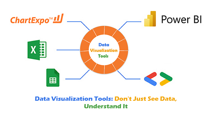
It transforms raw data into clear visual stories. This tool supports various chart types, accommodating diverse data analysis needs. Whether you need simple bar graphs or complex network diagrams, ChartExpo has you covered. The tool’s strength lies in its simplicity, making it accessible to users of all skill levels.
ChartExpo integrates seamlessly with popular platforms like Excel, Google Sheets, and Power BI. This integration facilitates a smooth workflow, as users can directly import data from these applications.
The ease of integration means there’s no need for complex setups or configurations, streamlining the data visualization process significantly.
Customization is a breeze with ChartExpo. Users can modify colors, fonts, and layouts to match their branding or presentation style. This flexibility ensures that each visualization reflects the unique identity of the user or their organization. Whether you prefer minimalistic designs or vibrant displays, ChartExpo allows for total creative control.
The following video will help you create data examination in Microsoft Excel.


Google Sheets excels in creating simple charts and graphs. Users can visualize data quickly. Select data, click “Insert,” and choose a chart. The process is straightforward and efficient. This simplicity helps users spot trends without complex tools.
Different chart options cater to varied data types. Radar, waterfall chart, and histogram are available. Each type serves a specific purpose, enhancing data understanding. For example, line charts are great for showing time series data. Users see how values change over time, making insights clear.
Additionally, customization options allow for tailored visuals. Users can adjust colors, labels, and axes. This flexibility ensures that each chart clearly communicates the intended message. It’s about making data not just visible, but meaningful.
Google Sheets supports real-time collaboration, a standout feature. Multiple users can edit a sheet simultaneously. Changes appear instantly, with each user’s cursor in a different color. This feature facilitates teamwork and faster decision-making.
Commenting and chat features further enhance collaboration. Team members can leave notes or discuss changes without leaving the sheet. This integrated communication streamlines workflows and keeps everyone on the same page. It’s like having a meeting right within the document.
Moreover, access controls ensure data security and management. Owners can set who can view, comment, or edit. This control is crucial for managing sensitive information. Teams can collaborate without compromising data integrity.
Google Sheets integrates seamlessly with various data sources. This capability is vital for effective data visualization. Users can import data from websites, CSV files, and even other spreadsheets. Integration is simple, usually involving just a few clicks.
For more advanced users, Google Sheets supports connections to SQL databases. This feature allows for pulling data directly from a database into a spreadsheet. It’s ideal for dynamic data needs. Users work with the most current data, providing up-to-date insights.
Additionally, Google Sheets can connect with other apps via APIs. This flexibility means that virtually any data source can feed into Sheets. Users can create rich, interactive reports. It’s about turning data from multiple sources into actionable insights.
Power BI dashboards display data vividly. Users see key metrics at a glance. Visuals are customizable to highlight important figures. These dashboards combine data from various sources seamlessly. This integration allows for a unified view of business metrics.
Real-time data feeds keep the dashboard current, enhancing decision-making. Each widget or tile in the dashboard can display a different data set. This flexibility helps users focus on specific business areas without hassle.
Power BI’s cloud service offers significant advantages. Users access dashboards from anywhere, on any device. This accessibility is crucial for remote teams and mobile workers. Real-time updates mean that all views reflect the most current data.
Decision-makers don’t wait for periodic reports. Instead, they see live data, allowing for quicker reactions to market changes. Cloud storage also means that data backups are automatic and secure. Users trust that their data is safe and always available.
Power BI handles complex datasets with advanced analytics capabilities. It supports large volumes of data without performance lag. Users apply machine learning models to predict trends and behaviors. These predictions help in making proactive business decisions.
The software also identifies patterns that might not be obvious at first glance. Such insights can be pivotal for strategic planning. Moreover, users customize data views to suit their analytical needs. This customization includes calculations, aggregations, and annotations to enrich reports.
Excel makes creating charts a breeze. Start with your data in a spreadsheet. Select the data you want to visualize. Next, choose the ‘Insert’ tab. Here, you’ll see options for different charts. Select a bar chart or a line graph. Excel will instantly generate the chart.
It’s that simple! Want to change the chart type? Just right-click on the chart and select ‘Change Chart Type.’ You can switch to any other format and see which one tells your story best.
Data isn’t always ready for a chart. First, you might need to clean it up. Excel has got you covered. Use features like ‘Remove Duplicates‘ to clean your dataset. Find this option under the ‘Data’ tab. It helps you delete repeated entries with ease.
Need to fill in missing values? The ‘Flash Fill’ function is magic. It automatically fills in missing data based on patterns it detects in your data. This is perfect for quickly prepping your data.
Think Excel is just basic charts? Think again! Add-ins and extensions take it to the next level. Check out the Excel store for tools that can add more power to your data analysis. For example, the Power Query add-in is a game-changer.
It lets you connect, combine, and refine data sources with ease. Then there’s Power Pivot. It helps you model vast amounts of data. Want visualizations that stand out? Explore add-ins that offer advanced chart types and customization options. These tools make your data not just visible, but insightful.
Tableau sets the standard for interactive dashboards. It makes data analysis exciting. You see your data come to life. The software turns numbers into visually appealing graphs and charts. This tool is perfect for businesses and individuals alike.
Dashboards in Tableau are not only beautiful but also intuitive. You can see patterns and insights with ease. This helps in making informed decisions quickly. Imagine having the power to predict trends at your fingertips.
Tableau goes beyond simple charts. It allows users to create complex visual stories. This capability makes it a favorite among data analysts. The interactive features ensure that every presentation becomes a compelling narrative.
Tableau’s drag-and-drop functionality is impressive. It revolutionizes how we work with data. You don’t need advanced programming skills. Simply pick a data feature, drag it, and drop it where you need it. It’s that easy!
This functionality makes Tableau accessible to everyone. Whether you’re a seasoned data scientist or a business owner, you can use it. It simplifies the process of data visualization. You spend less time figuring out how to use the tool and more time analyzing data.
The ease of use also speeds up the workflow. Tasks that used to take hours can now be completed in minutes. This efficiency is why many organizations prefer Tableau. It allows users to focus on insights, not on navigating complex software.
Tableau offers flexibility with its cross-platform support. You can access your data visualizations from anywhere. Whether on a desktop, in the cloud, or via a mobile device, Tableau has you covered. This flexibility is crucial in today’s mobile-first world.
For desktop users, Tableau provides a powerful platform for data analysis. It harnesses the full capabilities of modern computers. For teams and individuals who prefer working online, Tableau Online offers a cloud-based solution. You can collaborate and share insights without any hardware limitations.
Mobile users are not left out either. The Tableau Mobile app brings robust data visualization tools to your fingertips. This means you can make data-driven decisions on the go. Whether you’re in a meeting or out in the field, your data is always accessible.
Visual exploration in Tableau is not just about looking at pretty graphs. It’s about uncovering the truth hidden in your data. With Tableau, spotting trends and anomalies becomes an engaging activity. You can interact with your data in real-time.
Imagine being able to identify a sudden spike in sales with just a glance. Or noticing a drop in performance that was not immediately obvious. Tableau’s visual tools help you see these and act swiftly, giving you a competitive edge.
Moreover, this visual exploration can lead to new insights. It encourages curiosity and deeper analysis. You might find connections you never knew existed. This can lead to innovative solutions and strategies for your business or research.
QlikView’s associative data modeling is revolutionary. It allows users to make connections between data sets intuitively. This model does not limit users to pre-defined queries. Users can freely explore data, making new connections. This freedom uncovers hidden insights, enhancing business intelligence.
The associative model in QlikView lets users see how data is related. When a user selects one data point, all associated data instantly updates. This immediate response reveals patterns and trends that might not be obvious. It’s like having a bird’s-eye view of your data landscape. This view helps in making informed decisions quickly.
Associative data modeling eliminates the blind spots in data analysis. Users can spot all possible outcomes from their data sets. This comprehensive visibility ensures that no data is left in silos. It supports a holistic approach to data analysis. This approach is key to a deeper understanding of business operations.
QlikView scales impressively from small teams to large enterprises. It manages vast amounts of data efficiently. This capability makes it ideal for businesses of all sizes. As a business grows, QlikView grows with it. It adapts to increased data needs without losing performance.
For small teams, QlikView offers simplicity and speed. Teams can set up and start analyzing data quickly. There’s no need for extensive IT support. For large enterprises, QlikView supports complex data needs. It handles large data volumes across various departments smoothly. This flexibility is crucial for enterprise-level analytics.
QlikView’s scalability ensures that all users have a seamless experience. Whether it’s a few users or thousands, the performance remains consistent. This consistency is vital for businesses relying on timely data insights. It ensures that decision-making is based on the latest, most accurate data.
QlikView’s user-centric design prioritizes ease of use. Its intuitive interface allows users to interact with data without confusion. This design philosophy ensures that more users can benefit from data insights. It reduces the learning curve and allows quick adoption across teams.
The focus on user experience is evident in how data visualization is handled. Visuals are clear, engaging, and informative. They communicate data points effectively, making it easier for users to understand complex information. This clarity is crucial in promoting a data-driven culture.
QlikView’s design empowers users to perform their data analysis. They don’t need to rely heavily on IT teams. This independence speeds up the analysis process. It also encourages a proactive approach to data exploration. Users feel confident in their ability to interact with and analyze data.
Visualizing marketing data can significantly improve campaign strategies. A good visualization tool helps marketers see which campaigns perform best. It also identifies demographic trends and customer preferences.
These tools should be able to pull real-time data from various sources. This capability allows for immediate adjustments to maximize campaign effectiveness. They should also be user-friendly to enable marketers to create visual reports quickly.
Financial reporting demands high accuracy and the ability to handle large volumes of data. Visualization tools in finance help clarify complex information. They make trends and patterns in the data easy to understand.
A suitable tool for finance will offer detailed charts and graphs. These help in forecasting and analyzing financial health. The tool must ensure data security and compliance with financial regulations.
In operations management, the right visualization tool can transform workflows. It helps managers monitor production processes and identify bottlenecks. This leads to better decision-making and increased efficiency.
Tools for operations should support data from various sources. They need to provide real-time updates. This is crucial for managing daily operations smoothly.
Each of these sections engages with specific industry needs for data visualization tools. They highlight the importance of choosing a tool that aligns with industry-specific requirements. This alignment helps in harnessing the full potential of data for strategic decision-making.
Simplicity is your best friend in design. Start by reducing the number of widgets or elements. Each piece of your dashboard should earn its spot. If it doesn’t serve a direct purpose, it might be best to cut it.
Next, organize strategically. Group related information together. This setup guides your viewer’s eyes through the dashboard in a logical flow, making it easier to digest important data without feeling overwhelmed.
Lastly, use space wisely. White space isn’t wasted space; it’s a powerful tool that helps prevent visual overload. It makes your important data stand out, so don’t be afraid to let your dashboard breathe.
Choosing the right chart can make or break your dashboard’s effectiveness. Bar charts work great for comparing quantities, while line charts are perfect for showing changes over time. Know what insight you want to convey, and select the chart that best represents it.
Consider your audience. Not everyone is a data scientist, so pick charts that are easy to understand at a glance. Complex visuals may look impressive but can confuse the viewer if not used appropriately.
Lastly, color matters. Use color to highlight the most important parts of your data. But remember, more isn’t always better. A few well-chosen colors can guide viewers to the key insights without causing a visual overload.
Data storytelling is about weaving facts into narratives. Start with your main message. What do you want your audience to take away? Structure your data around this message to guide your audience through the story you’re telling.
Visuals are your allies here. They can highlight trends, compare figures, or point out anomalies. Use them to reinforce your story, not distract from it. Effective use of visuals can make complex information much more digestible.
Lastly, keep your audience engaged. Use clear, straightforward language. Break down your insights into manageable parts. This approach keeps your audience with you, step-by-step, through your data story.
Dynamic data shifts quickly. Real-time updates in data visualization tools keep you informed. You see changes as they happen. This feature allows businesses to make decisions with the most current data available. Imagine managing stock inventory or monitoring website traffic; real-time data is invaluable. In sectors like finance or health, where conditions evolve swiftly, staying updated can define success.
Drill-down features give you a closer look at your data. Start with a broad overview. Click further to see detailed layers of information. This function is crucial for deep analysis. It helps users spot trends and anomalies by reviewing data at various levels. For instance, in sales, you might view national data first. Next, drill down to regional and then store-level sales. It’s like having a data microscope.
Sharing capabilities transform individual analysis into a collaborative effort. Share dashboards and reports with ease. Team members in different locations can view and interact with the same data. This feature supports remote teams and ensures everyone is on the same page. It’s perfect for projects requiring collective input. Imagine simplifying complex projects by enabling seamless data-sharing.
Handling too much data feels like trying to fit an ocean into a bucket. Large datasets are tricky, right? Tools need to handle millions of rows without crashing or slowing down.
If they don’t, you’re stuck waiting—or worse, starting over. The fix? Use tools with smart aggregation techniques and filters. These help you zero in on what matters without drowning in details.
Pro tip: Look for tools offering summary views or automated clustering. It’s a lifesaver when time’s short.
Ever opened a new tool and thought, “Where do I even start?” Yeah, we’ve all been there. Some platforms feel more like a maze than a solution. And if the team struggles, adoption tanks. The answer? Pick tools with step-by-step tutorials or drag-and-drop functionality.
Better yet, make sure they have an active support community. A quick forum search often saves hours of trial and error.
Different platforms sometimes play together about as well as cats and dogs. Exporting data from one tool to another can break formatting—or worse, lose key details. That’s a headache you don’t need.
Solution? Focus on tools supporting universal file formats like CSV or JSON. Even better, find options with direct integrations to reduce the back-and-forth juggling.
Remember: Compatibility isn’t a luxury—it’s how you avoid wasting time on tech headaches.
Data complexity often dictates the type of visualization tool needed. If your data involves multiple variables or is highly relational, look for tools that provide advanced data analytics features. These tools should be able to handle complex data correlations and provide comprehensive visual outputs that are easy to interpret.
On the other hand, if your data is less complex, a simple tool with basic functionalities might be just what you need. These tools often offer user-friendly interfaces and quicker setup times. They allow you to create visualizations without overwhelming you with too many options.
It’s also wise to test the tools with your data before fully committing. Many tools offer trial periods where you can run your data sets and check the compatibility. This step ensures that the tool meets your data handling and visualization needs without any unexpected hiccups.
Budget is a major factor when choosing a data visualization tool. High-end tools often offer more features but at a higher cost. Assess whether these advanced features are necessary for your data visualization needs. It might turn out that a less expensive tool with fewer features suffices for your tasks.
Consider not only the initial cost but also long-term expenses such as updates, support, and additional services. Some tools might require a one-time purchase, while others operate on a subscription model. Calculate the total cost of ownership over the period you intend to use the tool.
Furthermore, don’t overlook the potential return on investment. A more expensive tool that significantly boosts your data analysis capabilities might be worth the extra cost if it leads to better decision-making.
Good support can make or break your experience with a data visualization tool. Check if the tool provides ample technical support, user manuals, and training resources. Tools with active user communities and forums are beneficial as they offer peer-to-peer assistance and knowledge sharing.
The availability of regular updates and bug fixes is another important consideration. Tools that are frequently updated tend to keep up with the latest trends in data visualization and security protocols.
Lastly, consider the learning curve associated with the tool. Tools with active communities and extensive learning resources can help new users get up to speed quickly and make the most out of the software. Engaging with community forums and support teams can also provide new ideas and methods for data analysis, enriching your overall experience.
Visualizing Key Performance Indicators (KPIs) simplifies tracking business health. Effective visualization leads to better understanding and action. Here’s how it works.
Charts and graphs transform numbers into visual stories. This makes it easier to follow KPI trends over time. Stakeholders grasp the narrative without drowning in data.
Dashboards organize multiple KPIs at once. They allow for quick comparisons and trend spotting. This setup helps focus on areas needing attention.
Scenario comparison tools aid in strategic planning. They allow teams to visualize outcomes before deciding. Here’s a closer look.
These tools simulate different business scenarios. This helps in understanding potential impacts and risks. Such foresight is vital for strategic decision-making.
They also provide side-by-side comparisons of possible outcomes. Decision-makers can weigh options with clarity. This leads to more strategic and informed choices.
Presenting complex data to stakeholders is challenging. Visualization tools make this data accessible. Here are effective strategies for clear presentations.
Use graphs to highlight key data points. This draws attention to the most important information. It helps stakeholders focus on what matters.
Simplify visuals to avoid overload. Use clear labels and avoid clutter. This makes the data easy to understand at a glance.
Incorporate storytelling techniques. Present data as part of a narrative. This approach keeps stakeholders engaged and makes the data relatable.
Data visualization tools simplify how you interpret data. They make raw numbers understandable by turning them into visuals like charts and graphs. Whether you’re tracking trends, analyzing performance, or presenting findings, these tools help you see what matters quickly and clearly.
Choosing the right tool depends on your goals. Tools like ChartExpo offer flexibility, while others, like Google Sheets or Power BI, suit specific needs. Understanding the strengths of each tool ensures you get the insights you need without wasting time.
Don’t let your data overwhelm you. With the right data visualization tools, you can turn complexity into clarity and make informed decisions confidently.
Your data has a story to tell—let it speak.
How much did you enjoy this article?


Ecommerce analytics often lead to mixed signals and costly misreads. Fix attribution gaps, align teams, and act on the right data. Get started now!
Is your sales funnel hiding costly gaps? Learn how pipeline stalls, false metrics, and handoff chaos could be draining revenue. Get started now!
Dot plots can sharpen decisions or distort them. How do you avoid common traps and misuse? Find out how to make yours count.