Categories
A pivot table in Power BI comes in handy when you’re dealing with a large volume of data. It’s used for viewing data from different perspectives.


The goal of this guide is to introduce the reader to Pivot Table and its principles. In this guide, you’ll discover how Pivot Tables work, and how to analyze your business data.
First…
A pivot table is a statistics tool that reorganizes and summarizes selected rows and columns of data in a database table or spreadsheet to generate the desired report. The database or spreadsheet is not changed, it merely turns or “pivots” the data so it can be viewed from multiple perspectives.
Pivot tables are of the essence when you’re handling large data volumes that will be difficult to calculate by hand. With large data volumes, pivot tables can help you perform data processing functions like sums, ranges, outliers, or averages. The information is arranged in the table in a meaningful layout that draws attention to the key values.
Pivot tables are used for summarizing, analyzing, exploring, and presenting data in a concise and flexible format. Here are some key uses:
Here are some reasons for the creation of a Power BI pivot table.
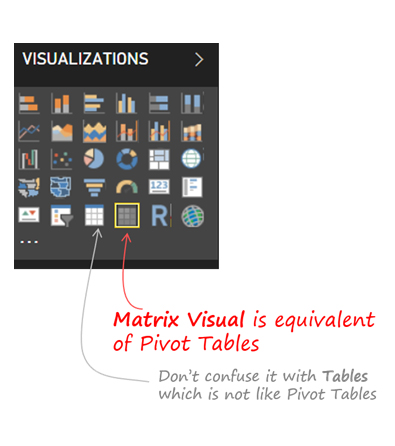
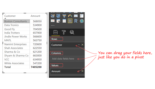
Pivot Table is found in Excel, but cannot be found in Power BI. However, “Matrix Visualization” is a great alternative to the Pivot Table in Excel. To create a Pivot, navigate to “Matrix Visual.”
After creating a Matrix, you’ll get options like Columns, Rows, and Values.
Here are key functionalities to help you get the most from your pivot tables in Power BI.
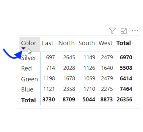
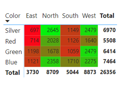
To sort the matrix visual (pivot table), use the subtotal column or row field. To do that, click the subtotal header or row header to sort the matrix.
A close look at the row header shows the up or down triangle that represents the column used for sorting. From the image below, the pivot table has been sorted using the “Color” row.
The Filter pane in Power BI can be used in applying general filters to the matrix visual. However, if you want a more interactive experience, you should add a slicer in Power BI. The slicer helps the user to filter the pivot based on other columns.
To add a slicer, navigate to the Visualization pane and choose the Slicer visual. Add the field you desire to use for slicing the data. In this illustration, a date-based slicer is added to filter the pivot table based on quarters.
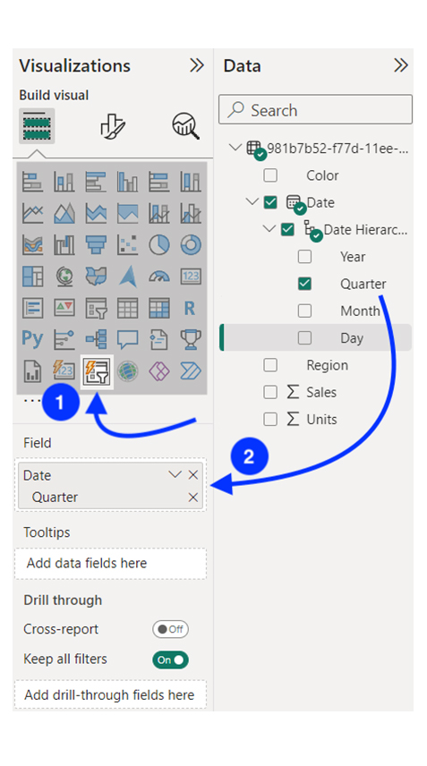
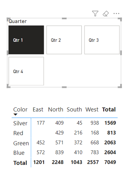
The slicer is used to slice or filter the matrix visual data. For instance, a slicer has been created using the “Quarter” value from the date column. Choosing a quarter (like Qtr 1) will filter the Power BI pivot table to showcase data within that quarter only.
To customize the layout of the slicer, navigate to the formatting pane of the Power BI.
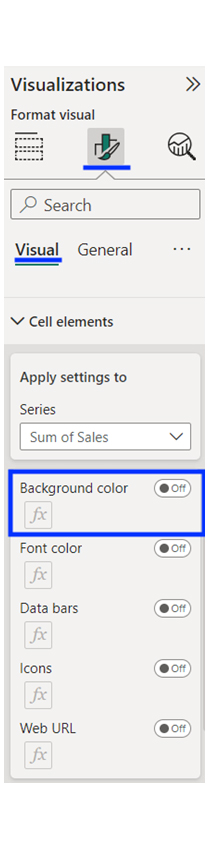
To apply for conditional formatting, select the matrix visual and navigate to the “Visualizations” pane. To see the conditional formatting Power BI options, you’ll have to expand the “Cell elements” section.
You have the option of changing the icons, data bars, font color, background color, and website URLs. For instance, if you want to apply conditional formatting to the background color, toggle the option, and click the “Fx” button.
The various format style options are:
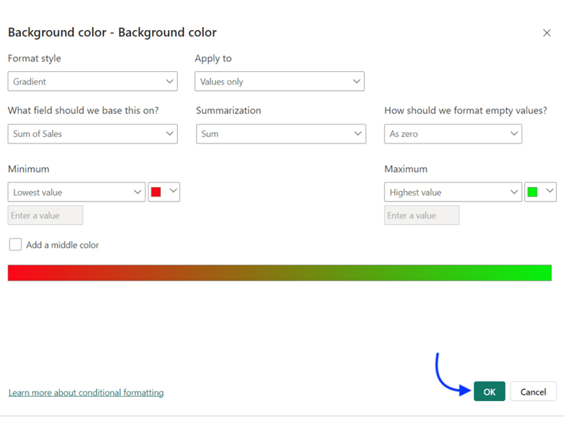
From the illustration below, you’ll notice that the gradient-based conditional formatting has been applied, and it is based on the sum of values. After completing the settings, click “OK” to apply the formatting.
The result will look like the image below:
You can also create a PivotChart-like visual in Power BI by applying the data bar’s conditional formatting.
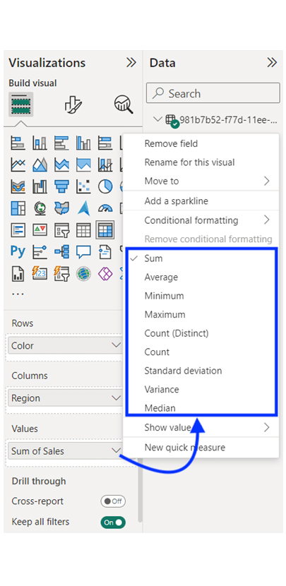
By default, the matrix visual adds all the values in the column. However, you can change the aggregation type depending on your analytical needs within the analytical report. For instance, changing the average values in certain cases is possible.
To do that, click the column name that’s found beneath the “Values,” and choose the aggregation type from the options below:
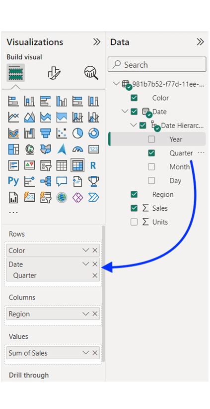
If you want to add another row (like Quarter) into the matrix visual, you’ll have to drag and drop the field into the “Rows” section.
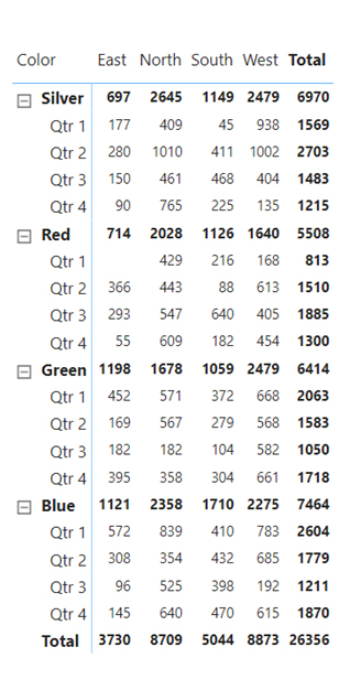
Click the + (plus) sign on the left. Alternatively, you can click on the double-headed arrow icon to expand the pivot table to all rows.
The image below shows how the Power BI pivot table with multiple rows expanded looks like:
Stage 1: Logging in to Power BI


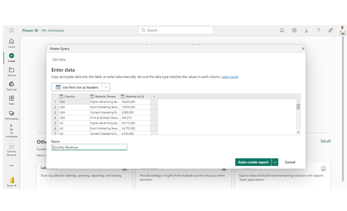
| Country | Revenue Stream | Revenue (in $) |
| USA | Digital Advertising Revenue | 39,620,000 |
| USA | Event Marketing Revenue | 10,670,000 |
| USA | Content Marketing Revenue | 5,580,000 |
| USA | Print & Outdoor Revenue | 455,270 |
| UK | Digital Advertising Revenue | 40,710,000 |
| UK | Event Marketing Revenue | 24,770,000 |
| UK | Content Marketing Revenue | 6,330,000 |
| UK | Print & Outdoor Revenue | 552,190 |
| DNK | Digital Advertising Revenue | 47,040,000 |
| DNK | Event Marketing Revenue | 29,070,000 |
| DNK | Content Marketing Revenue | 7,740,000 |
| DNK | Print & Outdoor Revenue | 600,690 |
| DNK | Media Relations Revenue | 106,430 |
| AUS | Digital Advertising Revenue | 53,790,000 |
| AUS | Event Marketing Revenue | 38,530,000 |
| AUS | Content Marketing Revenue | 6,590,000 |
| AUS | Print & Outdoor Revenue | 9,040,000 |
| AUS | Media Relations Revenue | 6,130,000 |
| FR | Digital Advertising Revenue | 57,860,000 |
| FR | Event Marketing Revenue | 50,450,000 |
| FR | Content Marketing Revenue | 3,560,000 |
| FR | Print & Outdoor Revenue | 18,790,000 |
| FR | Media Relations Revenue | 15,460,000 |
| IND | Digital Advertising Revenue | 60,470,000 |
| IND | Event Marketing Revenue | 63,200,000 |
| IND | Content Marketing Revenue | 2,080,000 |
| IND | Print & Outdoor Revenue | 29,500,000 |
| IND | Media Relations Revenue | 30,020,000 |
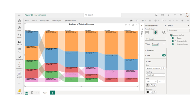
Here are three insights from the chart:
Learn about Pivot Tables in Power BI through this video, an essential tool for pivot reporting, data aggregation, and detailed analysis. Mastering Pivot Tables will enable you to create structured reports and uncover valuable insights from your data.
Yes, Power BI helps in the creation of pivot tables for data visualization and analysis.
Power BI offers more than the traditional pivot table. It offers advanced data modeling, sharing features, and visualization. It also provides a more dynamic and comprehensive analytical platform.
Yes, the “Matrix” visual is similar to the Pivot Table. It allows users to analyze and summarize data across columns, rows, and values.
The pivot table in Power BI is a data summarization tool that helps in analyzing and organizing data from spreadsheets or databases. It enables dynamic data visualization and analysis. This will, in turn, help stakeholders make informed decisions.
Pivot tables are used to identify trends and filter data. Cases like decreasing or increasing sales trends can be identified by merely analyzing data using the Pivot table. The pivot table is also used to filter out irrelevant data. For instance, it can be used to filter sales data to show transactions within a period.
By following the steps outlined in this guide, you’ll be able to create compelling visualization in Power BI. And in no time, become proficient in using Power BI.
Now you know what pivot table in Power BI is, what kind of data will you be analyzing with the tool?
How much did you enjoy this article?


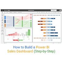
Learn how to create a Power BI sales dashboard to monitor revenue, sales KPIs, and trends with real-time interactive visuals and insights.
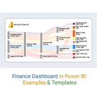
Learn how to create a Power BI finance dashboard and explore its key benefits for analyzing financial data, improving insights, and supporting better decisions.
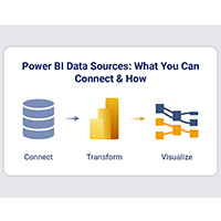
Power BI data sources connect reports to files, databases, and cloud services. Learn to configure, analyze, and optimize connections. Read on!