Categories
What are the Tableau alternatives, and why are so many businesses exploring them? Tableau is a powerhouse in data visualization, no doubt. However, companies are branching out as the demand for data-driven insights grows. They want tools that match their budgets, skill levels, and unique needs.
Take this: Tableau’s annual subscription can cost $70 per user per month. For smaller teams or startups, that adds up fast. In addition, beginners face a steep learning curve. Not everyone has the resources to invest heavily in training or premium pricing.


The options aren’t limited. Power BI, for instance, starts at $10 a month and integrates seamlessly with Microsoft tools. Then there’s Google Looker Studio, which is free and great for teams already using Google Workspace. These tools simplify workflows and help businesses get more done faster.
The global business intelligence software market hit $29 billion in 2023. It’s clear that companies value tools that turn raw data into actionable insights. However, with so many software similar to Tableau emerging, how do you choose? Flexibility, cost, and ease of use often top the list.
Imagine this: A marketing agency wants quick client reports without hours of setup. Or a small nonprofit needs insights without breaking its budget. Different use cases demand different solutions. The right alternative can save time, cut costs, and make data stories more compelling.
Exploring Tableau alternatives isn’t about ditching Tableau altogether. It’s about finding what works for your team and goals. Whether you’re prioritizing affordability, integrations, or simplicity, options abound.
So, which one will work best for you?
Let’s find out.
First…
Tableau is a powerful data visualization tool, but it’s not always the best fit for every business. Depending on your needs, you might find that another platform offers more flexibility, affordability, or ease of use.
Here are a few reasons why exploring a Tableau alternative could make sense for you:
When comparing Tableau competitors, it’s important to focus on features that match your business goals, technical needs, and budget. Here’s what to consider:
Choose a tool with an intuitive interface so your team can create dashboards and reports without advanced training.
Look for transparent pricing and flexible plans that grow with your business without high license fees.
Ensure the tool integrates easily with your existing databases, cloud platforms, and third-party apps.
A good Tableau competitor should handle large datasets smoothly without slowing down your analysis.
Check for sharing options, real-time collaboration, and permissions control to make teamwork easier.
The tool should let you build interactive visuals, customize dashboards, and present insights your way.
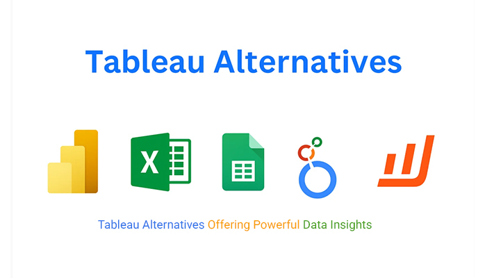
Power BI is one of the most popular Tableau alternatives. It connects easily to multiple data sources, offers strong AI-driven insights, and integrates well with other Microsoft tools. It’s more affordable than Tableau and great for organizations already using Microsoft products.
Excel remains a trusted choice for budgeting, reporting, and quick data analysis. With features like pivot tables, charts, and Power Query, you can build interactive dashboards at a low cost. It’s perfect for users who prefer simplicity and flexibility.
Google Sheets is a cloud-based, collaborative option for teams that need real-time data sharing. With add-ons like ChartExpo, it can create professional visuals while keeping your data accessible from anywhere.
Looker Studio lets you turn raw data into interactive dashboards and reports. It integrates smoothly with Google Analytics, Ads, and BigQuery, making it a great choice for digital marketers and analysts.
ChartExpo is a plug-in that works seamlessly with Excel and Google Sheets. It offers easy-to-use custom visuals like Sankey diagrams, funnel charts, and Pareto charts — no coding required. It’s ideal for marketers, analysts, and business users who want professional-quality visuals without complex setup.
Choosing the right Tableau alternative depends on your goals, team size, and technical needs. Here are a few key factors to consider before making a decision:
Evaluate your budget. Some tools, like Looker Studio and Google Sheets, are free, while others, like Power BI or ChartExpo, offer affordable pricing with advanced features.
Pick a platform that your team can learn quickly. If you have non-technical users, focus on tools with a simple, intuitive interface.
Decide what matters most — AI insights, big data support, or advanced visualization options. Choose a tool that aligns with your reporting goals.
Make sure the alternative connects easily with your existing data sources, CRMs, and cloud platforms.
Select a platform that ensures strong control over data access, quality, and compliance.
Data tells stories, but only if you can see them clearly. Google Sheets is great for organizing data, but its charts? Not so much. Basic visuals can’t handle complex insights.
That’s where ChartExpo shines. As the best Tableau alternative, it transforms Google Sheets into a powerhouse for data visualization. With over 80 chart types, it’s simple, fast, and highly effective.
Whether mapping trends or uncovering patterns, ChartExpo will help you visualize data like never before. It bridges the gap between raw numbers and actionable insights.
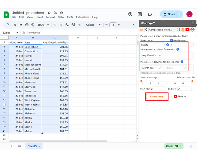
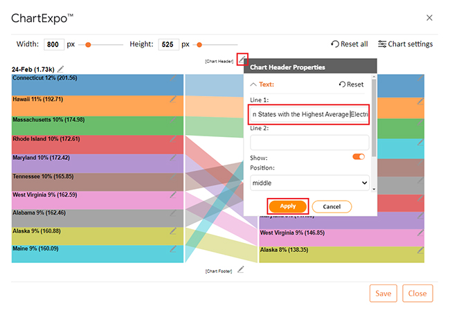
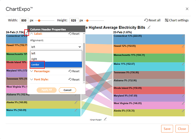
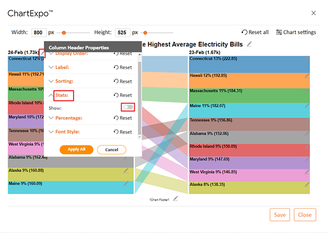
Let’s learn how to install ChartExpo in Google Sheets.
ChartExpo charts are available both in Google Sheets and Microsoft Excel. Please use the following CTAs to install the tool of your choice and create beautiful visualizations in a few clicks in your favorite tool.
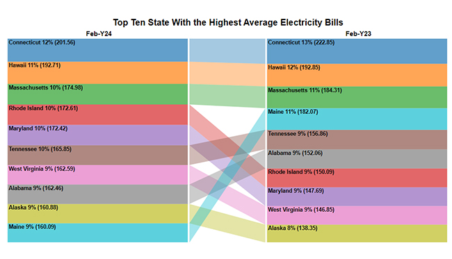
Let’s visualize the data below in Google Sheets using ChartExpo and glean valuable insights:
| Month-Year | State | Avg. Electricity Bill ($) |
| Feb-Y24 | Connecticut | 201.56 |
| Feb-Y23 | Connecticut | 222.85 |
| Feb-Y24 | Hawaii | 192.71 |
| Feb-Y23 | Hawaii | 192.85 |
| Feb-Y24 | Massachusetts | 174.98 |
| Feb-Y23 | Massachusetts | 184.31 |
| Feb-Y24 | Rhode Island | 172.61 |
| Feb-Y23 | Rhode Island | 150.09 |
| Feb-Y24 | Maryland | 172.42 |
| Feb-Y23 | Maryland | 147.69 |
| Feb-Y24 | Tennessee | 165.85 |
| Feb-Y23 | Tennessee | 156.86 |
| Feb-Y24 | West Virginia | 162.59 |
| Feb-Y23 | West Virginia | 146.85 |
| Feb-Y24 | Alabama | 162.46 |
| Feb-Y23 | Alabama | 152.06 |
| Feb-Y24 | Alaska | 160.88 |
| Feb-Y23 | Alaska | 138.35 |
| Feb-Y24 | Maine | 160.09 |
| Feb-Y23 | Maine | 182.07 |


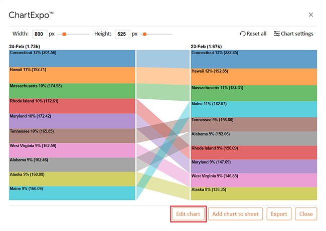
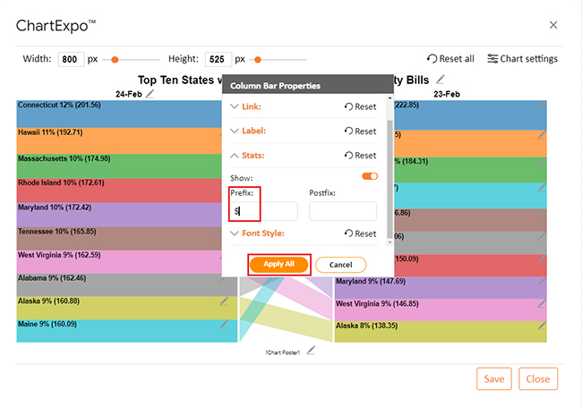
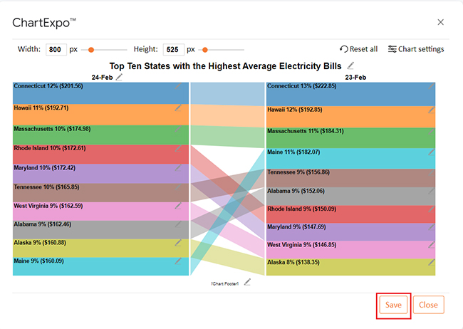
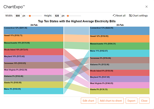
The data compares average electricity bills across states for February 2023 and February 2024.
Many programs similar to Tableau provide similar visualization features at a lower price, making them ideal for startups and small businesses.
Tools like Power BI, ChartExpo, and Google Sheets are more beginner-friendly, allowing users to create dashboards without deep technical knowledge.
Some applications similar to Tableau integrate more seamlessly with everyday tools like Excel, Google Workspace, or CRMs, making data management simpler.
Depending on the tool, some Tableau alternatives handle large data volumes more efficiently, improving speed and responsiveness.
Several competitors offer built-in collaboration features, making it easier for teams to share insights and work together in real time.
Know what insights you want to gain before creating visuals. A clear objective helps you choose the right chart type and metrics.
Avoid clutter. Use clean layouts and highlight only the most important KPIs to make reports easy to read and interpret.
Maintain a uniform color scheme and labeling style across visuals. This improves readability and helps users understand patterns faster.
Add filters, drill-downs, and hover effects to make dashboards more engaging and help users explore data on their own.
Ensure your data sources are accurate and up to date. Regular validation prevents reporting errors and builds trust in your insights.
Power BI is the best alternative to Tableau. It offers strong data visualization and analysis features and integrates well with Microsoft tools. Moreover, Power BI is cost-effective and user-friendly, ideal for businesses seeking powerful insights without Tableau’s price tag.
Google Looker Studio is similar to Tableau. It was formerly known as Google Data Studio. Looker Studio provides powerful data visualization and reporting tools. It integrates seamlessly with Google services, supports collaboration, and is a cost-effective alternative to Tableau.
Power BI is better for affordability and Microsoft integration, while Tableau excels in advanced visuals and handling large datasets. Moreover, Power BI suits small to medium businesses, while Tableau is ideal for complex analytics. The choice depends on budget and specific needs.
Tableau is a leader in data visualization, but it’s not the only option. Applications similar to Tableau offer diverse features to match different needs. From affordability to customization, there’s a tool for everyone.
Power BI is a strong choice. It integrates smoothly with Microsoft tools, and its user-friendly design appeals to beginners and experts. It is also budget-friendly.
Qlik Sense is great for deep insights. Its associative data engine reveals hidden connections, making it ideal for advanced analytics. It’s a favorite for data-driven organizations.
Google Data Studio works well for smaller teams. It’s free, easy to use, and integrates seamlessly with Google products. It’s perfect for marketers and web-focused projects.
Looker takes a unique approach. It focuses on business intelligence rather than visuals alone. Its cloud-based platform supports dynamic, collaborative workflows.
ChartExpo stands out for simplicity and creativity. It transforms Google Sheets with advanced charts – over 80 options make it perfect for clear, engaging visuals.
The best Tableau alternative depends on your needs. Budget, integration, and complexity all matter. Exploring these options helps you choose wisely; the right tool will turn data into actionable insights.
How much did you enjoy this article?


Calculate accounts receivable turnover ratio to measure credit collection speed, improve cash flow, and strengthen your financial strategy. Read on!

Change Management KPIs are the key to tracking adoption, performance, and ROI during transitions. Find out which metrics matter. Read on!

Data collection methods and techniques determine the quality of every insight you act on. Explore key approaches for gathering reliable data. Read on!


