Categories
By ChartExpo Content Team
Healthcare transformation is changing how people get care and how organizations make decisions. It’s not a trend. It’s a shift that affects clinics, hospitals, and health systems of all sizes.
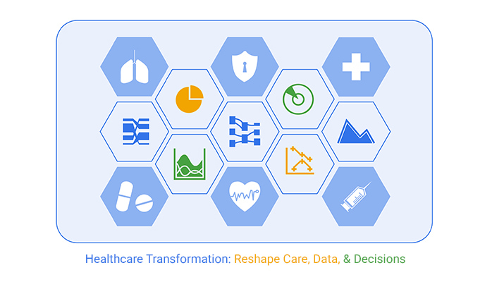


Healthcare transformation means making care faster, more accurate, and easier to access. It connects patient needs, real-time data, and action. It turns slow, manual decisions into fast ones backed by evidence. It also brings doctors and staff better tools to respond before a problem gets worse.
You don’t need massive budgets to take action. Healthcare transformation starts with clear data and ends with better results. Whether you’re running a small clinic or a large network, the question is simple: are you using your data to make care better—or just watching charts?
Healthcare transformation is the process of implementing significant changes across healthcare systems to increase the quality of care, efficiency, and patient satisfaction. It involves integrating cutting-edge technologies, such as electronic health records (EHRs), telemedicine, and artificial intelligence, to create a more dynamic health service.
Such transformations are designed to address existing challenges, like high costs and uneven quality, while preparing systems for future demands.
Focusing on healthcare transformation as merely a matter of enhancing reporting techniques or dashboard visuals misses the broader scope of what these changes aim to achieve. It’s not just about more data visualization but about utilizing these tools to make real-time decisions, predict health trends, and provide strategic insights that lead to better patient care and health outcomes.
This proactive approach transforms data into actionable intelligence, not just retrospective reports.
Healthcare transformation is vital for all sizes of health institutions, from small clinics to large integrated delivery networks. For small clinics, digital transformation can mean more efficient patient management and improved diagnostic tools.
For larger systems, it means the ability to manage vast amounts of data across different facilities and make unified decisions that improve patient care across the board. This scalability shows how transformation is indispensable, regardless of the healthcare provider’s size.
Imagine a doctor checking your vital signs during a routine visit. Descriptive analytics does something similar for healthcare systems. It provides a snapshot of past and current data to show what has happened or what is happening. Hospitals use this to monitor patient admission rates or surgery success rates over time.
Now, let’s say a doctor finds something unusual in your vitals. Diagnostic analytics is the next step. It digs into data to understand the cause of trends spotted by descriptive analytics. For example, if a hospital notices a spike in patient readmissions, diagnostic analytics can help trace these cases back to what went wrong initially.
Predictive analytics is like a weather forecast for healthcare, using historical data to predict future outcomes. This could mean predicting patient influx during flu season, helping hospitals prepare better.
Finally, think of prescriptive analytics as a medical prescription that not only predicts future health scenarios but also suggests actions to achieve desired outcomes. If predictive analytics forecasts a high number of patient admissions, prescriptive analytics might recommend scheduling more staff or opening new wards.
Descriptive and Diagnostic Analytics are great starting points for any healthcare organization. They require less sophisticated technology and can provide valuable insights with minimal investment.
Predictive Analytics is useful when you have consistent, high-quality data and the need to forecast future events. However, it’s not worth the effort if the data is unreliable or if the events you’re predicting have minimal impact on operations or care outcomes.
Prescriptive Analytics is the most advanced but also the most demanding. It’s best used in high-stakes environments where optimal outcomes are critical, such as in resource allocation during a pandemic. Avoid using prescriptive analytics for day-to-day decisions that don’t require complex analysis.
Think of healthcare analytics as a toolset that matches your mission. If your goal is simply to understand past performance, descriptive analytics is your go-to. When trying to understand the “why” behind the numbers, turn to diagnostic analytics.
For organizations aiming to look ahead, predictive analytics offers a crystal ball of sorts, forecasting what might happen next. And when you need to not only predict but also influence the future, prescriptive analytics provides both foresight and guidance.
The CARE model stands as a beacon in healthcare transformation, consisting of four vital pillars: Culture, Access, ROI, and Execution. This model addresses the entire ecosystem of healthcare, ensuring improvements and sustainability in service delivery.
Culture in healthcare sets the tone for service delivery and affects every interaction with patients. Promoting a culture of empathy, safety, and continuous learning leads to better patient outcomes and staff satisfaction. Transforming culture involves training, leadership commitment, and a shift in values to prioritize patient-centered care.
Access is about removing barriers to care. This includes not just geographic and financial access, but also informational and technological. Ensuring patients can easily obtain the care they need without undue hardship is crucial. Strategies to improve access may include telemedicine, enhanced insurance coverage, and community outreach programs.
ROI (Return on Investment) in healthcare is not just about financial gains. It includes patient health outcomes, efficiency of service delivery, and long-term sustainability. Measuring ROI involves assessing how investments in healthcare lead to better patient results and streamlined operations.
Execution is the actual implementation of strategies and ideas. This requires effective project management, clear communication, and ongoing evaluation. Execution in healthcare means turning plans into action and ensuring that these actions yield the desired outcomes.
The phased maturity journey in healthcare transformation is a strategic approach to ensure that data analytics efforts do not end up unused or ineffective. It involves starting with foundational practices, assessing capabilities, and gradually building more advanced analytics applications. This step-by-step approach helps organizations to align their analytics strategies with practical, achievable goals.
Ownership of the CARE Model should ideally lie with the leadership team, but its implementation involves all levels of an organization. For effective implementation, clear roles and responsibilities must be defined. Training, regular assessments, and feedback loops help in refining the processes and ensuring that the model aligns with the organization’s goals.
A radar chart can illustrate the maturity levels of an organization across the key capabilities defined in the CARE Model. Each axis represents one of the pillars (Culture, Access, ROI, Execution), with further subdivisions for specific functions or metrics.
Radar chart helps organizations identify areas of strength and those needing improvement, guiding strategic focus and resources allocation.
Ever felt lost in a sea of numbers? Healthcare professionals often face this when they confront dashboards packed with data. The key isn’t just to present data but to transform it into clear, actionable insights.
How can we do this? By simplifying data presentation and directly connecting it to actionable health outcomes. For instance, instead of complex figures, a simple color-coded alert system could indicate patient risk levels, guiding immediate clinical actions.
Integrating data into the clinical decision-making process as it happens—this is where the magic lies. Data should not just be a retrospective glance but a real-time guide. Imagine a scenario where doctors receive real-time data insights as they diagnose and treat patients. This could radically shift outcomes, making treatment more tailored and timely.
Consider a regional hospital that implemented real-time analytics to track patient flow and treatment outcomes. Initially, clinicians hesitated to rely on this new system. However, as they observed real-time data aiding in quicker, more accurate decisions, their trust grew. This shift not only improved patient outcomes but also enhanced staff satisfaction and efficiency.
Visuals speak louder than words. A dot plot chart can vividly compare the outcomes before and after the adoption of clinical analytics. Each dot represents an outcome metric, such as patient recovery times, with clear before and after markers.
Dot plot visual representation can starkly highlight the positive impact of integrating real-time analytics into healthcare processes.
It’s not sorcery—it’s statistics. Predictive analytics uses historical data to foresee sepsis, stroke, and cancer risks. These models identify subtle patterns that hint at future health threats, allowing medical professionals to intervene sooner.
This timely intervention can mean the difference between a manageable condition and a medical emergency.
Risk scores are more than numbers; they’re a tool for saving lives. By converting data into real-time alerts, clinicians receive immediate notifications about patients at risk. This system ensures that the right professional can take swift action, potentially averting a health crisis. It’s about transforming data into a lifeline.
A Pareto chart reveals the most significant predictors of health conditions. For sepsis, factors like infection sites and patient age might dominate. For stroke, it could be blood pressure and prior medical history. Understanding these variables helps focus preventive measures, making them more effective and targeted.
This visual tool is key in distilling complex data into actionable insights.
Managing an OR is no small feat, especially when juggling wait times, throughput, and overlapping procedures. These elements can create a scheduling nightmare that affects not only patient satisfaction but also the stress levels of staff. However, with strategic tweaks grounded in data, hospitals can turn this chaos into harmony.
Shortening wait times starts with understanding the root causes, which might include delayed patient transfers or slow turnovers. By tracking these factors, hospitals can pinpoint improvement areas.
Overlapping procedures need careful handling to avoid conflicts. Scheduling software equipped with real-time updates and alerts can help staff anticipate and resolve overlaps before they disrupt the workflow.
Machine learning isn’t just a buzzword—it’s a transformative tool for OR scheduling. By modeling different block scheduling scenarios, machine learning algorithms can anticipate the outcomes of various scheduling configurations. This foresight allows hospitals to optimize their schedules for the best possible patient outcomes and staff utilization.
For example, machine learning can analyze historical data to identify the most efficient sequence and duration of scheduled surgeries. It then creates a variety of models to simulate potential changes and their impacts. This approach not only improves current scheduling practices but also adapts to new challenges, keeping the OR running smoothly.
Consider a real-life example where a health system harnessed the power of analytics and reduced its surgical delays. By implementing a targeted analytics solution, the system could identify specific factors leading to delays, such as equipment availability or staffing inefficiencies.
Armed with this information, the hospital adjusted its processes, such as enhancing staff training on equipment use and optimizing surgical team schedules. The result? A significant reduction in delays, leading to improved patient care and staff satisfaction.
Visualizing patient flow from the OR to recovery can be effectively achieved using a Sankey diagram. This type of chart illustrates the movement of patients through different stages of care, highlighting where delays occur and where resources are most heavily used. By analyzing this flow, hospitals can identify critical points that need attention, which might include understaffed recovery areas or bottlenecks in patient transfers.
With a clear visual representation, staff can better understand the patient journey and implement more effective strategies to optimize every step from the OR to recovery. This not only enhances patient outcomes but also boosts the overall efficiency of hospital operations.
Vanity metrics look good on reports but don’t improve patient outcomes. For example, tracking the number of scheduled appointments does not necessarily translate to effective treatments or patient satisfaction.
These metrics can mislead healthcare providers into thinking they are performing well when critical areas needing attention might be overlooked. It’s essential to distinguish between metrics that offer a superficial sense of achievement and those that provide actionable insights into improving clinical practices.
Designing effective KPIs (Key Performance Indicators) involves focusing on outcomes that matter. Start by identifying what improvements would make a real difference to patient health and experience. These might include reduced readmission rates or improved patient-reported outcome measures.
Ensure these KPIs are equitable, offering a clear picture across different population groups to avoid widening disparities in healthcare quality. Effective KPIs should prompt specific actions that lead to measurable improvements in patient care and health equity.
Small clinics often face resource limitations, making it vital to use data effectively. By focusing on prescriptive analytics, these clinics can pinpoint which interventions are most likely to improve patient outcomes.
For instance, if data reveals high diabetes complications, a clinic might prioritize personalized patient education on lifestyle management. Prescriptive insights allow clinics to allocate their limited resources more effectively, ensuring they do the most good for their patient community.
Visualizing data can reveal a lot about the effectiveness of clinical KPIs. A stacked area chart showing the percentage of KPIs that lead to action can help healthcare providers see which metrics are functional and which are not.
This visualization can drive home the point that not all KPIs are equally useful in prompting clinical improvements. Charts like these can be powerful tools in reevaluating which metrics we prioritize in healthcare settings.
To move from ad hoc decisions to systemwide intelligence, healthcare leaders must first understand their current decision-making processes. Often, decisions are made based on immediate data without considering the bigger picture. This approach can lead to inconsistent and inefficient outcomes.
Introducing systemwide decision intelligence involves setting up integrated data systems that provide insights across various departments. Such systems help in recognizing patterns and predicting needs before they become critical issues. Training staff to interpret and use this data effectively is just as important as the data itself.
Regular reviews and adjustments to these systems ensure they remain relevant and effective. Healthcare leaders should encourage a culture where data-driven decisions are valued and rewarded. This shift not only improves patient outcomes but also enhances operational efficiency across the board.
It’s a common misconception that the right tools will solve all problems in healthcare transformation. However, most systems stall due to a lack of clear vision and resistance to change, not because of inadequate tools. Leaders may invest in state-of-the-art technology but overlook the importance of getting their team on board with new changes.
To overcome these stalls, clear communication of the benefits and impacts of new systems is essential. Leaders should be champions of change, inspiring and motivating their team to embrace new processes. Training and continuous support also play crucial roles in ensuring the adoption of new systems.
Addressing cultural resistance involves recognizing and rewarding early adopters and change leaders within the organization. By focusing on people and processes as much as on tools, healthcare systems can overcome stalls and move towards effective transformation.
For healthcare Chief Operating Officers (COOs), aligning talent, processes, and governance is pivotal. This alignment ensures that the organization’s operational activities are efficient and effective. First, understanding the strengths and gaps in the current team is crucial. This understanding allows for targeted training and hiring to fill the gaps.
Next, refining processes to ensure they are as efficient as possible is vital. This might mean reevaluating patient flow, administrative tasks, or communication channels. Efficient processes reduce waste and improve patient and staff satisfaction.
Lastly, robust governance structures are necessary to maintain accountability and standardize operations across the organization. These structures should be clear and enforceable, with regular audits to ensure compliance. By aligning these three elements, COOs can drive their organizations toward streamlined operations and improved care outcomes.
Visualizing data through a slope chart can provide insightful perspectives on the time spent on analysis versus action during different phases of healthcare transformation. In the initial phases, analysis might dominate as teams work to understand the current landscape and identify areas for improvement. However, as the transformation progresses, the focus should shift towards action.
This shift is crucial for maintaining momentum in healthcare transformation. Spending too much time on analysis can lead to paralysis by analysis, where decisions are delayed, and opportunities are missed. Conversely, jumping too quickly to action without sufficient analysis can lead to missteps and wasted resources.
Governance in healthcare transcends mere policy documentation and committee meetings. It embodies the broader commitment to uphold data integrity and patient privacy. Effective governance involves setting actionable standards and real-time compliance monitoring, ensuring that policies translate into practice.
It also demands engagement from all healthcare sectors. From frontline healthcare workers to top management, everyone plays a vital role. Their collective responsibility is to adhere to governance frameworks, thus safeguarding data and patient interests.
Moreover, governance should evolve with technological advances. As new data forms and tech emerge, governance structures must adapt swiftly. This adaptability ensures that governance measures remain relevant and robust, providing a safe, compliant healthcare environment.
Shadow analytics occur when departments bypass central IT systems, creating data silos. This practice can lead to inconsistent data pools, eroding trust among healthcare stakeholders. When data isn’t centralized, discrepancies arise, making it difficult to gain a unified view of patient information.
Centralizing data management can counter these challenges. It ensures data consistency and accuracy, which, in turn, rebuilds trust. However, centralization brings its own set of challenges, like potential bottlenecks and decreased departmental autonomy.
Balancing central oversight with departmental flexibility is key. Healthcare organizations must design systems that maintain data integrity and accessibility while allowing departments some control. This balanced approach can mitigate trust erosion and enhance organizational efficiency.
As a Chief Nursing Officer, I spearheaded the shift to a centralized data ownership model to streamline operations. We centralized patient records to ensure all caregiving teams had timely and consistent data access. This move significantly improved our care coordination and patient outcomes.
Implementing this model involved extensive training and adjustments. Staff had to adapt to new protocols and systems, which initially met some resistance. However, clear communication and demonstrating the benefits gradually won their buy-in.
The centralized model also facilitated better compliance with healthcare regulations. With a unified system, adhering to privacy laws and guidelines became much easier, enhancing our overall compliance posture.
The Matrix Chart visually represents data access and trust levels across different roles and departments in a healthcare organization. It categorizes staff roles like Doctors, Nurses, Administrative Staff, etc., and departments like Cardiology, Orthopedics, etc.
Each cell in the chart indicates the level of data access granted to a role in a department. It also reflects trust levels, offering insights into potential data governance improvements. This chart is a pivotal tool for administrators to quickly assess and optimize data flow and trustworthiness within their organization.
Healthcare teams often face a dashboard overload. They struggle to make informed decisions quickly. Simplifying these tools can lead to more focused decision-making, especially when working with healthcare dashboard examples that highlight only the most relevant metrics. Imagine having just the essential dashboards that directly impact patient care and operational efficiency. This clear, focused approach can transform chaotic data streams into actionable i
Rationalizing your BI tools doesn’t mean losing vital functionalities. Start by assessing the unique needs of your healthcare setting. Which tools do you use daily? Which ones serve similar purposes? By consolidating overlapping tools and keeping only those that add unique value, you maintain functionality while reducing clutter.
A Mekko chart provides a vivid illustration of tool redundancy and its financial impact across departments. This visual can highlight how similar tools overlap in different departments. Seeing where costs can be cut without sacrificing service quality is essential.
With this insight, healthcare administrators can make informed decisions about which tools to keep and which to retire, optimizing both costs and care.
Quantifying the value of analytics in healthcare isn’t just smart; it’s essential. Start by linking analytics to specific healthcare outcomes. For instance, if an analytics tool helps reduce the duration of hospital stays by predicting patient complications earlier, you can measure the savings in bed days and operational costs.
Additionally, consider patient satisfaction scores. If analytics improve these scores through better patient engagement and care, you’ve got a direct line to quantifying your investment’s impact. Remember, it’s all about connecting the dots between the data you analyze and the outcomes you improve.
In the shift towards value-based care, aligning outcomes with payer expectations is crucial. This means tracking everything from patient health improvements to cost reductions. For example, if a healthcare provider agrees to a contract based on reducing diabetic complications, they need to track metrics like emergency visits or hospital admissions for these patients.
By showing a decrease in these incidents thanks to proactive care, providers prove their value to payers, ensuring better alignment and potentially more favorable contract terms in the future.
Visualizing data can be just as telling as the data itself. Picture a waterfall chart that tracks the initial investment in healthcare transformation against the cascade of savings over time, broken down by teams or departments.
This visual helps stakeholders see not just the total savings but also how each segment contributes to financial health. Such clarity not only proves the value of the investment but also encourages continued support from all corners of the organization.
Imagine finance speaking in dollars, operations in timelines, and clinical care in health outcomes. This scenario often leads to confusion and missed opportunities for synergy. Bridging this gap requires a common language of Key Performance Indicators (KPIs) that resonate across all departments.
Regular cross-departmental meetings can help create a shared understanding and appreciation of each other’s metrics, fostering a more collaborative environment.
Creating unified KPIs starts with a clear strategic vision. Each department’s goals should directly support this overarching plan. For instance, if the strategic goal is to improve patient satisfaction, finance could track investment in patient care technologies, operations could monitor wait times, and clinical care might measure patient feedback scores.
These aligned KPIs ensure that while the methods may differ, the end goal is shared and clear to all stakeholders.
Consider a multihospital network that aligned its KPIs to reduce readmission rates. They introduced a shared KPI where finance allocated budgets for post-discharge follow-up programs, operations set up swift scheduling systems, and clinical staff engaged in thorough patient education on self-care.
This cooperative approach led to a significant drop in readmissions, showcasing the power of unified KPIs in action.
A Tornado Chart can vividly display the potential risks of KPI fragmentation versus the benefits of strategic alignment. On one side, the chart shows the risk of misaligned objectives leading to inefficiencies and wasted resources.
On the other, it illustrates how closely aligned KPIs mitigate risks and drive towards common strategic goals, enhancing overall organizational health and success. This visual tool is a compelling way to present the case for KPI alignment to stakeholders across the network.
When hospitals view analytics solely as an IT project, they miss the mark. This approach confines analytics to a technical sphere, ignoring its clinical potential. It’s vital to integrate analytics across all departments, not just IT.
This broader vision encourages collaborative decision-making and enhances patient care outcomes. Remember, analytics should be a shared tool, not just a technical gadget.
Dashboards provide data, but they don’t make decisions for you. Relying solely on dashboards can lead to a passive approach to decision-making. It’s essential to train staff to interpret this data effectively.
They need to turn these insights into actionable strategies that improve patient care. A dashboard is just the beginning; the real work lies in the analysis and application of its data.
Without a clear leader, healthcare projects often flounder. A designated owner ensures accountability and drives the project forward. This role is crucial in navigating challenges and celebrating milestones. Without this leadership, projects can stall or veer off course, wasting valuable resources and time.
If healthcare staff can’t understand the data, they can’t use it effectively. Investing in is crucial. This training helps staff make sense of data and apply it in their daily responsibilities. A well-trained team can achieve remarkable improvements in patient care through informed decisions.
Value in healthcare analytics doesn’t just appear; it must be demonstrated and communicated. It’s crucial to set clear goals and measure outcomes against them. This approach ensures that everyone understands the benefits and can articulate them clearly. Without this clarity, the perceived value of transformation efforts may be underestimated or overlooked.
Healthcare transformation is about action, not access. Data isn’t helpful until it drives change.
Start with the basics. Use clear metrics. Share outcomes that matter. Drop vanity metrics. Keep what drives care forward.
Build tools your team trusts. Train people to use them. Make decisions in real time—not after the fact.
Don’t chase tech. Fix the process. Set goals. Show impact.
Align your staff, systems, and scorecards. One plan. One direction. One purpose.
If your data isn’t helping patients, it’s in the way.
How much did you enjoy this article?


Calculate accounts receivable turnover ratio to measure credit collection speed, improve cash flow, and strengthen your financial strategy. Read on!

Change Management KPIs are the key to tracking adoption, performance, and ROI during transitions. Find out which metrics matter. Read on!

Data collection methods and techniques determine the quality of every insight you act on. Explore key approaches for gathering reliable data. Read on!


