• Home
  • Tools dropdown img
    • Spreadsheet Charts

      • ChartExpo for Google Sheets
      • ChartExpo for Microsoft Excel
    • Power BI Charts

      • Power BI Custom Visuals by ChartExpo
    • Word Cloud

  • Charts dropdown img
    • Chart Category

      • Bar Charts
      • Circle Graphs
      • Column Charts
      • Combo Charts
      • Comparison Charts
      • Line Graphs
      • PPC Charts
      • Sentiment Analysis Charts
      • Survey Charts
    • Chart Type

      • Box and Whisker Plot
      • Clustered Bar Chart
      • Clustered Column Chart
      • Comparison Bar Chart
      • Control Chart
      • CSAT Survey Bar Chart
      • CSAT Survey Chart
      • Dot Plot Chart
      • Double Bar Graph
      • Funnel Chart
      • Gauge Chart
      • Likert Scale Chart
      • Matrix Chart
      • Multi Axis Line Chart
      • Overlapping Bar Chart
      • Pareto Chart
      • Radar Chart
      • Radial Bar Chart
      • Sankey Diagram
      • Scatter Plot Chart
      • Slope Chart
      • Sunburst Chart
      • Tornado Chart
      • Waterfall Chart
      • Word Cloud
    • Google Sheets
      Microsoft Excel
  • Services
  • Pricing
  • Contact us
  • Blog
  • Support dropdown img
      • Gallery
      • Videos
      • Contact us
      • FAQs
      • Resources
    • Please feel free to contact us

      atsupport@chartexpo.com

Categories
All Data Visualizations Data Analytics Surveys
Add-ons/
  • Google Sheets
  • Microsoft Excel
  • Power BI
All Data Visualizations Data Analytics Surveys
Add-ons
  • Google Sheets
  • Microsoft Excel
  • Power BI

We use cookies

This website uses cookies to provide better user experience and user's session management.
By continuing visiting this website you consent the use of these cookies.

Ok

ChartExpo Survey


Home > Blog > Data Analytics

Booking Dashboard: Charts for Booking Insights

Juggling a dozen spreadsheets just to find how many rooms were booked last Tuesday is common. It’s exhausting. A Booking Dashboard solves that headache by pulling all reservation and scheduling data into one clean view.

Booking Dashboard

Whether you’re running a hotel, clinic, or service business, this single-screen solution delivers real-time visibility into booking trends. That means faster decisions, sharper forecasting, smoother operations, and happier customers—no more digging through separate systems.

Table of Contents:

  1. What is a Booking Dashboard?
  2. Why Using a Booking Dashboard is Essential?
  3. Key Components of a Booking System Dashboard
  4. How to Create a Booking Dashboard in Power BI?
  5. How to Analyze a Booking Dashboard Template in Power BI?
  6. Benefits of Using a Reservation Dashboard
  7. Common Metrics Tracked in a Booking Dashboard
  8. Best Practices for Designing a Booking Admin Dashboard
  9. FAQs
  10. Wrap Up

What is a Booking Dashboard?

Definition: A booking dashboard is a visual interface that tracks reservations, cancellations, revenue, availability, and customer behavior. It pulls data from booking systems and displays it through charts, tables, and KPIs for quick analysis. Think of it as a data dashboard built specifically for reservation workflows.

Unlike generic reporting tools, it’s purpose-built for reservation analysis by date, channel, or service type. When integrated with a business dashboard, booking metrics align directly with broader performance goals. This connection keeps everyone on the same page.

Booking Dashboard

Why Using a Booking Dashboard is Essential?

Managing bookings across disconnected systems? That’s a recipe for mistakes. A booking dashboard centralizes everything so decisions happen faster and with better context.

Here’s why organizations rely on a booking system dashboard:

  • Clear visibility into booking trends and seasonal demand patterns.
  • Quicker response to cancellations and low occupancy periods.
  • Stronger coordination through a connected operations dashboard.
  • Better financial alignment using a finance dashboard in Power BI.

Booking insights also support demand generation when paired with a marketing dashboard that includes reservation-based metrics.

Key Components of a Booking System Dashboard

A well-designed reservation dashboard brings availability, revenue, and customer data into a single actionable interface. Here’s what a strong setup typically includes.

Core Components Include:

  • Calendar and Availability Management: Real-time schedules prevent double bookings and ensure accurate resource allocation across the board.
  • Booking and Inventory Management: Centralized controls handle reservations, cancellations, and staff schedules. Integration with an inventory dashboard improves capacity planning significantly.
  • Reporting and Analytics: Metrics like booking volume, cancellations, utilization, revenue per booking, and channel performance provide actionable insights at a glance.
  • Integration and Automation: When connected to a digital dashboard, data updates automatically for improved accuracy and faster responsiveness.

How to Create a Booking Dashboard in Power BI?

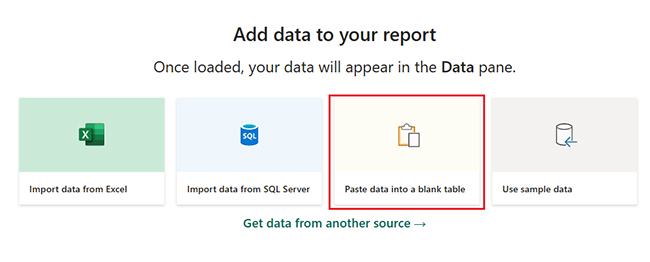
Learning how to create a dashboard in Power BI for booking analysis takes some preparation, but the payoff is worth it. Here’s a practical approach.

Step-By-Step Approach:

  • Connect Data Sources: Import booking data from reservation systems, CRMs, or databases.
  • Clean and Transform Data: Use Power Query to handle missing values, duplicates, or inconsistent formats.
  • Define Key Metrics: Identify KPIs such as booking conversion rate, cancellation rate, and revenue trends.
  • Design Visuals: Apply best practices from Power BI dashboards design to ensure clarity and ease of use.
  • Publish and Share: Make the dashboard accessible to stakeholders with role-based views.

Power BI also integrates with other analytical views, like a social media dashboard, to show how online engagement influences booking behavior.

How to Analyze a Booking Dashboard Template in Power BI?

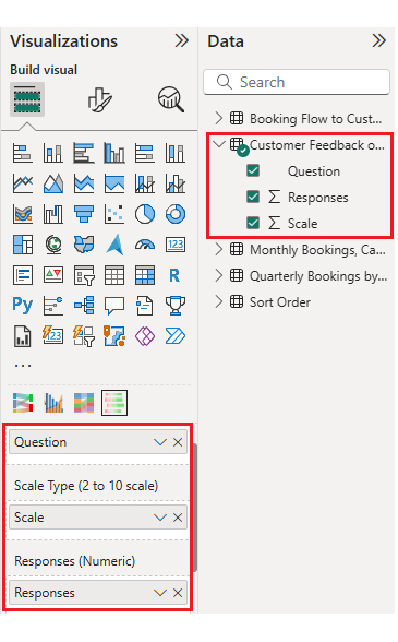
Analyzing a booking dashboard template in Power BI goes beyond staring at charts. It means understanding booking flows, customer behavior, and performance gaps. ChartExpo enhances Power BI by offering specialized visuals that simplify complex booking datasets.

Why Use ChartExpo for Booking Analysis?

  • Converts booking data into clear, interactive visuals.
  • Improves storytelling for teams using a booking admin dashboard.
  • Makes trend comparison and channel analysis easier to execute.
  • Offers a 7-day free trial and costs $10/month.

Example:

First, install Power BI.

  • Log in to Power BI.
  • Enter your email. Click the “Submit” button.
Booking Dashboard
  • You’ll be redirected to your Microsoft account.
  • Enter your password and click “Sign in”.
Booking Dashboard
  • Choose whether to stay signed in.


Booking Dashboard
  • Once done, the Power BI home screen will open.

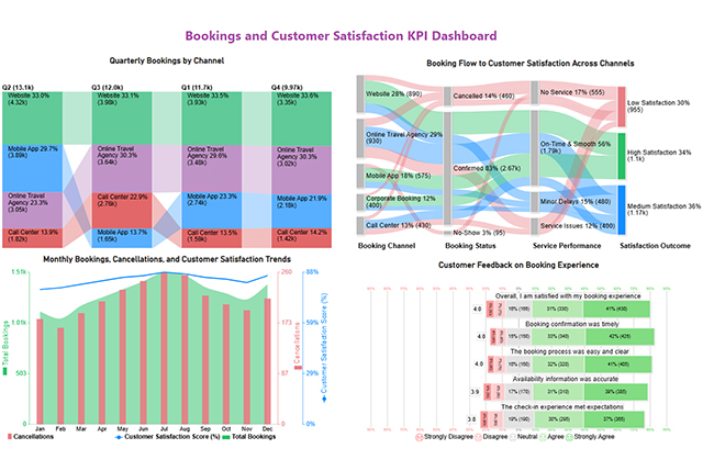
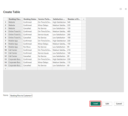
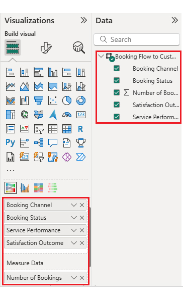
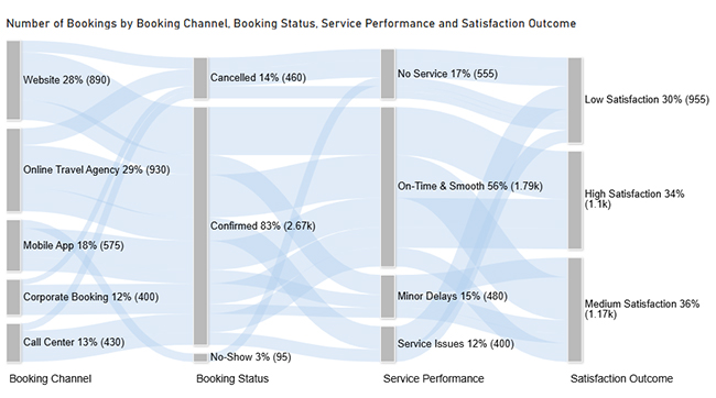
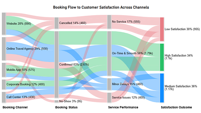
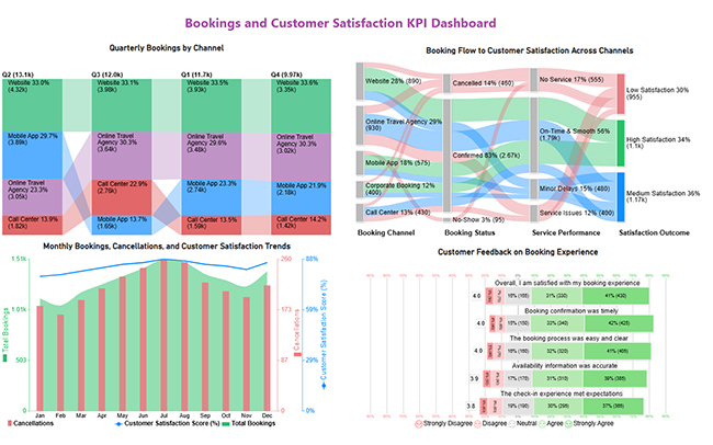
Now, consider this sample data for a Sankey Chart.

Booking Channel Booking Status Service Performance Satisfaction Outcome Number of Bookings
Website Confirmed On-Time & Smooth High Satisfaction 540
Website Confirmed Minor Delays Medium Satisfaction 220
Website Cancelled No Service Low Satisfaction 130
Online Travel Agency Confirmed On-Time & Smooth Medium Satisfaction 480
Online Travel Agency Confirmed Service Issues Low Satisfaction 260
Online Travel Agency Cancelled No Service Low Satisfaction 190
Mobile App Confirmed On-Time & Smooth High Satisfaction 330
Mobile App Confirmed Minor Delays Medium Satisfaction 150
Mobile App No-Show No Service Low Satisfaction 95
Call Center Confirmed On-Time & Smooth Medium Satisfaction 210
Call Center Confirmed Service Issues Low Satisfaction 140
Call Center Cancelled No Service Low Satisfaction 80
Corporate Booking Confirmed On-Time & Smooth High Satisfaction 230
Corporate Booking Confirmed Minor Delays Medium Satisfaction 110
Corporate Booking Cancelled No Service Low Satisfaction 60
  • First, you need to add data to your report. Click on “Paste data into a blank report”.
Booking Dashboard
  • Paste the data into a blank table, name it, and click Load.
Booking Dashboard
  • To build a Sankey Chart, import the visual from AppSource by opening the Visualizations panel in Power BI.
  • Select “Get more Visuals”.
Booking Dashboard
  • Search ChartExpo and select the Sankey Diagram. It’s also recommended to add the Multi Axis Line Chart, Comparison Bar Chart, and Likert Chart to support different insights.
Booking Dashboard
  • Click on the “ADD” button.
Booking Dashboard
  • Once you’ve added all four charts to your visuals, you’ll see the chart icons in your visuals list.
Booking Dashboard
  • To add the Sankey Chart visual, click on the chart icon and choose the dimension and measures.
Booking Dashboard
  • In Visualization properties, click on License Settings and add the key. This removes the watermark from your Sankey Chart.
Booking Dashboard
  • After applying the key, the watermark disappears from the chart.
Booking Dashboard
  • Now, enhance the chart’s appearance and modify the title to better align with your data.
Booking Dashboard
  • You can set bar colors from “Visual”.
Booking Dashboard
  • The final look of the Sankey Chart is shown below.
Booking Dashboard

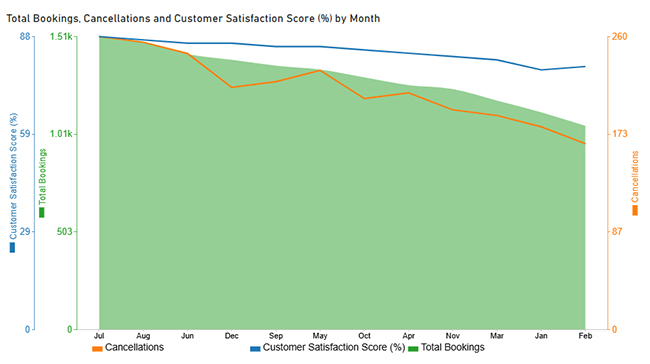
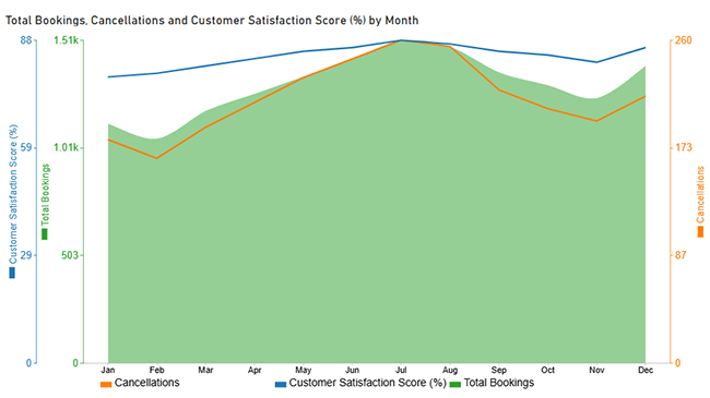
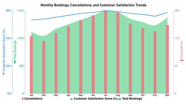
Now let’s discuss the second chart. Consider this sample data for a Multi Axis Line Chart.

Month Total Bookings Cancellations Customer Satisfaction Score (%)
Jan 1,120 180 78
Feb 1,050 165 79
Mar 1,180 190 81
Apr 1,260 210 83
May 1,340 230 85
Jun 1,420 245 86
Jul 1,510 260 88
Aug 1,480 255 87
Sep 1,360 220 85
Oct 1,300 205 84
Nov 1,240 195 82
Dec 1,390 215 86
  • Once data is manually pasted in Power BI or exported from Excel, choose the dimension and measures.
Booking Dashboard
  • Before creating the chart, enter the key to remove the watermark. Once applied, the chart appears without the watermark.
Booking Dashboard
  • If months on the x-axis aren’t in the correct order, create a new table to sort the data from Jan to Dec.
  • Enter data manually, name it, and click on the “Load” button.
Booking Dashboard
  • A new table named Sort Order will be created and linked to the main data table.
Booking Dashboard
  • Open “Table View”, select the “Sort Order” table, select the “Month Column”, and set the sorting order column.
Booking Dashboard
  • Choose sort by order.
Booking Dashboard
  • With the custom sorting set, use the Month column from the Sort Order table instead of the original table’s Month column.
Booking Dashboard
  • The chart will now display with the custom sorting applied to the X-axis.
Booking Dashboard
  • First, change the title of the chart, just like the first chart. Then change the data representation.
Booking Dashboard
  • Next, change legend properties to set the shape type.
Booking Dashboard
  • You can add postfix signs as well.
Booking Dashboard
  • The final look of the Multi Axis Line Chart is shown below.
Booking Dashboard

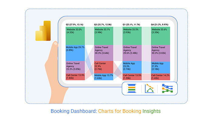
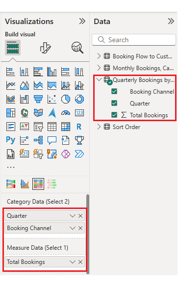
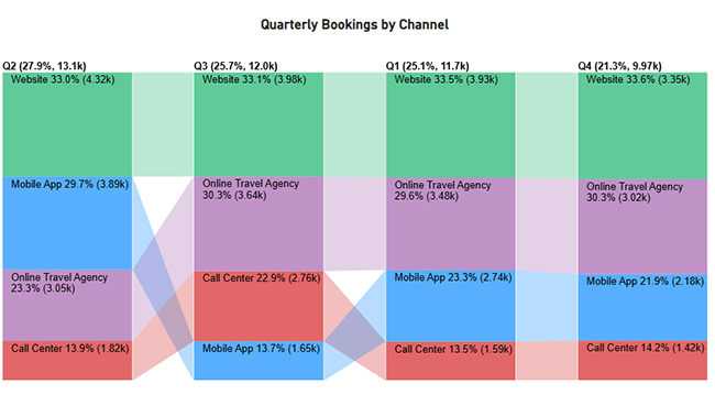
Now let’s discuss the third chart. Consider this sample data for a Comparison Bar Chart.

Quarter Booking Channel Total Bookings
Q1 Website 3,930
Q1 Online Travel Agency 3,480
Q1 Mobile App 2,740
Q1 Call Center 1,590
Q2 Website 4,320
Q2 Online Travel Agency 3,050
Q2 Mobile App 3,890
Q2 Call Center 1,820
Q3 Website 3,980
Q3 Online Travel Agency 3,640
Q3 Mobile App 1,650
Q3 Call Center 2,760
Q4 Website 3,350
Q4 Online Travel Agency 3,020
Q4 Mobile App 2,180
Q4 Call Center 1,420
  • Once data is manually pasted in Power BI or exported from Excel, choose the dimension and measures.
Booking Dashboard
  • Before creating the chart, enter the key to remove the watermark, then update the chart title and change the bar color.
Booking Dashboard
  • The final look of the Comparison Bar Chart is shown below.
Booking Dashboard

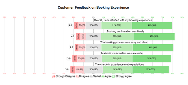
Now let’s discuss the fourth chart. Consider this sample data for a Likert Chart.

Question Scale Responses
The booking process was easy and clear 1 45
The booking process was easy and clear 2 70
The booking process was easy and clear 3 160
The booking process was easy and clear 4 320
The booking process was easy and clear 5 405
Booking confirmation was timely 1 40
Booking confirmation was timely 2 65
Booking confirmation was timely 3 150
Booking confirmation was timely 4 340
Booking confirmation was timely 5 425
Availability information was accurate 1 55
Availability information was accurate 2 80
Availability information was accurate 3 170
Availability information was accurate 4 310
Availability information was accurate 5 385
The check-in experience met expectations 1 60
The check-in experience met expectations 2 90
The check-in experience met expectations 3 190
The check-in experience met expectations 4 295
The check-in experience met expectations 5 365
Overall, I am satisfied with my booking experience 1 50
Overall, I am satisfied with my booking experience 2 75
Overall, I am satisfied with my booking experience 3 165
Overall, I am satisfied with my booking experience 4 330
Overall, I am satisfied with my booking experience 5 430
  • Once data is manually pasted in Power BI or exported from Excel, choose the dimension and measures.
Booking Dashboard
  • Enter the key to remove the watermark, then update the title and adjust rating colors. Change legend text from “Legend Options” as well.
Booking Dashboard
  • The final look of the Likert Scale Chart is shown below.
Booking Dashboard
  • Arrange the charts efficiently and add interactivity to create a clear, engaging dashboard. After placement, the dashboard should appear as shown below.
Booking Dashboard

Key Insights

  • In the Sankey Chart, confirmed bookings with smooth service lead to high satisfaction, while cancellations and service issues drive low satisfaction.
  • In the Comparison Bar Chart, website and online travel agency channels generate the most bookings, with steady mobile app growth.
  • In the Multi Axis Line Chart, bookings and satisfaction peak mid-year despite higher cancellations.
  • In the Likert Scale Chart, most customers report a positive and smooth booking experience.

Benefits of Using a Reservation Dashboard

A reservation dashboard improves booking operations by providing real-time visibility into demand, capacity, and performance metrics.

Key benefits include:

  • Reduced overbooking and underutilization issues.
  • Increased efficiency through automated processes.
  • Improved forecasting using historical trend data.
  • Better cross-team coordination and communication.
  • Enhanced customer satisfaction across touchpoints.

A reservation dashboard can also integrate with a customer experience dashboard to measure how booking interactions influence loyalty and retention.

Common Metrics Tracked in a Booking Dashboard

An effective booking dashboard focuses on metrics that reflect revenue performance, operational efficiency, and customer behavior patterns.

Commonly Tracked Metrics:

  • Number of confirmed bookings.
  • Average booking value.
  • Revenue by channel or service.
  • Cancellation and no-show rates.
  • Availability and utilization rates.
  • Repeat bookings and satisfaction trends.

Best Practices for Designing a Booking Admin Dashboard

Designing a booking admin dashboard requires balancing simplicity with functionality. Get it wrong, and nobody uses it.

Best Practices Include:

  • Prioritize high-impact KPIs at the top for faster decisions.
  • Use consistent color schemes and labels to improve clarity.
  • Group related metrics to match admin workflows.
  • Avoid clutter by showing only essential information.
  • Test usability with real users to ensure efficient daily use.

FAQs

How does a booking dashboard improve booking management?

A booking dashboard centralizes reservation data, reduces manual errors, and enables faster responses to demand and revenue changes. It’s the difference between reacting and proactively managing your business.

What tools are used to create a booking dashboard?

Power BI, ChartExpo, and data connectors are commonly used to build interactive dashboards. These tools handle data integration and visualization without requiring advanced coding skills.

Can a booking dashboard be customized for different business needs?

Yes, dashboards can be customized by industry, user role, and operational goals. A hotel’s needs differ from a clinic’s, and a good booking dashboard template adapts to those differences.

Wrap Up

A booking dashboard provides clear visibility into reservations, performance, and customer behavior, enabling data-driven decision-making across the organization.

By tracking key metrics and booking flows, businesses can improve operational efficiency, forecasting accuracy, and customer satisfaction. With Power BI and tools like ChartExpo, businesses can turn booking data into clear, actionable insights that optimize operations and performance.

How much did you enjoy this article?

ExcelAd1
Start Free Trial!
158980

Related articles

next previous
Data Analytics11 min read

Growth Metrics: Growth Insights Made Visual

Growth metrics measure performance and growth. This blog shows key KPIs and tools to help you track progress and make smarter decisions.

Data Analytics11 min read

Renovation Budgeting: A Visual Approach

Learn how to use renovation budgeting to plan and track your home project. This guide shows tips, tools, and visuals to control costs and avoid overspending.

Data Analytics8 min read

What is ROI in Business: ROI Insights Made Simple

Understand ROI in Business, how to calculate it, analyze returns, and use real examples to make smarter, data-driven investment decisions.

Data Analytics9 min read

Healthcare Datasets: Step-by-Step Guide for Insights

Learn what datasets for healthcare are, why they matter, real-world examples, and how to analyze medical data effectively with Power BI and advanced visuals.

Data Analytics7 min read

Customer Retention Metrics: Key KPIs Explained Visually

Customer Retention Metrics help track churn, loyalty, engagement, and revenue trends so teams can spot risks early and improve long-term customer value.

ChartExpo logo

Turn Data into Visual
Stories

CHARTEXPO

  • Home
  • Gallery
  • Videos
  • Services
  • Pricing
  • Contact us
  • FAQs
  • Privacy policy
  • Terms of Service
  • Sitemap

TOOLS

  • ChartExpo for Google Sheets
  • ChartExpo for Microsoft Excel
  • Power BI Custom Visuals by ChartExpo
  • Word Cloud

CATEGORIES

  • Bar Charts
  • Circle Graphs
  • Column Charts
  • Combo Charts
  • Comparison Charts
  • Line Graphs
  • PPC Charts
  • Sentiment Analysis Charts
  • Survey Charts

TOP CHARTS

  • Sankey Diagram
  • Likert Scale Chart
  • Comparison Bar Chart
  • Pareto Chart
  • Funnel Chart
  • Gauge Chart
  • Radar Chart
  • Radial Bar Chart
  • Sunburst Chart
  • see more
  • Scatter Plot Chart
  • CSAT Survey Bar Chart
  • CSAT Survey Chart
  • Dot Plot Chart
  • Double Bar Graph
  • Matrix Chart
  • Multi Axis Line Chart
  • Overlapping Bar Chart
  • Control Chart
  • Slope Chart
  • Clustered Bar Chart
  • Clustered Column Chart
  • Box and Whisker Plot
  • Tornado Chart
  • Waterfall Chart
  • Word Cloud
  • see less

RESOURCES

  • Blog
  • Resources
  • YouTube
SIGN UP FOR UPDATES

We wouldn't dream of spamming you or selling your info.

© 2026 ChartExpo, all rights reserved.