Categories
Operation dashboards offer real-time insights into key performance metrics. It enhances decision-making, operational effectiveness, and efficiency across multiple business functions.


This guide explores what an operations dashboard is, why you should use it, and some operational dashboard examples. It also exposes key performance indicators for operations and shows you how to create a dashboard in Power BI.
Some sections show the best-designed dashboards, some executive dashboard examples, data dashboard examples, and sales dashboard examples.
Aside from the operation dashboard, this guide will introduce you to the recruitment dashboards, web analytics dashboards, and store performance dashboards.
Definition: An Operations Dashboard is a real-time visualization tool that provides key performance indicators (KPIs) and critical data insights to manage and monitor business operations efficiently.
Operational Excellence Dashboards provide instant insights into key performance indicators (KPIs), enabling teams to identify inefficiencies, track progress, and take immediate corrective actions. This real-time visibility ascertains that operations run smoothly and that potential issues are addressed before they escalate.
By integrating data from various sources, these dashboards empower leaders with actionable insights. Decision-makers can identify bottlenecks, analyze trends, and implement data-driven strategies to enhance productivity and lower costs.
With real-time tracking and reporting features, an Operational Excellence Dashboard boosts accountability among teams and employees. It helps organizations set clear performance benchmarks and ensures that everyone is aligned with strategic goals.
A well-designed dashboard highlights inefficiencies and offers visibility into workflow disruptions. Businesses can allocate resources effectively, optimize processes, and improve overall operational performance. This leads to higher productivity and cost savings, especially when integrated into a Power BI sales dashboard, where operational insights directly support better sales planning, performance tracking, and revenue growth decisions.
Operations dashboards display critical KPIs like production output, order fulfillment, customer satisfaction, downtime, efficiency rates, and other performance metrics relevant to your business. These KPIs help businesses measure success and figure out areas for improvement.
Dashboards support real-time decision-making by pulling live data from multiple sources like CRM software, databases, IoT devices, and ERP systems. This way, users will have up-to-date information on operations.
Most dashboards give room for customization based on user roles. For instance, executives may focus on strategic KPIs. Operational managers, on the other hand, may need detailed process-level insights. Access controls ascertain data security and relevance for multiple teams.
The dashboard incorporates graphs, charts, tables, and progress indicators to present complex data in a visually appealing and easy-to-understand format. Common visualization tools are:
Automated notifications and alerts are integrated into dashboards to notify users of equipment failures, performance anomalies, urgent tasks, or missed targets. This proactive approach eliminates operational disruptions.
This section shows you all you need to know about the dashboard user interface design. It also explores the difference between the Power BI dashboard vs report.
Here are the stages involved in the creation of the Power BI operations dashboard.
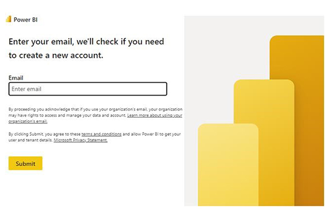
Stage 1: Log in to Power BI, enter your email, and click the “Submit” button.
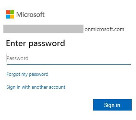
You’ll be redirected to a Microsoft account. Enter your password, and click “Sign in.”
You can opt to stay signed in.
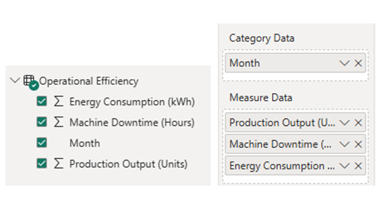
Stage 2: Create a Data Set and Select the Data Set to Use in the Multi-Axis Line Chart.
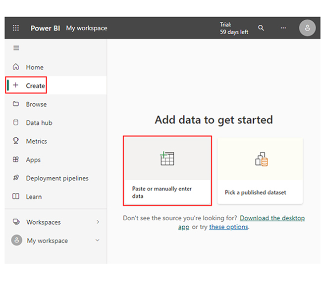
Navigate to the left-side menu, and click on the “Create” option. At this point, select “Paste or manually enter data.”
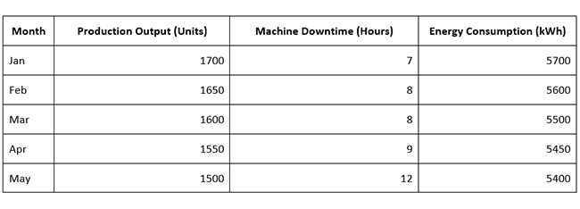
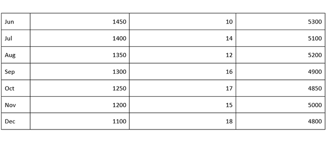
The following data will be used for this illustration.
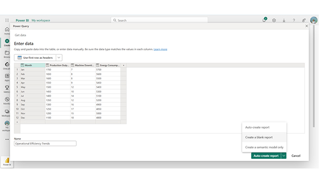
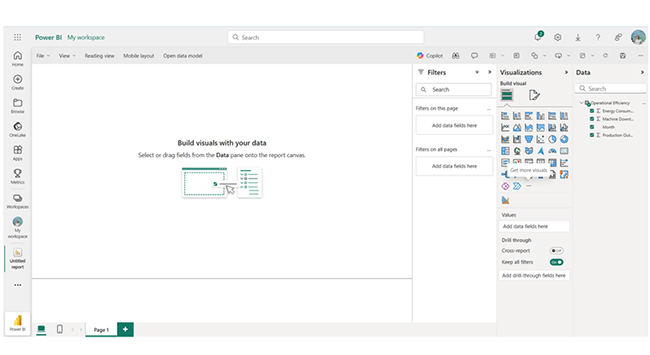
Paste the data table above into the “Power Query” window. After that, select the “Create a blank report” option.
A Report Canvas, similar to the one below, will appear on your screen.
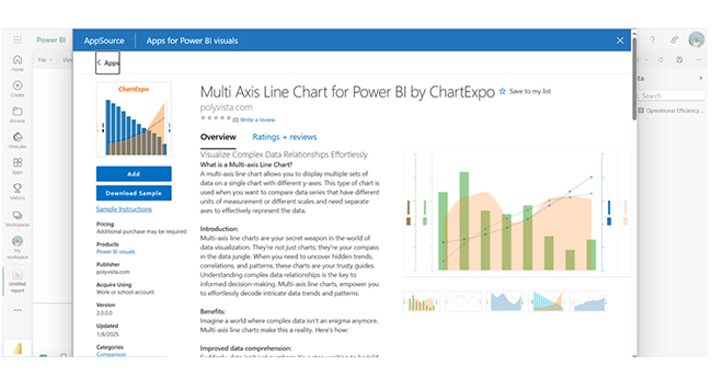
Stage 3: Adding the Power BI Multi Axis Line Chart Extension by ChartExpo.
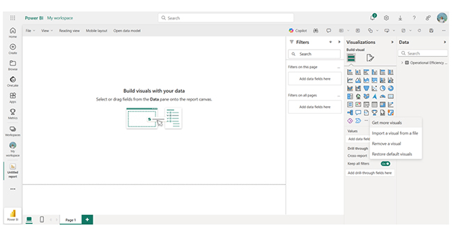
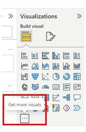
You’ll have to use an add-in or Power BI visual from AppSource. You also have to navigate to the right side of the Power BI dashboard and open the Power BI Visualizations panel.
Click the ellipsis symbol (…) to import the Multi-Axis Line Chart extension by ChartExpo.
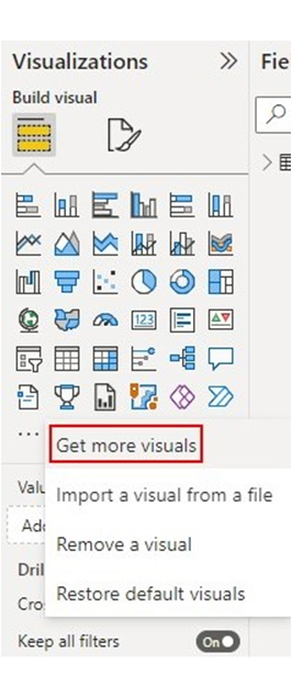
In the following menu that opens, select the “Get more visuals” option.
Enter “Multi-Axis Line Chart for Power BI by ChartExpo” in the highlighted search box. You’ll see the “Multi-Axis Line Chart for Power BI by ChartExpo” as shown below.
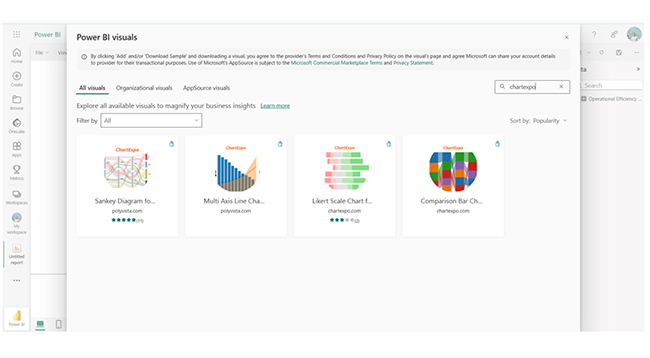
Click the highlighted “Add” button.
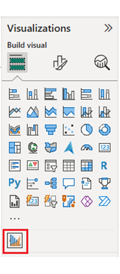
Power BI will add the “Multi-Axis Line Chart for Power BI by ChartExpo” icon in the visualization panel.
Stage 4: Drawing a Multi-Axis Line Chart with ChartExpo’s Power BI extension
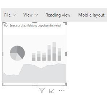
Select the “Multi-Axis Line Chart for Power BI by ChartExpo” icon in the visualization panel.
The following window opens in the report section of the dashboard.
There’s the option to resize the visual. To do that, navigate to the right side of the Power BI dashboard. You’ll see “Fields” next to “Visualizations.”
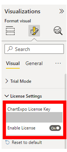
You’ll have to provide your email address or a ChartExpo license.
Stage 5: Activate the ChartExpo Trial or Apply a Subscription Key
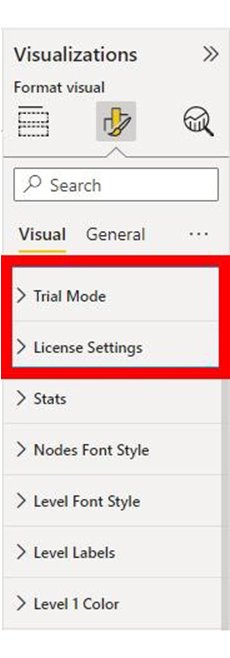
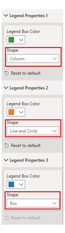
Select the ChartExpo visual. You’ll see three icons below “Build Visual” in the Visualizations panel. Select the middle icon, “Format visual,” and the visual properties will populate as shown below.
As a new user, you can begin by providing your email address in the textbox under the “Trial Mode” section. ChartExpo will send the License key to the email upon subscribing to the add-in. Toggle “Enable Trial” to activate the 7-day trial.
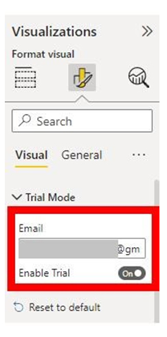
The Multi-Axis Line Chart created under the 7-day trial comes with the ChartExpo watermark. If you have a license key, enter it in the “ChartExpo License Key” textbox in the “License Settings” section. Slide the toggle switch next to “Enable License” to “On.”
The Multi-Axis line Chart you create will come without a watermark.
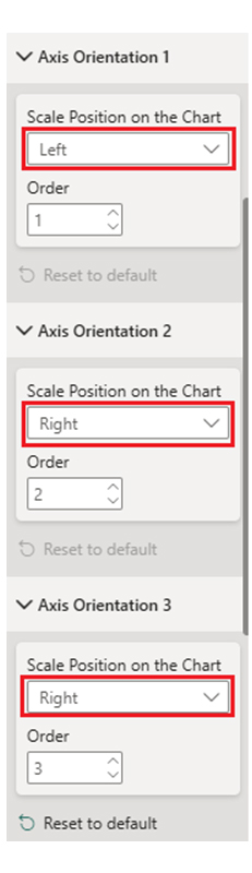
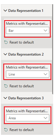
Here are ways to edit all changes in the chart.
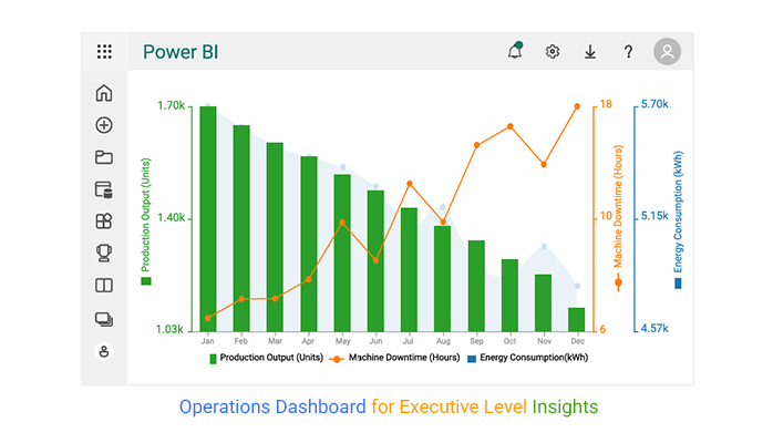
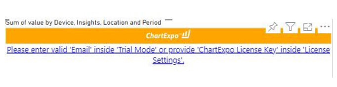
Here’s the final Multi Axis Line Chart in Power BI using ChartExpo:
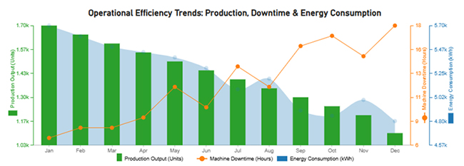
Production output declines steadily from 1,700 to 1.100 units, while machine downtime rises from 7 to 18 hours. Energy consumption decreases, and that indicates efficiency loss. Increased downtime likely impacts productivity, and that necessitates maintenance improvements to stabilize output and energy usage.
Choose a template that aligns with your business needs. Ensure it includes relevant visualization tools and KPIs that relate to your business operations.
To modify the template, you can add (or remove) charts, widgets, and tables based on your specific requirements. You can also adjust color schemes, layouts, and labels to enhance readability and usability.
Connect your dashboard to data sources like IoT devices, CRM, ERM, or Excel files to enable real-time updates. This ascertains accurate tracking of operational performance.
Configure alerts for critical metrics, and define performance benchmarks to receive notifications when targets are met or missed.
There is the option to grant access to relevant stakeholders and teams. Regularly review the dashboard to identify inefficiencies, analyze trends, and implement improvements.
Strategic dashboards focus on long-term goals, high-level KPIs for executives, and trends. Operational dashboards, on the other hand, provide real-time insights into daily processes that enable managers to monitor performance and make immediate decisions.
To create an operational dashboard, you have to define key KPIs, gather real-time data, use visualization tools (like graphs or charts), set alerts, customize layouts, integrate data sources, and ensure accessibility for relevant stakeholders.
An Operations Dashboard provides real-time insights into business performance, which enhances decision-making. Businesses use operational excellence dashboards to improve efficiency, reduce waste, and drive continuous improvement. That can be accomplished by tracking key metrics and optimizing processes.
The operations dashboard enables you to make data-driven decisions and monitor real-time performance. By integrating data from various sources, these dashboards enable decision-makers to analyze trends, identify bottlenecks, and implement data-backed strategies to improve overall productivity and reduce costs.
Operational Excellence Dashboards provide instant insights into key performance indicators (KPIs) that allow teams to detect inefficiencies, track progress, and take immediate corrective actions.
Now you know what an operational dashboard is, what will you include when creating one for your business?
How much did you enjoy this article?


Calculate accounts receivable turnover ratio to measure credit collection speed, improve cash flow, and strengthen your financial strategy. Read on!

Change Management KPIs are the key to tracking adoption, performance, and ROI during transitions. Find out which metrics matter. Read on!

Data collection methods and techniques determine the quality of every insight you act on. Explore key approaches for gathering reliable data. Read on!


