• Home
  • Tools dropdown img
    • Spreadsheet Charts

      • ChartExpo for Google Sheets
      • ChartExpo for Microsoft Excel
    • Power BI Charts

      • Power BI Custom Visuals by ChartExpo
    • Word Cloud

  • Charts dropdown img
    • Chart Category

      • Bar Charts
      • Circle Graphs
      • Column Charts
      • Combo Charts
      • Comparison Charts
      • Line Graphs
      • PPC Charts
      • Sentiment Analysis Charts
      • Survey Charts
    • Chart Type

      • Box and Whisker Plot
      • Clustered Bar Chart
      • Clustered Column Chart
      • Comparison Bar Chart
      • Control Chart
      • CSAT Survey Bar Chart
      • CSAT Survey Chart
      • Dot Plot Chart
      • Double Bar Graph
      • Funnel Chart
      • Gauge Chart
      • Likert Scale Chart
      • Matrix Chart
      • Multi Axis Line Chart
      • Overlapping Bar Chart
      • Pareto Chart
      • Radar Chart
      • Radial Bar Chart
      • Sankey Diagram
      • Scatter Plot Chart
      • Slope Chart
      • Sunburst Chart
      • Tornado Chart
      • Waterfall Chart
      • Word Cloud
    • Google Sheets
      Microsoft Excel
  • Services
  • Pricing
  • Contact us
  • Blog
  • Support dropdown img
      • Gallery
      • Videos
      • Contact us
      • FAQs
      • Resources
    • Please feel free to contact us

      atsupport@chartexpo.com

Categories
All Data Visualizations Data Analytics Surveys
Add-ons/
  • Google Sheets
  • Microsoft Excel
  • Power BI
All Data Visualizations Data Analytics Surveys
Add-ons
  • Google Sheets
  • Microsoft Excel
  • Power BI

We use cookies

This website uses cookies to provide better user experience and user's session management.
By continuing visiting this website you consent the use of these cookies.

Ok

ChartExpo Survey


Home > Blog > Data Analytics

Inventory Dashboard for Fast and Accurate Insights

An inventory dashboard provides real-time tracking of orders, stock levels, and sales. It helps businesses reduce costs, optimize inventory management, and improve decision-making.

Inventory Dashboard

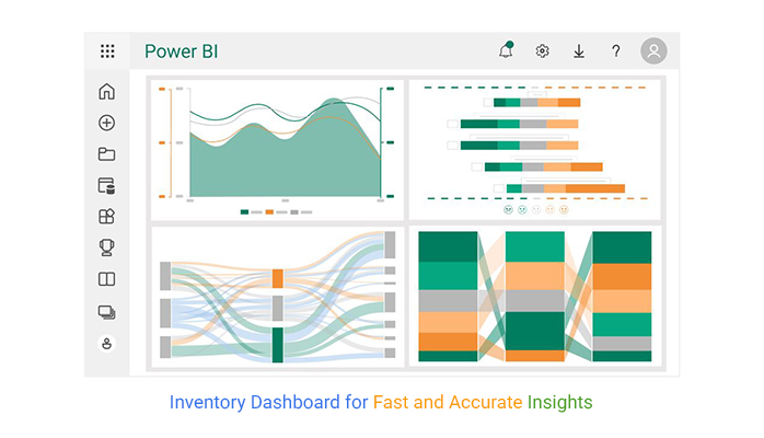
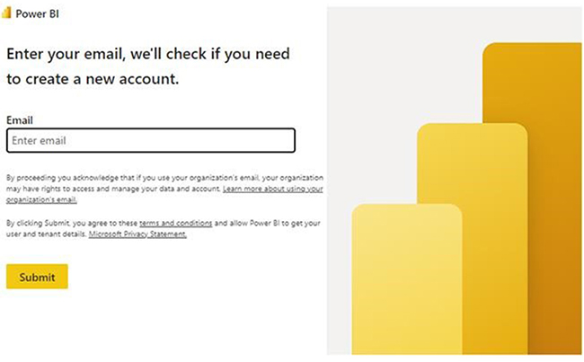
This explores how to create a dashboard in Power BI. It also shows some executive dashboard examples and sales dashboard examples.

There are sections of this guide that dive deep into the business intelligence dashboard, Power BI sales dashboard, and Power BI dashboard design. The guide helps both newbie and veteran analysts figure out the nitty-gritty of dashboard user interface design, digital dashboard, and Power BI KPI dashboard.

Table of Contents:

  1. What is an Inventory Dashboard?
  2. Who Can Use an Inventory Management Dashboard?
  3. How many Types of Inventory Analytics dashboards?
  4. How to Use an Inventory Dashboard in Power BI?
  5. How to Build an Inventory Dashboard in Power BI?
  6. Benefits of using the Power BI Inventory Dashboard
  7. What is the Limitation of Inventory Dashboards?
  8. FAQs
  9. Wrap Up

What is an Inventory Dashboard?

An inventory dashboard is a visual tool that shows real-time data related to inventory management. It tracks key metrics like sales, stock levels, turnover rates, and orders.

By consolidating this information into a single view, business owners are able to monitor inventory performance, prevent overstocking, reduce stockouts, and streamline order management.

Sankey Diagram:

Inventory Dashboard

Multi-Axis Line Chart:

Inventory Dashboard

Comparison Bar Chart

Inventory Dashboard

Likert Scale Chart

Inventory Dashboard

Who Can Use an Inventory Management Dashboard?

  • Inventory Managers

Inventory managers use these dashboards to track stock levels, monitor reorder points, and ensure that inventory is maintained at optimal levels.

Real-time data helps in identifying slow-moving items, managing stock rotation, and preventing overstocking (or stockouts).

  • Sales Teams

An inventory dashboard helps the sales team understand product availability and make informed sales pitches to customers. Knowing which items are in stock or on backorder enables the sales team to manage customer expectations and promote in-stock products.

  • Warehouse Managers

Warehouse managers rely on inventory dashboards to manage order picking, track goods in storage, and monitor warehouse space utilization. Dashboards offer a clear view of inventory movement and help them manage storage capacity efficiently. It also ensures that the right items are available for shipment.

  • Executives and Decision-Makers

Executives and business owners utilize inventory dashboards to assess overall inventory performance, track key performance indicators (KPIs), and ensure that inventory management aligns with business objectives.

How many Types of Inventory Analytics dashboards?

  • Stock Level Dashboard

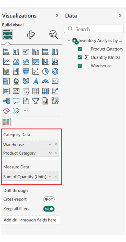
This type of dashboard focuses on tracking real-time stock levels across multiple products. It offers an overview of current inventory, stock availability, and reorder points.

  • Inventory Turnover Dashboard

Inventory turnover dashboards track how quickly inventory is sold (or used) over some time. It provides insights into turnover rates and shows whether products are moving too slowly or too quickly. High turnover rates indicate popular products, while low turnover signals overstocked (or underperforming) products.

  • Warehouse Efficiency Dashboard

This dashboard offers insights into warehouse operations like order picking efficiency, storage utilization, and space optimization.

  • Sales and Demand Dashboard

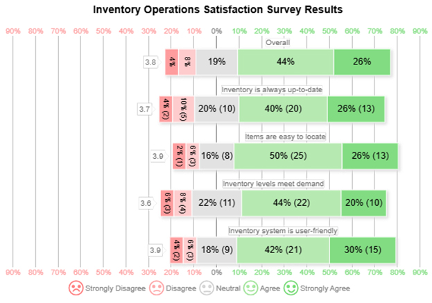
The sales dashboard and demand dashboards help business owners track how inventory aligns with customer demands. It visualizes top-selling products, sales trends, and demand forecasts. It helps businesses predict which products will need more stock.

How to Use an Inventory Dashboard in Power BI?

  • Connect Data Sources: You have to import inventory data from multiple sources like ERP systems, Excel, or databases.
  • Define Key Metrics: Identify metrics like sales trends, stock levels, order status, and inventory turnover.
  • Create Visualizations: Use Power BI’s charts (like line, bar, or pie, sankey plot) to represent metrics visually.
  • Add Interactivity: Use filters and slicers to allow users to drill down by warehouse, product, or time.
  • Apply Conditional Formatting: Use color coding to highlight vital issues like slow-moving items or low stock.
  • Schedule Data Refreshes: Set up regular data refresh intervals to keep your dashboard updated with real-time information.
  • Publish and Share: You can share your dashboard with relevant teams for monitoring and decision-making.
  • Monitor Performance: Always track inventory performance and make data-driven decisions for improved inventory management.

How to Build an Inventory Dashboard in Power BI?

  • Log in to Power BI, enter your email, and click the “Submit” button.
Inventory Dashboard
  • You’ll be redirected to a Microsoft account. Enter your password, and click “Sign in.”
Inventory Dashboard
  • You can opt to stay signed in.
Inventory Dashboard
  • Create a dataset and select the data to use in the required chart.
  • The data table below will be used for the Sankey Diagram in the dashboard.
Inventory Dashboard
  • To add data to your report, click on the “Paste data into a blank report.”
Inventory Dashboard
  • Paste the data table above into the blank table. Name it and click on the “Create a blank report” button.
Inventory Dashboard
  • Click on “Expand All” to see the chart metrics. You can check the dimensions and metrics.
Inventory Dashboard
  • Click on “Get more visuals.”
Inventory Dashboard
  • Search “ChartExpo” and select the Sankey Diagram. You should add these charts to your visuals. After all, these charts will be used in your business dashboard to generate different business insights.
Inventory Dashboard
  • Click on the “Add” button.
Inventory Dashboard
  • After adding all four charts to your visuals, you’ll see the chart icon in the visuals list. From left to right, Sankey Diagram, Multi Axis Line Chart, Likert Scale Chart, and Comparison Bar Chart by ChartExpo.
Inventory Dashboard
  • To add the Sankey Diagram visual (first one from left), click on the chart icon, and choose the dimension and measures.
  • Navigate to Visualization’s properties, click on License Settings, and add the key.
Inventory Dashboard
  • After adding the key, you’ll see the Sankey Diagram.
Inventory Dashboard
  • You can set the properties to customize the look and feel of the chart. You can also change the title of the chart.
Inventory Dashboard
  • Set the node colors for each level.
Inventory Dashboard
  • Here’s the final look and feel of the chart.
Inventory Dashboard
  • You can add the third chart (Comparison Bar Chart) to your report/dashboard.
Inventory Dashboard
  • The following Inventory Dashboard data will be used for the Comparison Bar Chart.
Inventory Dashboard
  • After the data has been manually pasted into the Power BI or exported from Excel, choose the dimension and measures.
Inventory Dashboard
  • You can add the header text on top of the chart.
Inventory Dashboard
  • To remove the watermark, enter the key. You can set the properties to customize the look and feel of the Comparison Bar Chart. You can also change the title of the chart. Next, sort the data columns.
Inventory Dashboard
  • Here’s the final look and feel of the Comparison Bar Chart.
Inventory Dashboard
  • You can add the final chart (Multi-Axis Line Chart) to your report/dashboard
Inventory Dashboard
  • The monthly revenue data below will be used for the multi-axis line chart.
Inventory Dashboard
  • After the data has been manually pasted in Power BI or exported from Excel, you’ll have to choose the dimensions and measures.
Inventory Dashboard
  • Enter the key to remove the watermark. You’ll have to set the properties to customize the look and feel of the Multi-Axis Line Chart. You’ll also have to change the title of the chart. Next, sort the data columns.
Inventory Dashboard
  • You’ll have to change the data representation to Bar, Line, and Area.
Inventory Dashboard
  • Next, you’ll change legend properties to set the shape type, Column, Line and Circle, and Area.
Inventory Dashboard
  • Here’s the final look and feel of the Multi-Axis Line Chart.
Inventory Dashboard
  • You can add the second chart (Likert Scale Chart) to the report/dashboard.
Inventory Dashboard
  • The following customer experience survey data will be used for the Likert Scale Chart.
Inventory Dashboard
  • After the data has been manually pasted in Power BI or exported from Excel, choose the dimension and measures.
Inventory Dashboard
  • Before creating the chart, enter the key to remove the watermark. Set the properties to customize the look and feel of the Likert chart. You can change the title of the chart. Next, change the text in the legend for smiley icons.
Inventory Dashboard
  • Here’s the final look and feel of the Likert Scale Chart.
Inventory Dashboard
  • After placing the charts inventory, the dashboard should look like the image below.
Inventory Dashboard

Insights

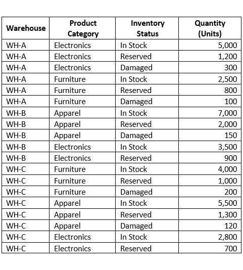
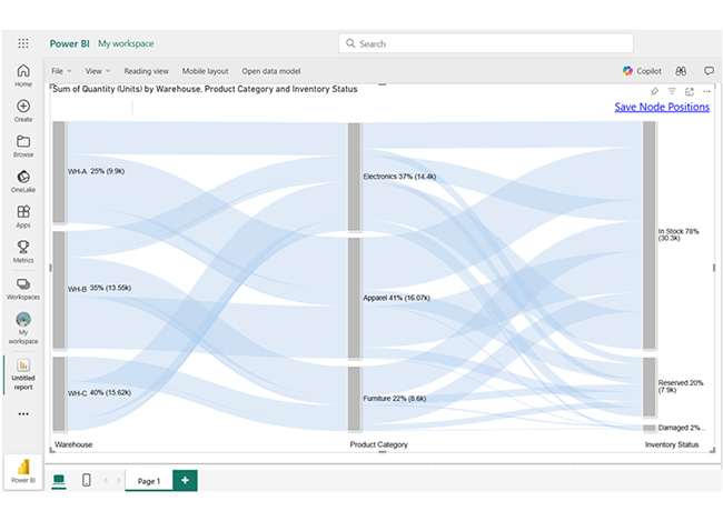
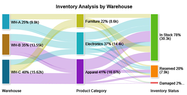
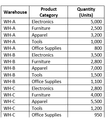
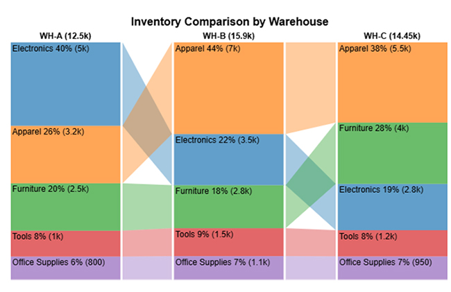
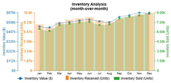
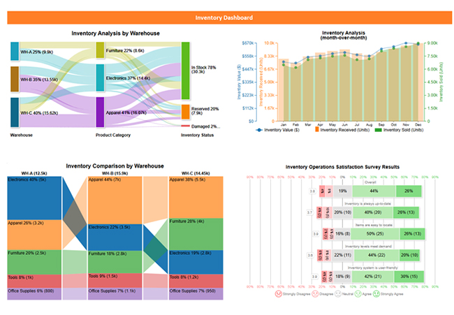
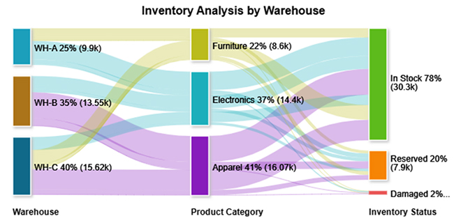
Inventory across warehouses is well-distributed with high in-stock levels, especially in Electronics and Apparel.

  • Survey responses indicate high satisfaction with inventory accuracy, system usability, and accessibility.
  • WH-C holds the most diverse and balanced stock. The inventory operations appear efficient, and demand is met reliably. Users can find the system functional and intuitive.

Benefits of using the Power BI Inventory Dashboard

  • Real-Time Insights: It tracks inventory levels, orders, and sales in real time.
  • Enhanced Efficiency: It automates reporting and reduces manual work
  • Data-Driven Decisions: Visualize key metrics for forecasting and better decision-making.
  • Customizable Visuals: You can tailor the dashboard to focus on specific KPIs like turnover rates and stock levels.

What is the Limitation of Inventory Dashboards?

  • Data Accuracy: If the underlying data is outdated or incorrect, the dashboard can lead to misleading conclusions.
  • Complexity: Setting up advanced dashboards requires technical expertise and time to integrate multiple data sources.
  • Cost: Implementing advanced inventory dashboards can incur additional costs for training and software.
  • Real-Time Limitations: There are dashboards that don’t offer real-time data updates, and that may lead to potential delays in inventory decision-making.

FAQs

What should be on an inventory dashboard?

An inventory dashboard should include stock value, stock levels, stock turnover ratio, backorders, out-of-stock days, product categories, and warehouse locations. It also includes monthly trends, key performance indicators (KPIs), and alerts for low stock.

What is the purpose of the inventory dashboard?

The inventory dashboard provides real-time visibility into stock performance, optimizes inventory management, and tracks key metrics. It also reduces shortages, supports faster, data-driven decision-making, and improves turnover.

Wrap Up

An inventory dashboard helps businesses optimize inventory, boost efficiency, and reduce costs.

The inventory dashboard provides real-time insights and enhances efficiency. It tracks inventory levels, orders, and sales in real time. It also automates reporting and reduces manual work.

With an inventory dashboard, you’ll tailor your dashboard to focus on specific KPIs like turnover rates and stock levels. And you’re able to share your dashboards with teams for better communication.

On the flip side, the inventory dashboard comes with limitations like cost and complexity. You’ll most likely incur additional costs for software and training. Furthermore, setting up advanced dashboards requires technical expertise and time to integrate multiple data sources.

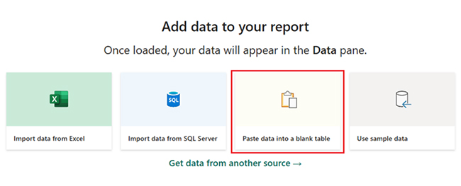
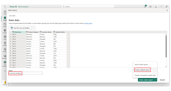
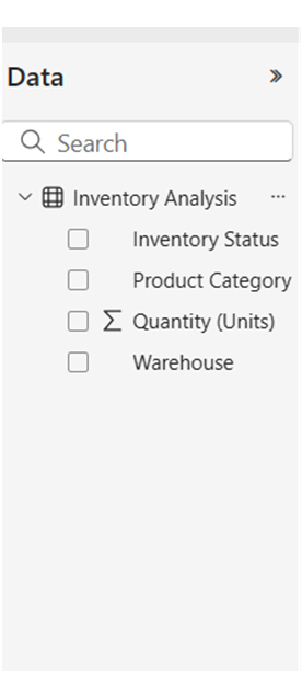
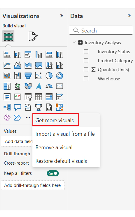
Now you know how to create an inventory dashboard using Power BI, what metrics will you be looking out for in your dashboard?

How much did you enjoy this article?

PBIAd1
Start Free Trial!
155572

Related articles

next previous
Data Analytics9 min read

Website Performance Metrics: From Data to Smart Visual

Website performance metrics track speed, engagement, and user actions. Click to learn top metrics, tools, and tips to boost site performance and conversions.

Data Analytics7 min read

Leveraging Big Data Analytics to Reduce Healthcare Costs

This guide dives deep into how to leverage big data analytics to reduce healthcare costs. It shows you why you should use big data in the healthcare industry.

Data Analytics9 min read

Bank Dashboard: Enhancing Insights Through Data

Here is all you need to know about bank dashboards. You'll discover key features of an effective bank dashboard and how to analyze a banking dashboard.

Data Analytics8 min read

Metrics vs. Measures: Understanding the Key Differences

Metrics vs. measures track the right data and explain performance. This blog shows how to use both effectively with examples and visualization tips.

Data Analytics10 min read

DevOps Performance Metrics for Chart-Based Insights

DevOps performance metrics track efficiency in software delivery. This blog shows you how to use them to boost performance and streamline workflows.

ChartExpo logo

Turn Data into Visual
Stories

CHARTEXPO

  • Home
  • Gallery
  • Videos
  • Services
  • Pricing
  • Contact us
  • FAQs
  • Privacy policy
  • Terms of Service
  • Sitemap

TOOLS

  • ChartExpo for Google Sheets
  • ChartExpo for Microsoft Excel
  • Power BI Custom Visuals by ChartExpo
  • Word Cloud

CATEGORIES

  • Bar Charts
  • Circle Graphs
  • Column Charts
  • Combo Charts
  • Comparison Charts
  • Line Graphs
  • PPC Charts
  • Sentiment Analysis Charts
  • Survey Charts

TOP CHARTS

  • Sankey Diagram
  • Likert Scale Chart
  • Comparison Bar Chart
  • Pareto Chart
  • Funnel Chart
  • Gauge Chart
  • Radar Chart
  • Radial Bar Chart
  • Sunburst Chart
  • see more
  • Scatter Plot Chart
  • CSAT Survey Bar Chart
  • CSAT Survey Chart
  • Dot Plot Chart
  • Double Bar Graph
  • Matrix Chart
  • Multi Axis Line Chart
  • Overlapping Bar Chart
  • Control Chart
  • Slope Chart
  • Clustered Bar Chart
  • Clustered Column Chart
  • Box and Whisker Plot
  • Tornado Chart
  • Waterfall Chart
  • Word Cloud
  • see less

RESOURCES

  • Blog
  • Resources
  • YouTube
SIGN UP FOR UPDATES

We wouldn't dream of spamming you or selling your info.

© 2025 ChartExpo, all rights reserved.