Categories
Juggling a dozen spreadsheets just to find how many rooms were booked last Tuesday is common. It’s exhausting. A Booking Dashboard solves that headache by pulling all reservation and scheduling data into one clean view.
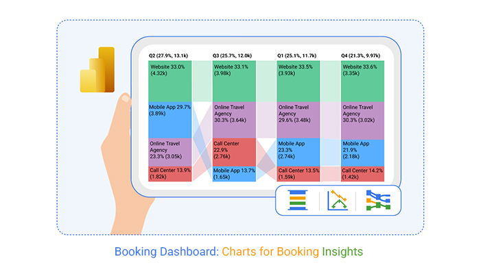
Whether you’re running a hotel, clinic, or service business, this single-screen solution delivers real-time visibility into booking trends. That means faster decisions, sharper forecasting, smoother operations, and happier customers—no more digging through separate systems.
Definition: A booking dashboard is a visual interface that tracks reservations, cancellations, revenue, availability, and customer behavior. It pulls data from booking systems and displays it through charts, tables, and KPIs for quick analysis. Think of it as a data dashboard built specifically for reservation workflows.
Unlike generic reporting tools, it’s purpose-built for reservation analysis by date, channel, or service type. When integrated with a business dashboard, booking metrics align directly with broader performance goals. This connection keeps everyone on the same page.
Managing bookings across disconnected systems? That’s a recipe for mistakes. A booking dashboard centralizes everything so decisions happen faster and with better context.
Here’s why organizations rely on a booking system dashboard:
Booking insights also support demand generation when paired with a marketing dashboard that includes reservation-based metrics.
A well-designed reservation dashboard brings availability, revenue, and customer data into a single actionable interface. Here’s what a strong setup typically includes.
Core Components Include:
Learning how to create a dashboard in Power BI for booking analysis takes some preparation, but the payoff is worth it. Here’s a practical approach.
Power BI also integrates with other analytical views, like a social media dashboard, to show how online engagement influences booking behavior.
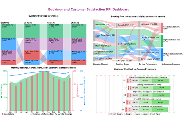
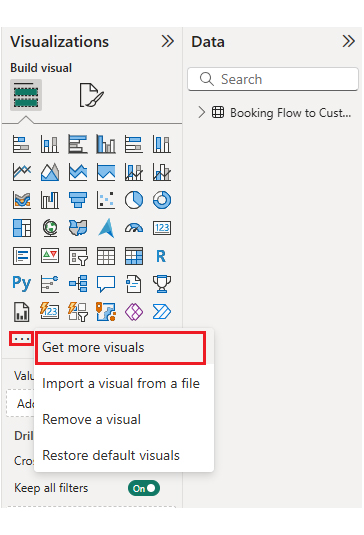
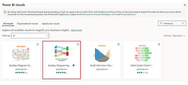
Analyzing a booking dashboard template in Power BI goes beyond staring at charts. It means understanding booking flows, customer behavior, and performance gaps. ChartExpo enhances Power BI by offering specialized visuals that simplify complex booking datasets.
Example:
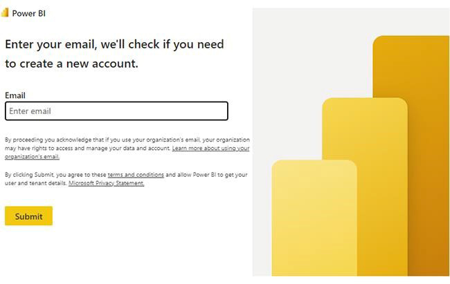
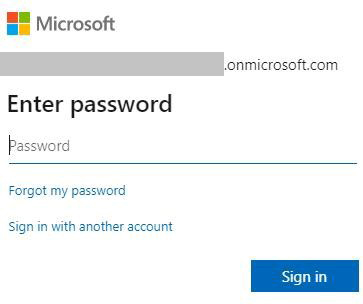
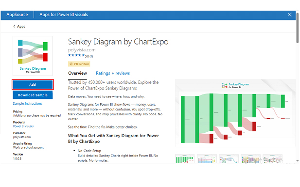
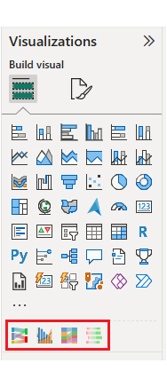
First, install Power BI.
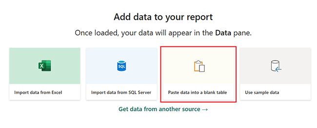
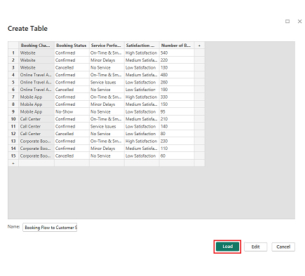
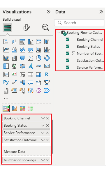
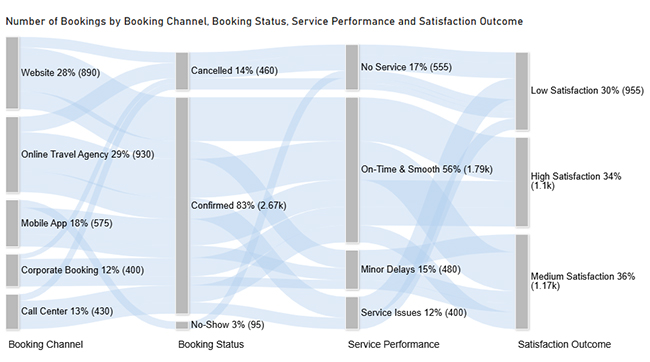
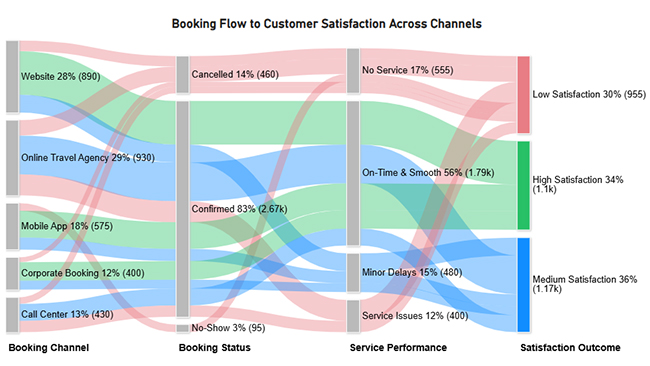
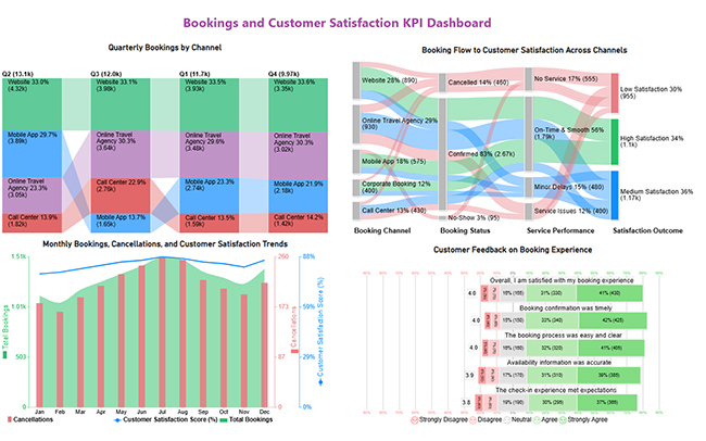
Now, consider this sample data for a Sankey Chart.
| Booking Channel | Booking Status | Service Performance | Satisfaction Outcome | Number of Bookings |
| Website | Confirmed | On-Time & Smooth | High Satisfaction | 540 |
| Website | Confirmed | Minor Delays | Medium Satisfaction | 220 |
| Website | Cancelled | No Service | Low Satisfaction | 130 |
| Online Travel Agency | Confirmed | On-Time & Smooth | Medium Satisfaction | 480 |
| Online Travel Agency | Confirmed | Service Issues | Low Satisfaction | 260 |
| Online Travel Agency | Cancelled | No Service | Low Satisfaction | 190 |
| Mobile App | Confirmed | On-Time & Smooth | High Satisfaction | 330 |
| Mobile App | Confirmed | Minor Delays | Medium Satisfaction | 150 |
| Mobile App | No-Show | No Service | Low Satisfaction | 95 |
| Call Center | Confirmed | On-Time & Smooth | Medium Satisfaction | 210 |
| Call Center | Confirmed | Service Issues | Low Satisfaction | 140 |
| Call Center | Cancelled | No Service | Low Satisfaction | 80 |
| Corporate Booking | Confirmed | On-Time & Smooth | High Satisfaction | 230 |
| Corporate Booking | Confirmed | Minor Delays | Medium Satisfaction | 110 |
| Corporate Booking | Cancelled | No Service | Low Satisfaction | 60 |



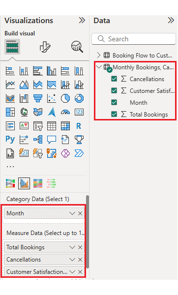
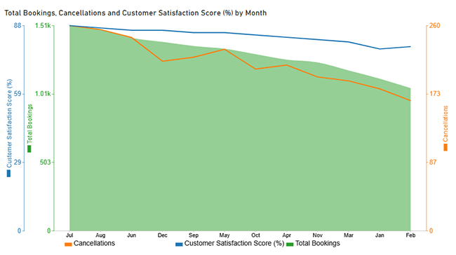
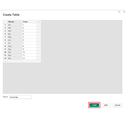
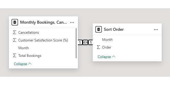
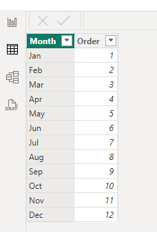
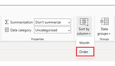
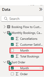
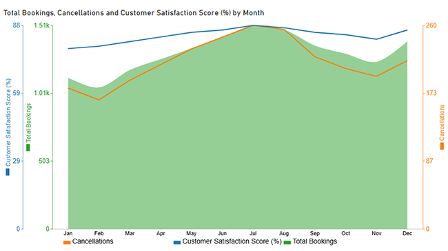
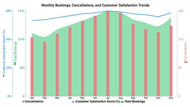
Now let’s discuss the second chart. Consider this sample data for a Multi Axis Line Chart.
| Month | Total Bookings | Cancellations | Customer Satisfaction Score (%) |
| Jan | 1,120 | 180 | 78 |
| Feb | 1,050 | 165 | 79 |
| Mar | 1,180 | 190 | 81 |
| Apr | 1,260 | 210 | 83 |
| May | 1,340 | 230 | 85 |
| Jun | 1,420 | 245 | 86 |
| Jul | 1,510 | 260 | 88 |
| Aug | 1,480 | 255 | 87 |
| Sep | 1,360 | 220 | 85 |
| Oct | 1,300 | 205 | 84 |
| Nov | 1,240 | 195 | 82 |
| Dec | 1,390 | 215 | 86 |


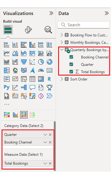
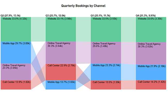
Now let’s discuss the third chart. Consider this sample data for a Comparison Bar Chart.
| Quarter | Booking Channel | Total Bookings |
| Q1 | Website | 3,930 |
| Q1 | Online Travel Agency | 3,480 |
| Q1 | Mobile App | 2,740 |
| Q1 | Call Center | 1,590 |
| Q2 | Website | 4,320 |
| Q2 | Online Travel Agency | 3,050 |
| Q2 | Mobile App | 3,890 |
| Q2 | Call Center | 1,820 |
| Q3 | Website | 3,980 |
| Q3 | Online Travel Agency | 3,640 |
| Q3 | Mobile App | 1,650 |
| Q3 | Call Center | 2,760 |
| Q4 | Website | 3,350 |
| Q4 | Online Travel Agency | 3,020 |
| Q4 | Mobile App | 2,180 |
| Q4 | Call Center | 1,420 |

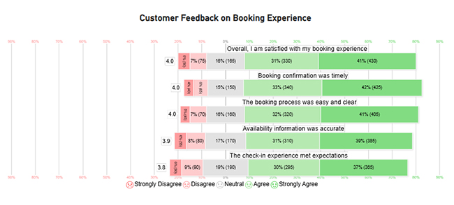
Now let’s discuss the fourth chart. Consider this sample data for a Likert Chart.
| Question | Scale | Responses |
| The booking process was easy and clear | 1 | 45 |
| The booking process was easy and clear | 2 | 70 |
| The booking process was easy and clear | 3 | 160 |
| The booking process was easy and clear | 4 | 320 |
| The booking process was easy and clear | 5 | 405 |
| Booking confirmation was timely | 1 | 40 |
| Booking confirmation was timely | 2 | 65 |
| Booking confirmation was timely | 3 | 150 |
| Booking confirmation was timely | 4 | 340 |
| Booking confirmation was timely | 5 | 425 |
| Availability information was accurate | 1 | 55 |
| Availability information was accurate | 2 | 80 |
| Availability information was accurate | 3 | 170 |
| Availability information was accurate | 4 | 310 |
| Availability information was accurate | 5 | 385 |
| The check-in experience met expectations | 1 | 60 |
| The check-in experience met expectations | 2 | 90 |
| The check-in experience met expectations | 3 | 190 |
| The check-in experience met expectations | 4 | 295 |
| The check-in experience met expectations | 5 | 365 |
| Overall, I am satisfied with my booking experience | 1 | 50 |
| Overall, I am satisfied with my booking experience | 2 | 75 |
| Overall, I am satisfied with my booking experience | 3 | 165 |
| Overall, I am satisfied with my booking experience | 4 | 330 |
| Overall, I am satisfied with my booking experience | 5 | 430 |

A reservation dashboard improves booking operations by providing real-time visibility into demand, capacity, and performance metrics.
Key benefits include:
A reservation dashboard can also integrate with a customer experience dashboard to measure how booking interactions influence loyalty and retention.
An effective booking dashboard focuses on metrics that reflect revenue performance, operational efficiency, and customer behavior patterns.
Commonly Tracked Metrics:
Designing a booking admin dashboard requires balancing simplicity with functionality. Get it wrong, and nobody uses it.
Best Practices Include:
A booking dashboard centralizes reservation data, reduces manual errors, and enables faster responses to demand and revenue changes. It’s the difference between reacting and proactively managing your business.
Power BI, ChartExpo, and data connectors are commonly used to build interactive dashboards. These tools handle data integration and visualization without requiring advanced coding skills.
Yes, dashboards can be customized by industry, user role, and operational goals. A hotel’s needs differ from a clinic’s, and a good booking dashboard template adapts to those differences.
A booking dashboard provides clear visibility into reservations, performance, and customer behavior, enabling data-driven decision-making across the organization.
By tracking key metrics and booking flows, businesses can improve operational efficiency, forecasting accuracy, and customer satisfaction. With Power BI and tools like ChartExpo, businesses can turn booking data into clear, actionable insights that optimize operations and performance.