Categories
By ChartExpo Content Team
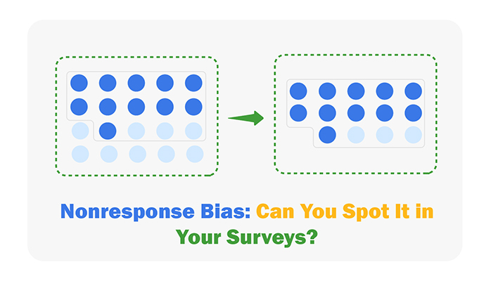
Have you ever wondered why some surveys feel incomplete or skewed? The answer often lies in nonresponse bias.
When certain groups don’t respond, their voices are missing from the data, leaving an incomplete picture. It’s like building a puzzle with half the pieces—you’re left guessing what the full image should look like.
Nonresponse bias happens when the answers you get differ significantly from the ones you don’t.


Think about a survey where older participants respond more than younger ones. The results would lean heavily toward older opinions, leaving out critical insights from younger groups. This gap can lead to decisions based on distorted data.
Why does nonresponse bias matter? Because it affects the trustworthiness of your results.
Whether it’s customer feedback, employee satisfaction, or research studies, bias in your data can lead to flawed conclusions. Understanding nonresponse bias isn’t just for statisticians—it’s essential for anyone relying on data to make informed decisions.
First…
Definition: Nonresponse bias occurs when certain groups of people fail to respond to a survey, creating a gap between those who participate and those who don’t. This imbalance can distort the survey’s results, as the responses you collect may no longer represent the broader population you’re studying.
For example, if a survey on workplace satisfaction only garners responses from highly engaged employees, the results could paint an overly positive picture of the workplace, ignoring potential dissatisfaction among others.
Nonresponse bias is a major concern because it undermines the accuracy and reliability of survey findings, making it critical to identify and address issues in the survey process.
When you’re missing responses in a survey, the results you get aren’t giving you the whole truth. This is nonresponse bias in action, tilting the scales and giving you a distorted view of reality.
It’s like trying to guess the score of a basketball game by only watching the second half. You miss out on the full context, and the final understanding is skewed.
This bias can affect everything from customer feedback surveys to important research studies, leading to decisions that might not be truly reflective of the larger group’s opinions.
Diving into the world of nonresponse, we encounter two main villains: unit nonresponse and item nonresponse.
Unit nonresponse happens when people don’t participate in the survey at all. Imagine inviting friends to a party, and some don’t show up – that’s unit nonresponse.
On the other hand, item nonresponse occurs when participants skip certain questions. It’s like those friends who come to the party but don’t join in the karaoke.
Both types of nonresponse can throw a wrench in the works for researchers trying to paint an accurate picture with their data.
Why fuss over nonresponse bias? Because it’s all about trust in the data.
If survey results are skewed, they can lead to decisions that aren’t right for the situation. It’s like a chef seasoning a dish based only on one diner’s feedback – it just doesn’t work if you’re feeding a diverse crowd!
Ensuring the validity of survey results through careful design and analysis methods safeguards data integrity and supports informed decisions that genuinely reflect the whole group’s views and needs. This vigilance preserves the reliability of the data and the decisions that stem from it.
Systematic nonresponse bias is a sneaky little problem where certain patterns in who doesn’t respond skew the survey results.
For instance, if younger people tend to ignore your survey more than older folks, your findings might tilt unfairly towards the opinions of the older population. Recognizing these patterns helps you understand how your data might be leaning one way or another.
Now, let’s break it down further. People might not respond because they refuse to or because they simply can’t.
Refusal could be due to lack of interest or distrust in the survey process, while inability could be because they didn’t have access to the survey or found it too complicated. Understanding these motivations can help tailor future surveys to increase response rates.
Longitudinal surveys are like marathons; they track the same group over time. With each follow-up survey, some folks drop out, a phenomenon known as the “wave effect.” This dropout can lead to biases if, say, the dropouts have something in common.
Watching out for who sticks around and who doesn’t can tell you a lot about the reliability of your ongoing results.
Spotting nonresponse bias early can save you a headache later. Watch for unusually high or low response rates from specific groups.
Say, if you notice younger folks aren’t replying as much as the older crowd, you might need to tweak your approach. Also, keep an eye on how the responses vary at different times or days. Maybe people are more chatty over the weekends? These clues help you sniff out bias before it skews your data.
Imagine having a crystal ball that helps predict who will answer your survey and who’ll ghost you. That’s what response propensity models do, sort of.
These models use stats to figure out the likelihood of different people responding based on their characteristics. It’s like being a detective, except you’re using numbers, not clues, to solve the mystery of who’s going to help fill your data gaps.
Here’s a nifty trick: conduct a follow-up study. Reach out again, but this time target the hard-to-get responders from your original survey.
This approach helps you compare the original respondents with these late bloomers to see if their answers differ. It’s a bit like calling back guests who left the party early to find out what they missed—or in this case, what insights you missed from them.
Imagine you’re making a smoothie but have way too many bananas compared to strawberries. It wouldn’t really taste like a strawberry-banana smoothie, would it?
Weighting techniques in surveys work similarly. If part of your survey group is overrepresented, you weight their responses less to balance the flavor of your data smoothie. This helps you get a taste that’s closer to what you’d expect if everyone had answered your survey.
Think of proxy variables as stand-ins at a concert when the main singer has lost their voice. These variables sing the missing parts.
In surveys, if you can’t get information directly because of nonresponse, you use related information—proxy variables—to fill in the gaps.
For example, if younger folks aren’t responding to your survey on tech use, but you have their general online shopping data, you might use that to infer their tech habits.
Sensitivity analysis is like a what-if game. What if the missing responses are very different from what we have? How much would that mess up our conclusions?
By tweaking your data assumptions and checking how your results shift, you get a clearer picture of how sturdy your findings are. It’s like checking the quality of a bridge by pushing it a bit—better safe than sorry.
This approach ensures that the insights drawn are not just flying on a single assumption but are tested for different scenarios, providing a robust basis for decisions.
Imagine you’re checking how satisfied folks are with your service, but hey, not everyone responds to your survey. This is where a CSAT Survey Chart comes into play. It’s a straightforward bar chart showing the levels of satisfaction among respondents.
What it also does is highlight the gap of those who didn’t respond, helping you visualize the extent of potential nonresponse bias. You might see high satisfaction scores, but with a low response rate, the nonresponders could tell a different story.
Now, let’s shift gears to attitudes. Likert scales are perfect when you want to understand how people feel about a statement, from “Strongly Agree” to “Strongly Disagree.” But not everyone answers these either.
A Likert Scale Chart helps you see not just the common responses, but also the silence. It visually represents the distribution of answers and, crucially, the missing ones. This gap can significantly skew your data, suggesting that maybe those silent voices disagree but didn’t bother to say so.
The following video will help you to create a Likert Scale Chart in Microsoft Excel.
The following video will help you to create a Likert Scale Chart in Google Sheets.
The following video will help you to create a Likert Scale Chart in Microsoft Power BI.
When it comes to surveys, who’s responding matters just as much as who isn’t. Age, income, and education levels can significantly sway the results.
Older individuals might skip online surveys due to tech challenges, while younger folks might dodge them due to time constraints.
Low-income groups might not have access to the survey tools, and highly educated people might skip surveys they deem unimportant.
Each group’s unique reasons for non-participation shape the final data, potentially skewing it.
Ever started a survey only to ditch it halfway? You’re not alone. Long or complex surveys often scare away participants. The more questions there are, the more likely someone will drop out before finishing.
It’s not just the number, though; it’s the nature of the questions. If they’re too invasive or confusing, you might lose even the most eager participants. This dropout can skew your data, leaving out vital perspectives.
Trust plays a massive role in whether people decide to fill out your survey. If your survey looks shady or if the purpose behind it isn’t clear, potential respondents might just skip it.
Transparency about how you’ll use the data can help build trust. Let people know their responses are valuable and protected. When respondents trust the process, they’re more likely to take part, helping you avoid the pitfalls of nonresponse bias.
Google Forms is a go-to tool for many, and for good reason. It’s straightforward to use, making it easier for just about anyone to create a survey quickly.
The real magic? Its simplicity helps boost response rates. People are more likely to complete surveys that don’t look like a chore, and Google Forms hits that sweet spot of being user-friendly while still offering enough features to get robust data.
Microsoft Forms is another fantastic tool that helps minimize nonresponse bias through its clean interface and intuitive design. What stands out with Microsoft Forms is its integration with other Microsoft products.
Imagine you’re using Microsoft Teams or Office 365; incorporating surveys becomes seamless, almost second nature. This integration can encourage more participants to complete the survey since it’s part of an ecosystem they’re already using.
Each tool offers distinct advantages, but both aim to reduce barriers to survey completion, helping you gather more complete and reliable data.
The sequence and setup of questions can greatly influence the quality of the responses you receive. Start with less sensitive questions to ease respondents into the survey, building trust. Ensure questions are direct and clear to avoid confusion, which can lead to nonresponse or inaccurate answers.
Today, many people use their smartphones for just about everything. Surveys should be mobile-friendly, meaning they are easy to read and interact with on a smartphone screen. This accessibility increases the likelihood of responses, as participants can complete the survey anytime, anywhere, at their convenience.
Not everyone prefers the same survey method. Some like online surveys, while others might prefer a phone call or a paper form. Offering multiple ways to respond—known as mixed-mode surveys—caters to different preferences and can reduce nonresponse bias by reaching a wider audience.
This approach helps gather more comprehensive data from various segments of your target population.
Imputation is a method used to estimate missing data. Think of it as guessing the answers of someone who left a survey half-filled.
Multiple imputation is popular—it creates several sets of plausible values to reflect uncertainty in the estimates. This method helps in achieving more accurate results by filling these gaps with educated guesses based on available data.
Post-stratification involves adjusting survey weights so that the survey sample mirrors a known population on certain characteristics, such as age or gender.
It’s like tweaking the scales until the weight of apples matches what you know it should weigh based on a trusted scale. This method is vital for correcting biases introduced by differential survey response rates across known demographic groups.
Hot-deck imputation involves filling in missing survey responses with values from respondents who are similar on other variables.
Imagine you’re doing a puzzle and find pieces that, while not perfect, fit well enough to complete the picture. It’s a practical way to handle missing data, especially when patterns of missingness are complex.
Offering incentives is a great way to boost survey responses. However, the key is balance. Too much can skew results, making them biased. So, what works? Gift cards, small payments, or entry into a prize draw are popular. They must match the effort of completing the survey.
Remember, the goal is to increase participation without compromising the data quality.
Touching base with participants before sending out surveys can dramatically raise response rates. How? It builds trust and shows respect for their time. Sending an email, a postcard, or even a quick call can alert them to the upcoming survey.
This heads-up acts as a gentle nudge, increasing the likelihood they’ll participate. It’s all about making them feel valued.
Not everyone likes answering surveys in the same way. Some prefer online, others might like paper forms or phone calls. Using mixed-mode surveys reaches people where they are comfortable.
This approach reduces bias by allowing diverse participation methods. It’s about accessibility and convenience, giving everyone a fair chance to contribute their views.
When it comes to online surveys, one big issue is digital dropouts. These are people who start a survey but don’t finish it.
To tackle this, it’s smart to keep surveys short and sweet. Engaging questions that are direct hit the mark. Also, giving a progress bar can nudge participants to complete the survey, as they can see the end is near!
Dealing with real-time refusals in phone surveys can be tricky. A good approach is to train interviewers to be quick on their feet. If someone says no, they need to kindly ask why. Sometimes, just explaining the purpose of the survey and how quick it will be can turn a no into a yes.
For mail surveys, silent nonrespondents are a common headache. To increase responses, make sure the survey looks professional and is easy to read. Include a prepaid return envelope to remove barriers. A follow-up reminder postcard can also boost response rates, reminding folks that their input is valuable and awaited.
Here’s a thought—what if the people who didn’t answer your survey are different from those who did? This can really throw off your conclusions.
To get the real scoop, compare the characteristics of respondents and nonrespondents. Think about factors like age, location, or even the time they received the survey. Spotting patterns here can give you clues about who’s missing from your data and why their voice is crucial.
Got skewed data? No worries! Regression models, including linear regression graphs, can be your best pals here. They help you visualize and understand the relationship between the survey’s nonresponses and other variables you know from your respondents.
By predicting the likely responses of nonparticipants, you can adjust your results to better mirror your target population. This isn’t about guessing—it’s about using statistics to make your data more reliable.
Want to really get into the nitty-gritty? Subgroup analysis lets you zoom in on different groups within your survey. Maybe younger folks are less likely to respond, or perhaps people from certain areas are missing out.
By identifying these patterns, you can tailor your follow-up efforts or adjust your survey methods next time to boost participation across the board. This isn’t just about filling gaps; it’s about understanding the story behind each subgroup.
When surveys don’t get enough responses, the results can tilt one way. This skew can lead to bad decisions, costing businesses a lot of money.
Think about a company launching a product based on skewed survey data. If the product doesn’t hit the mark with the majority, it leads to huge losses from unsold stock and wasted marketing budgets.
Making decisions based on wrong data? That’s a recipe for disaster. Nonresponse bias can mislead businesses and undermine data-driven decision-making, causing them to believe insights that don’t truly reflect their broader customer base.
For instance, if only young, tech-savvy people respond to a survey about tech product use, a business might wrongly assume all age groups will use the product similarly. This can lead to misguided strategies and investments.
Trust is hard to earn and easy to lose. If a business often bases decisions on biased survey results, it risks its reputation. Customers and stakeholders can lose faith if they see a company repeatedly making off-the-mark decisions. It’s like crying wolf—do it enough times, and people stop believing what you say.
These topics highlight how critical it is for businesses to get their survey data right and avoid the pitfalls of nonresponse bias.
Machine learning is reshaping how we handle nonresponse bias in surveys and data collection. Think of it as a smart assistant that predicts where biases might occur.
By analyzing patterns from previous data, these tools can pinpoint potential bias before it skews the results. What’s more, machine learning can adjust data collection methods in real time, ensuring more accurate and reliable outcomes.
It’s like having a bias watchdog that’s always on duty, making sure the data plays fair.
Bayesian analysis offers a fresh perspective on tackling nonresponse bias. This technique uses prior knowledge, or pre-existing beliefs, about a population to refine current survey results. It’s akin to updating an old map with new roads.
Bayesian methods provide a flexible framework for integrating nonresponses, essentially filling in the missing puzzle pieces of a dataset. This approach helps researchers draw more precise conclusions, ensuring that every voice, even the silent ones, is accounted for in the data.
Dealing with nonresponse in complex surveys requires a robust design strategy. Multi-layered studies, for example, use various techniques to mitigate bias. One effective method is oversampling, where you intentionally target harder-to-reach groups to boost their representation in the sample.
It’s like sending more invitations to a party to make sure everyone shows up.
Another tactic is using follow-ups with nonrespondents, which can be as simple as sending a reminder text or making a quick call. This proactive approach helps increase response rates and ensures the data reflects the whole population more accurately.
In the bustling world of market research, nonresponse bias is like an uninvited guest at a party—it can skew the outcomes if not addressed properly.
Imagine launching a new product based on feedback from only a fraction of your target audience. That’s risky, right? To combat this, businesses actively seek ways to increase response rates and analyze who isn’t responding and why.
This vigilance helps ensure that the data reflects the true preferences and opinions of the entire consumer base, leading to better business decisions and more successful products.
When companies want to feel the pulse of their workforce, they often turn to employee engagement surveys. However, a common hurdle is nonresponse bias, where the silent voices often carry the most weight.
If only the happiest or the most disgruntled employees respond, the results might paint a distorted picture of overall employee sentiment.
Companies tackle this by making surveys anonymous or ensuring employees that feedback leads to real change. These strategies encourage a higher response rate, giving a more accurate measure of the workplace climate.
In the realms of health and social sciences, survey accuracy isn’t just helpful—it’s crucial. Nonresponse bias can lead to significant missteps in understanding public health behaviors or social trends.
Researchers focus on designing surveys that are easy to respond to and relevant to all participants. They also employ follow-up strategies to include those who initially might not respond.
Ensuring representativeness in these surveys allows researchers to draw conclusions that truly reflect the population, leading to better policy-making and health outcomes.
Nonresponse bias can distort survey results, leading to misguided decisions and missed opportunities. It arises when certain groups fail to respond, leaving their perspectives out of the data.
Recognizing its types, causes, and impacts is the first step toward addressing it.
To reduce nonresponse bias, adopt effective survey designs, including clear question structures, mobile-friendly formats, and mixed modes of distribution. Employ statistical adjustments like weighting and imputation to correct for missing data.
Understanding nonresponse bias isn’t just for researchers. It’s essential for businesses, health professionals, and social scientists aiming to make data-driven decisions.
Reliable survey data isn’t about guessing; it’s about ensuring every voice has the chance to be heard.
Addressing nonresponse bias isn’t a one-time fix—it’s an ongoing effort to ensure your data reflects reality.
After all, better data means better decisions.
How much did you enjoy this article?


Google Forms to Google Sheets keeps your data organized and current with every submission. Learn the steps, methods, and tips now!

Product survey questions reveal what customers truly think. Learn how to ask the right ones and act on the survey results. Read on!

Learn how the 5-Point Performance Rating Scale improves employee evaluations with clear, consistent, and fair performance reviews across teams.


