Categories
The toggle button in Power BI is a control feature that enables a user to switch between multiple states. It could be switching between measurements, images, or pages. The toggle button makes Power BI reports interactive.


One of the primary benefits of the toggle button is the space it creates within a report. For instance, it eliminates the need to use two images in a single report. Instead, the user has the option of switching between images with the toggle button.
In this guide, you’ll discover what the toggle button in Power BI is, why it is important, and when to use it.
First…
The toggle button in Power BI is an interactive feature that helps in switching between multiple views or states in a report. With the toggle button, users can easily change data visualizations, and switch between multiple data perspectives and toggle filters. This will, in turn, improve the user experience within Power BI reports and dashboards.
The major reasons why the Power BI toggle button is important are:
The toggle button allows users to dynamically interact with their reports. By switching between multiple views or states, users can easily explore their data from multiple perspectives. The data exploration is done without the need to move out of the current page.
Toggle buttons help the report creator enhance visual storytelling by creating a compelling narrative and guiding users through it. For instance, toggling between multiple visual perspectives (or data sets) allows the report creator to show how various factors impact overall business outcomes. All these pieces make the story more understandable and compelling.
Quick switches between multiple data views help to enhance productivity and efficiency amongst users. This way, users are enabled to quickly access their desired information without manually adjusting multiple filters or navigating through various pages.
These are instances when you should use the toggle button in Power BI:
With the toggle button, you’ll have access to multiple perspectives of the same data. It could be switching between multiple visualization types, or toggling between detailed views and summary.
It helps the user filter data by categories like customer segment, product line, or region. All these help in diving deep into the data analysis.
The toggle button helps users switch between multiple periods or datasets in the Sankey diagram. It could be used for year-over-year or month-over-month comparisons.
The toggle button enhances interactive storytelling by allowing users to easily change filters without navigating away from their current view.
It helps users compare what-if analysis results or multiple business scenarios.
Here’s a brief overview of how the toggle button works, and how to set it up:
Creating toggle buttons involves the use of buttons or shapes from your Power BI visualizations pane. To design toggle buttons, use text or images. Designing the toggle button helps to indicate the various states like “Monthly/Yearly,” or “On/Off.”
Bookmarks capture the different views or states you want the users to toggle between. One bookmark could show a yearly view, while the other shows a chart in a monthly view.
To assign action buttons, select the toggle button and navigate to the format pane. Turn on the action toggle that’s under the “Action” section.
When a user clicks on the toggle button, it activates the assigned bookmark and that switches the report view to the captured state. A user can dynamically explore and filter data by toggling between multiple bookmarks.
You have to test the toggle button to figure out if it switches between your views. Also, make adjustments to the button actions or bookmarks in Power BI when necessary.
First, you’ll have to create a toggle button. The toggle button always works with the bookmarks. To create a toggle button, you’ll have to create a bookmark.
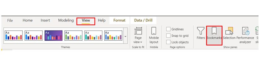
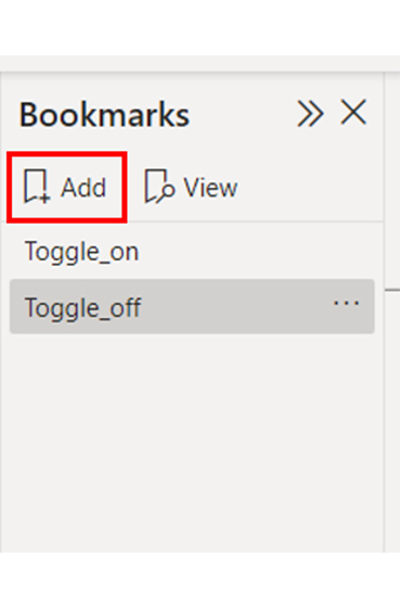
Step 1: Navigate to the view and select the Bookmark option.
Step 2: Look out for the Bookmarks panel. To add it, click on Add.
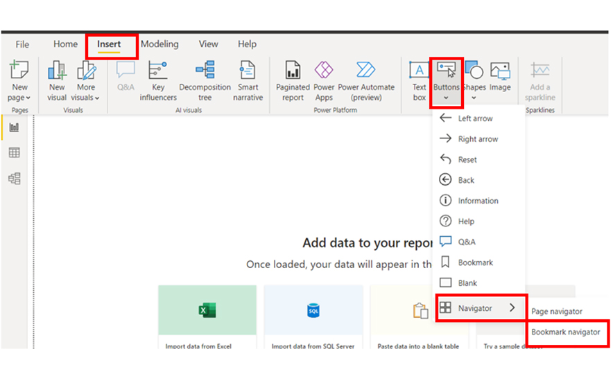
Step 3: To insert the bookmark navigator, go to “insert,” and click on “Buttons.” From the drop-down menu in “Navigators,” select “Bookmark Navigator.”
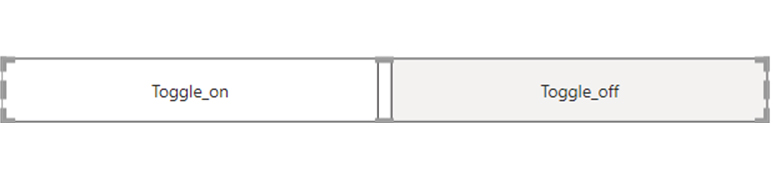
Step 4: To observe the bookmark created on your dashboard, use the Toggle_on and Toggle_off states as shown below.
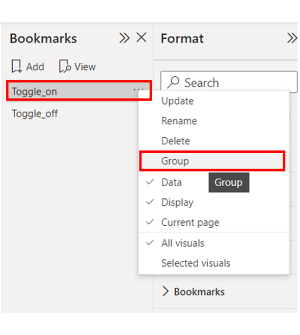
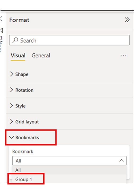
Step 5: Navigate to the “Bookmark Navigator” and select “Toggle_on.” After that, right-click and select “Group.” There’s the option of renaming the Group.
Step 6: Navigate to the “Formatting option” of the Bookmark and click “Bookmarks.” A close look at the drop-down of the Bookmark will reveal the Toggle_on group that has been created. Choose the “Group-1” option.
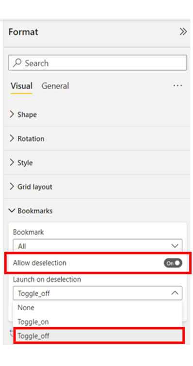
Step 7: Switch on the “Allow deselection” option. The option is found below the bookmarks. After that, take a look at the drop-down list of the “Launch on deselection,” and select “Toggle_off.”
Step 8: At this point, you’ve completed the primary setup for the toggle button. Next, navigate to the “Bookmark panel” and rename your “Toggle_on” with a dot. To do that, copy and paste the Unicode character circle. This will make the toggle button look realistic.
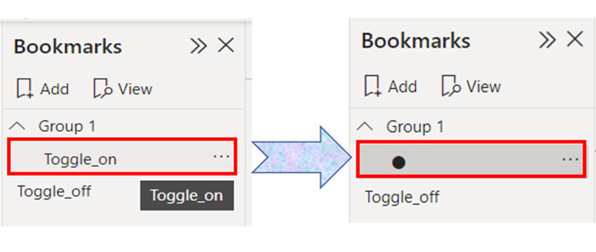
Step 9: From the image below, you’ll notice the dot popping up on the toggle.
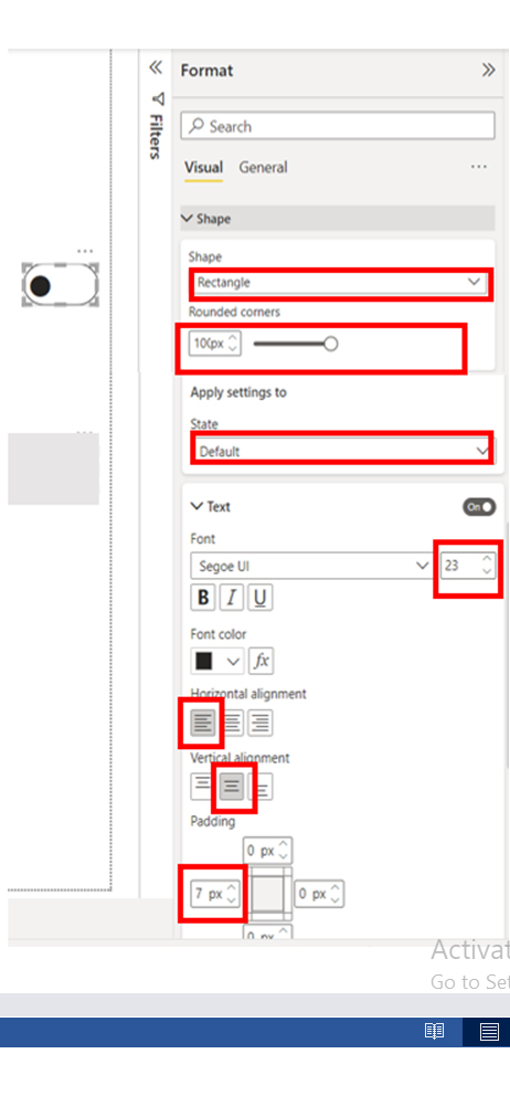
Step 10: You have to format the toggle button to suit your needs. To do that, navigate to the “Bookmark” panel and select “Toggle_off.” In the “Format” panel, you’ll notice that the “State” is in “Default.” You need to be creative and customize the options to fit your needs. The image below shows how the formatting options have been customized to fit a user’s needs.
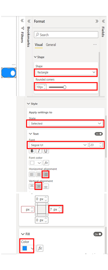
Step 11: You can repeat step 10 for “Toggle_on.” To do that, navigate to the “Bookmark” panel, and select “dot.” Start the formatting process. You’ll notice that in the “Format” panel, the “State” has the “Selected” option. Customize it to fit what you’re looking for. The image below shows the formatting options of a user.

Step 12: To check the toggle button you’ve created, click on it using ctrl+click.
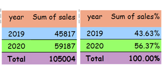
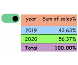
Step 13: You have to add the toggle button to your visuals. The image below shows two matrices the first shows the sum of sales, while the other shows the percentage of the total.
Step 14: The two matrix visuals should overlap above one other. The aim is to show one image while hiding the other when the toggle is on, and vice versa when the toggle is off.
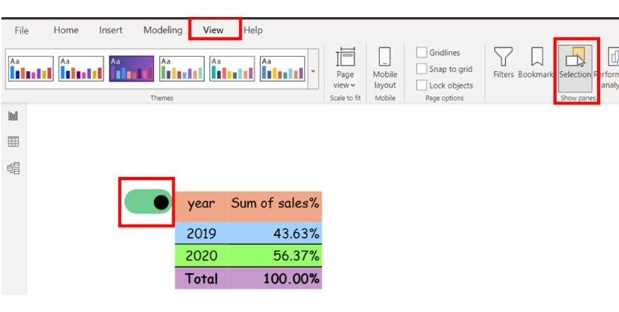
Step 15: Navigate to “view,” and click the “selection” panel. It comes with three options bookmark, the sum of sales, and the sum of sales in %. To hide one matrix and unhide another, you’ll have to keep the toggle button on.
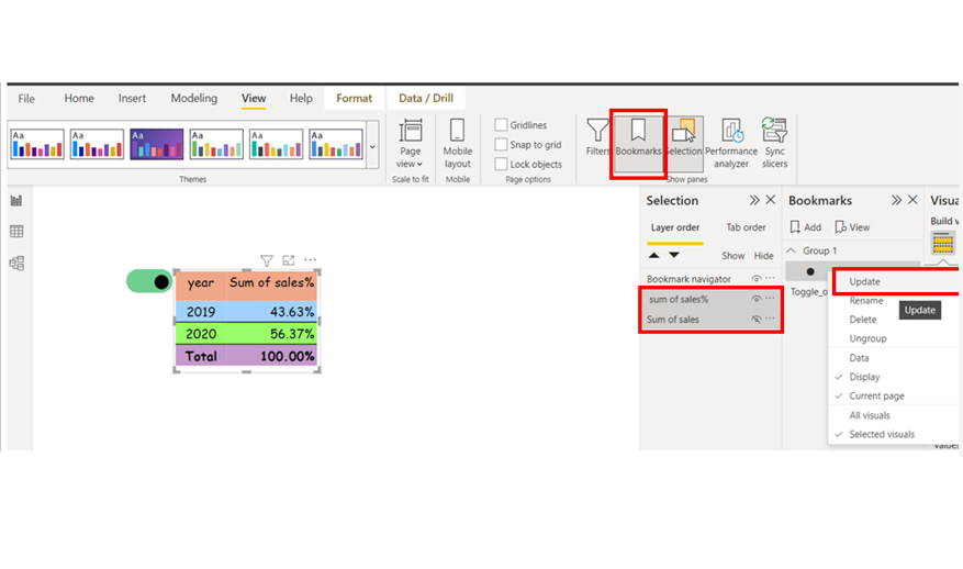
Step 16: Navigate to the “bookmark” panel and update the “toggle on” by choosing the sum of sales and the sum of sales % (right-click the “toggle_on” option to see the update option).
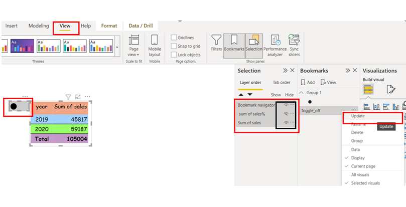
Step 17: Keep the toggle off by repeating the two steps above in the reverse order of the hidden and unhidden state. To update the Toggle off, you’ll have to choose bookmark navigator, the sum of sales, and the sum of sales %. To see the update, right-click on toggle_off.
Stage 1: Logging in to Power BI


| Country | Revenue Stream | Revenue (in $) |
| USA | Digital Advertising Revenue | 39,620,000 |
| USA | Event Marketing Revenue | 10,670,000 |
| USA | Content Marketing Revenue | 5,580,000 |
| USA | Print & Outdoor Revenue | 455,270 |
| UK | Digital Advertising Revenue | 40,710,000 |
| UK | Event Marketing Revenue | 24,770,000 |
| UK | Content Marketing Revenue | 6,330,000 |
| UK | Print & Outdoor Revenue | 552,190 |
| DNK | Digital Advertising Revenue | 47,040,000 |
| DNK | Event Marketing Revenue | 29,070,000 |
| DNK | Content Marketing Revenue | 7,740,000 |
| DNK | Print & Outdoor Revenue | 600,690 |
| DNK | Media Relations Revenue | 106,430 |
| AUS | Digital Advertising Revenue | 53,790,000 |
| AUS | Event Marketing Revenue | 38,530,000 |
| AUS | Content Marketing Revenue | 6,590,000 |
| AUS | Print & Outdoor Revenue | 9,040,000 |
| AUS | Media Relations Revenue | 6,130,000 |
| FR | Digital Advertising Revenue | 57,860,000 |
| FR | Event Marketing Revenue | 50,450,000 |
| FR | Content Marketing Revenue | 3,560,000 |
| FR | Print & Outdoor Revenue | 18,790,000 |
| FR | Media Relations Revenue | 15,460,000 |
| IND | Digital Advertising Revenue | 60,470,000 |
| IND | Event Marketing Revenue | 63,200,000 |
| IND | Content Marketing Revenue | 2,080,000 |
| IND | Print & Outdoor Revenue | 29,500,000 |
| IND | Media Relations Revenue | 30,020,000 |
Here are three major insights from the chart:
Discover the power of the Toggle Button in Power BI with this hands-on video tutorial. This essential feature allows you to seamlessly switch between views and data sets. Mastering the Toggle Button will enable you to create interactive and user-friendly reports, enhancing your data visualization capabilities and making your dashboards more dynamic.
To toggle visuals on and off in Power BI, you’ll have to create a shape or button and assign bookmarks to each visual state. This will enable users to switch between them.
“Toggle” refers to switching between multiple states, while a “toggle button” is the specific UI element that’s used in Power BI and other similar software interfaces.
Toggle buttons offer improved interactivity and help users to easily switch between multiple views or states within a report. This facilitates customization and data exploration in Power BI.
The toggle button in Power BI is an interactive control for switching between multiple views or states in a report. It helps in enhancing usability and interactivity in scenarios that require dynamic data exploration.
Toggle buttons lower the need to have clustered visuals or multiple report pages. Instead of having multiple pages for different filters or views, a single with toggle buttons will serve the same purpose. All of these make the report concise, and it also makes it easy to navigate.
The steps outlined in this guide will help you become better at the use of Power BI. This way, you’ll start creating interactive, engaging visualizations.
Now you know the importance of toggle buttons in Power BI, how will you integrate toggle buttons into your visuals?
How much did you enjoy this article?


Learn how to use KPI visuals in Power BI to track performance against targets, understand trends, and make faster, data-driven decisions.
Power BI Calculated Columns transform raw data into structured DAX-driven insights. Learn to create, apply, and optimize them. Read on!
Power BI Dashboards vs Reports: key differences, use cases, and when to use each for monitoring KPIs and analyzing data in depth.