Categories
Businesses generate massive volumes of financial data every day. Revenue, expenses, forecasts, budgets, and performance metrics all produce numbers that are difficult to interpret in raw spreadsheet form.
Financial charts solve this problem by transforming complex financial data into clear visual insights.
Instead of analyzing thousands of rows manually, decision-makers can quickly identify trends, monitor profitability, compare performance, and detect risks through visual analysis.
From executive reporting to investment evaluation, financial charts help organizations communicate financial performance clearly and support faster data-driven decisions.
In this blog post, you’ll learn the following:
Definition: Financial charts are visual representations of financial data, such as revenue, expenses, profits, investments, and financial performance. They help businesses analyze trends, compare values, and understand financial movement over time.
Financial charts simplify financial reporting by converting numbers into visuals that clearly show patterns and relationships.
They are commonly used in:
Instead of reading spreadsheets line by line, analysts can instantly understand performance using visual comparisons.
The financial values being analyzed include revenue, operating costs, and profit margins.
The horizontal axis typically represents time periods or categories, while the vertical axis displays financial values.
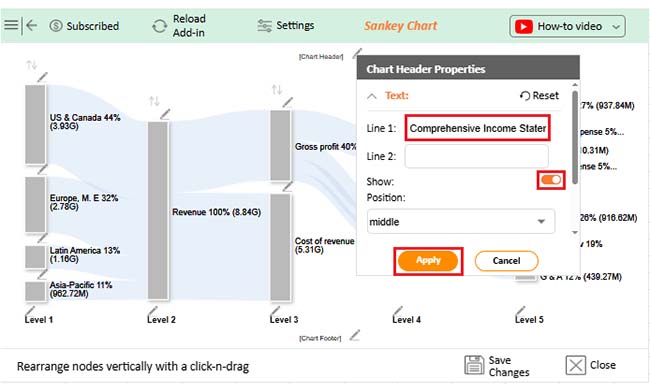
Provide context so viewers understand exactly what the chart measures.
Help distinguish between multiple datasets.
Improve accuracy when comparing values across time periods.
Financial charts allow executives and analysts to visualize performance and identify opportunities or risks quickly.
Charts such as line charts or waterfall charts clearly show growth patterns and cost impact.
Organizations can monitor:
Patterns that remain hidden in spreadsheets become obvious visually.
Financial data often needs to be shared with non-finance stakeholders.
Charts simplify complex analysis into clear visual storytelling during meetings or reports.
Financial visuals help businesses forecast market behavior and evaluate future scenarios.
Outliers or unusual spending patterns can also be detected early.
Businesses and individuals use financial charts to monitor:
This improves accountability and proactive planning.
Financial dashboards allow teams to absorb thousands of data points within seconds. Executives can instantly see which regions or departments perform best.
Visual financial reporting helps organizations:
When supported by structured financial models, charts make performance evaluation faster and more accurate.
Explore the best financial graphs examples for smarter decision-making:
A Stacked waterfall chart visually shows changes in values over time or across multiple datasets. It highlights the cumulative effect of a data series and allows easy comparison between multiple series through stacked bars, similar to traditional Waterfall reporting.
This chart is especially useful for analyzing the impact of different factors on a total value, such as in a price comparison template, or for identifying trends and disparities across multiple datasets.
A Scatter plot uses Cartesian coordinates to display values as dots, helping you visualize the relationship between two variables
Use it to compare key metrics and uncover patterns or correlations. For example, you can track how click-through rates impact conversion metrics in digital marketing. Scatter Plots reveal hidden “cause-and-effect” relationships between data points.
Types of correlations include:
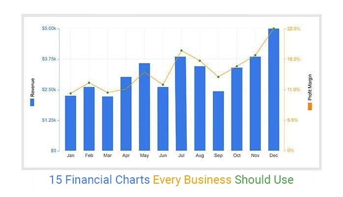
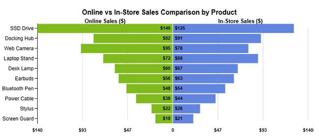
A Dual Axis Bar and Line Graph (one of the best financial graphs and charts) is best suited for comparing two sets of key metrics for a presentation.
It helps reveal trends, correlations, and patterns in limited space, making it ideal for presentations and performance analysis. You can use it to track revenue versus expenses, website traffic versus conversion rates, or any two related metrics, providing a clear, side-by-side comparison for better decision-making.
A Stacked Bar Chart divides each bar into sub-bars, showing part-to-whole relationships over time. It’s easy to read, handles large datasets without appearing cluttered, and clearly displays how subcategories contribute to the total.
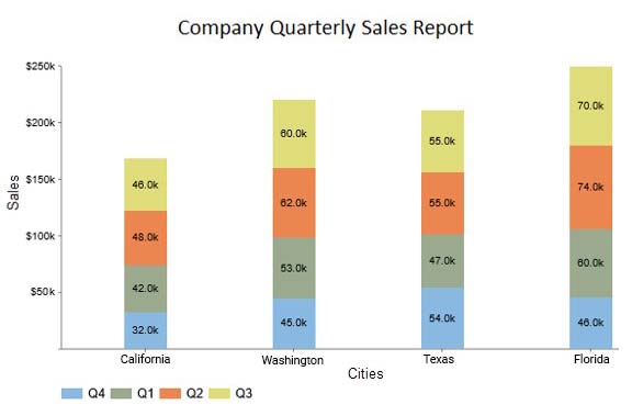
This chart is particularly useful for comparing multiple categories, tracking changes over time, and spotting trends across different segments, such as sales by product line, departmental expenses, or regional performance metrics.
A Progress Bar Chart displays the completion of tasks or goals, making it ideal for monitoring objectives and long-term financial targets.
Filled bars indicate progress, often using colors like green and red to highlight growth or decline. This chart is essential for ongoing monitoring and evaluation.
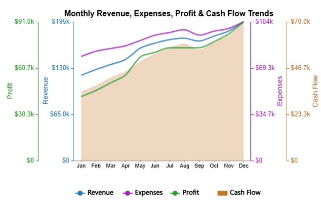
A Multi Axis Line Chart displays multiple financial metrics on separate value axes, making it easy to compare trends that use different scales. It helps reveal relationships between indicators like revenue, expenses, profit, and cash flow within a single, clear visual.
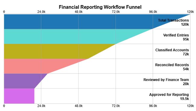
A Funnel Chart visually represents how financial data progresses through sequential stages, highlighting reductions at each step. It helps identify where the largest drop-offs occur in processes like transaction validation, reporting, or approval workflows.
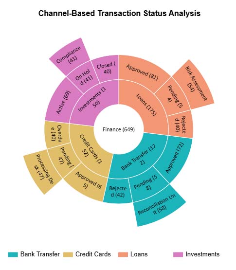
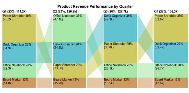
A Sunburst Chart visualizes hierarchical financial data across multiple levels, making it easy to see how each segment contributes to the whole. It helps break down complex finance workflows, such as transactions, channels, and statuses, into a clear, intuitive structure.
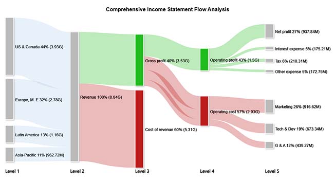
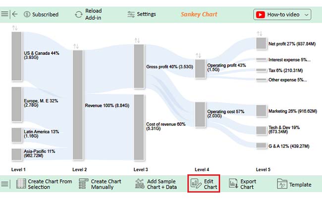
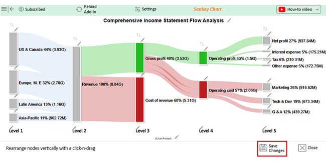
A Sankey Chart visualizes how values flow between categories, with the width of each path representing the size of the contribution. It’s widely used in finance to show how revenue is allocated and how costs reduce profit across different stages.
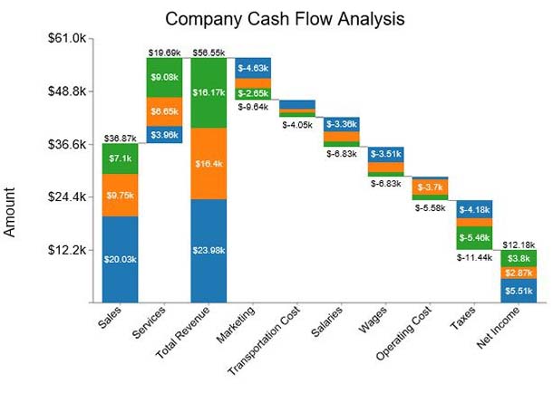
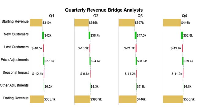
A Waterfall Chart shows how revenue or budget changes step-by-step through positive and negative contributors, helping you understand the factors driving the final value. It’s especially useful in financial analysis for visualizing quarter-wise movement in revenue, profit, or budget variance.
A Tornado Chart compares the impact of different factors side by side, making it easy to see which items, costs, or variables have the greatest influence on results. Its horizontal bar layout highlights the largest variations first, helping analysts quickly identify key drivers in financial or business performance.
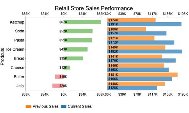
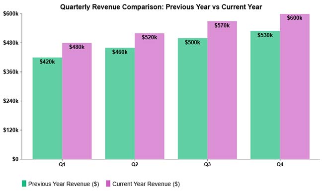
A Comparison Bar Chart displays multiple categories side by side, making it easy to compare values across different groups or time periods. It’s widely used in finance and business to visually analyze performance trends, identify growth patterns, and highlight differences between products or segments.
A Clustered Column Chart places multiple data series side-by-side within each category, making comparisons across groups easy and visually clear. It’s widely used in finance to analyze trends across products, quarters, or regions within the same timeframe.
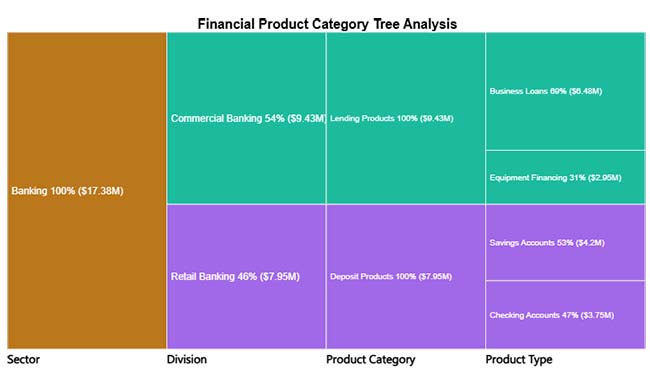
A Tree Diagram visually breaks down financial data into hierarchical levels, helping viewers understand how categories contribute to the whole. It’s especially useful in finance for exploring product portfolios, revenue sources, or cost structures in a clear top-down view.
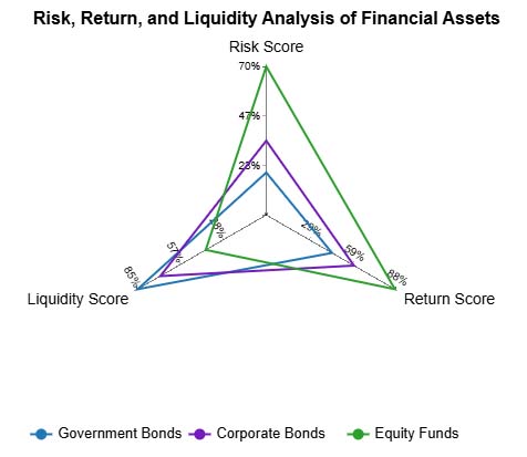
A Multi Axis Spider Chart visualizes multiple financial metrics simultaneously, allowing you to compare investment products across different performance dimensions. It helps reveal strengths, weaknesses, and trade-offs for each asset class in a single, intuitive graphic.
Excel, often paired with an income statement template in Excel, is one of the most popular tools for businesses and professionals looking to visualize data.
However, the default Excel features offer only basic financial graphs. These tools can make creating a clear financial market graph or professional financial graphs a challenge.
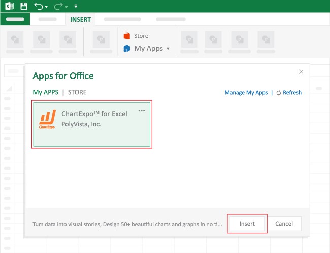
The good news is, you don’t have to give up Excel. By installing third-party apps, you can transform Excel into a powerful data visualization tool.
With ready-made charts, you can quickly create detailed financial diagrams and accounting graphs that make your data easy to interpret and present.
Why ChartExpo?
ChartExpo is a financial chart maker that comes as an add-in you can easily install in your Excel.
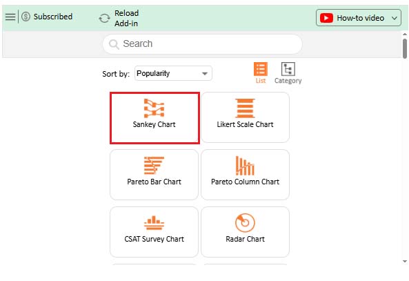
With different insightful and ready-to-use visualizations, including a Tornado chart and a Sankey chart in Excel, ChartExpo turns your complex, raw data into compelling visual renderings that tell the story of your data.
With just a few clicks, the app produces simple, clear visualizations.
Yes, ChartExpo generates financial graphs that are amazingly easy to interpret, even for non-technical audiences, making it one of the most efficient financial chart makers available.
Keep reading because we’ll show you how to install and use ChartExpo to generate visually stunning financial charts in the coming section.
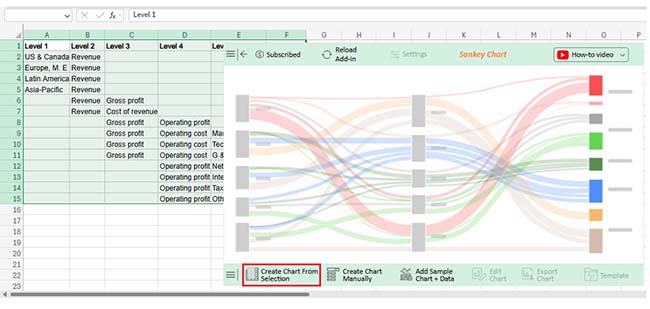
In this section, we’ll use a Progress Visualization (one of the proven financial graphs and charts) to display insights into the table below:
| Level 1 | Level 2 | Level 3 | Level 4 | Level 5 | Amount |
| US & Canada | Revenue | 3,930,000,000 | |||
| Europe, M.E | Revenue | 2,780,000,000 | |||
| Latin America | Revenue | 1,160,000,000 | |||
| Asia-Pacific | Revenue | 962,715,000 | |||
| Revenue | Gross Profit | 3,530,000,000 | |||
| Revenue | Cost of Revenue | 5,310,000,000 | |||
| Revenue | Gross Profit | Operating Profit | 1,500,000,000 | ||
| Revenue | Gross Profit | Operating Cost | Marketing | 916,617,000 | |
| Revenue | Gross Profit | Operating Cost | Tech & Dev | 673,341,000 | |
| Revenue | Gross Profit | Operating Cost | G & A | 439,273,000 | |
| Revenue | Operating Profit | Net Profit | 937,838,000 | ||
| Revenue | Operating Profit | Interest Expense | 175,212,000 | ||
| Revenue | Operating Profit | Tax | 210,312,000 | ||
| Revenue | Operating Profit | Other Expense | 172,747,000 |

This will automatically turn your data into an informative visualization.

Choosing the right chart for financial data helps communicate insights clearly.
A financial graph has two axes: the horizontal x-axis along the bottom and the vertical y-axis along the side. The x-axis typically represents categories or time periods, while the y-axis shows numerical values. By interpreting the position of data points along these axes, you can quickly understand trends, comparisons, and patterns in financial data.
Modern organizations rely on financial insights to remain competitive. Raw numbers alone rarely communicate performance clearly. Financial charts bridge the gap between complex financial datasets and meaningful decision-making.
They help businesses identify trends, evaluate profitability, communicate performance, and plan strategically. While spreadsheet tools provide a strong foundation for visualization, advanced charting solutions can further simplify complex analysis workflows.
Choosing the right financial charts ensures your data tells a clear story that supports confident business decisions.
How much did you enjoy this article?


Learn how to create a finance dashboard in Excel and track key metrics, visualize data, and gain actionable insights to make smarter financial decisions.
Transform spreadsheet data into color-coded visuals with a Heatmap in Excel. Learn two methods and see when color intensity beats numbers. Discover now!
Build nested rectangle charts that expose hidden patterns in layered datasets. Discover techniques for hierarchical analysis. Learn more!