• Home
  • Tools dropdown img
    • Spreadsheet Charts

      • ChartExpo for Google Sheets
      • ChartExpo for Microsoft Excel
    • Power BI Charts

      • Power BI Custom Visuals by ChartExpo
    • Word Cloud

  • Charts dropdown img
    • Chart Category

      • Bar Charts
      • Circle Graphs
      • Column Charts
      • Combo Charts
      • Comparison Charts
      • Line Graphs
      • PPC Charts
      • Sentiment Analysis Charts
      • Survey Charts
    • Chart Type

      • Box and Whisker Plot
      • Clustered Bar Chart
      • Clustered Column Chart
      • Comparison Bar Chart
      • Control Chart
      • CSAT Survey Bar Chart
      • CSAT Survey Chart
      • Dot Plot Chart
      • Double Bar Graph
      • Funnel Chart
      • Gauge Chart
      • Likert Scale Chart
      • Matrix Chart
      • Multi Axis Line Chart
      • Overlapping Bar Chart
      • Pareto Chart
      • Radar Chart
      • Radial Bar Chart
      • Sankey Diagram
      • Scatter Plot Chart
      • Slope Chart
      • Sunburst Chart
      • Tornado Chart
      • Waterfall Chart
      • Word Cloud
    • Google Sheets
      Microsoft Excel
  • Services
  • Pricing
  • Contact us
  • Blog
  • Support dropdown img
      • Gallery
      • Videos
      • Contact us
      • FAQs
      • Resources
    • Please feel free to contact us

      atsupport@chartexpo.com

Categories
All Data Visualizations Data Analytics Surveys
Add-ons/
  • Google Sheets
  • Microsoft Excel
  • Power BI
All Data Visualizations Data Analytics Surveys
Add-ons
  • Google Sheets
  • Microsoft Excel
  • Power BI

We use cookies

This website uses cookies to provide better user experience and user's session management.
By continuing visiting this website you consent the use of these cookies.

Ok

ChartExpo Survey


Home > Blog > Power BI

Power BI Calculation Groups: A Complete Overview

Power BI calculation groups help in applying specific calculations to existing DAX measures. For instance, calculation groups can implement time intelligence calculations like year-over-year, year-to-date, and currency conversion. It can also enable the selection of a measure in an existing report through a slicer.

Calculation groups are somewhat straightforward. However, coming up with the right design for a model with calculation groups can be challenging when you create multiple calculation groups (or when you use calculation items in measures).

Power BI Calculation Groups

In this guide, you’ll discover what Power BI calculation groups are, why you should use them, and how to create calculation groups in Power BI.

Table of Contents:

  1. What are Power BI Calculation Groups?
  2. Why Do We Use Calculation Groups in Power BI?
  3. What is the Application of Calculation Groups in Power BI?
  4. How to Create Calculation Groups in Power BI?
  5. How to Analyze Calculation Groups in Power BI?
  6. What are the Benefits of Calculation Groups in Power BI?
  7. What are the Limitations of Power BI Calculation Groups?
  8. Wrap Up

First…

What are Power BI Calculation Groups?

Power BI calculation groups are features introduced to enable the capabilities of DAX (Data Analysis Expressions) in Power BI. It allows users to define reusable calculations (or groups of calculations), which can be applied across multiple measures within a report.

Why Do We Use Calculation Groups in Power BI?

Calculation groups come in handy in scenarios where you have multiple calculated measures that share similar calculations or logic. Instead of writing and maintaining the same logic separately for each calculated measure, you’ll create a calculation group that embodies these common calculations. This helps save time while ensuring consistency and accuracy across the report.

What is the Application of Calculation Groups in Power BI?

  • Standardizing Measures: Calculation groups enable the standardization of calculations across multiple measures. This ensures consistency in data reporting.
  • Time Intelligence: Calculation groups facilitate dynamic time intelligence calculations, like rolling averages, month-to-date, or year-to-date, applied to various measures based on user selections. With Power BI date format options, users can customize how dates appear, enhancing readability and making date-based insights clearer.
  • Currency Conversion: It supports currency conversion calculations. Users are allowed to view data in different currencies without duplicating measures dynamically.
  • Scenario Analysis: Calculation groups enable scenario analysis by applying different calculation logic to measures based on user-selected scenarios like expected outcomes, best-case, or worst-case.

How to Create Calculation Groups in Power BI?

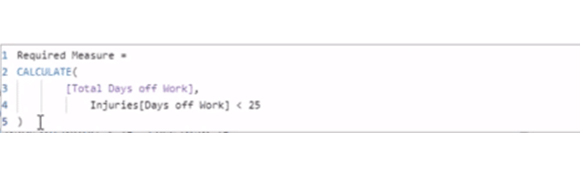
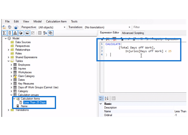
With this formula, you’ll have the CALCULATE function and you’ll be grouping “Total Days Off Work” in 25 days, or under 50 days, or any type of custom grouping you desire.

Type of Custom Grouping You Desire for Doing Power BI Calculation Groups

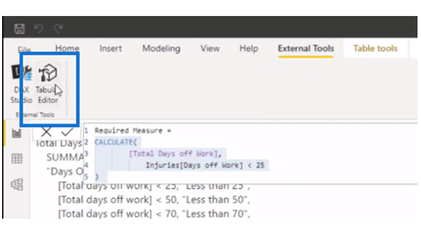
Since the measure has been created, copy it. Next, Navigate to “External Tool.” After that, go to “Tabular Editor.”

Go to Tabular Editor for Doing Power BI Calculation Groups

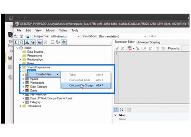
Navigate to “Tables” and right-click and select “Create New.” From the dropdown, select “Calculation Group.”

Select Calculation Group for Doing Power BI Calculation Groups

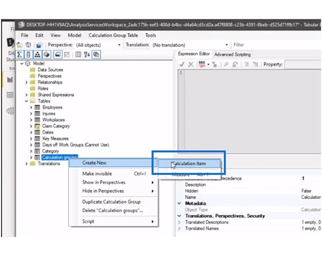
You can name it Calculation groups. Moving on, you’ll have to create a calculation item. To do that, right-click on the calculation group you’ve just created, and go to “Create New.” Select “Calculation Group” from the dropdown.

You Name it Calculation Groups for Doing Power BI Calculation Groups

You can call this one “Less than 25 Days.” Next, navigate to the Expression Editor section, and paste in the measure you’ve copied.

Expression Editor Section for Doing Power BI Calculation Groups

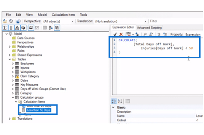
At this point, you’ll have to create another calculation item and call it “Less than 50 Days.” You’ll use the same measure, but change the grouping criteria from 25 to 50.

Change Grouping Criteria from 25 for Doing Power BI Calculation Groups

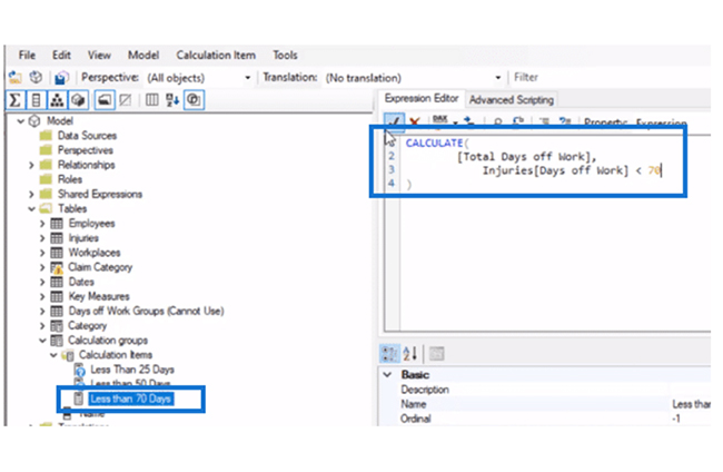
The next calculation item is for “Less than 70 Days.” You’ll have to do the same steps and just change the grouping criteria to 70.

Change Grouping Criteria from 70 for Doing Power BI Calculation Groups

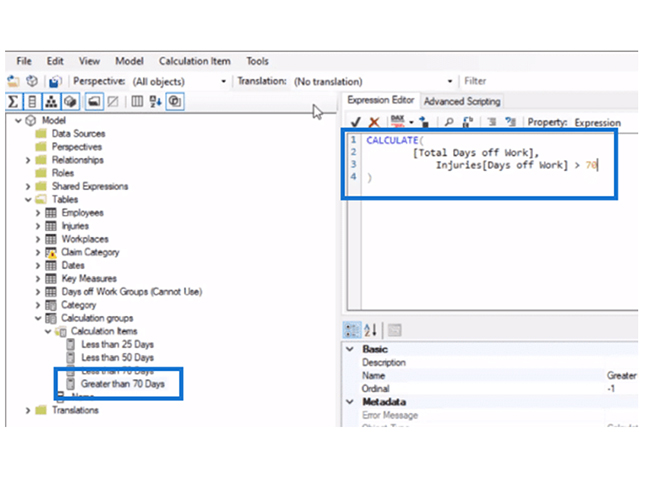
Finally, you’ll have to create a calculation item for “Greater than 70 Days.” In the DAX expression, change the grouping criteria to greater than (>) 70.

DAX Expression Change Grouping Criteria to Greater than 70 for Doing Power BI Calculation Groups

Click save and refresh it on the Power BI desktop.

How to Analyze Calculation Groups in Power BI?

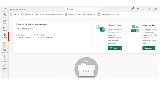
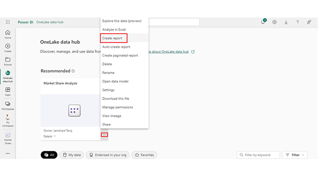
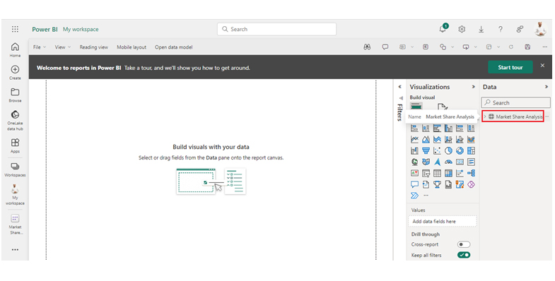
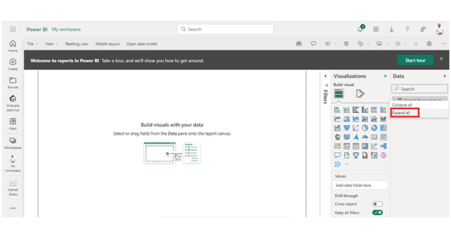
Stage 1: Logging in to Power BI
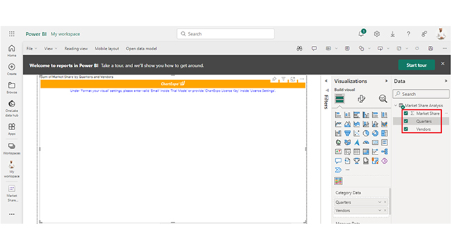
  • Log in to Power BI.
  • Enter your email address and click the “Submit” button.
Enter email to login to Power BI
    • You are redirected to your Microsoft account.
    • Enter your password and click “Sign in“.
Enter Password to login to Power BI
  • You can choose whether to stay signed in.
Click on stay signed in
  • Once done, the Power BI home screen will open.

Stage 2: Creating a Data Set and Selecting the Data Set to Use in Your Chart

  • Go to the left-side menu and click the “Create” button.
  • Select “Paste or manually enter data“.
select Paste or manually enter data in Power BI ce487
  • We’ll use the sample data below for this example.
Quarters Vendors Market Share
Q1 Samsung 27.69
Q1 Apple 28.45
Q1 Xiaomi 11.8
Q1 Huawei 6.53
Q1 Oppo 5.3
Q1 Vivo 4.19
Q2 Samsung 28.14
Q2 Apple 27.58
Q2 Xiaomi 12.62
Q2 Huawei 6.17
Q2 Oppo 5.5
Q2 Vivo 4.21
Q3 Samsung 28.45
Q3 Apple 27.71
Q3 Xiaomi 12.9
Q3 Huawei 6
Q3 Oppo 5.29
Q3 Vivo 4.17
Q4 Samsung 27.97
Q4 Apple 27.62
Q4 Xiaomi 12.68
Q4 Huawei 5.17
Q4 Oppo 6.07
Q4 Vivo 4.66
  • Paste the data table above into the “Power Query” window and name it “Market Share Analysis.” After that, select the “Create a dataset only” option.
Select Create a Dataset Only for Doing Power BI Calculation Groups
  • Navigate to the left-side menu, and click on the “Data Hub” option. Power BI will populate the data set list. If no data set has been created, you’ll get an error message.
Click Data Hub for Doing Power BI Calculation Groups
  • Click on “Create report.”
Click Create Report for Doing Power BI Calculation Groups
  • Click on “Market Share Analysis.”
Click on Market Share Analysis for Doing Power BI Calculation Groups
  • Click on “Expand All.”
Click on Expand All for Doing Power BI Calculation Groups
  • After clicking on “Expand All,” you’ll see your chart metrics.
You See Chart Metrics for Doing Power BI Calculation Groups
  • Click on “Get more visuals.”
Click on Get More Visuals for Doing Power BI Calculation Groups
  • You can search “ChartExpo” and select “Comparison Bar Chart.”
Select Comparison Bar Chart for Doing Power BI Calculation Groups
  • Click on “Add.”
Click on Add Button for Doing Power BI Calculation Groups
  • After that, you’ll see the Comparison Bar Chart in the visuals list.
See Comparison Bar Chart in Visuals List for Doing Power BI Calculation Groups
  • You can expand the chart space.
Expand Chart Space for Doing Power BI Calculation Groups
  • After that, select the metrics of your data.
Select Metrics of Data for Doing Power BI Calculation Groups
  • Click on the second icon of Format visuals. After that, click on visual.
Click on Second Icon of Format Visuals for Doing Power BI Calculation Groups
  • In Visual, click on License Settings and add the key. After adding the key, you’ll see the comparison bar chart.
Add License Key for Doing Power BI Calculation Groups
  • To add the header text, click on the General tab. After that, add the header text in Title.
Click Add Header Text for Doing Power BI Calculation Groups
  • Here’s the final look at the Comparison Bar Chart in Power BI.
Final Power BI Calculation Groups

Insights:

  • Samsung and Apple are the top two vendors in terms of market share, with Samsung taking the lead.
  • Huawei has been losing market share, while Xiaomi has been gaining market share.
  • Vivo and Oppo have been relatively stable in terms of market share. In the last quarter, there was transition between Huawei and Oppo.

Transform Graphs with Power BI Calculation Groups for Advanced Insights:

  1. Open your Power BI Desktop or Web.
  2. From the Power BI Visualizations pane, expand three dots at the bottom and select “Get more visuals”.
  3. Search for “Comparison Bar Chart by ChartExpo” on the AppSource.
  4. Add the custom visual.
  5. Select your data and configure the chart settings to create the chart.
  6. Customize your chart properties to add header, axis, legends, and other required information.
  7. Share the chart with your audience.

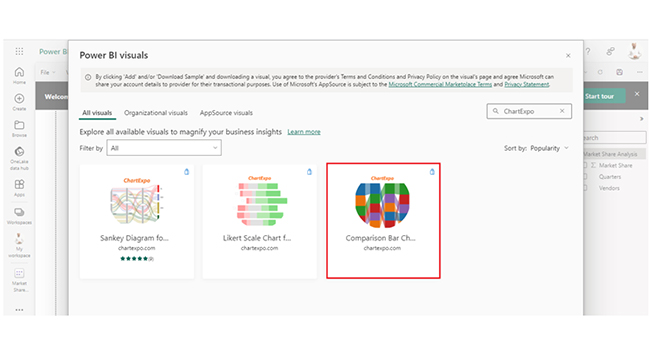
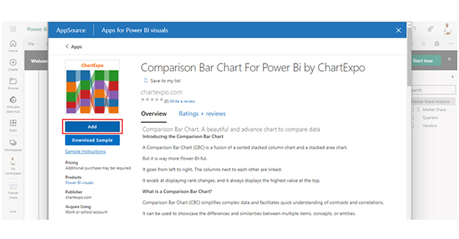
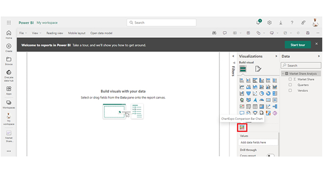
The following video will help you create a Comparison Bar Chart in Microsoft Power BI.


What are the Benefits of Calculation Groups in Power BI?

  • Reusability: Calculation groups allow users to define calculations once and reuse them across multiple measures within a report. This eliminates the need to duplicate logic for similar calculations in different measures.
  • Consistency: Since the same calculation logic is uniformly applied across measures, consistency in reporting is maintained. This consistency helps in accurate data analysis and decision-making, and that comes in handy in enterprise-level reporting where standardized calculations are needed.
  • Maintenance Efficiency: Calculation groups streamline the maintenance process by centralizing the definition of calculations. Any modifications (or updates) to the logic can be made in the calculation group, and that reduces the risk of errors and ensures that reports remain up-to-date with the latest calculation logic.

What are the Limitations of Power BI Calculation Groups?

  • Complexity in Implementation: Calculation groups come with some complexity during implementation. Users will need a deep understanding of DAX and Power BI modeling concepts to effectively manage and create calculation groups. Complex scenarios (or requirements) may require more advanced DAX skills, and that potentially poses a barrier for less experienced users.
  • Performance Considerations: When dealing with complex calculations or large datasets, calculation groups impact report performance. Applying calculation groups to numerous measures or using them extensively in a report can increase memory consumption and processing time. This will, in turn, lead to slower performance. To mitigate these performance issues and ensure a satisfactory user experience, you’ll have to keep on optimizing and testing.
  • Limited Compatibility: Calculation groups come with compatibility limitations with certain data visualizations and features within Power BI. Not all visuals (or functionalities) fully support calculation groups, and that restricts their applicability in some scenarios.
  • Version Dependencies: Calculation groups were introduced in specific versions of Power BI. That is, reports containing calculation groups may not be compatible with older versions of the software. This version dependency becomes an issue where different versions of Power BI are in use or when sharing reports with users who are using older versions. Users have to ascertain that stakeholders (and third parties) have access to compatible versions of Power BI.

FAQs

How to create calculation groups in Power BI without Tabular Editor?

To create calculation groups in Power BI, you’ll have to navigate to the “Modeling” tab and select “New Calculation Group” from the ribbon. After that, define groups and measures, and manage them within the Power BI interface.

What is ordinal in the calculation group?

In a calculation group, the ordinal determines the order of calculation items. It specifies the sequence in which calculation items are evaluated and applied within the group’s logic.

What is the use of a calculation group?

Calculation groups in Power BI allow for dynamic grouping and application of measures, and that enhances analysis by enabling users to switch calculations (or perspectives) seamlessly within reports.

Wrap Up

Power BI calculation groups enable dynamic switching between different calculation logic for measures within a report, and that enhances flexibility and analysis.

Calculation groups help accommodate diverse business requirements without cluttering the model with redundant measures. It helps users to easily handle an increasing number of calculations. Aside from that, the calculation group offers a structured approach to organizing and managing calculations, and that ensures scalability as reporting requirements evolve over time.

The calculation group promotes consistency in reporting. With consistent reporting, you’re sure of having the same logic applied uniformly across measures. Consistency is necessary for accurate analysis and decision-making, and that comes in handy during enterprise-level reporting where standardized calculations are needed to help align various stakeholders and departments.

To create a calculation group, you’ll have to use Power BI Desktop’s “Modelling” tab, select “New Calculation Group,” and define calculation items and expressions.

How much did you enjoy this article?

PBIAd1
Start Free Trial!
143417

Related articles

next previous
Power BI12 min read

How to Create Sankey Diagram in Microsoft Power BI?

Learn How to Create Sankey Diagram in Microsoft Power BI using Desktop & Web Service. What they are and how to use them effectively.

Power BI8 min read

Power BI Artificial Intelligence: Insights Using Visuals

Discover all there is to know about the Power BI artificial intelligence. You'll also discover how AI is used in Power BI, and how to use it for analysis and more.

Power BI9 min read

Budgeting in Healthcare: Use Visuals to Spot Budget Gaps

This guide helps you discover what budgeting in healthcare is. You'll also discover the factors that affect hospital budgets and types of budgeting in healthcare.

Power BI9 min read

Predictive Analytics in Power BI for Making Insightful Visuals

This guide shows you everything you need to know about Predictive Analytics in Power BI. It also shows you how it works, and how to interpret the results.

Power BI8 min read

Quarterly Business Review Template for Optimum Reports

Discover what the quarterly business review template is. This guide also shows you the best practices to consider when using the QBR template.

ChartExpo logo

Turn Data into Visual
Stories

CHARTEXPO

  • Home
  • Gallery
  • Videos
  • Services
  • Pricing
  • Contact us
  • FAQs
  • Privacy policy
  • Terms of Service
  • Sitemap

TOOLS

  • ChartExpo for Google Sheets
  • ChartExpo for Microsoft Excel
  • Power BI Custom Visuals by ChartExpo
  • Word Cloud

CATEGORIES

  • Bar Charts
  • Circle Graphs
  • Column Charts
  • Combo Charts
  • Comparison Charts
  • Line Graphs
  • PPC Charts
  • Sentiment Analysis Charts
  • Survey Charts

TOP CHARTS

  • Sankey Diagram
  • Likert Scale Chart
  • Comparison Bar Chart
  • Pareto Chart
  • Funnel Chart
  • Gauge Chart
  • Radar Chart
  • Radial Bar Chart
  • Sunburst Chart
  • see more
  • Scatter Plot Chart
  • CSAT Survey Bar Chart
  • CSAT Survey Chart
  • Dot Plot Chart
  • Double Bar Graph
  • Matrix Chart
  • Multi Axis Line Chart
  • Overlapping Bar Chart
  • Control Chart
  • Slope Chart
  • Clustered Bar Chart
  • Clustered Column Chart
  • Box and Whisker Plot
  • Tornado Chart
  • Waterfall Chart
  • Word Cloud
  • see less

RESOURCES

  • Blog
  • Resources
  • YouTube
SIGN UP FOR UPDATES

We wouldn't dream of spamming you or selling your info.

© 2025 ChartExpo, all rights reserved.